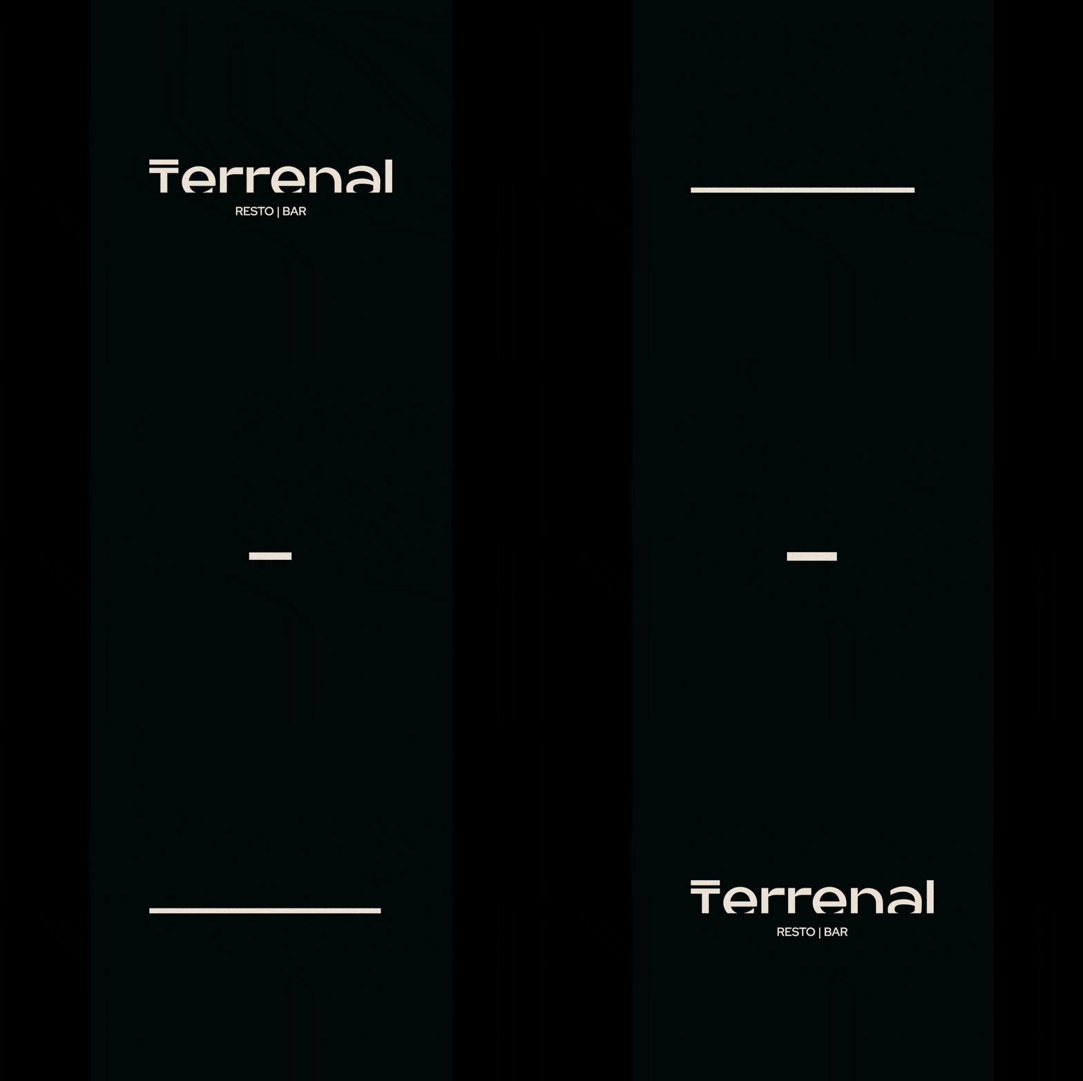
Terrenal Resto Bar
BRANDING | ILLUSTRATION

The Client

Terrenal is a Resto-Bar located in Riobamba, Ecuador that draws inspiration from the Andean Paramo for its concept.


Keywords

Branding / Design / Naming / Restaurant / Bar / Paramo / Andean
The Objective

Design the Naming and Branding for a Resto Bar with the concept of the Andean Paramo.


The Solution

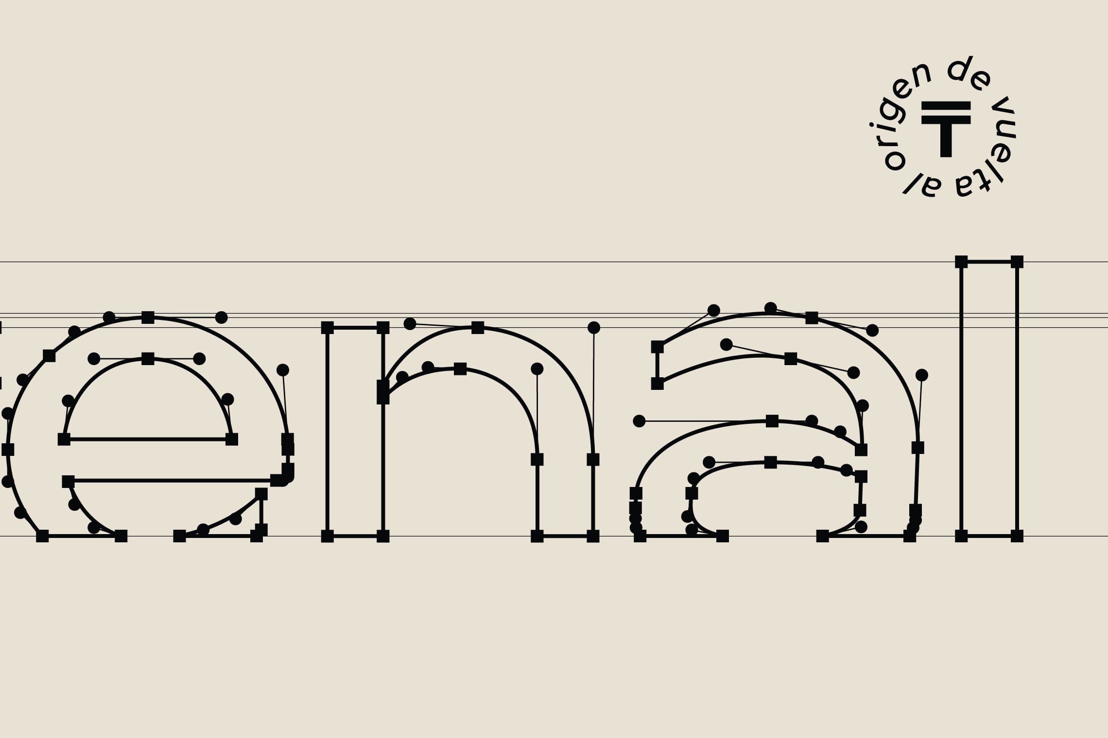
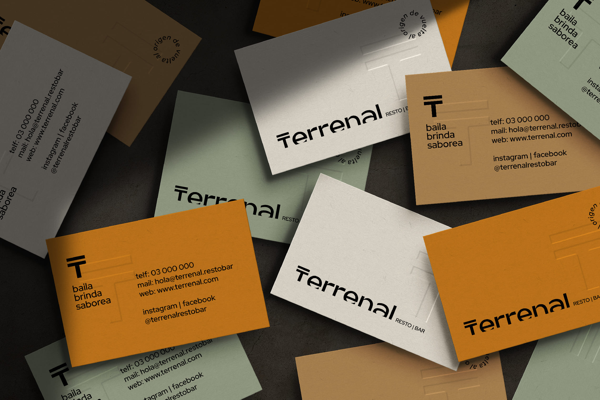
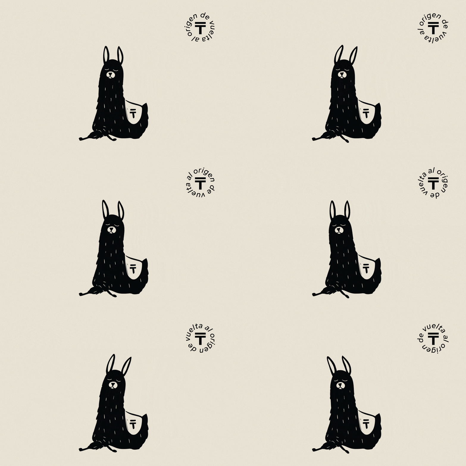
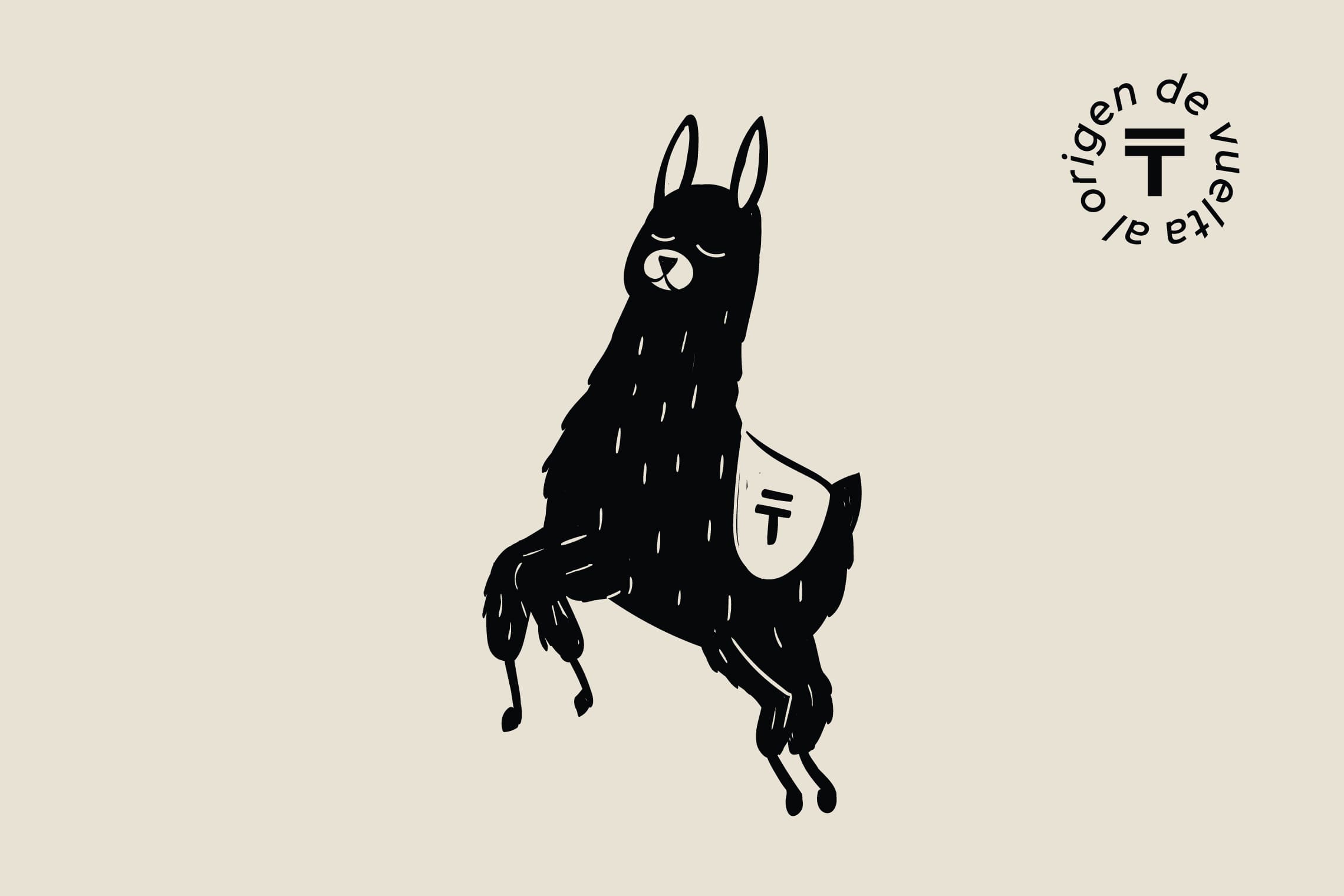
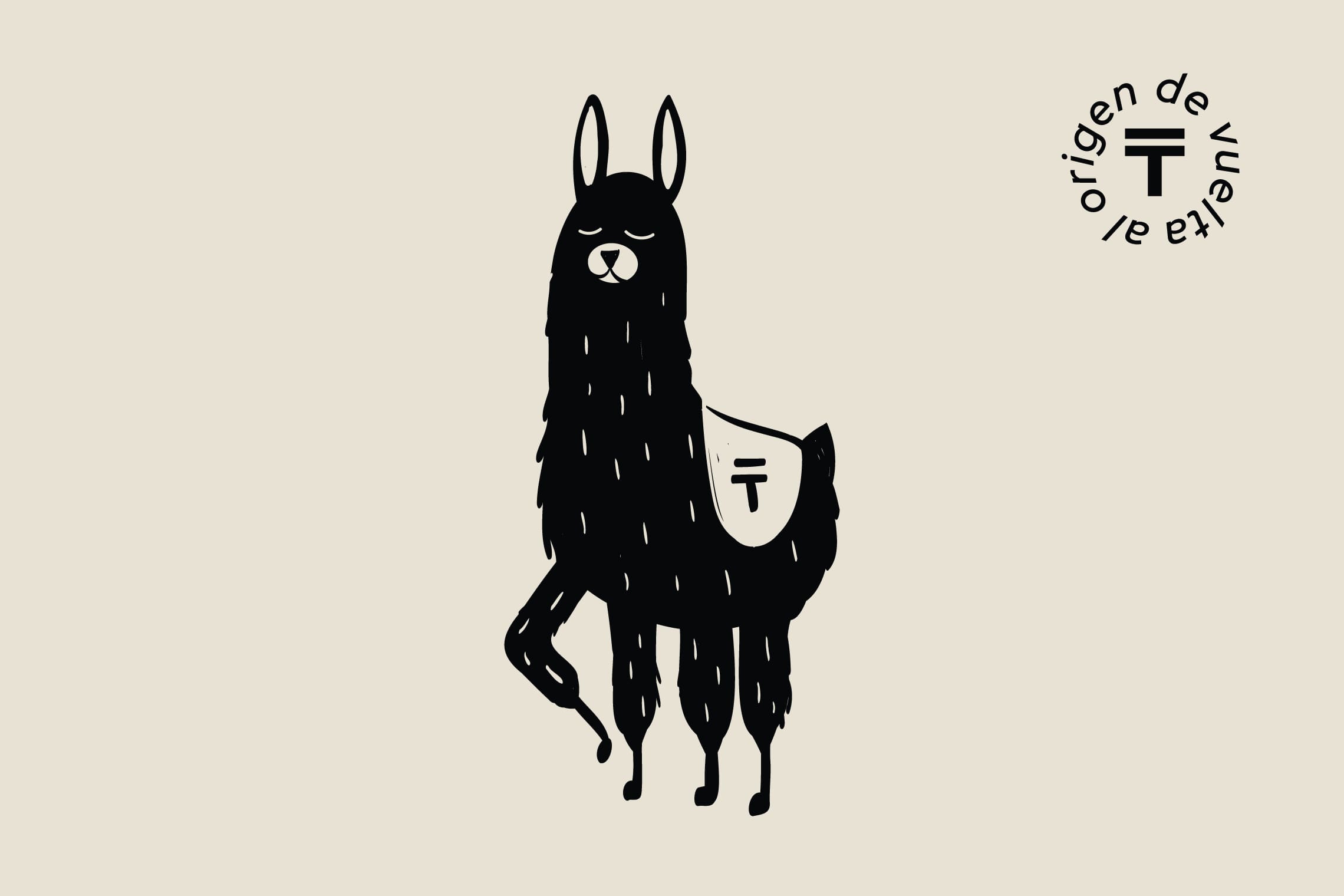
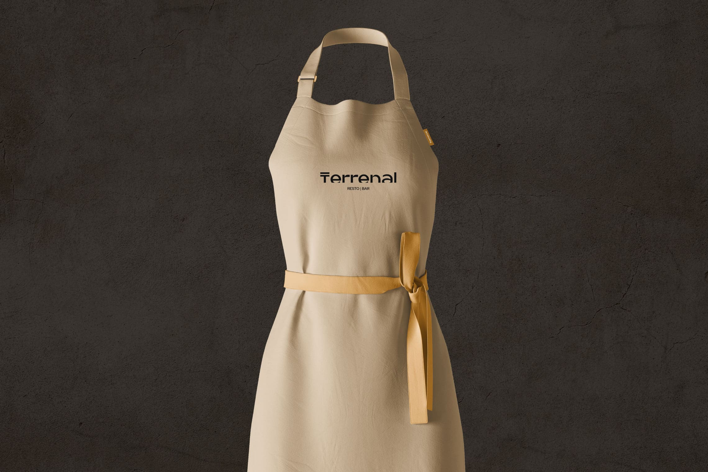
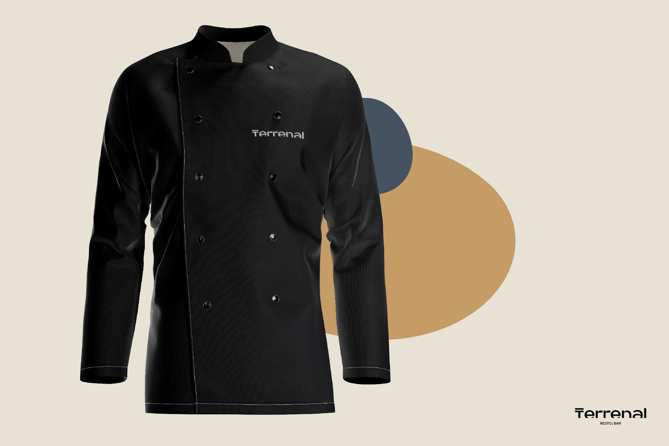
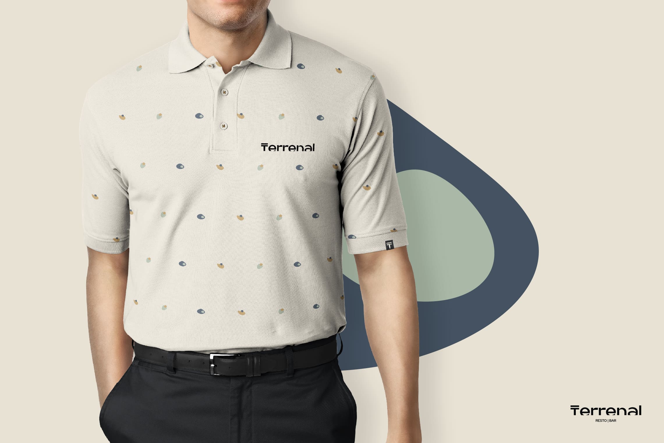
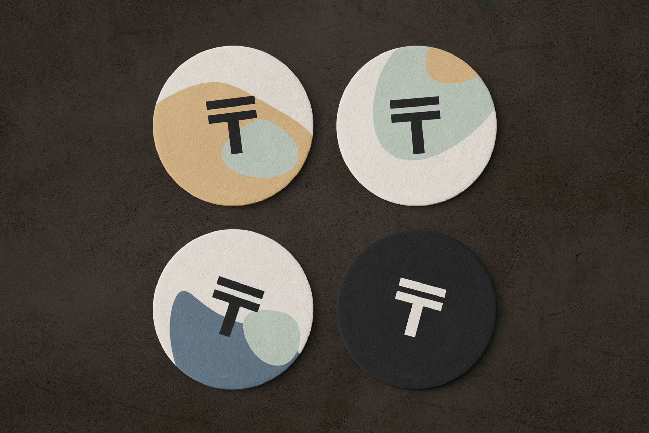
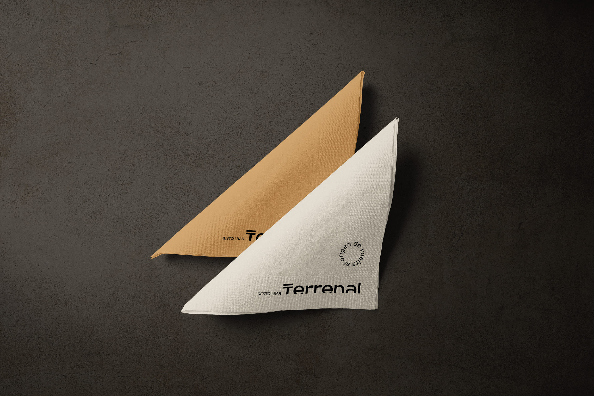
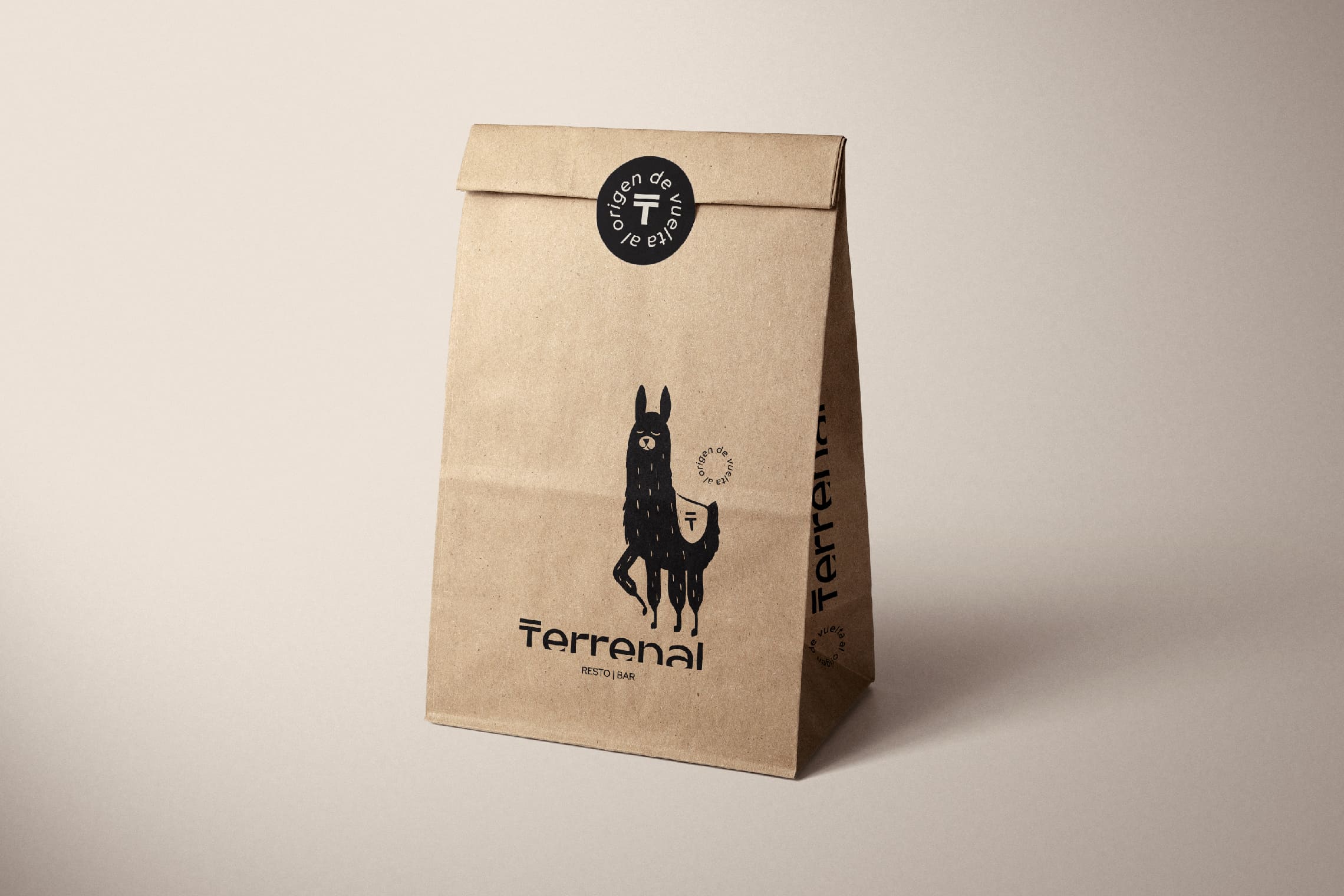
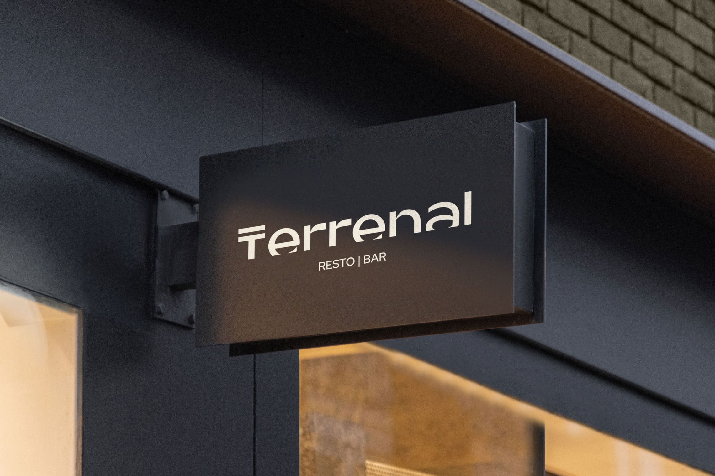
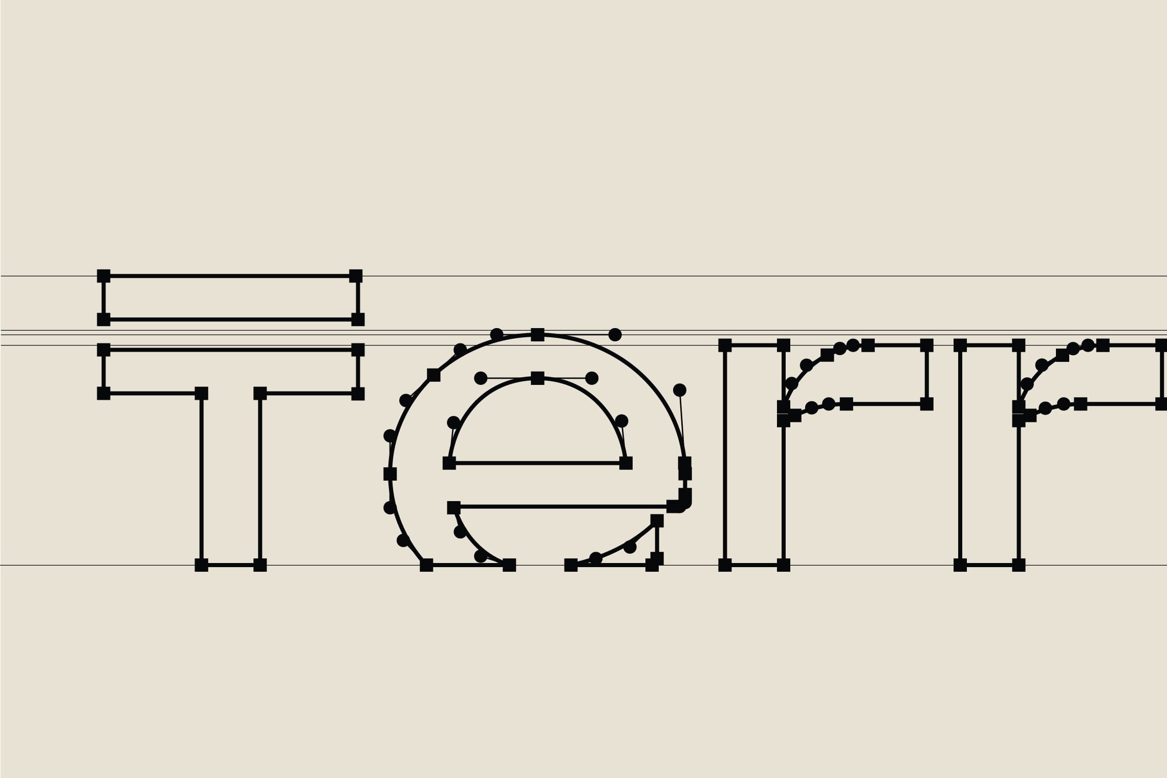
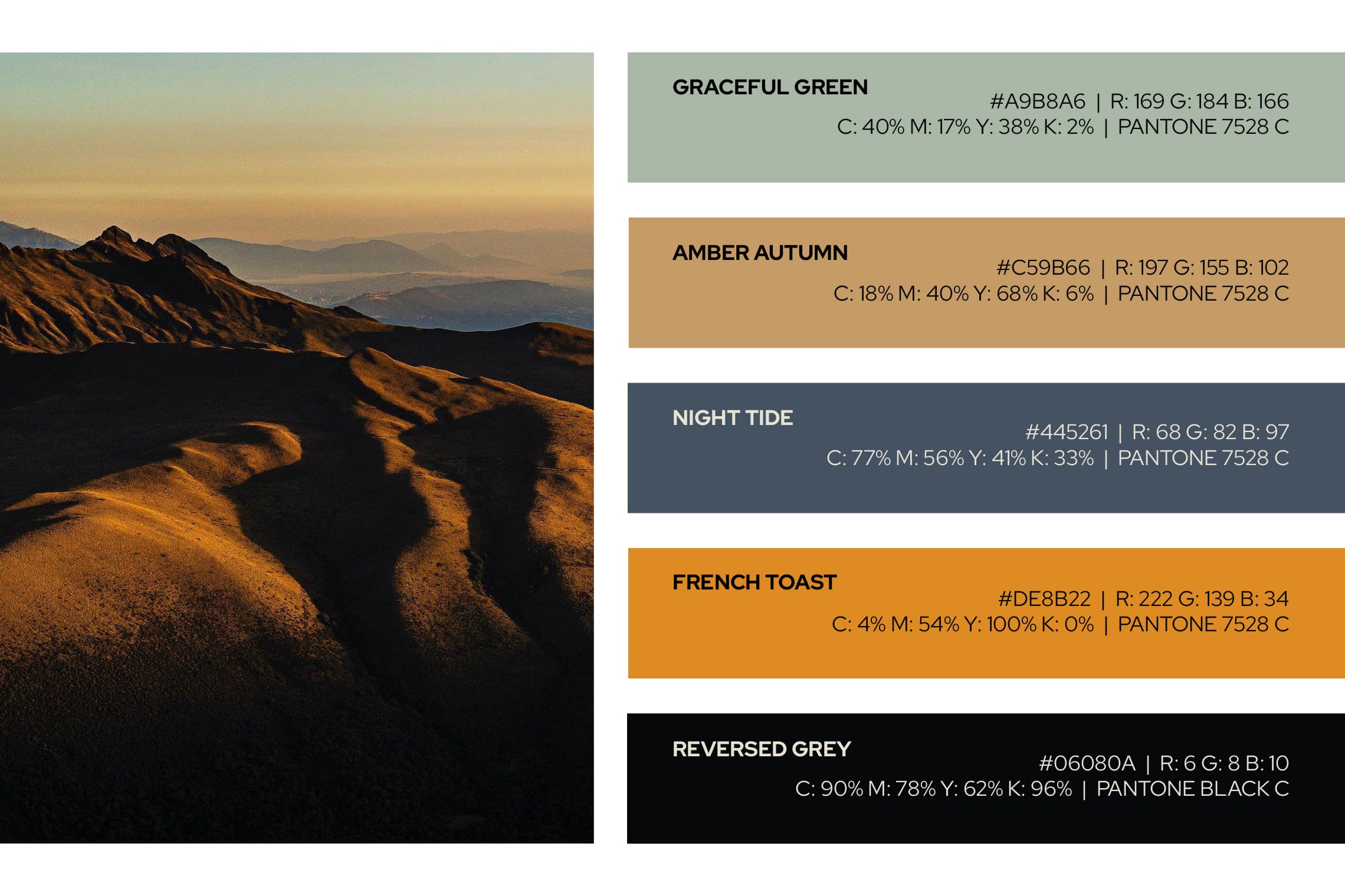
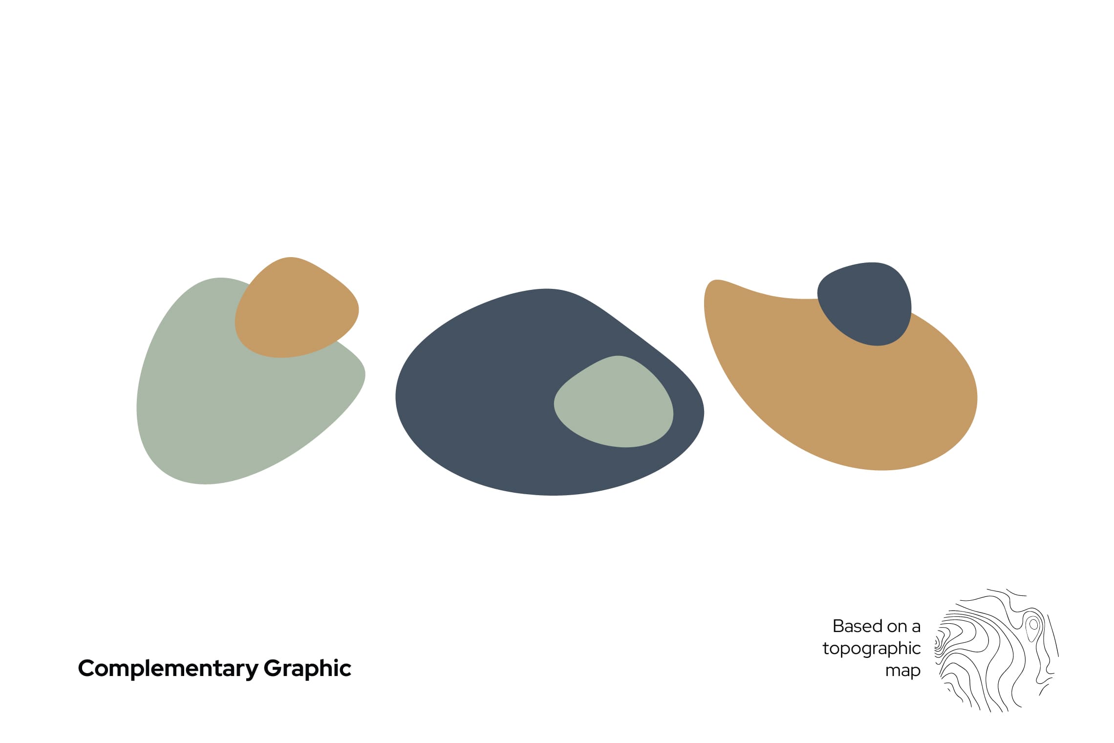
For the name design, we have chosen “Terrenal” for its literal meaning: of earthly and material things, in opposition to the celestial or spiritual, or related to them; this definition favors the experience of traversing the paramo both in its light and in its darkness. The typography designed for this project is a modern sans -serif typeface, with a top line in the letter “T” that leaves everything earthly below it; the concept is strengthened by stopping the letters in time, at a point of sunrise or sunset represented by a cut in the bottom part, evoking the horizon. This project features the colors of the paramo and a unique character native to the paramo to strengthen brand recognition and essence.
Suggested Projects
Simples Finanzas
Extreme Max
Educar com Evidências
Simples Finanzas
BRANDING

The Client

Simple Finances is a financial education program in Mexicali, Mexico, that aims to create wealth, reduce stress, and provide financial control.


Keywords

Branding / Design / Education / Personal Finance

The Objective

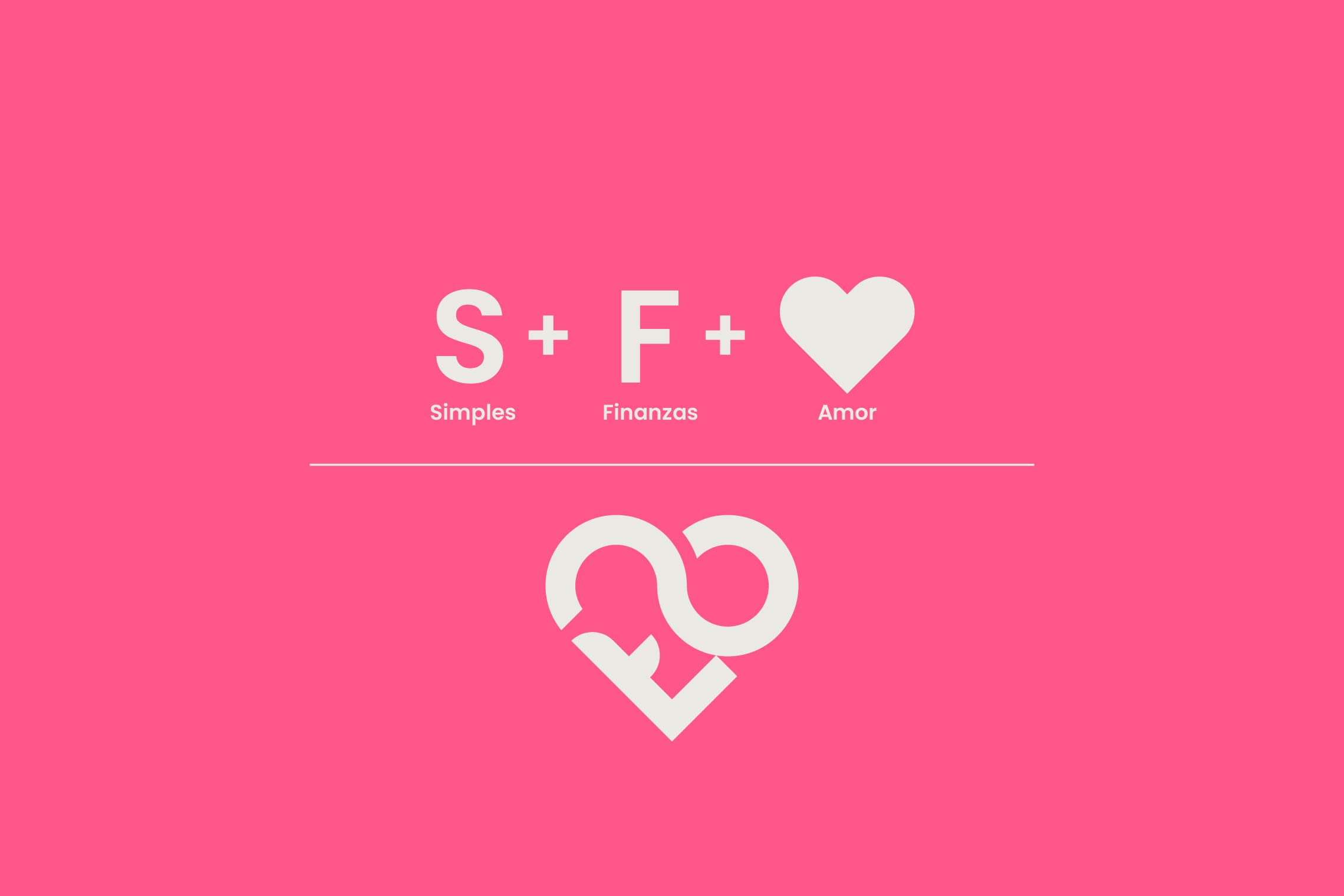
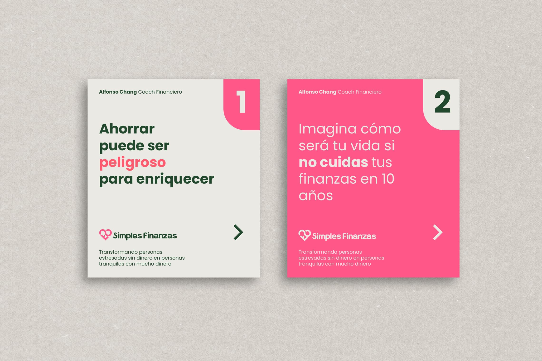
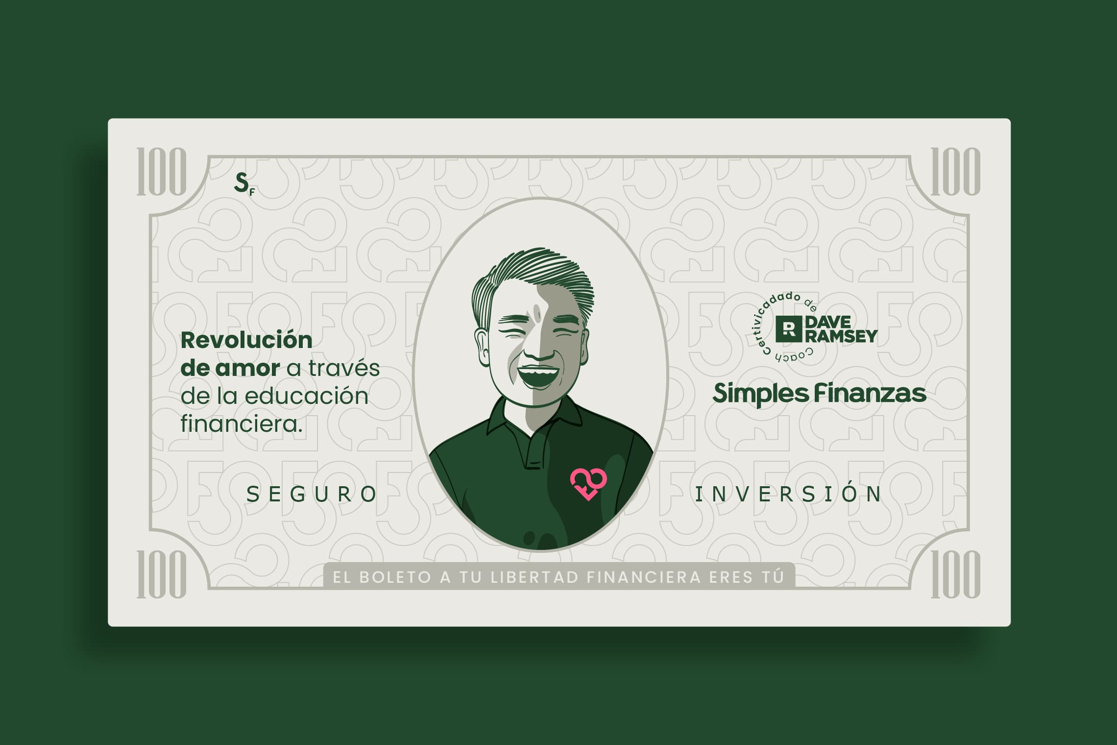
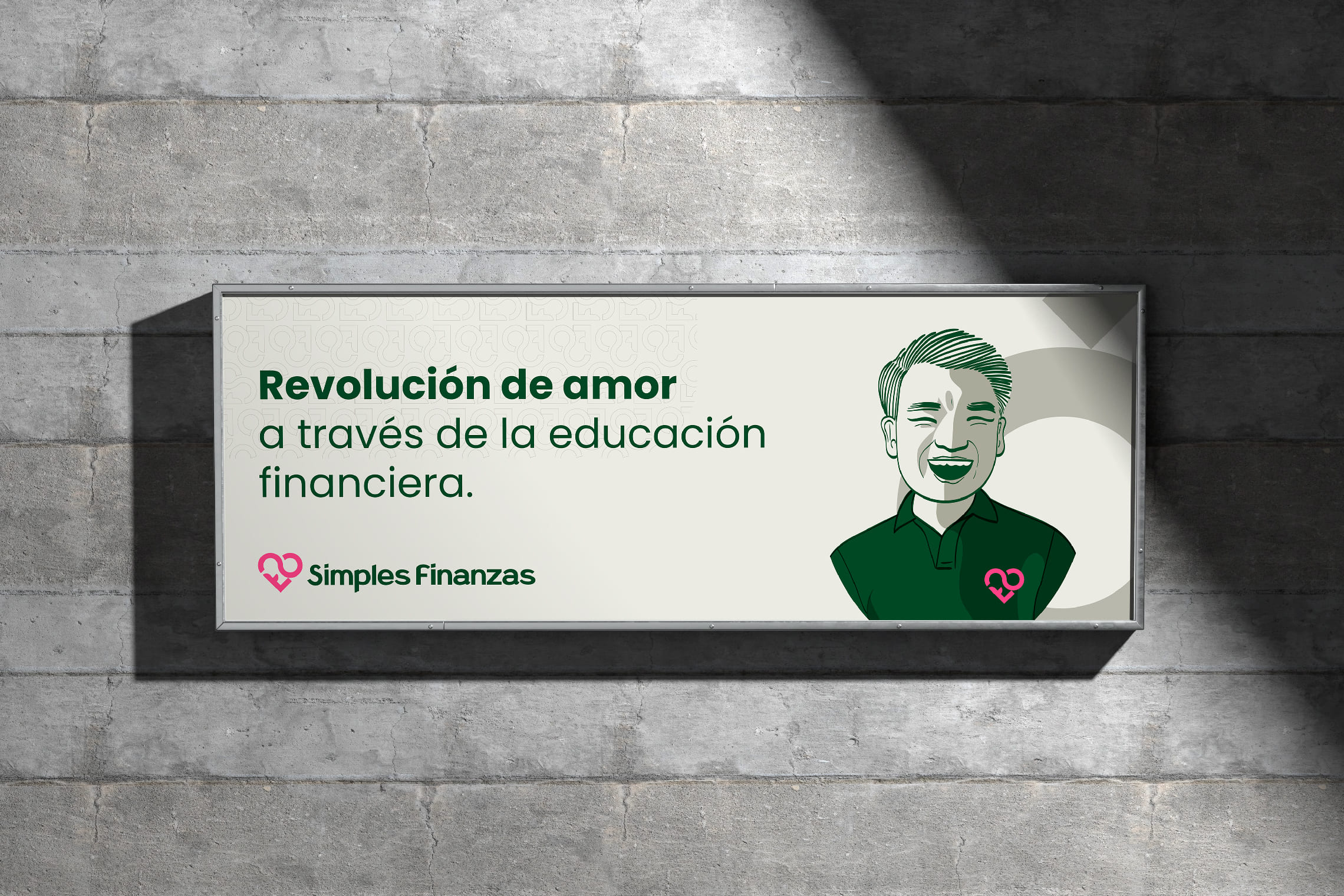
Design a brand that represents my ideal of ‘the revolution of love through financial education’ Alfonso Chang Coach


The Solution

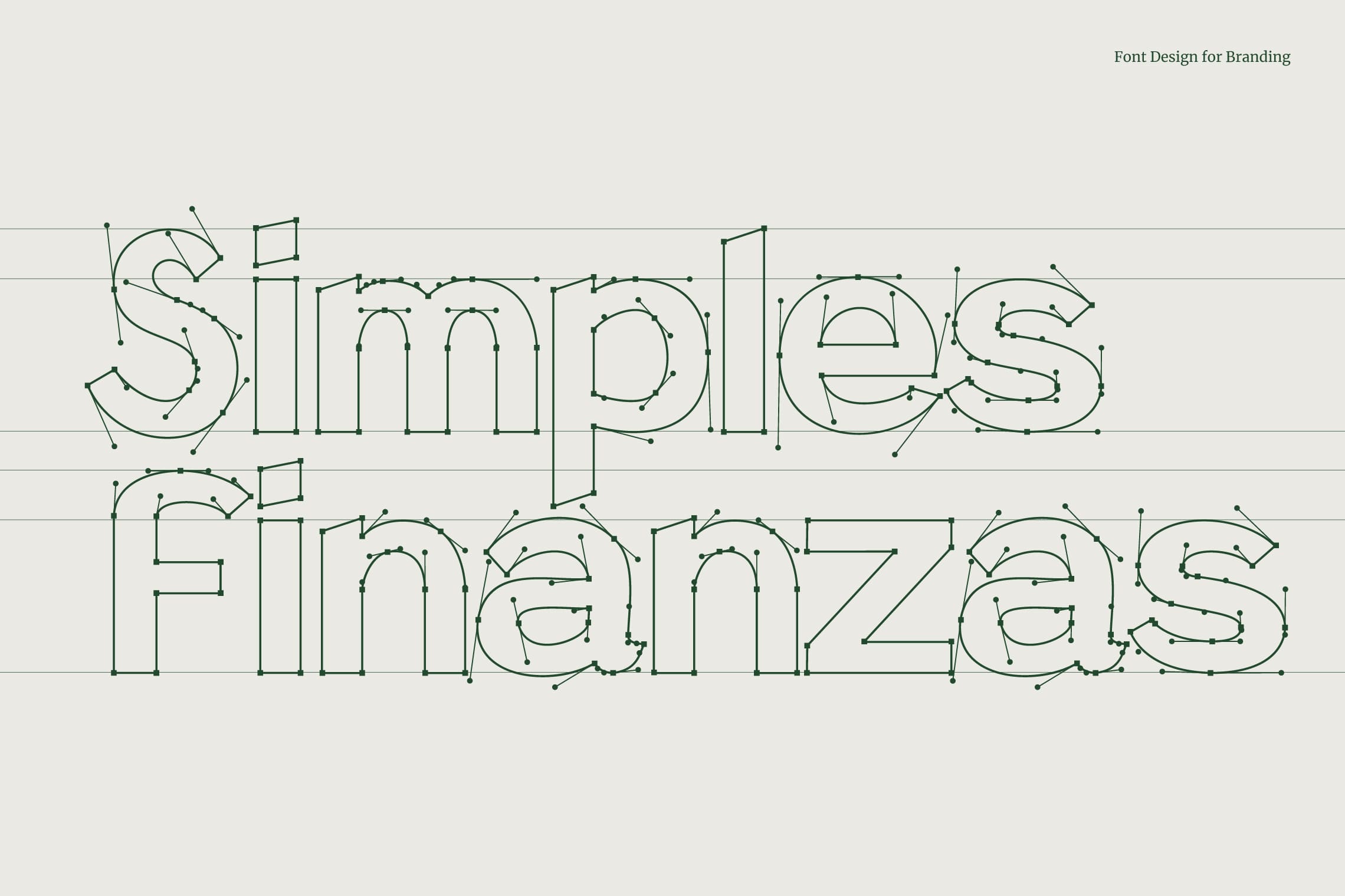
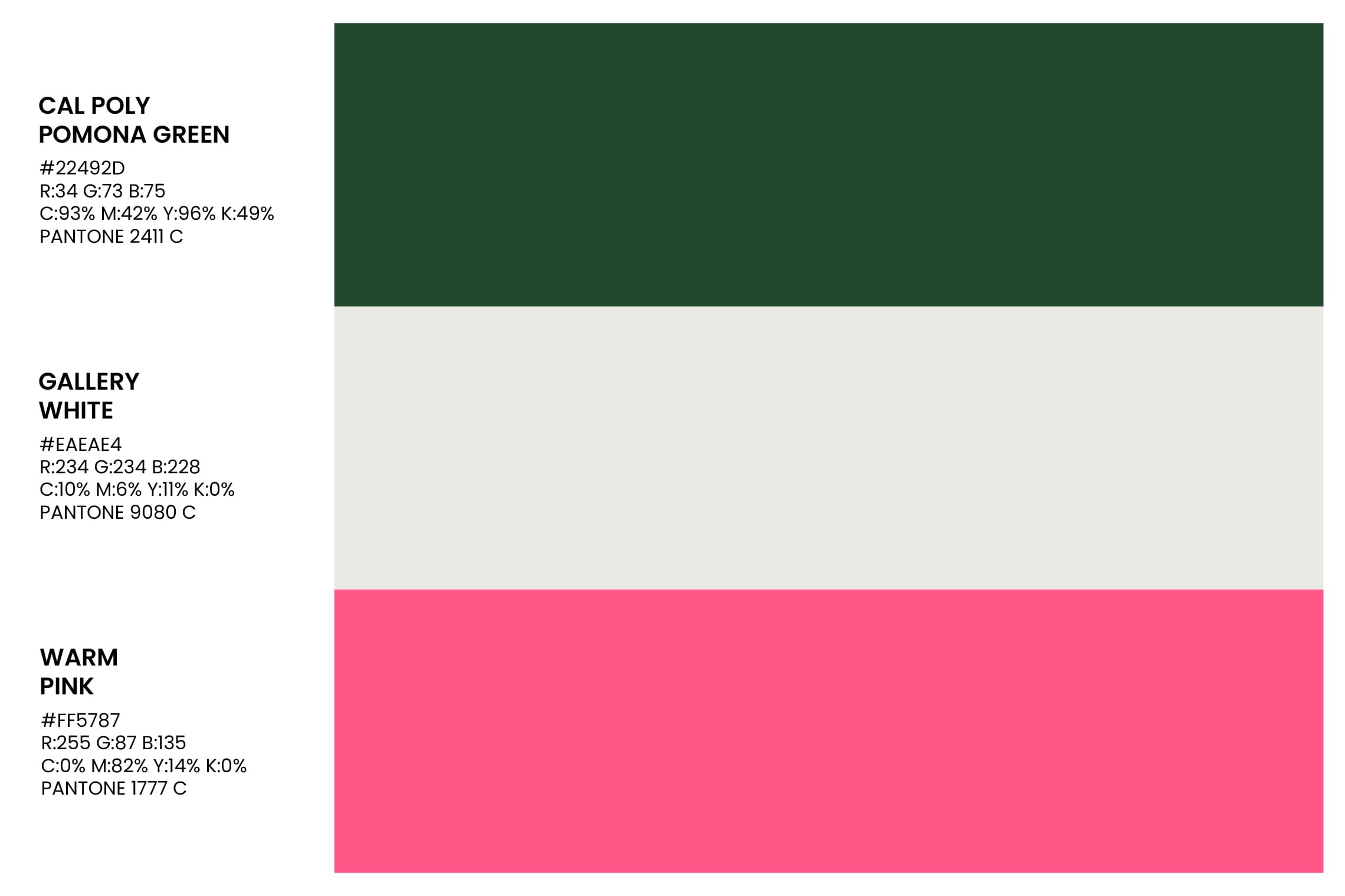
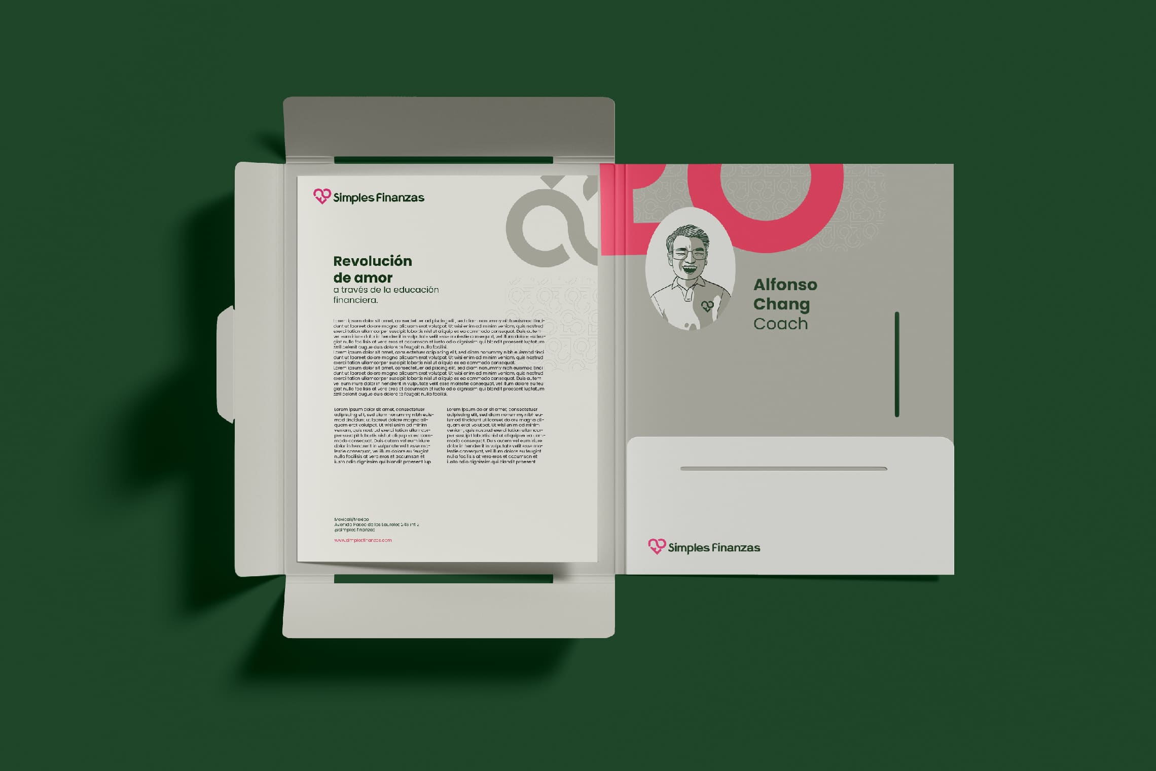
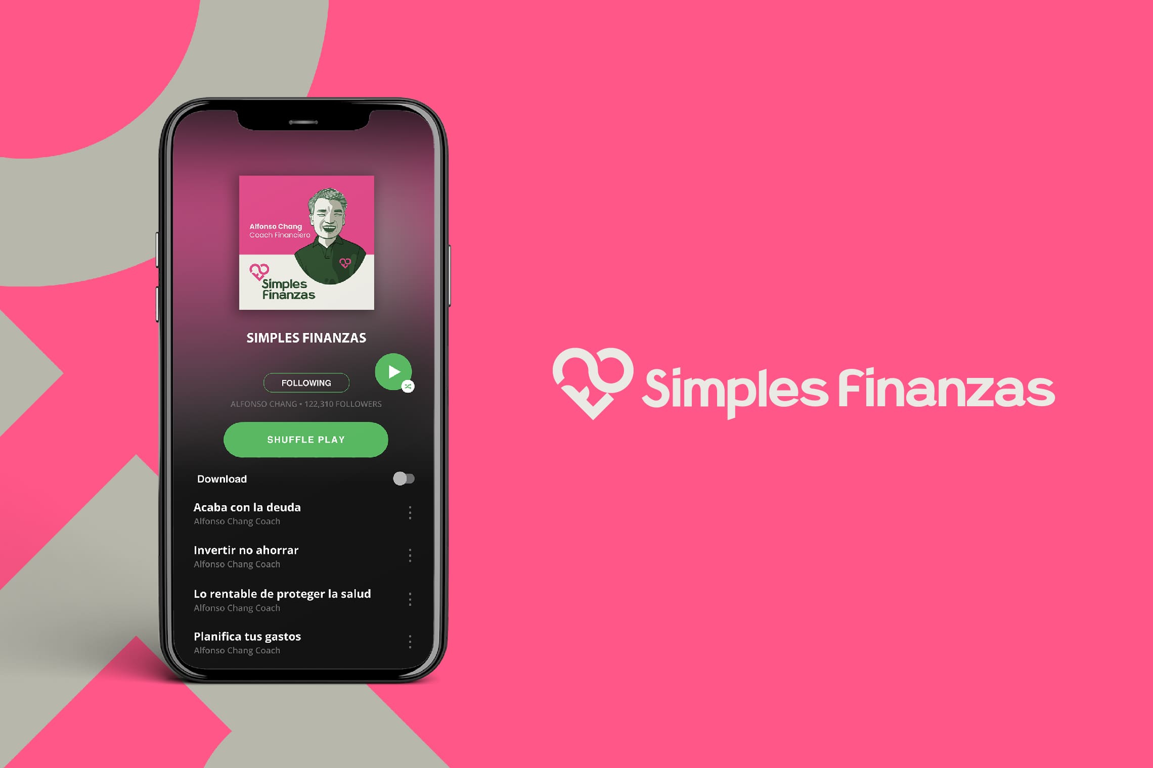
We designed an isologo formed by the S + F that represents a heart, based on the essence of ‘the revolution of love through financial education’. To complement it, we developed a Sans Serif typography with a modern personality and a reliable structure. The chosen colors reinforce the concept of wealth and balance through the use of green, while pink adds positivity and modernity to the whole.

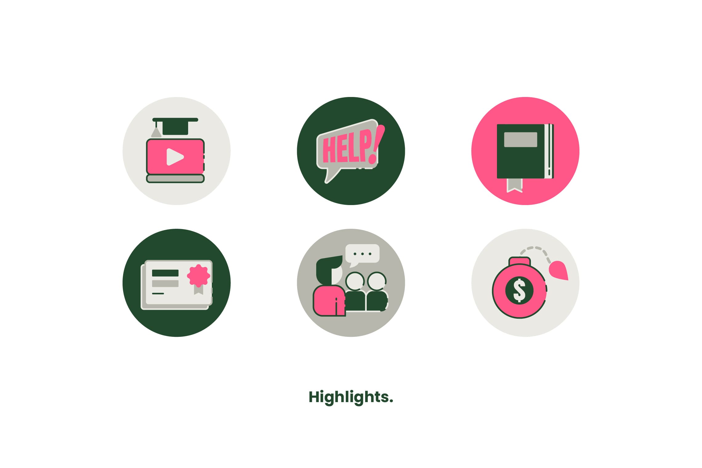
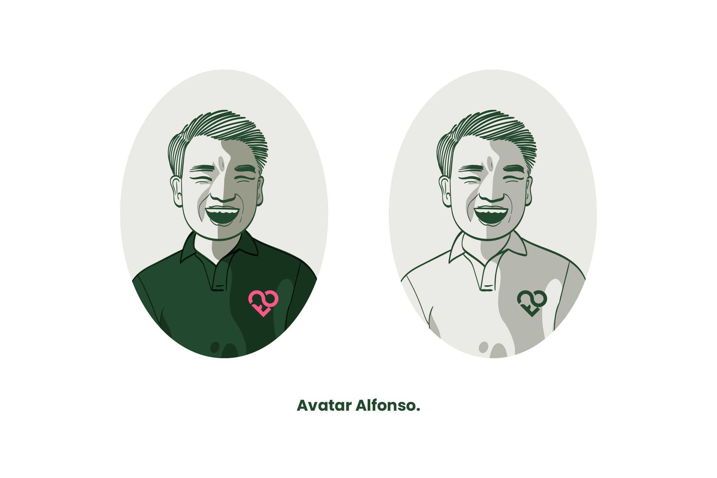
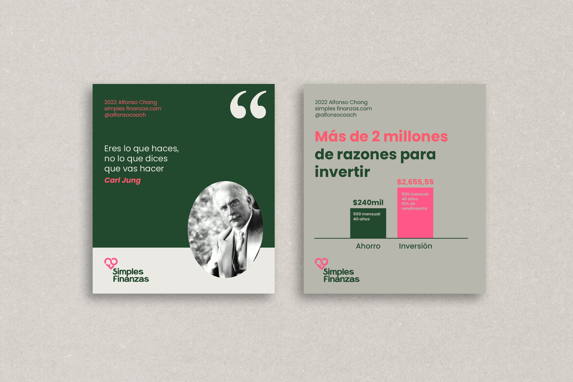
In addition, Alfonso’s avatar has been illustrated to allow for greater closeness with his students, and basic graphic elements and guidelines have also been established for his Instagram account.

Suggested Projects
Extreme Max
Educar com Evidências
SCIO Education Center
Extreme Max
BRANDING

The Client

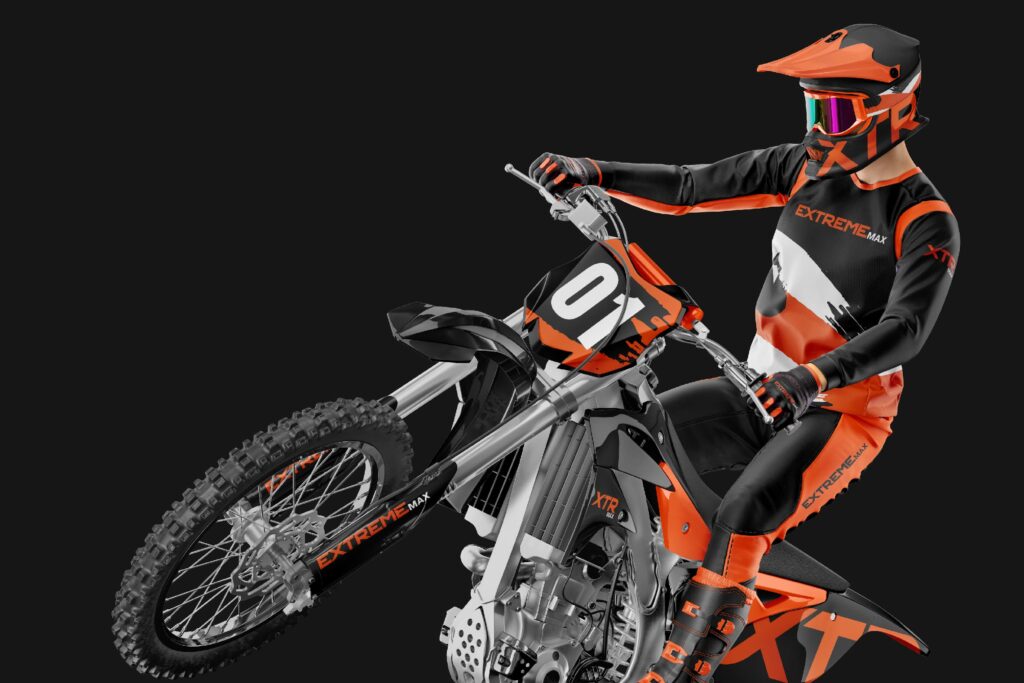
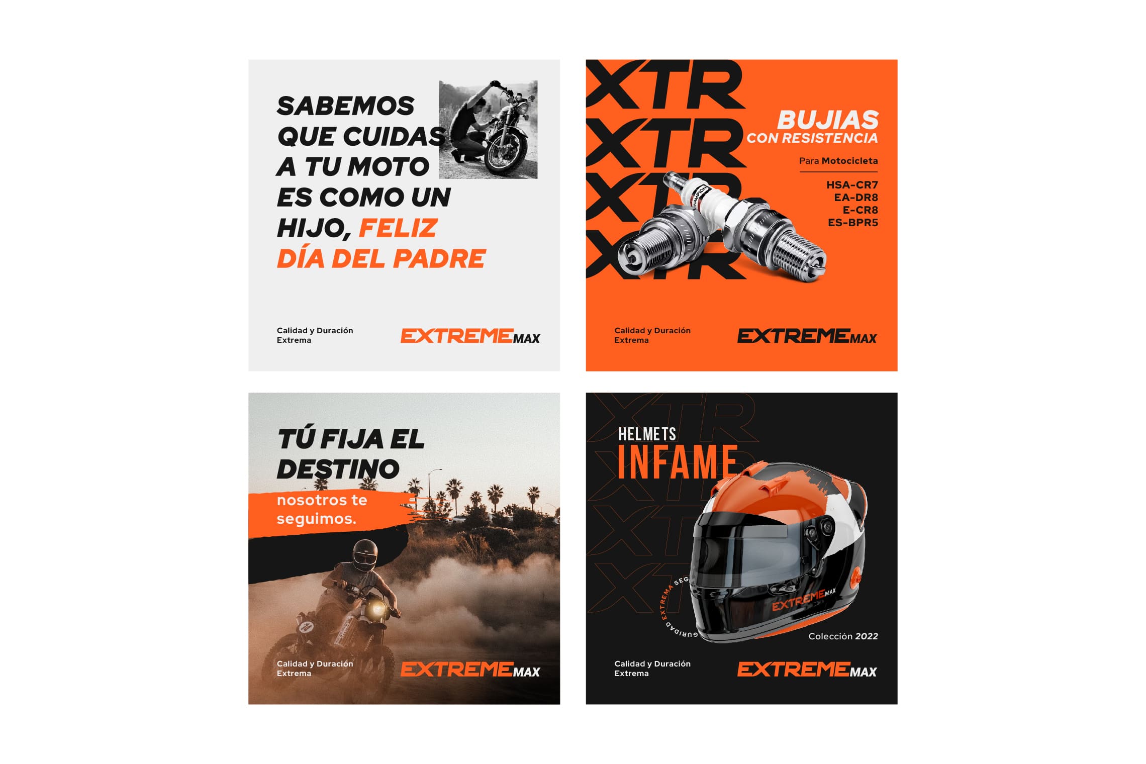
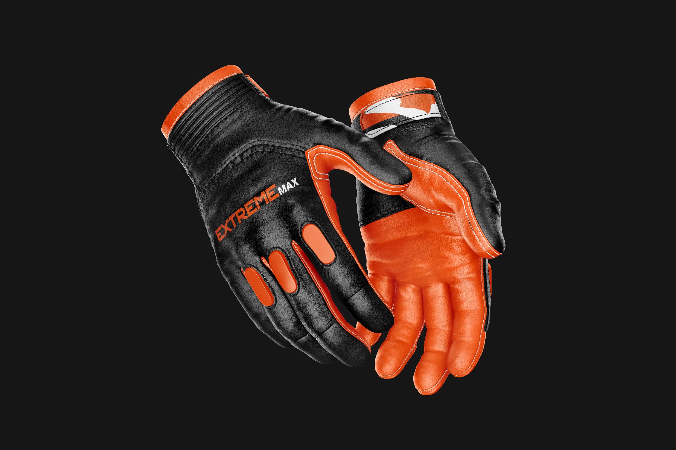
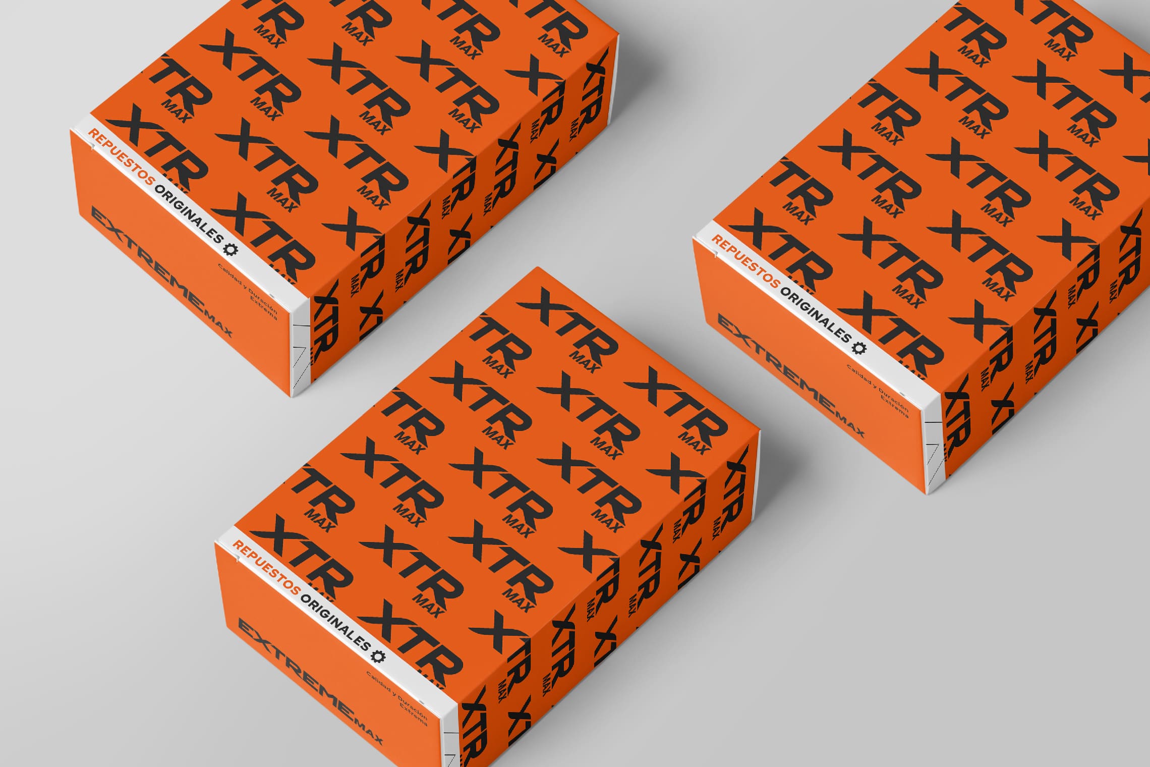
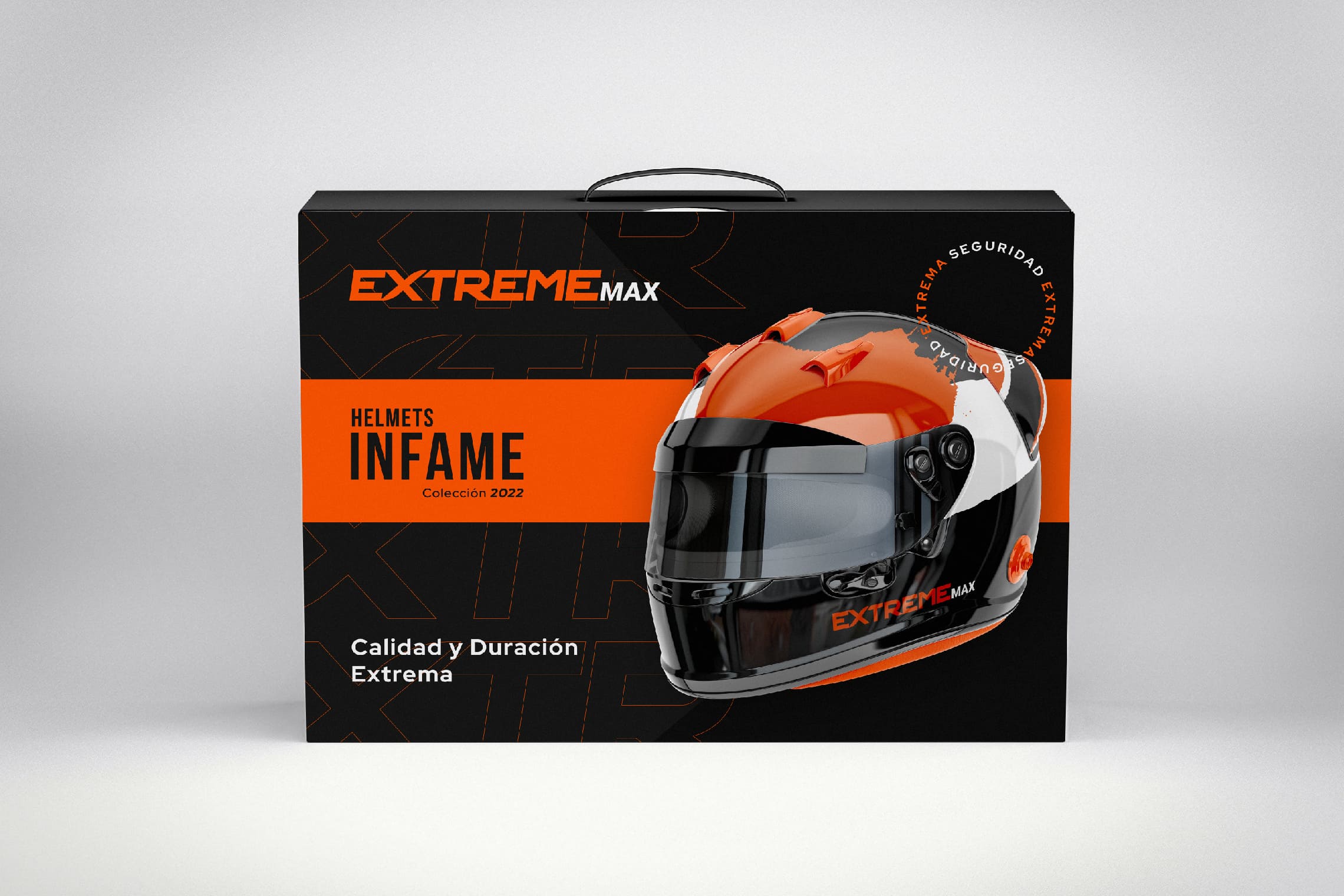
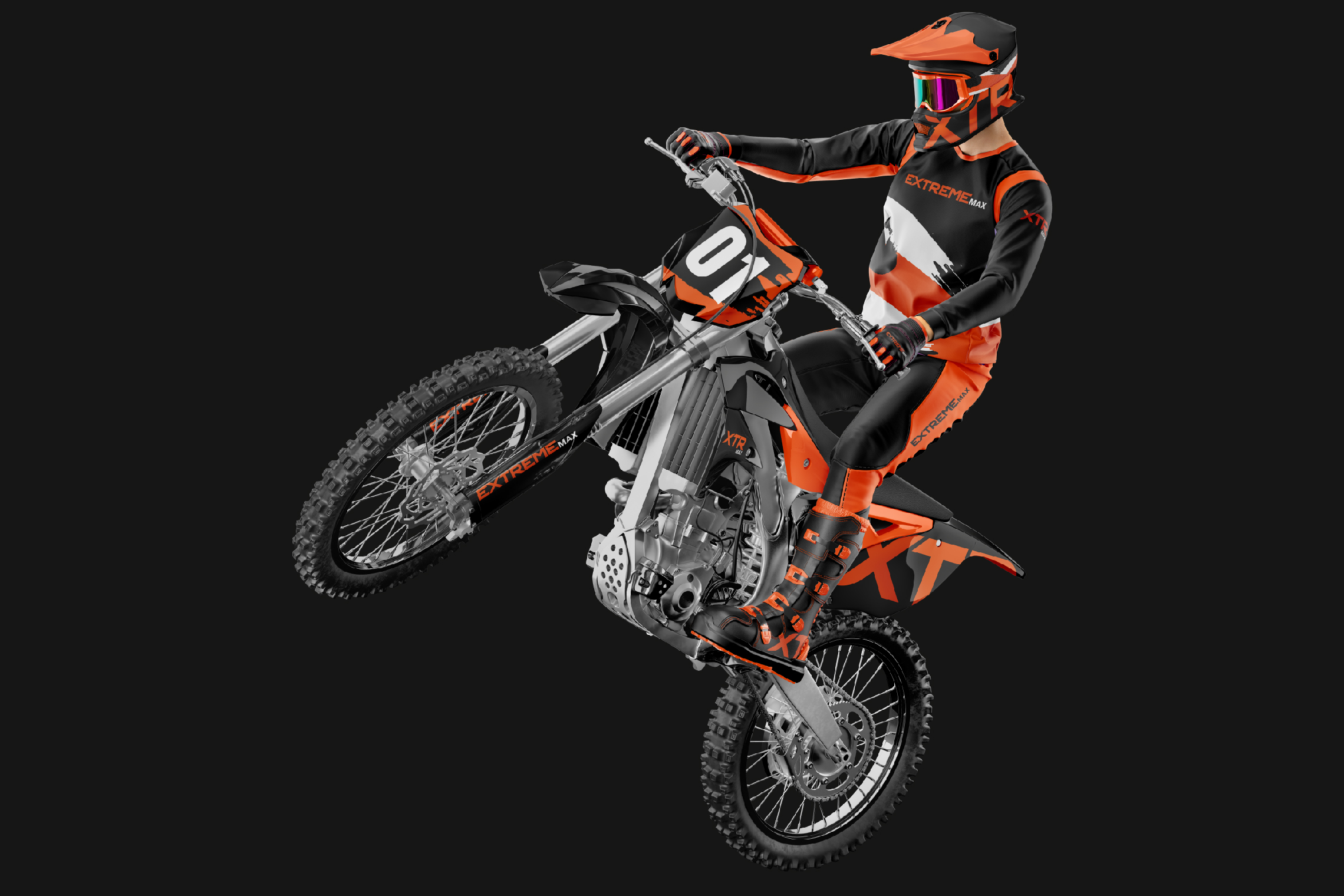
Extreme Max is a company specialized in motorcycle parts and accessories located in Latacunga, Ecuador.


Keywords

Branding / Design / Motorcycles / Distributor

The Objective

We need a brand with a strong and professional spirit that conveys a lot of energy when seen.


The Solution

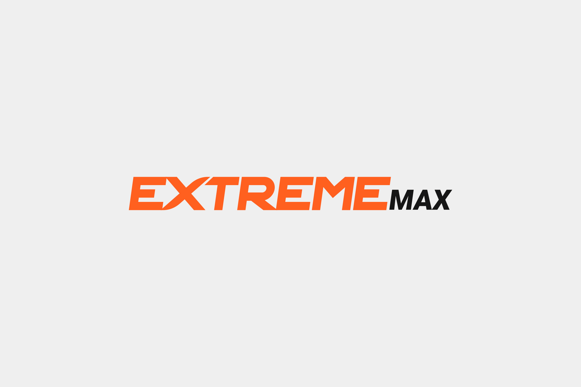
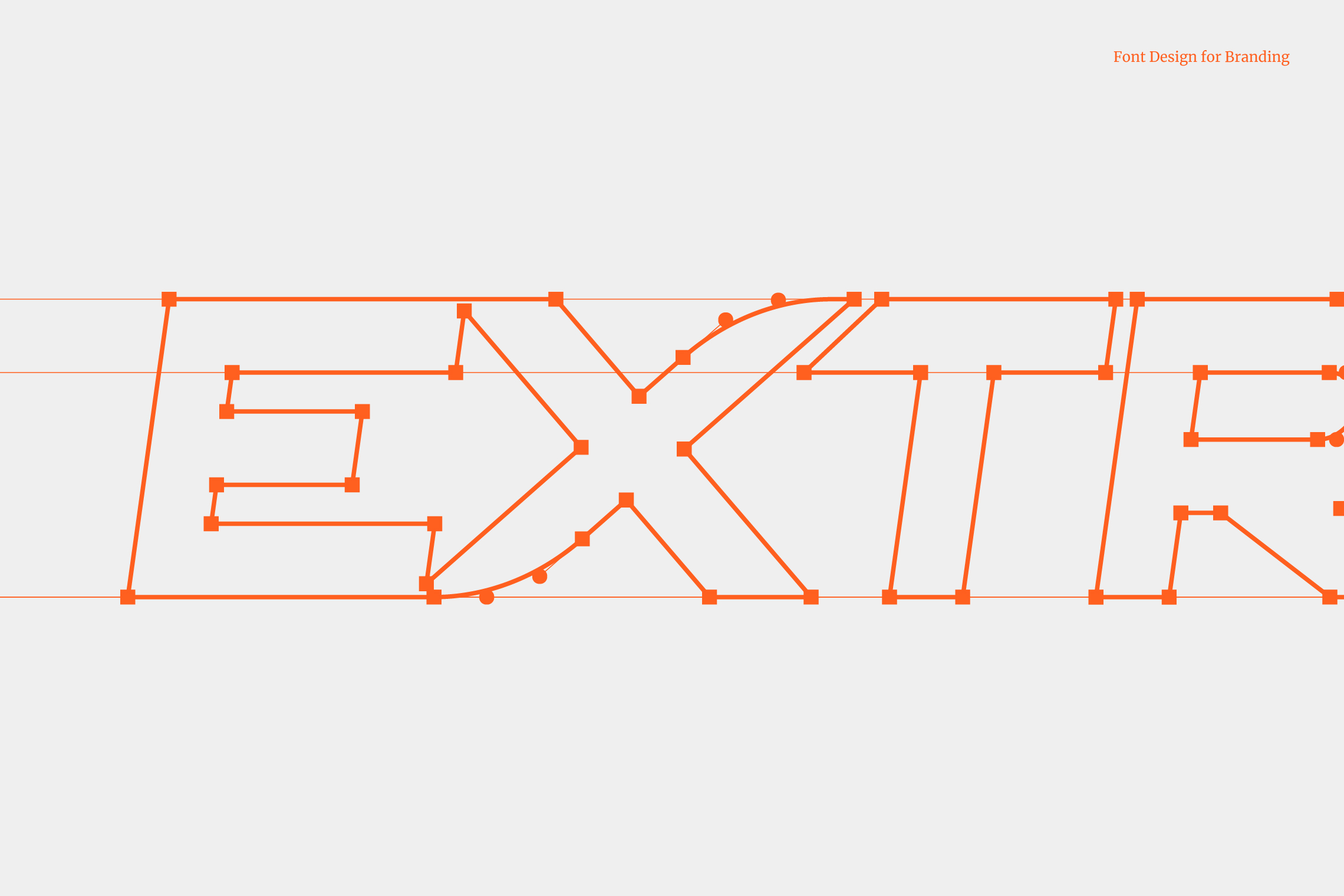
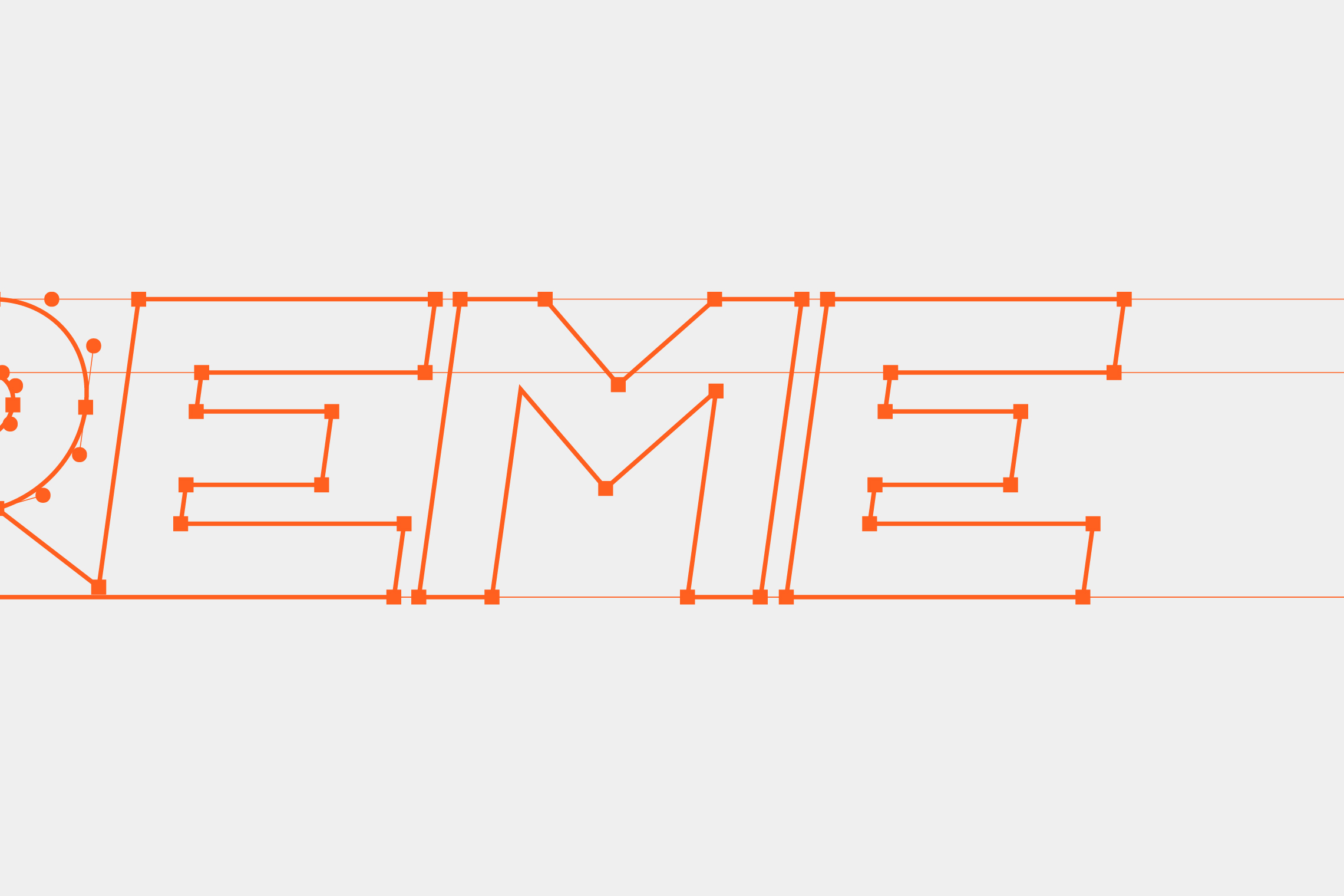
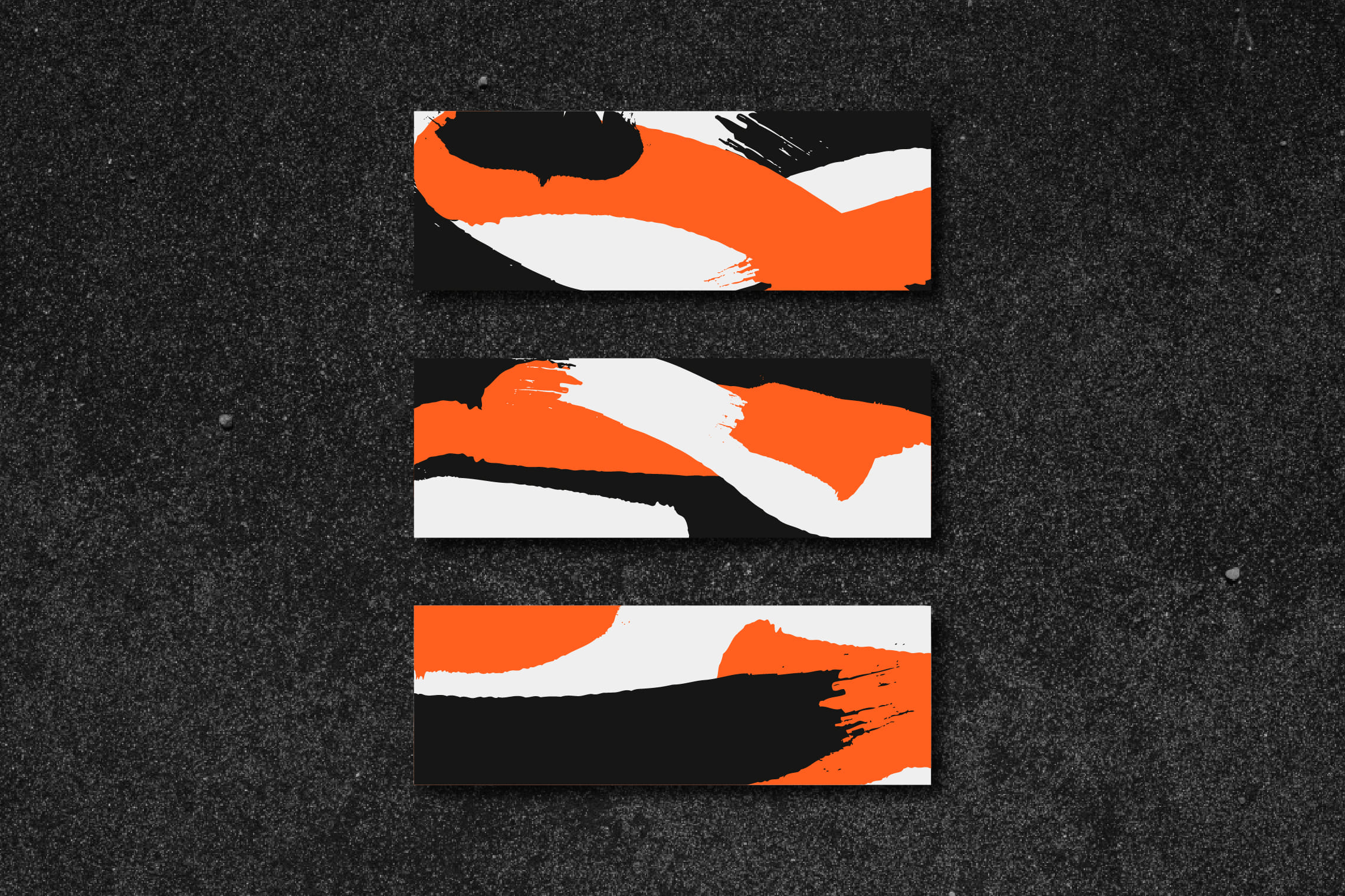
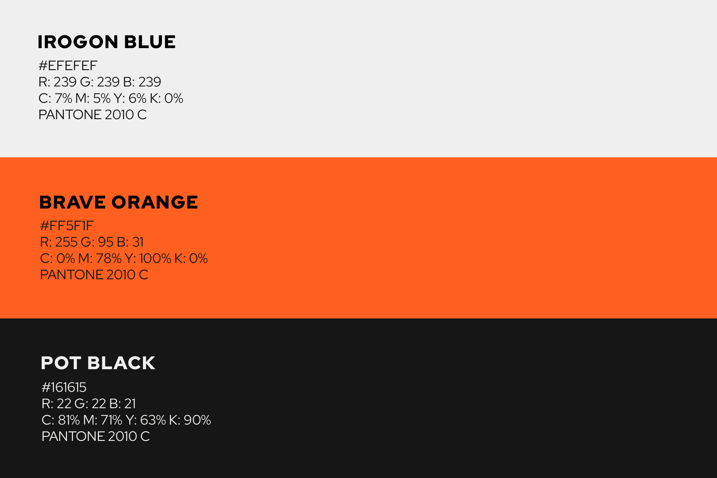
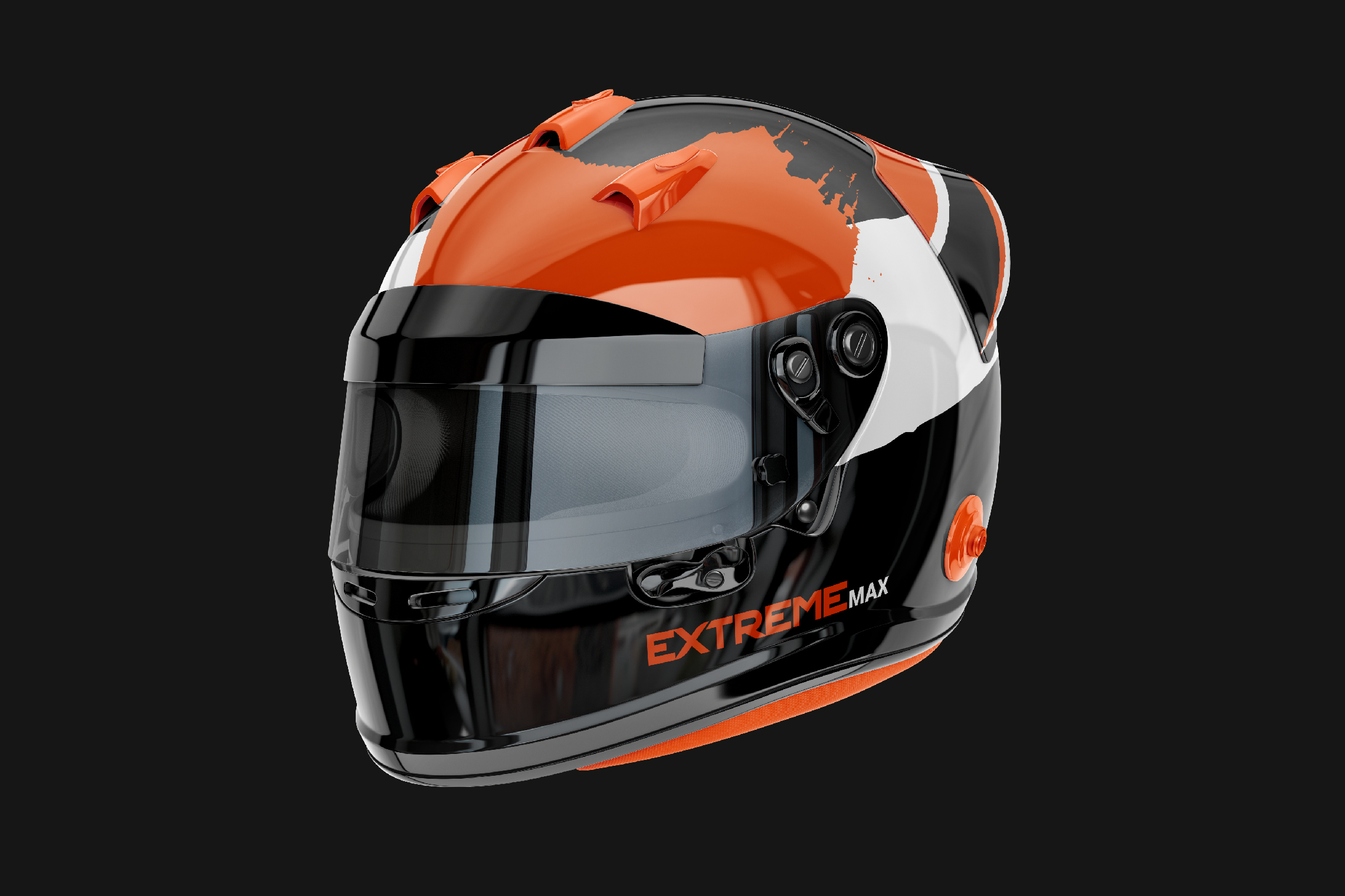
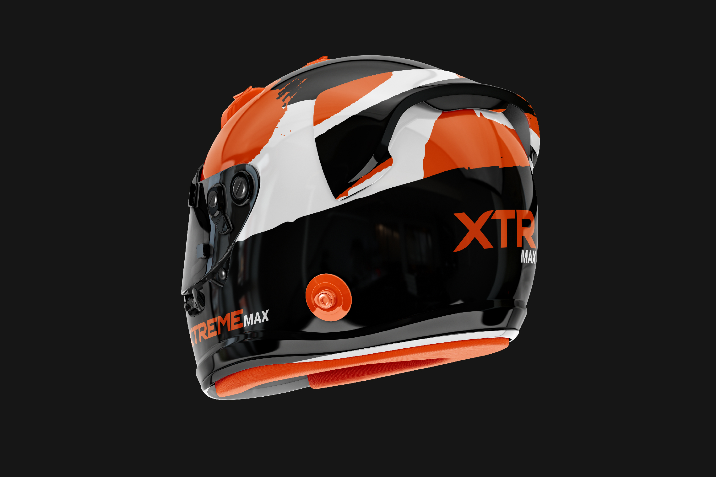
For this rebranding, we developed strong and energetic elements through form and color. The typography designed for Extreme Max is a bold sans-serif typeface that conveys forward motion through its inclination and the internal arrow formed between the E and the X.

Suggested Projects
Educar com Evidências
SCIO Education Center
Piamonte Higher Technical Institute
Educar com Evidências
BRANDING

The Client

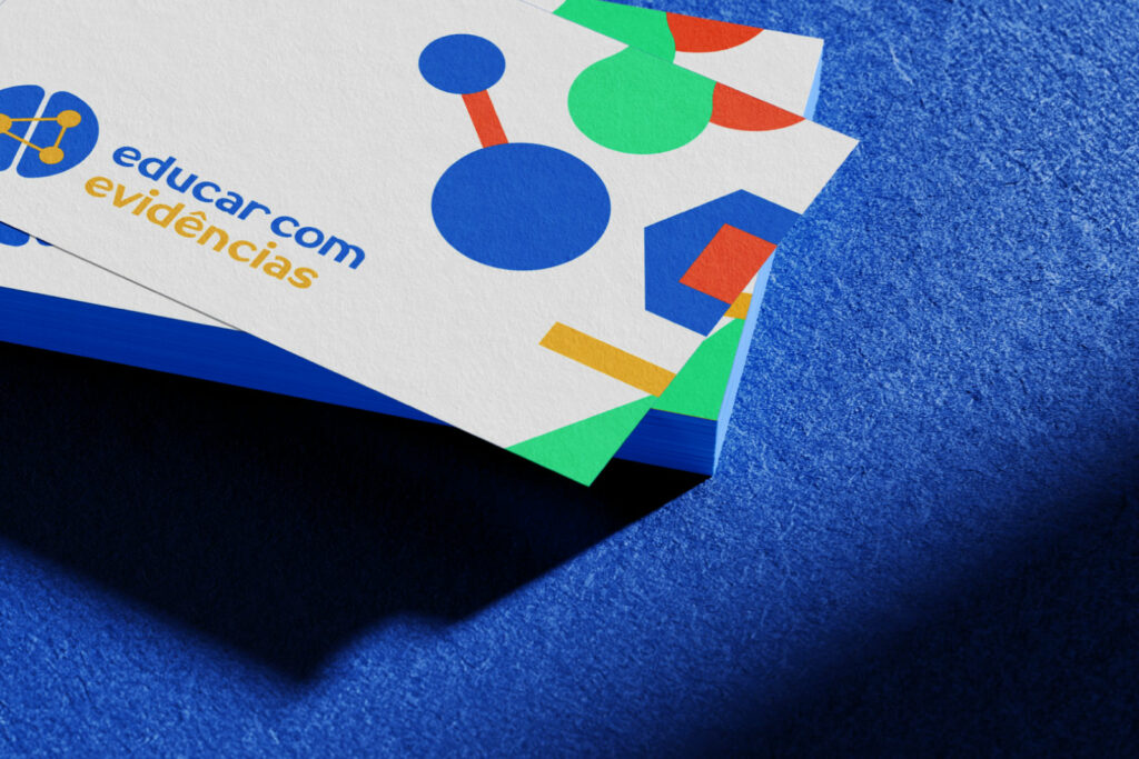
“Educar com Evidências” is an educational program in São Paulo, Brazil that focuses on the connection between science and education to achieve transformative learning.


Keywords

Branding / Design / Education / Academy

The Objective

To design a brand for our company that represents education and neuroscience, it is important to highlight the affective, cognitive, and social aspects of learning, as well as the values that make transformative education possible.


The Solution

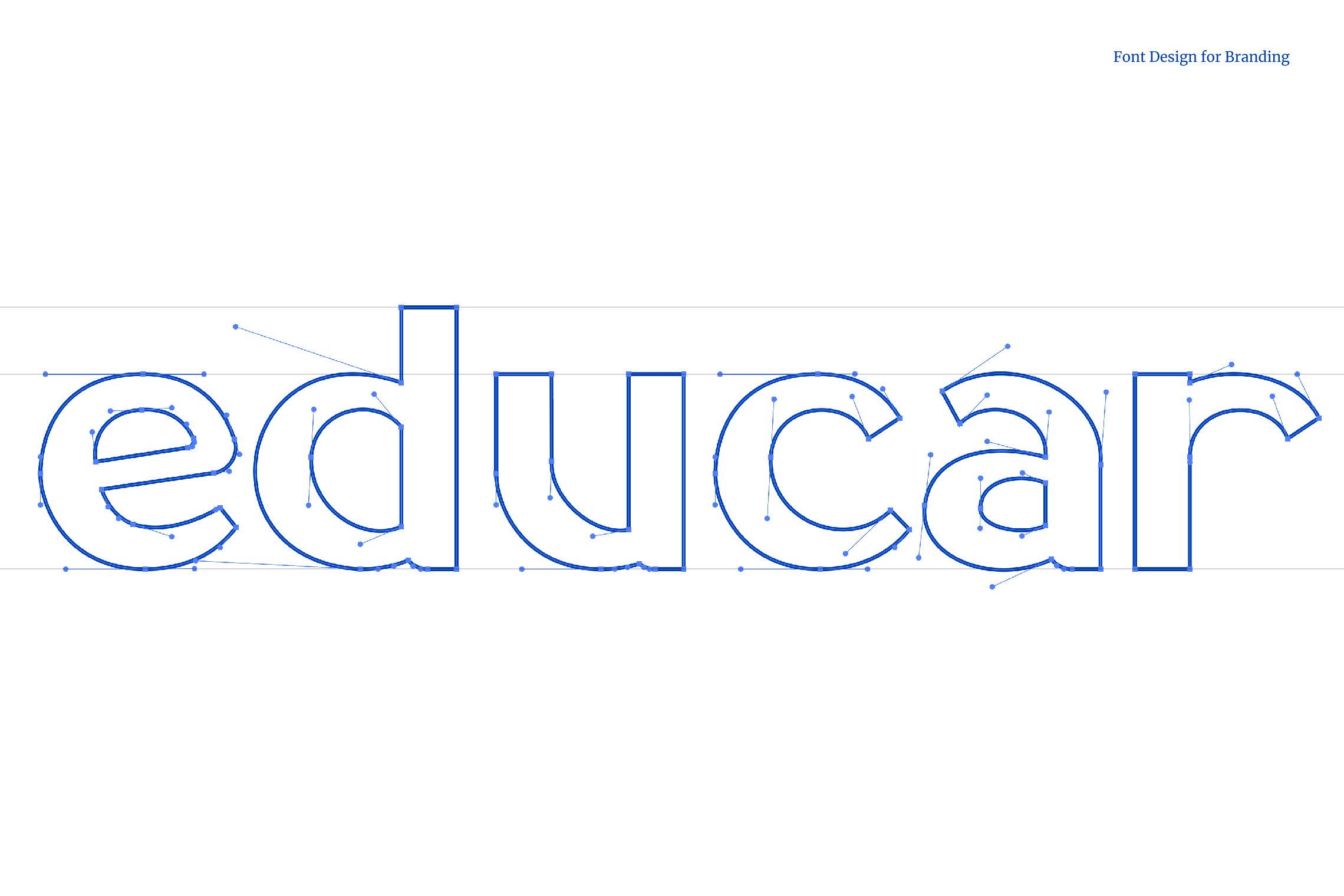
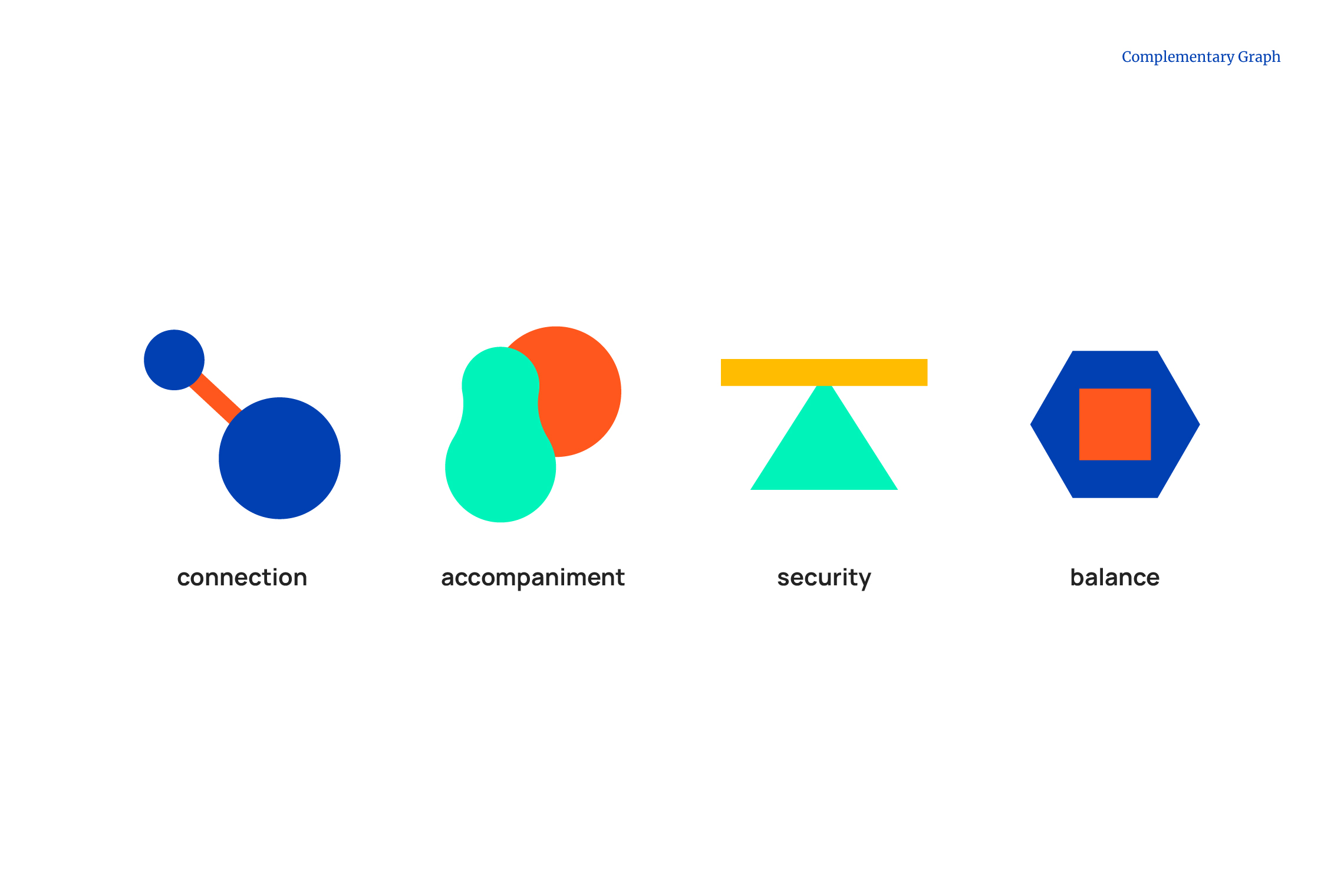
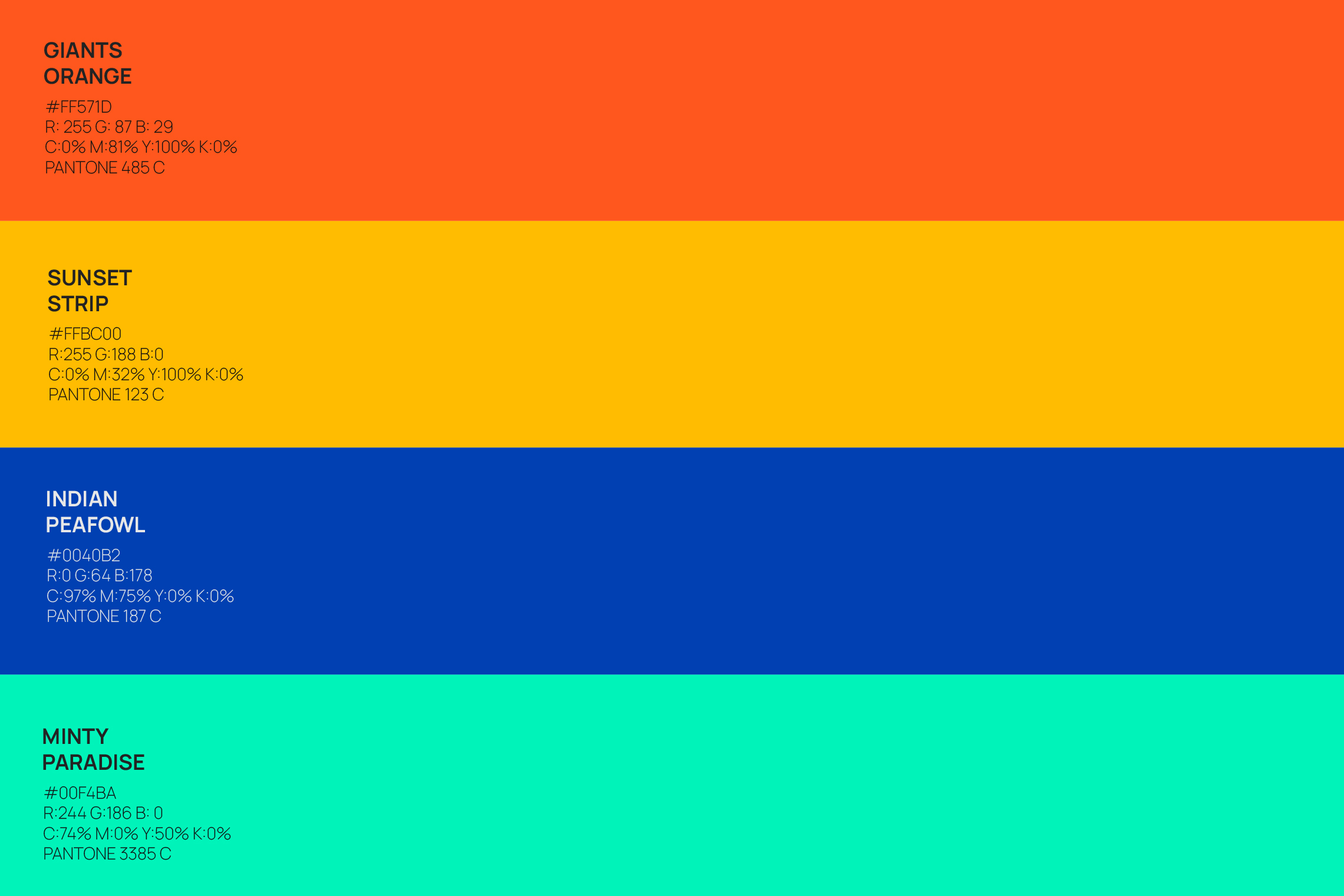
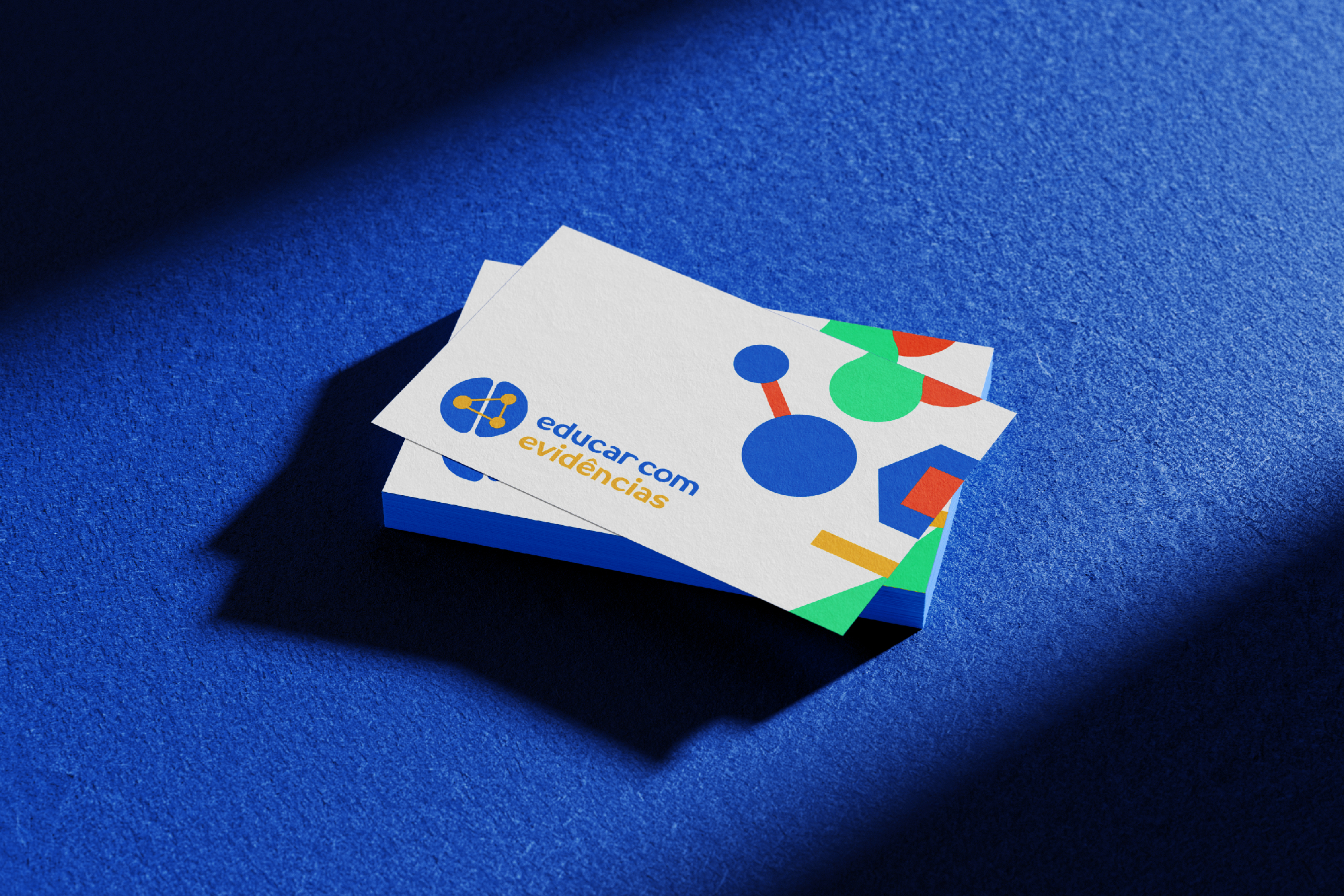
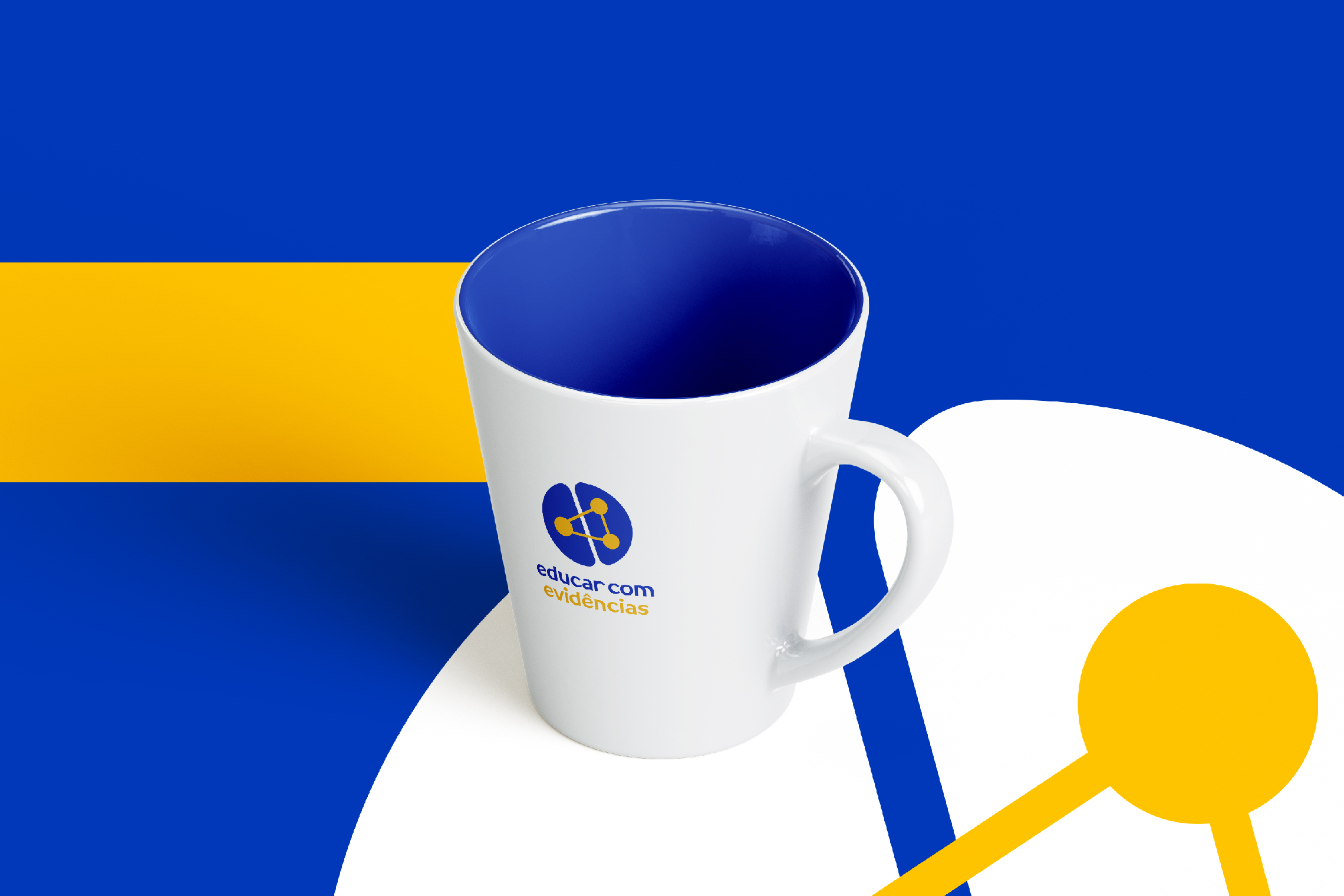
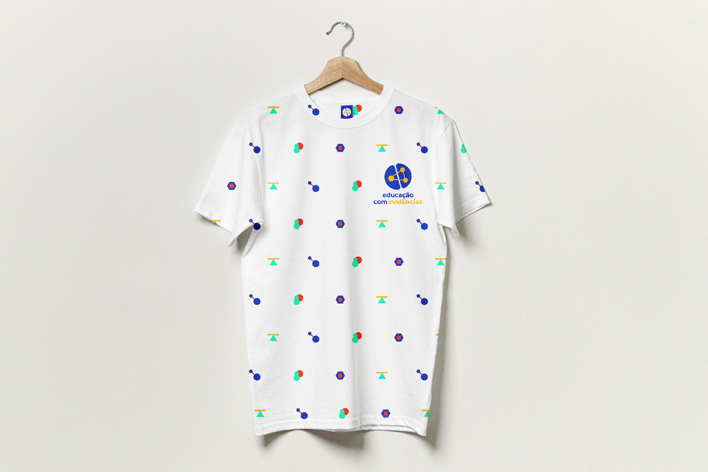
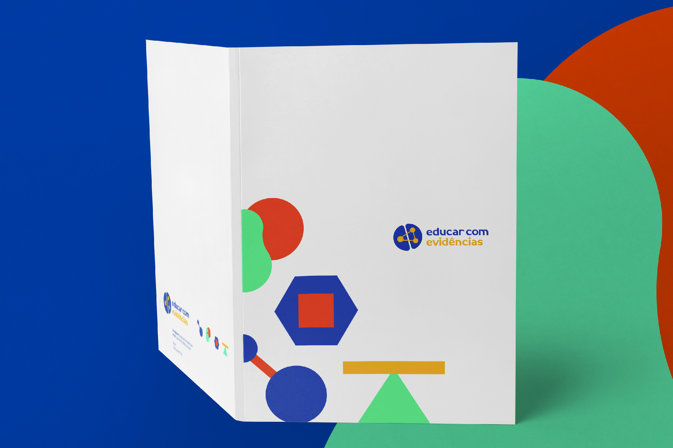
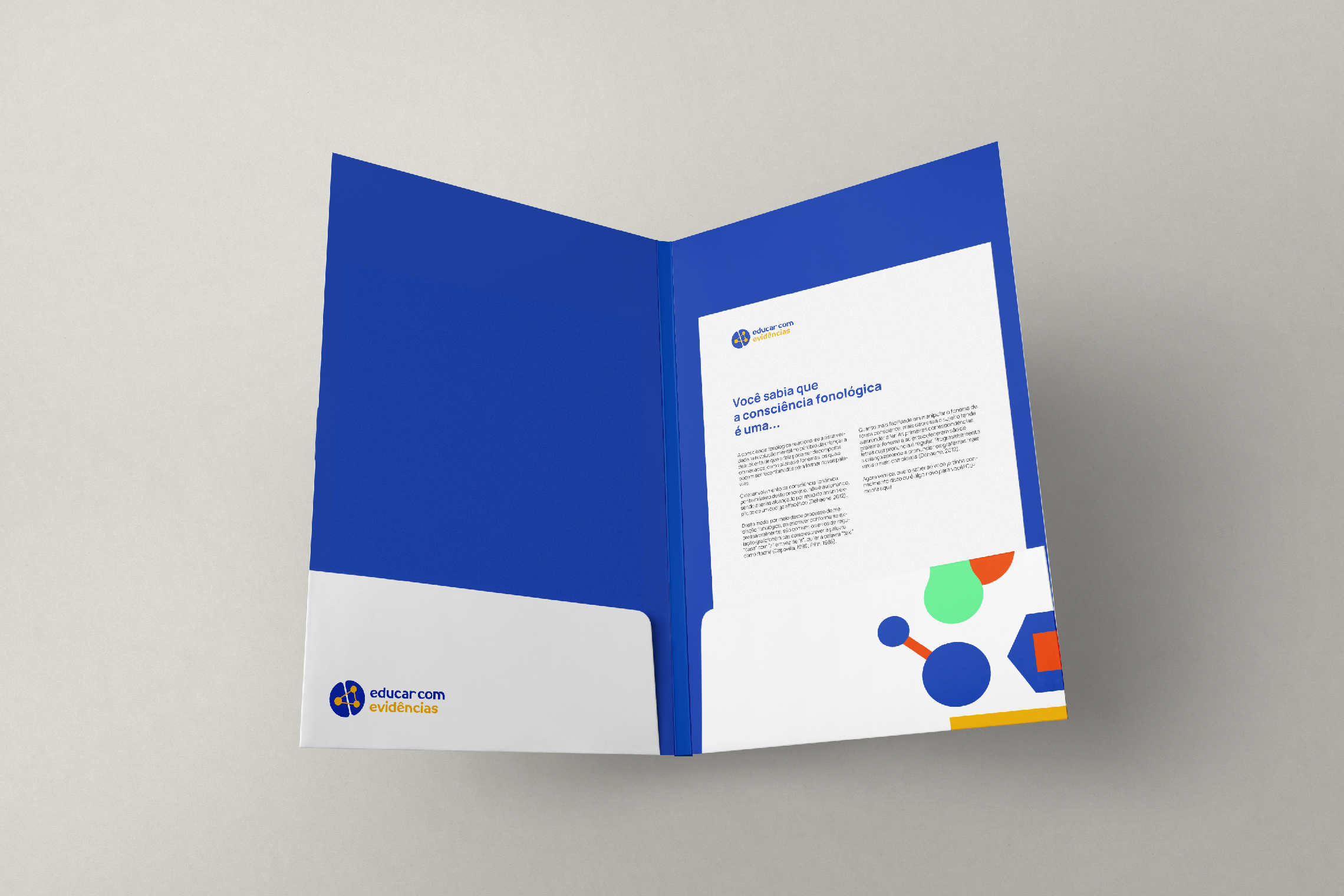
Its logo represents the cerebral hemispheres connected by 3 points that symbolize the affective, cognitive, and social aspects of learning. The typography and color palette convey professionalism, modernity and joy, while the complementary graphics represent values such as connection, support, security, and balance.

Suggested Projects
SCIO Education Center
Piamonte Higher Technical Institute
PURIK Pitajaya Beer
SCIO Education Center
BRANDING

The Client

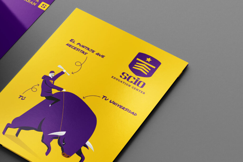
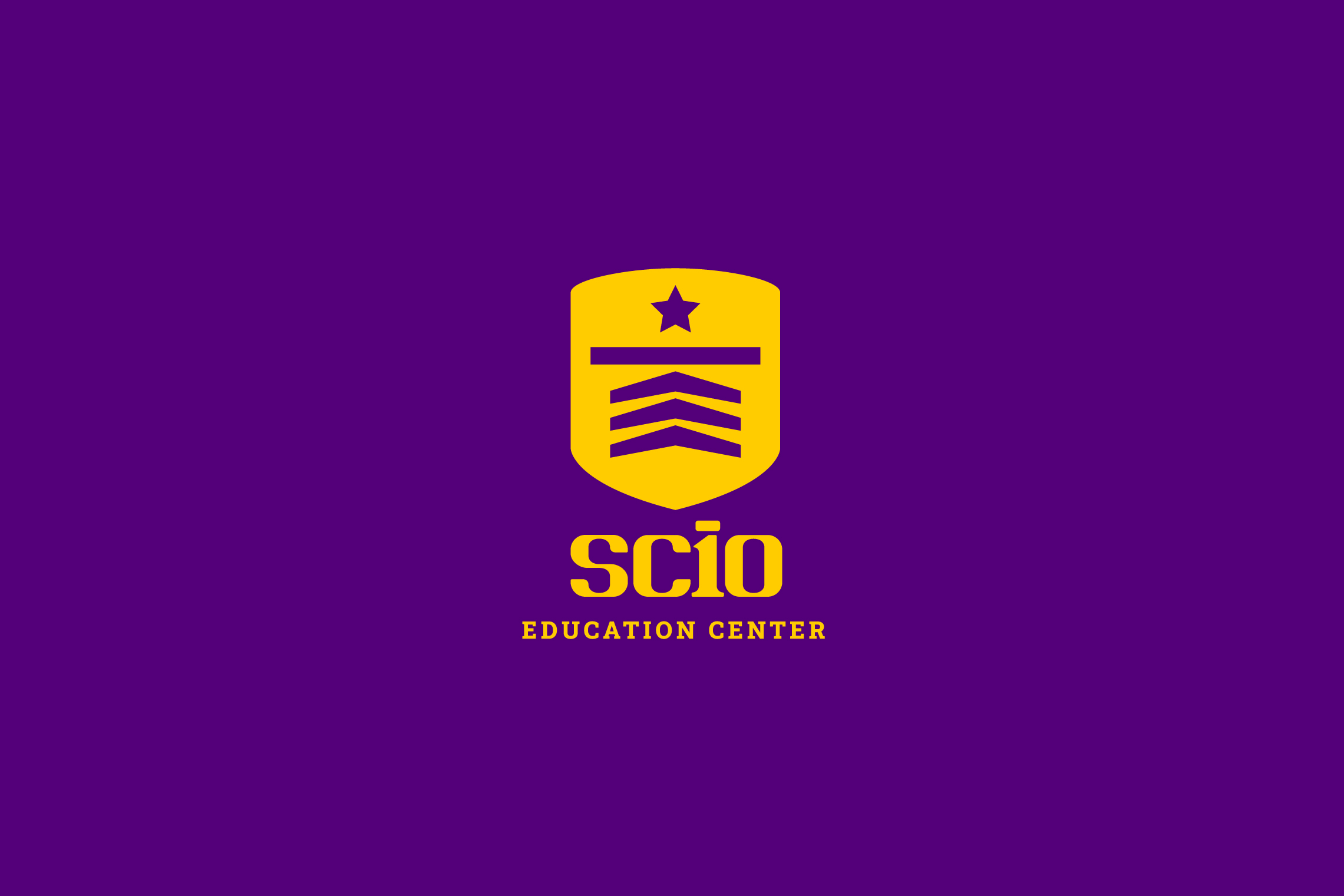
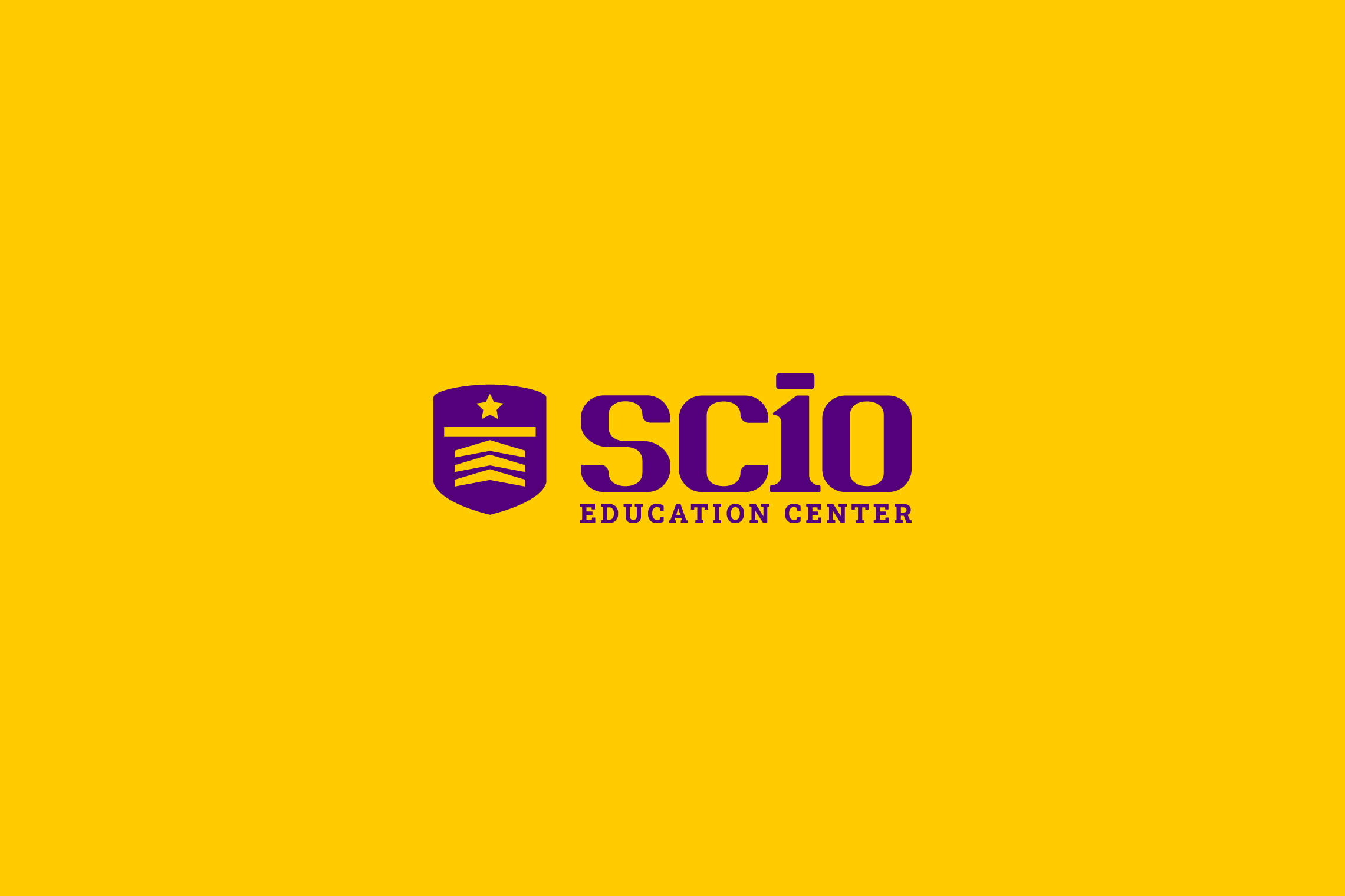
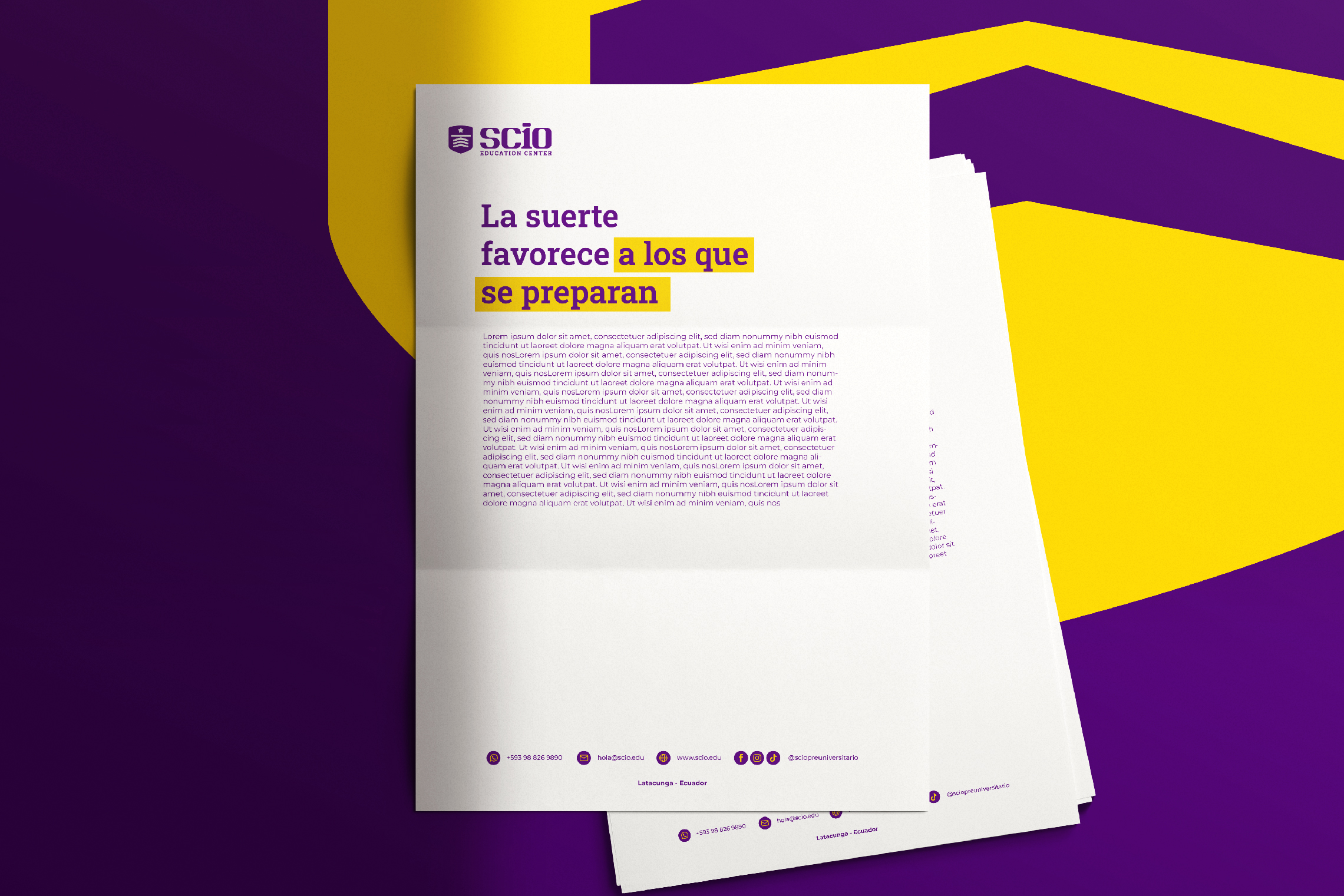
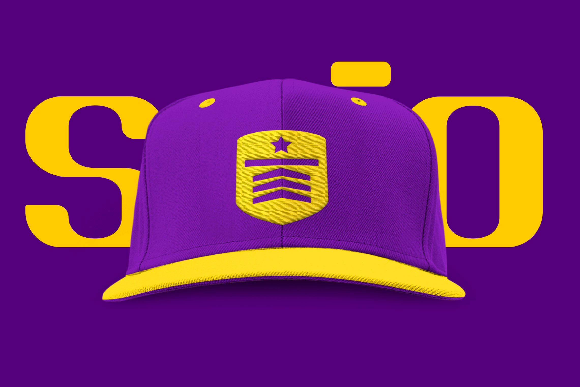
SCIO Education Center, is a training education center that will be located in the city of Latacunga – Ecuador, its goal is to democratize the education for pre-university students, maintaining fair prices and quality education.


Keywords

Branding / Design / Education / Academy

The Objective

To design a brand that conveys experience and confidence, as well as a young and determined attitude, capable of inspiring students to face academic challenges with determination.


The Solution

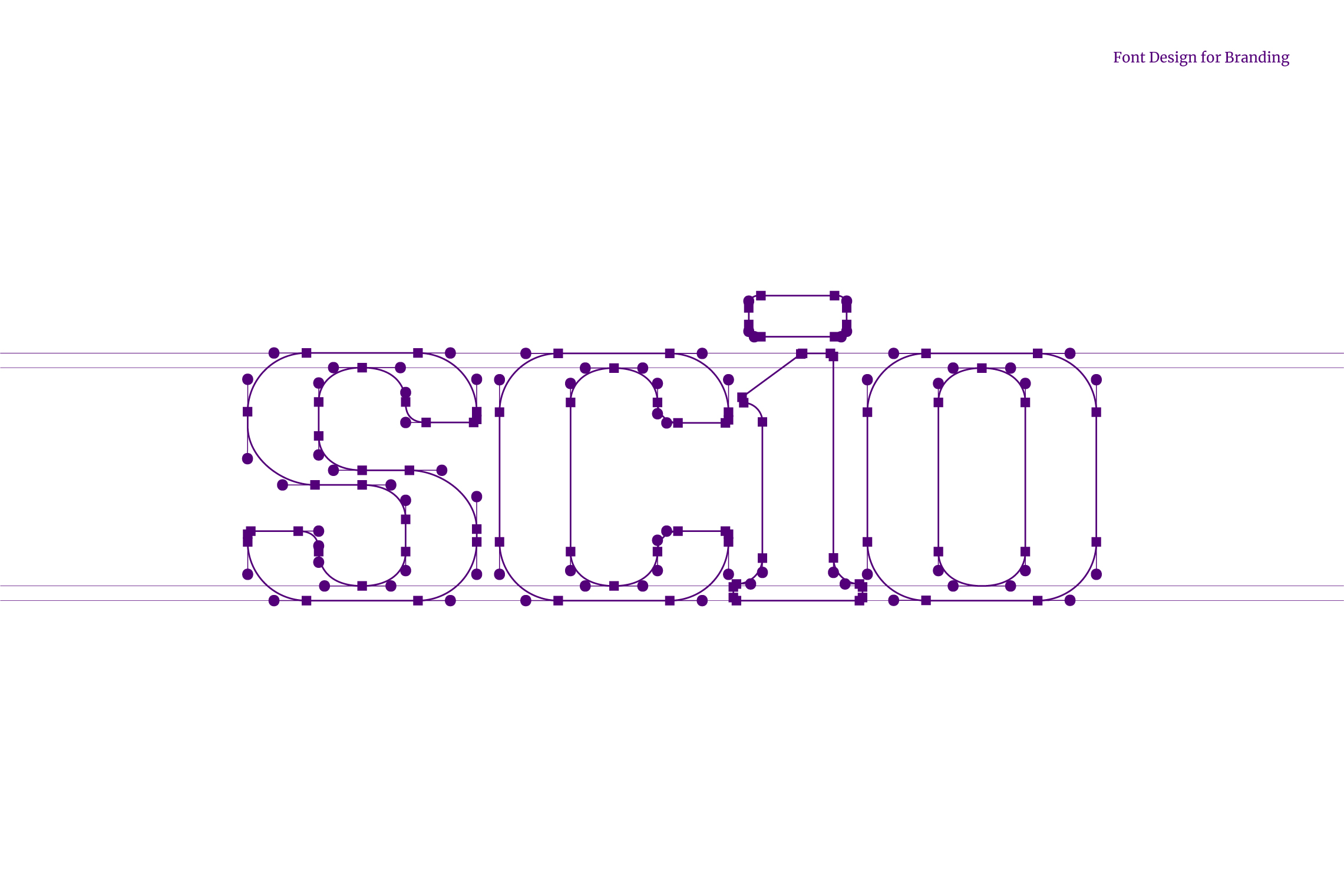
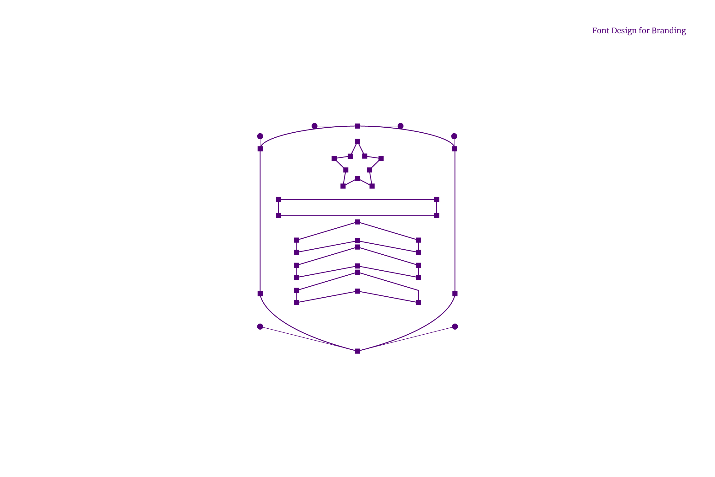
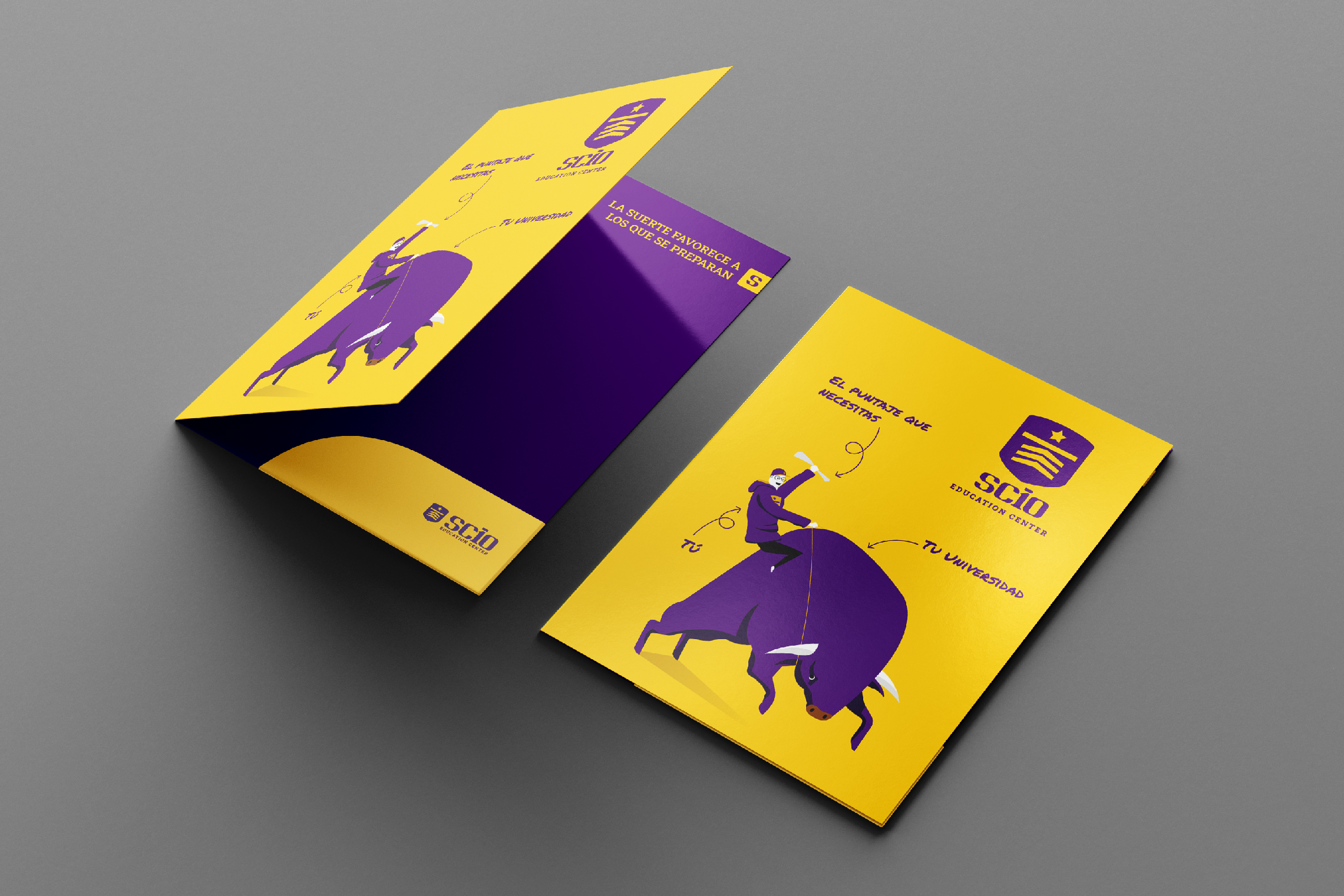
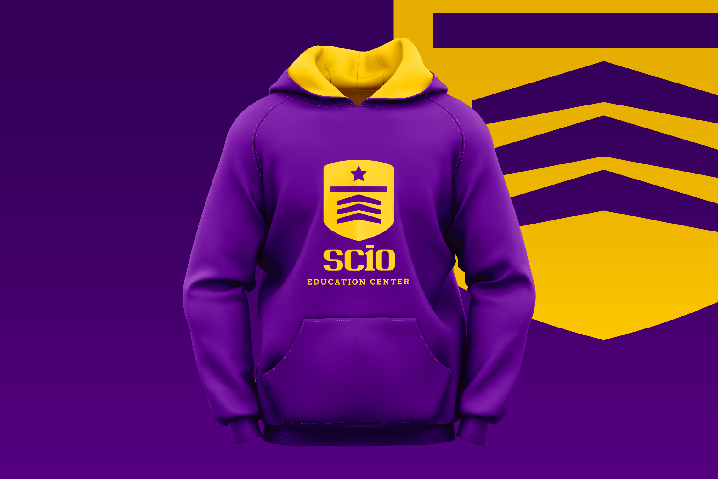
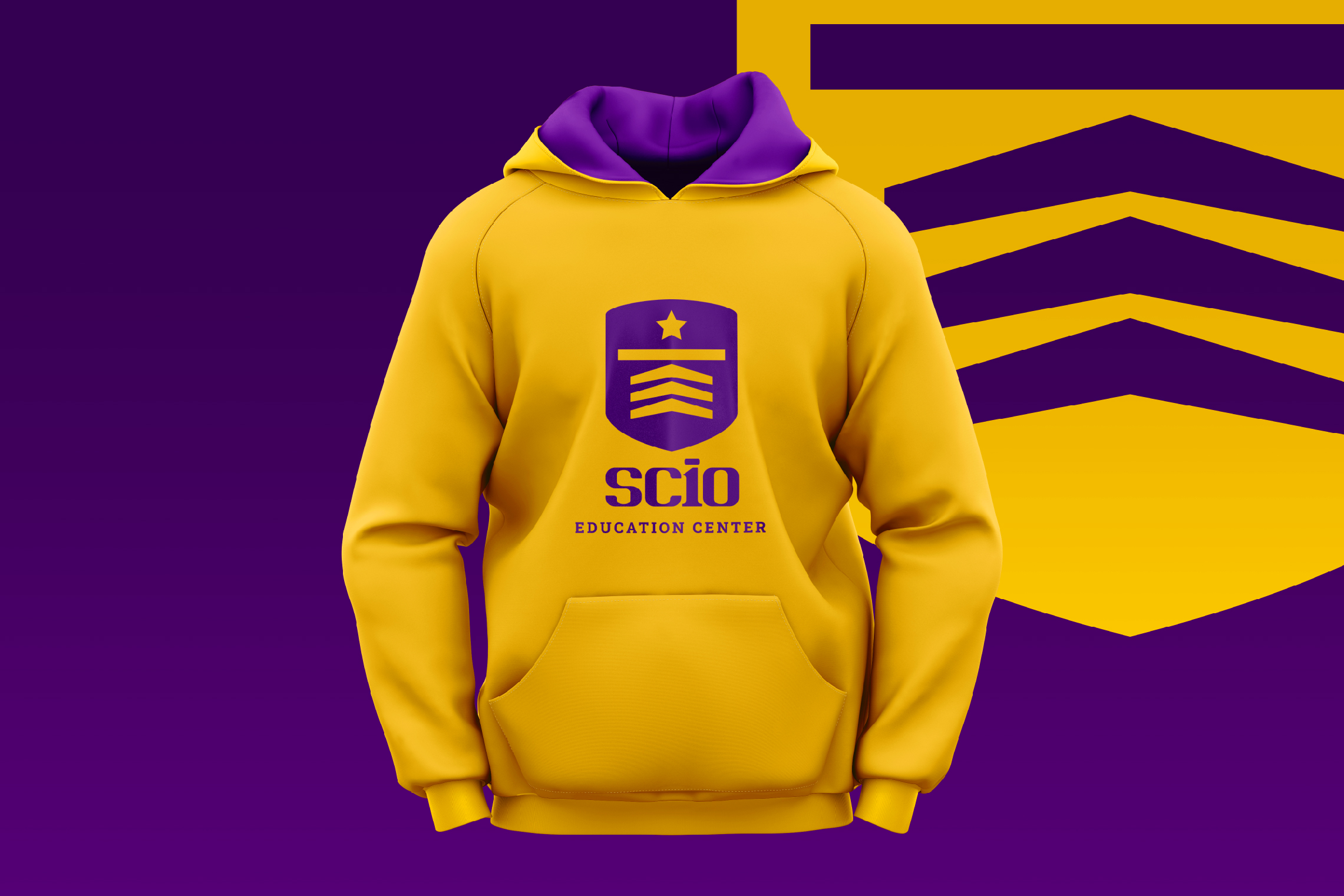
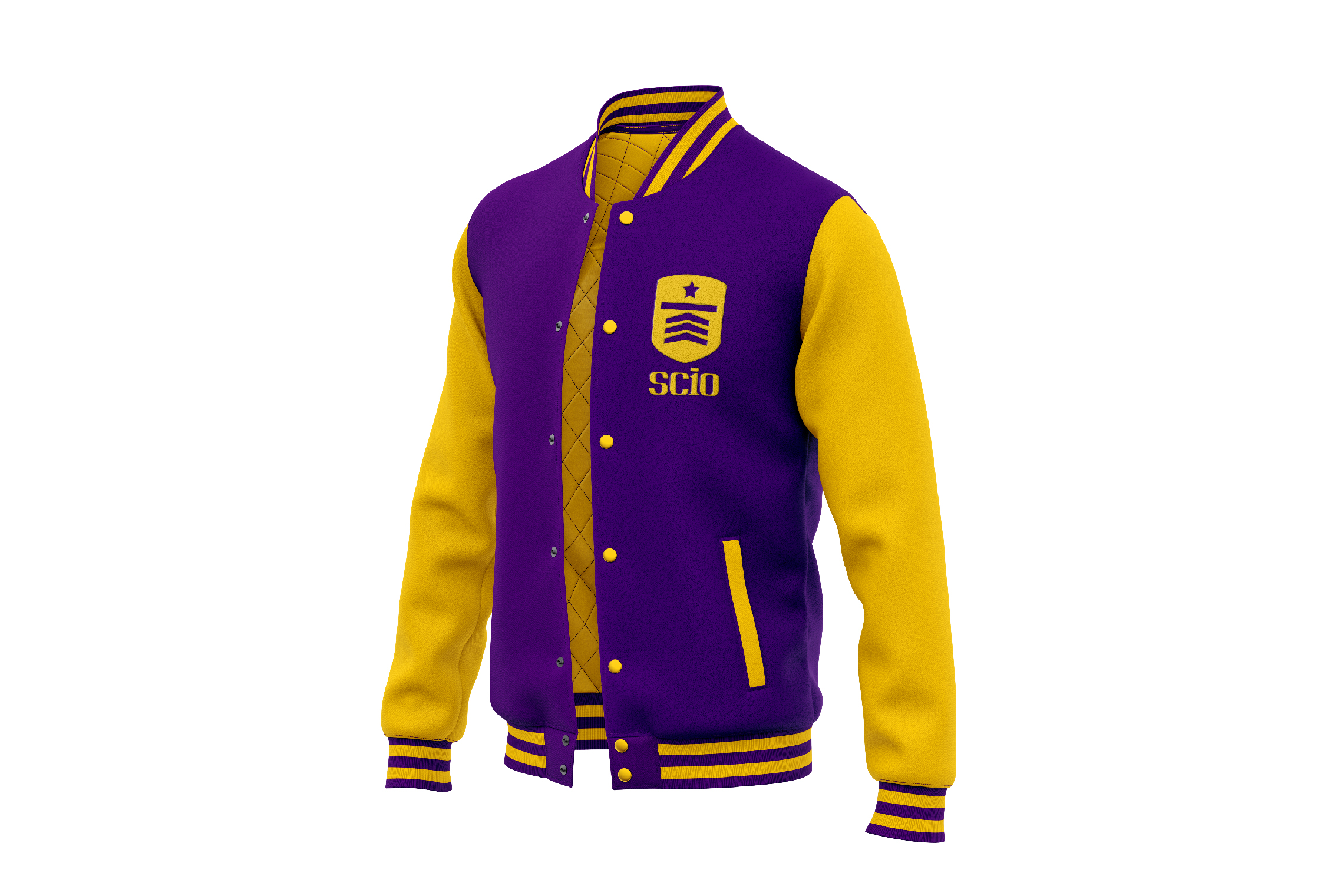
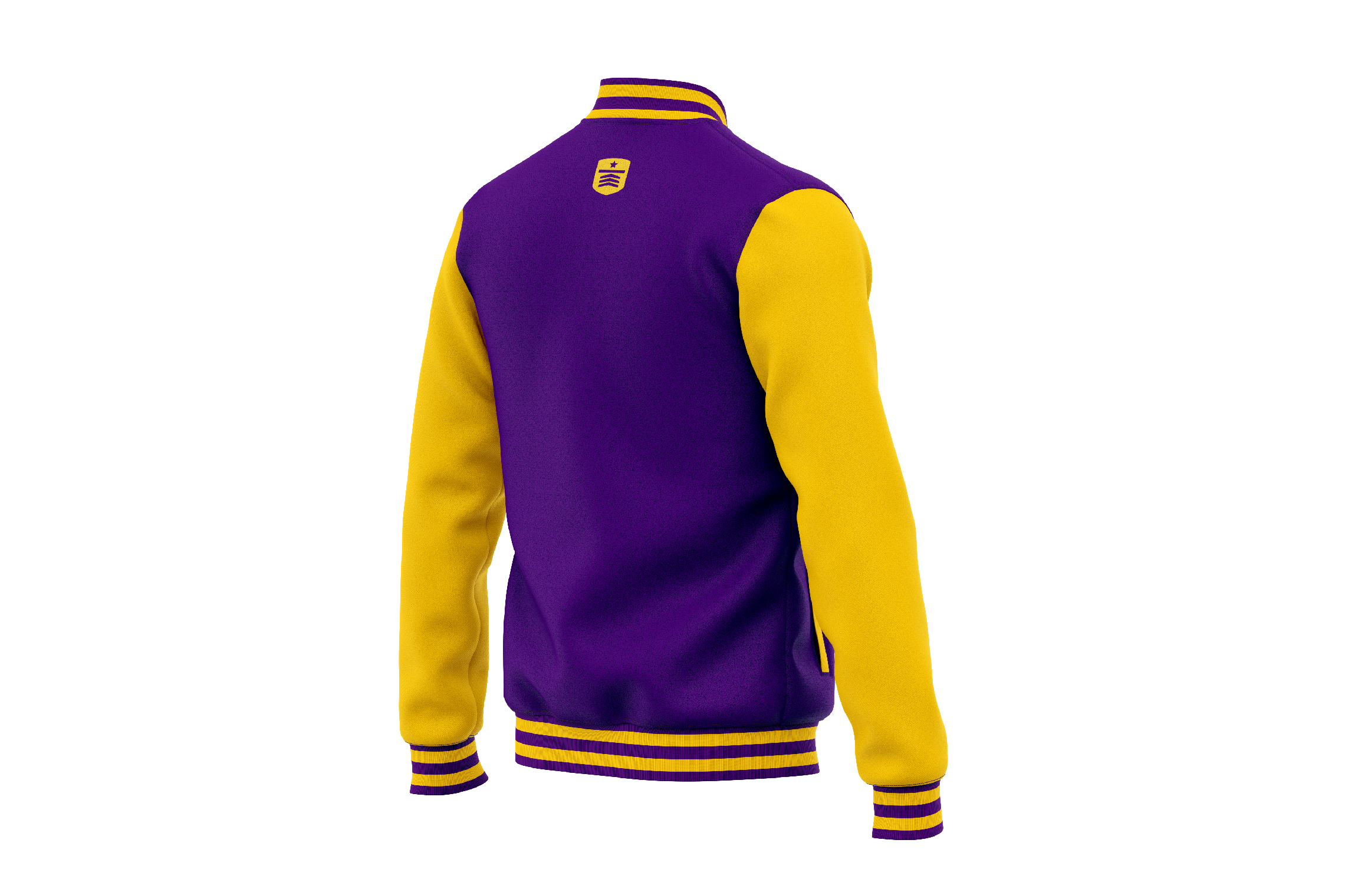
The icon designed for SCIO is a shield that inside shows three arrows, a line and a star, as a representation of the necessary steps to cross and reach the goal, it is also the abstraction of a graduate’s cap. On the other hand, the typography developed for SCIO has a young, strong and academic personality; the number 10 inscribed in the logo represents the highest grade.

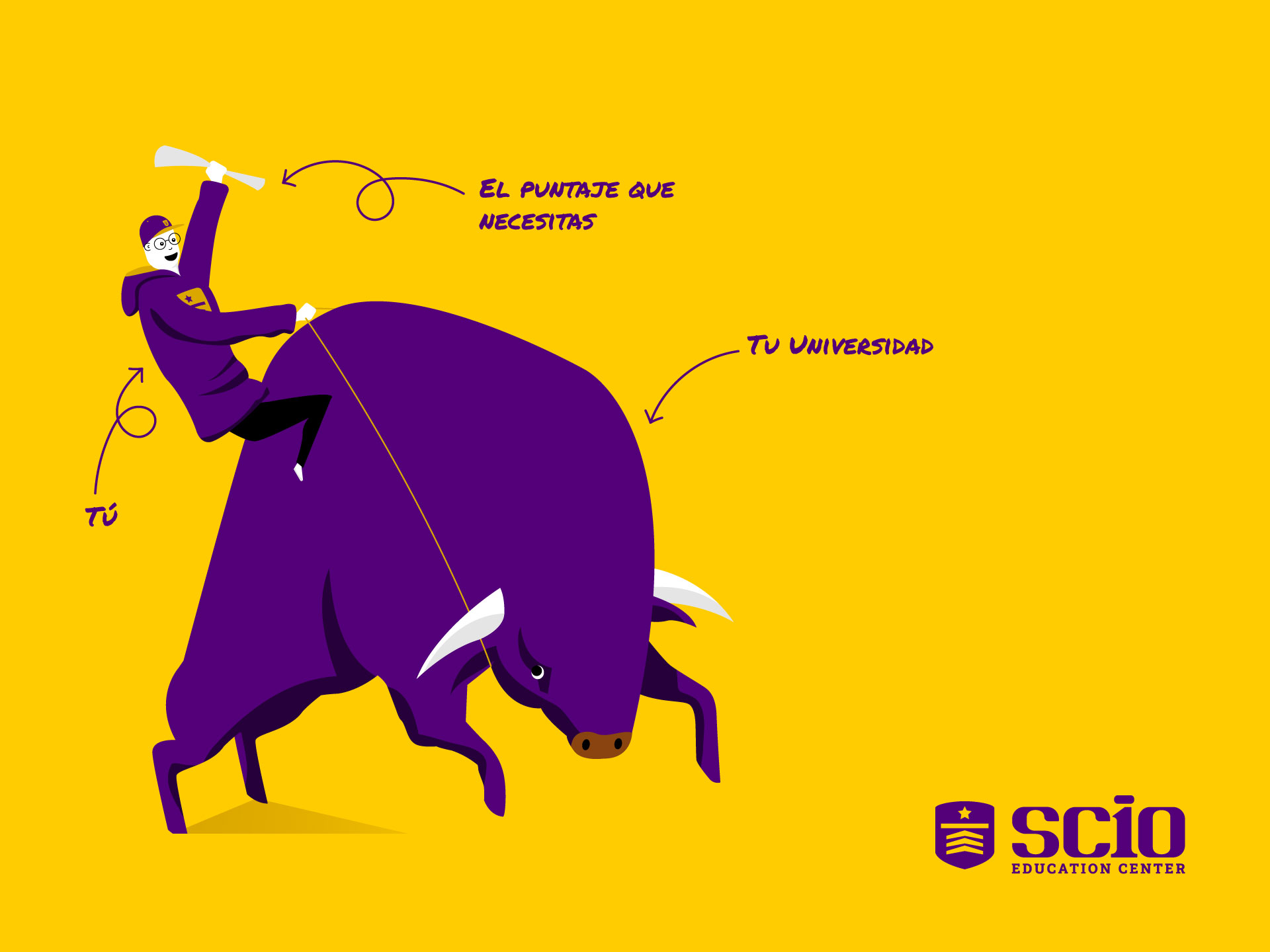
The chosen color scheme for SCIO is violet, linked to wisdom and creativity, accompanied by yellow, which expresses positive energy and warmth. Another graphic element designed for SCIO is the illustration of a bull and a young man with his diploma, it shows that everyone who is trained in this education center will master their goal.

Suggested Projects
Piamonte Higher Technical Institute
PURIK Pitajaya Beer
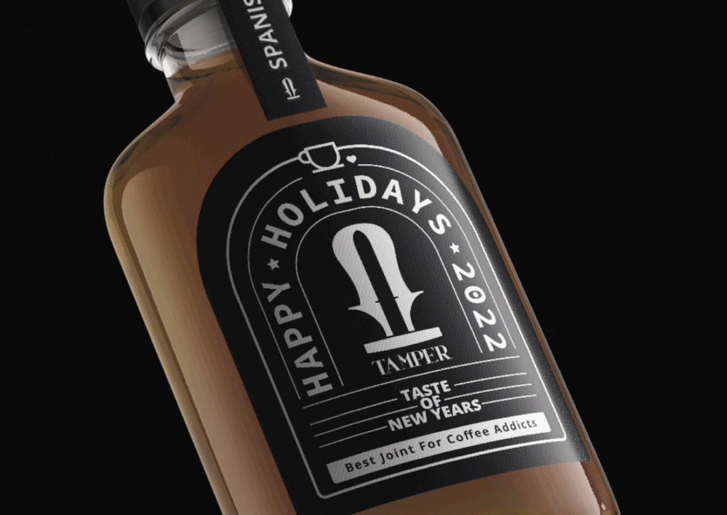
TAMPER Special Edition
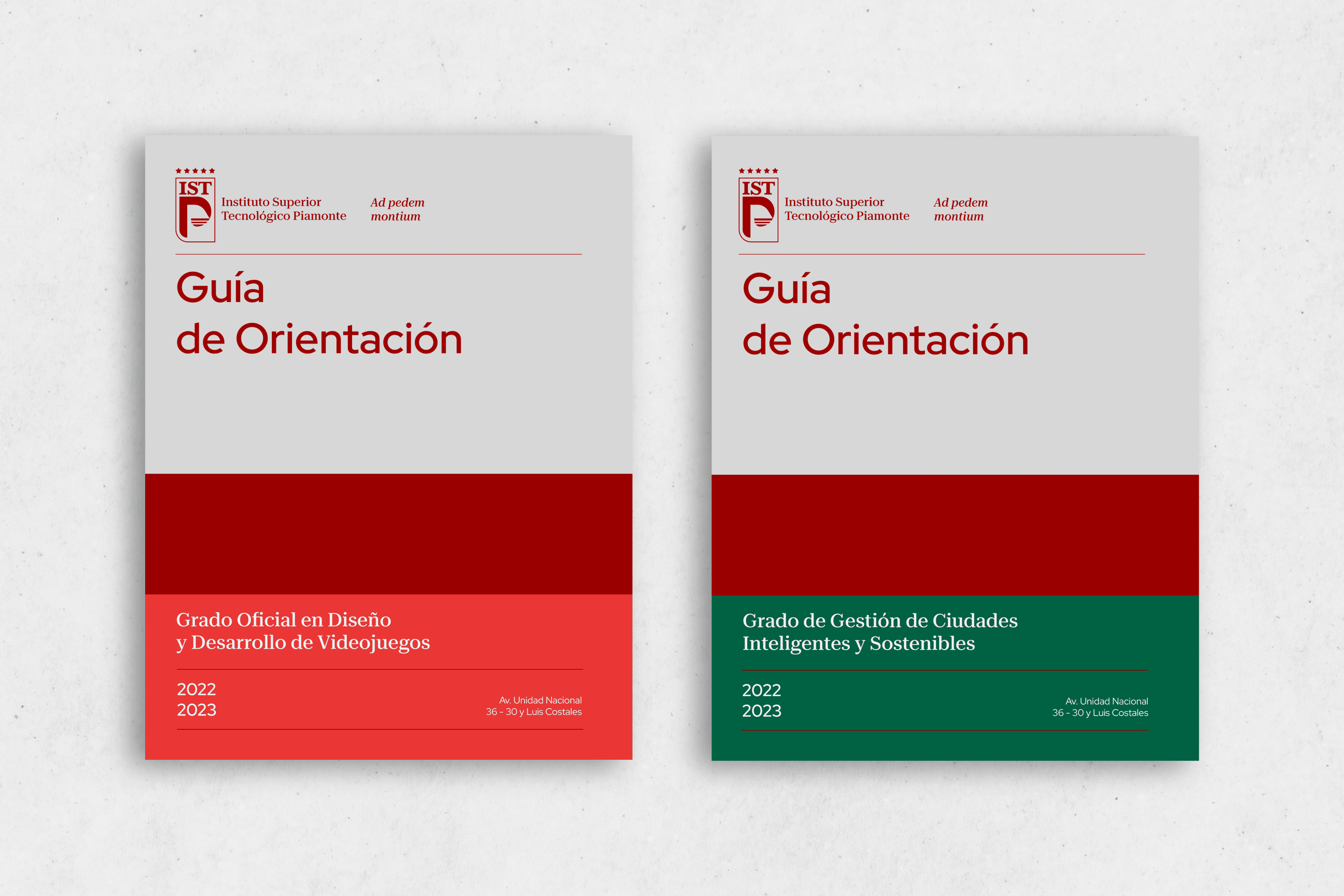
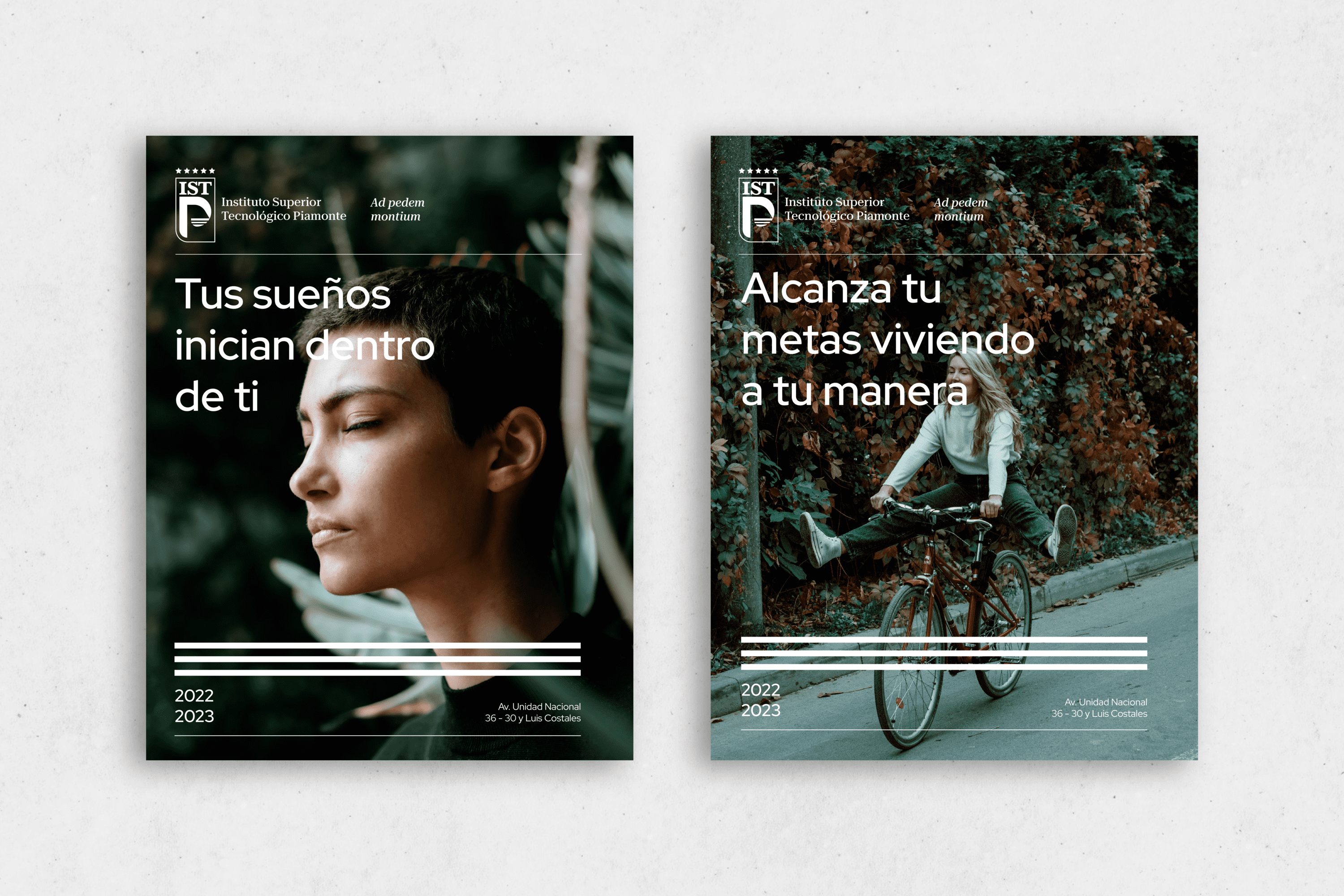
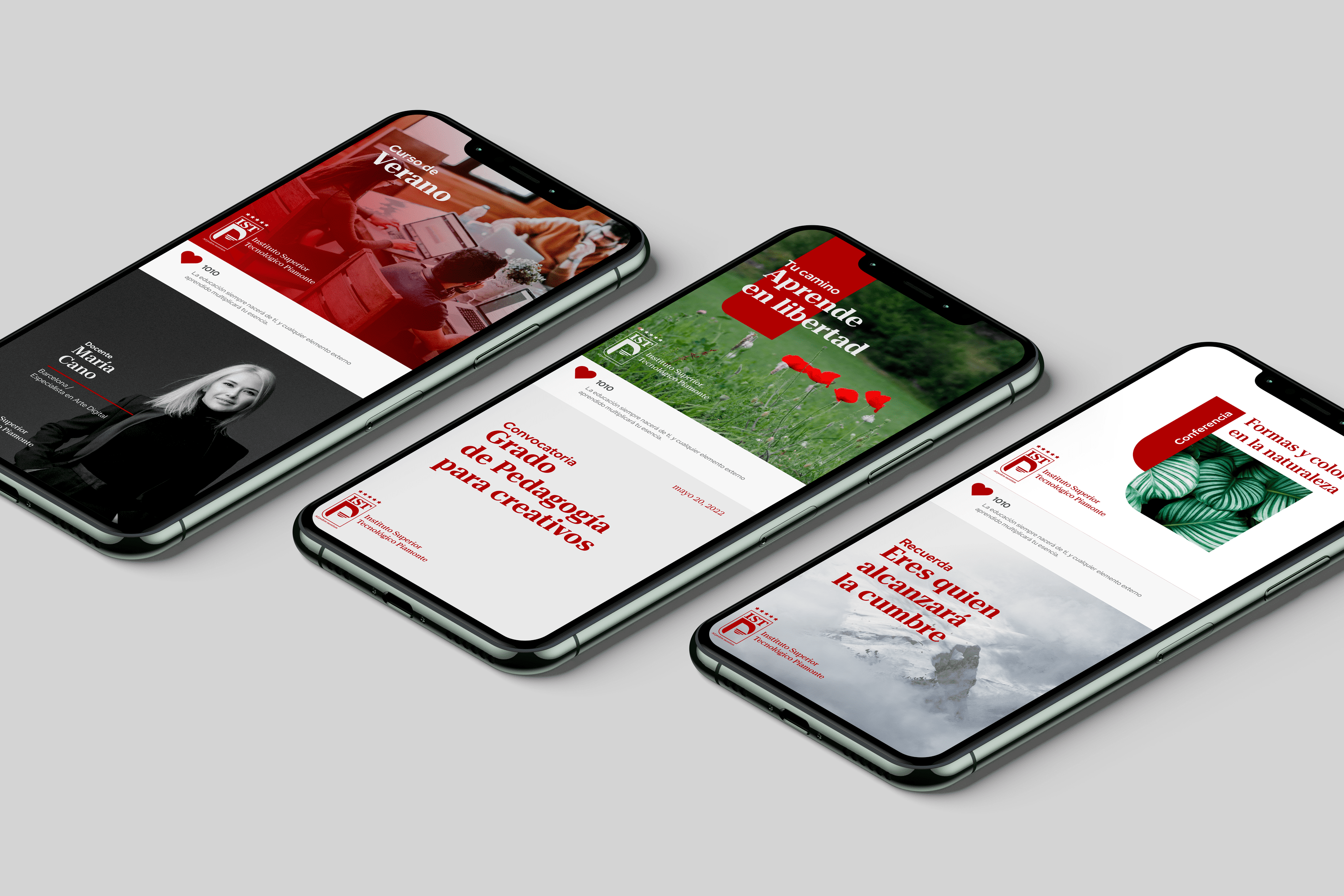
Piamonte Institute
BRANDING

The Client

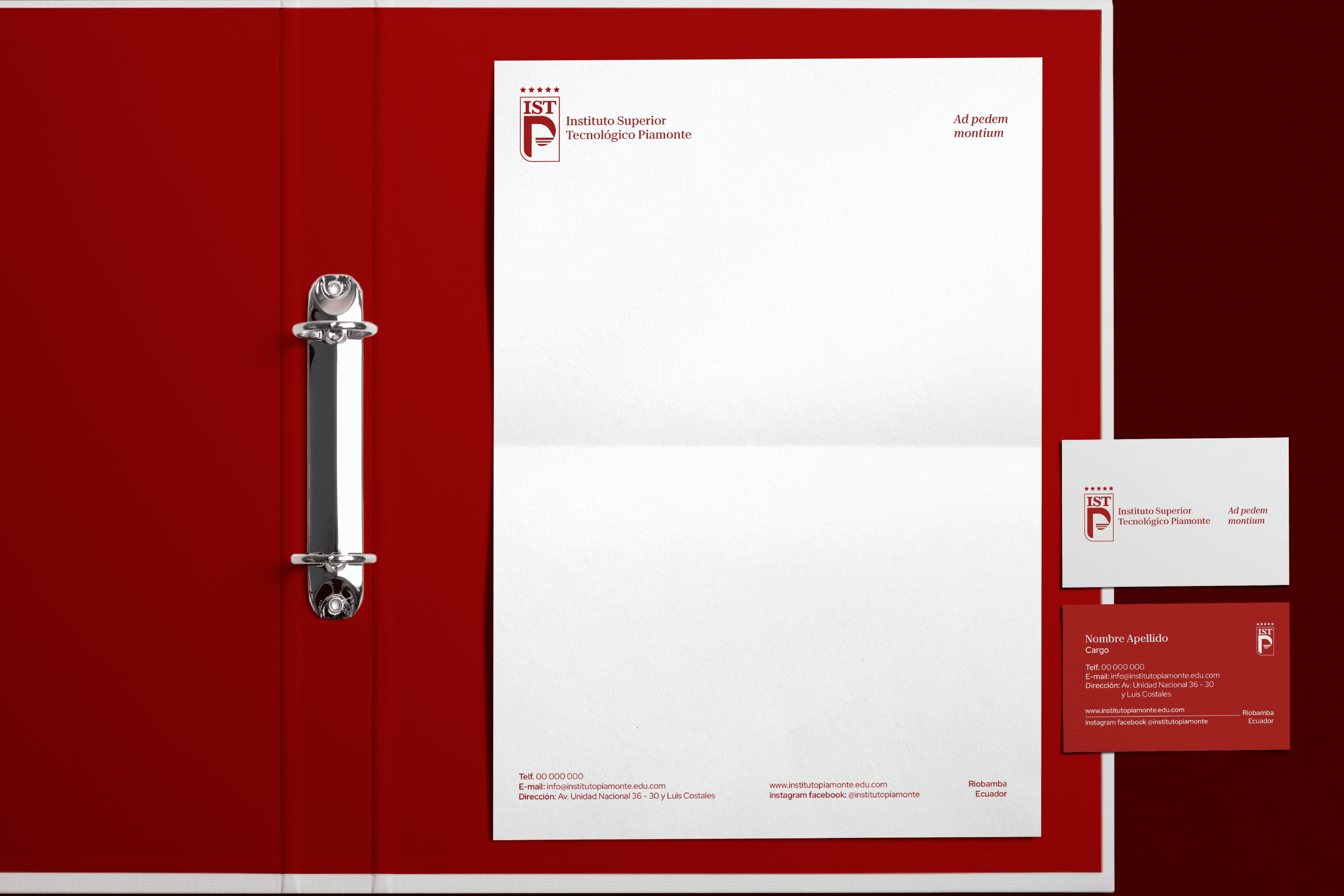
The Instituto Superior Tecnológico Piamonte is a new educational institution in Ecuador.


Keywords

Branding / Design / Education / Academy

The Objective

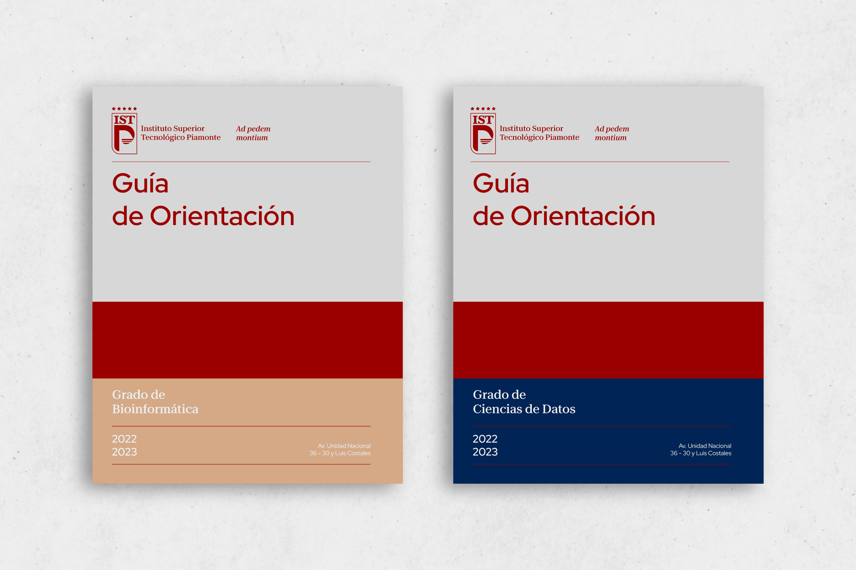
Develop a branding system that identifies the Piamonte Higher Technical Institute as an experienced, innovative education center and is perceived with an Italian essence, as we want to bring the best of there and merge it with the best of our country, Ecuador.


The Solution

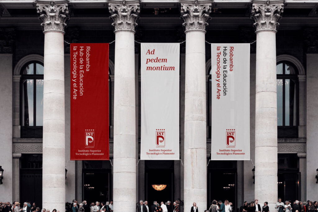
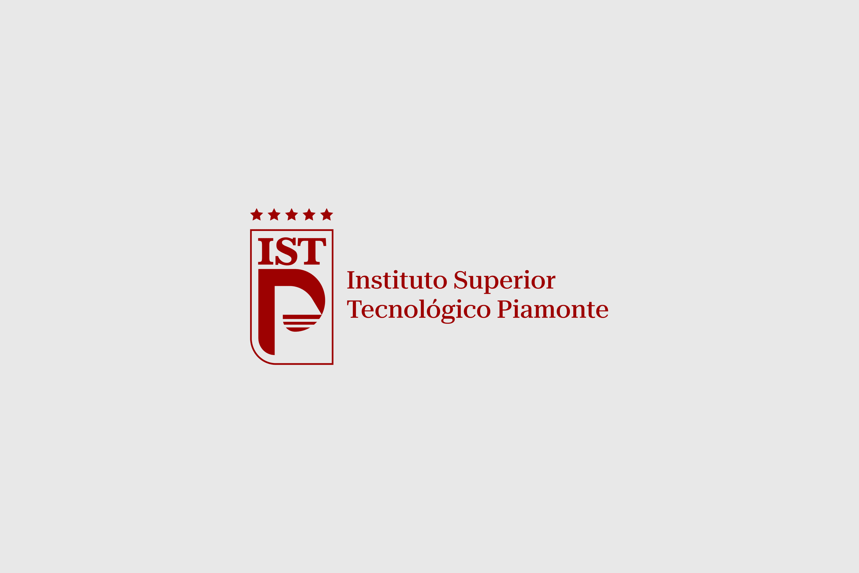
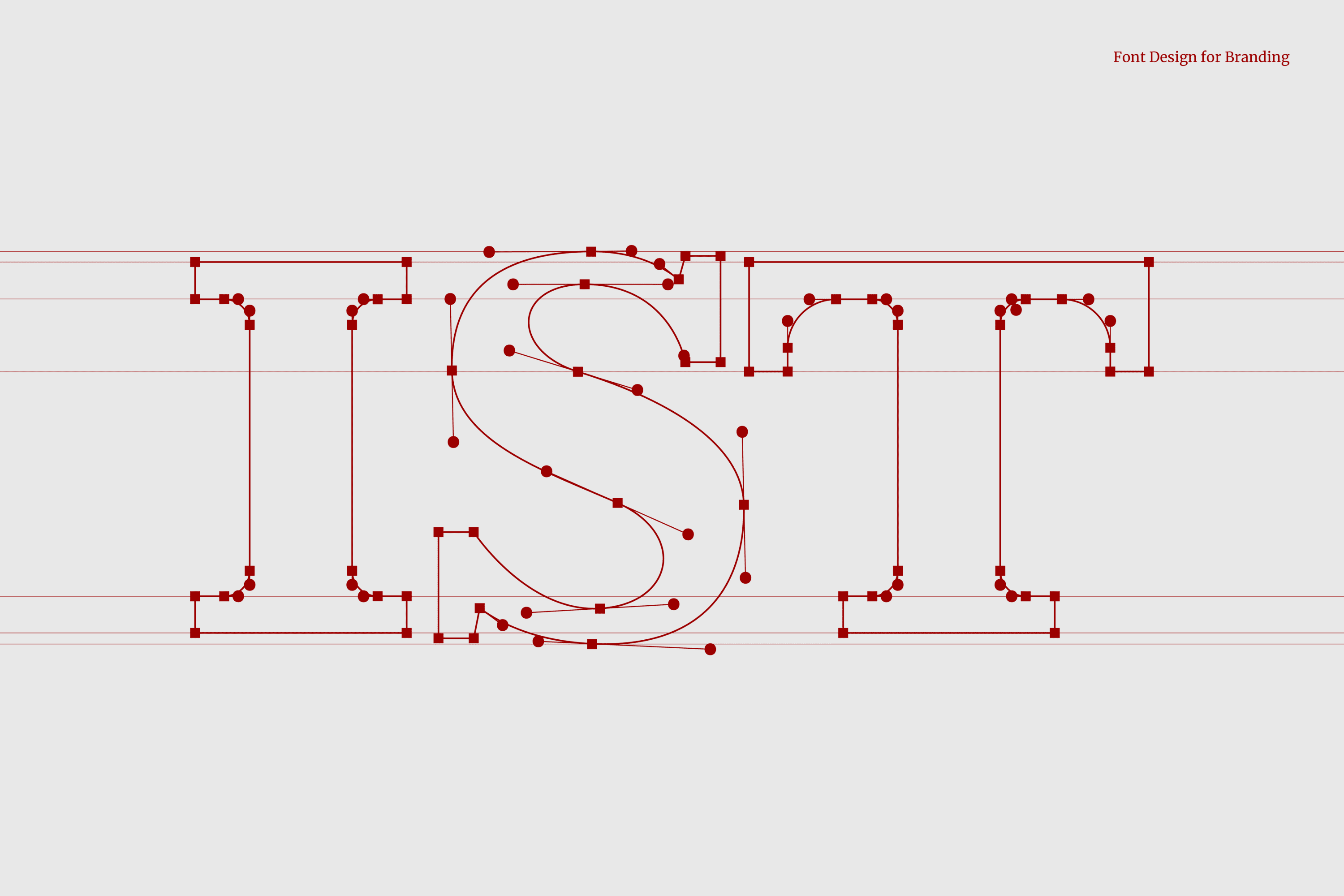
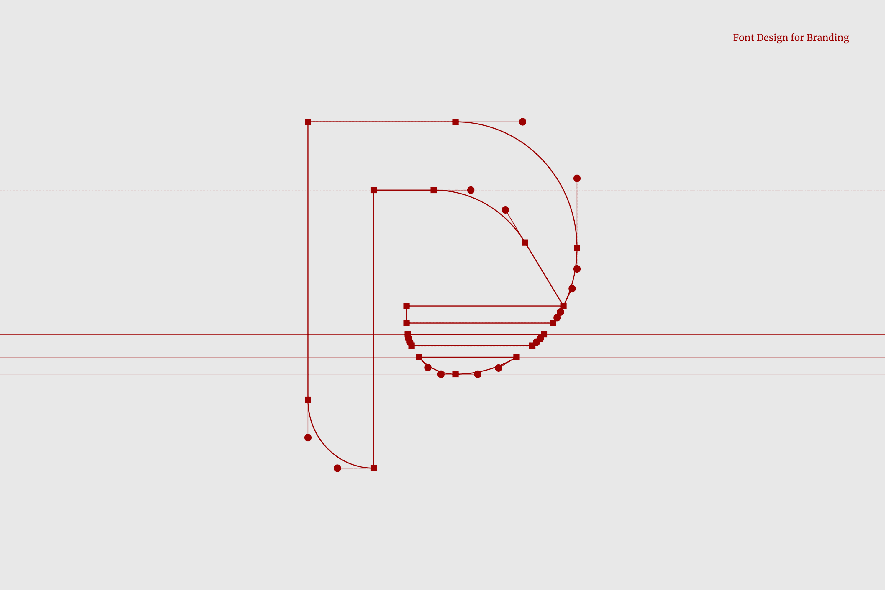
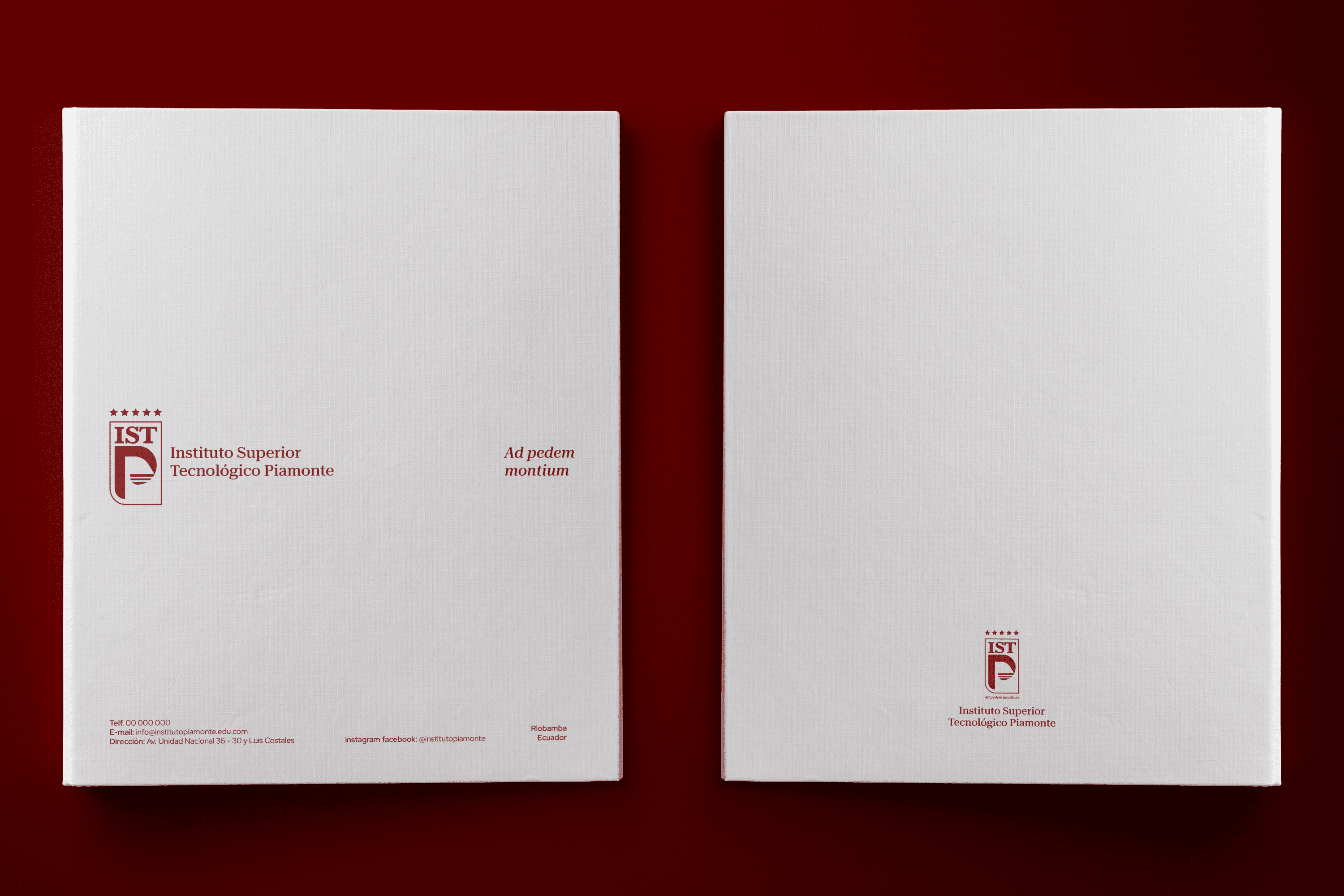
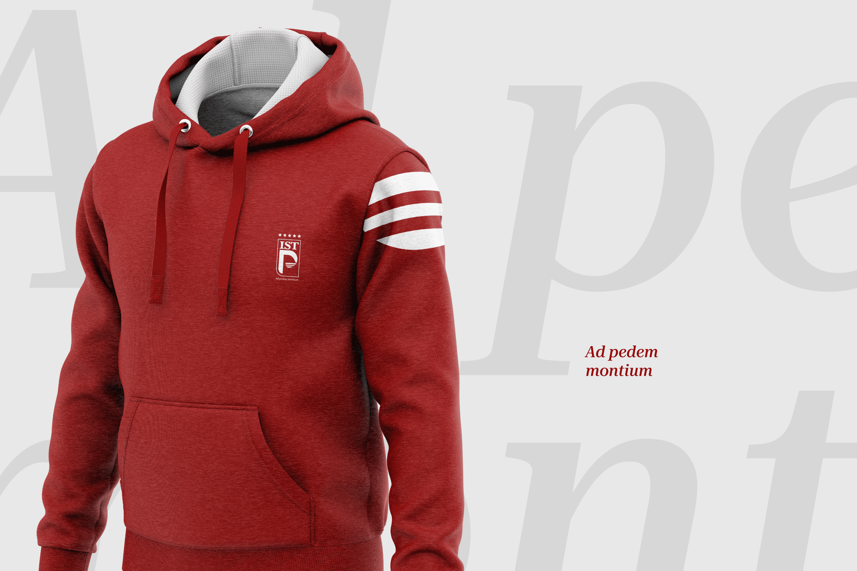
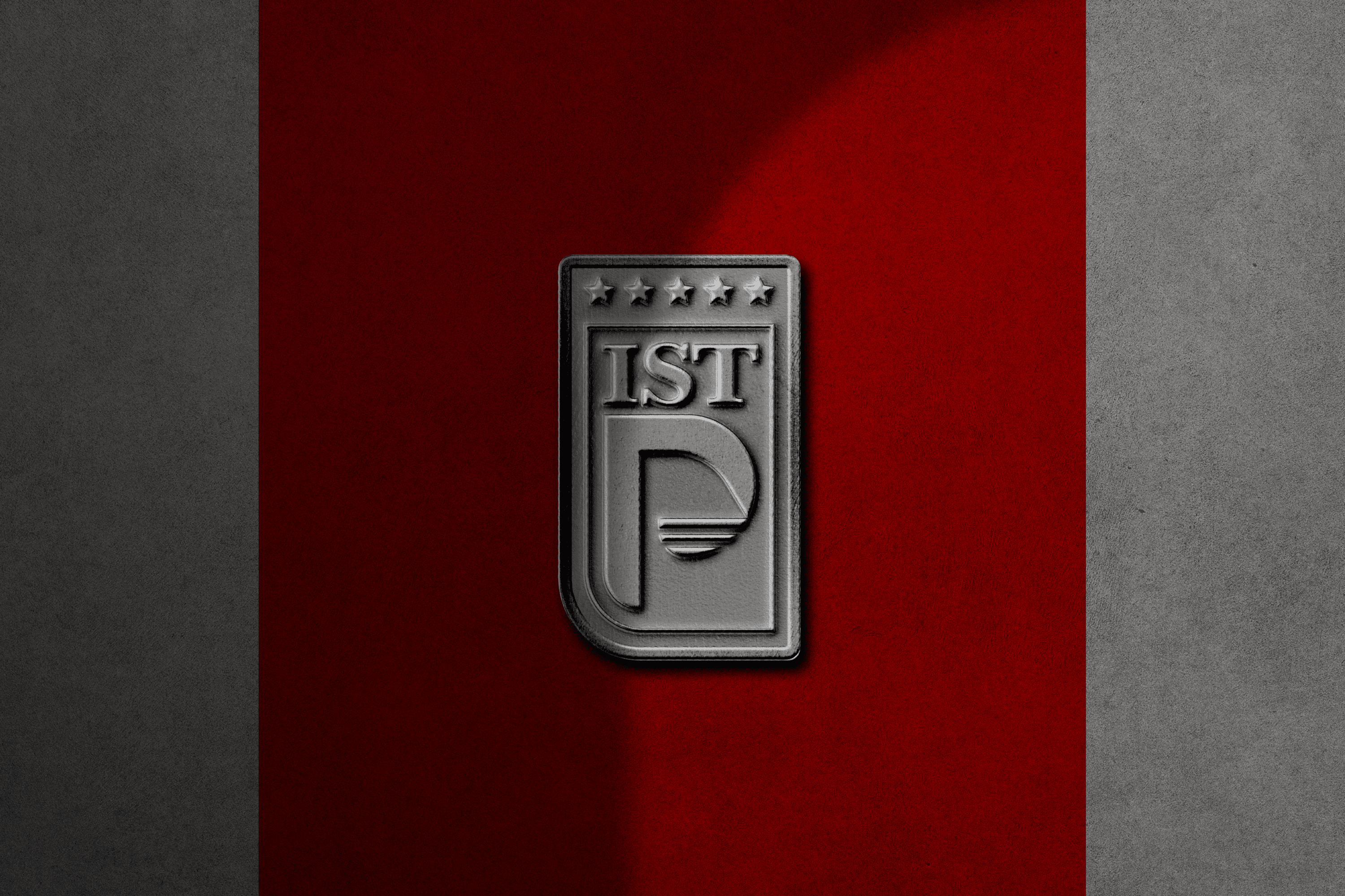
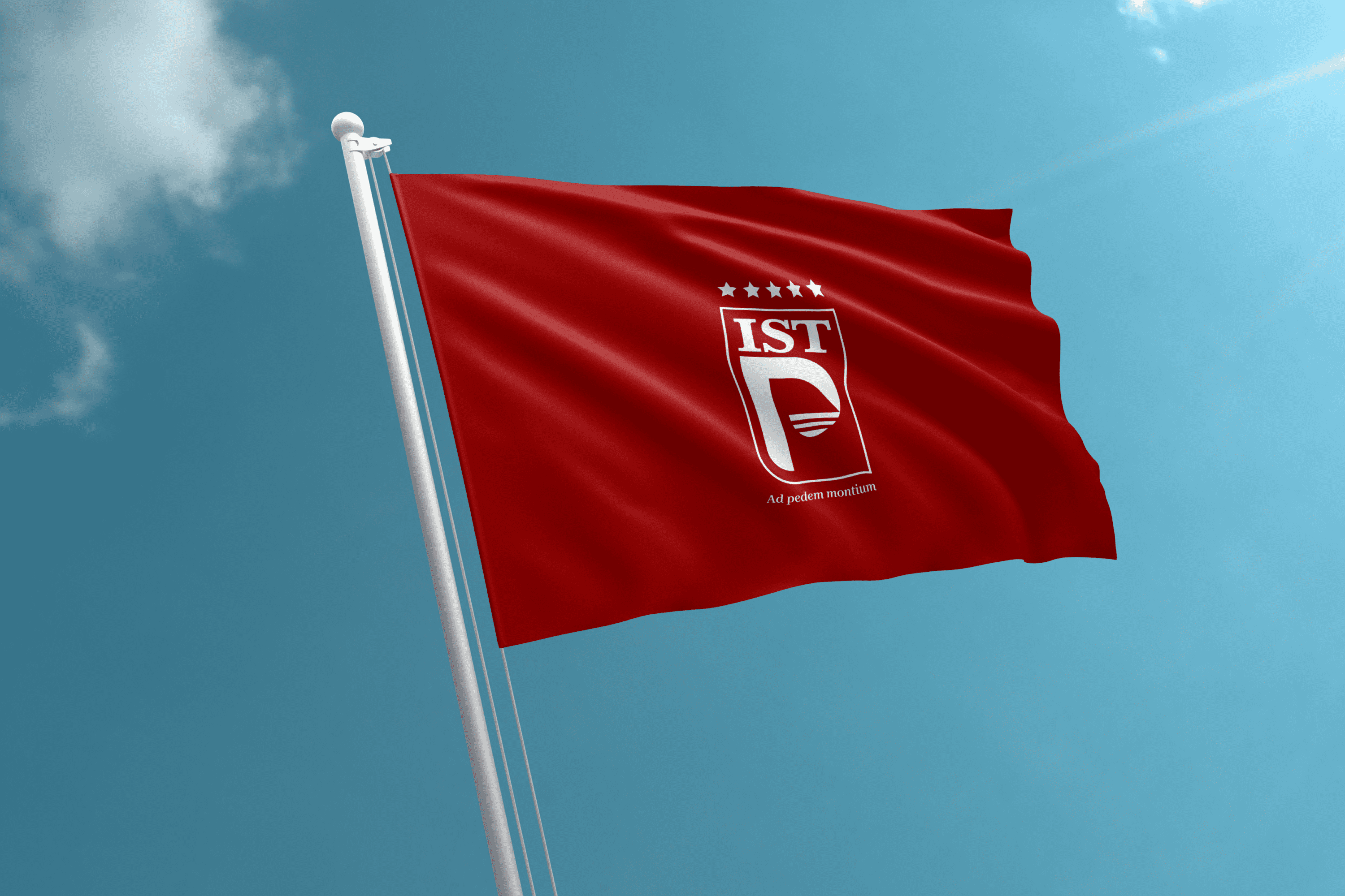
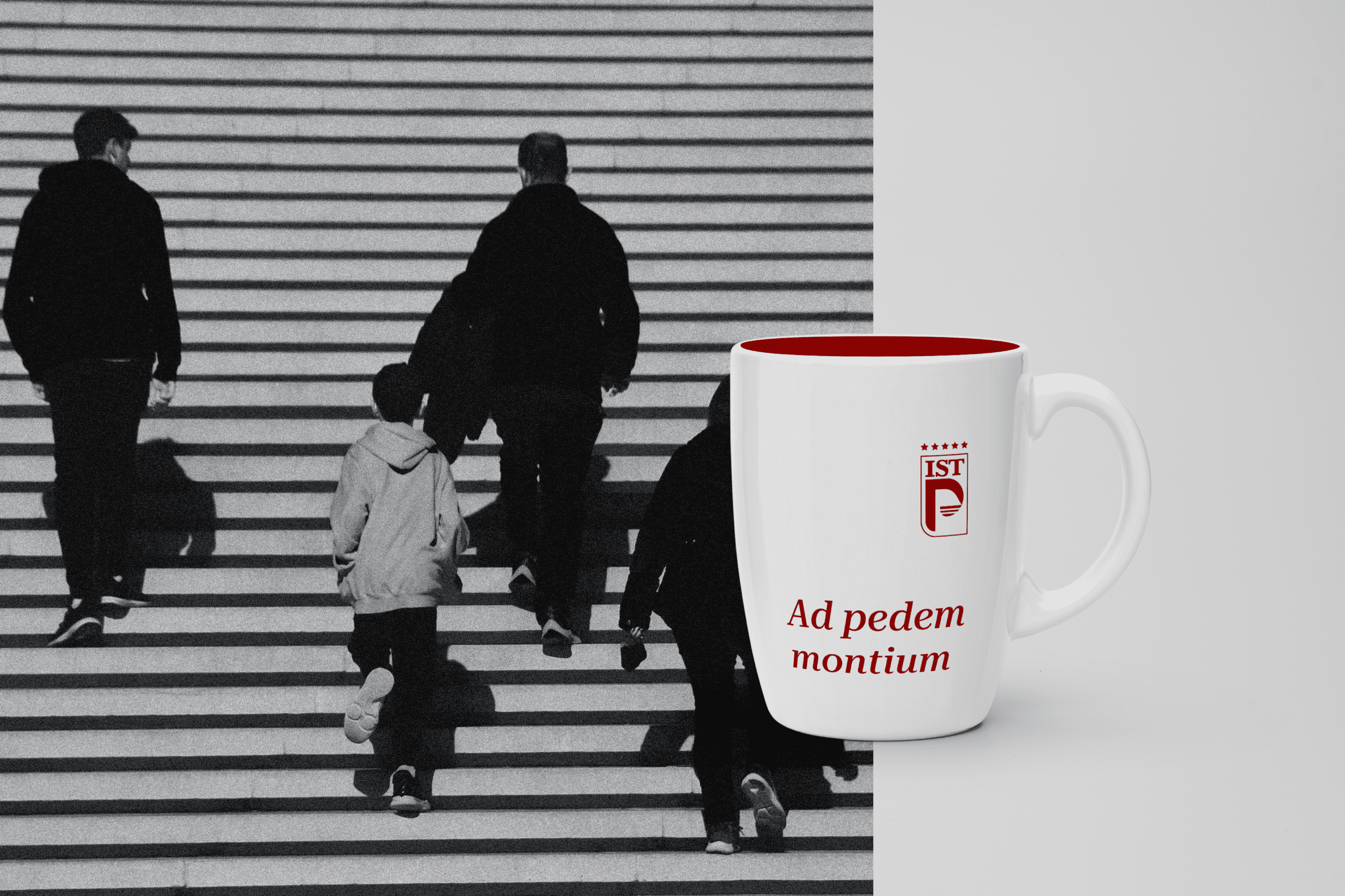
The logotype is a modern heraldic representation of a shield formed by the institute’s acronyms, where the letters IST were designed to reflect its experience through the finishing or serif. On the other hand, the counterform of the P represents a mountain whose base is three lines as a subjective representation of who starts the ascent to their goal. The number 3 was chosen because according to numerology it symbolizes expansion, agile mentality, sensitivity and talents present in every human being. All these elements are circumscribed within a rectangular area that defines the shield and at the top there are 5 stars as a symbol of quality.

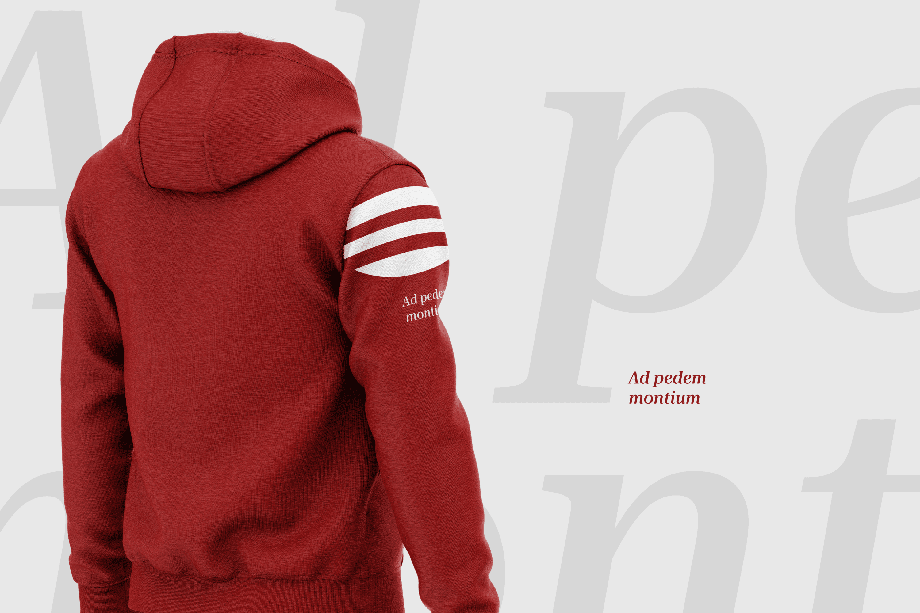
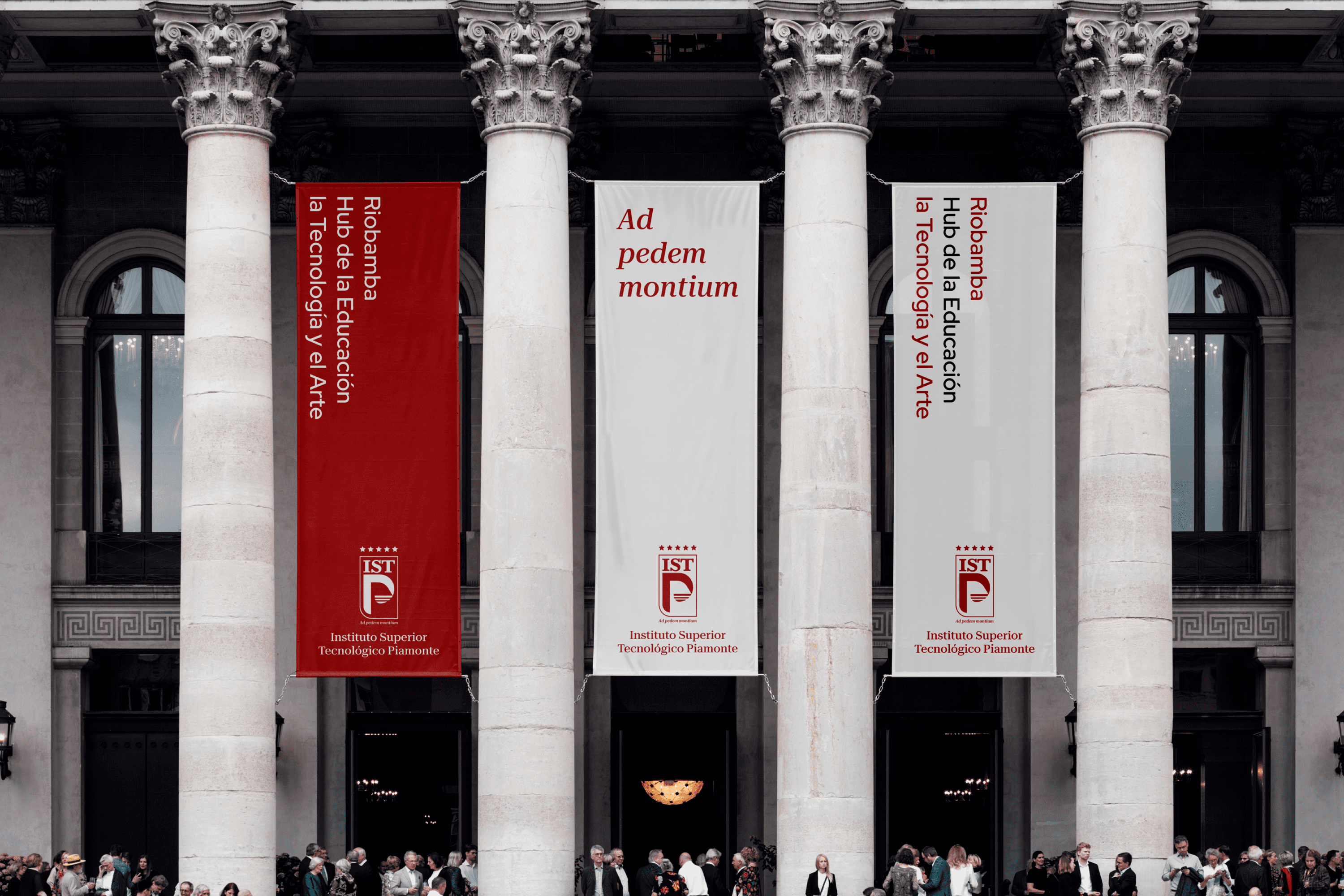
At the bottom, we find the meaning of Piamonte, At the foot of the mountain or in Latin “Ad pedem montium”.

Suggested Projects
PURIK Pitajaya Beer
TAMPER Special Edition
PLASTEX Product Catalog
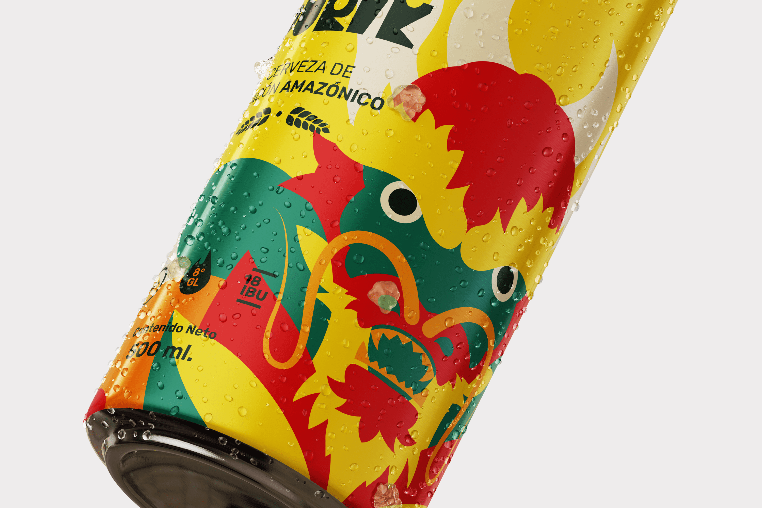
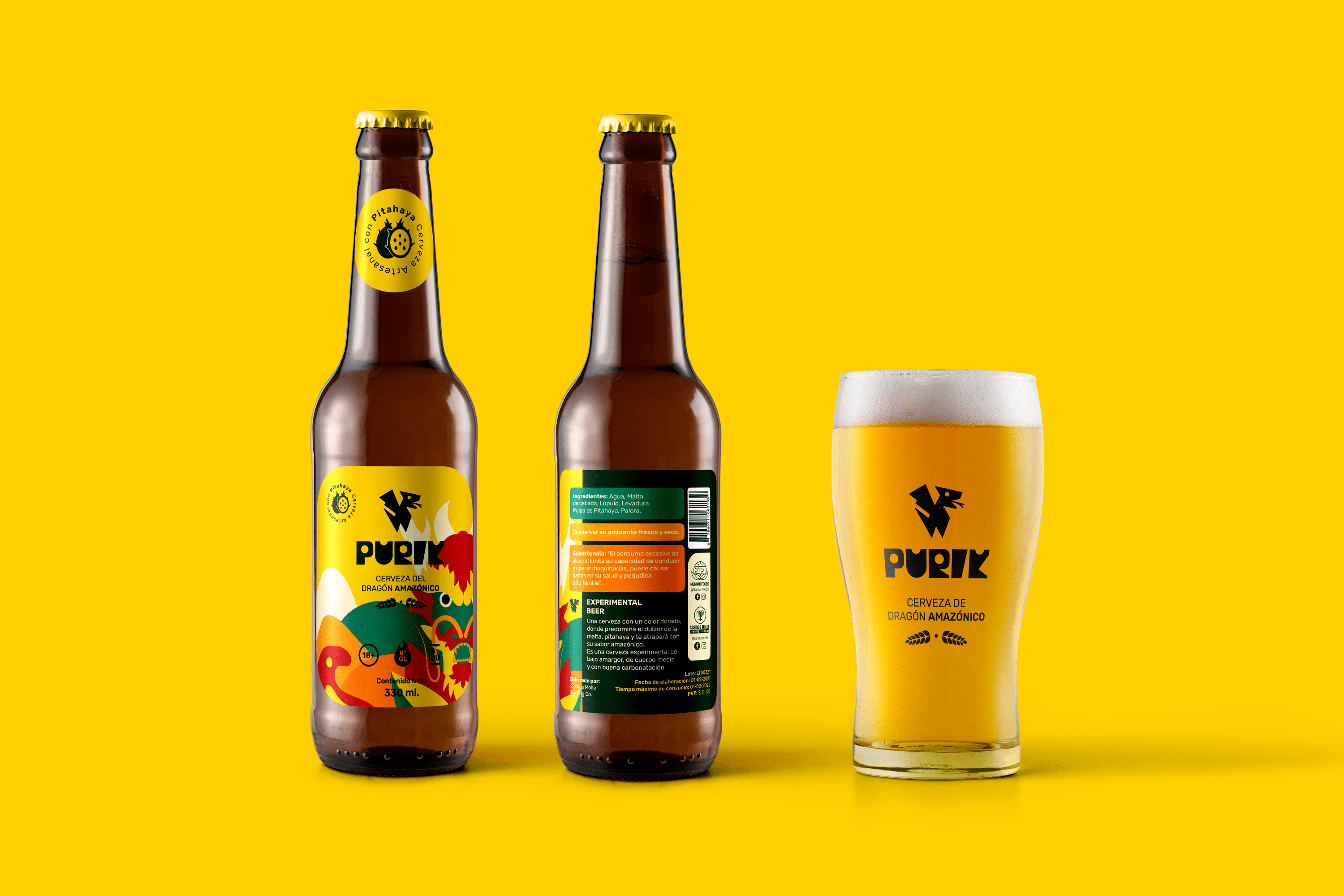
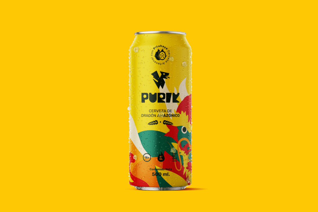
PURIK Amazonian Beer
BRANDING

The Client

We are a pioneering brand in the production of pitahaya (fruit from the Amazon) beer, located in Palora-Ecuador.


Keywords

Branding / Packaging / Beer / Ancestral

The Objective

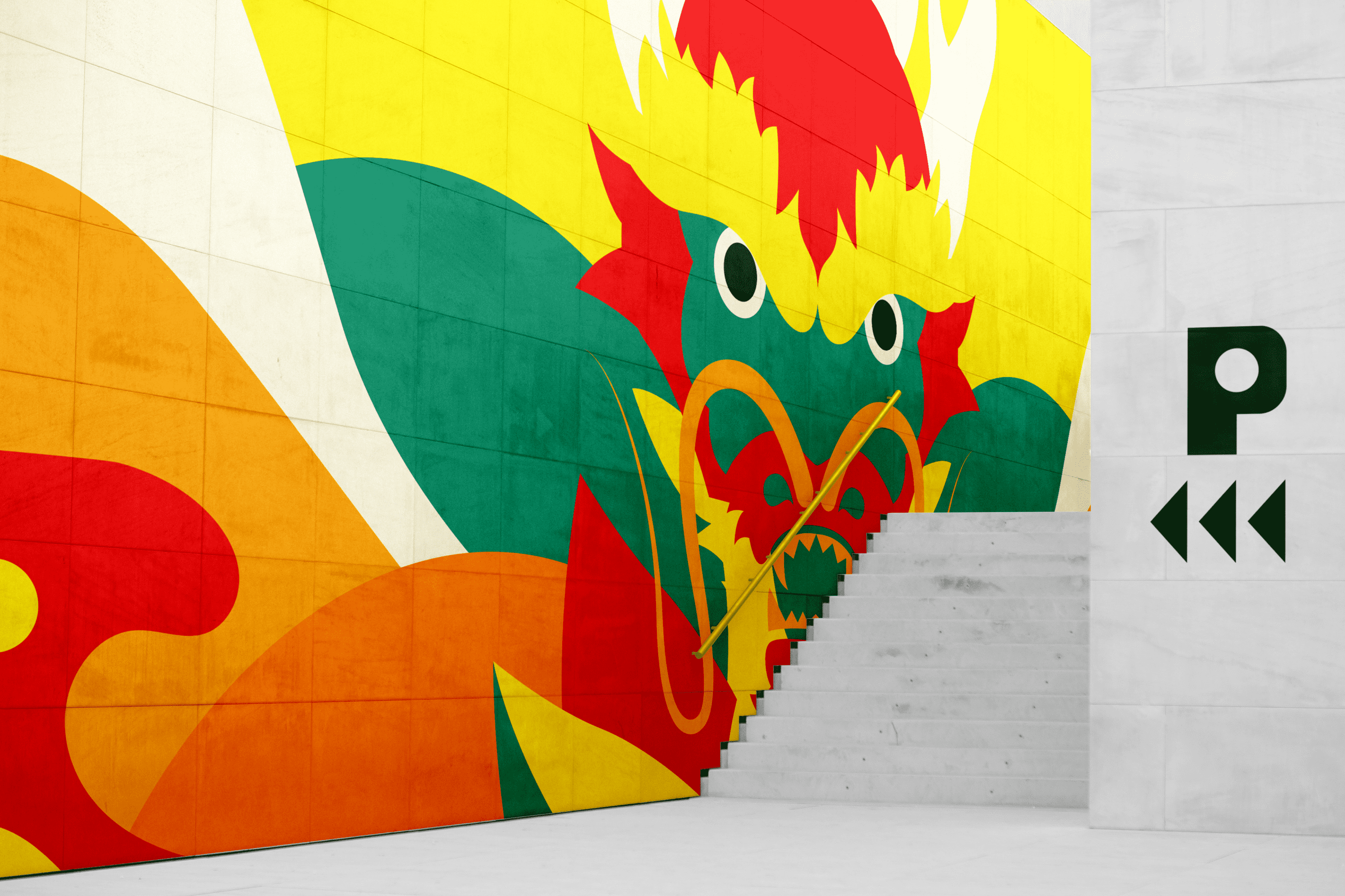
Design a vibrant beer brand that shows the essence of its Amazonian and ancestral origin.


The Solution

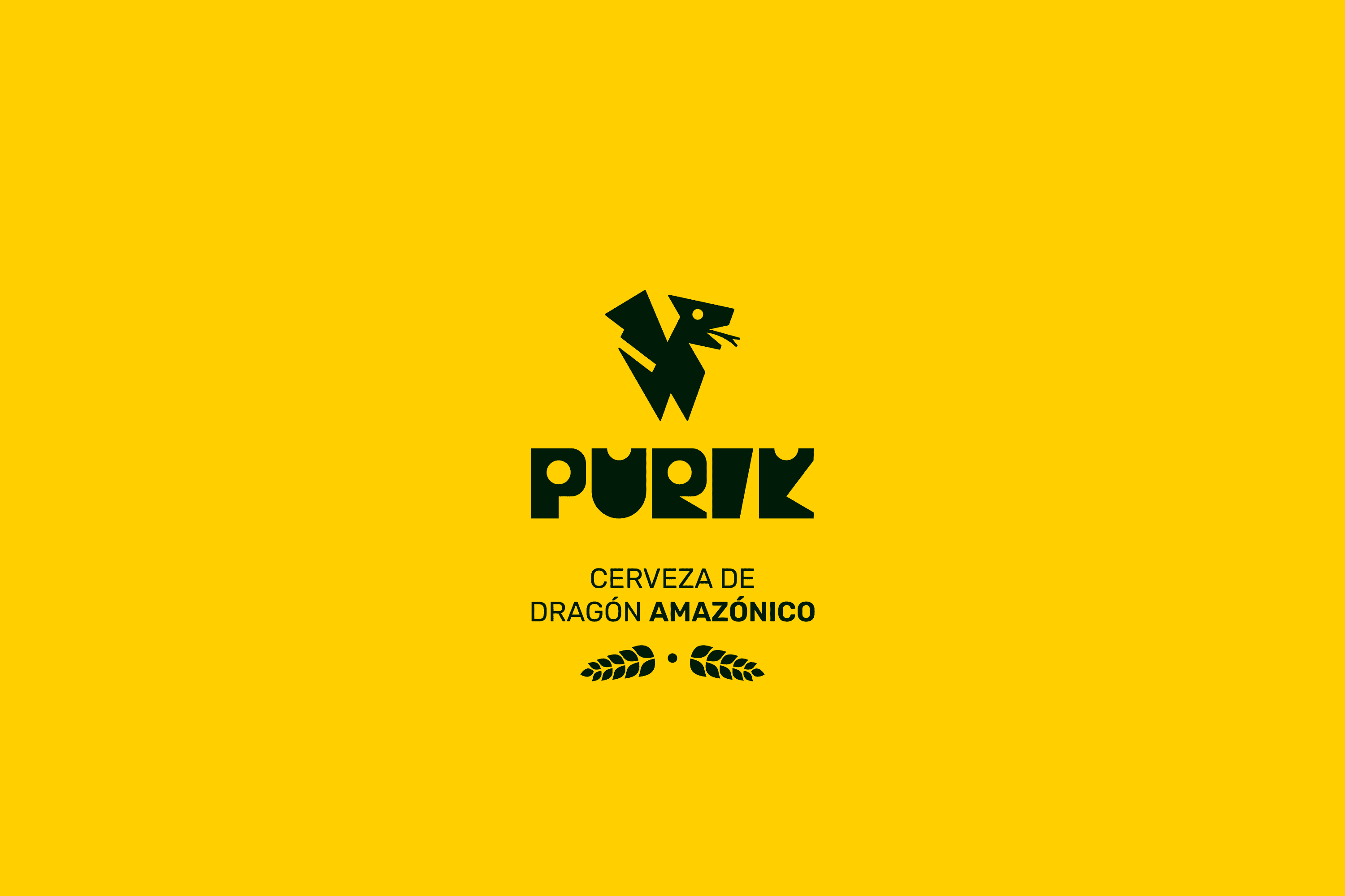
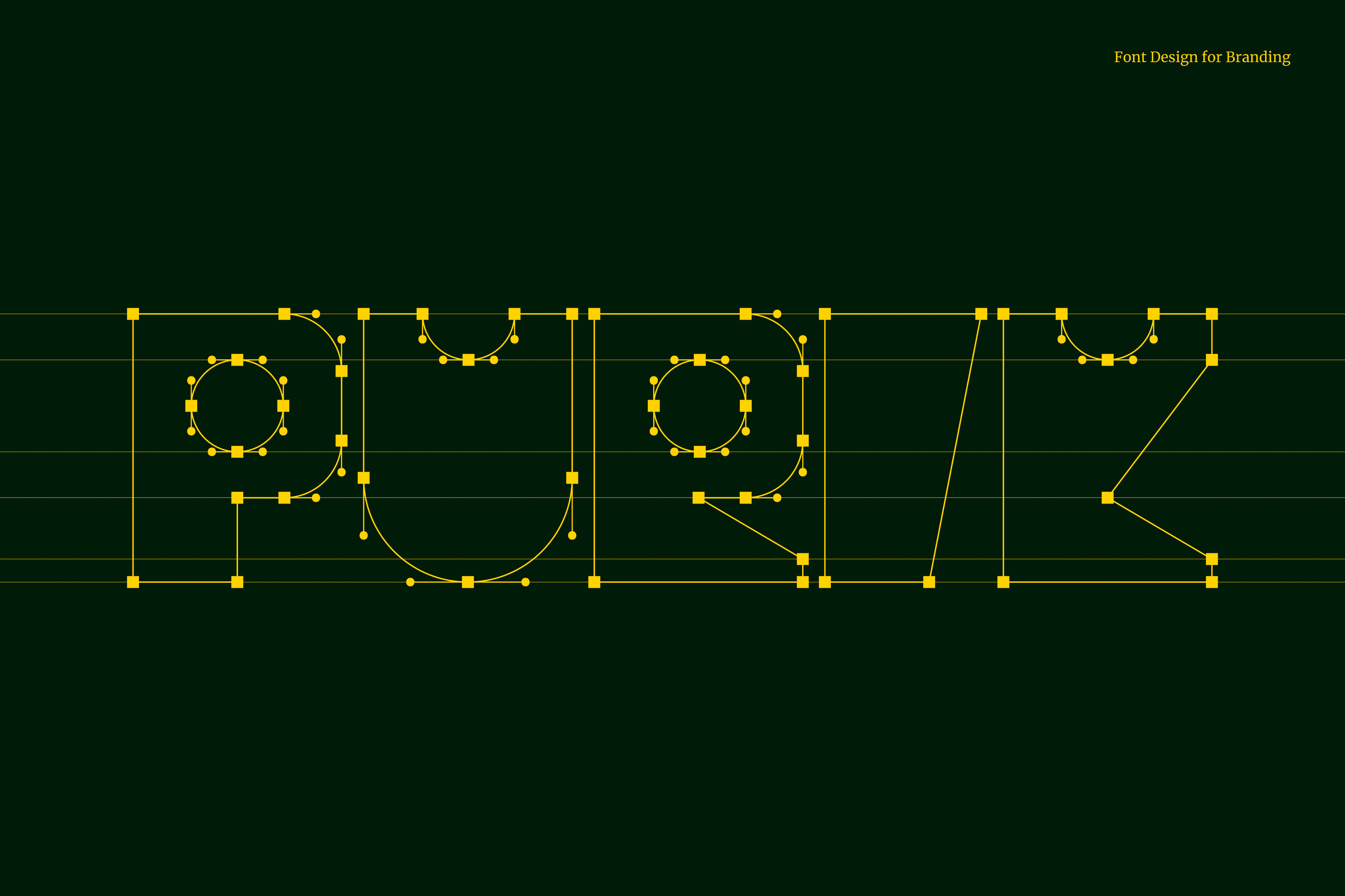
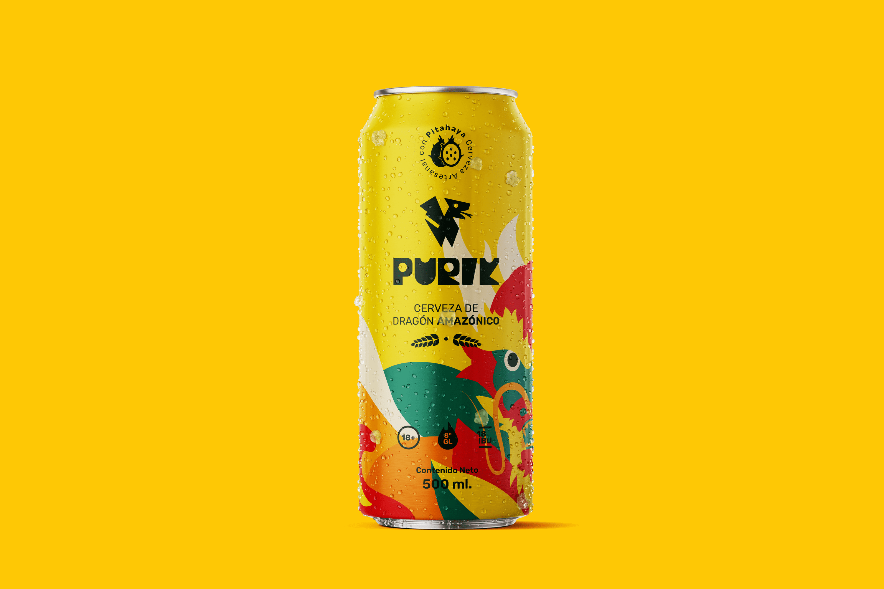
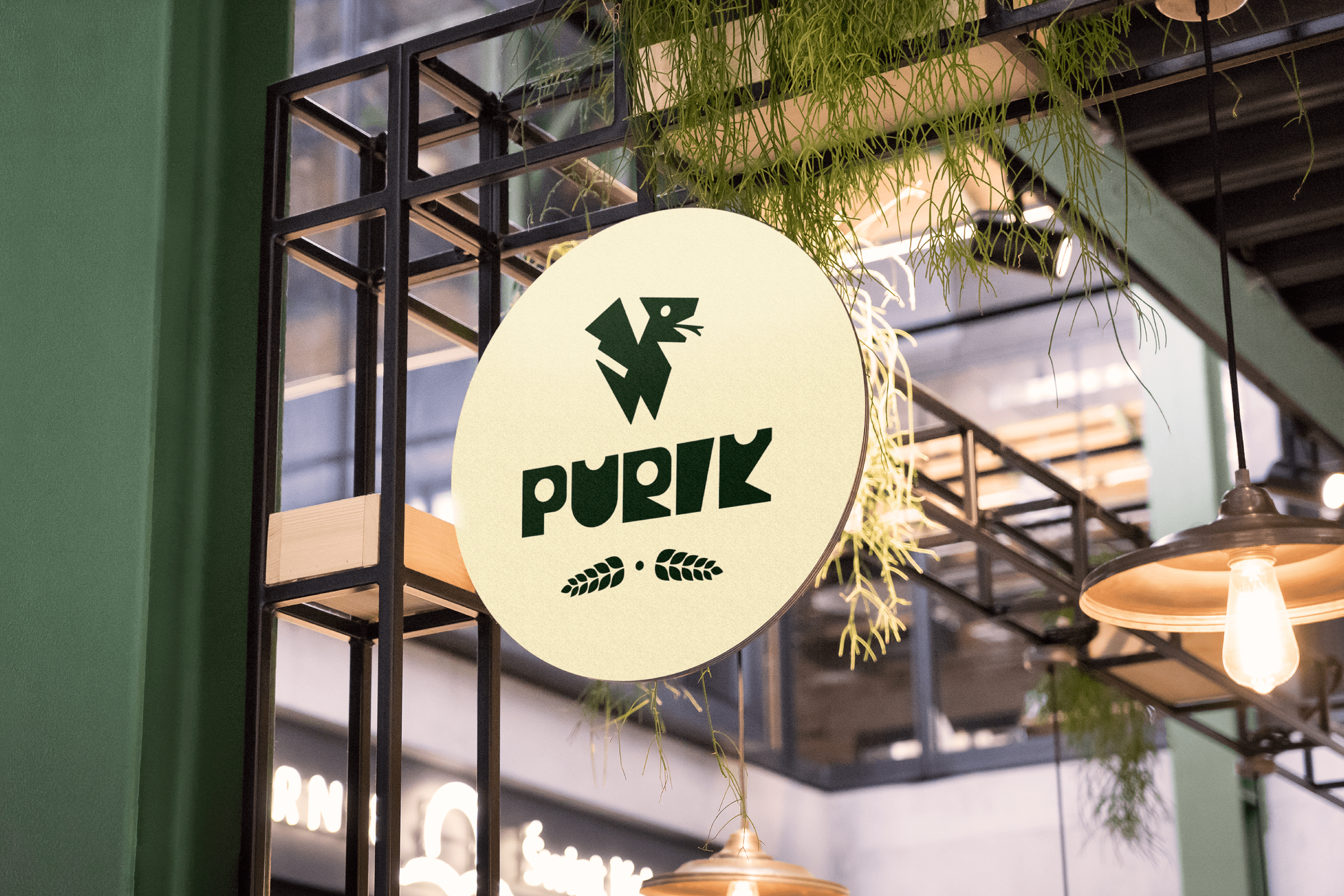
The name we have chosen for this drink is Purik, a word of Kichwa origin that means wanderer. The typography and icon were designed with a hieroglyphic appearance to emphasize the ancestral. Pitajaya is also known as the dragon fruit, for this reason, we have illustrated a dragon wrapped in leaves, shapes and colors full of energy that accentuate its origin. Its strong and vibrant personality reinforces its exotic nature.

Suggested Projects
TAMPER Special Edition
PLASTEX Product Catalog
Poncho Rosa Ice Cream
Feria Design Interview
Feria Design Studio
for the world
David Feria Estudio Interview
David Feria Studio
for the world

In a decade of design, I have had the privilege of meeting incredible people from various parts of the world. Experience dictates that the client is not always right, but neither are we as a studio; it is in this space where empathy and honesty are key to breaking barriers and connecting. Beyond borders, there’s a human being aiming to put their service or product in the hands of those who need it.

Our focus in the studio is to design unique, handmade brands. Some may call us old-fashioned, but we believe in the uniqueness of this method to achieve something exclusive. However, we face essential questions: What happens to the brands we create? Where do they thrive? What do they need to evolve? Is designing the brand enough? These reflections make it clear that creating a brand is just the beginning.

We offer a holistic solution to our clients and help them achieve their objectives.

Designing a great brand is important, but without effective communication, its value gradually diminishes. Presenting the brand across various channels, like the web, social media, packaging, etc., is crucial. Our role is to identify the most suitable channel for each goal, being part of an ecosystem that allows the brand to express itself in a healthy and coherent manner.

In our studio, we do not only design brands and ecosystems for their growth. We also focus on environmental and social impact. We donate 1% of our international income to environmental care (you can see more here) and offer our services to NGOs through our ‘Humanitarian Graphics‘ program.

A strong brand is essential for any business.
David Feria Estudio para el mundo Img

We invite you to learn more about how we can help you design your brand and build a healthy and coherent brand ecosystem. In the words of Pepe Mujica, ‘we don’t pay with money, we pay with the life time it took to earn that money’. With that philosophy, we commit to taking care of your investment and being honest about your real needs.
Thank you for your interest. We look forward to the opportunity to hear about your project and guide you before making any investment decision.
Written and Illustrated by: David Feria Naranjo | CEO Founder

Related Topics
Branding Cambiar Img  Portada

Feria Design Today

The way you knew your brand is dead
Arquetipos Branding Connections archetype

Feria Design Today

How do the 12 archetypes define the essence of your brand?
Bob Proctor Img  Portada

More from Feria Design

Bob Proctor, 10 steps to reach your best version
Feria Design Today
When is it time to rebrand?
Feria Design Today
The way you knew your brand is is dead

Growing is inevitable and your business evolves over time, for this reason several moments will arise when a rebranding will be necessary, this change often consists of finding a new approach to your brand and redefining what is important, what it stands for and above all, who you are. This process clarifies the future of your brand and shows your company the opportunities for a better and more rewarding life.

Here are a few reasons why your company needs to rebrand:

Update the look and feel.
The most common motivation behind a rebranding project is to have a modern look. Does your brand look dated or have a poor design identity?, it’s time to rebrand. Rebranding in a solid way allows you to retain old customers while successfully attracting new ones.

Blends into the marketplace

It’s important to be careful or your brand can become a mishmash of assets. If you fail to maintain visual and verbal consistency due to the use of inconsistent logos, typefaces, color palettes, images, messaging and tones of voice, this will cause your brand to fall into a major slump due to lack of self-understanding. Fortunately, there is a solution for this. This type of rebranding is undertaken when a company needs to create a greater sense of continuity across the brand and overcome the inefficiencies, frustration and confusion that result from not communicating consistently to customers.

“Differentiating ourselves in a saturated market or giving the brand a fresher, more modern image are aspects to take into account at the time of rebranding.”
Branding Cambiar Img

We fell into the dull zone.

Even if it were the case that you were selling the most mundane thing in the world, there is no good reason for your brand to look or act boring. If you’ve noticed an attitude of indifference around your brand, it’s because you haven’t discovered a compelling or relevant focus from which to orbit. Finding an authentic theme is the solution, apply some creativity and tell your story in a way that surprises and captivates people. What was initially perceived as boring could become a driver of inspiration for others.

Gain a competitive advantage

Your competition is growing but you’re not? One of the main factors companies react to is loss of market share or declining sales. Good planning and execution of a rebrand enables your company to position itself ahead of the competition and keep your customers excited. It is advisable to identify what gives your company the edge and what is the essence that makes your point of view unique and build your brand around it.

Changes in the business

Changing business models is something many companies do, these changes or adding service or products allows them to stay competitive and profitable. If you used to do A, but now you do A and B, it could be a call to rebrand. Your customers will only know you do A unless you find a way to show them that you also do B. Diversifying or splitting a business justifies a rebrand as a clarification resource.

We have a negative image

Any brand can be exposed to negative connotations and it is not easy to remove our brand from that environment, but sometimes rebranding is a corrective measure and an effective strategy for a company trying to recover from a bad image. Sometimes it works if the damage is not so serious, but sometimes it is too late.

“If your brand has been associated with a negative connotation, don't wait for the situation to get worse, it's time to rebrand.”
Branding Cambiar Img

You merged or have a new acquisition

Changing ownership often results in a rebranding so that this change is visible and allows for compliance with all legal requirements. Under the new rules, your values, vision and priorities may have a significant change that must be taken into account. This is the ideal time to ensure that creative and strategy are aligned to reflect the new goals, vision, personality and message.

Name update

Sometimes the name you have is incorrect or just plain wrong for your business. The name may no longer fit your identity or you may have run into a trademark registration conflict. Whatever the case may be, changing your name allows for a new existence and grants a great opportunity to examine your entire brand from the ground up.

You started to scale

Several startups begin and experience growth without having a professional brand design. However, rebranding becomes a crucial step for young companies to be taken seriously as they scale and take on more established brands.

Rebranding is a path of great risk and reward. Deciding to rebrand should never be done lightly, without having come up with solid strategic reasons for undertaking the process and deciding on the right brand partner to guide you through each step of the process. If you have thought about undertaking this rebranding process for your company, send us an email or schedule a free phone consultation. David Feria Studio can help you decide if it is time to rethink, update and revitalize your brand.


Written and Illustration: David Feria Naranjo | Founding CEO

“It is essential to do a phonetic check of the name before designing to ensure its subsequent registration, rebranding for a name that could not be registered is a waste of time and money. ”
Related Topics
Arquetipos Branding Connections archetype

Feria Design Today

How do the 12 archetypes define the essence of your brand?
Bob Proctor Img  Portada

More from Feria Design

Bob Proctor, 10 steps to reach your best version
Feria Design Today
How do the 12 archetypes define the
essence of your brand?
Feria Design Today
How do the 12 archetypes define the
essence of your brand?

The transformative power of brand archetypes

In the universe of branding, nothing happens by chance. Brands that stand out and become favorites have a secret: they understand and apply the power of archetypes. These are not mere labels; they are the essence that gives life, personality, and direction to a brand, allowing it to connect authentically with its audience.


The journey to authenticity: Understanding your archetype

Identifying your brand’s archetype is crucial for defining its role and narrative in your consumers’ lives. This clarity is essential for conveying who you are and what values you represent. Whether the connection with your archetype emerges instantly or requires deep analysis, the goal is the same: to find your brand’s true identity and enhance its emotional impact and resonance.


The diversity of archetypes: A mirror of our humanity

Archetypes reflect different facets of human experience, from empathy and care to bravery and exploration. By choosing and embodying one of these archetypes, your brand not only defines itself but also invites your audience to see a reflection of their own values and aspirations.

"An archetype provides brands with the ability to forge deeper connections with their audiences."
Arquetipos Branding Collective Archetype

The 12 brand archetypes and their characteristics

  1. The Caregiver: Characterized by empathy, generosity, and a desire to assist others. Brand examples: Campbell’s, Johnson & Johnson.
  2. The Citizen: Values the dignity and worth of each individual, offering lessons through empathy and practical wisdom. Brand examples: Gap, Habitat for Humanity.
  3. The Hero: Represents strength and courage, overcoming significant obstacles and persevering in the face of adversity. Brand examples: Nike, U.S. Army.
  4. The Innocent: Maintains an optimistic and confident outlook, known for spontaneity and joy. Brand examples: Charmin, Avon.
  5. The Explorer: Longs to venture beyond the known, seeking new experiences and less traveled paths. Brand examples: The North Face, Subaru.
  6. The Rebel: Challenges the status quo and advocates for transformation, questioning established structures. Brand examples: Harley Davidson, Virgin.
  7. The Lover: Seeks to create experiences of pleasure and intimacy, celebrating beauty and emotional connections. Brand examples: Victoria’s Secret, BMW.
  8. The Creator: Focuses on innovation and artistic expression, rejecting mediocrity. Brand examples: LEGO, Canon.
  9. The Jester: Lives to enjoy life and have fun, turning the ordinary into the extraordinary. Brand examples: Taco Bell, Skittles.
  10. The Sage: Dedicates itself to the pursuit of truth and knowledge, aspiring to provide enlightening solutions. Brand examples: CNN, The Wall Street Journal.
  11. The Magician: Explores the fundamental laws of the universe to transform and manifest visions. Brand examples: Disney, TED.
  12. The Ruler: Inspires leadership and responsibility, fostering an environment that values everyone’s contribution. Brand examples: Rolex, American Express.
"What is your company's archetype, The Hero, The Sage, or The Maiden?"
Arquetipos Branding Timeless Archetype

Essential guidance: Discovering and living your archetype

Defining your brand’s archetype can be an introspective journey that, at times, requires an external perspective to provide objectivity and depth. It is a process that invites collaboration and exploration, and that can reveal the heart and unique essence of your brand.


A Legacy of authenticity and connection

Determining and embracing your brand’s archetype is not just a branding exercise; it’s a step toward creating an authentic and memorable identity. This approach not only strengthens your brand’s communication and presence but also guides you in building a resonant and meaningful legacy. By understanding and living your archetype, your brand can transcend, connecting genuinely and enduringly with people.


Want to find your own archetype and connect with your audience through your brand? Contact us.

"This approach not only strengthens your brand's communication and presence but also guides you in building a legacy."
Related Topics
Bob Proctor Img  Portada

More from Feria Design

Bob Proctor, 10 steps to reach your best version