The Client
The Instituto Superior Tecnológico Piamonte is a new educational institution in Ecuador.
Keywords
Branding / Design / Education / Academy
The Objective
Develop a branding system that identifies the Piamonte Higher Technical Institute as an experienced, innovative education center and is perceived with an Italian essence, as we want to bring the best of there and merge it with the best of our country, Ecuador.
The Solution
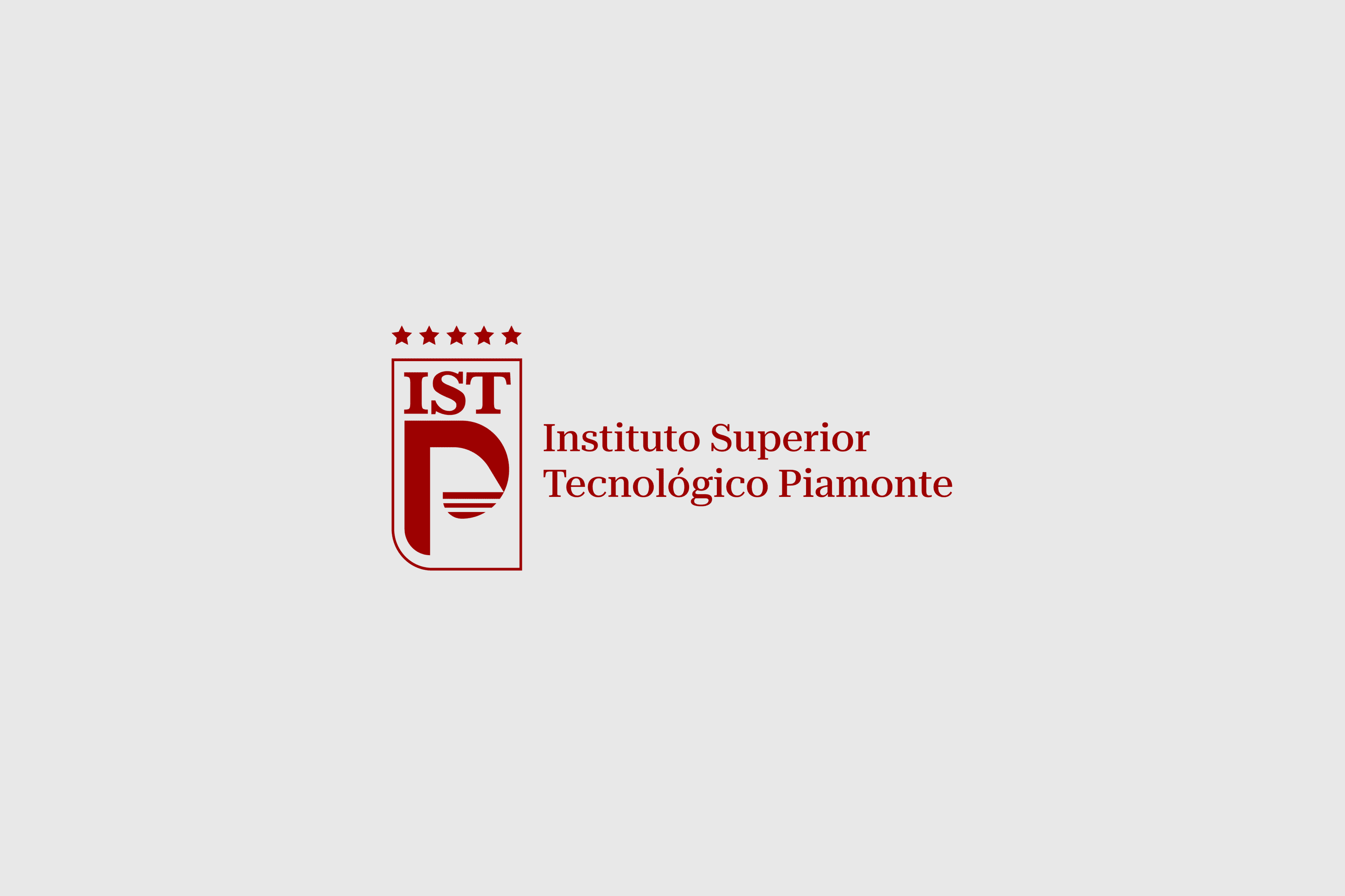
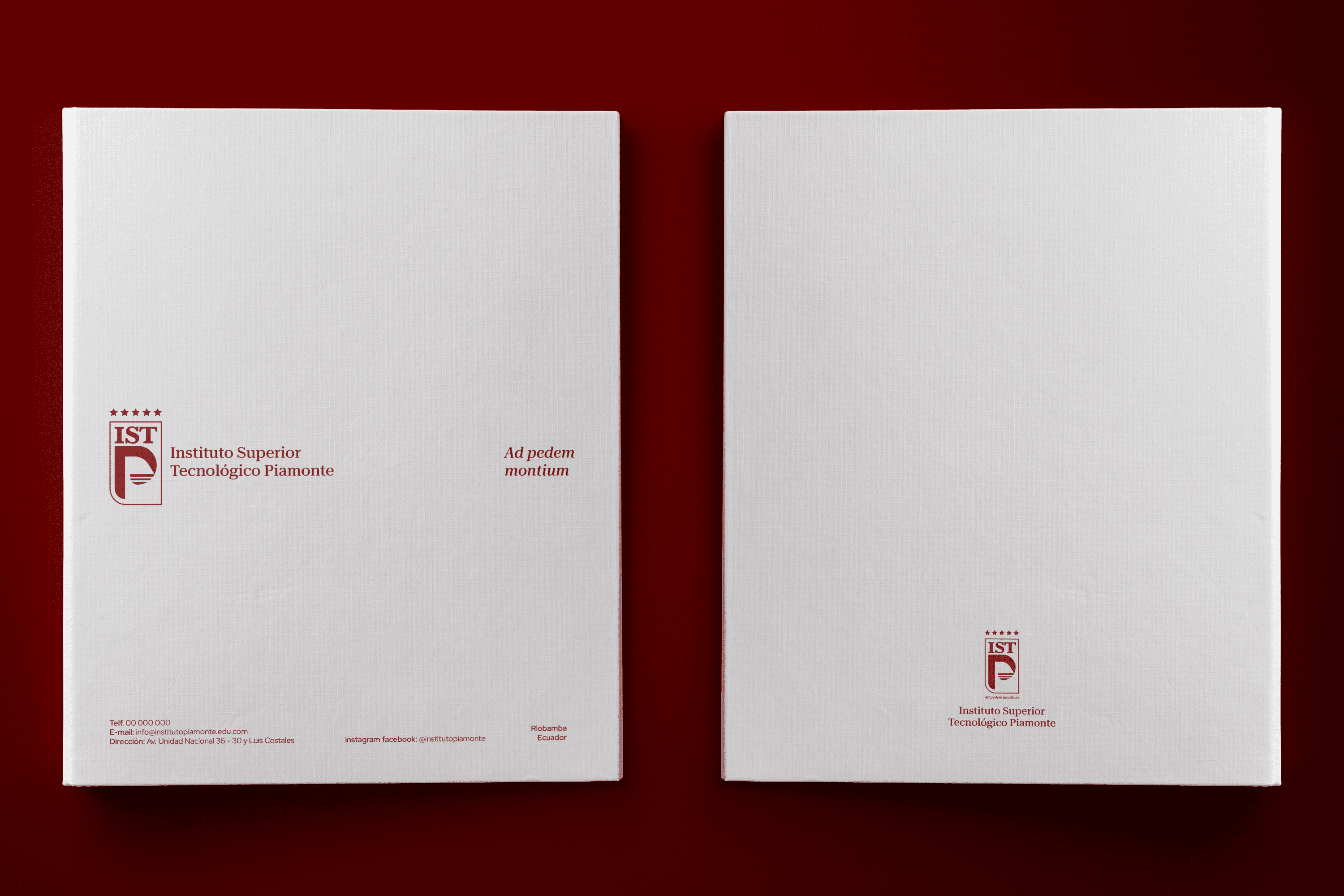
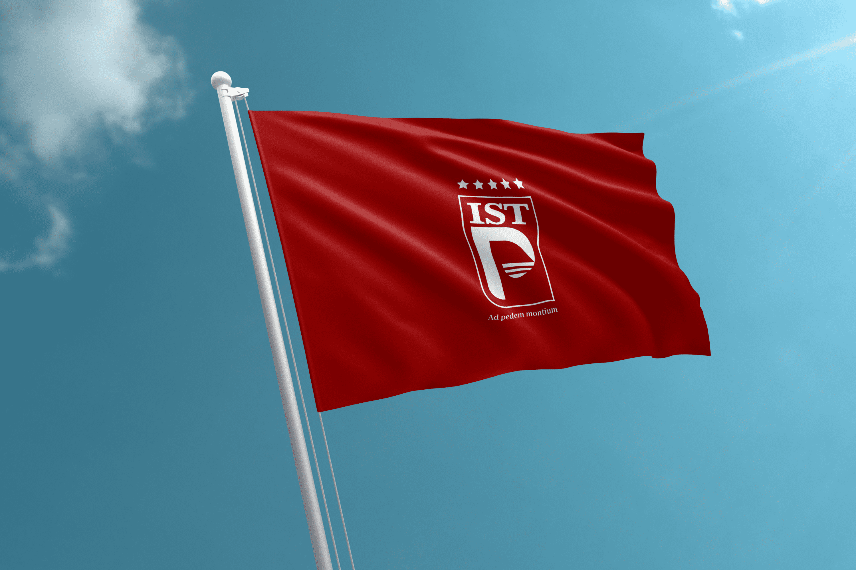
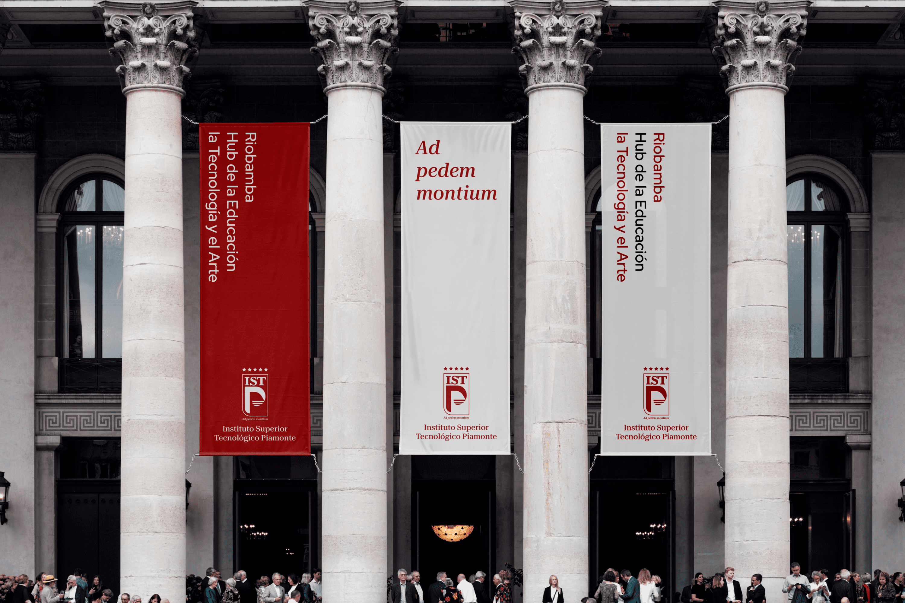
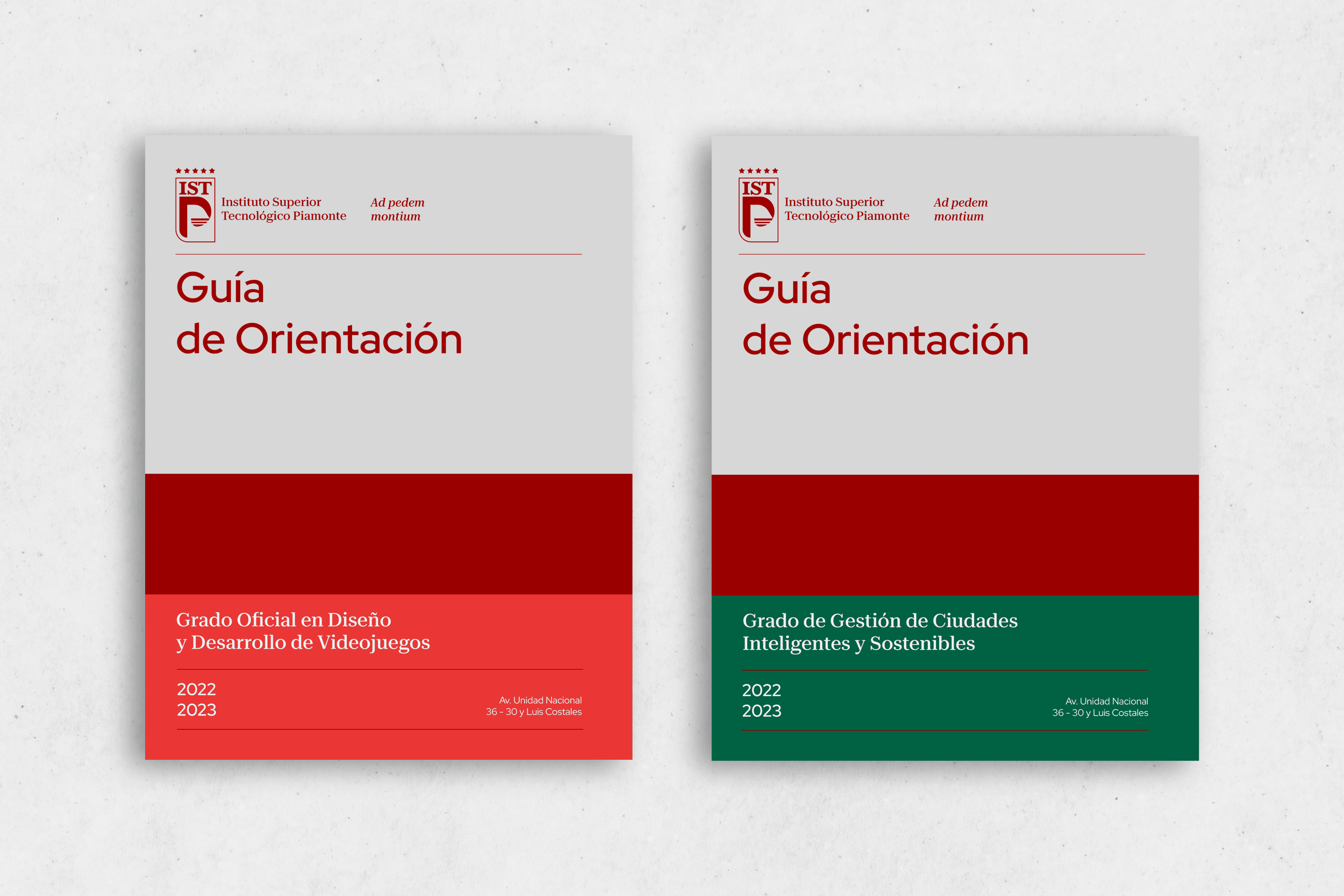
The logotype is a modern heraldic representation of a shield formed by the institute’s acronyms, where the letters IST were designed to reflect its experience through the finishing or serif. On the other hand, the counterform of the P represents a mountain whose base is three lines as a subjective representation of who starts the ascent to their goal. The number 3 was chosen because according to numerology it symbolizes expansion, agile mentality, sensitivity and talents present in every human being. All these elements are circumscribed within a rectangular area that defines the shield and at the top there are 5 stars as a symbol of quality.
At the bottom, we find the meaning of Piamonte, At the foot of the mountain or in Latin “Ad pedem montium”.


 Facebook