Terrenal Resto Bar
BRANDING | ILLUSTRATION

The Client

Terrenal is a Resto-Bar located in Riobamba, Ecuador that draws inspiration from the Andean Paramo for its concept.


Keywords

Branding / Design / Naming / Restaurant / Bar / Paramo / Andean
The Objective

Design the Naming and Branding for a Resto Bar with the concept of the Andean Paramo.


The Solution

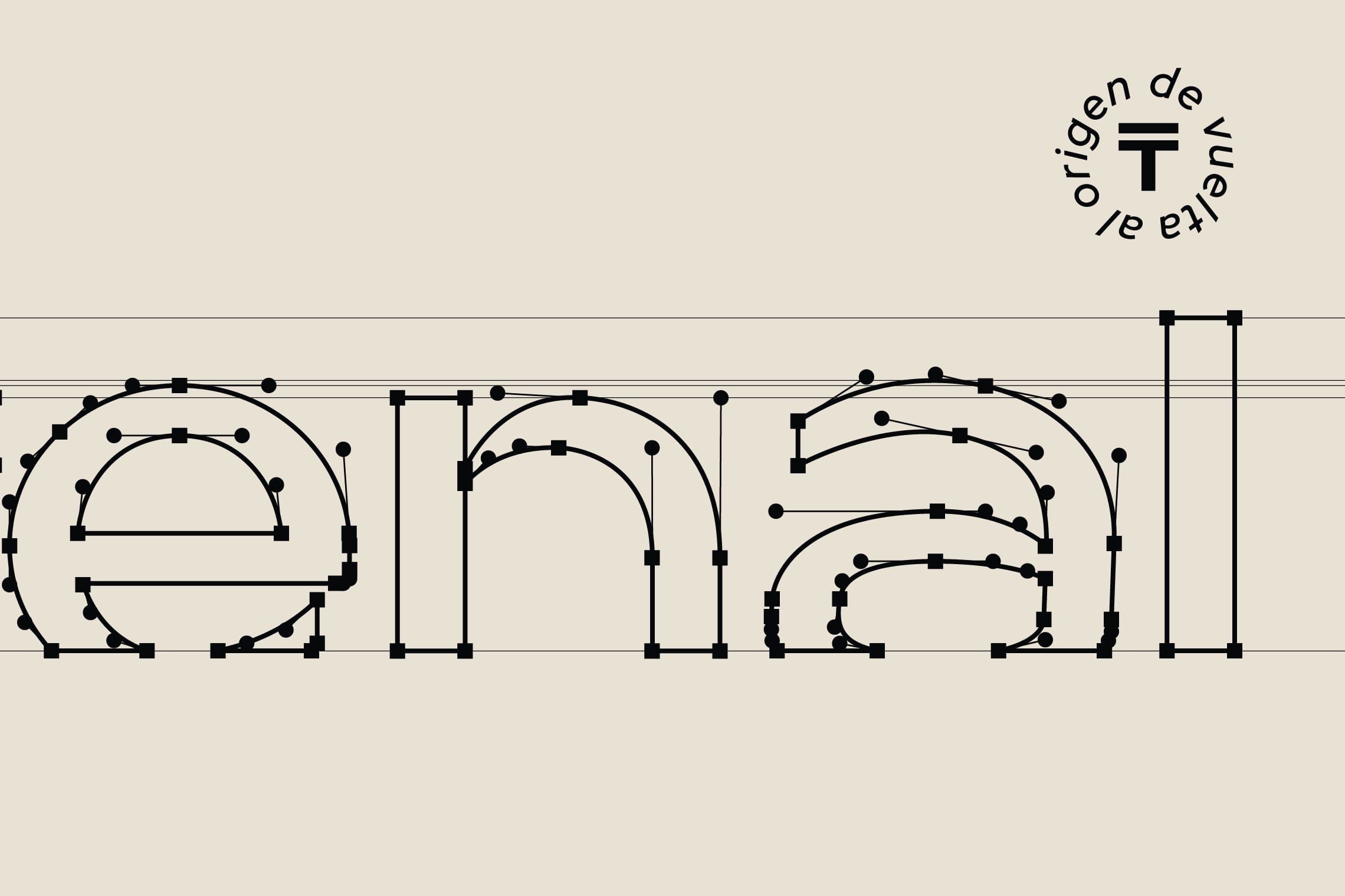
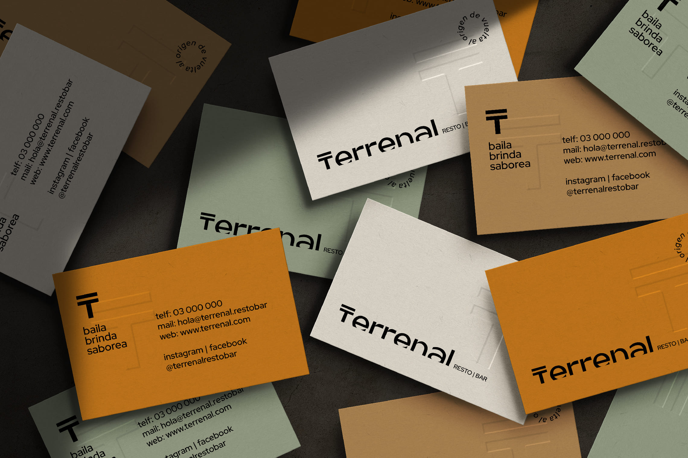
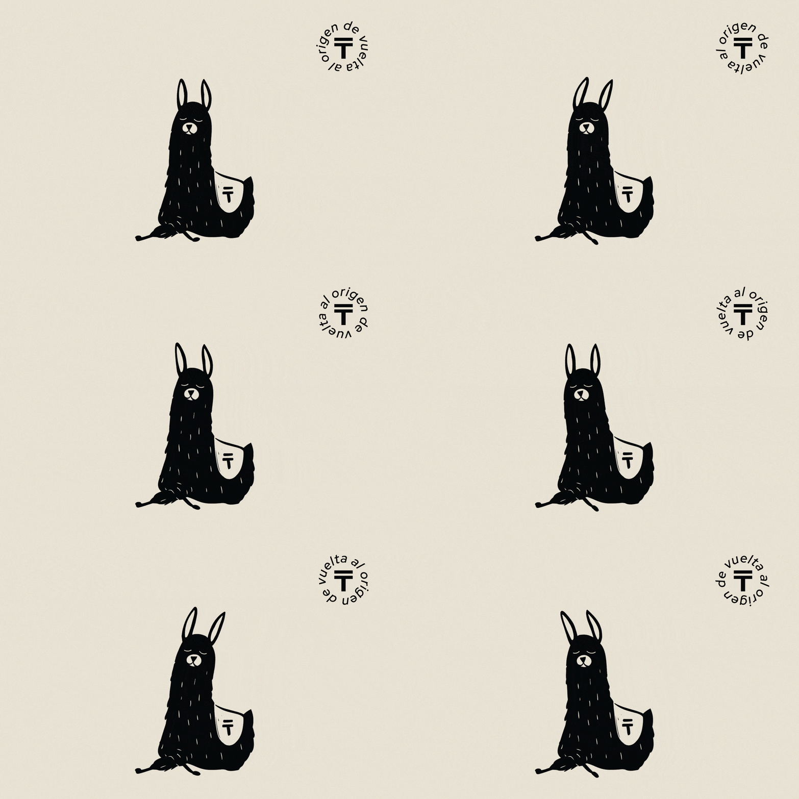
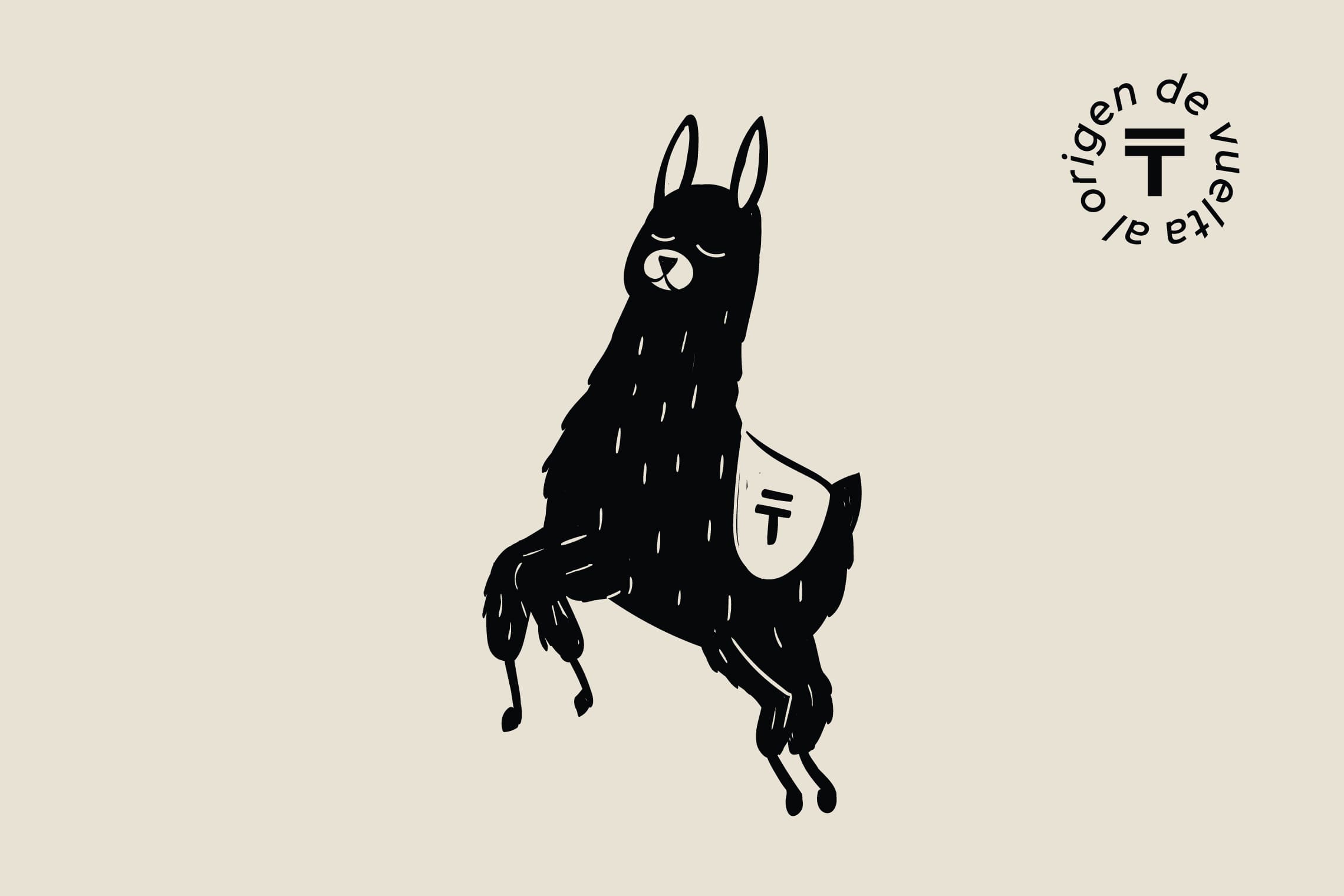
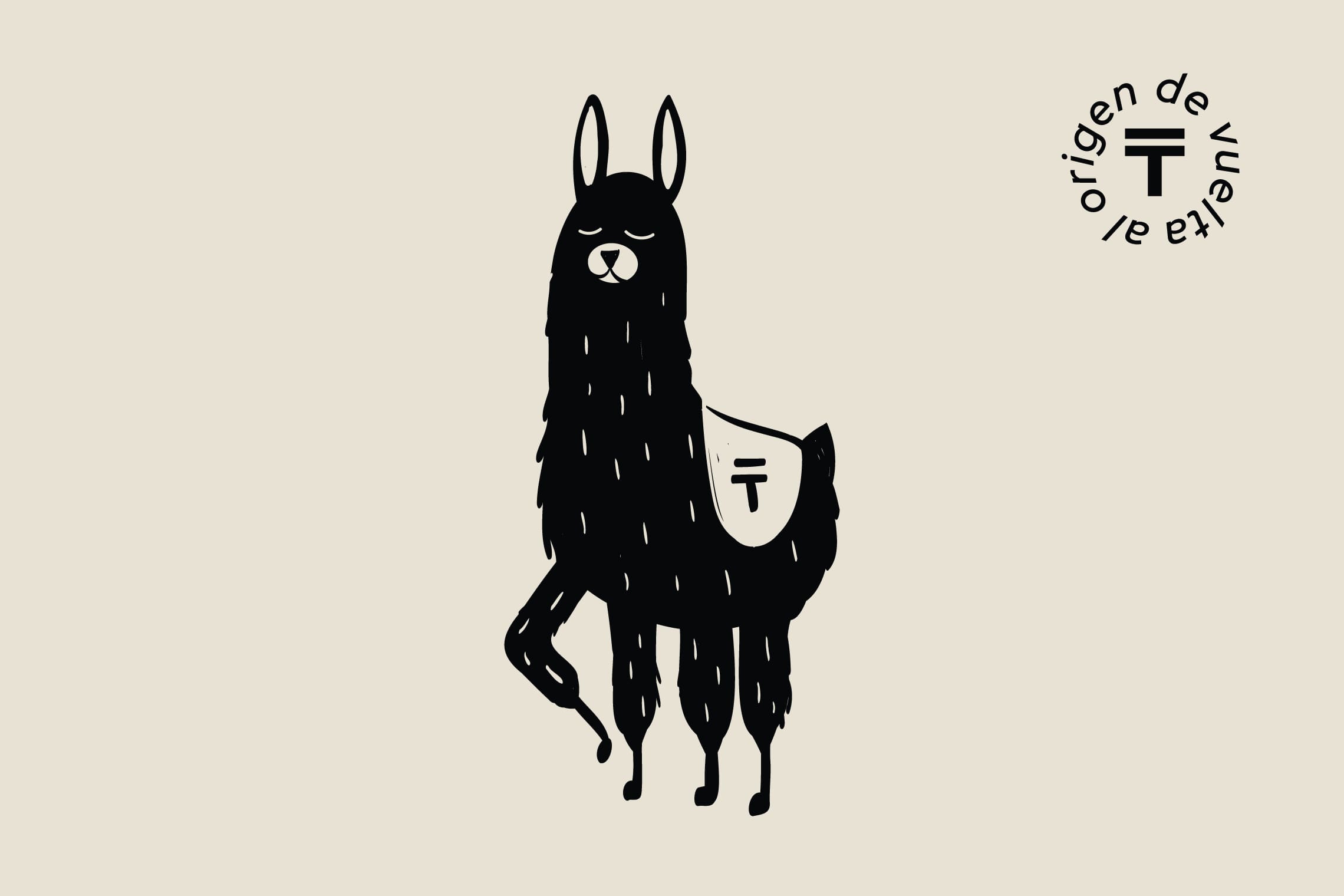
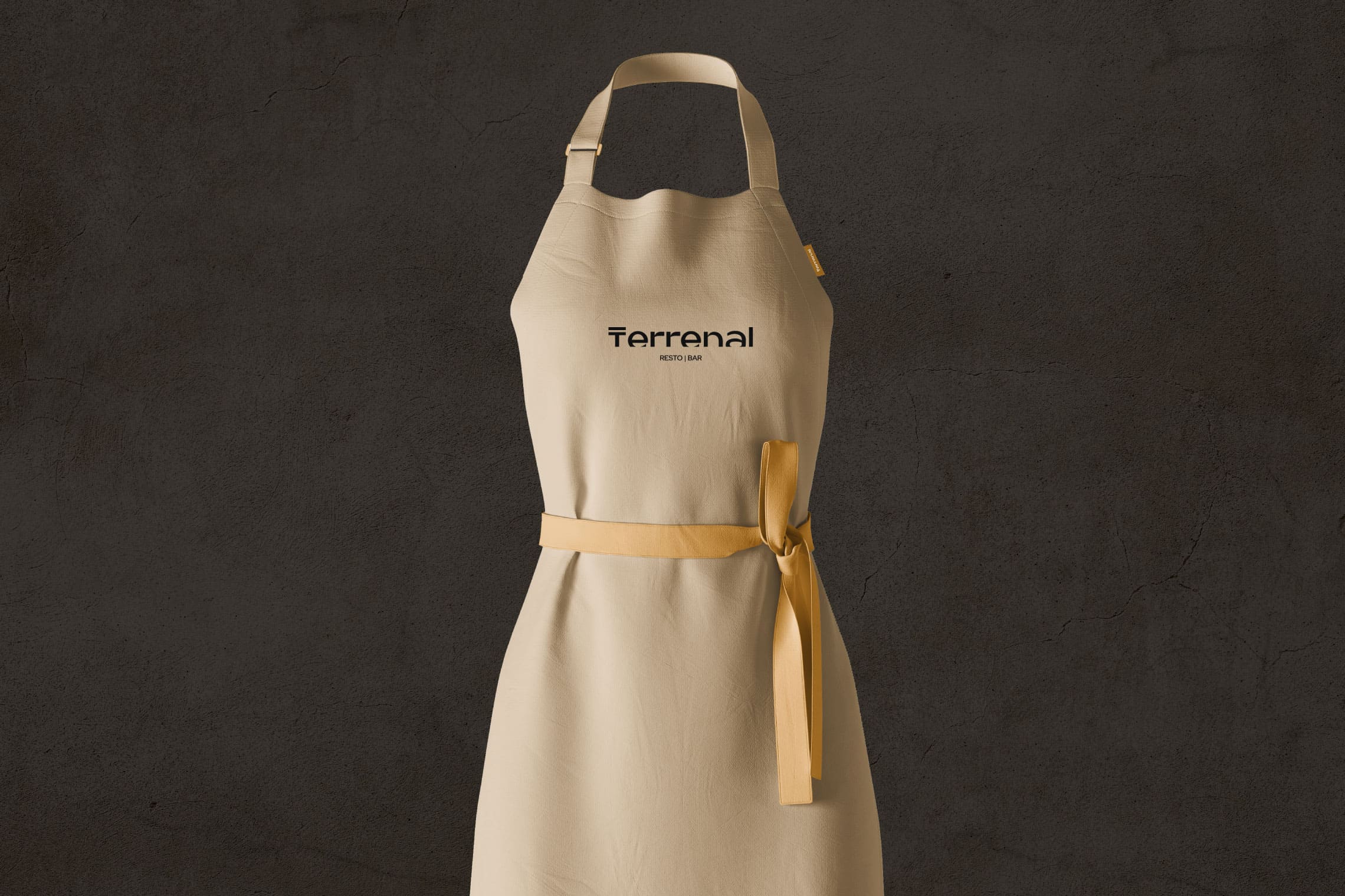
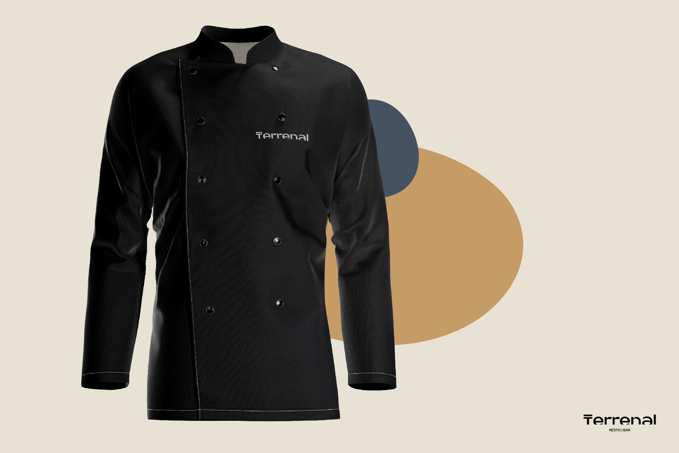
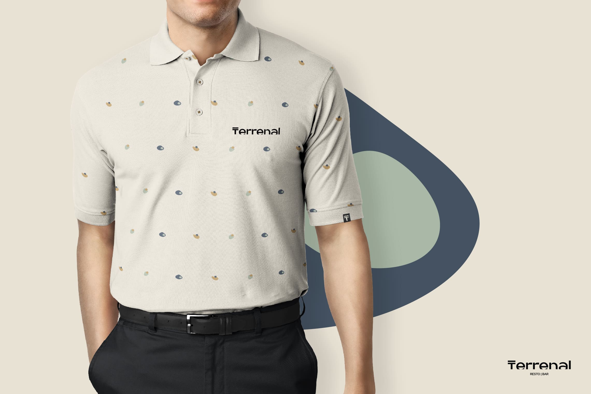
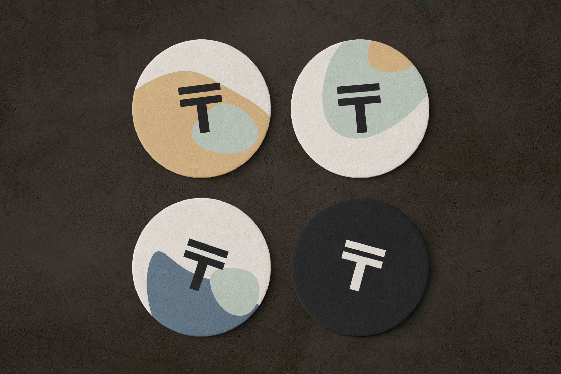
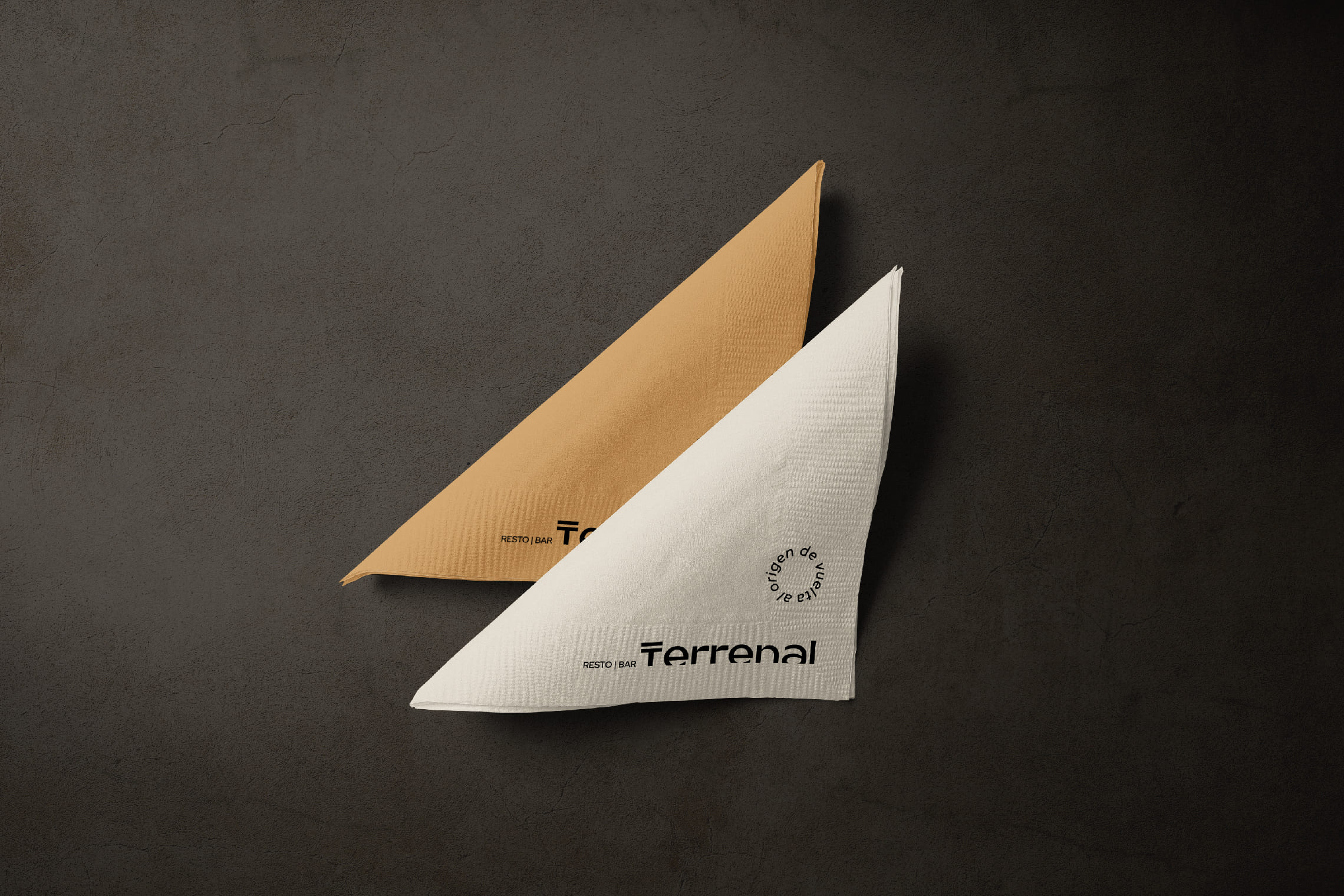
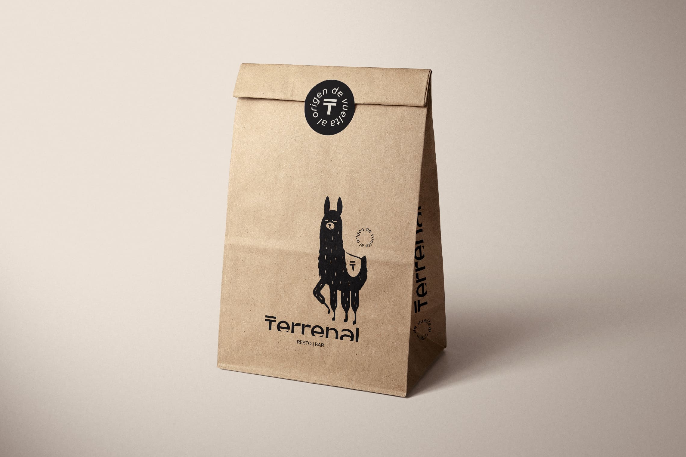
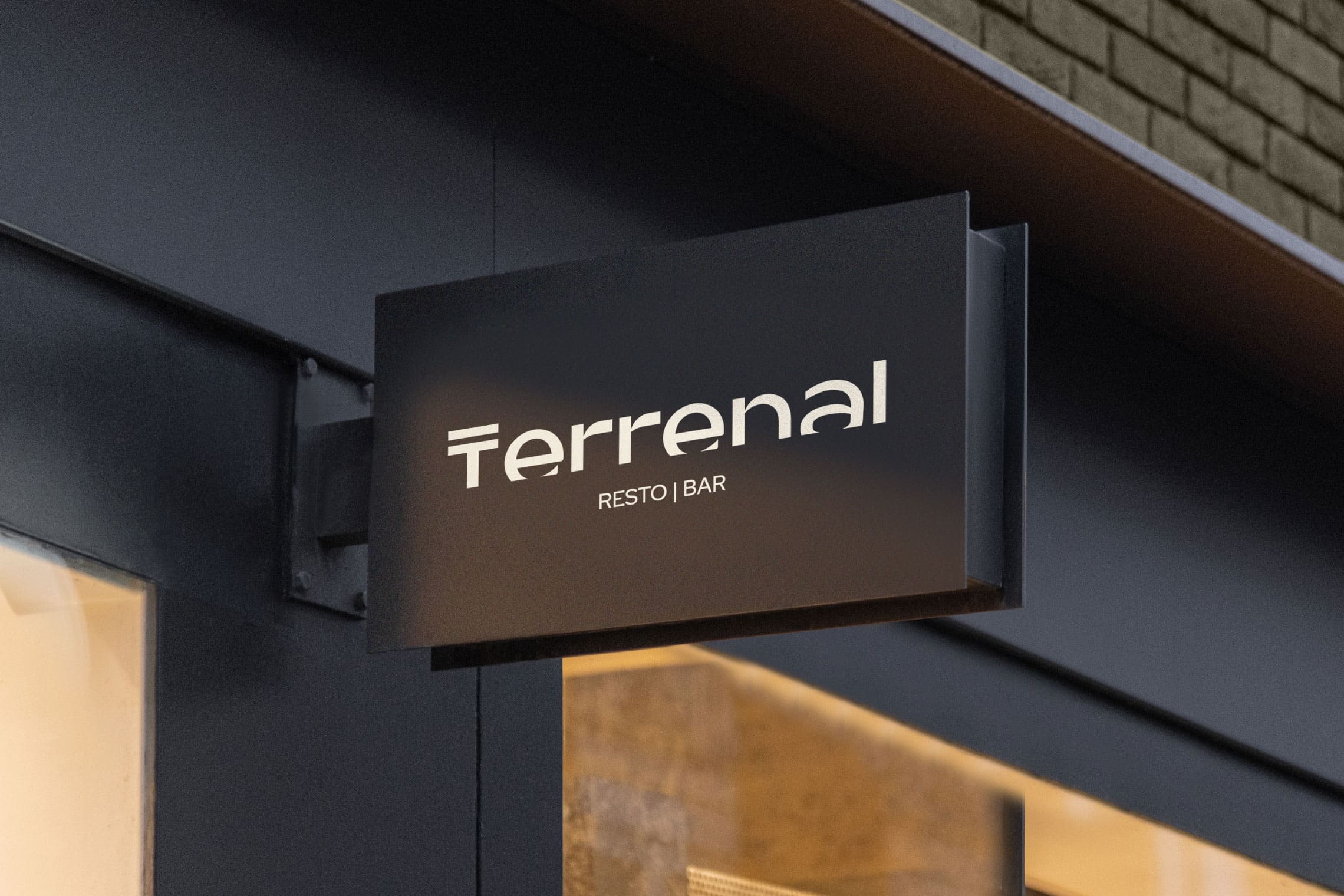
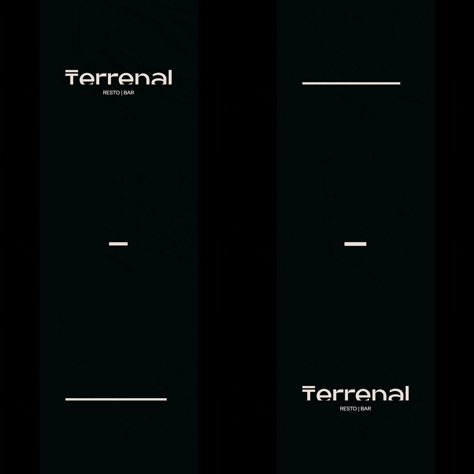
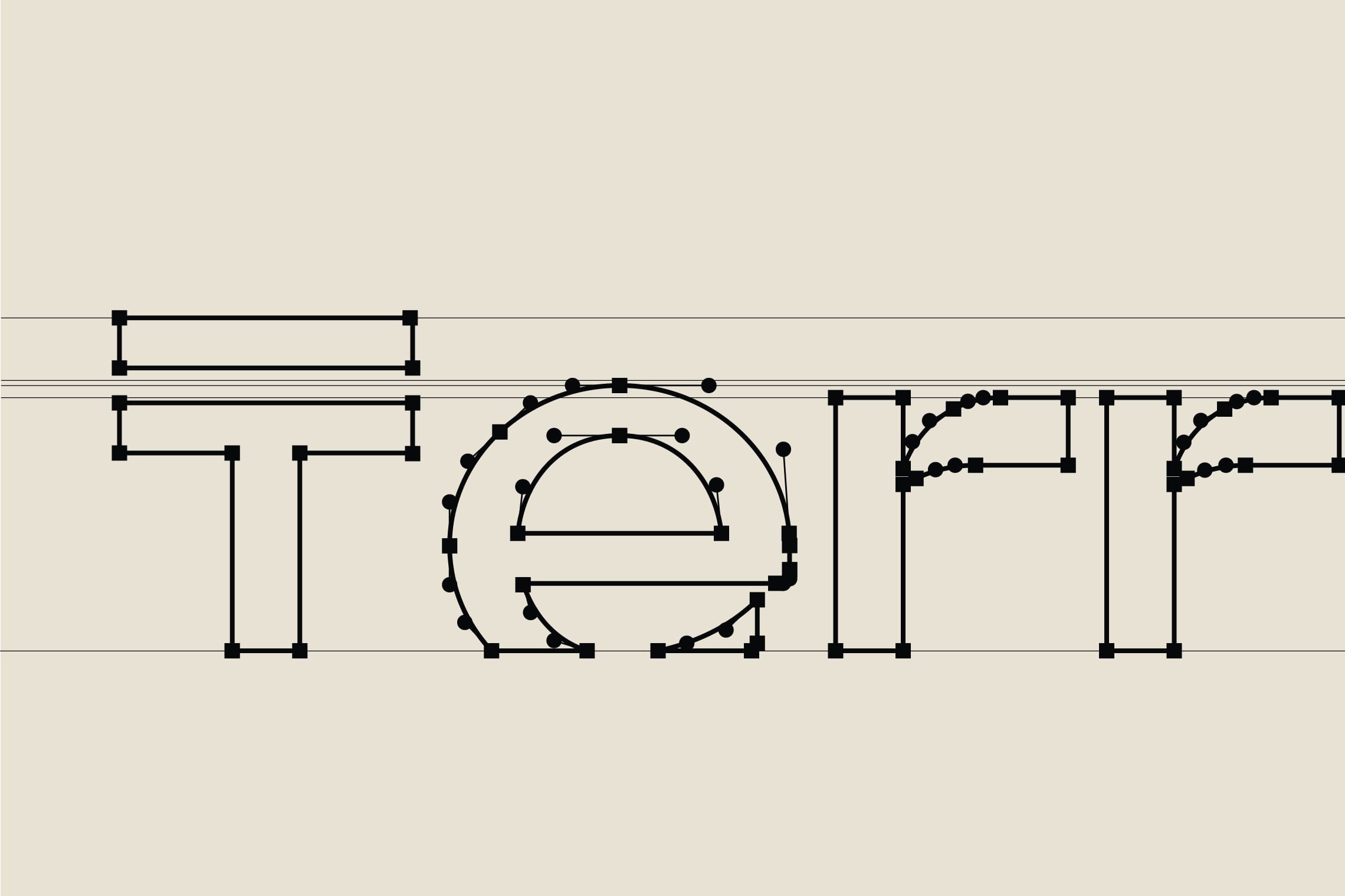
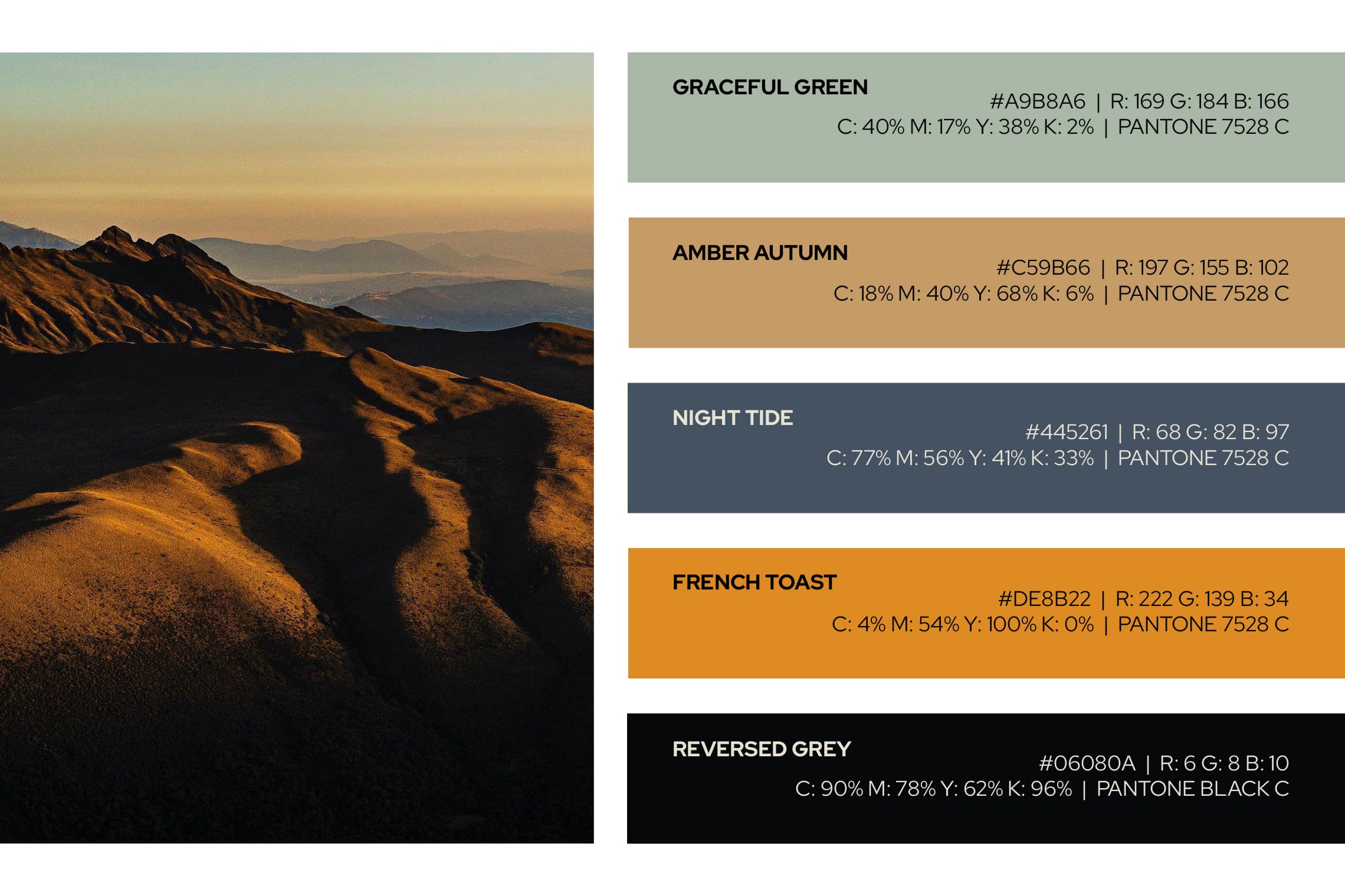
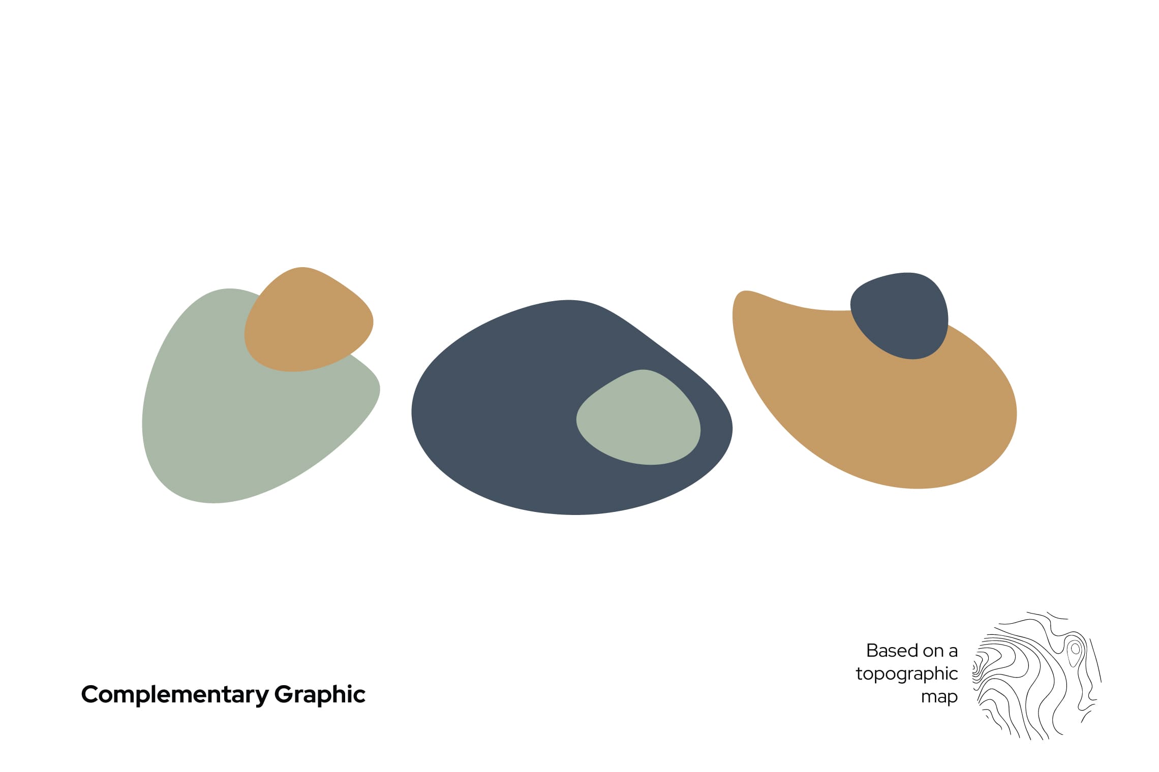
For the name design, we have chosen “Terrenal” for its literal meaning: of earthly and material things, in opposition to the celestial or spiritual, or related to them; this definition favors the experience of traversing the paramo both in its light and in its darkness. The typography designed for this project is a modern sans -serif typeface, with a top line in the letter “T” that leaves everything earthly below it; the concept is strengthened by stopping the letters in time, at a point of sunrise or sunset represented by a cut in the bottom part, evoking the horizon. This project features the colors of the paramo and a unique character native to the paramo to strengthen brand recognition and essence.
Suggested Projects
Simples Finanzas
Extreme Max
Educar com Evidências
Simples Finanzas
BRANDING

The Client

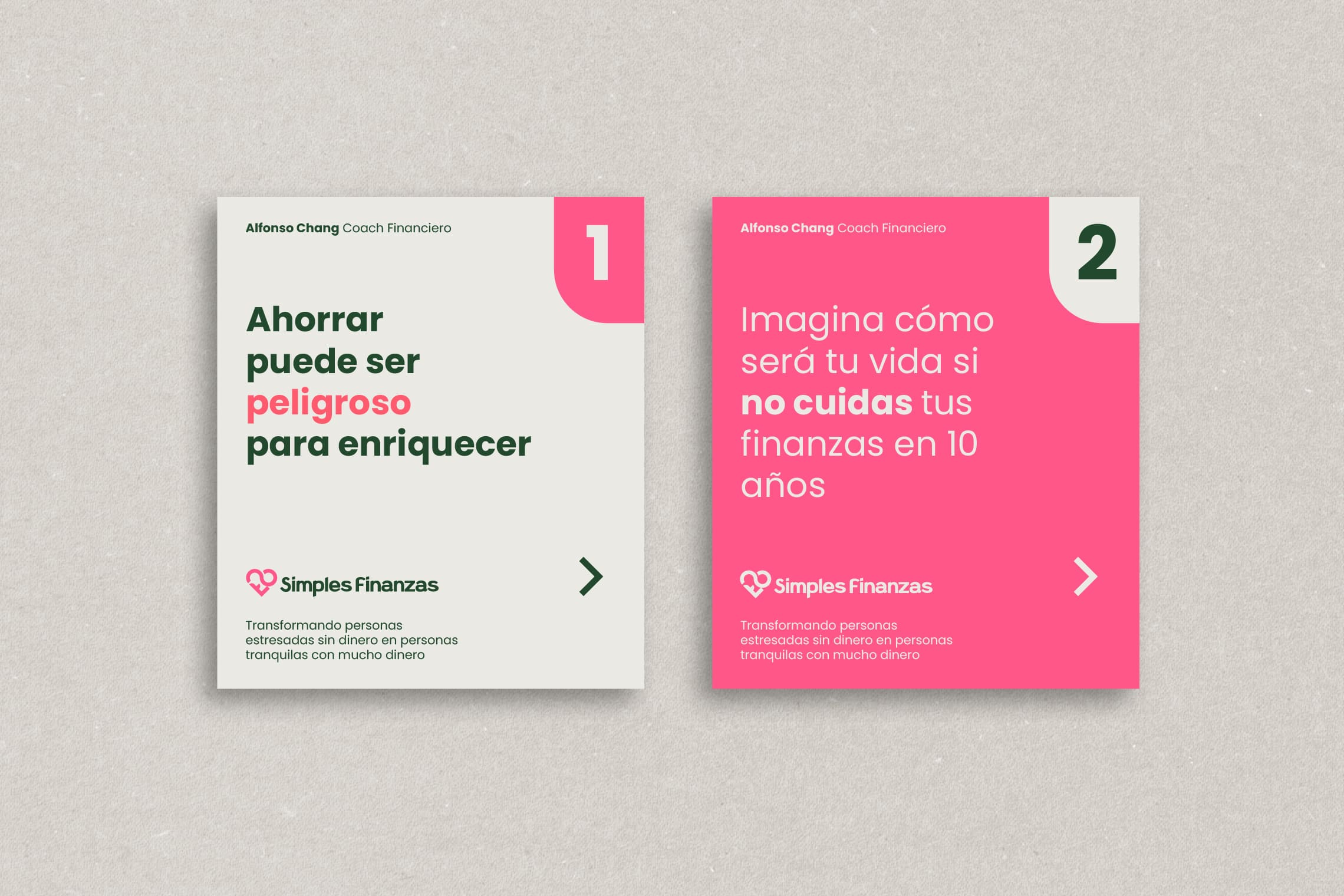
Simple Finances is a financial education program in Mexicali, Mexico, that aims to create wealth, reduce stress, and provide financial control.


Keywords

Branding / Design / Education / Personal Finance

The Objective

Design a brand that represents my ideal of ‘the revolution of love through financial education’ Alfonso Chang Coach


The Solution

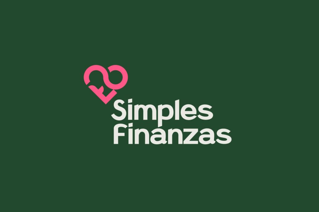
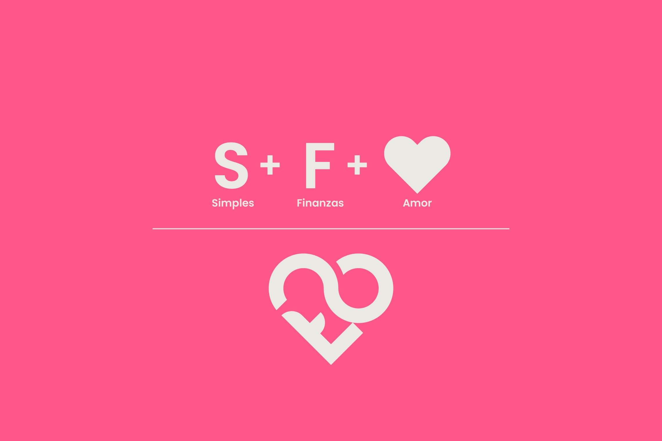
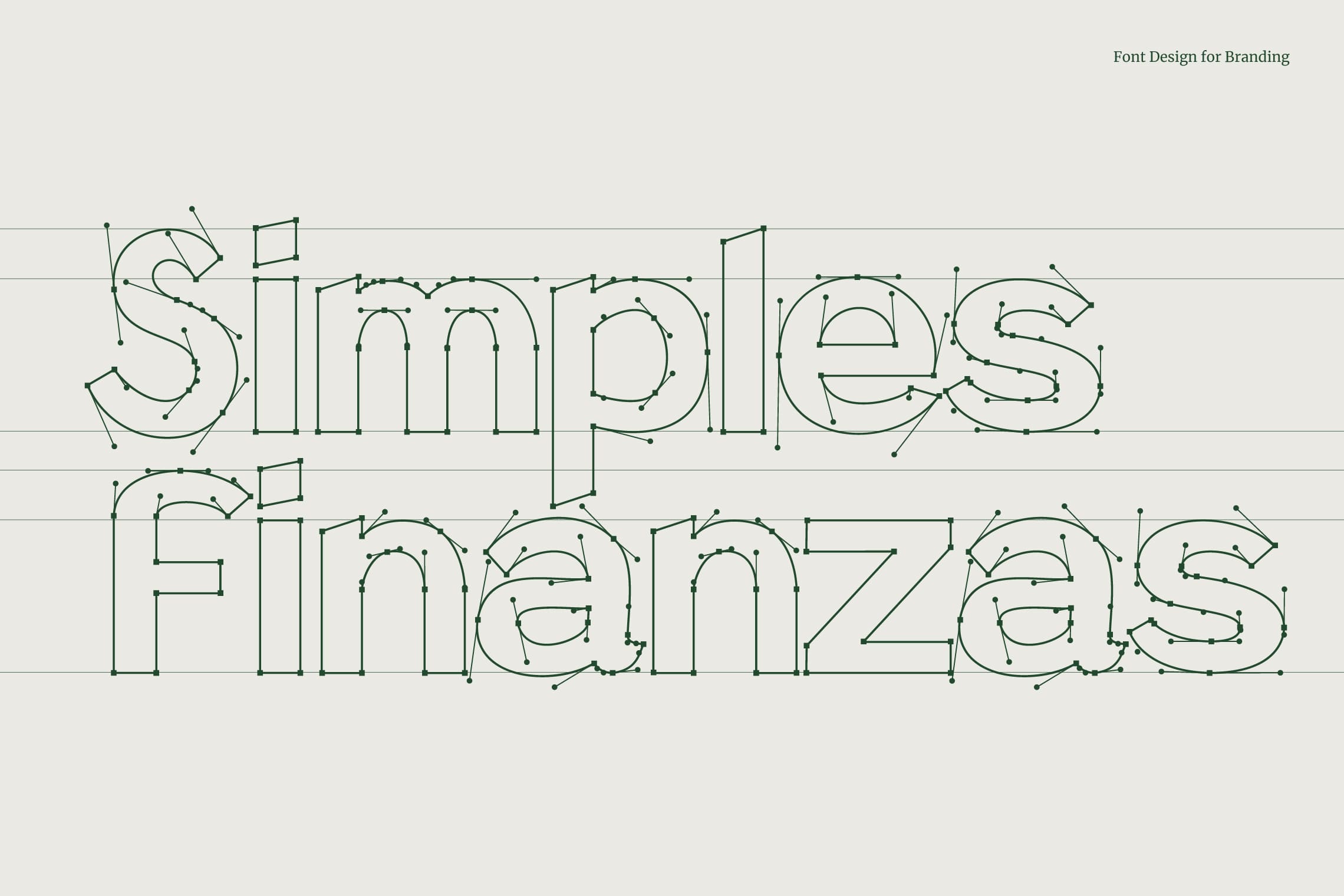
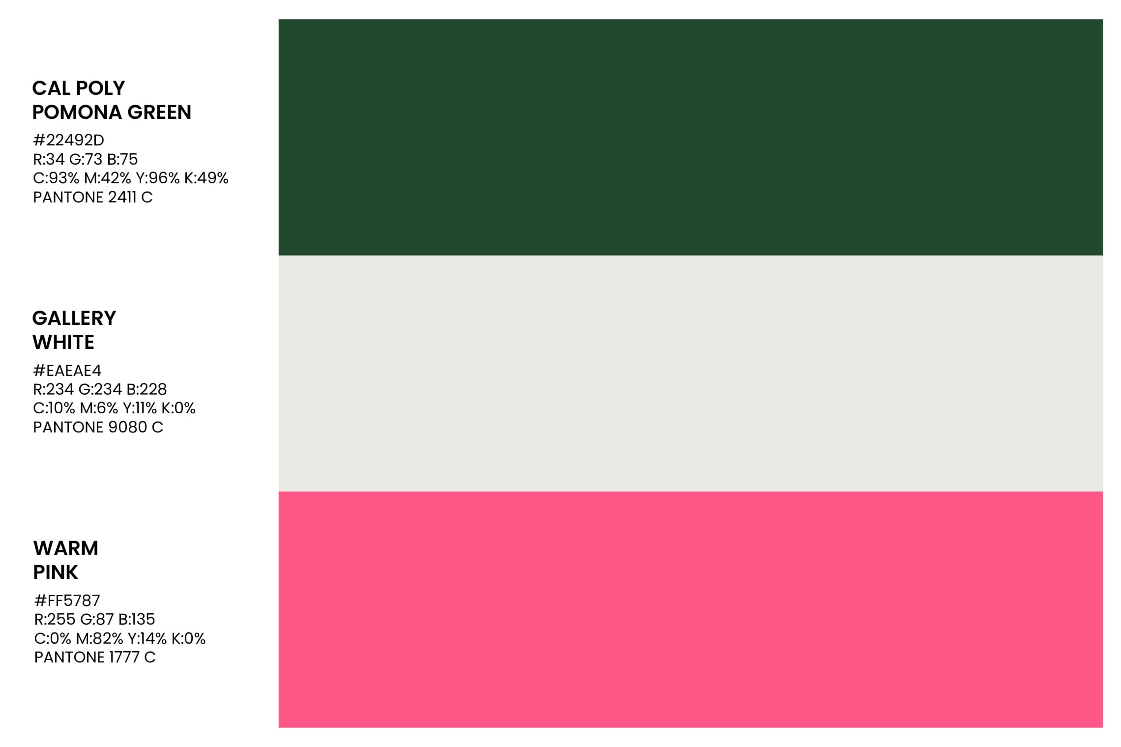
We designed an isologo formed by the S + F that represents a heart, based on the essence of ‘the revolution of love through financial education’. To complement it, we developed a Sans Serif typography with a modern personality and a reliable structure. The chosen colors reinforce the concept of wealth and balance through the use of green, while pink adds positivity and modernity to the whole.
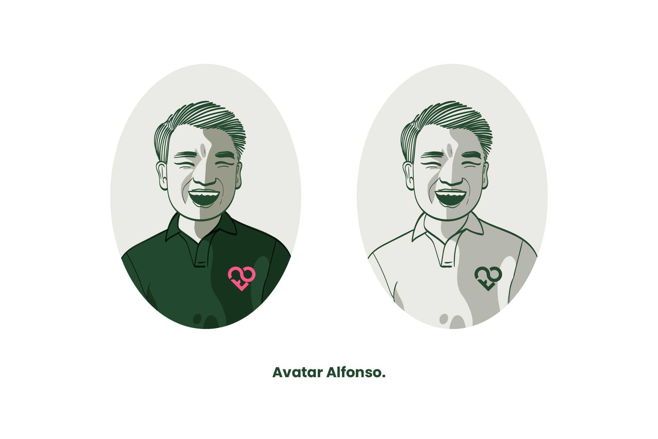
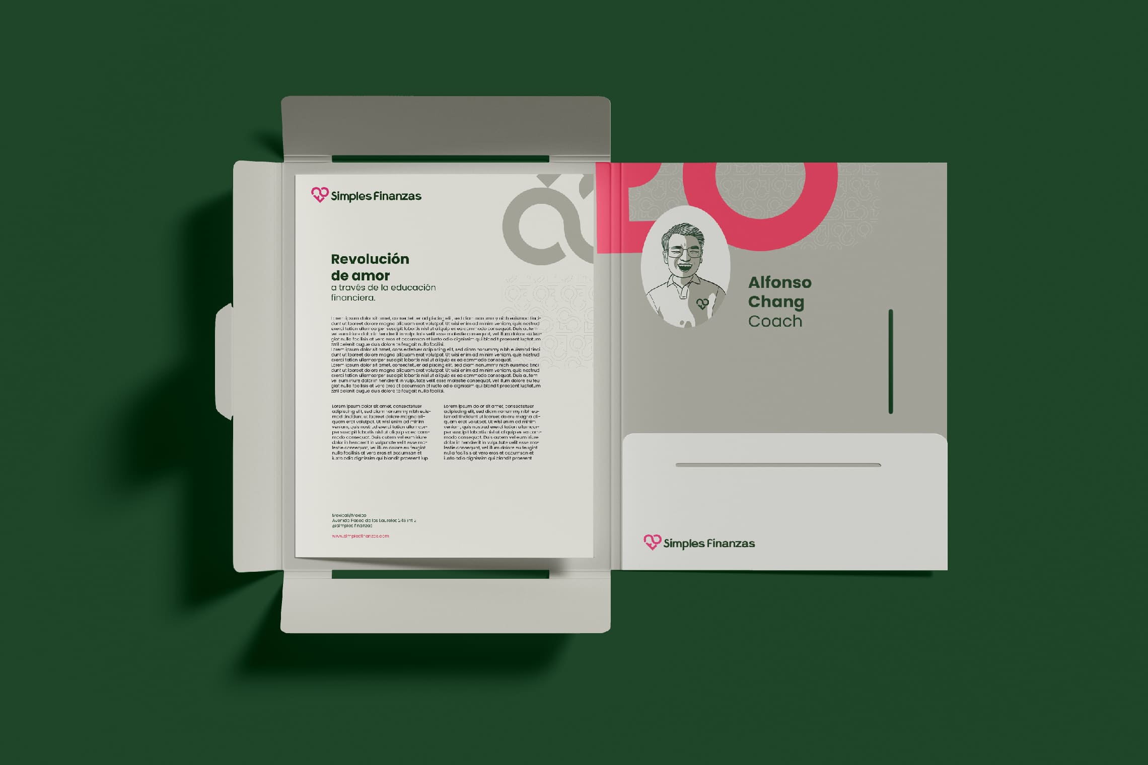
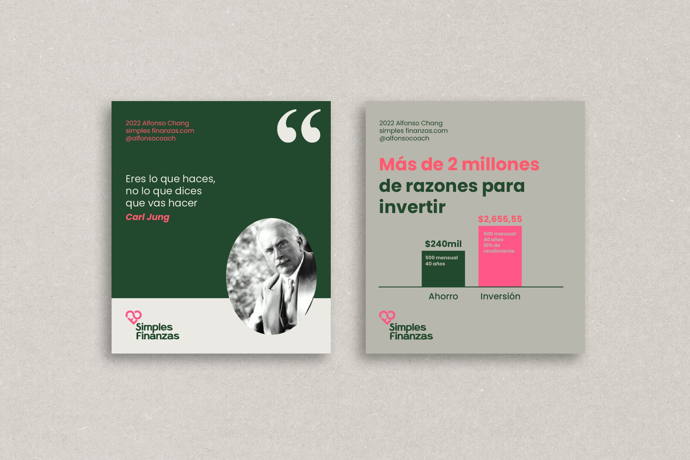
In addition, Alfonso’s avatar has been illustrated to allow for greater closeness with his students, and basic graphic elements and guidelines have also been established for his Instagram account.

Suggested Projects
Extreme Max
Educar com Evidências
SCIO Education Center
Extreme Max
BRANDING

The Client

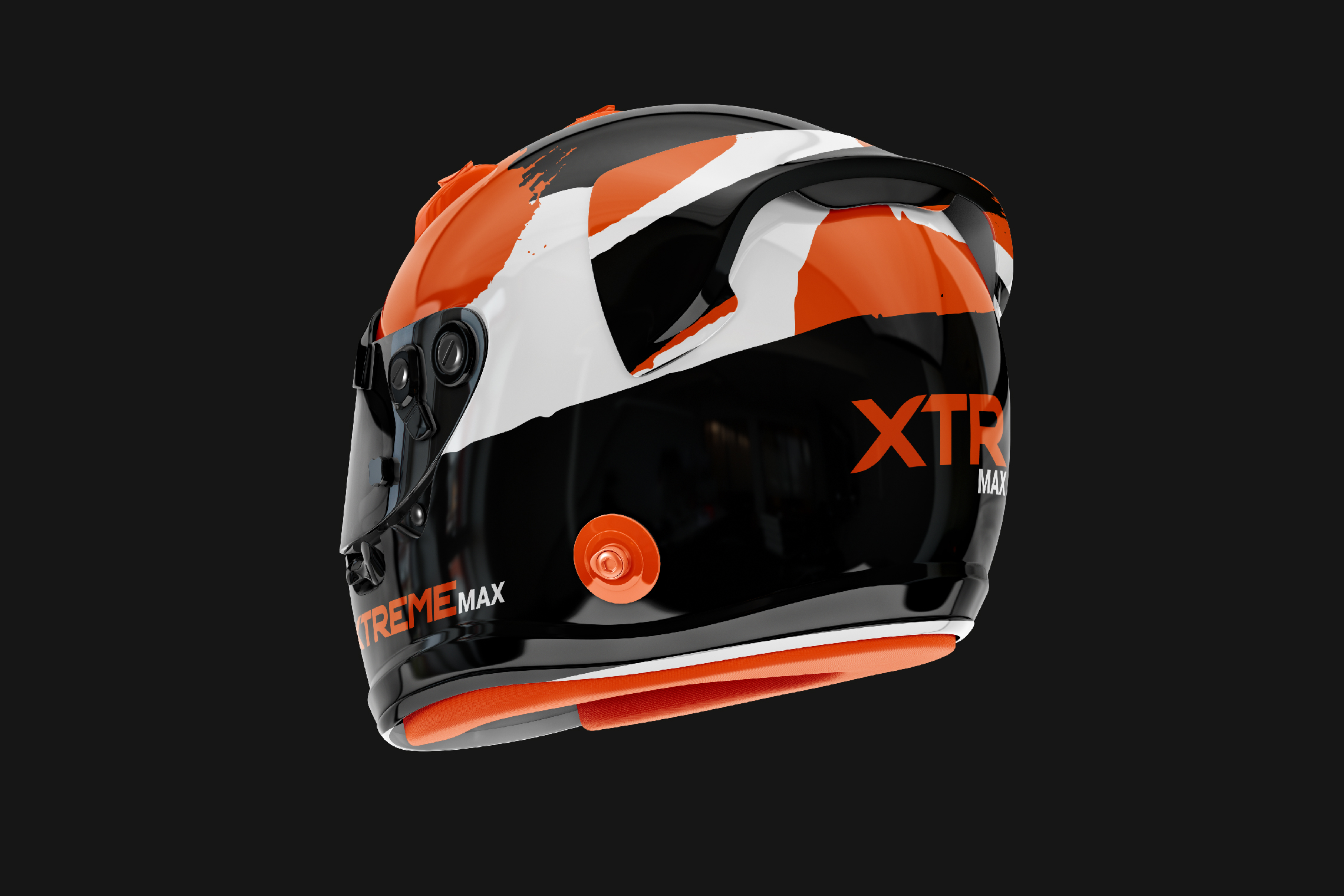
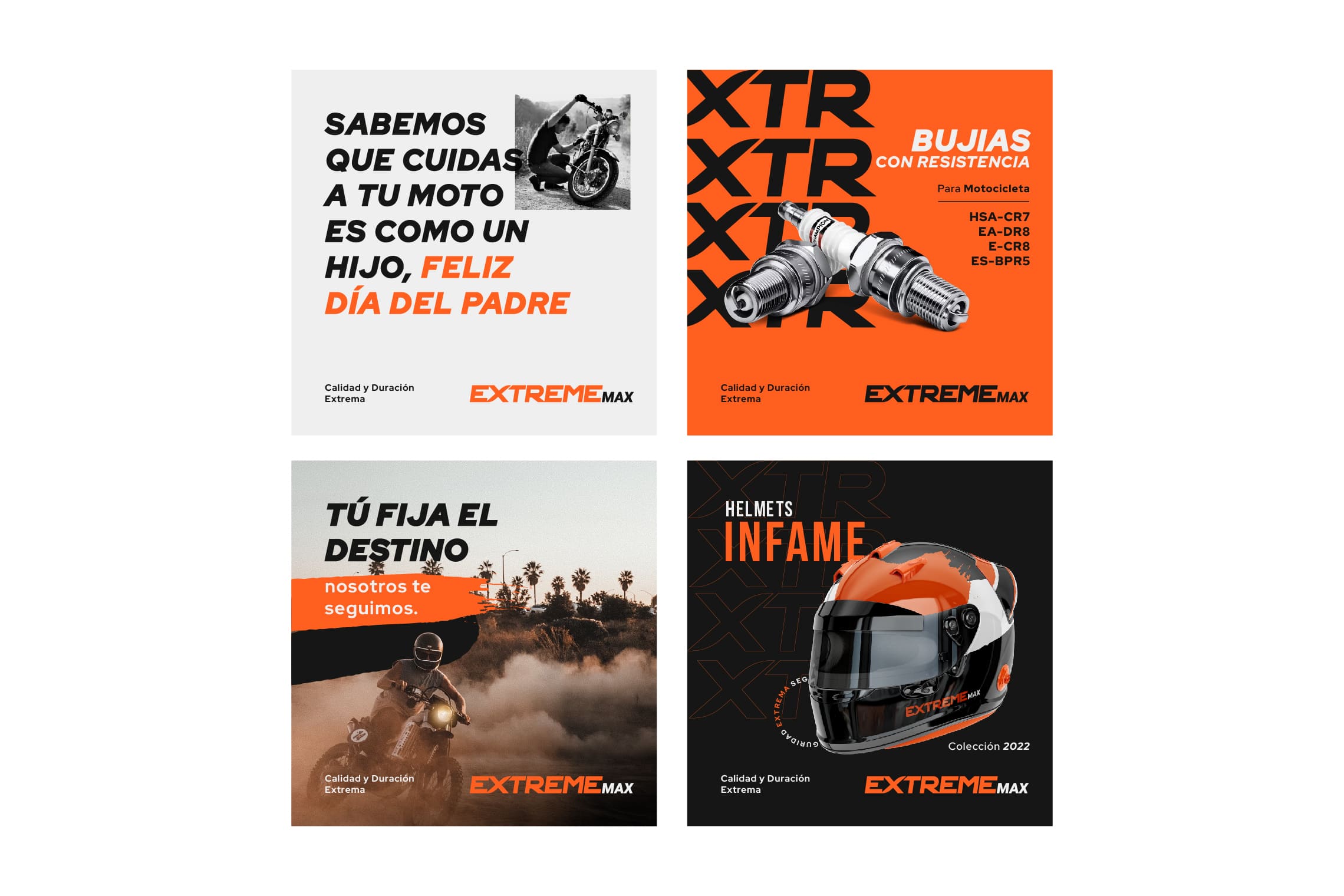
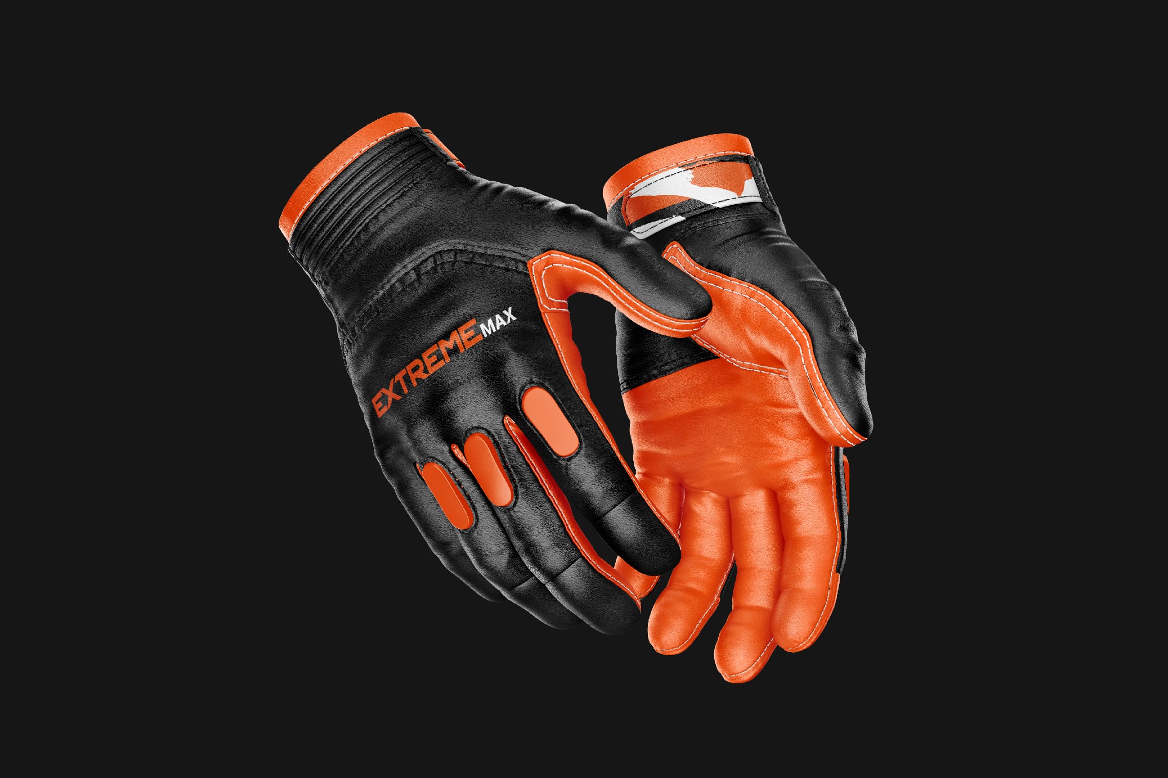
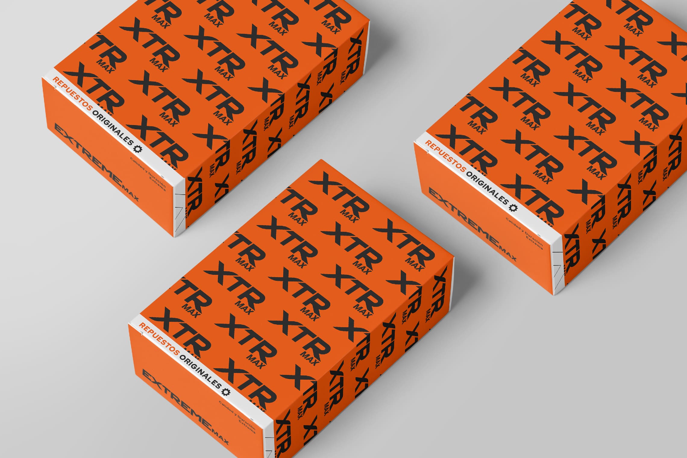
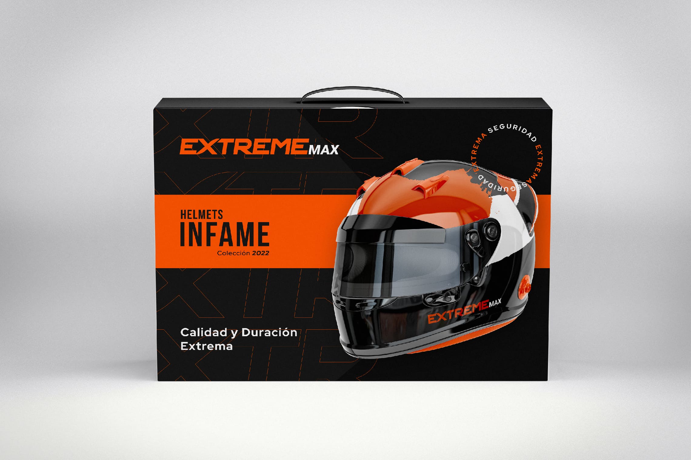
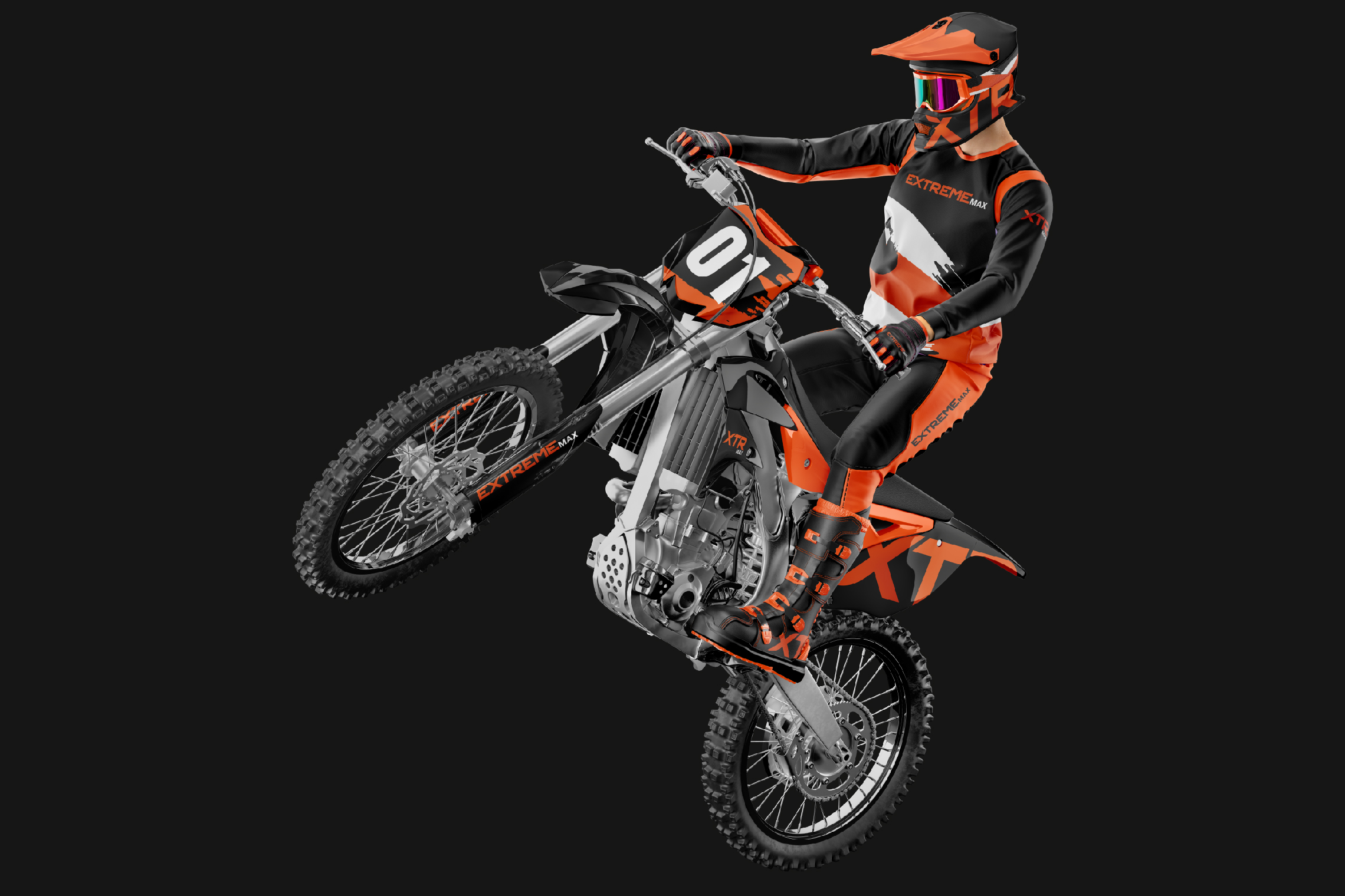
Extreme Max is a company specialized in motorcycle parts and accessories located in Latacunga, Ecuador.


Keywords

Branding / Design / Motorcycles / Distributor

The Objective

We need a brand with a strong and professional spirit that conveys a lot of energy when seen.


The Solution

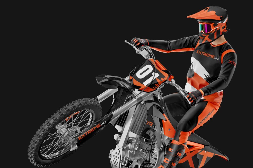
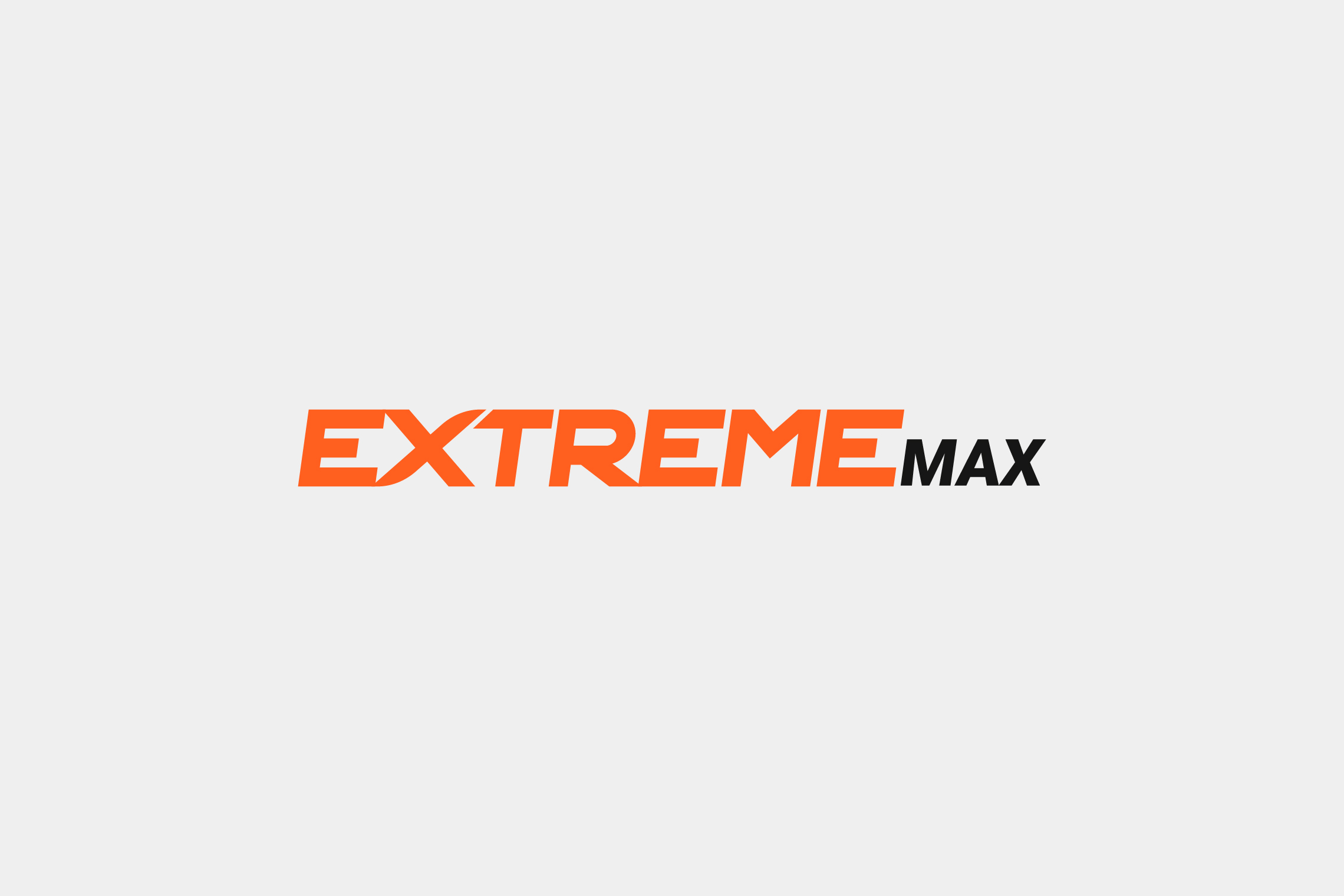
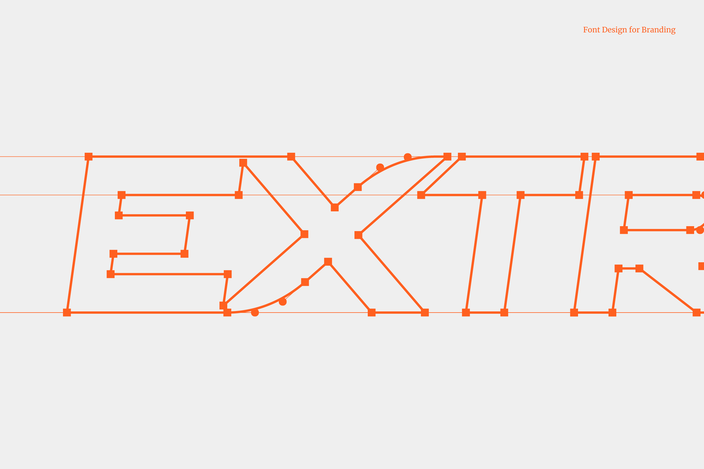
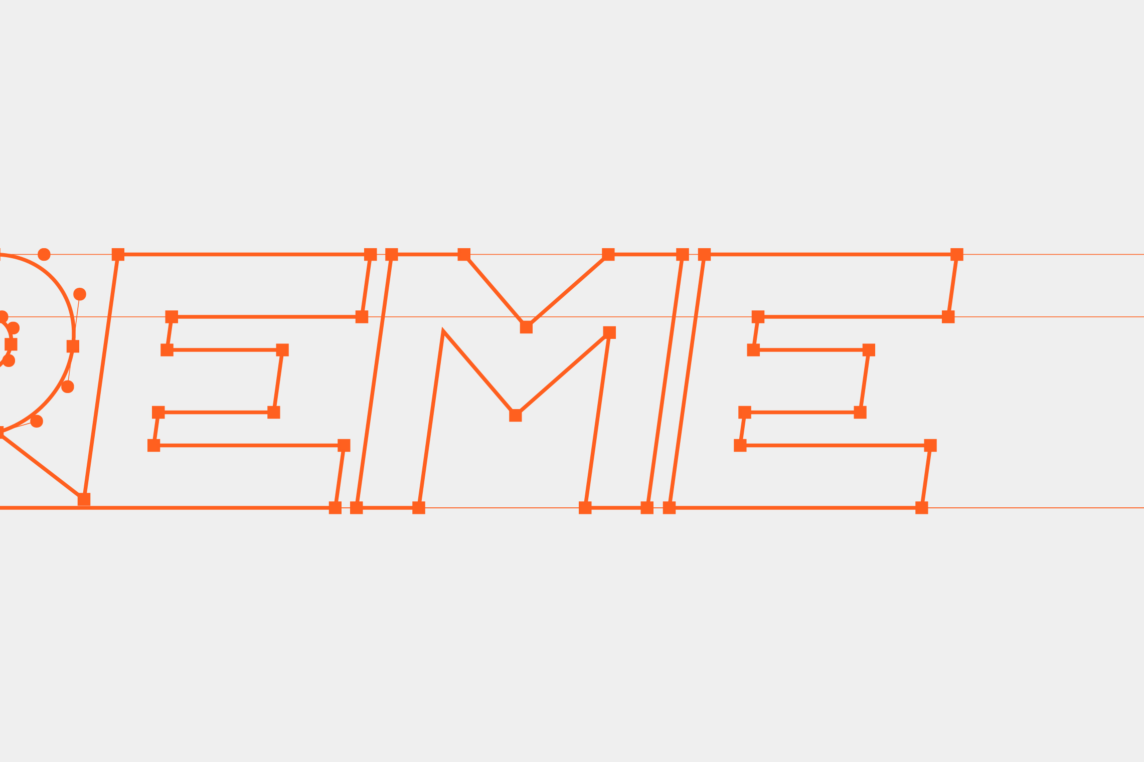
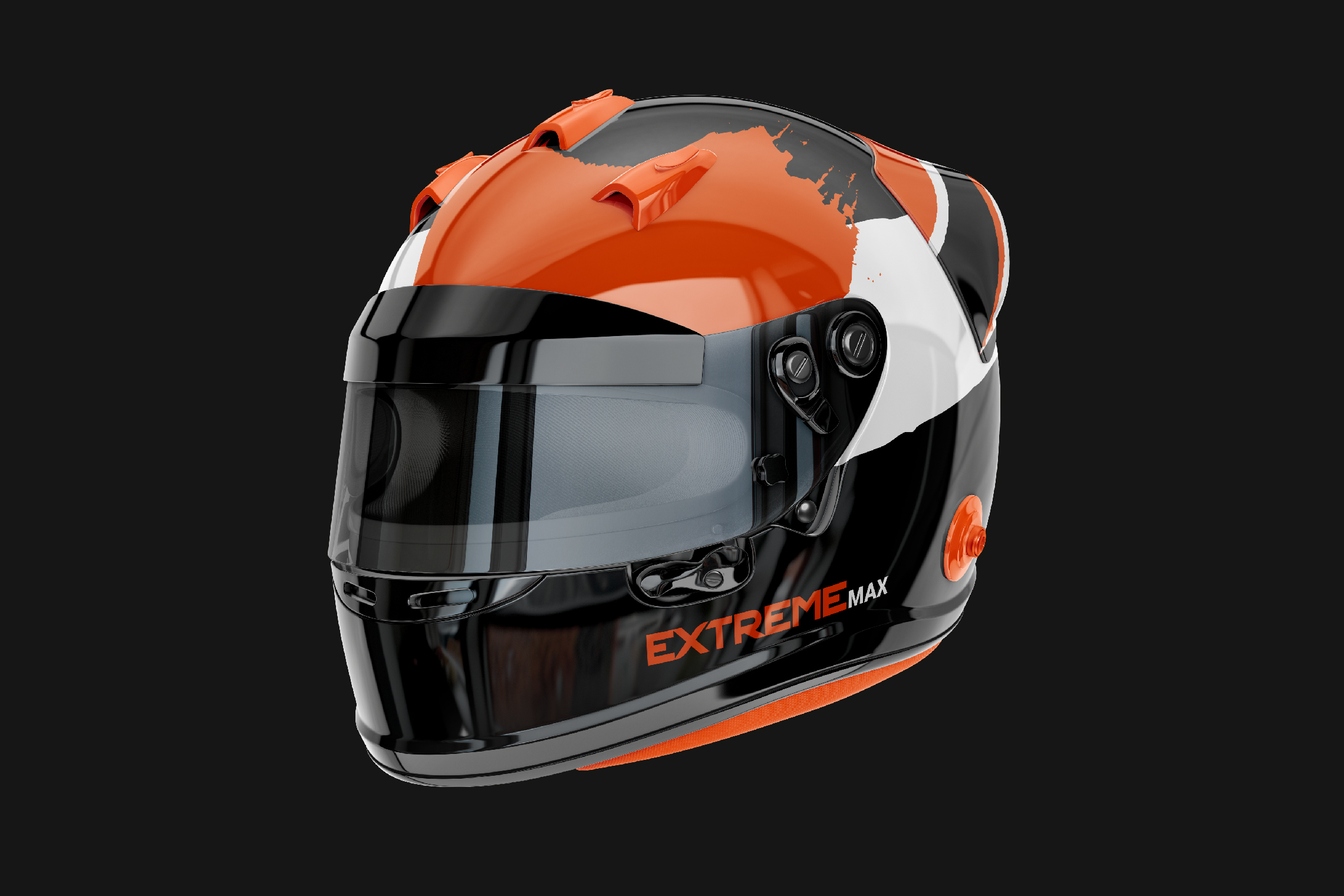
For this rebranding, we developed strong and energetic elements through form and color. The typography designed for Extreme Max is a bold sans-serif typeface that conveys forward motion through its inclination and the internal arrow formed between the E and the X.

Suggested Projects
Educar com Evidências
SCIO Education Center
Piamonte Higher Technical Institute
Educar com Evidências
BRANDING

The Client

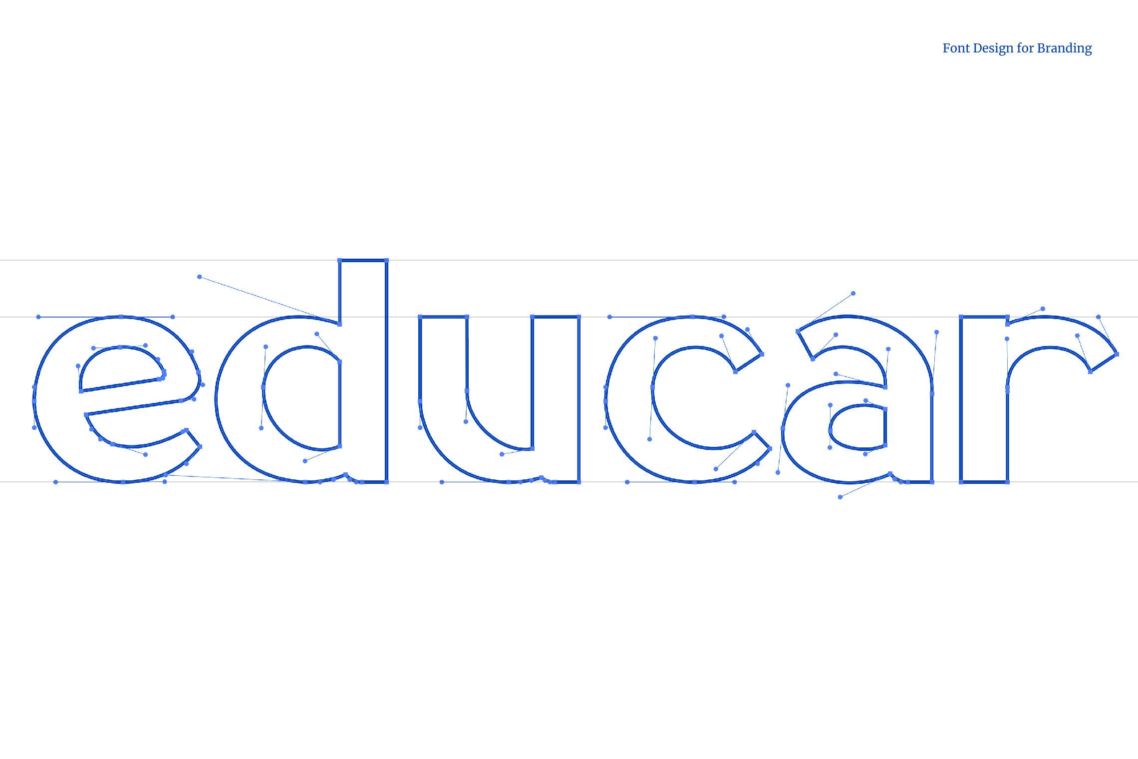
“Educar com Evidências” is an educational program in São Paulo, Brazil that focuses on the connection between science and education to achieve transformative learning.


Keywords

Branding / Design / Education / Academy

The Objective

To design a brand for our company that represents education and neuroscience, it is important to highlight the affective, cognitive, and social aspects of learning, as well as the values that make transformative education possible.


The Solution

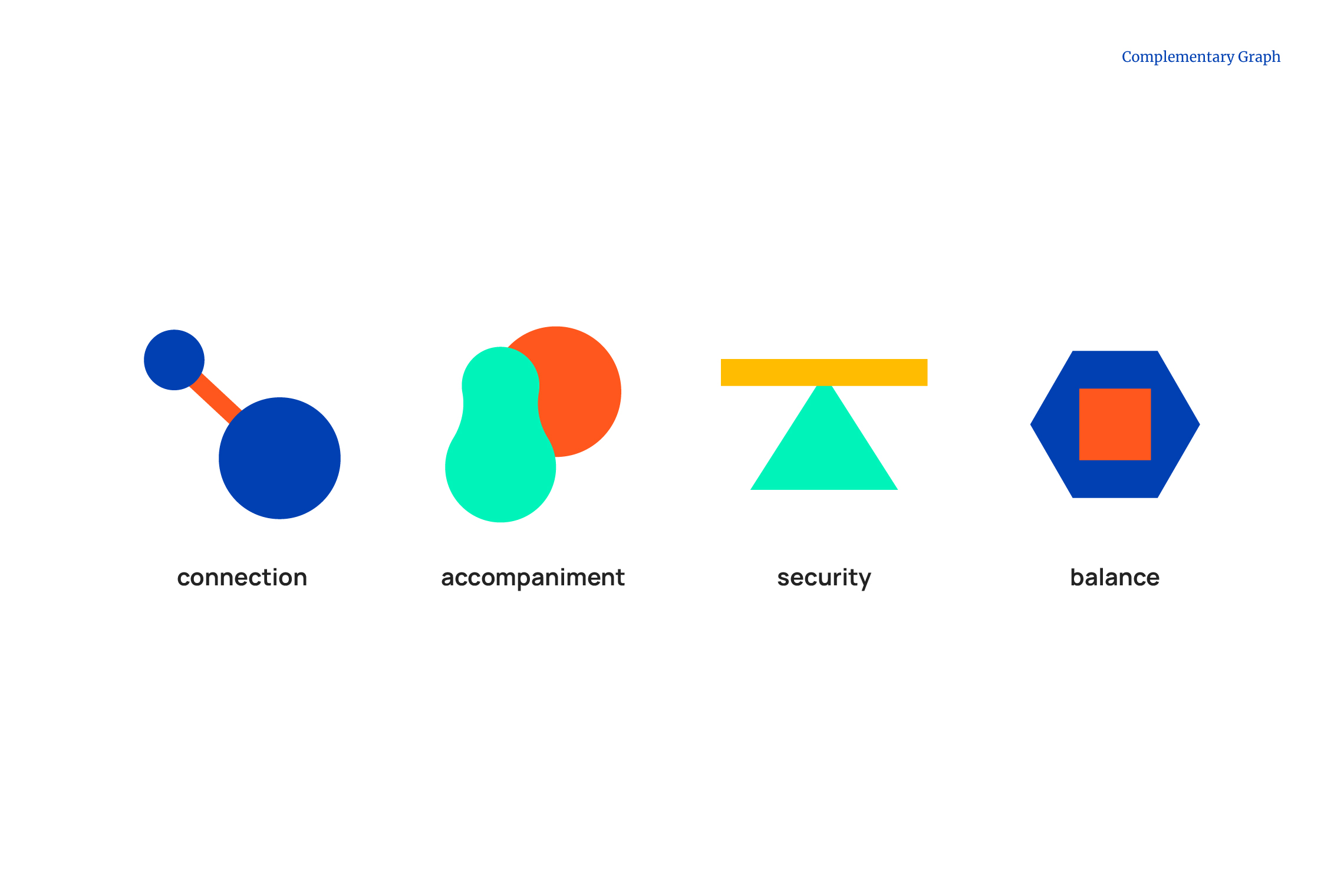
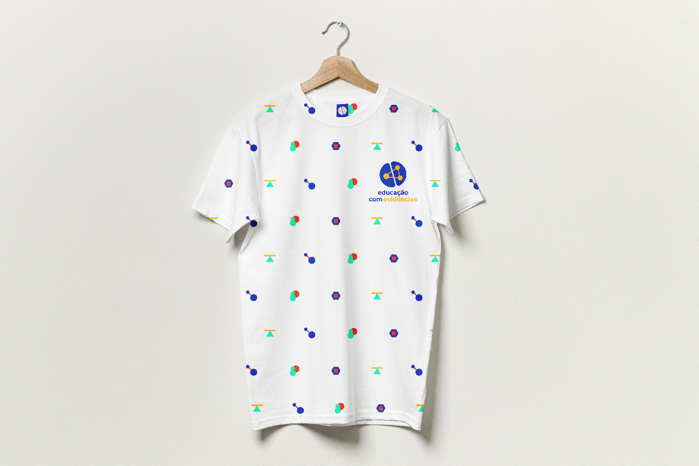
Its logo represents the cerebral hemispheres connected by 3 points that symbolize the affective, cognitive, and social aspects of learning. The typography and color palette convey professionalism, modernity and joy, while the complementary graphics represent values such as connection, support, security, and balance.

Suggested Projects
SCIO Education Center
Piamonte Higher Technical Institute
PURIK Pitajaya Beer
SCIO Education Center
BRANDING

The Client

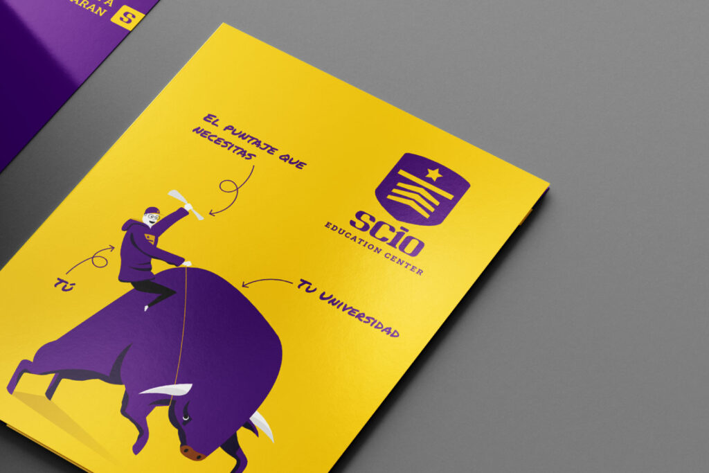
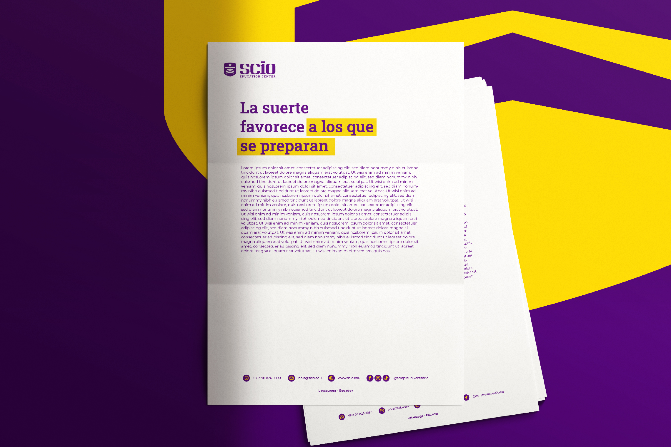
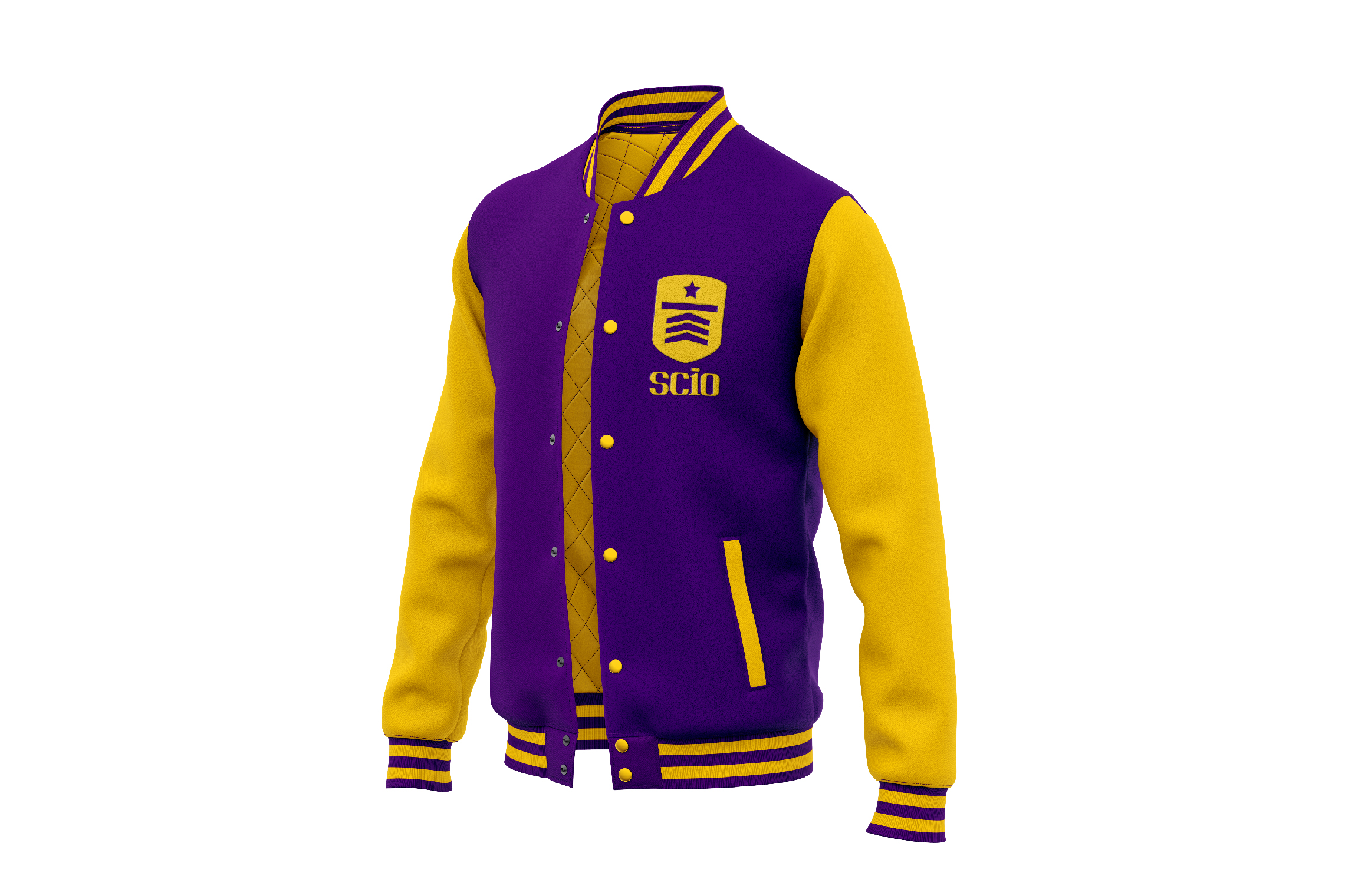
SCIO Education Center, is a training education center that will be located in the city of Latacunga – Ecuador, its goal is to democratize the education for pre-university students, maintaining fair prices and quality education.


Keywords

Branding / Design / Education / Academy

The Objective

To design a brand that conveys experience and confidence, as well as a young and determined attitude, capable of inspiring students to face academic challenges with determination.


The Solution

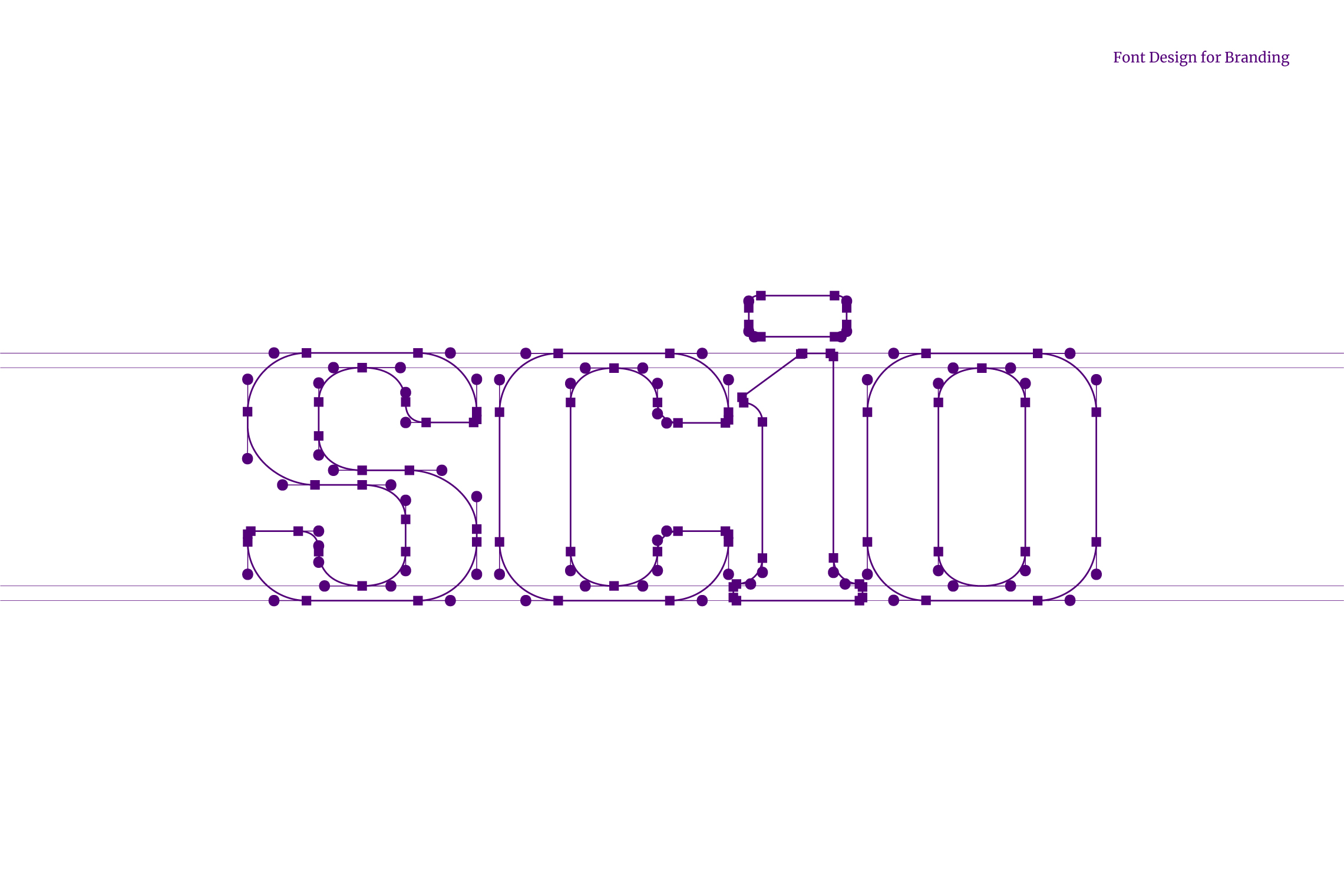
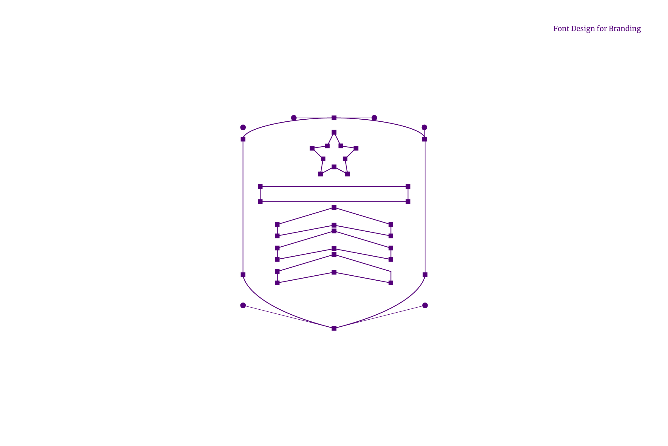
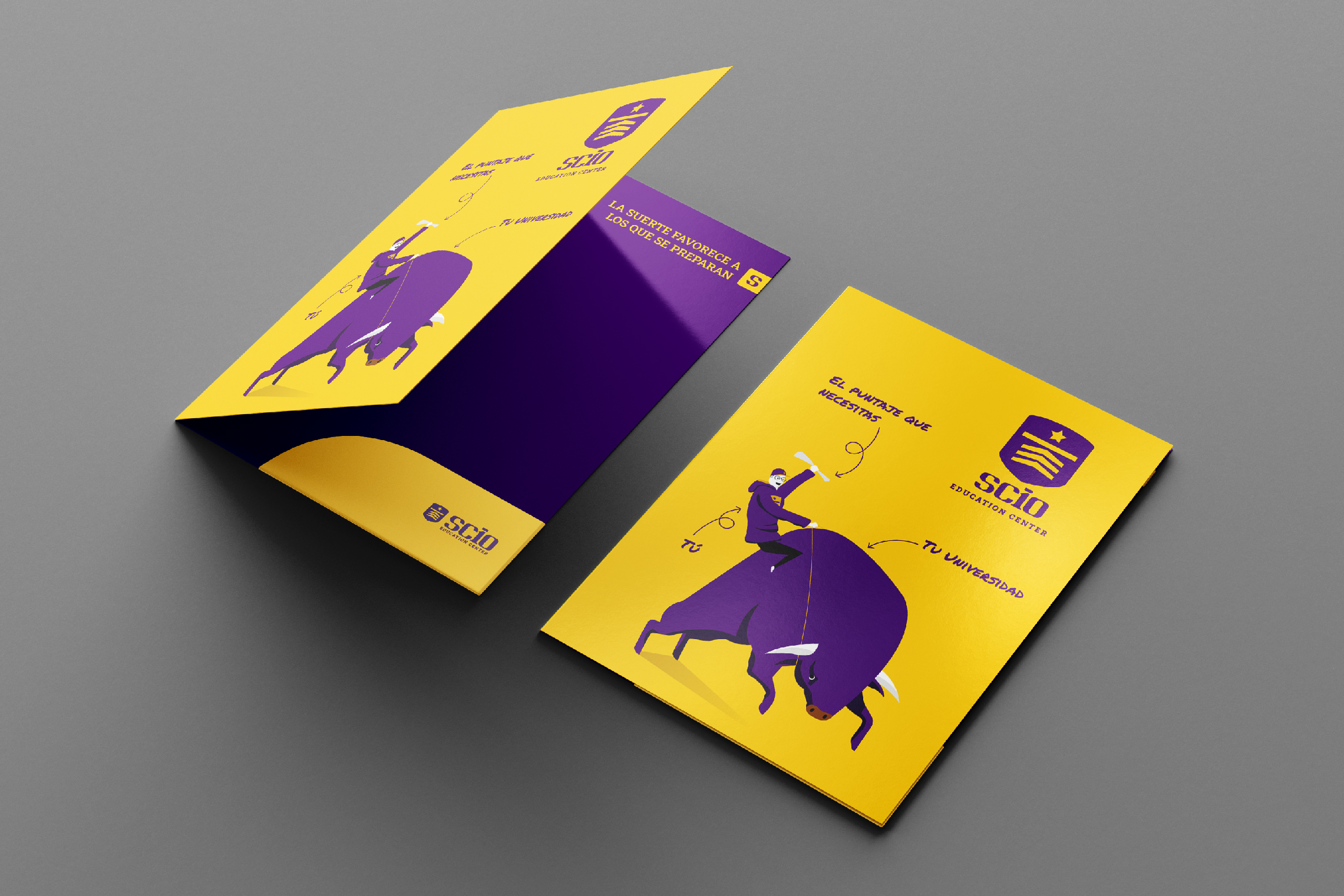
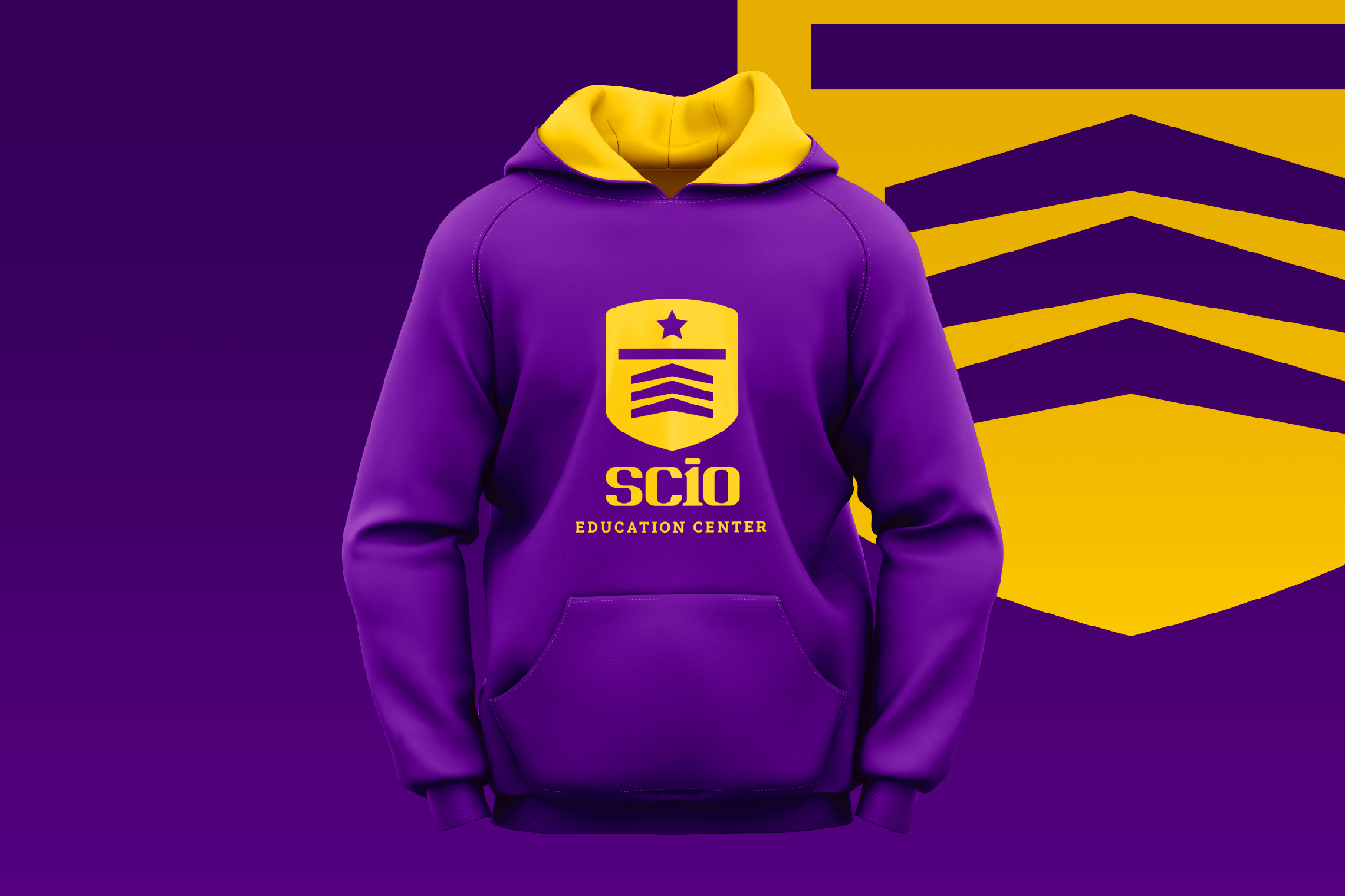
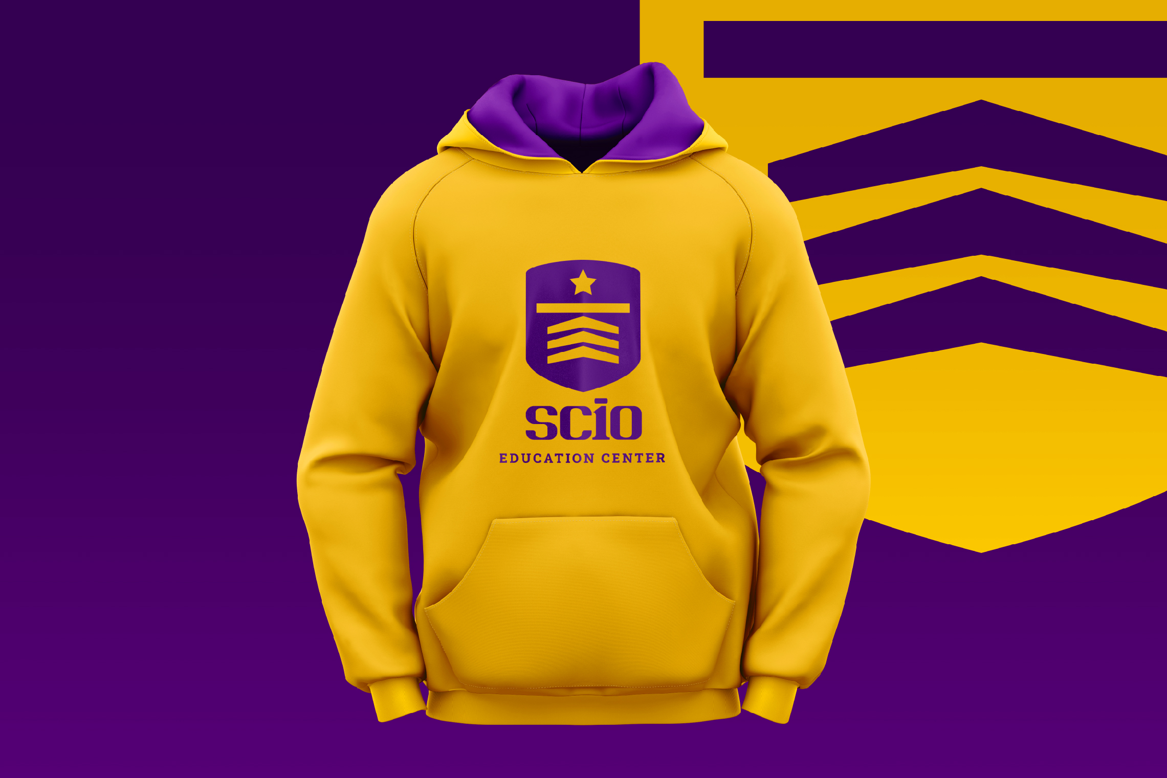
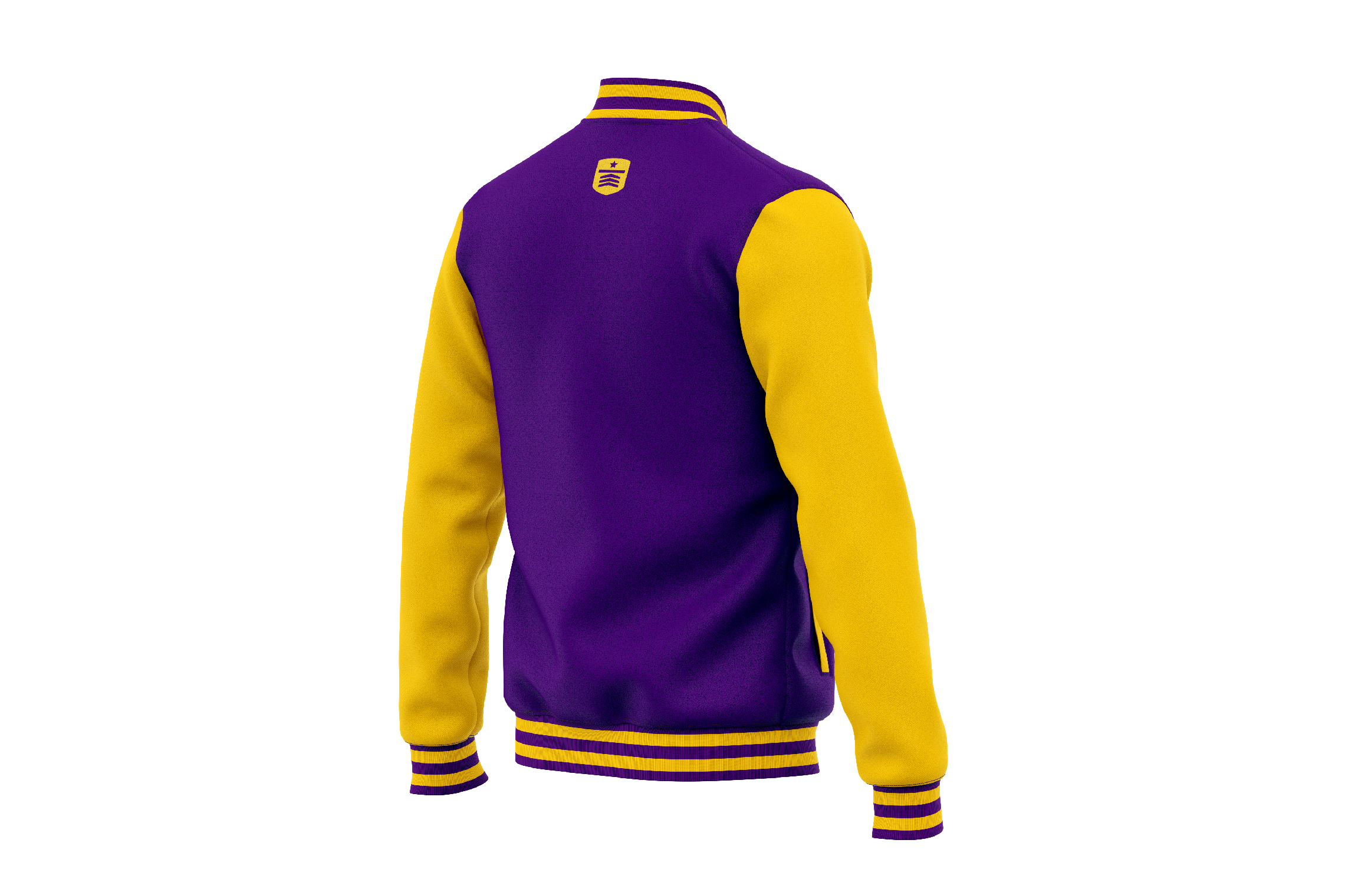
The icon designed for SCIO is a shield that inside shows three arrows, a line and a star, as a representation of the necessary steps to cross and reach the goal, it is also the abstraction of a graduate’s cap. On the other hand, the typography developed for SCIO has a young, strong and academic personality; the number 10 inscribed in the logo represents the highest grade.

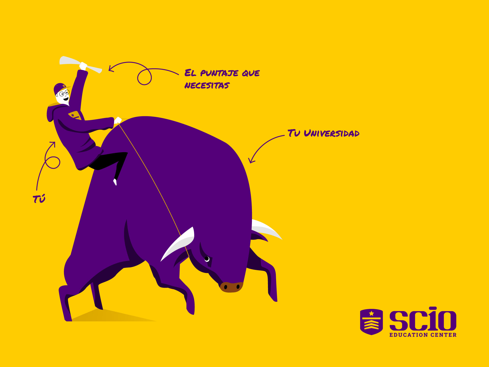
The chosen color scheme for SCIO is violet, linked to wisdom and creativity, accompanied by yellow, which expresses positive energy and warmth. Another graphic element designed for SCIO is the illustration of a bull and a young man with his diploma, it shows that everyone who is trained in this education center will master their goal.

Suggested Projects
Piamonte Higher Technical Institute
PURIK Pitajaya Beer
TAMPER Special Edition
Piamonte Institute
BRANDING

The Client

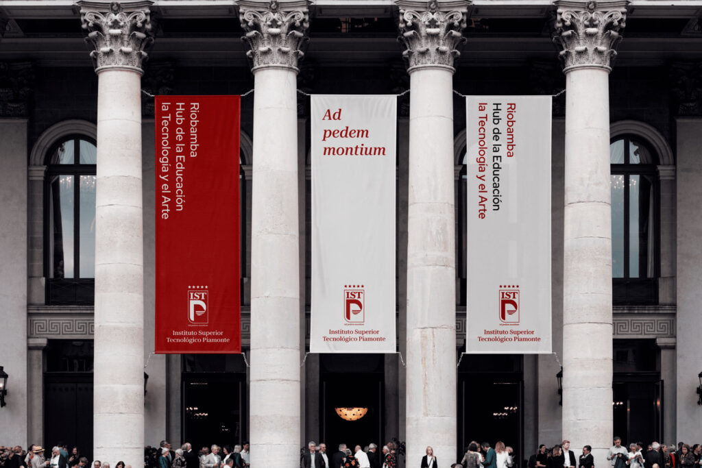
The Instituto Superior Tecnológico Piamonte is a new educational institution in Ecuador.


Keywords

Branding / Design / Education / Academy

The Objective

Develop a branding system that identifies the Piamonte Higher Technical Institute as an experienced, innovative education center and is perceived with an Italian essence, as we want to bring the best of there and merge it with the best of our country, Ecuador.


The Solution

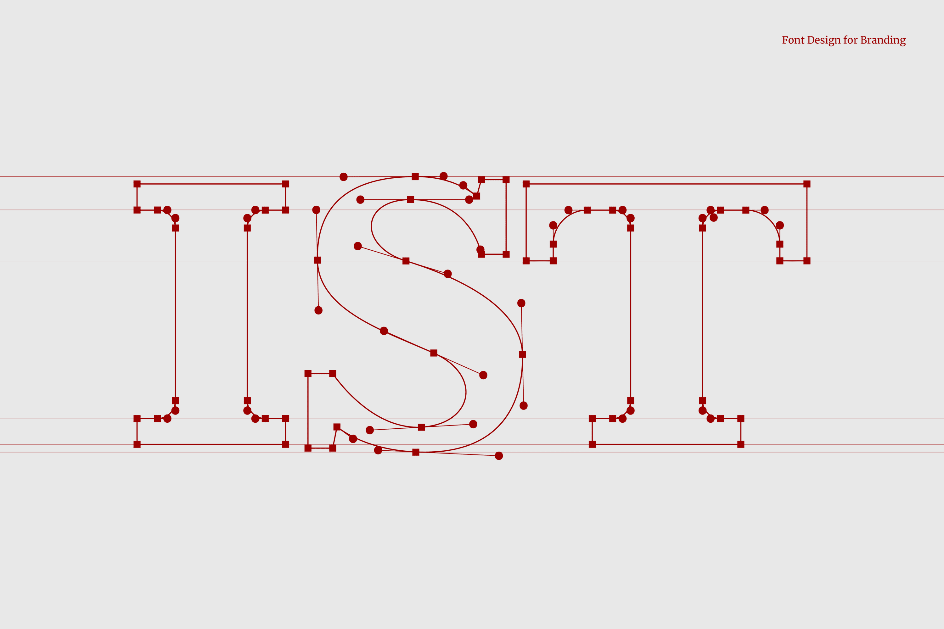
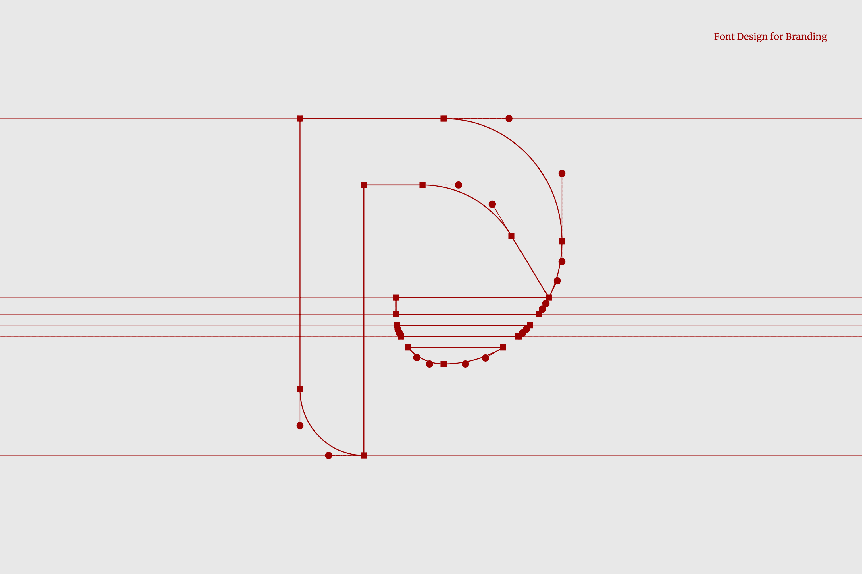
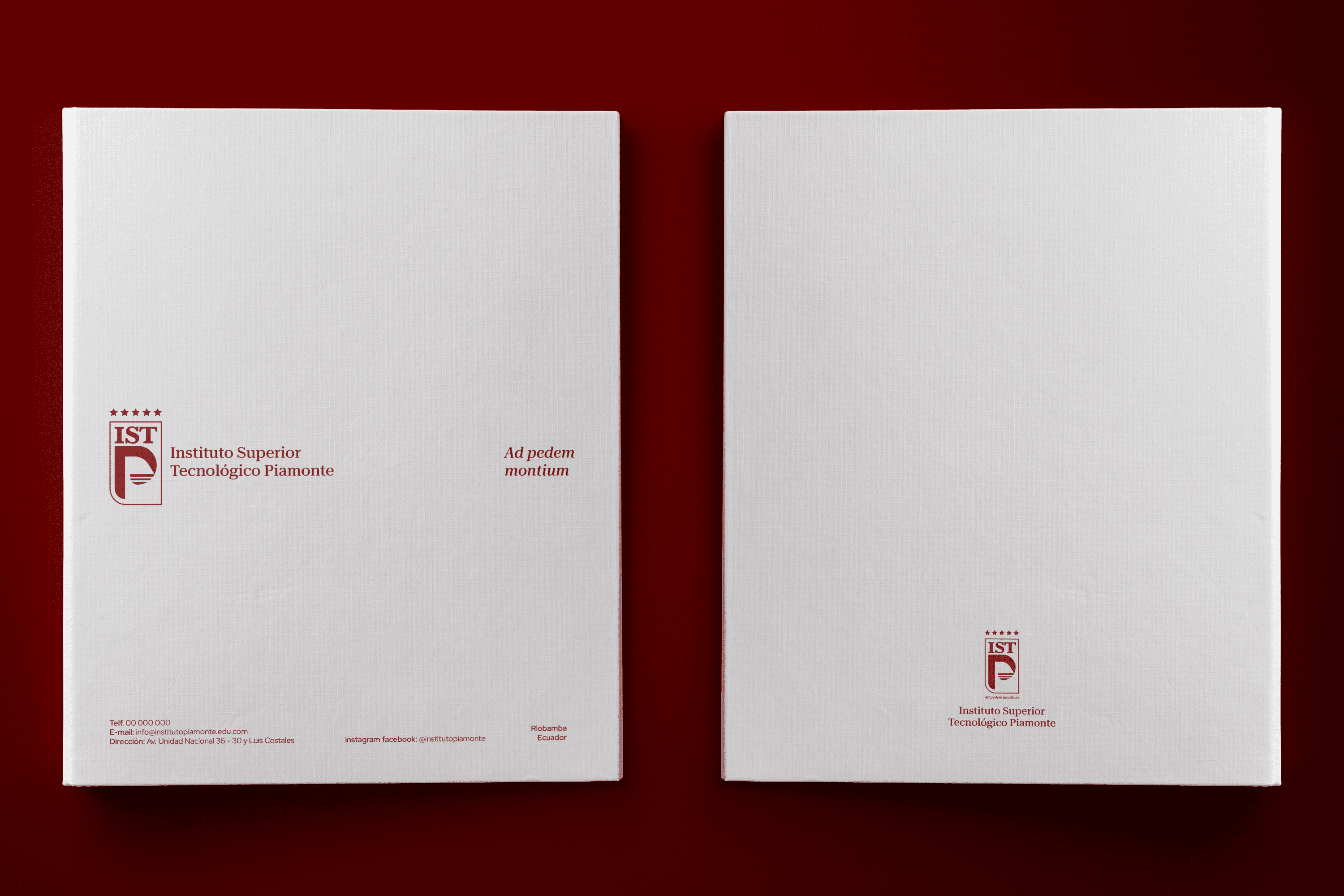
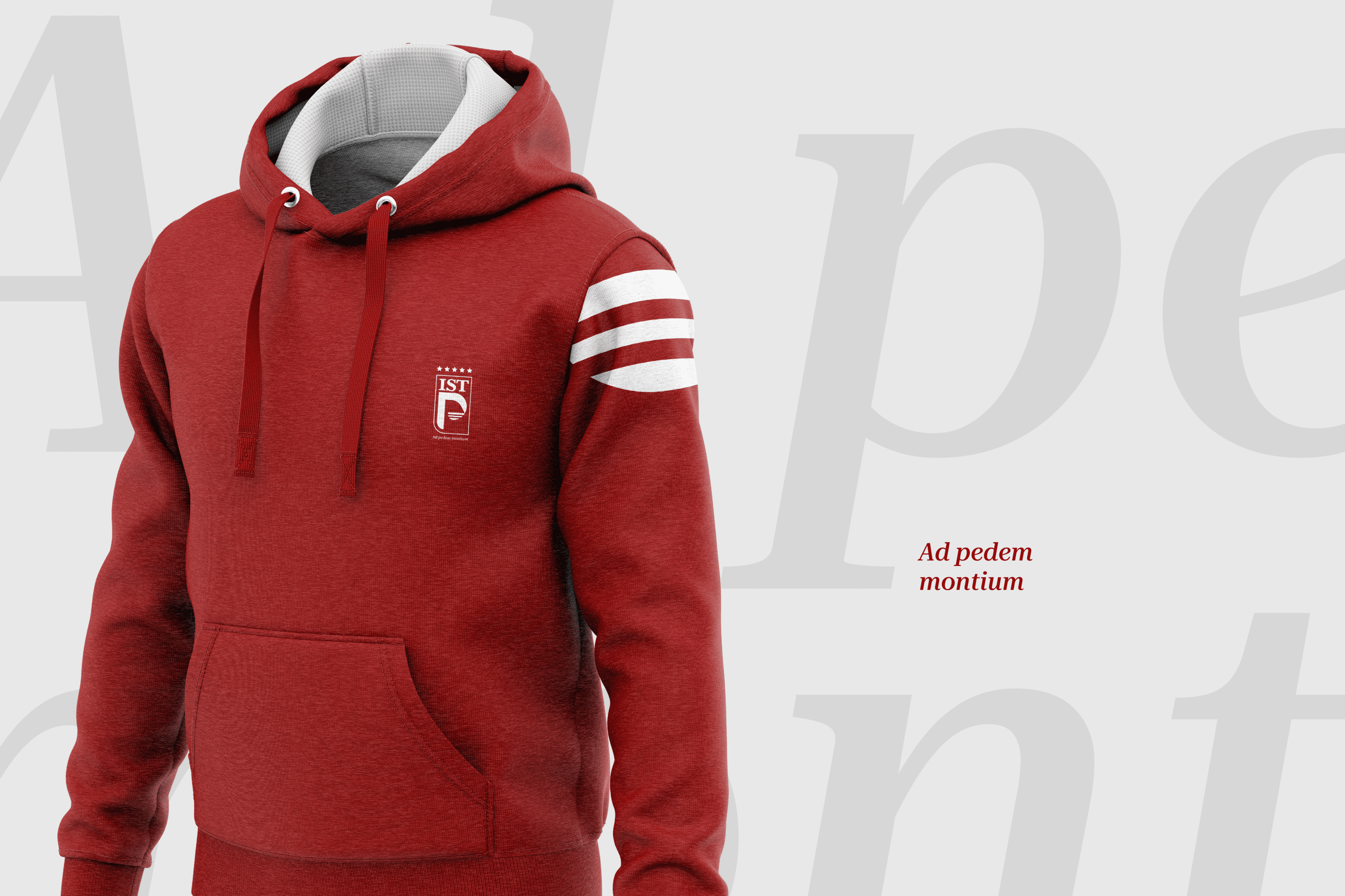
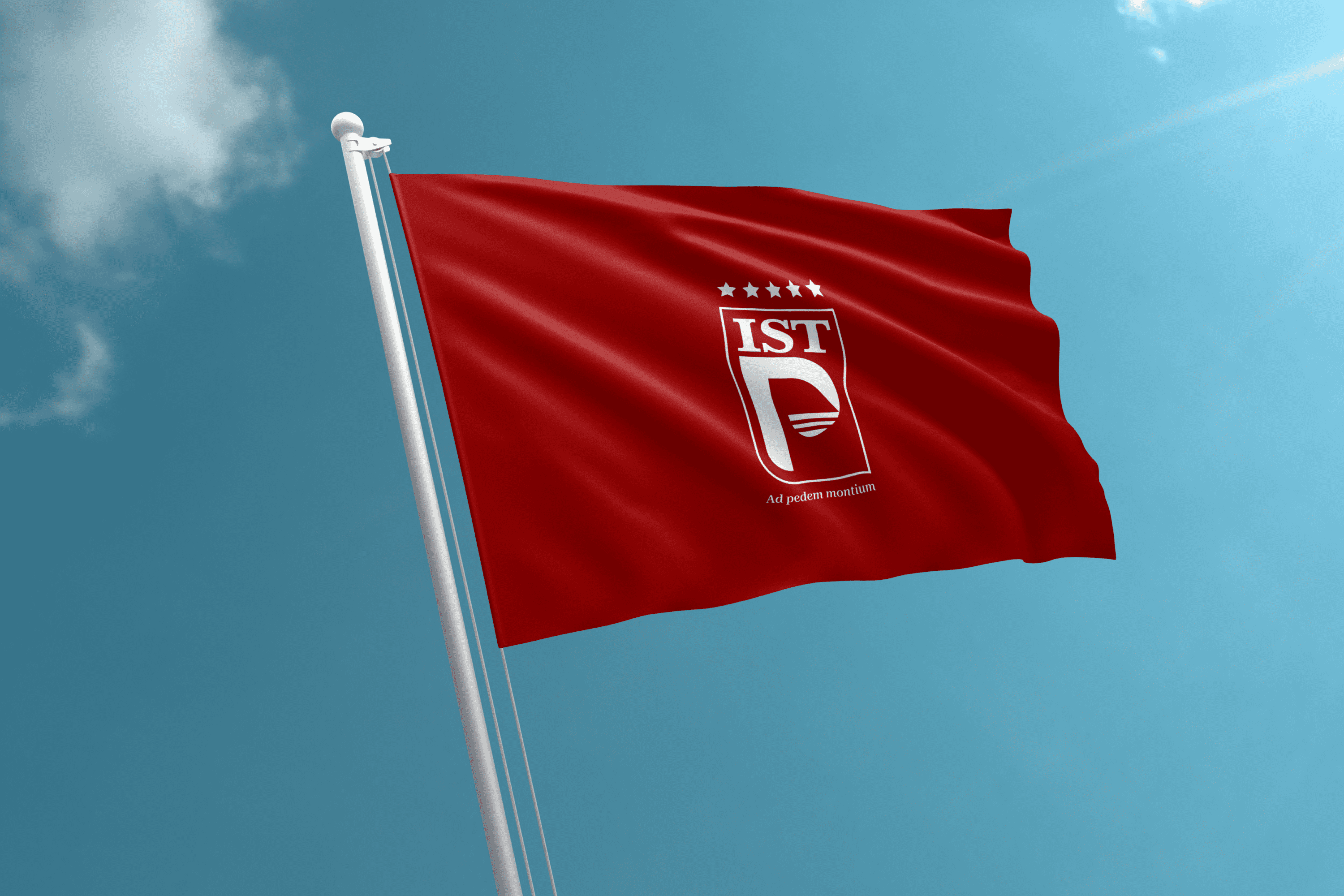
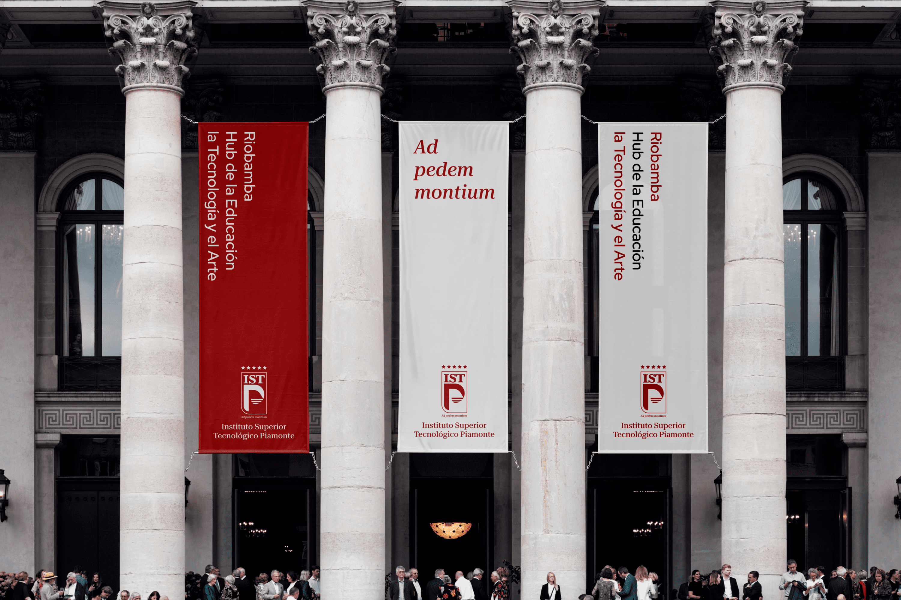
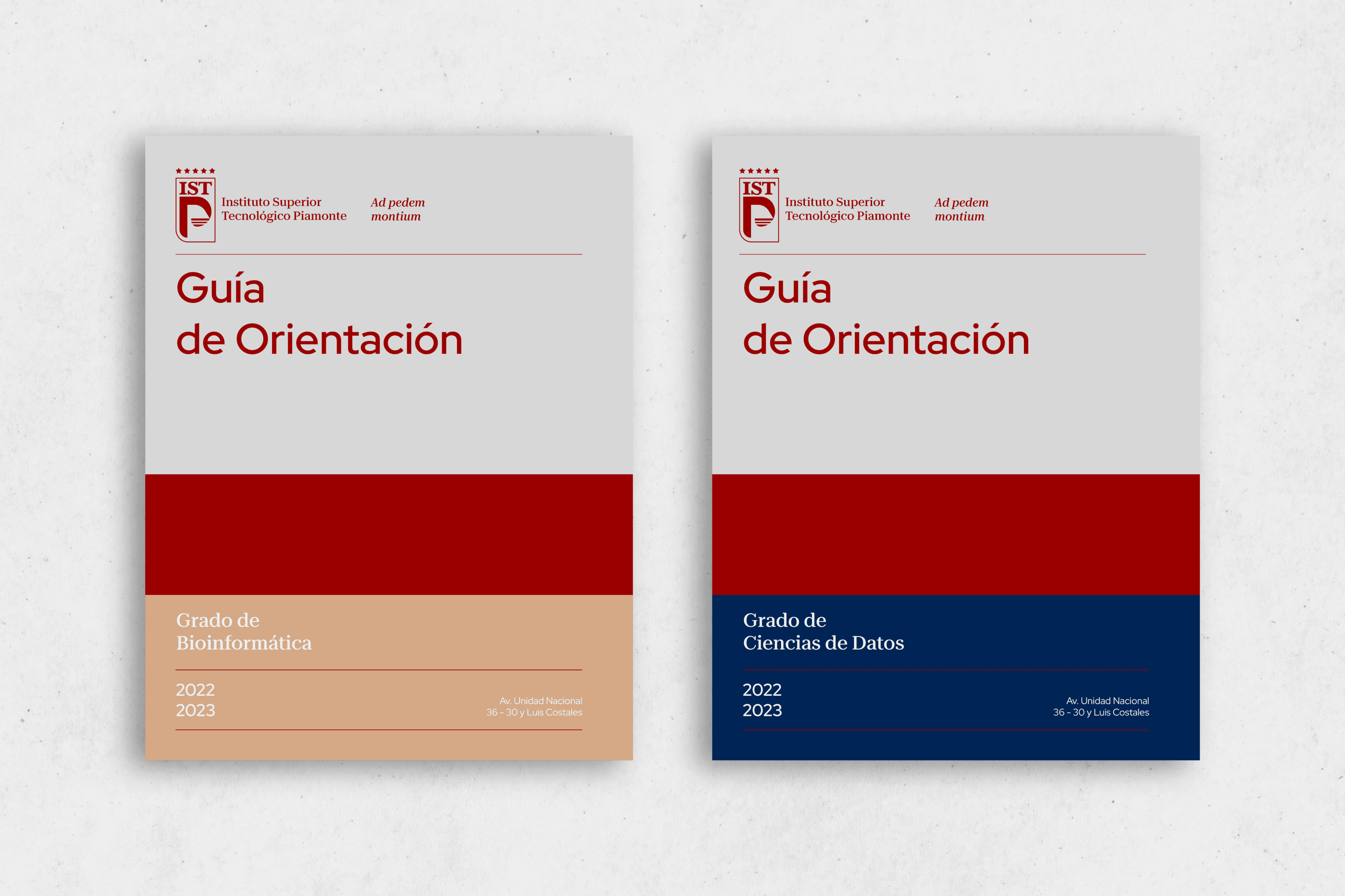
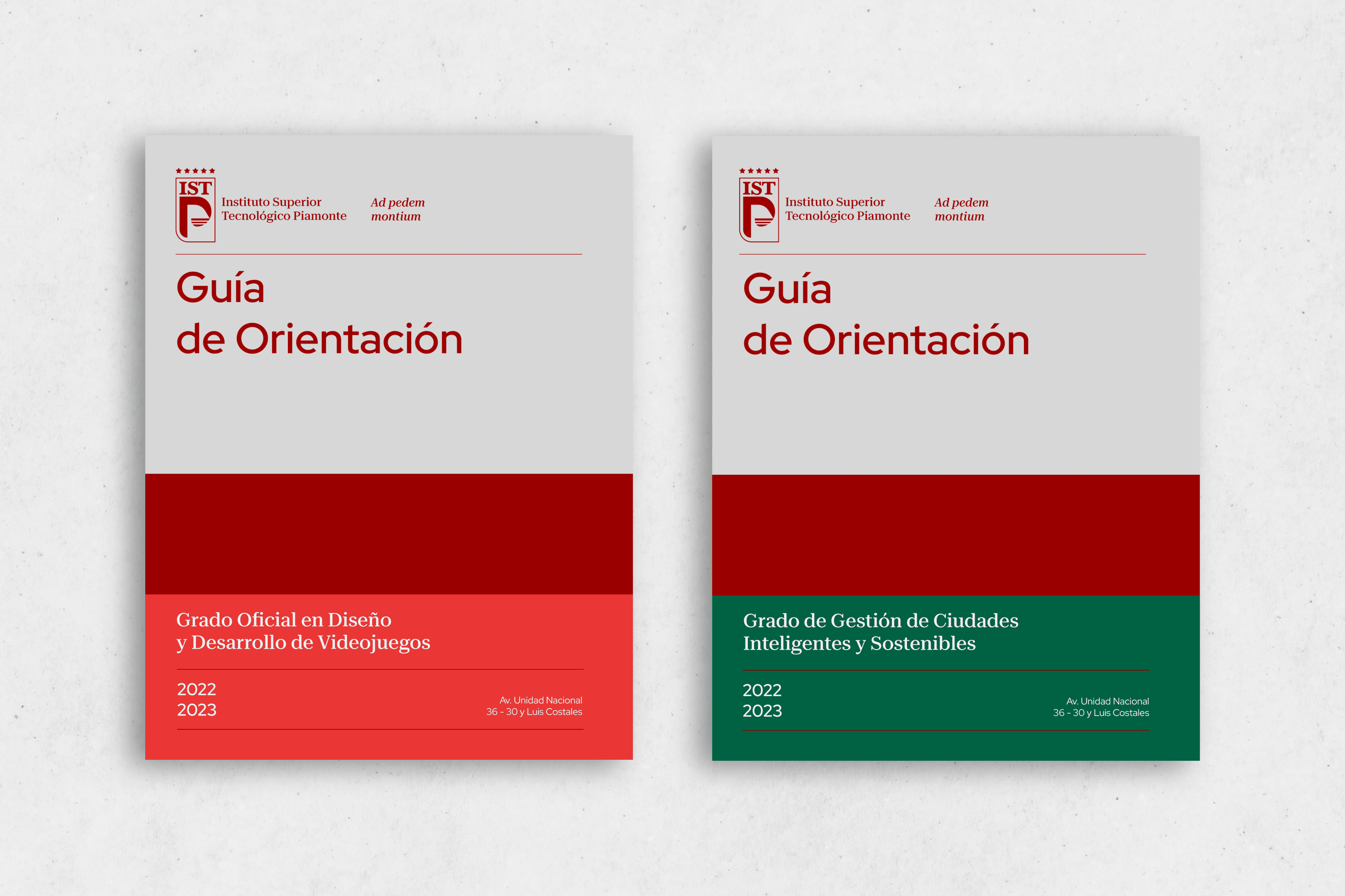
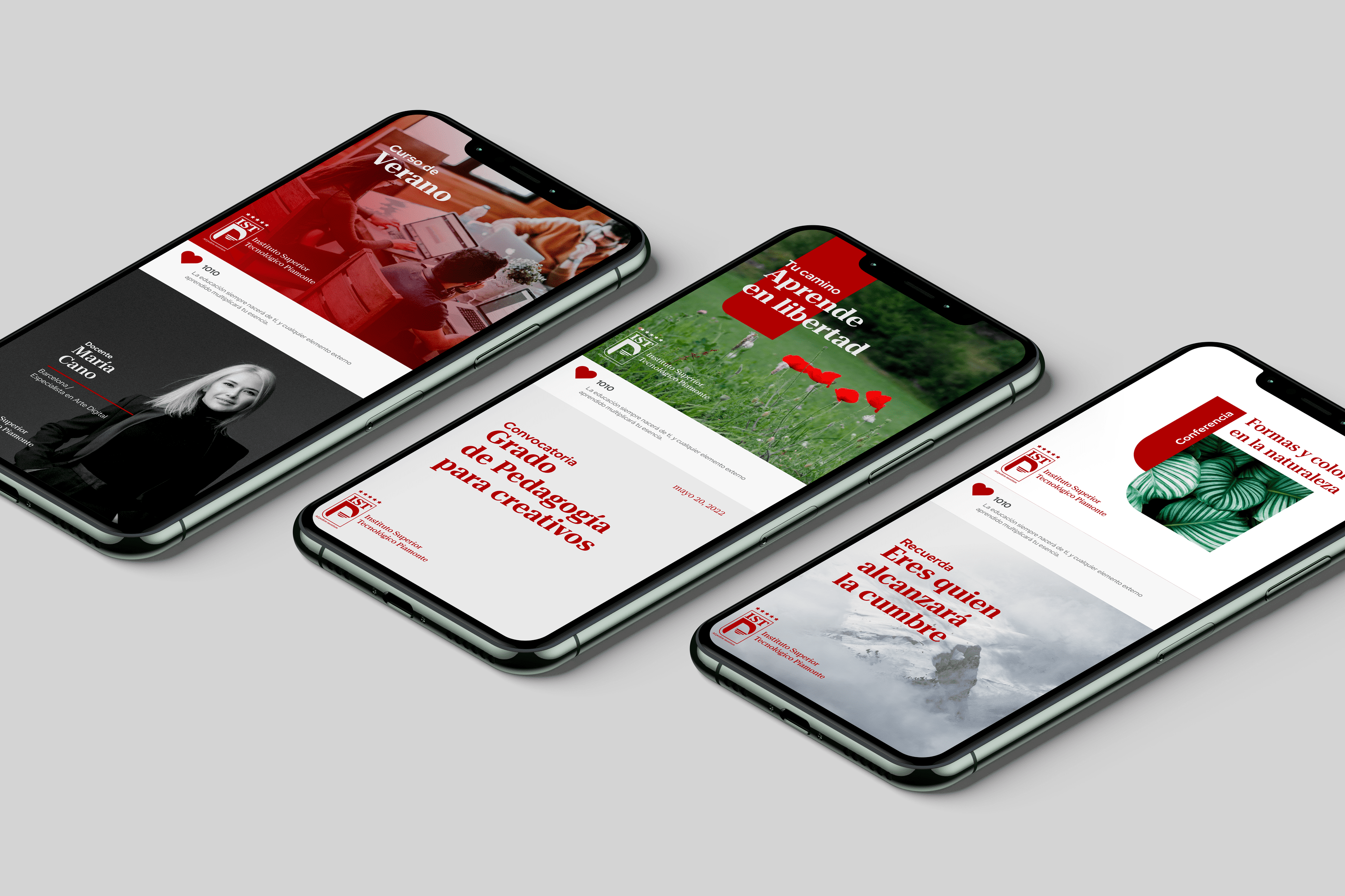
The logotype is a modern heraldic representation of a shield formed by the institute’s acronyms, where the letters IST were designed to reflect its experience through the finishing or serif. On the other hand, the counterform of the P represents a mountain whose base is three lines as a subjective representation of who starts the ascent to their goal. The number 3 was chosen because according to numerology it symbolizes expansion, agile mentality, sensitivity and talents present in every human being. All these elements are circumscribed within a rectangular area that defines the shield and at the top there are 5 stars as a symbol of quality.

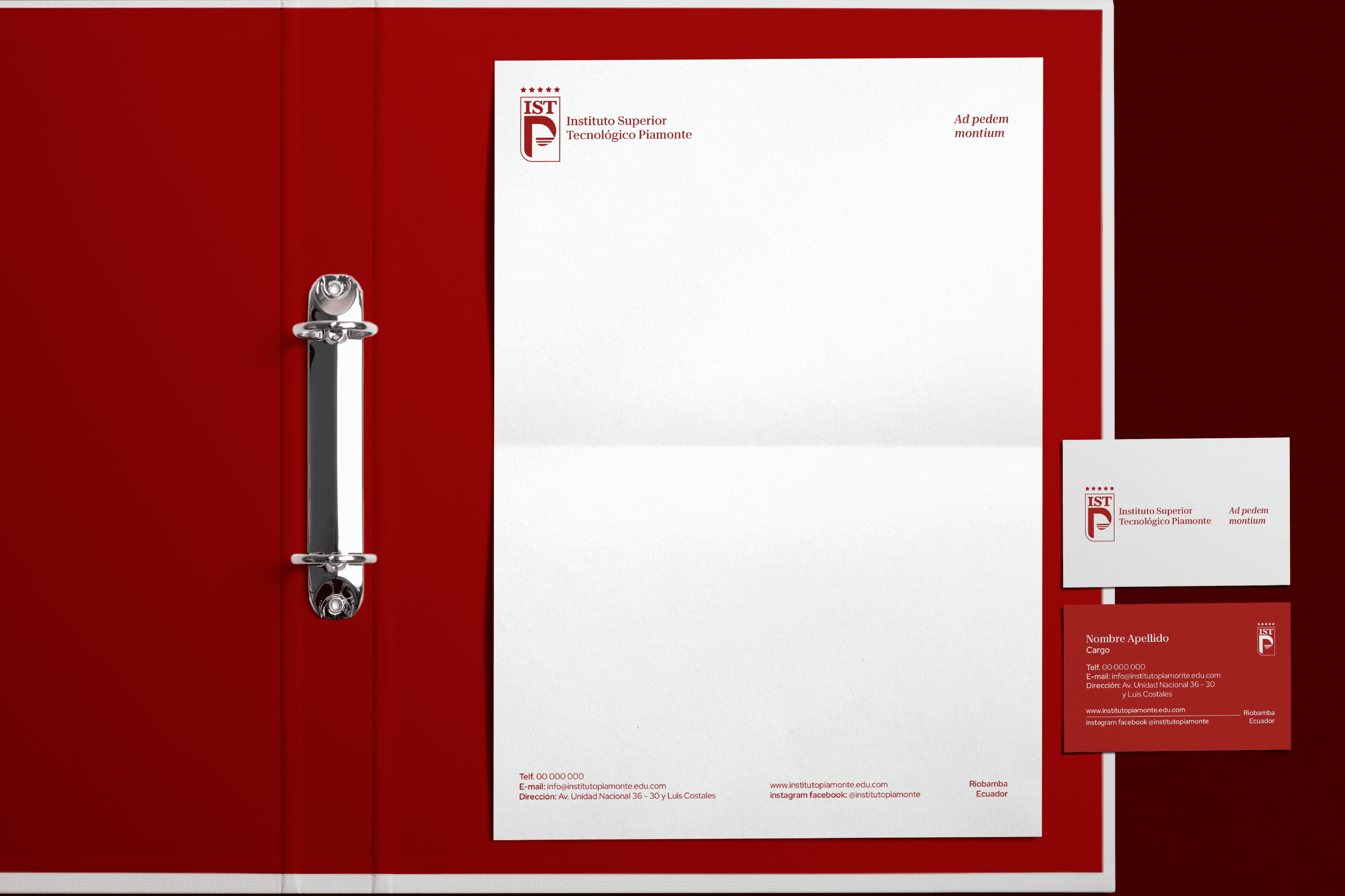
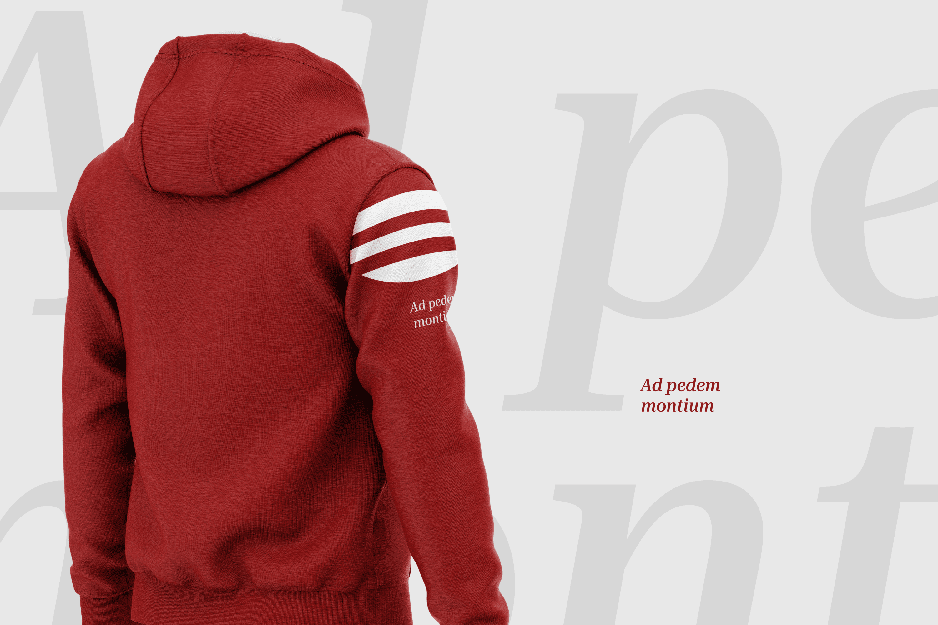
At the bottom, we find the meaning of Piamonte, At the foot of the mountain or in Latin “Ad pedem montium”.

Suggested Projects
PURIK Pitajaya Beer
TAMPER Special Edition
PLASTEX Product Catalog
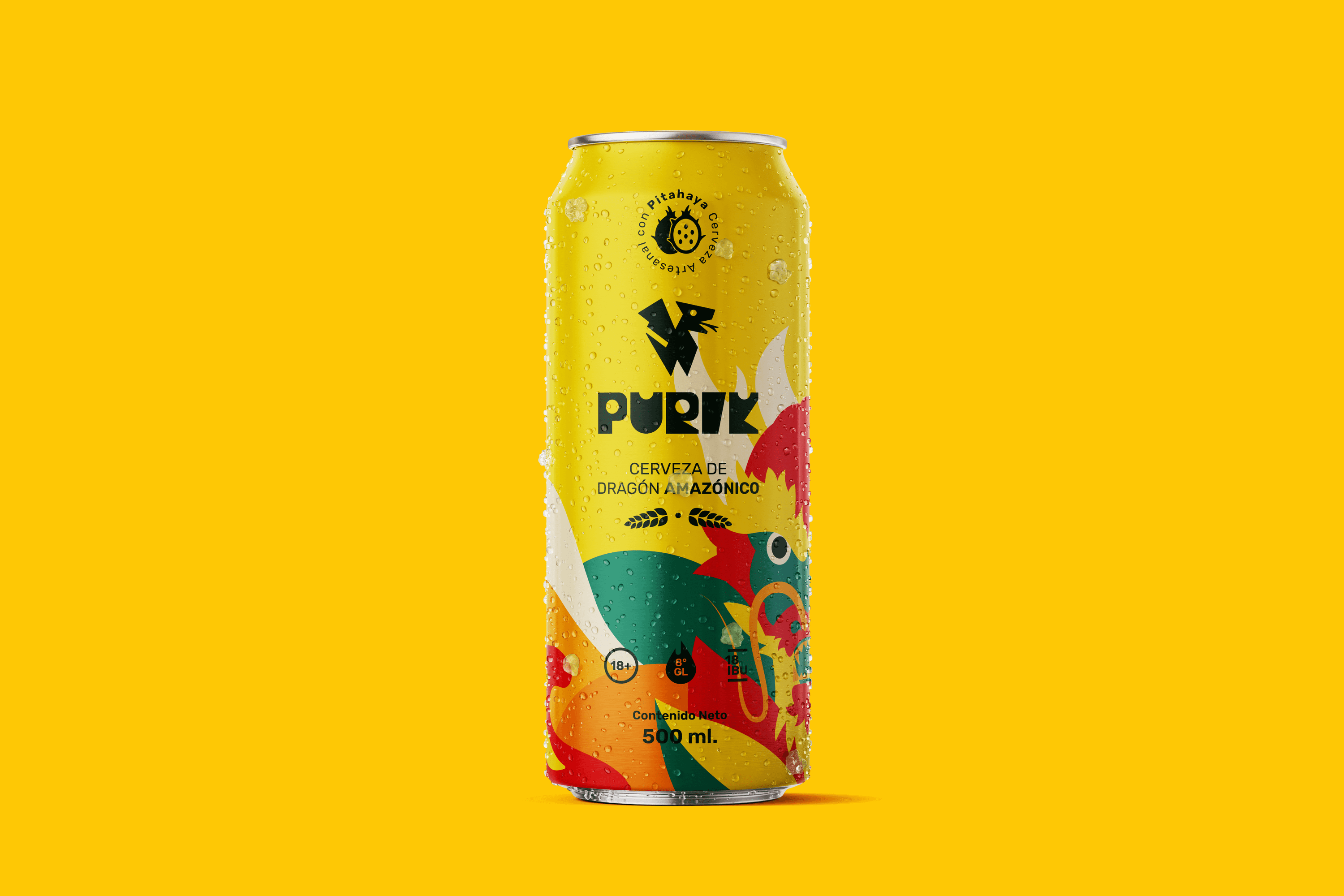
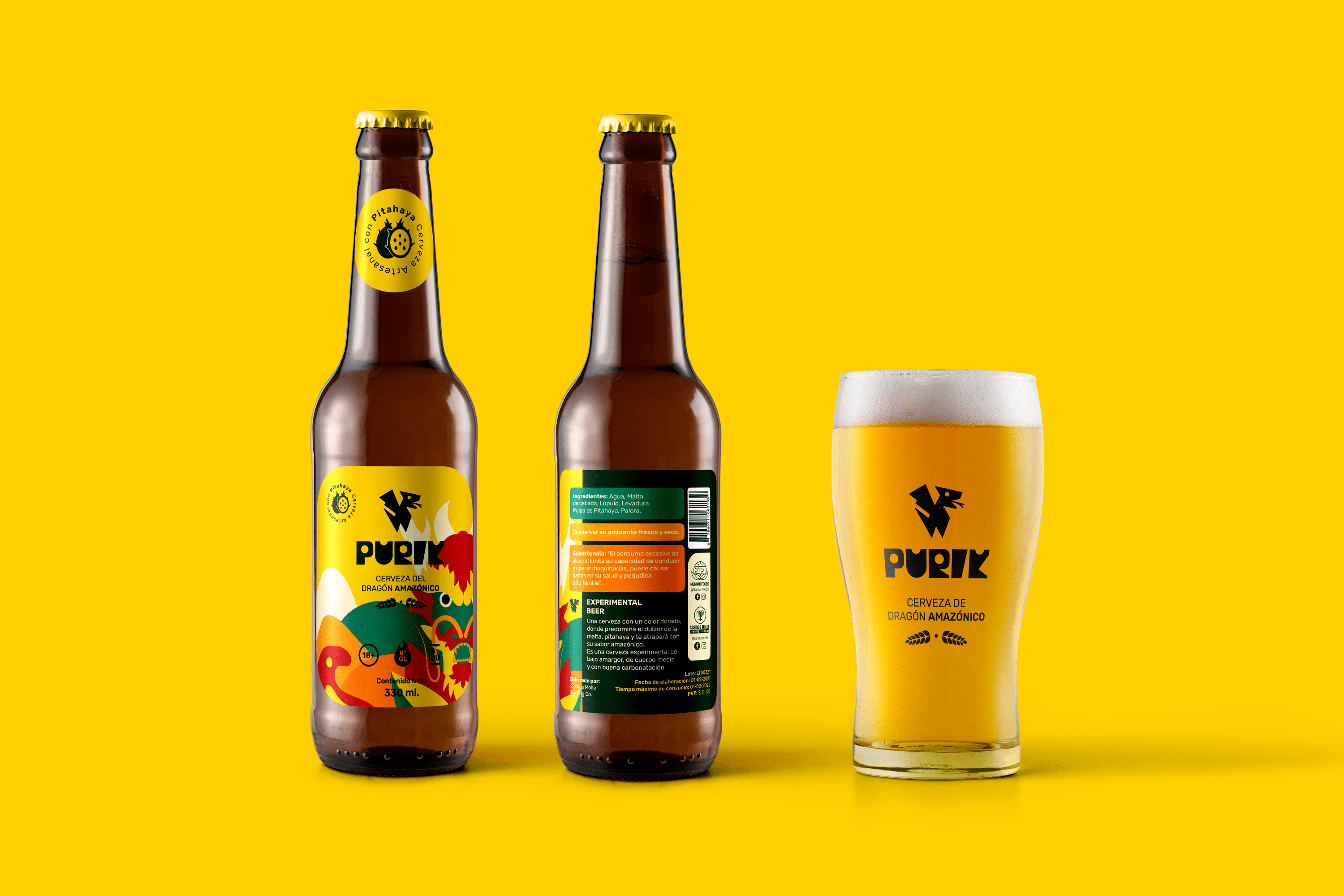
PURIK Amazonian Beer
BRANDING

The Client

We are a pioneering brand in the production of pitahaya (fruit from the Amazon) beer, located in Palora-Ecuador.


Keywords

Branding / Packaging / Beer / Ancestral

The Objective

Design a vibrant beer brand that shows the essence of its Amazonian and ancestral origin.


The Solution

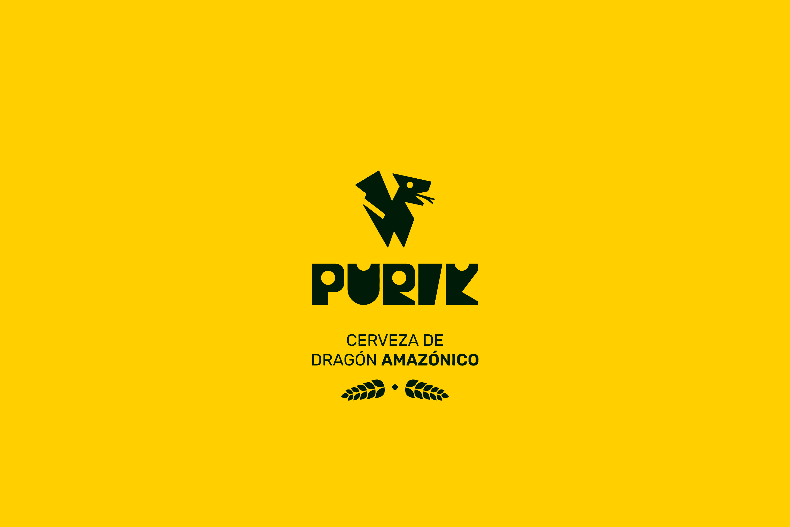
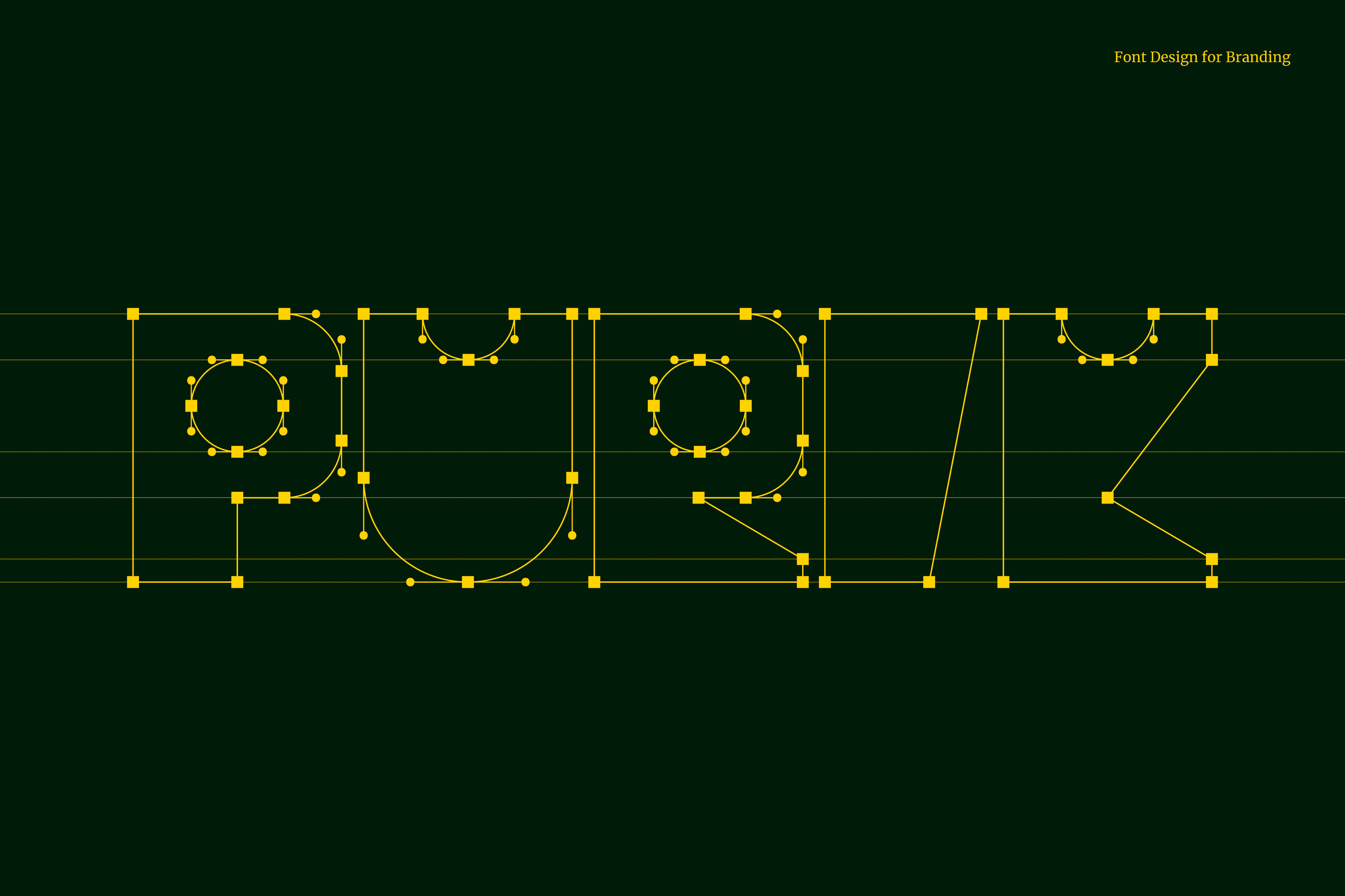
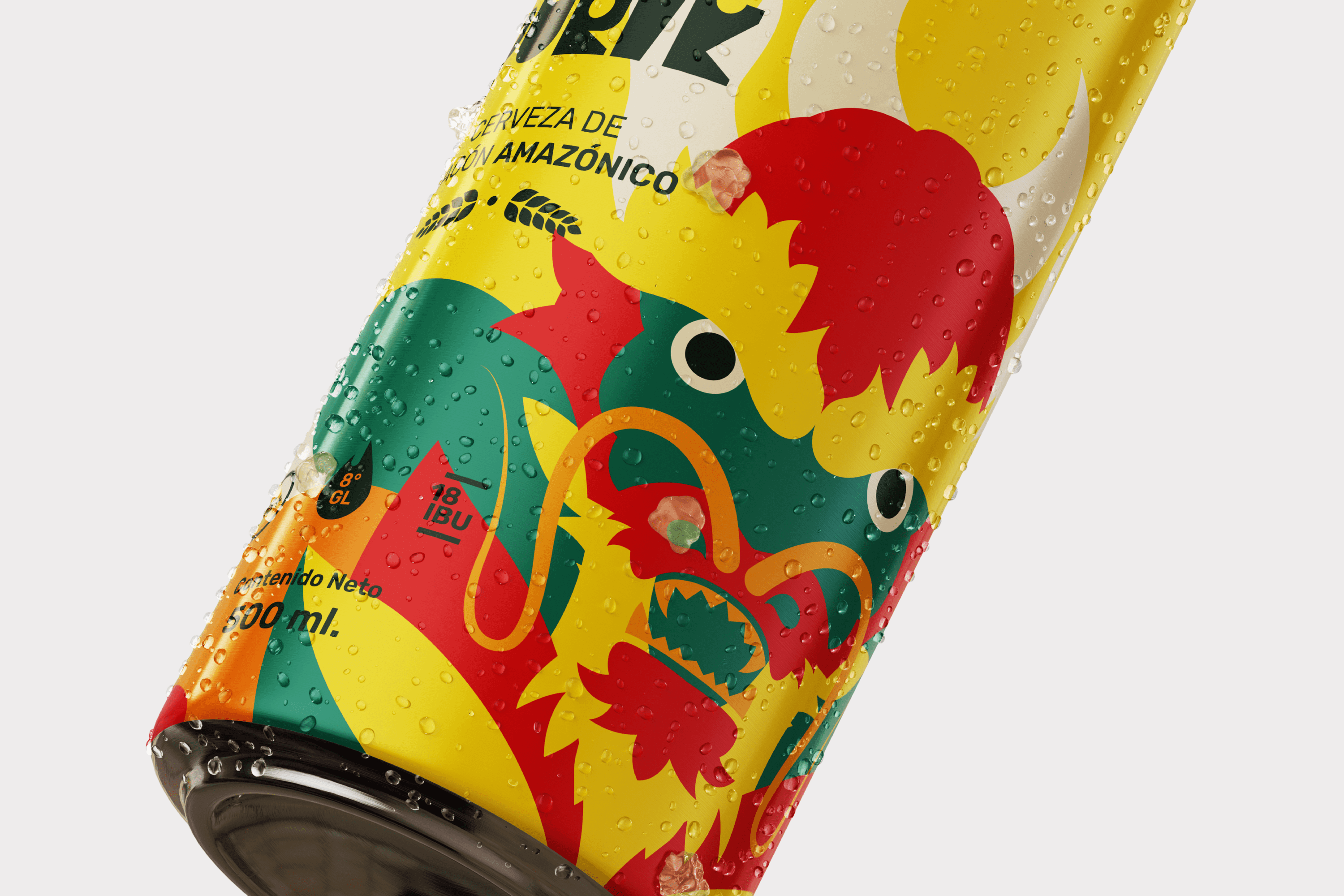
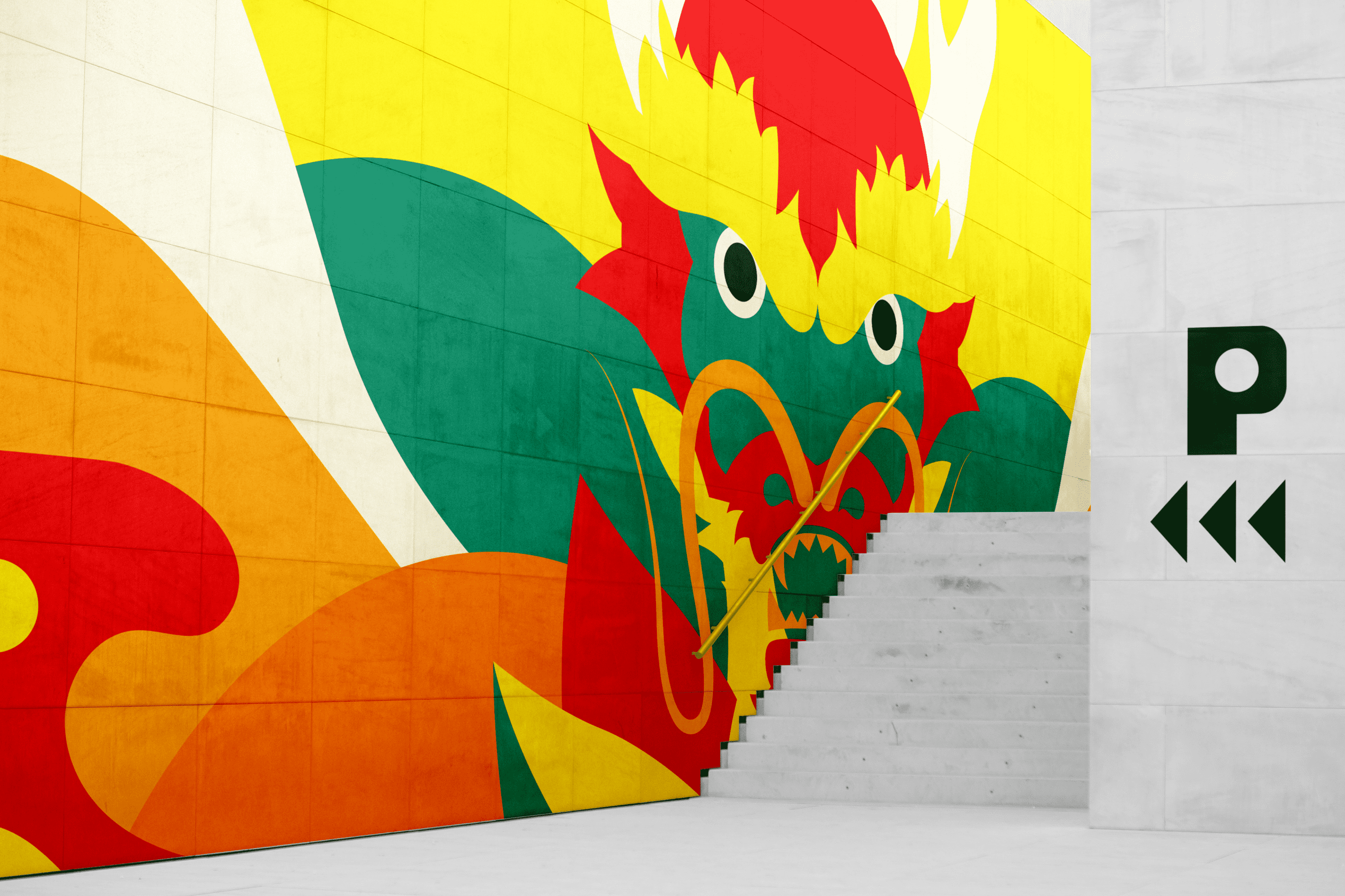
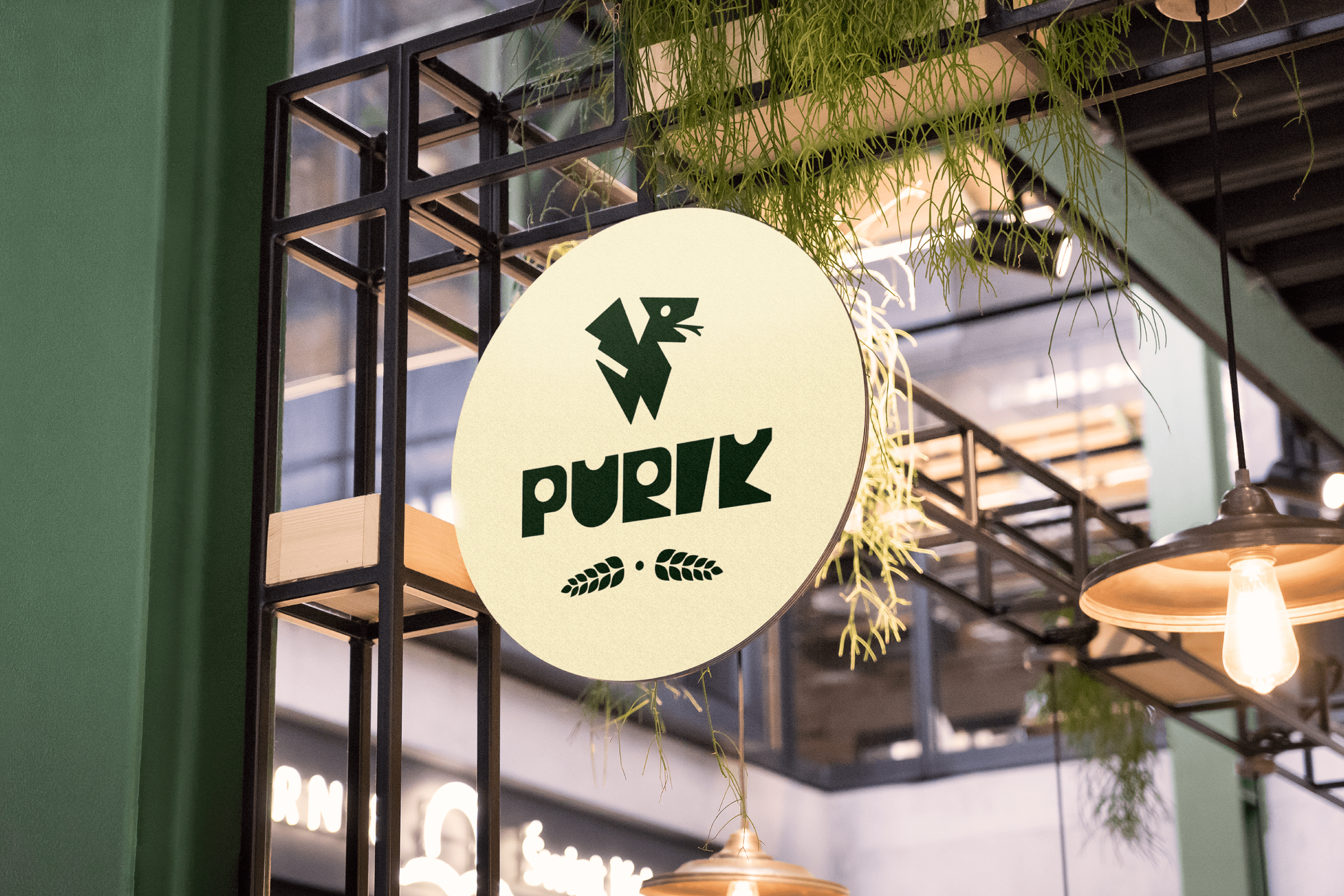
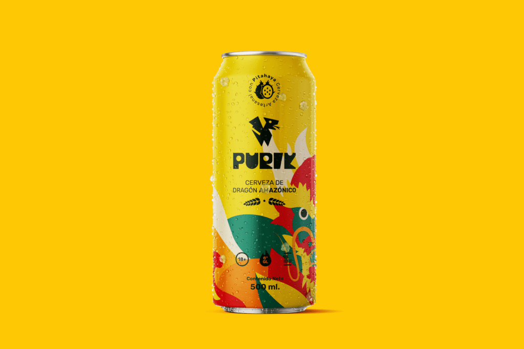
The name we have chosen for this drink is Purik, a word of Kichwa origin that means wanderer. The typography and icon were designed with a hieroglyphic appearance to emphasize the ancestral. Pitajaya is also known as the dragon fruit, for this reason, we have illustrated a dragon wrapped in leaves, shapes and colors full of energy that accentuate its origin. Its strong and vibrant personality reinforces its exotic nature.
Suggested Projects
TAMPER Special Edition
PLASTEX Product Catalog
Poncho Rosa Ice Cream
BRANDING

The Client

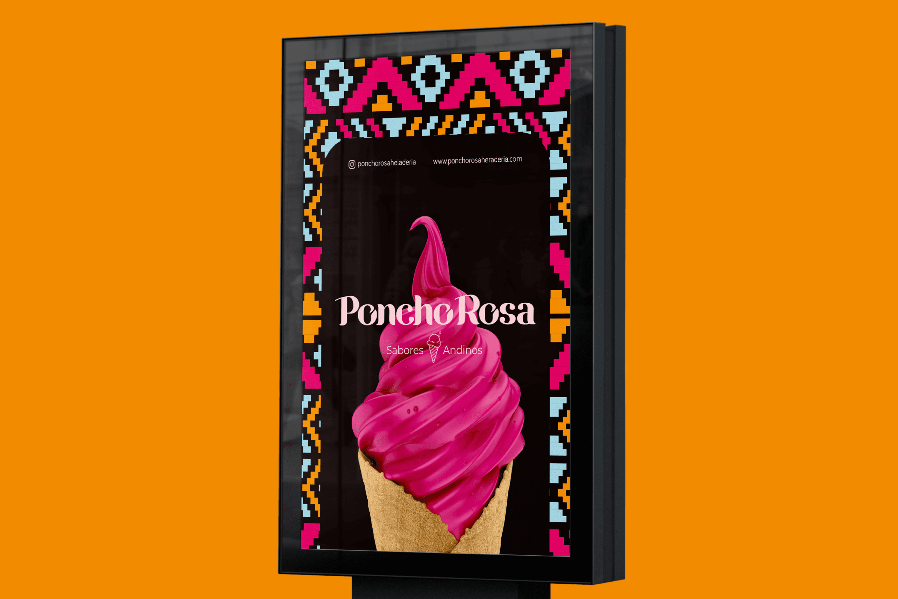
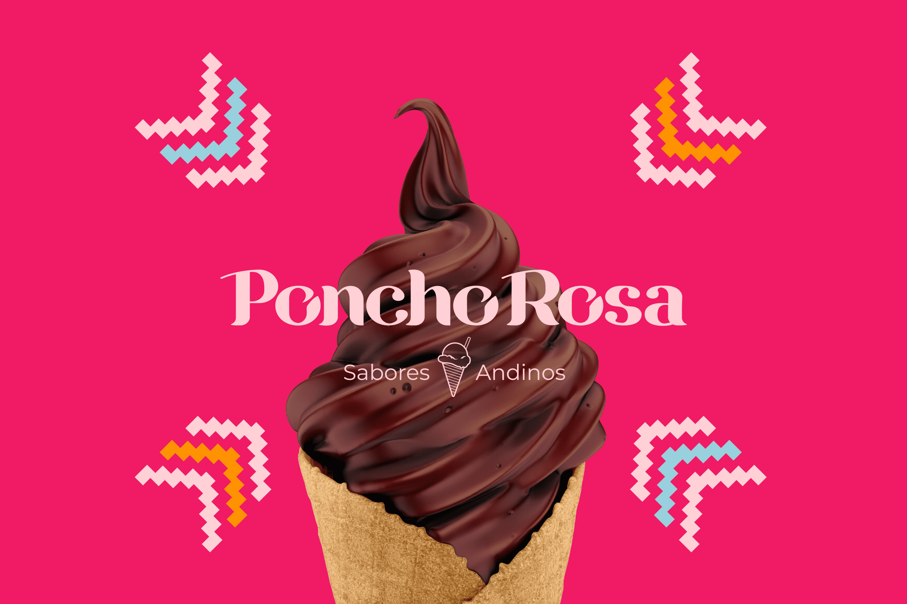
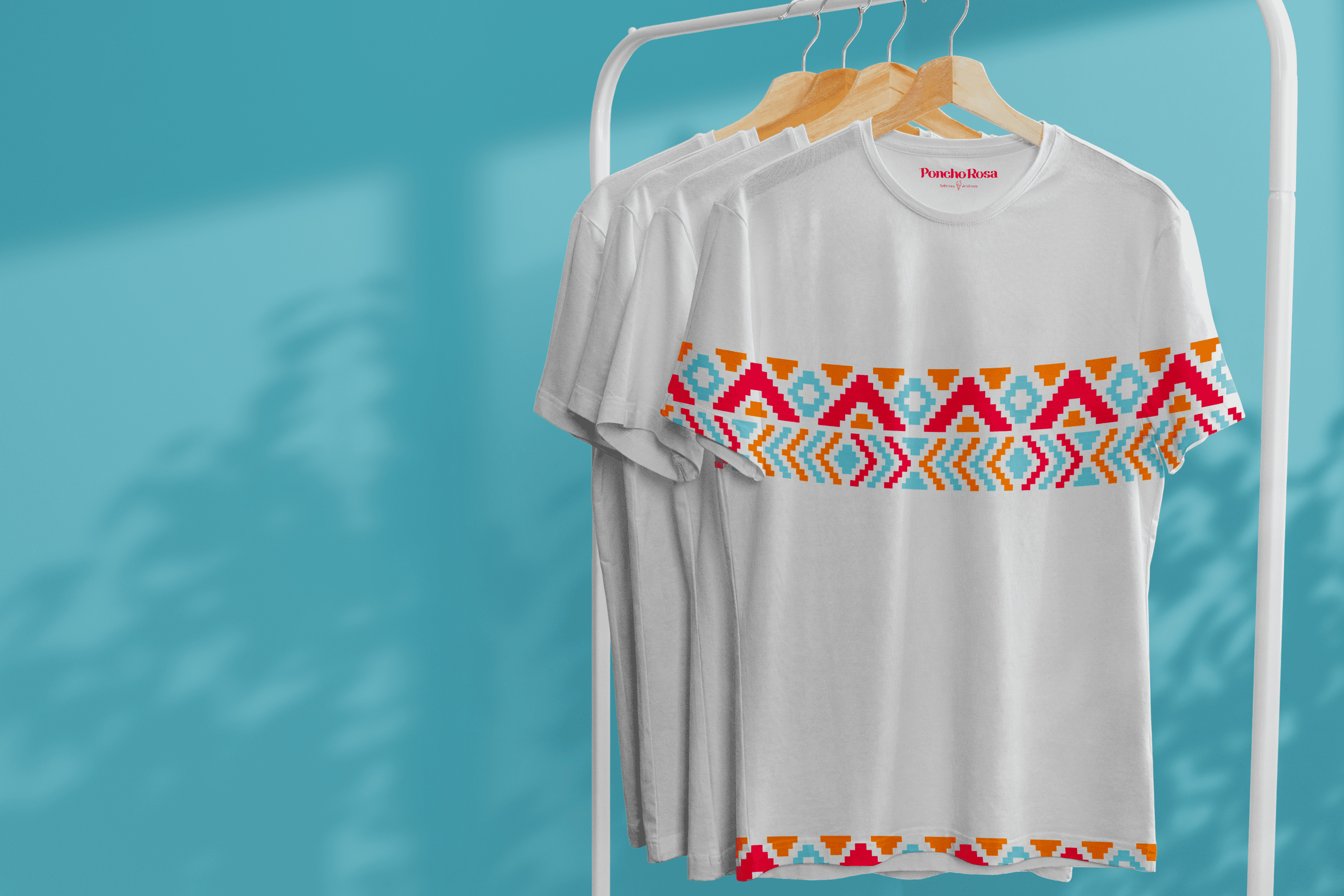
Poncho Rosa is an ice cream shop that blends ice cream with flavors from the Andean region. It is located in Riobamba – Ecuador.


Keywords

Branding / Design / Ice Cream Shop / Cultural / Andean

The Objective

Develop a branding system that expresses the diversity, joy and richness of the Andean region through its forms and colors.


The Solution

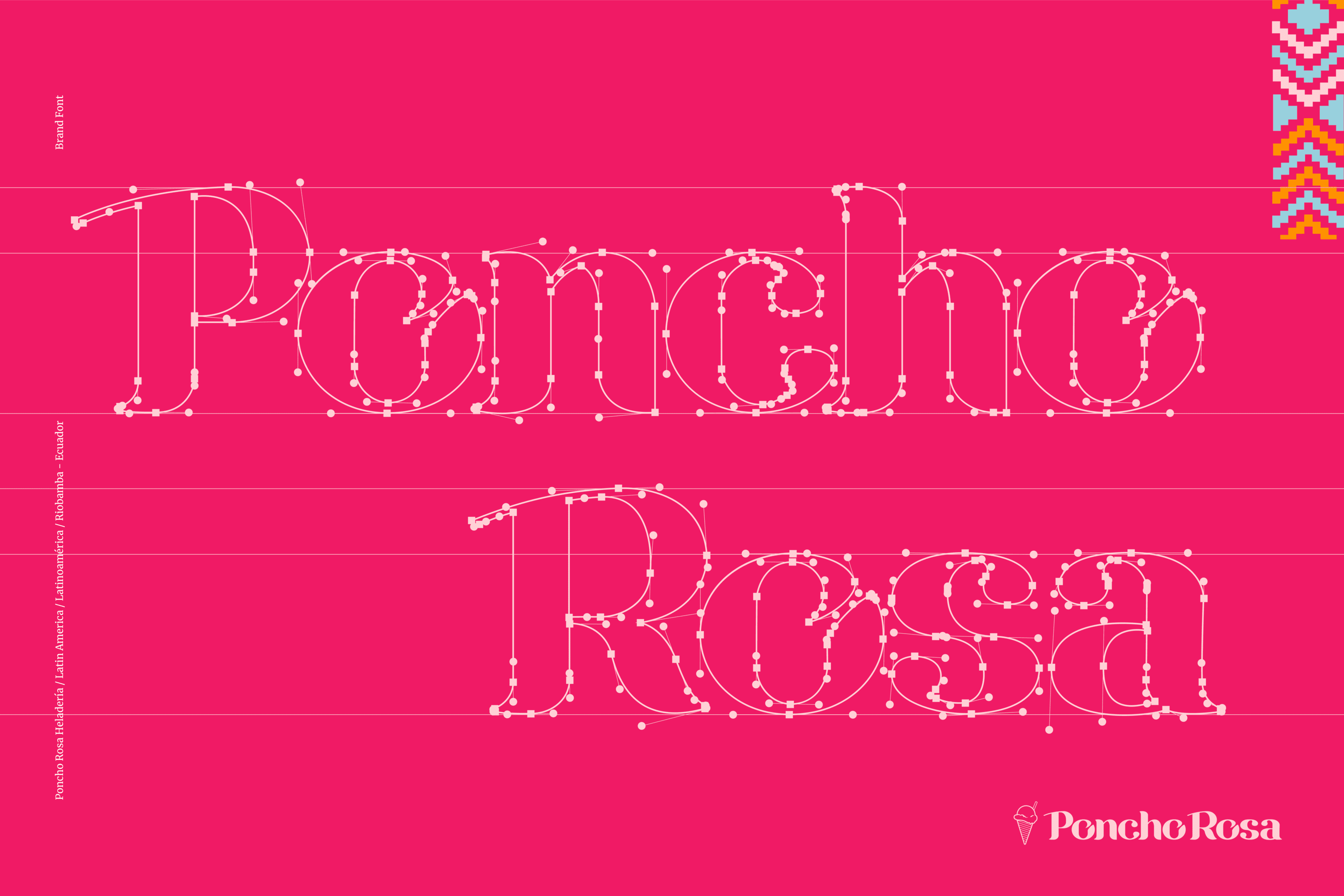
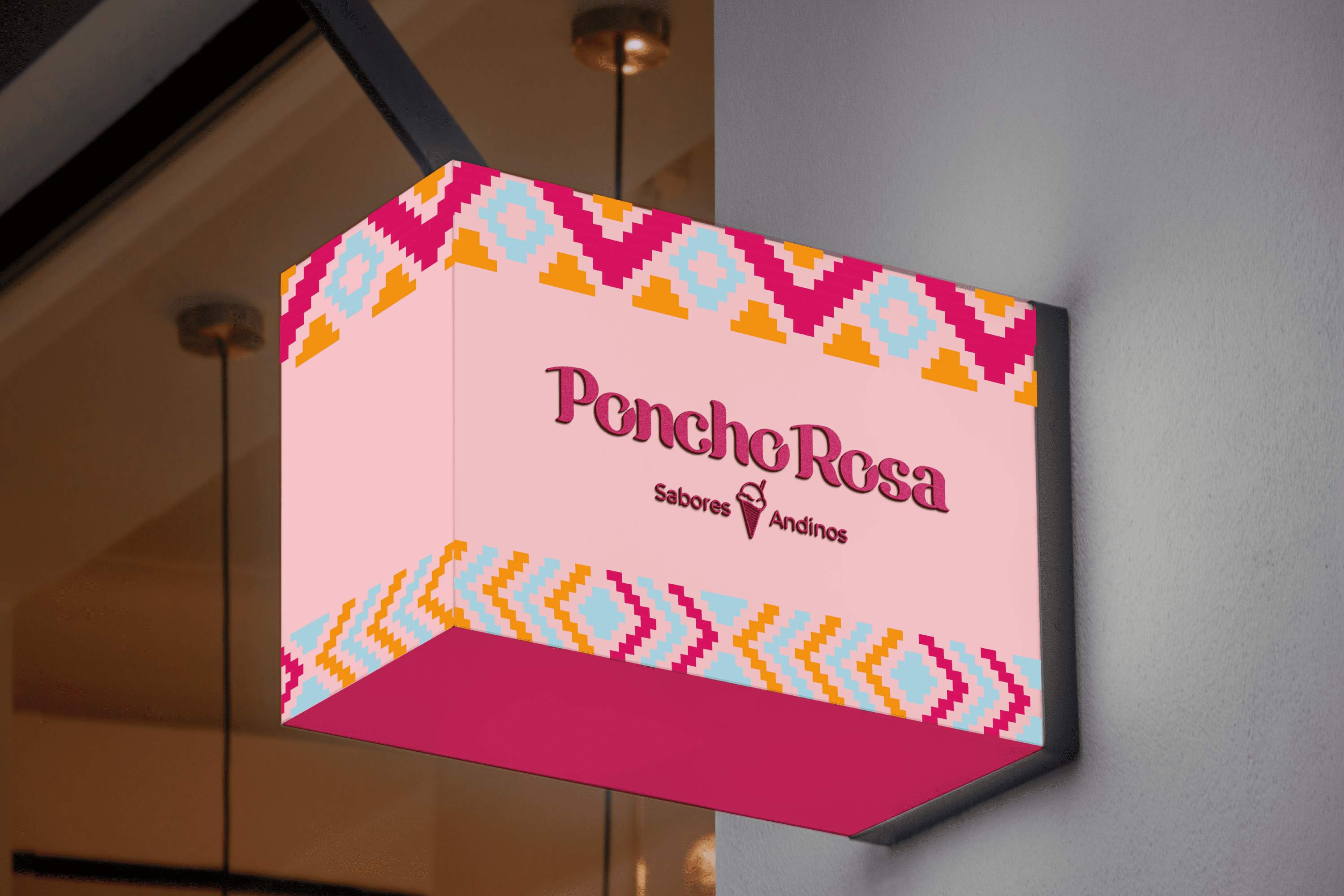
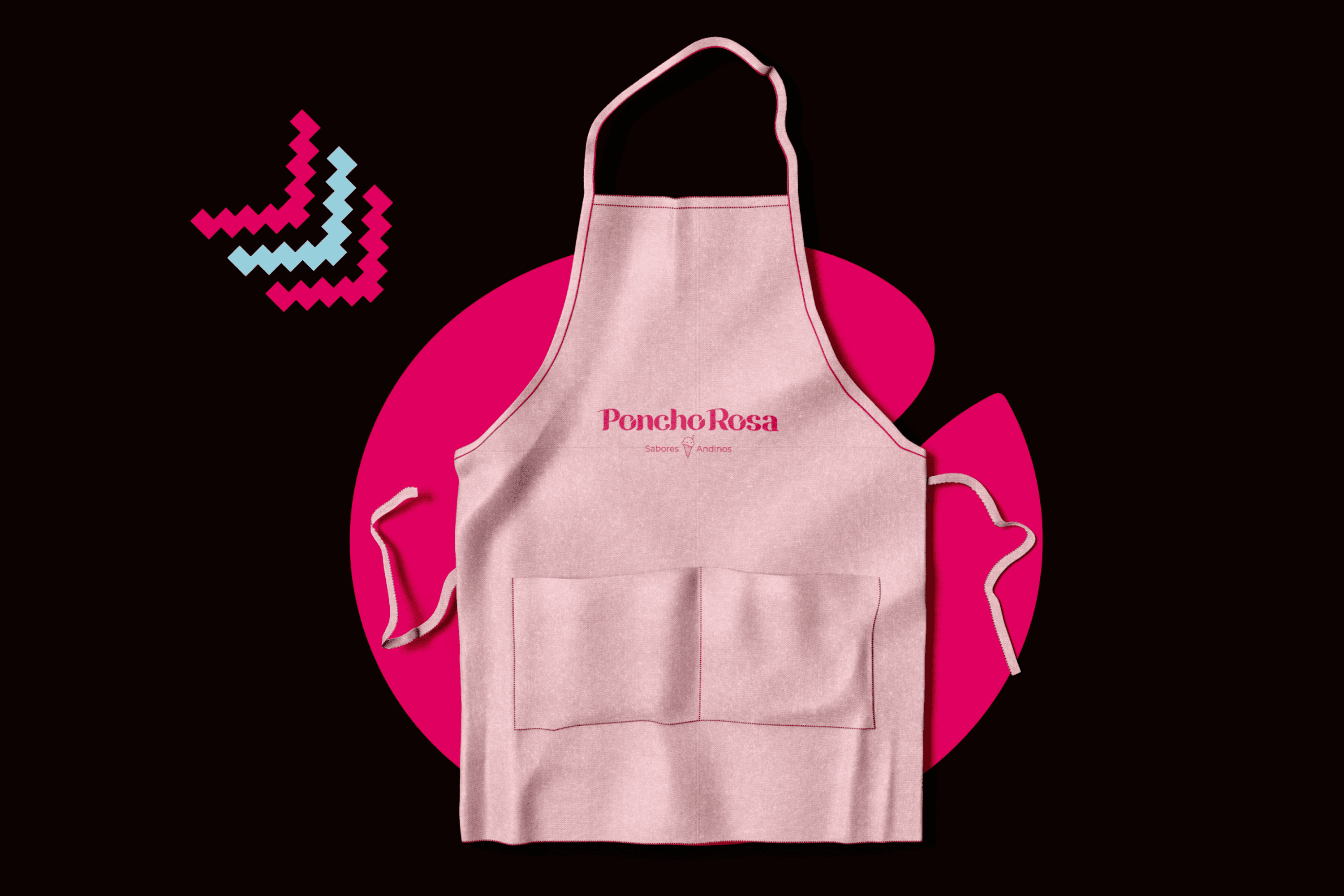
For the creation of Poncho Rosa, we designed a Bold Serif typography that conveys a strong, friendly, and feminine personality, which is characteristic of its origin. The complementary graphic takes Andean visual representations to the world of ice cream and gives it dynamism and color.

Suggested Projects
TAMPER Special Edition
PLASTEX Product Catalog
NAMU Agency
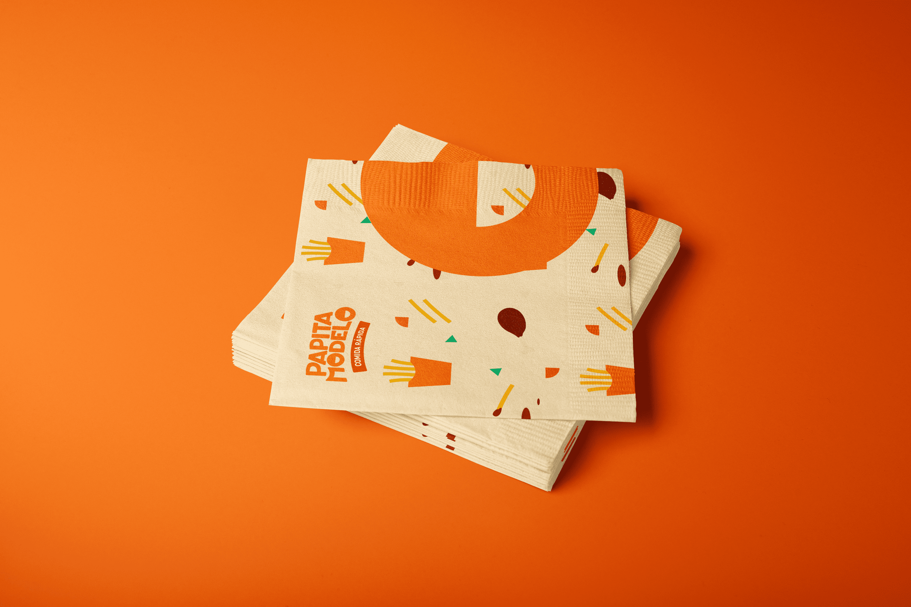
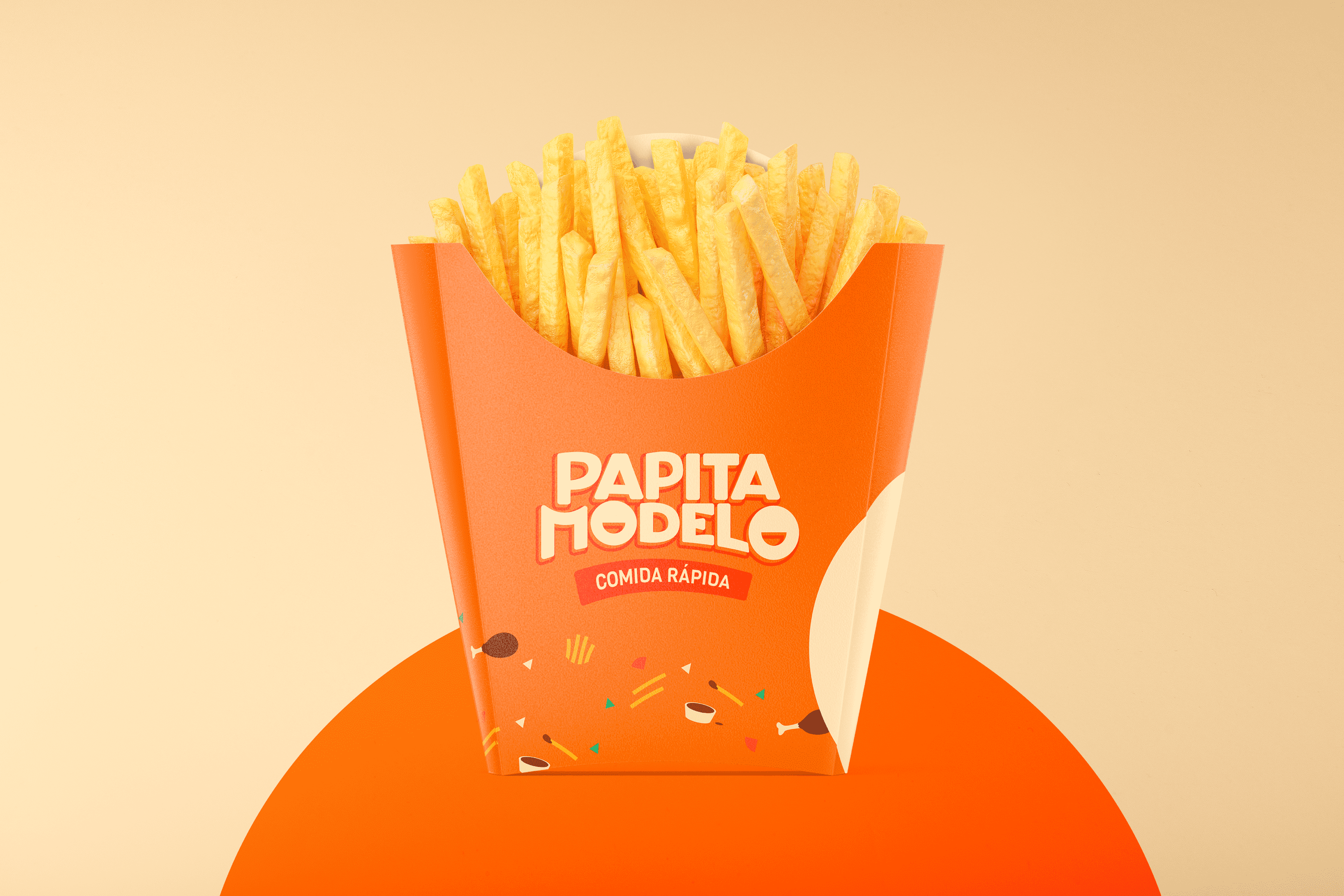
Papita Modelo Fast Food
BRANDING

The Client

Papita Modelo is a fast food venture in Guayaquil, Ecuador.


Keywords

Branding / Design / Fast Food

The Objective

To design a visual identity that is easy recognizable in the sector, with a fun and friendly personality for consumers.


The Solution

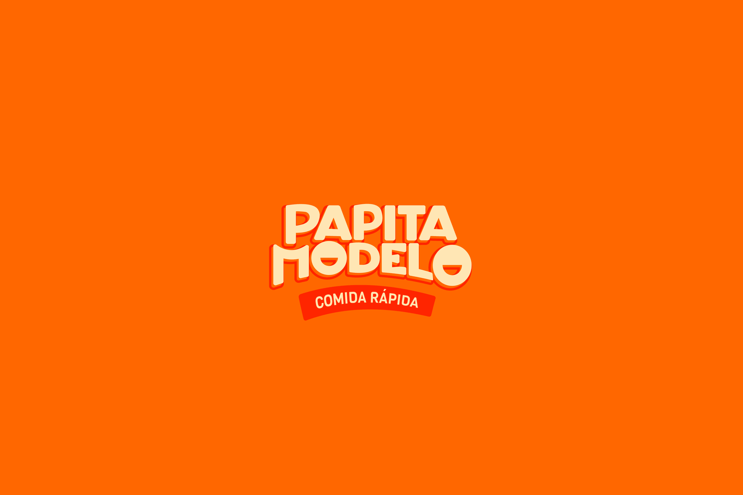
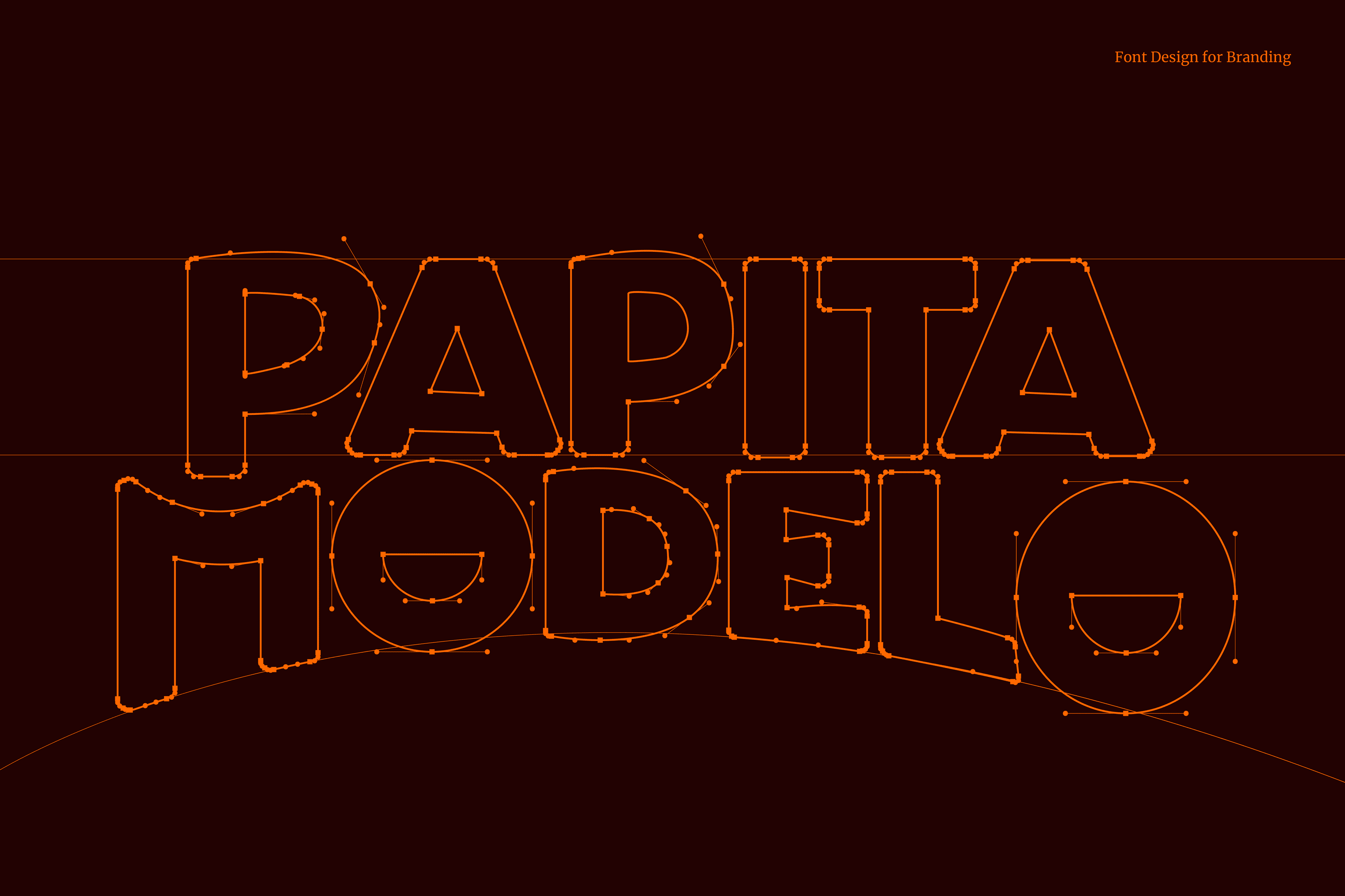
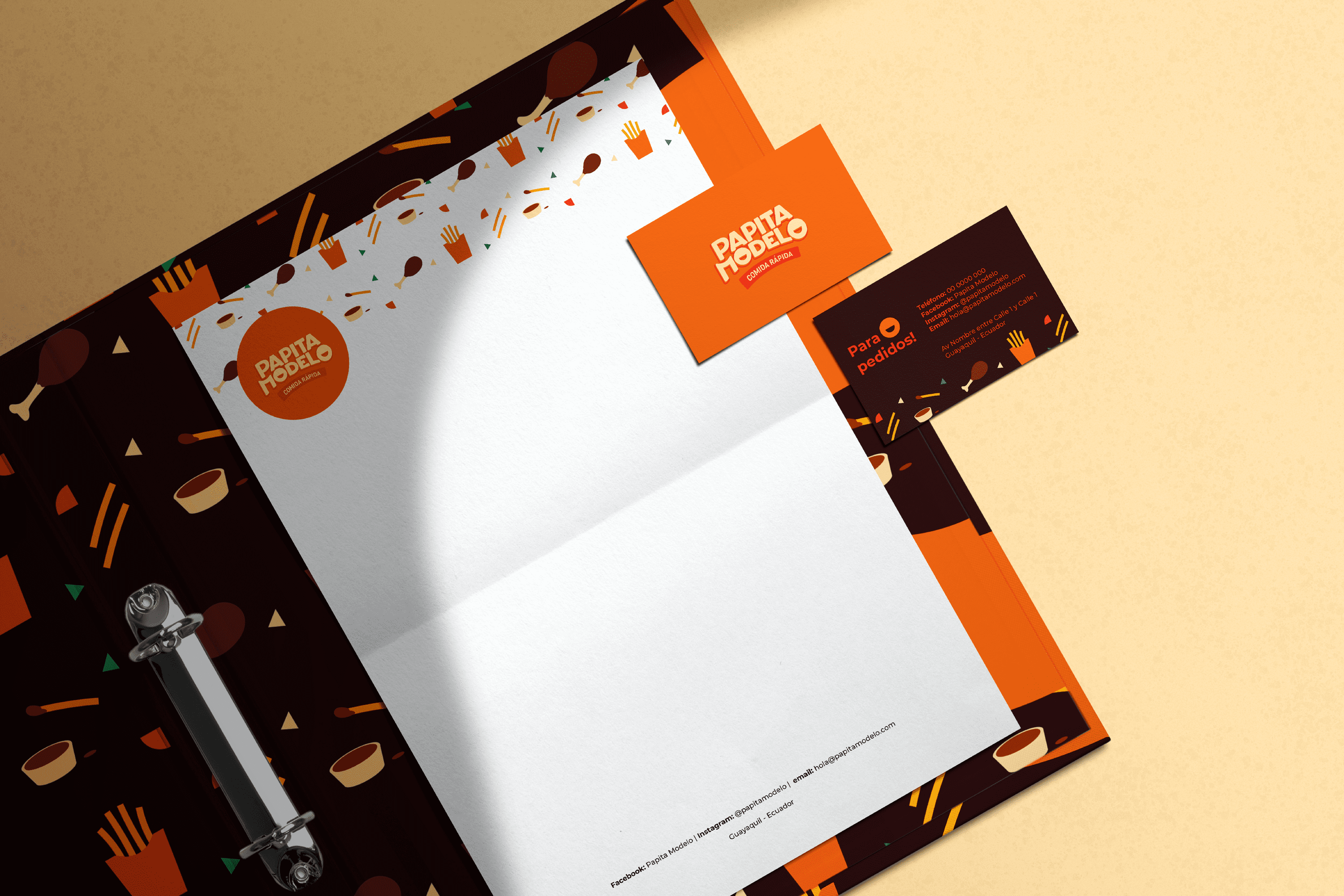
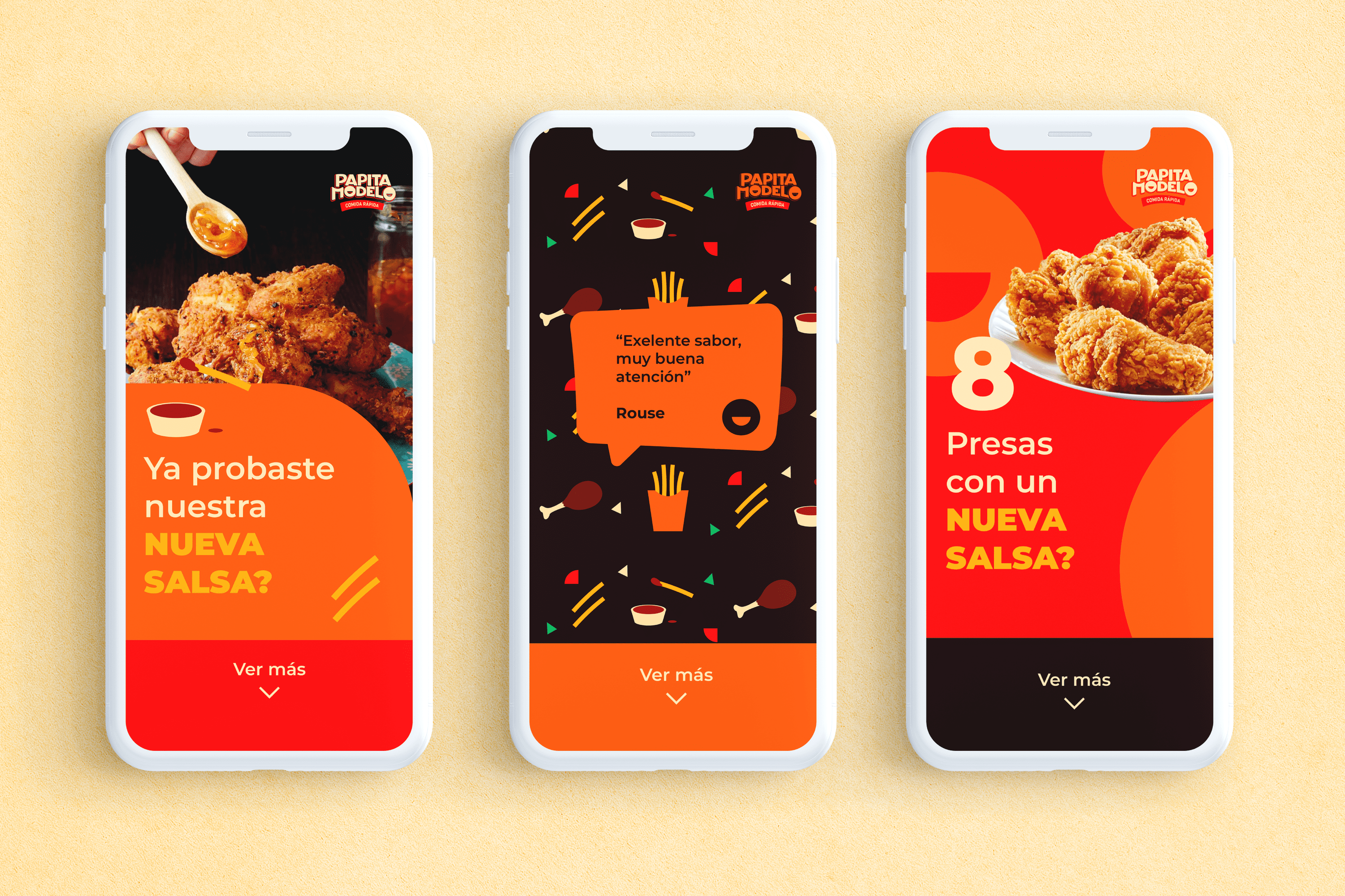
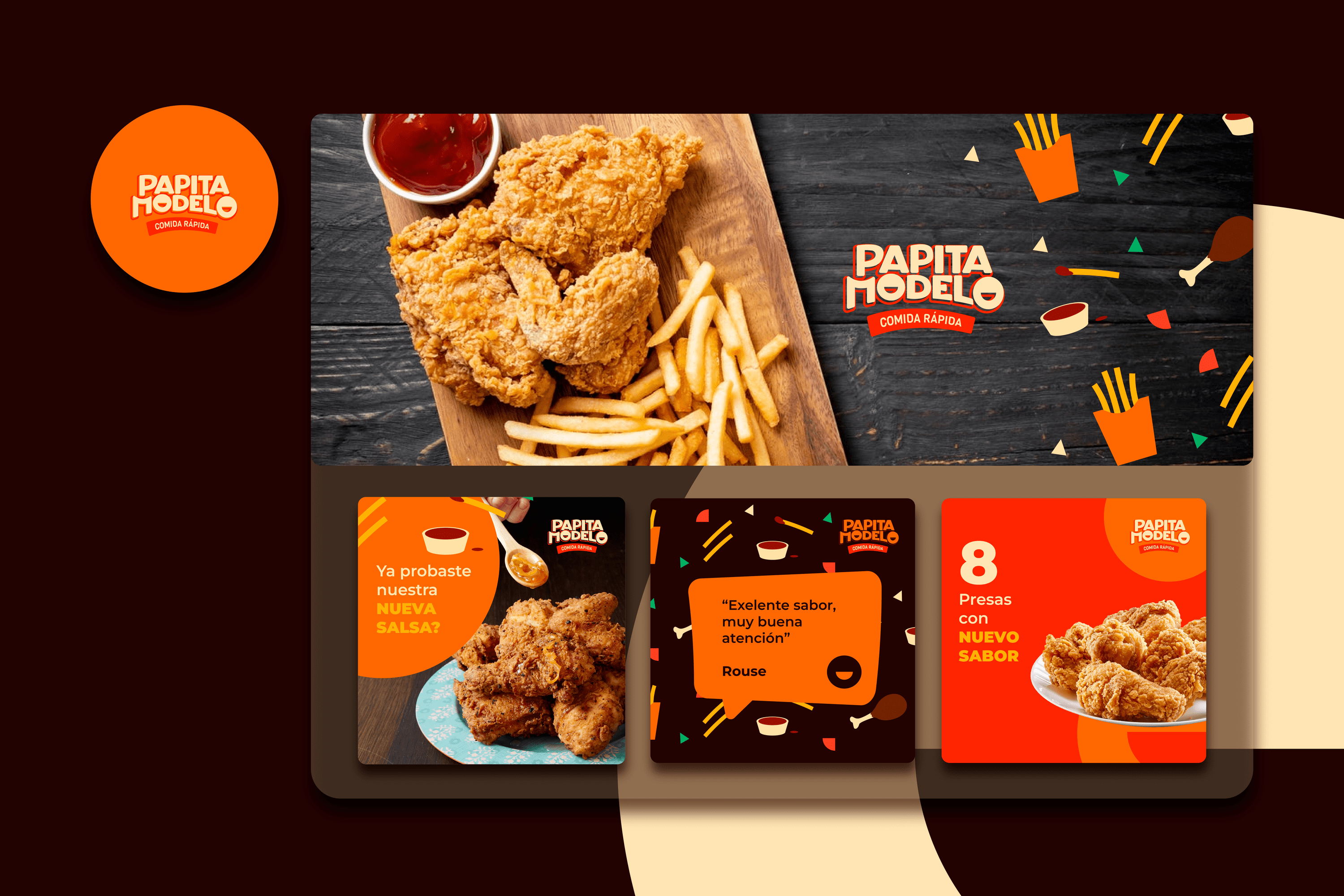
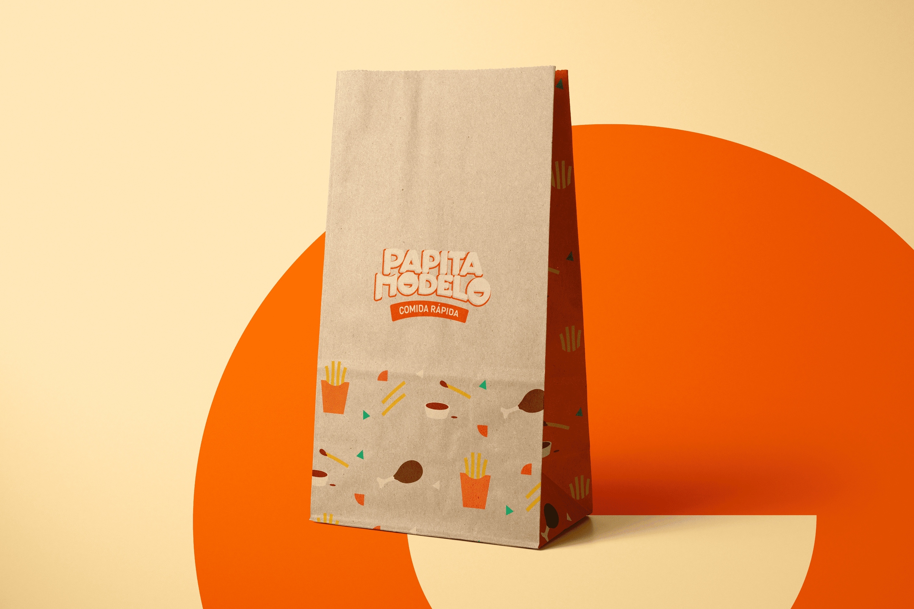
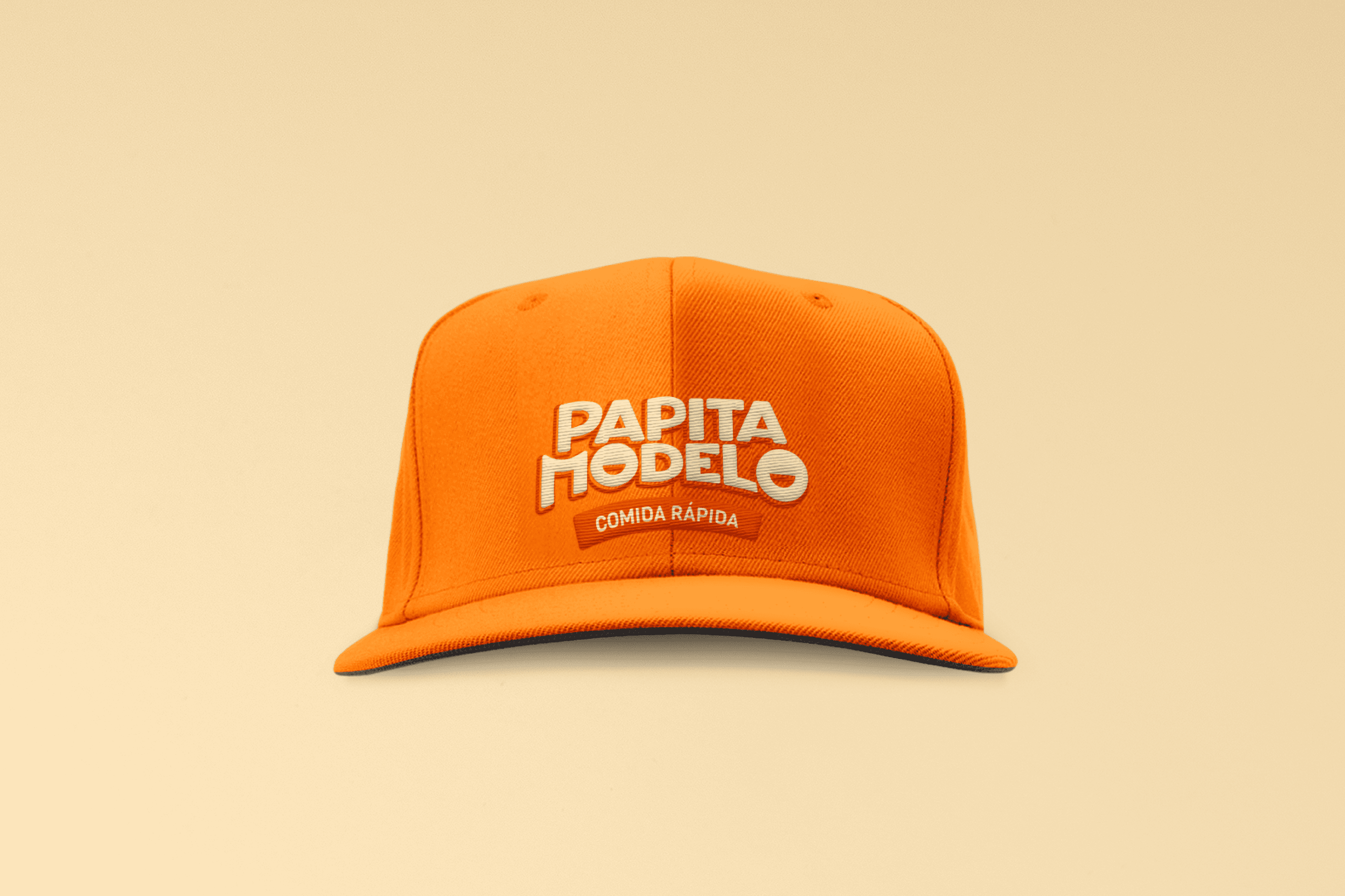
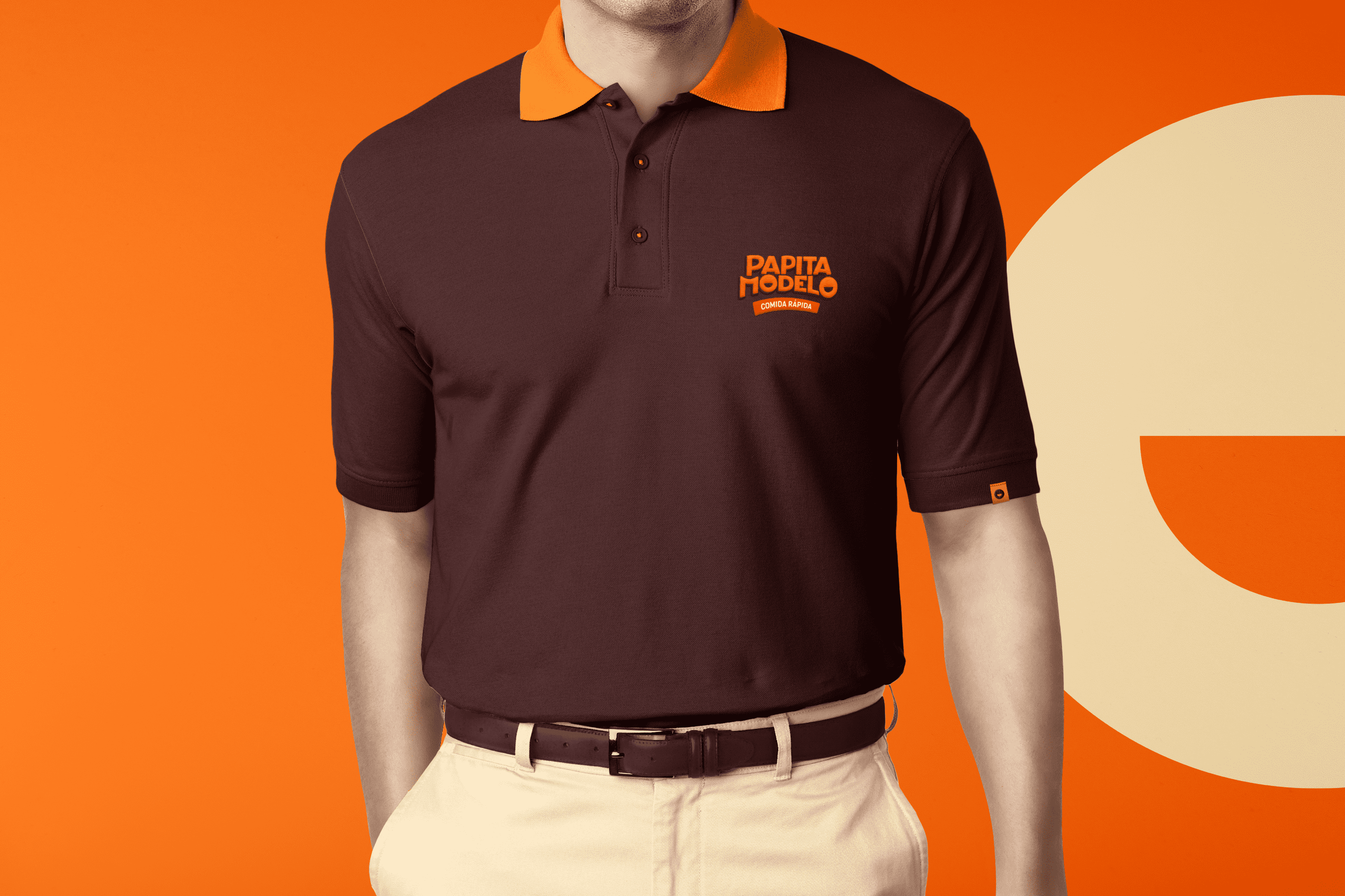
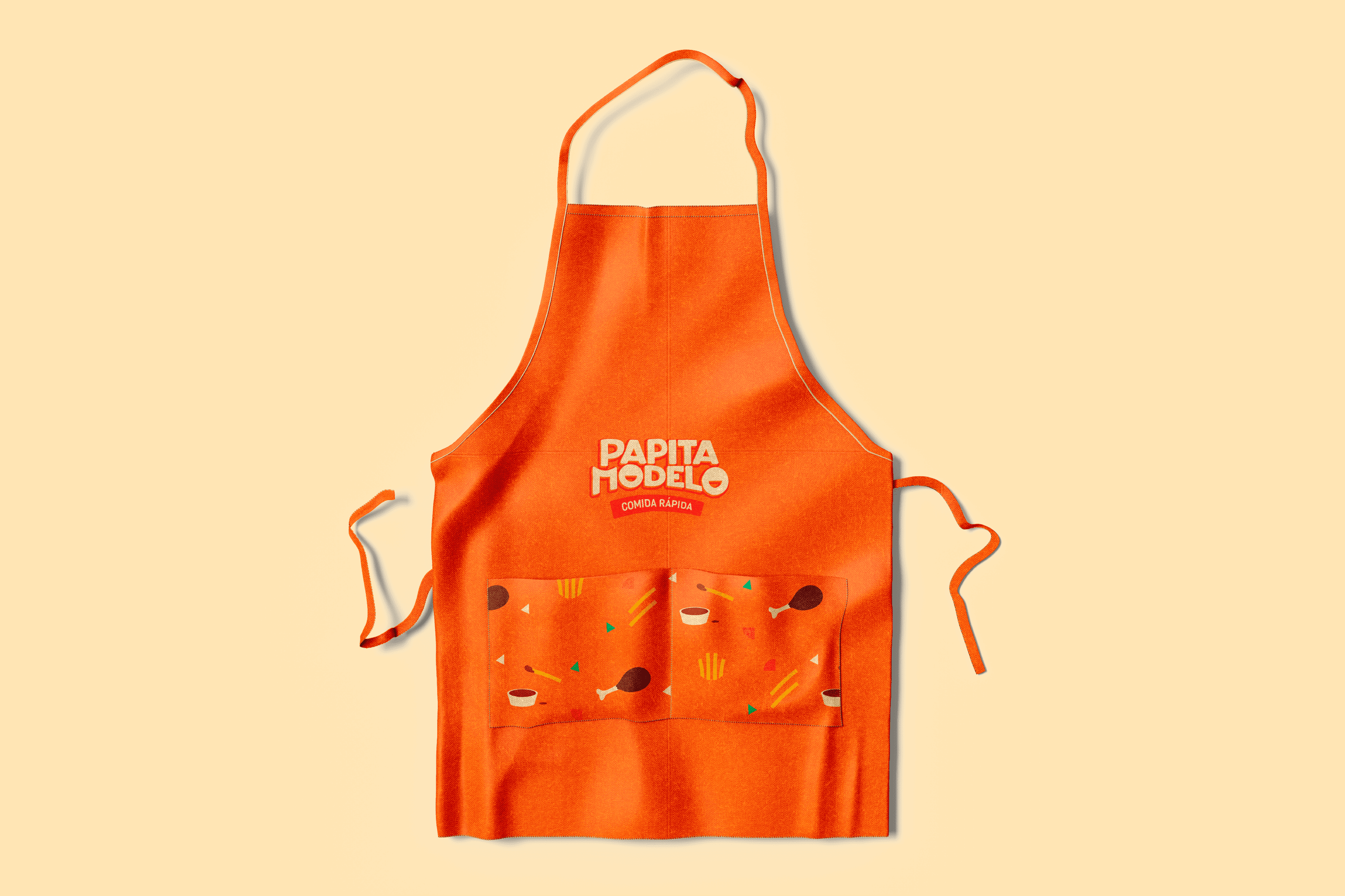
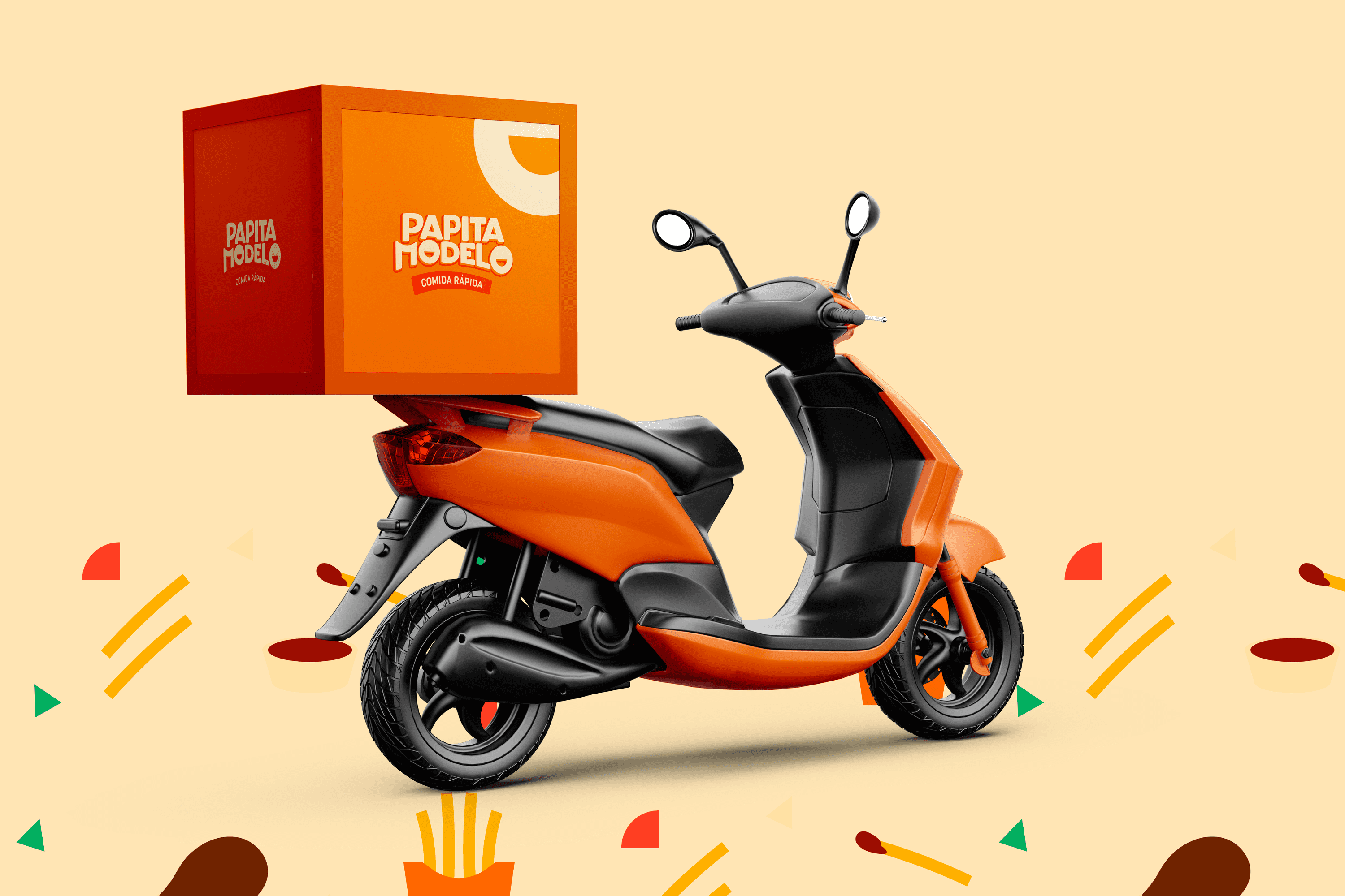
The name chosen for this Establishment is Papita Modelo, which links the neighborhood where it is located with the product, for easy recognition. For the design of Papita Modelo, a youthful and spontaneous typography has been created, a characteristic that is reinforced thanks to the personality of each character, its wide features and the straight line that forms at the top of Papita evoke confidence, at the same time the curved endings both in each character and below Modelo project friendliness; but the most distinctive feature of this logo is the smile drawn in its O this alludes to the joy that is felt after eating and the flavor of Papita Modelo.

The color is directly linked to the fast food sector and the optimistic and fun personality of the brand. As an interesting fact, the thickness of the potatoes was taken as a reference to design this typography.

Suggested Projects
TAMPER Special Edition
PLASTEX Product Catalog
NAMU Agency
JM Services and Foods
BRANDING

The Client

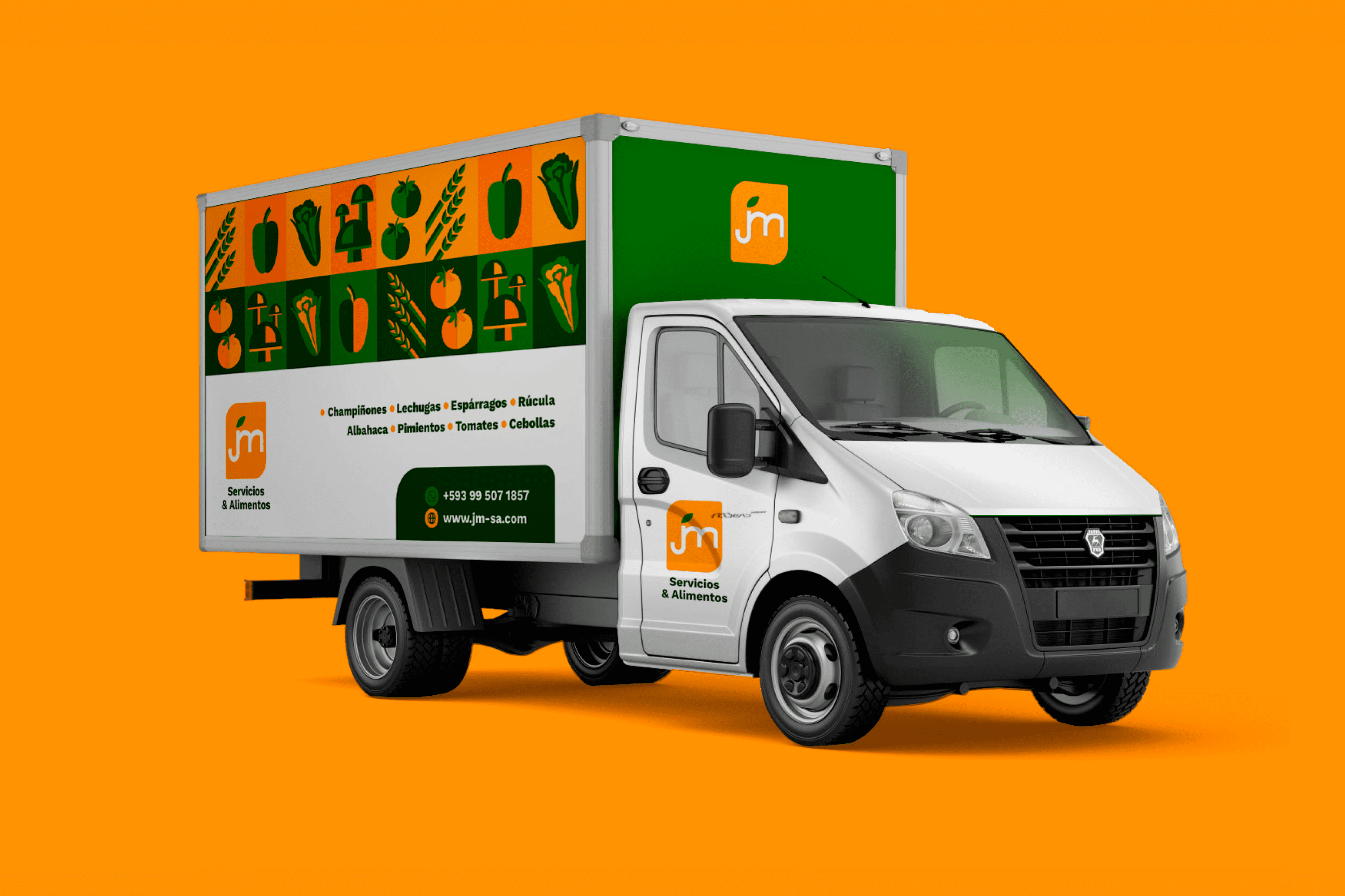
JM Services and Foods is a family company that was born 16 years ago, dedicated to the commercialization of vegetables and mushrooms to restaurants, hotels, sub-distributors and end consumers, located in the city of Quito, Ecuador.


Keywords

Branding / Design / Industry / Foods

The Objective

To redesign the JM Services & Foods brand and develop a visual system with a fresh, modern, and easily recognizable personality, allowing us to reach a more selective market.


The Solution

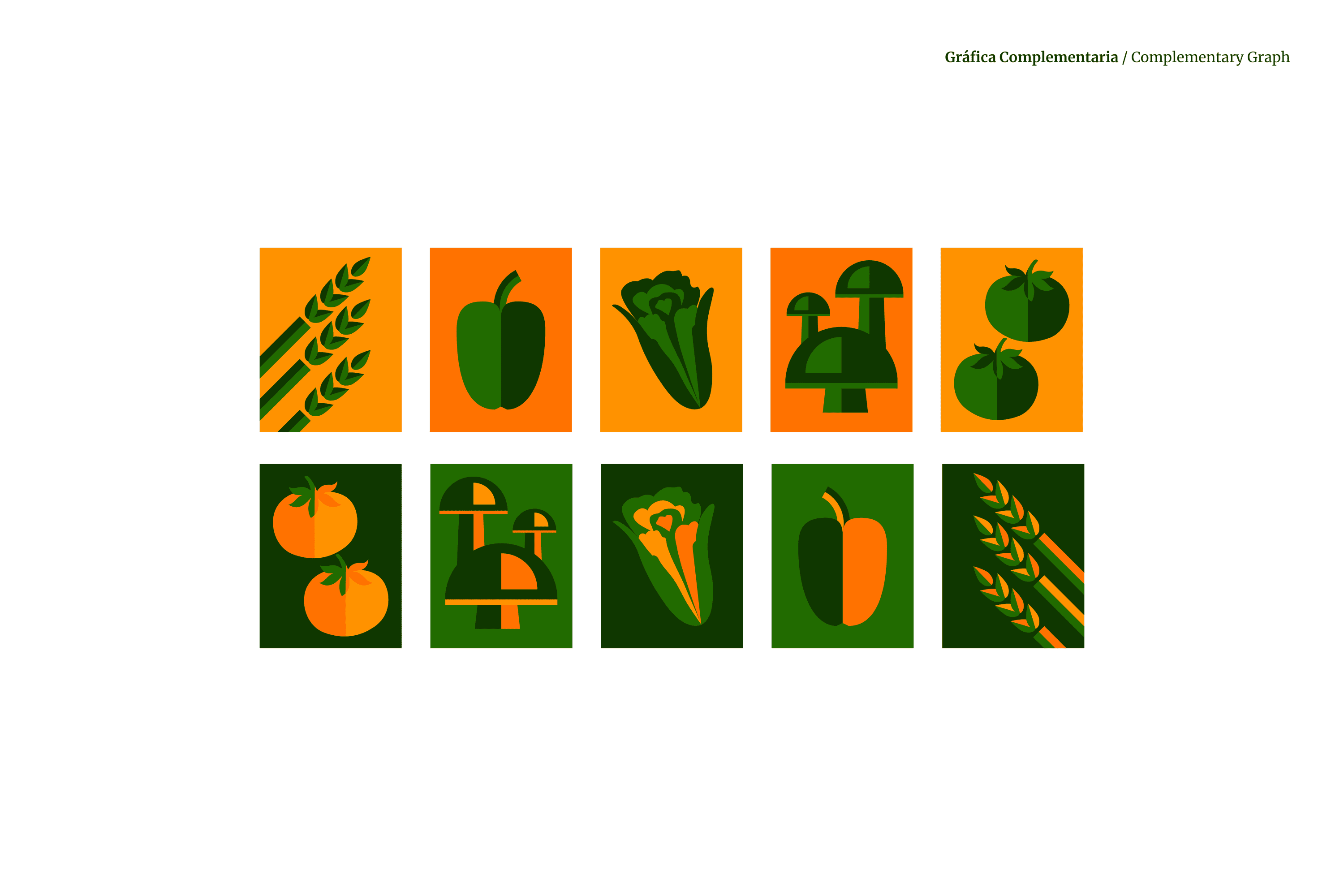
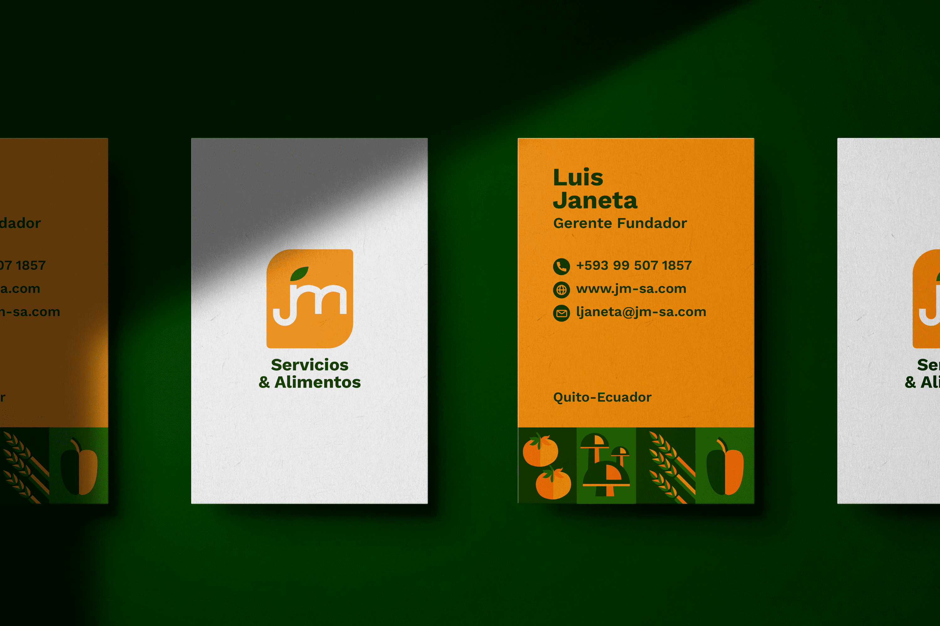
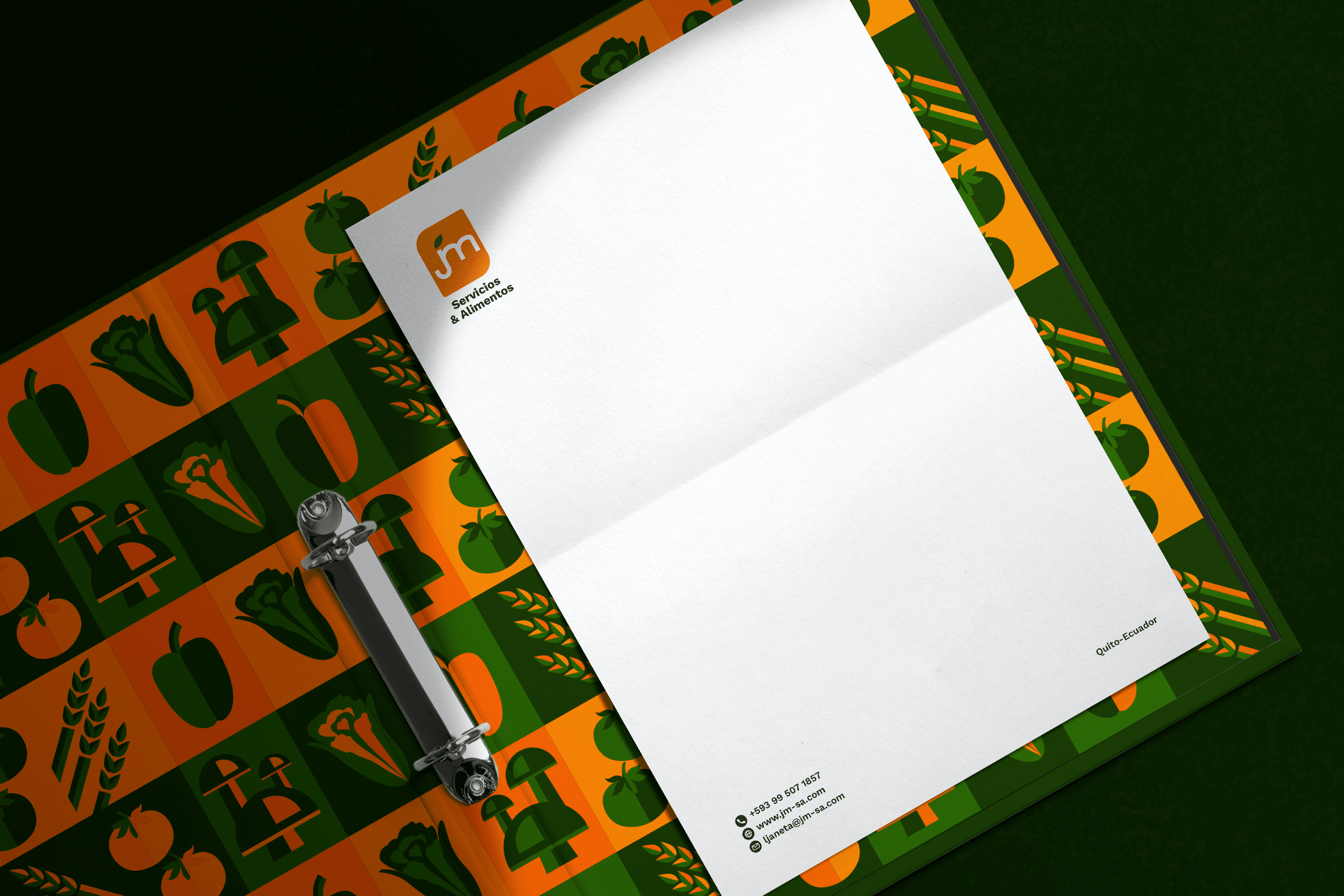
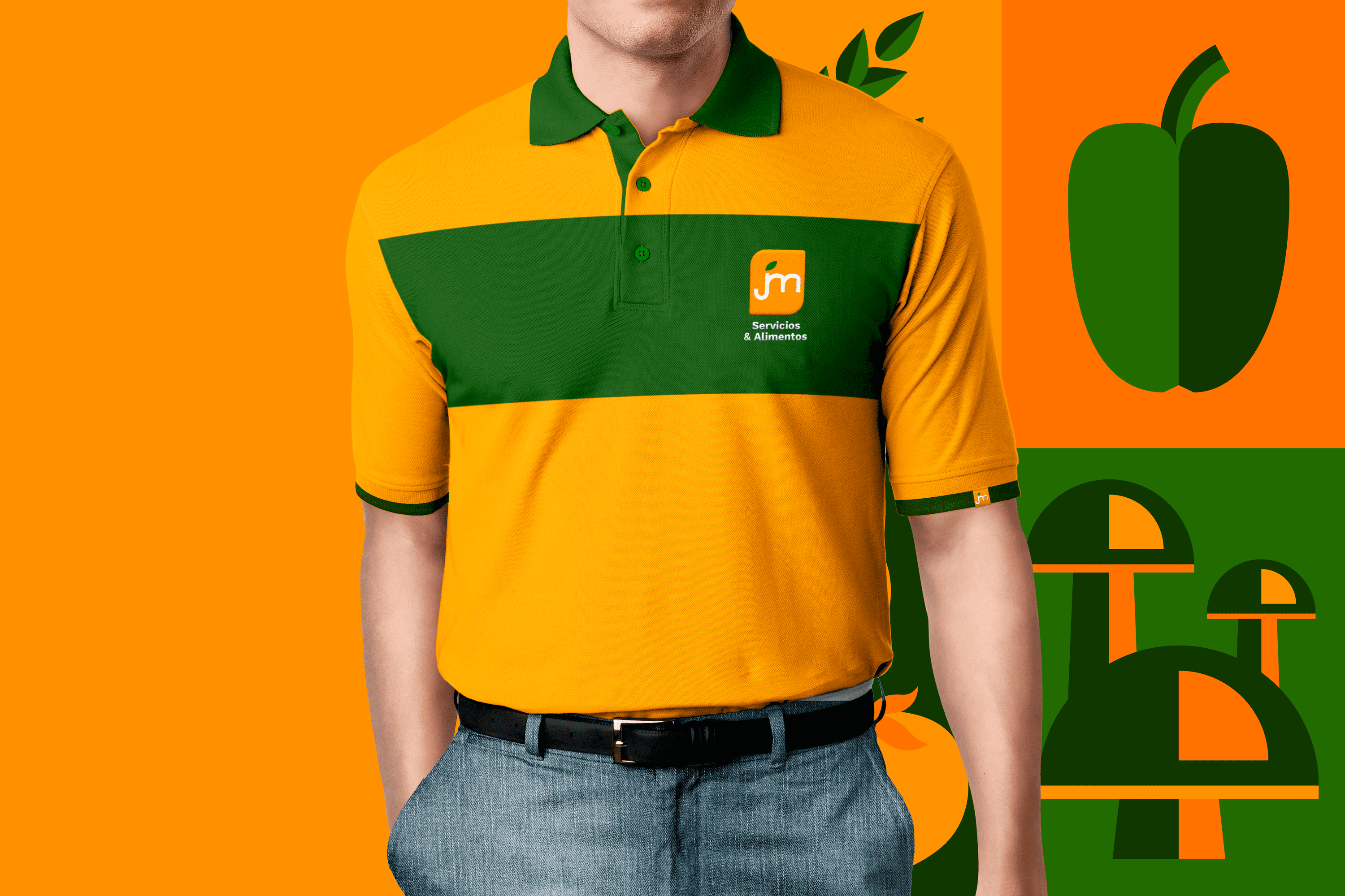
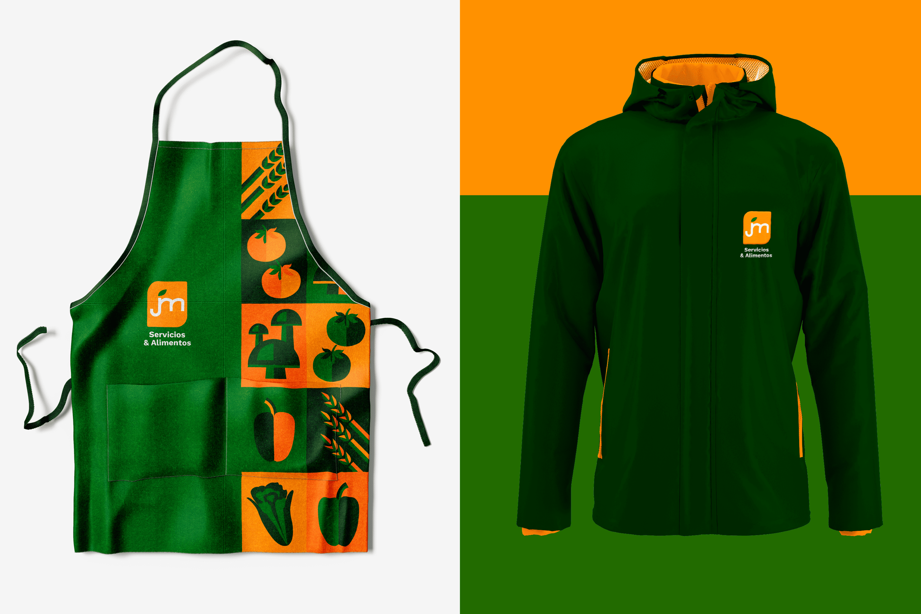
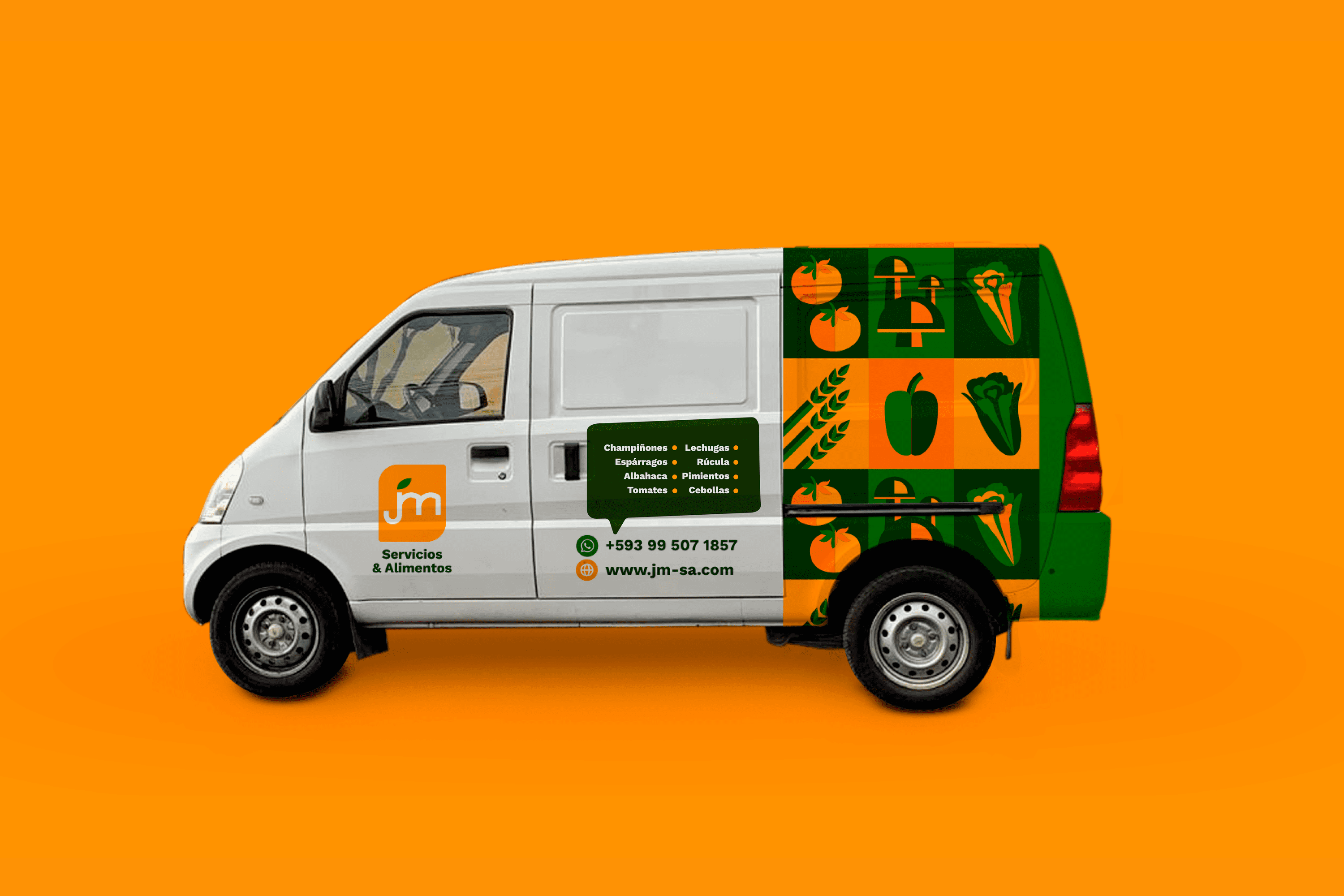
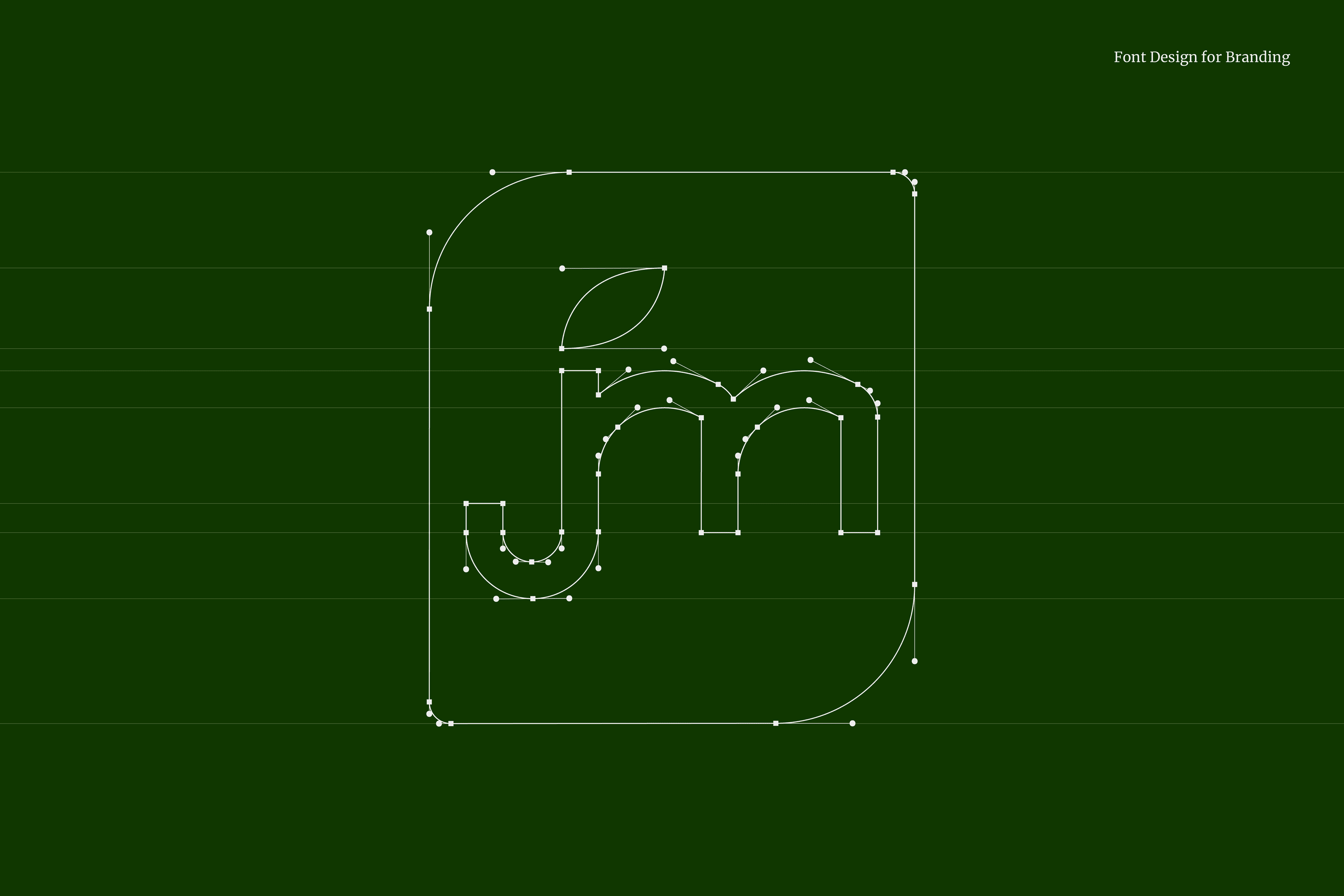
The iconic and typographic parts come together to represent the diversity of food products distributed by JM Services & Foods, inscribed in a rectangular area with rounded corners to communicate protection of JM’s products and trust in both their services and products.

The selected color palette features orange that conveys vitality, friendliness, and closeness. On the other hand, the range of greens represents in color psychology: health, naturalness, freshness, fertility, organic and abundance, qualities that strengthen the identity of JM Services & Foods.

Suggested Projects
TAMPER Special Edition
PLASTEX Product Catalog
NAMU Agency