Be Here Project
BRANDING

The Client

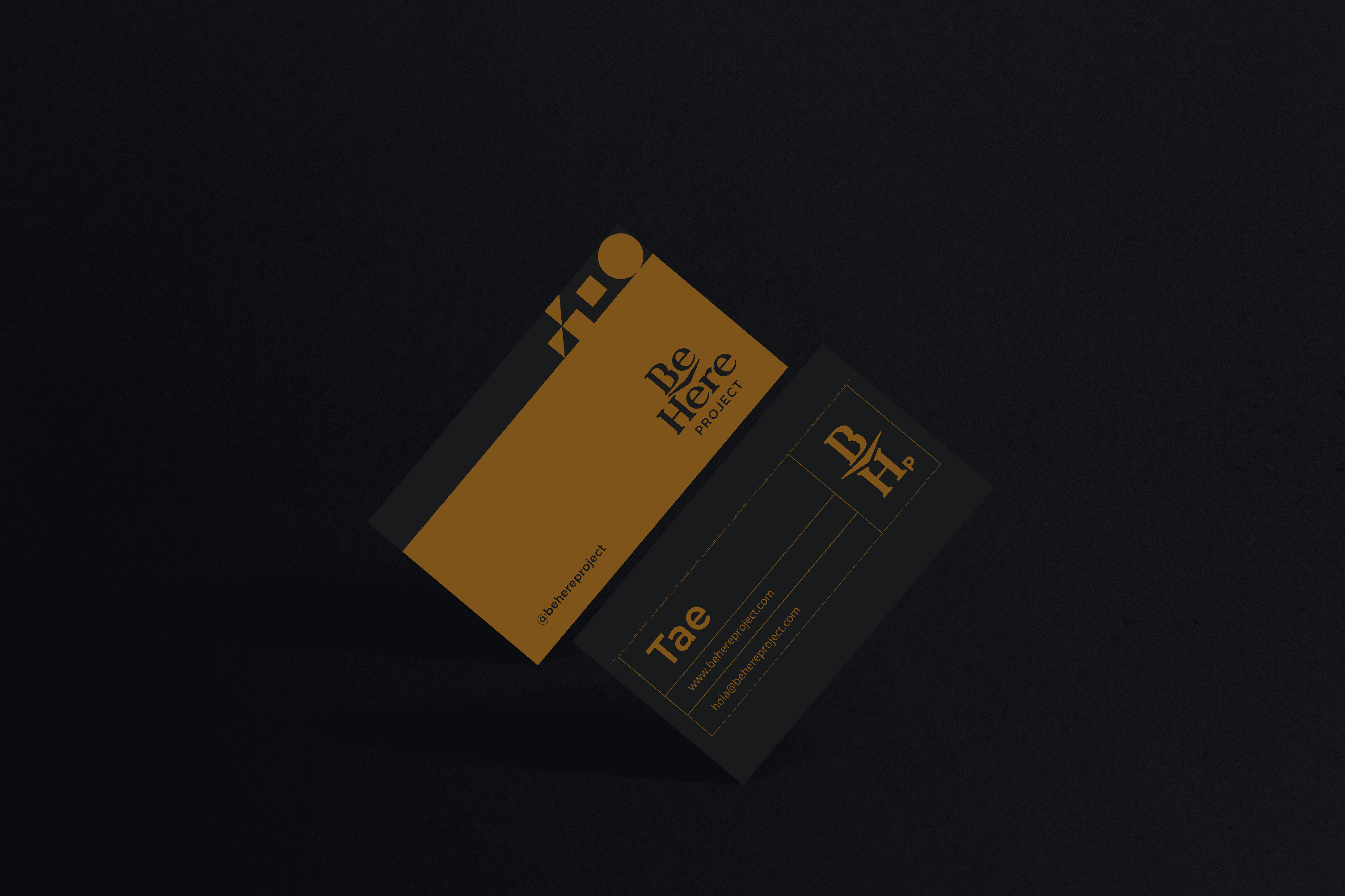
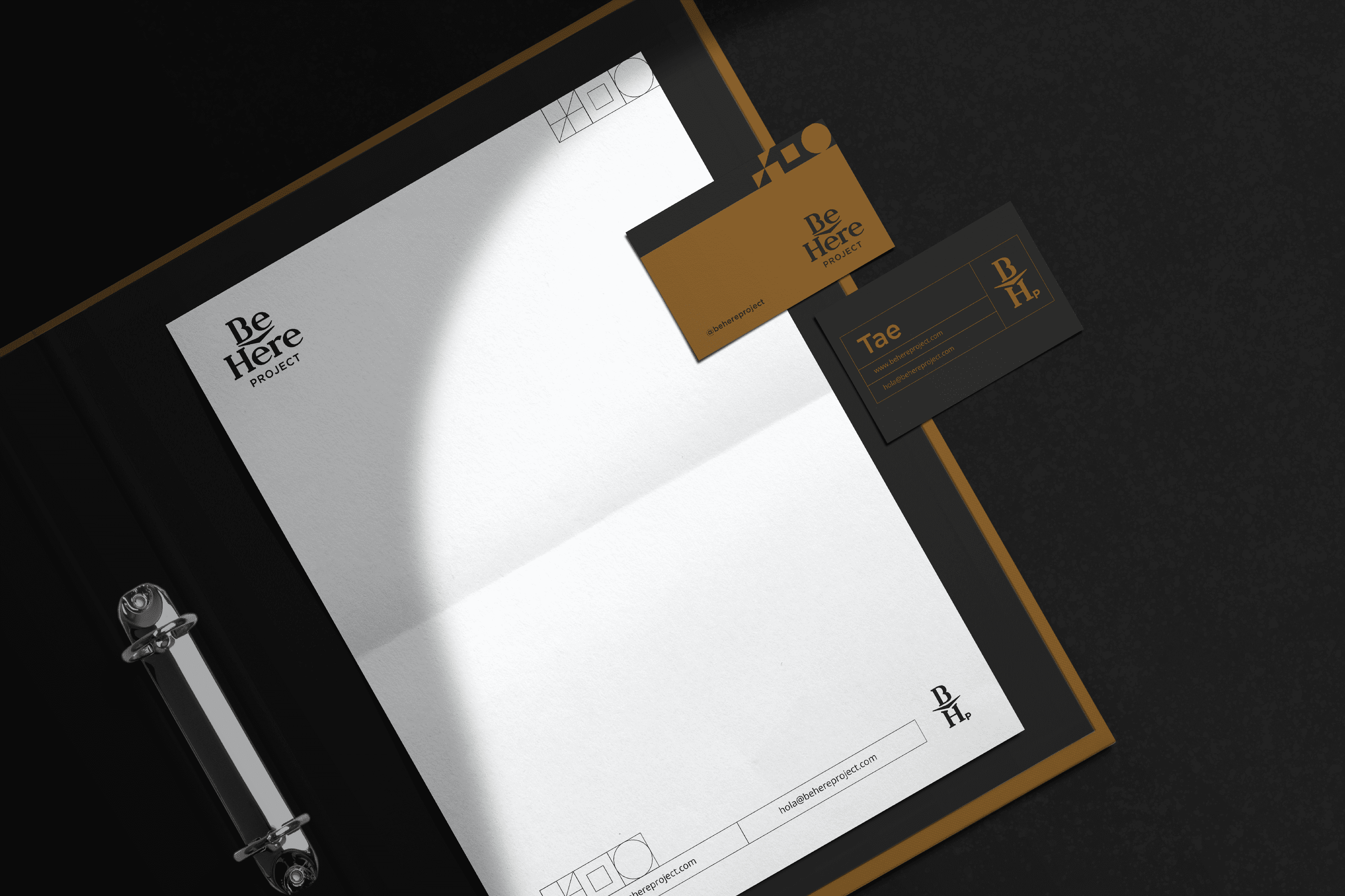
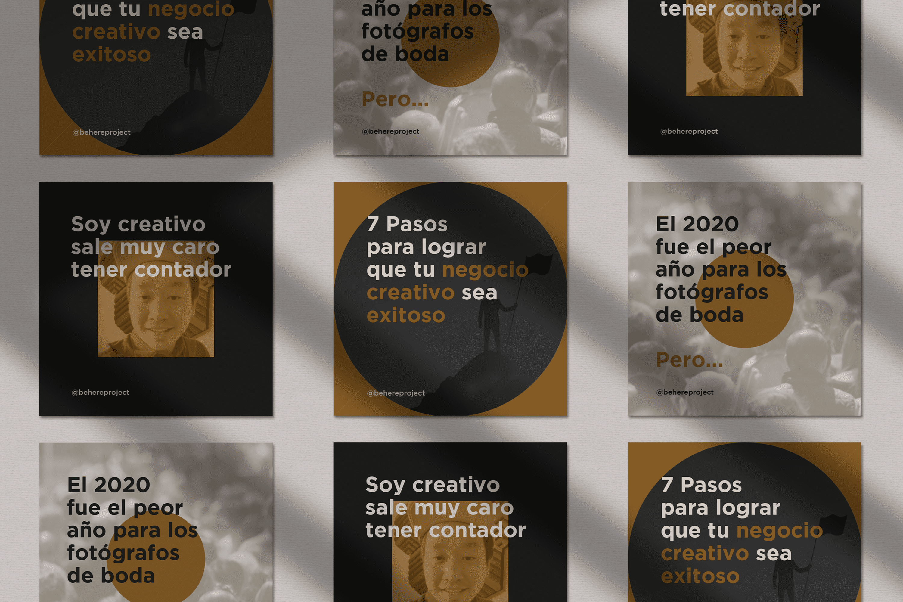
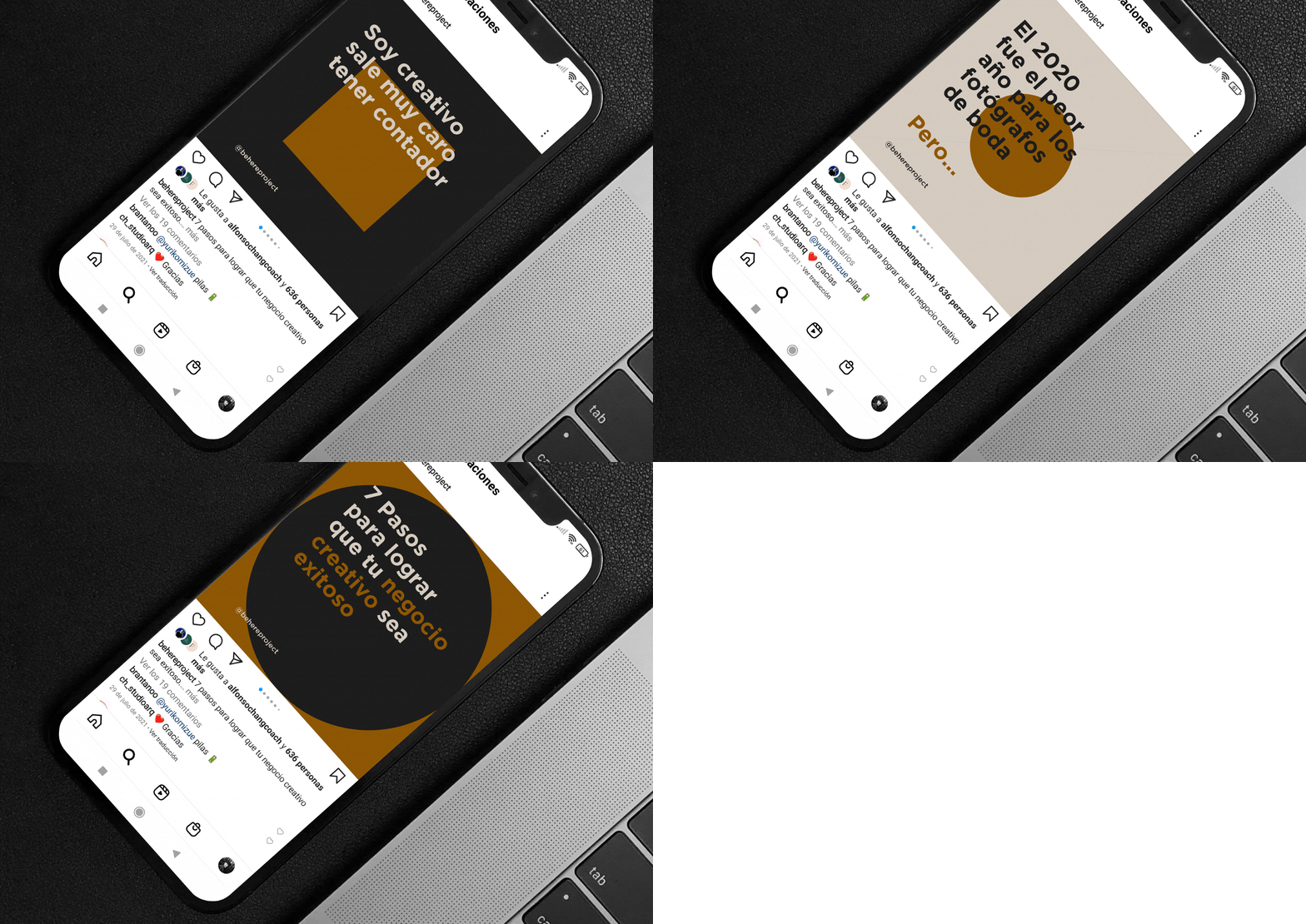
The Be Here Project is an education project for photographers whose mission is to inspire more than 1 million creatives to create a sustainable business while doing what they love, located in Mexicali, Mexico.


Keywords

Branding / Education / Photographers
The Objective

Redesign a brand with an academic personality and a fresh, modern look for Be Here Project.


The Solution

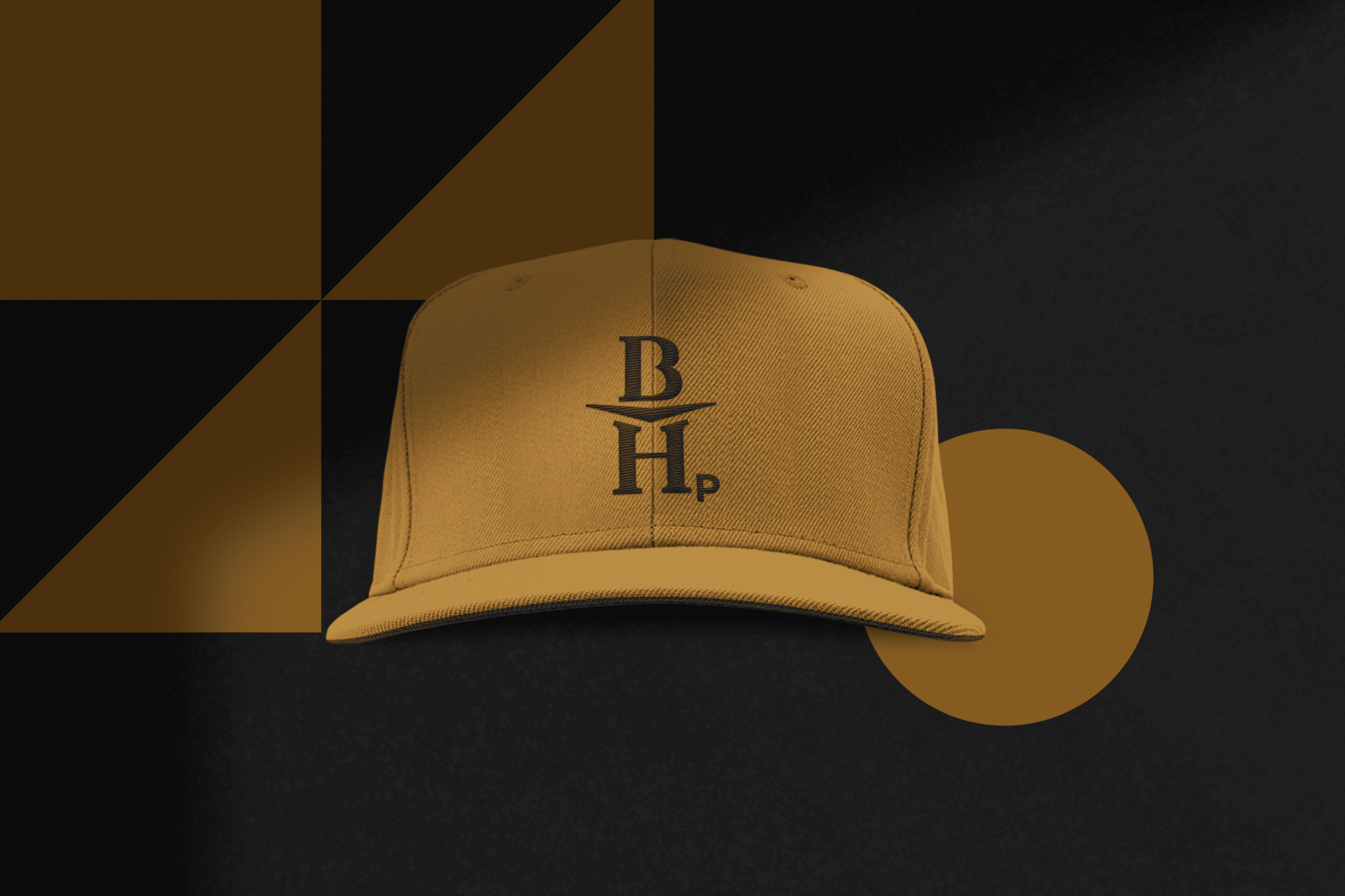
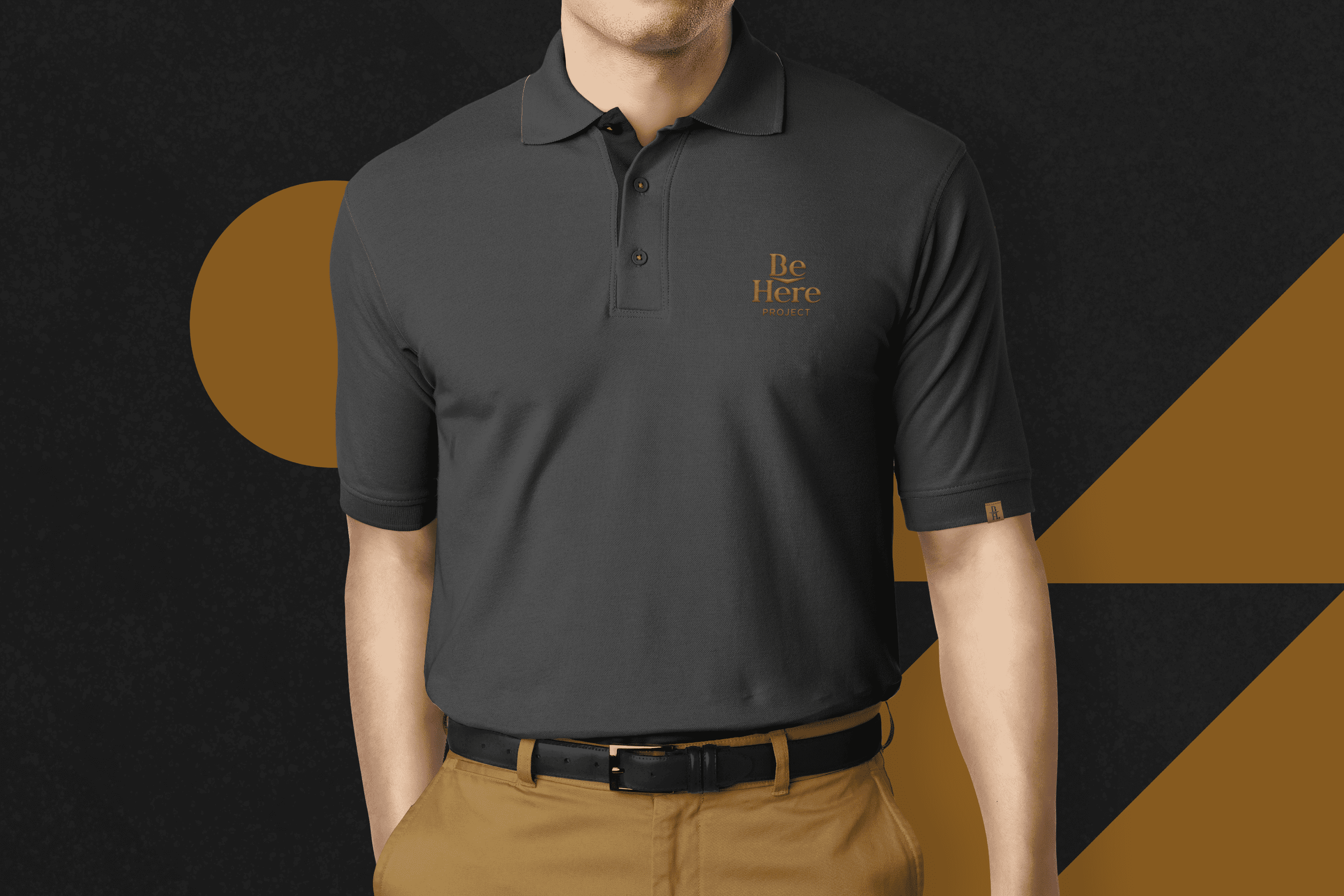
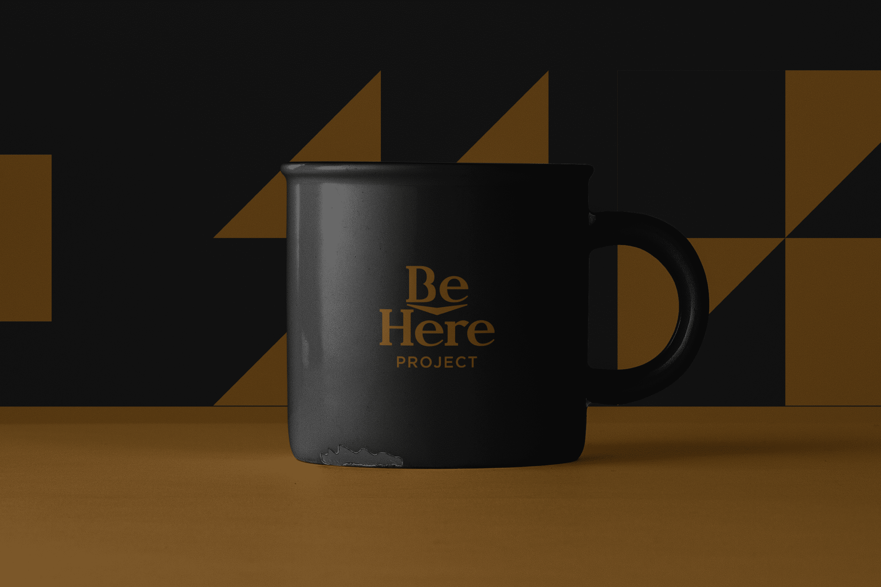
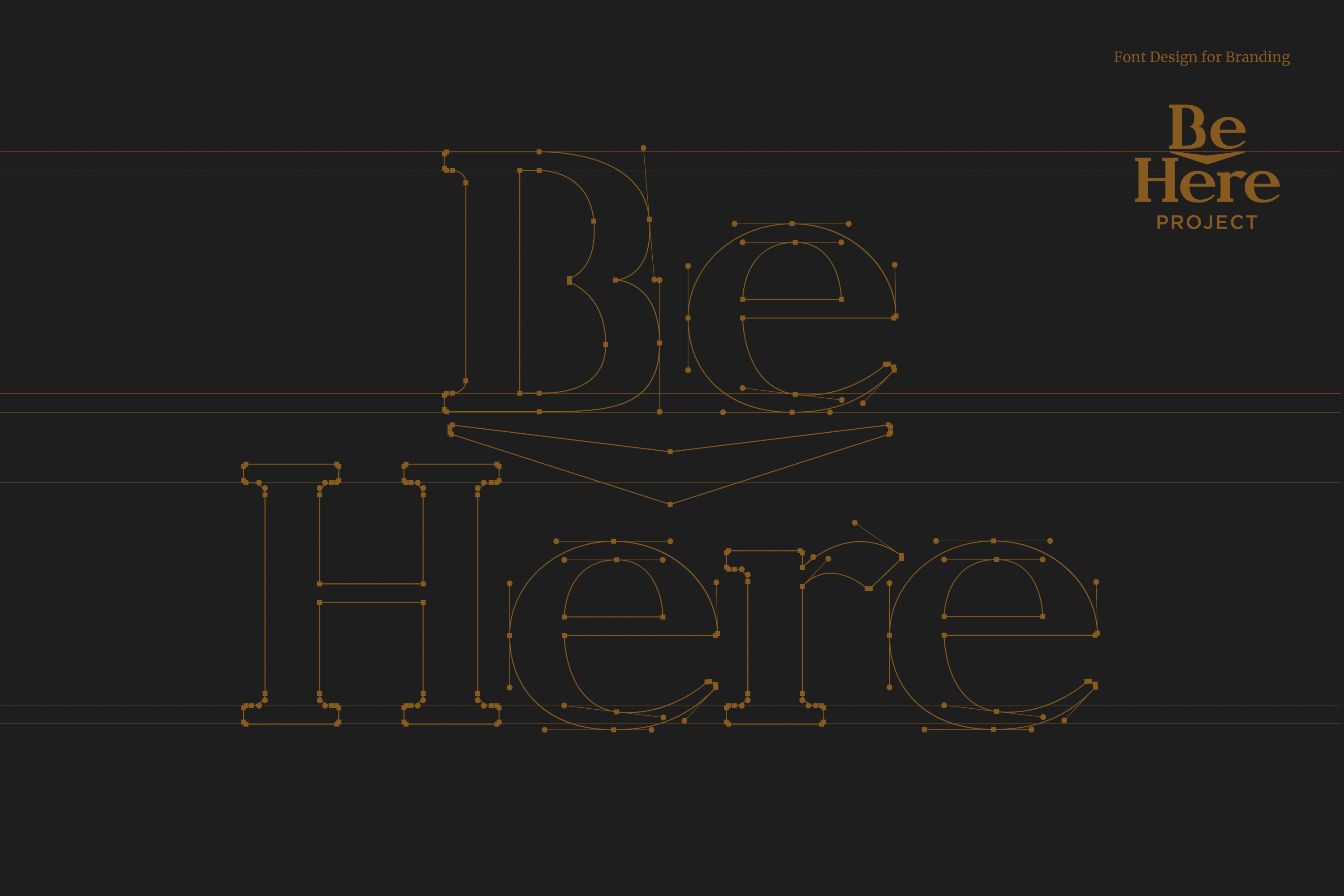
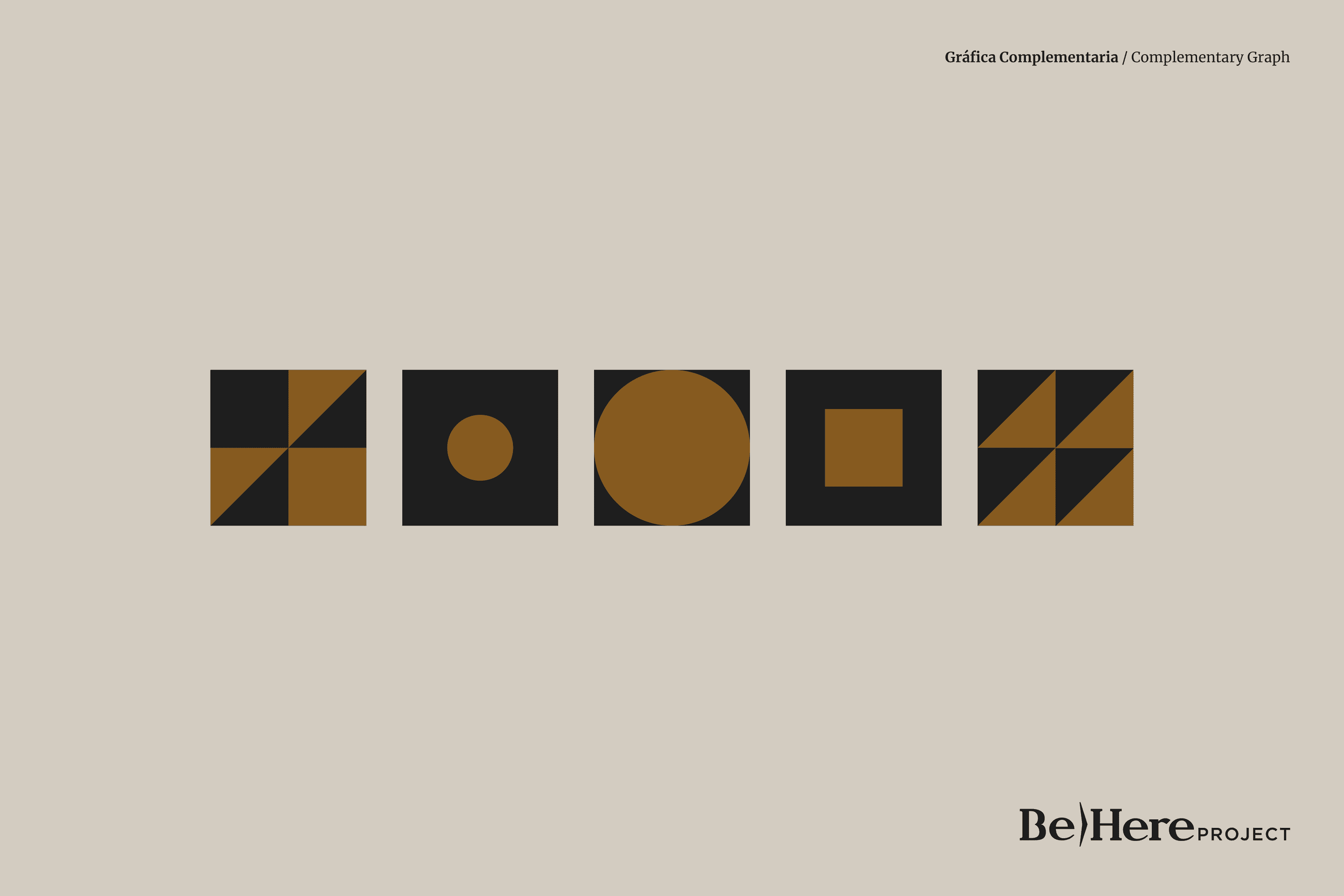
The iconic and typographic part come together to reinforce the concept of “Be Here”. The wide flagpoles and features project confidence, the serif adds to this characteristic, as it gives the typography stability and at the same time the serif alludes to the academic and learning environment. The circular and wide vowels give Be Here Project’s typography a friendly character. On the other hand, the concept of Be Here has been reinforced by integrating a central arrow into the design.
Suggested Projects
Terrenal Resto Bar
Simples Finanzas
Extreme Max
Mafer Merino Photography
BRANDING

The Client

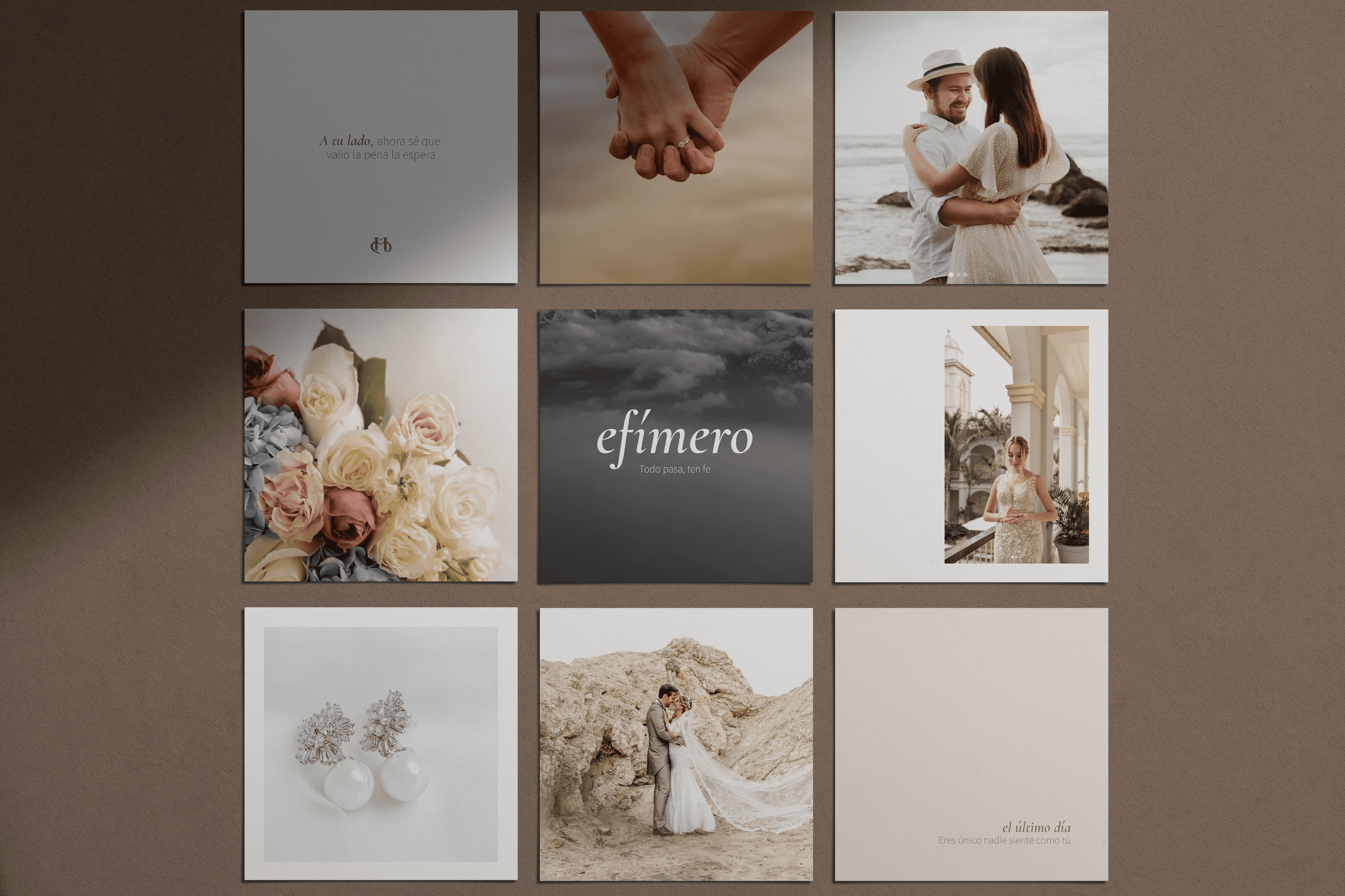
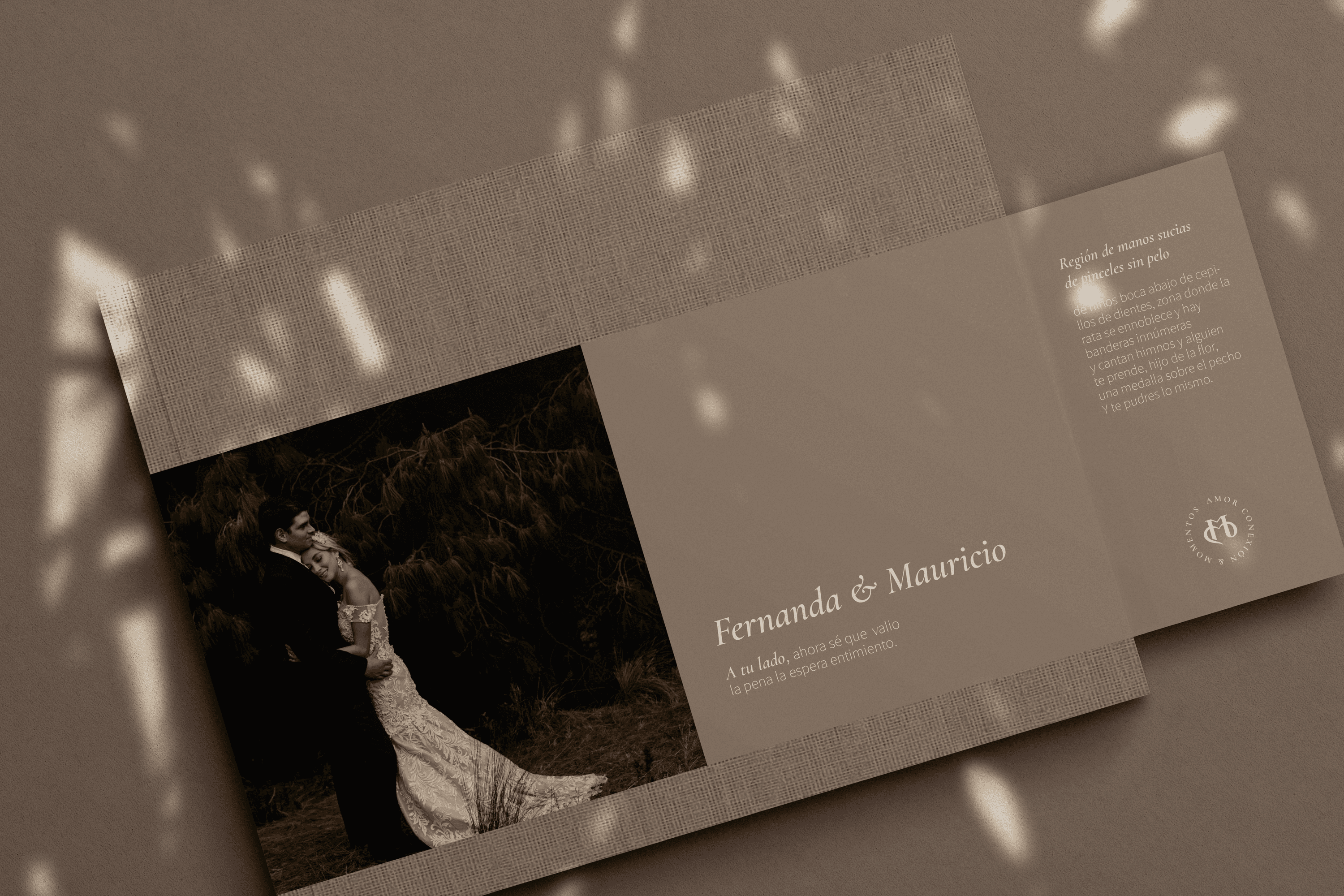
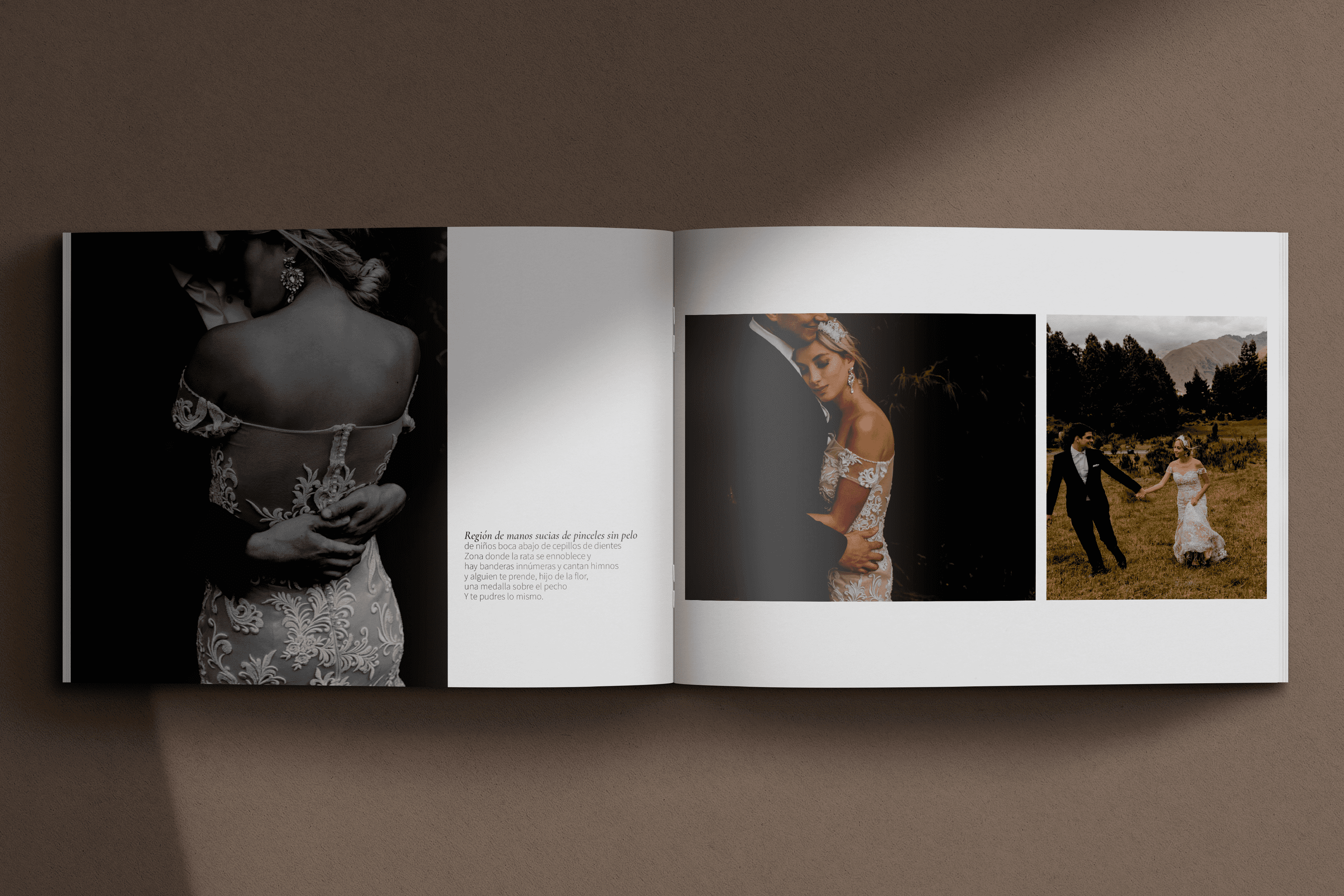
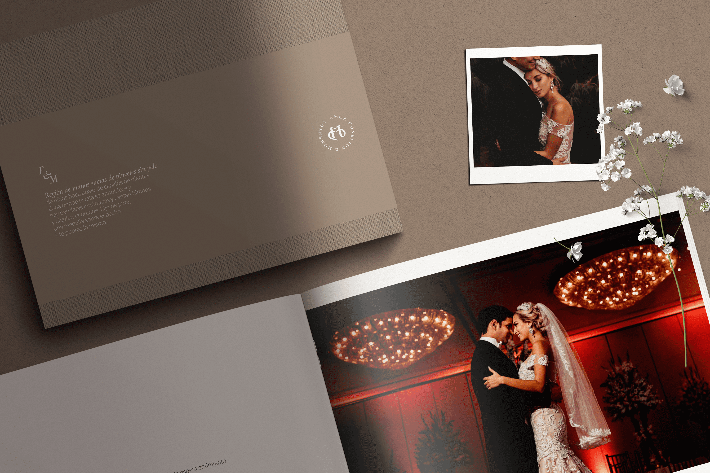
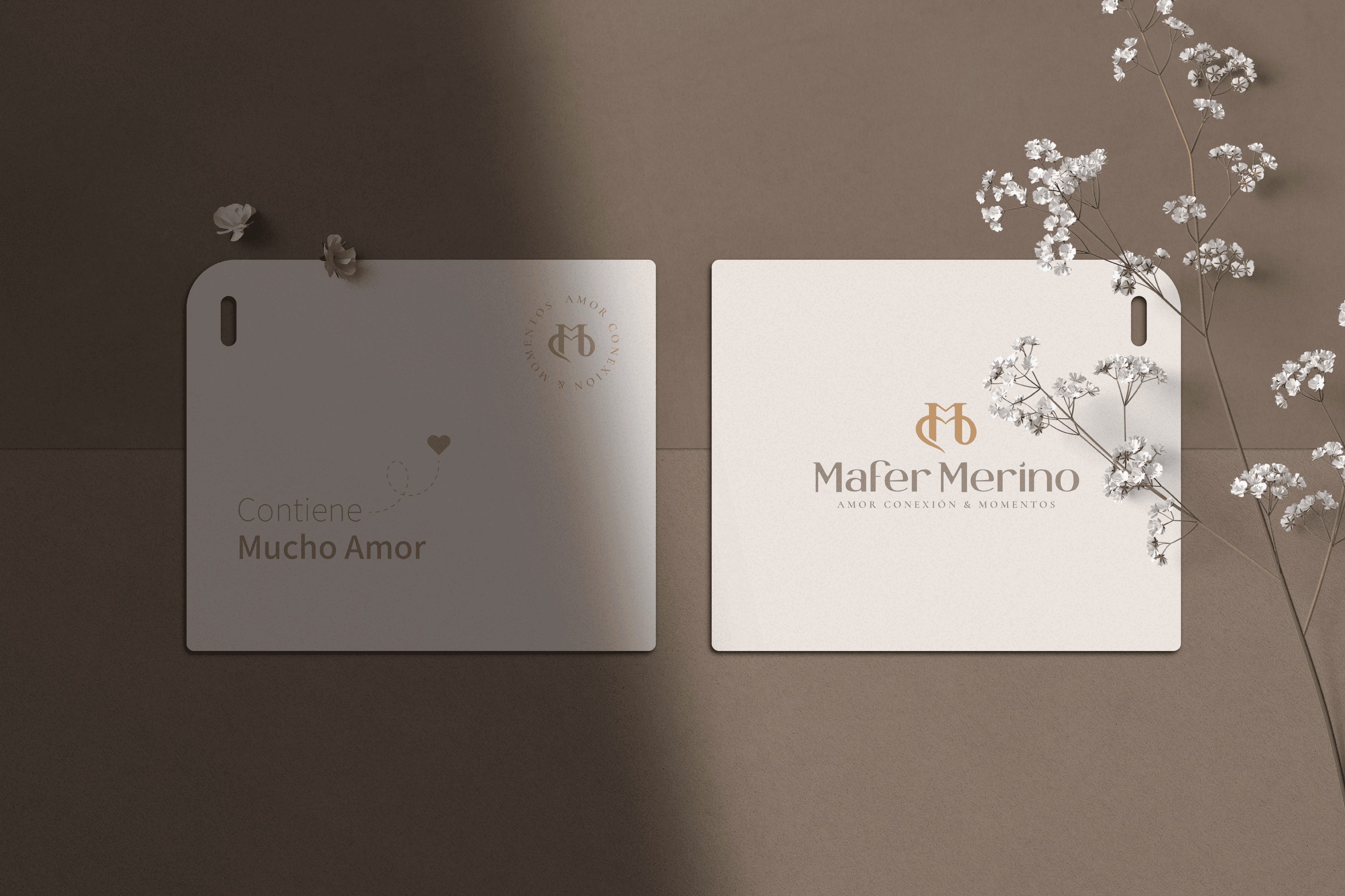
Mafer Merino is a wedding photographer with over 10 years of experience, specializing in capturing the real emotions behind love, located in Samborondón, Ecuador.


Keywords

Branding / Photography / Weddings

The Objective

Design a visual identity for a photography lover, which speaks of the experience of love and real connection that my couples experience through my way of living and doing photography.


The Solution

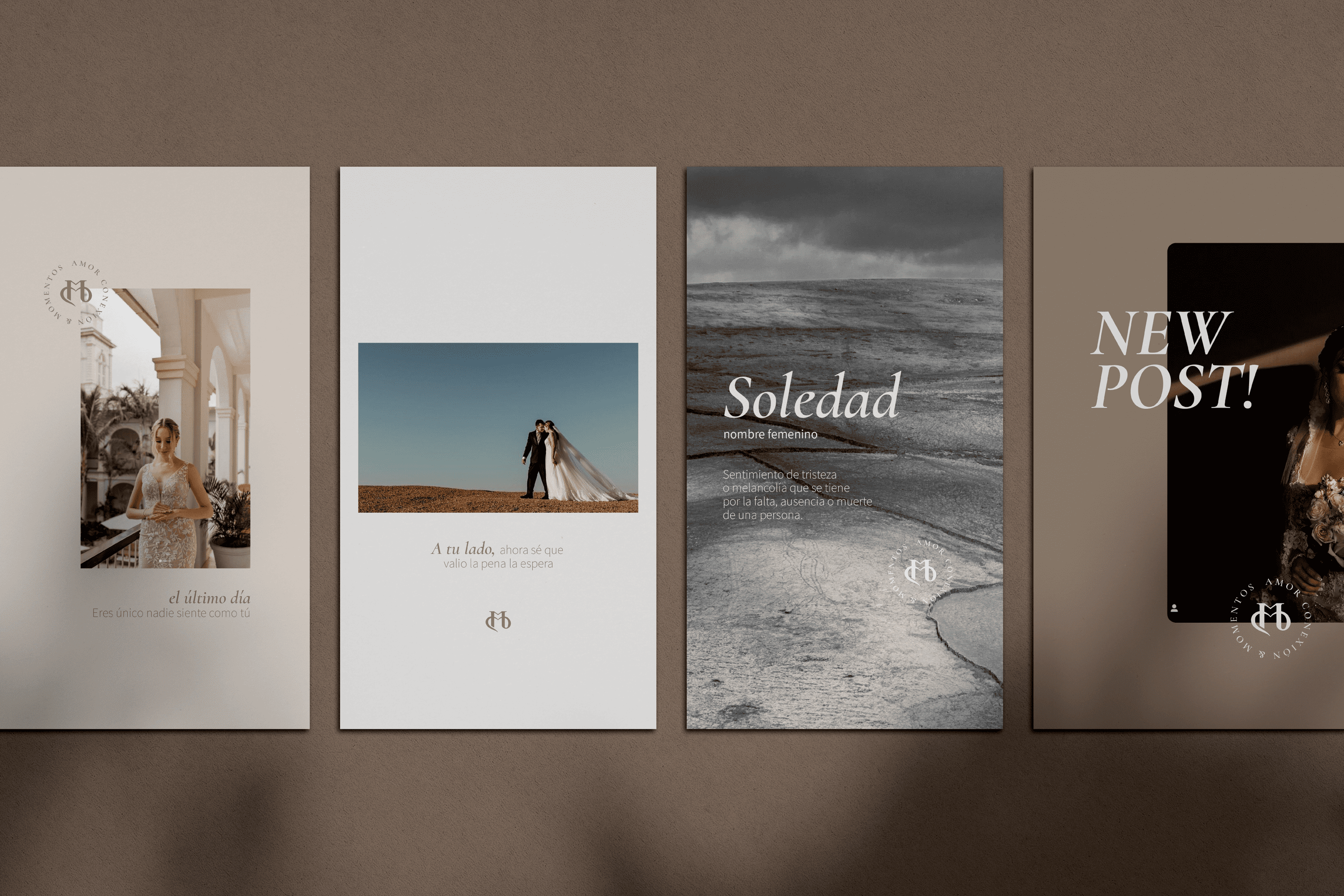
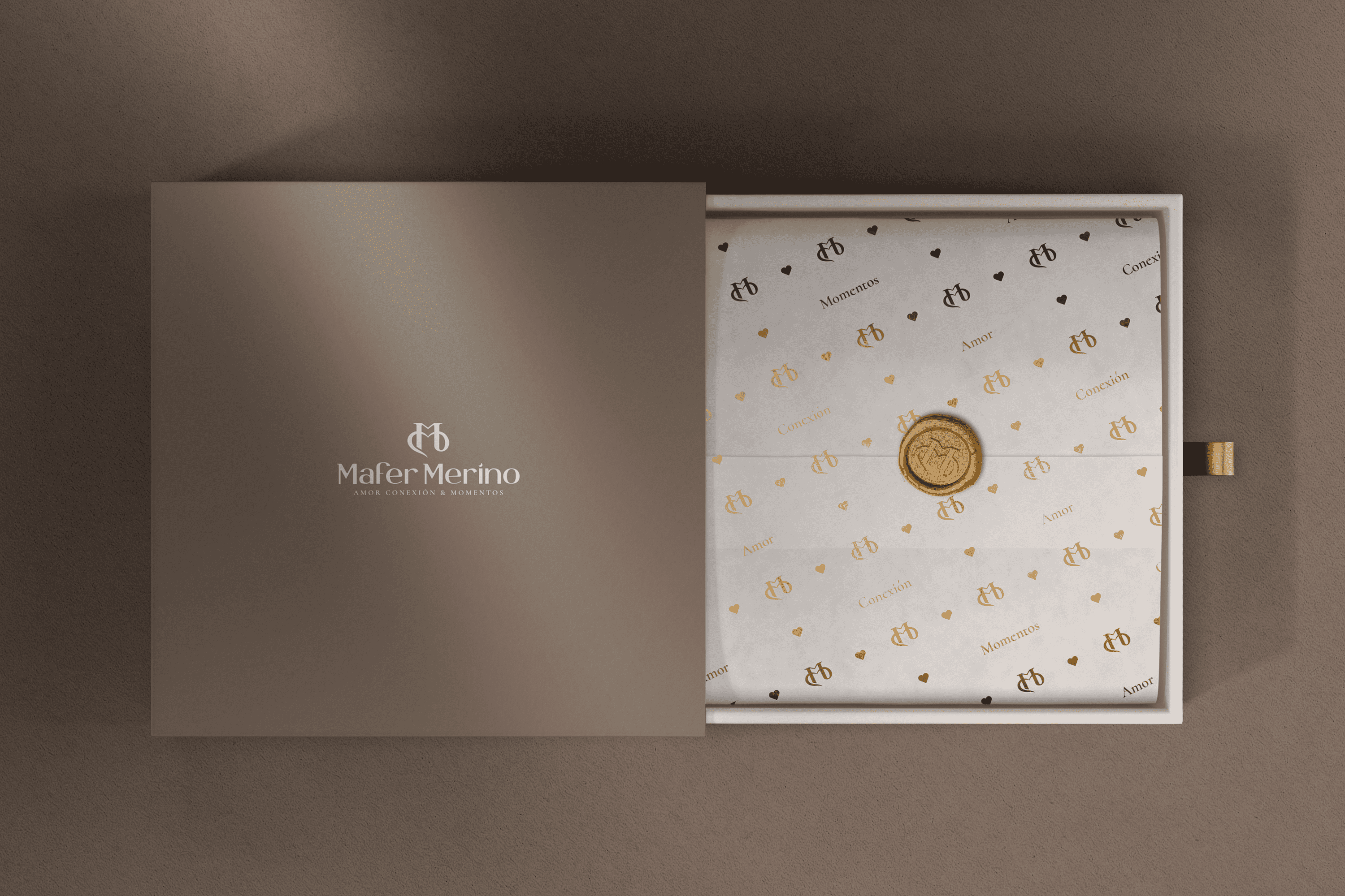
For the redesign of the main Isotope, we were inspired by the love of two people, transforming the initials of Mafer Merino MM, in the first its two pillars allude to two people who are united by the second M that forms a connection link, a bond of love. The finish of this isotope arises from a classic environment.

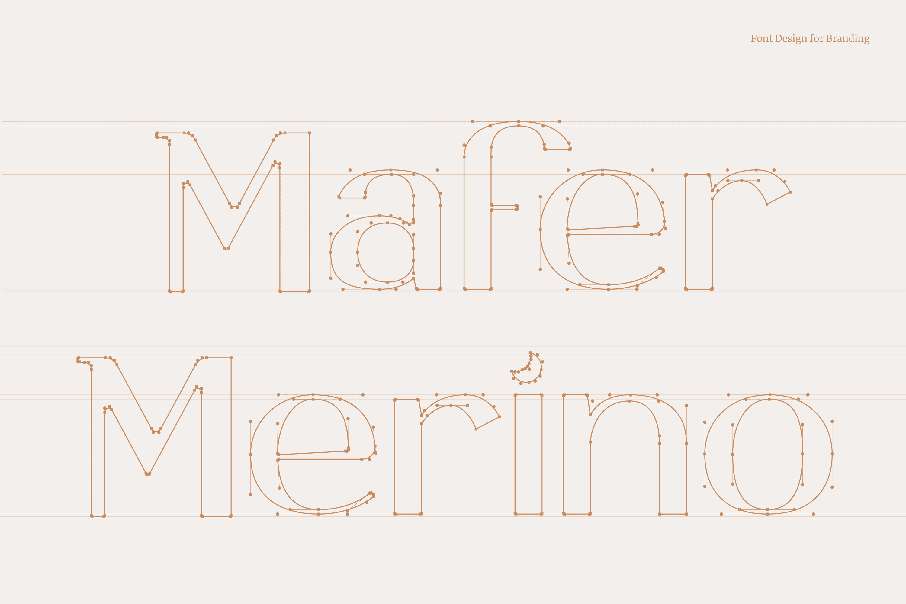
On the other hand, the typography developed for Mafer Merino is San Serif, a contemporary and elegant letter type that together with its isotope speaks of its way of telling stories. Mafer takes care of every detail and is a lover of the moon, for this reason we have hidden a small moon and that is to love is to look towards the sky and dare to dream.
Suggested Projects
Terrenal Resto Bar
Simples Finanzas
Extreme Max
Compra Manabí
BRANDING

The Client

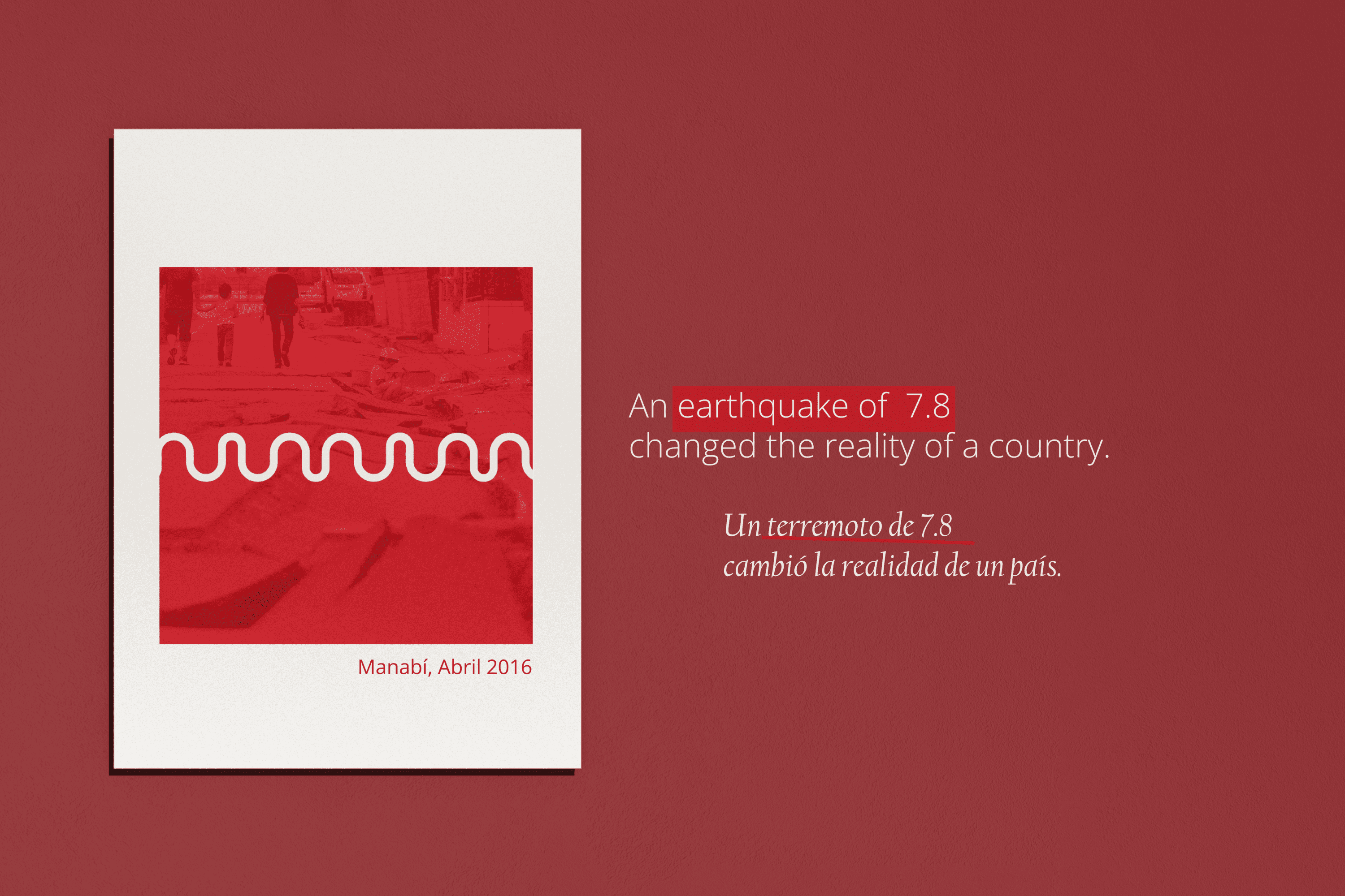
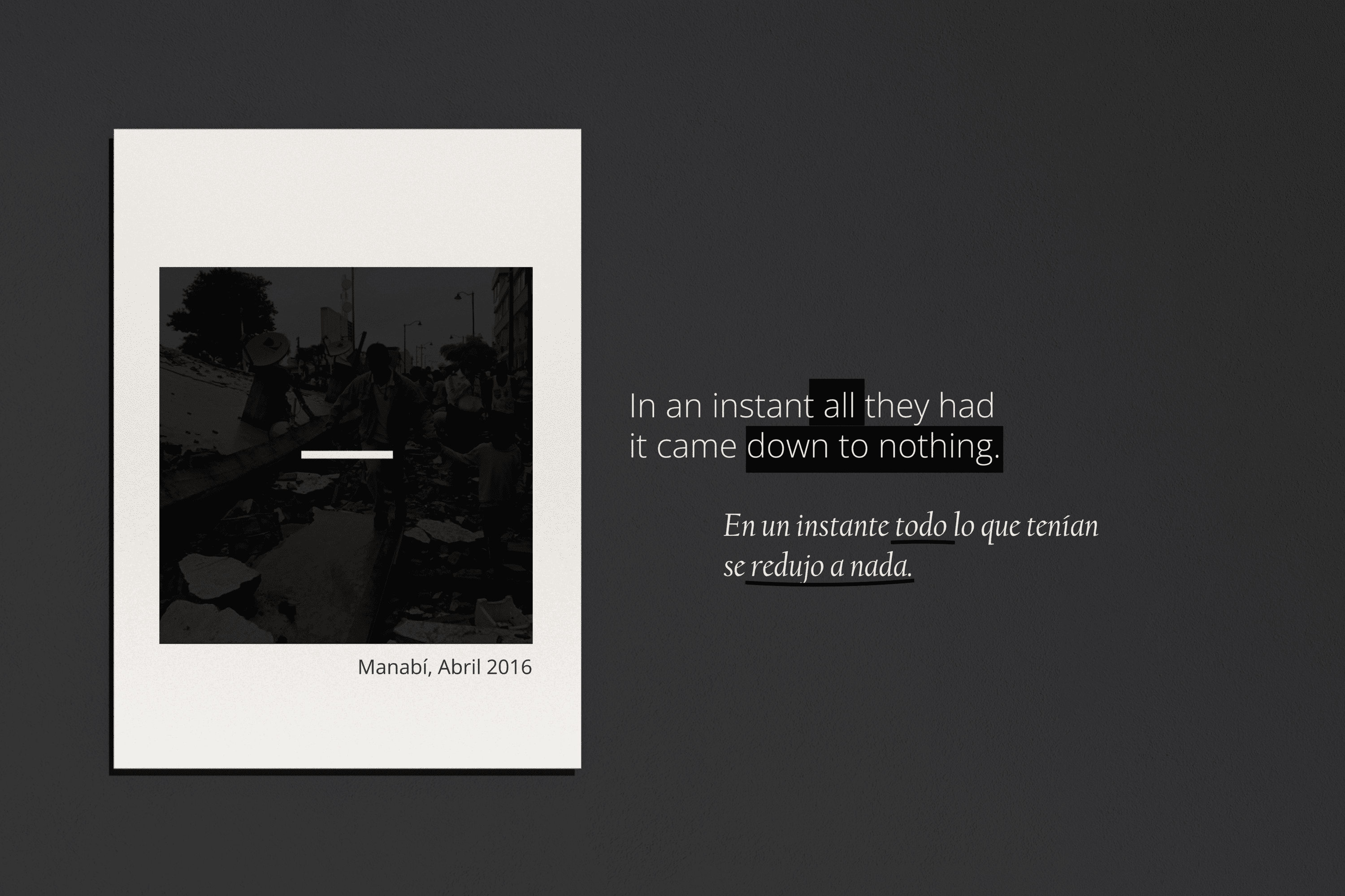
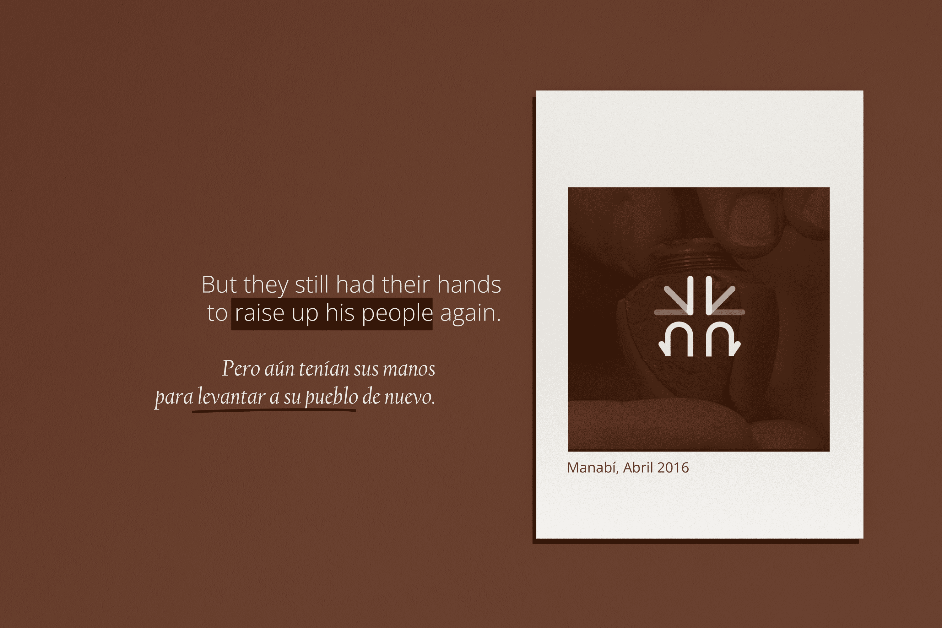
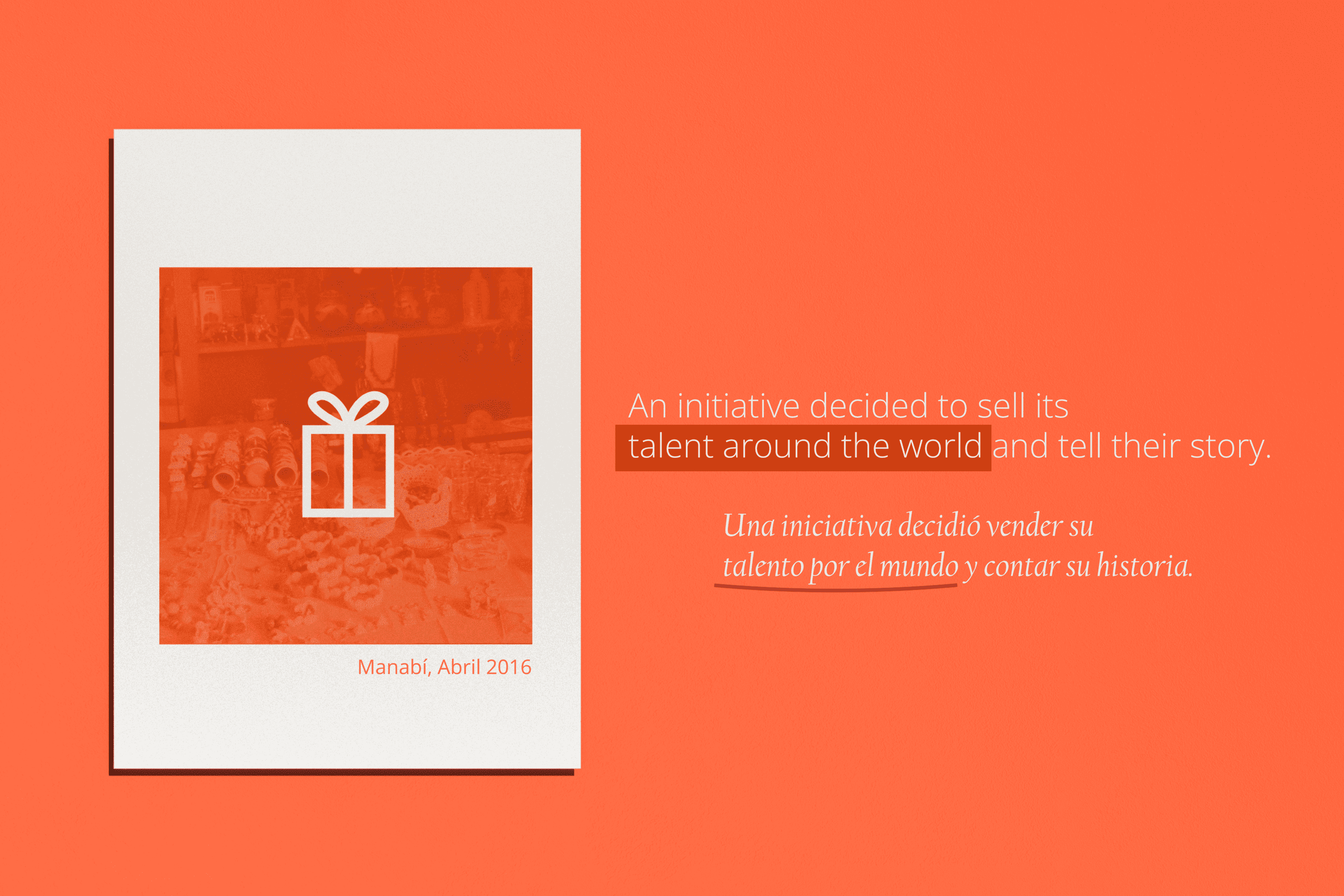
Compra Manabí is a social and economic reactivation project, which seeks to help the victims of the earthquake of April 16, 2016 in Manabí – Ecuador.


Keywords

Branding / Humanitarian Graphics / History

The Objective

Design a brand that expresses the story of the catastrophe that occurred on april 16th, 2016 and the hope that the Compra Manabí project aims to convey.


The Solution

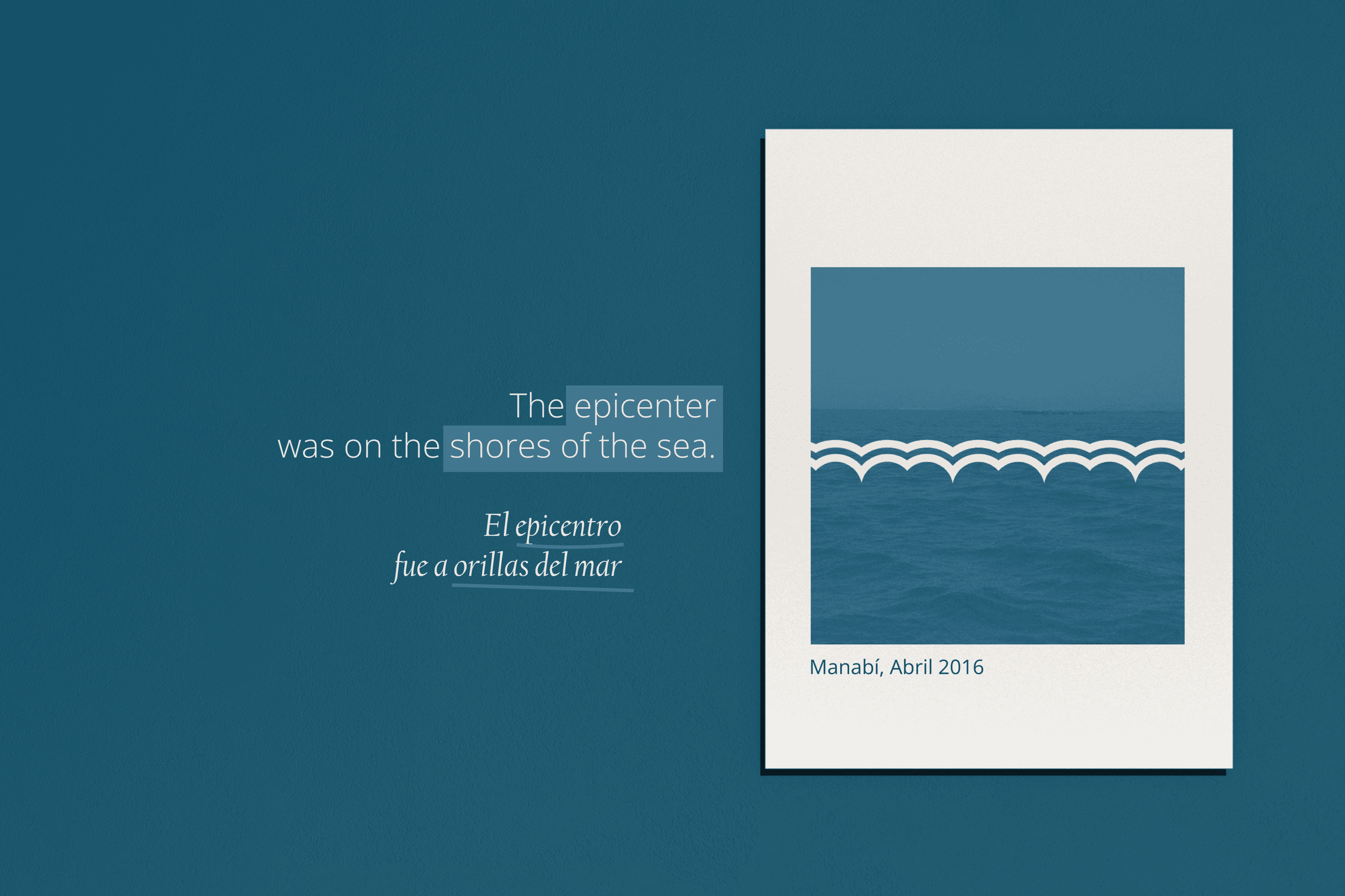
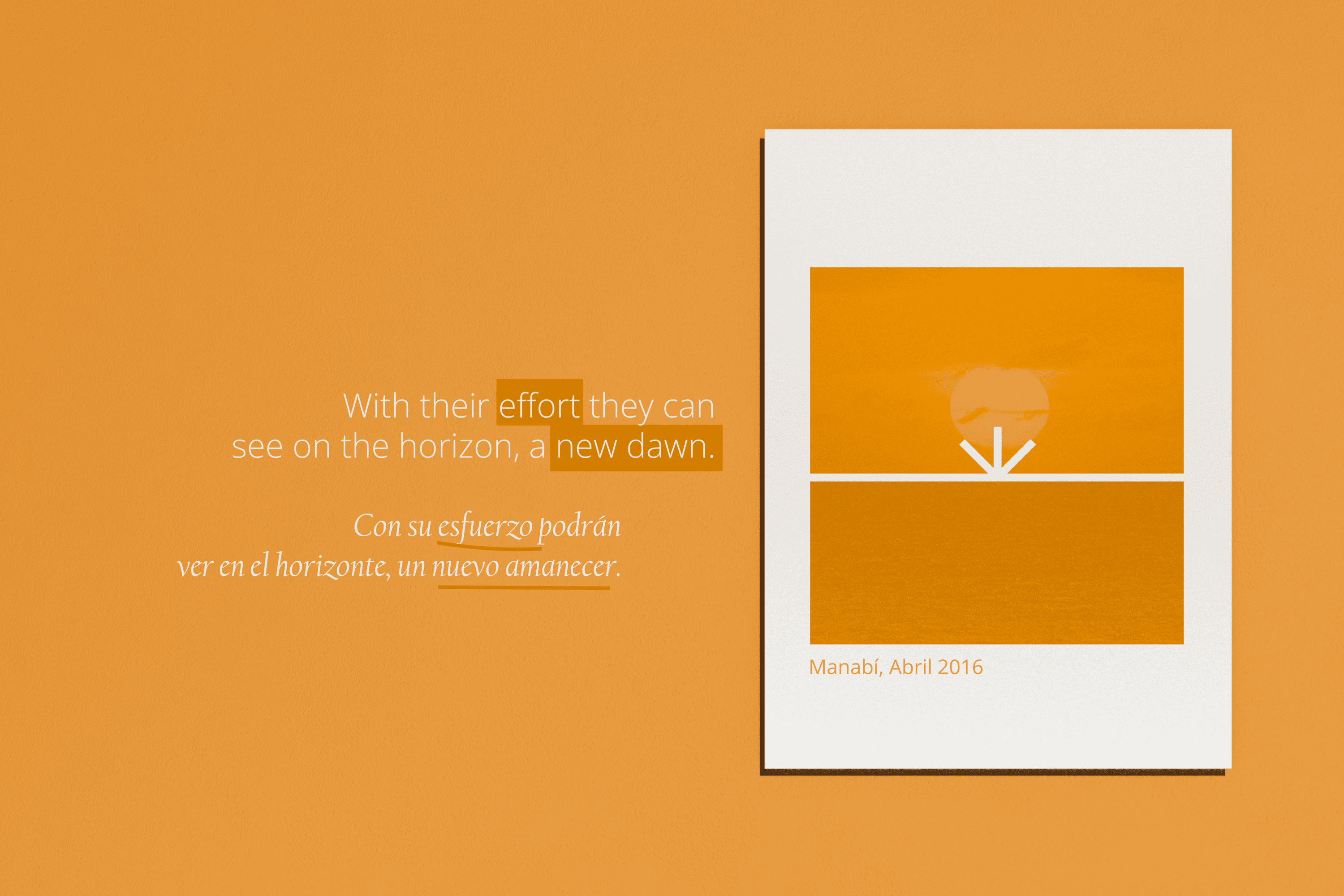
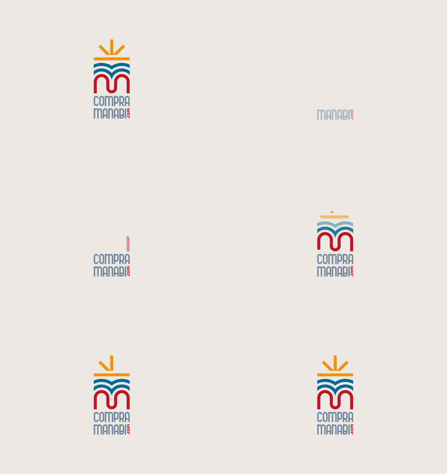
The logo designed for Compra Manabí is composed of a modern san serif typography and an icon that is a fragment in time of the past, present, and future of the catastrophe that occurred in Manabí, like a hieroglyph waiting to be deciphered, each level of its composition holds a layer that speaks of the earthquake, two subsequent layers that show that it was on the shores of the sea and in contrast to the first layer show an intermediate level of stability, a top line that is related to the horizon and that space of calm generated through the Compra Manabí initiative, at the end we see an abstraction of the sun or two lines ascending to the center as a sign of rebirth. Through color, we reinforce the location of the catastrophe and the action scenario of Compra Manabí.

Suggested Projects
Terrenal Resto Bar
Simples Finanzas
Extreme Max
Josue Habacuc
BRANDING

The Client

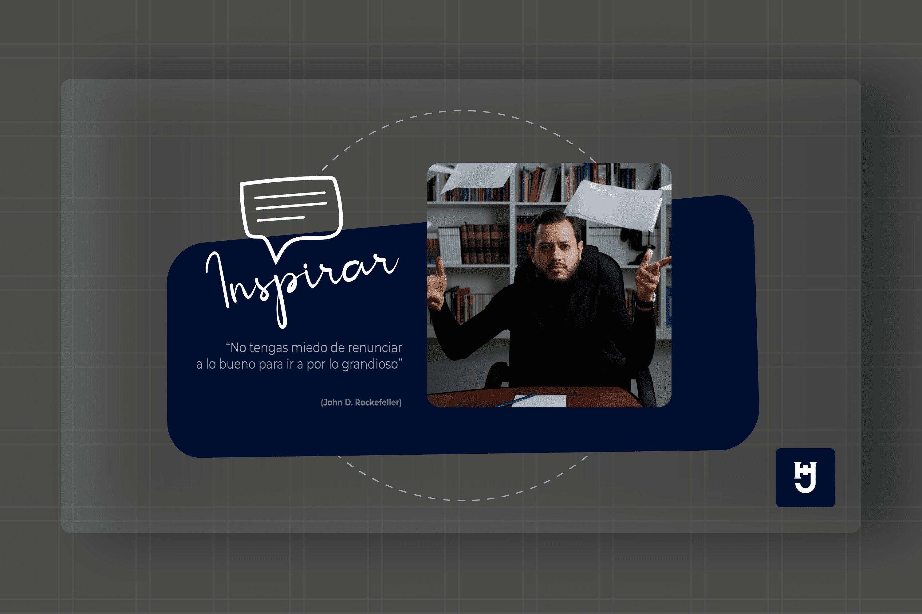
Josue Habacuc is a Pedagogue and Educational Innovator. Founder and CEO of Red Ecuatoriana de Pedagogía, the largest educational network for teacher training in Ecuador.

Keywords

Branding / Personal Brand / Education / Pedagogy

The Objective

Design a brand that is part of the education universe, that expresses modernity, credibility and professionalism.


The Solution

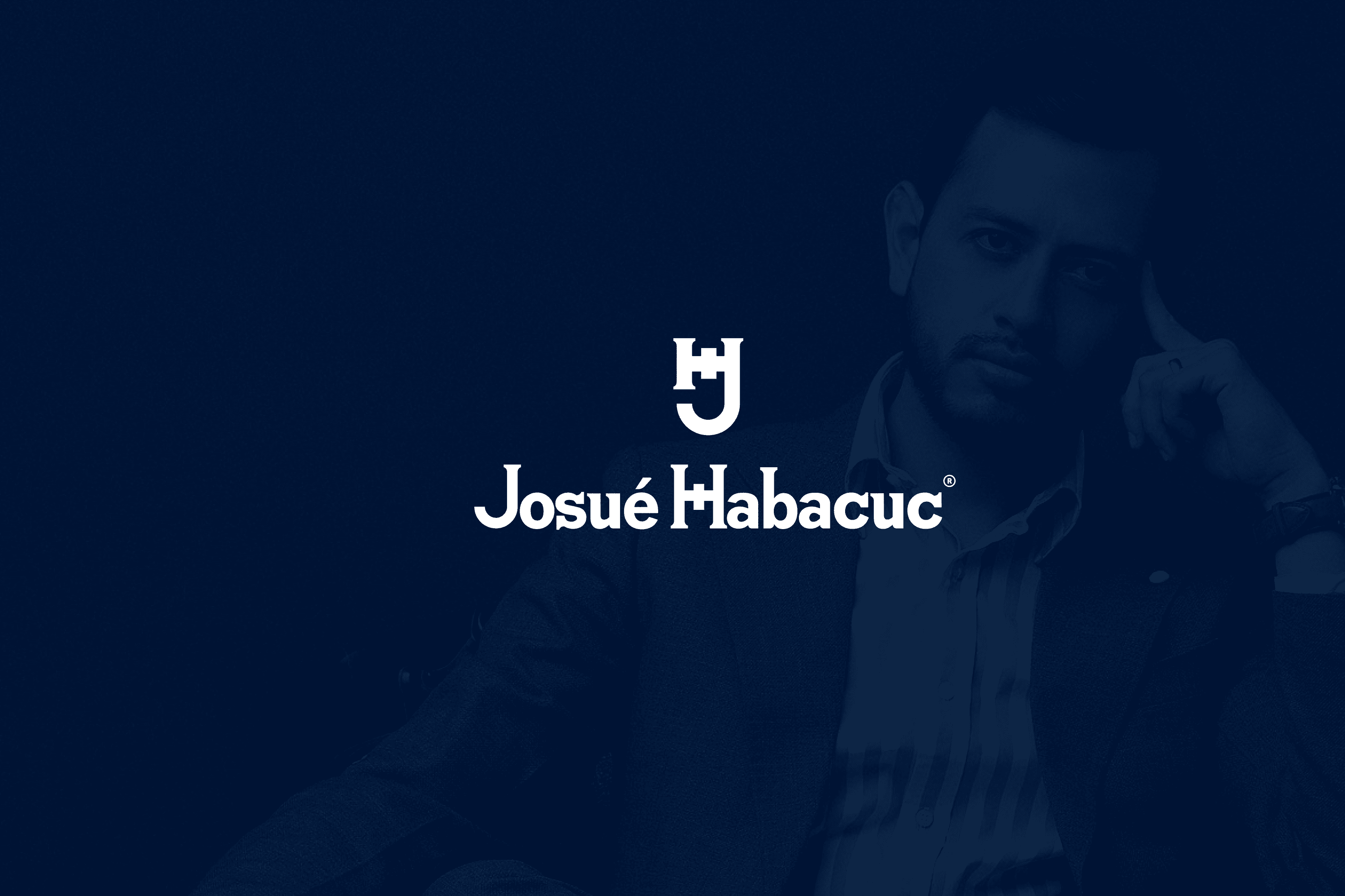
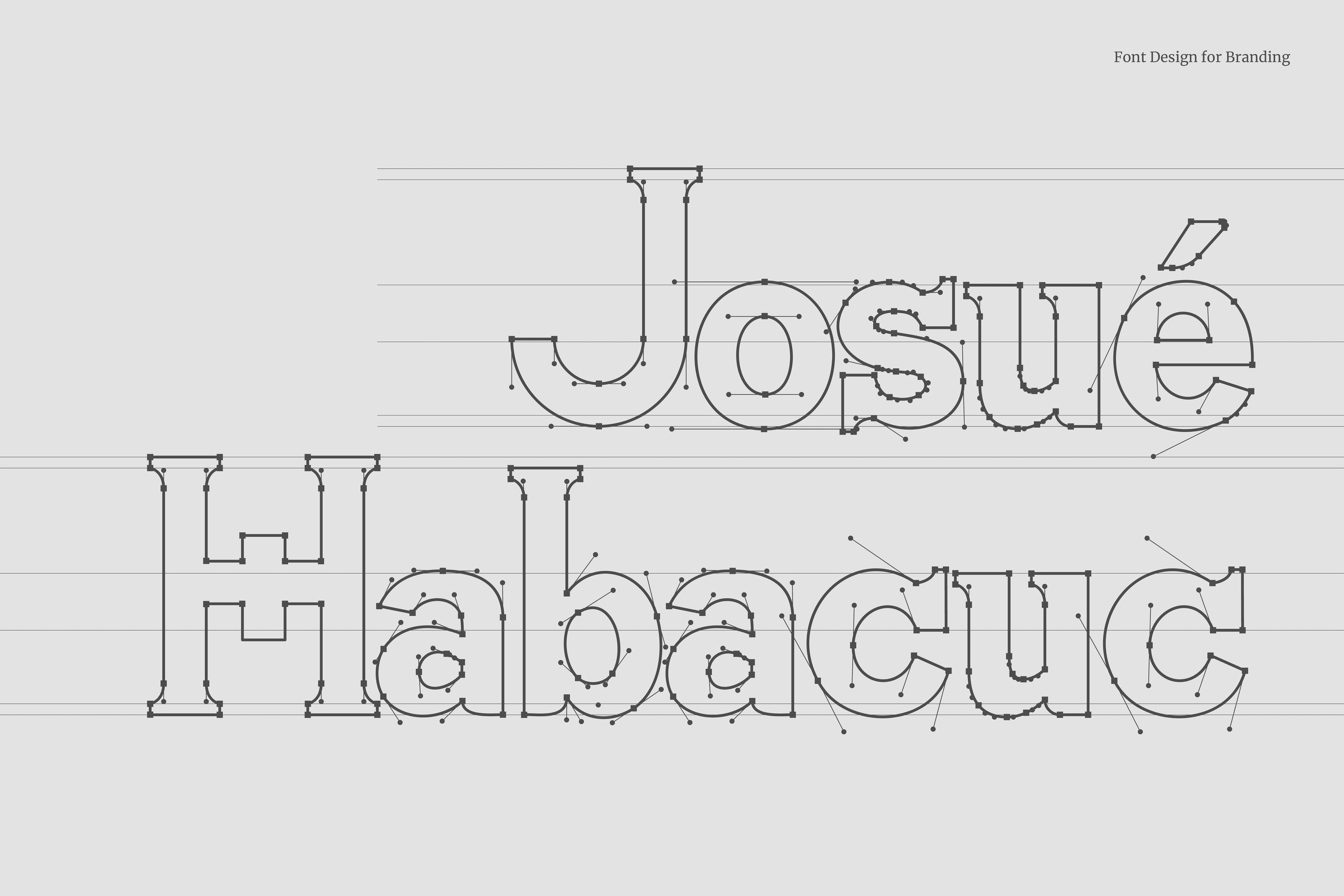
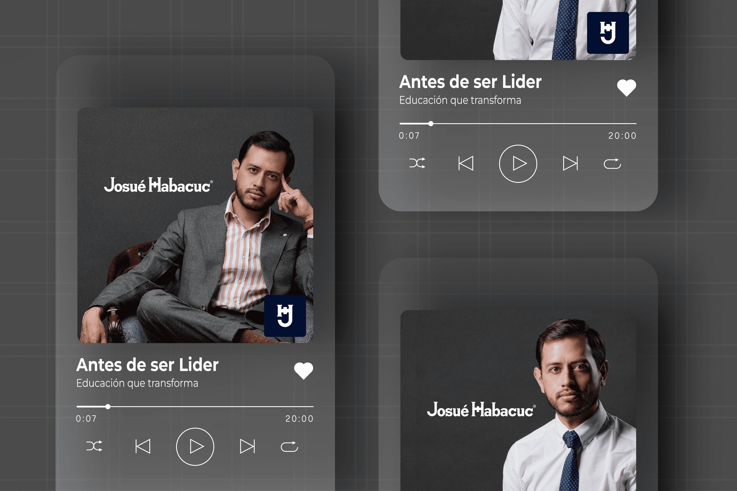
We created a concept that revolved around the academy and gave it innovative features by combining the characteristics of Serif and Sans Serif typography present in the endings of each letter. The colors selected represent the blue of the academy and the gray representing modernity.

The isotype is the combination of the two main acronyms JH present in his name and surname, to form a seal with heraldic characteristics that preserves his legacy.

Suggested Projects
Terrenal Resto Bar
Simples Finanzas
Extreme Max
Pinky Bar
BRANDING

The Client

“Pinky Bar” is a beauty salon with more than 10 years, which goes hand in hand with the trends and offers the service of hairdressing, coloring among other beauty services. It is located in Kuwait, Western Asia.


Keywords

Branding / Beauty Salon

The Objective

Develop an elegant brand, linked to beauty care, that transmits confidence and status.


The Solution

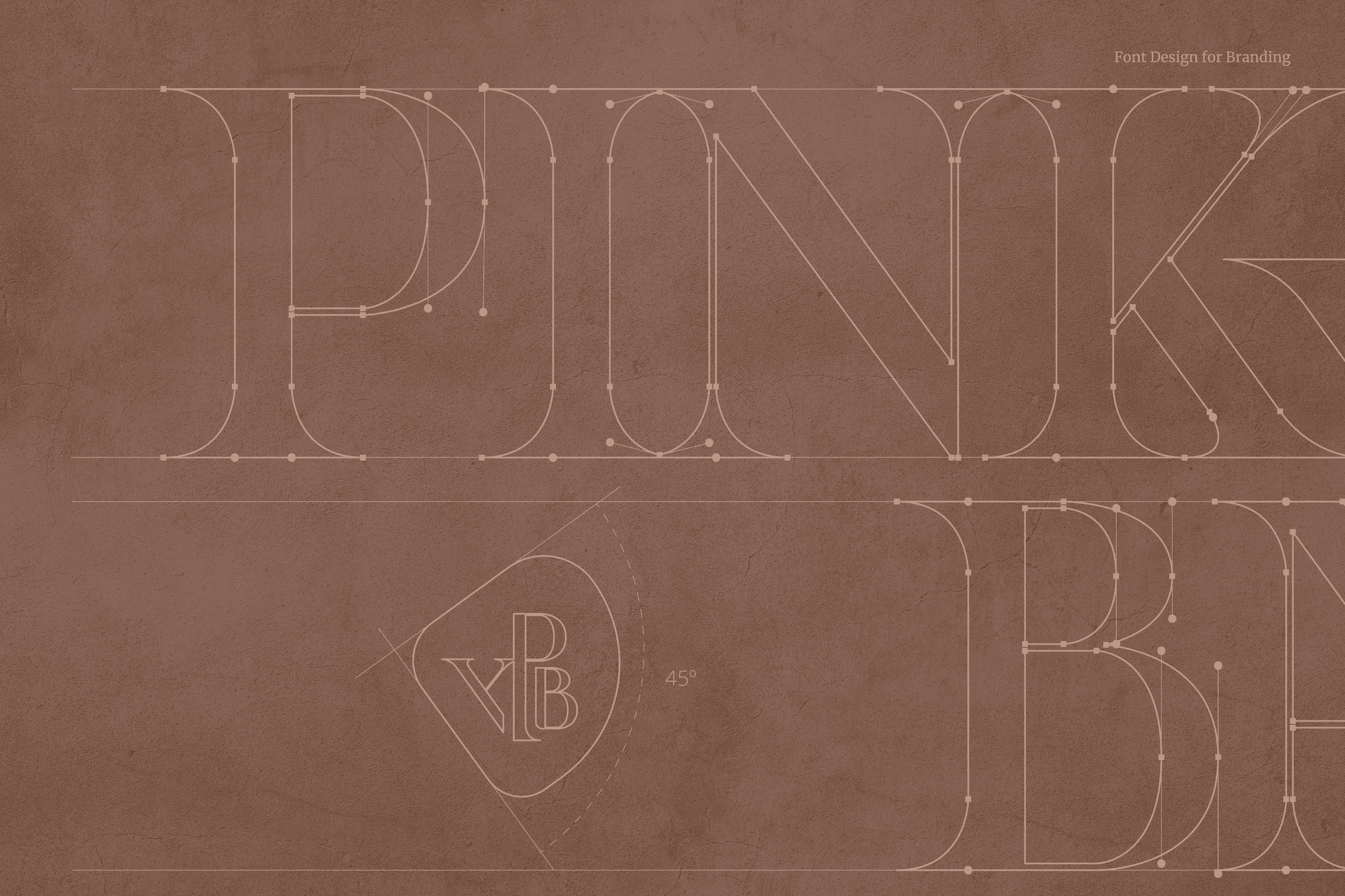
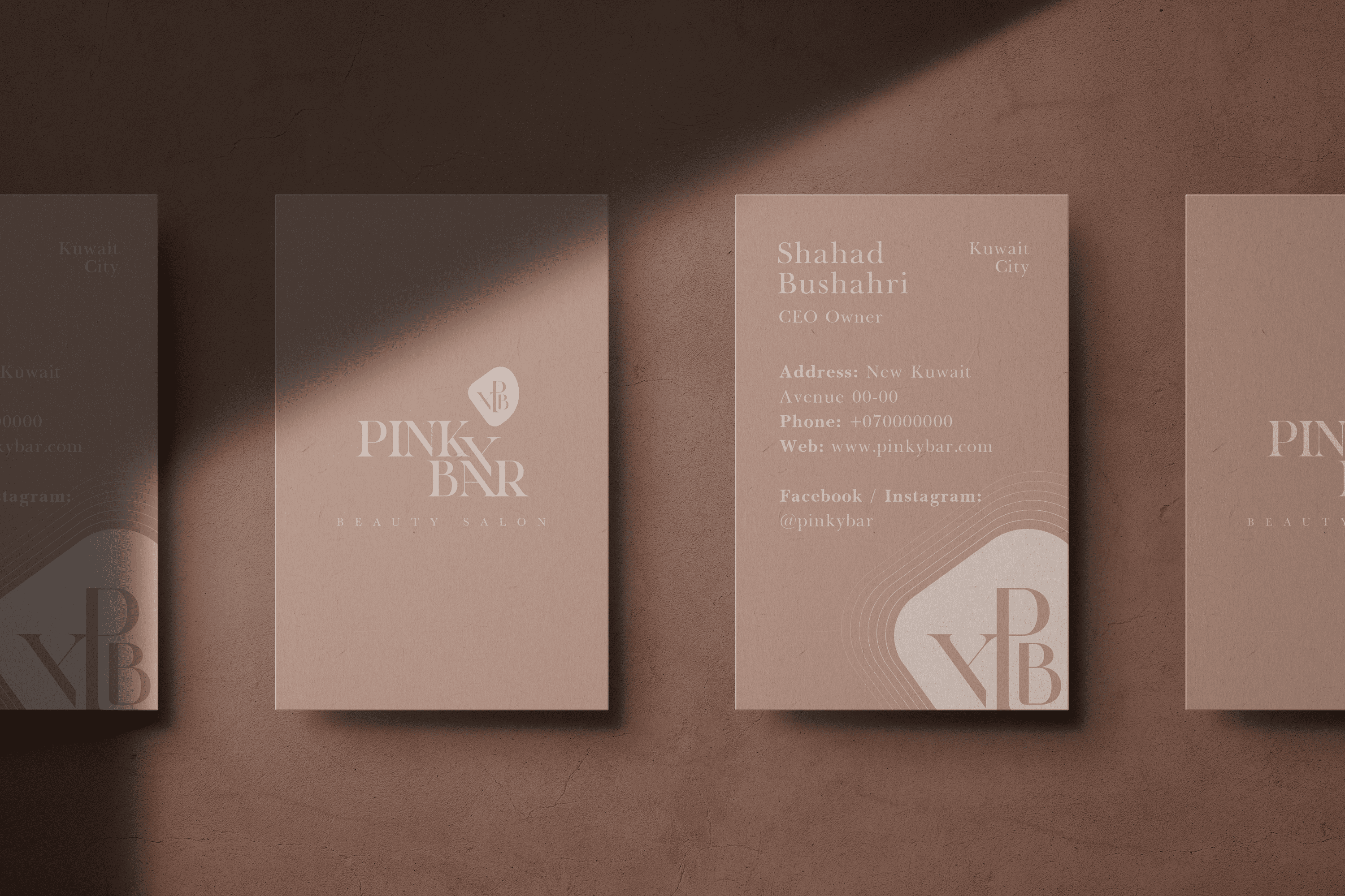
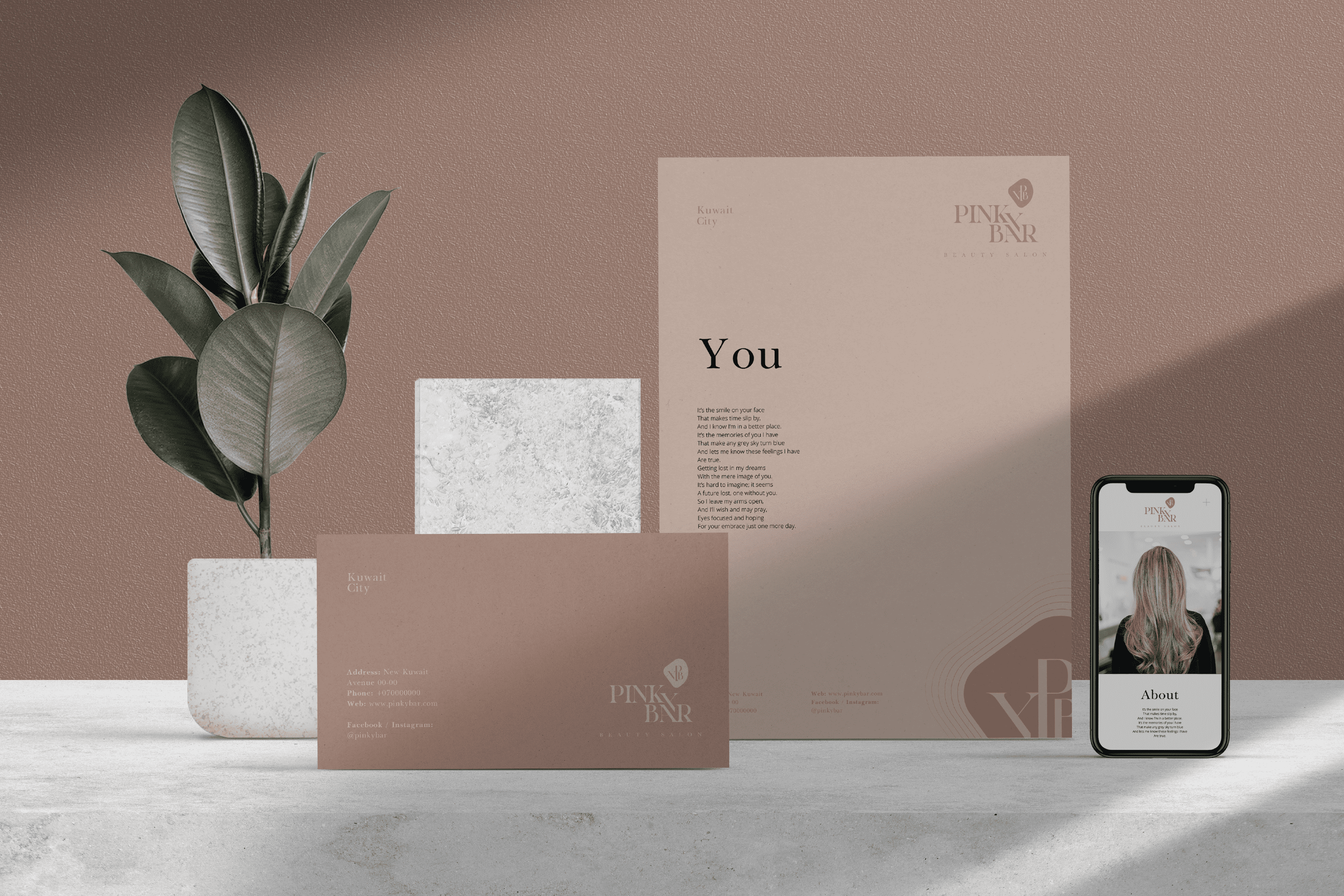
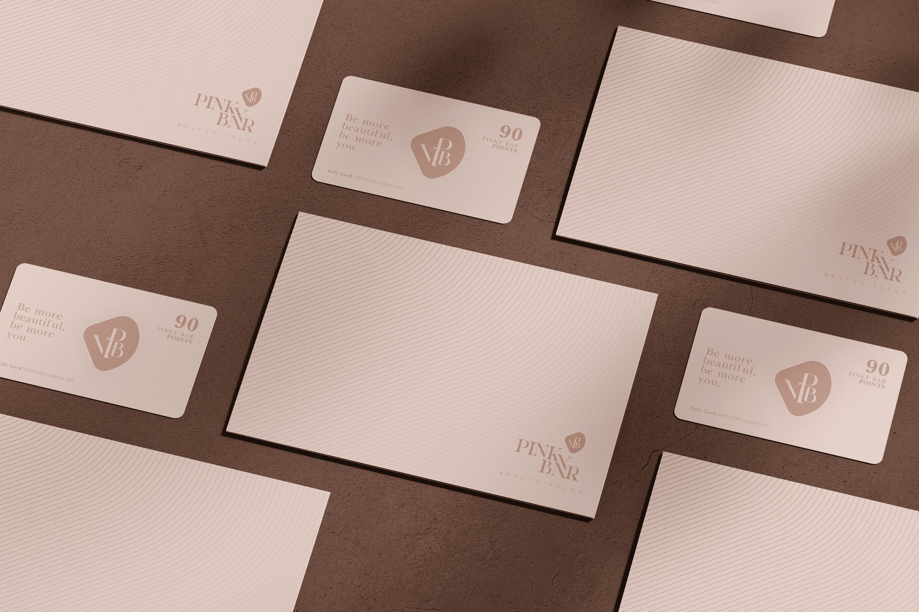
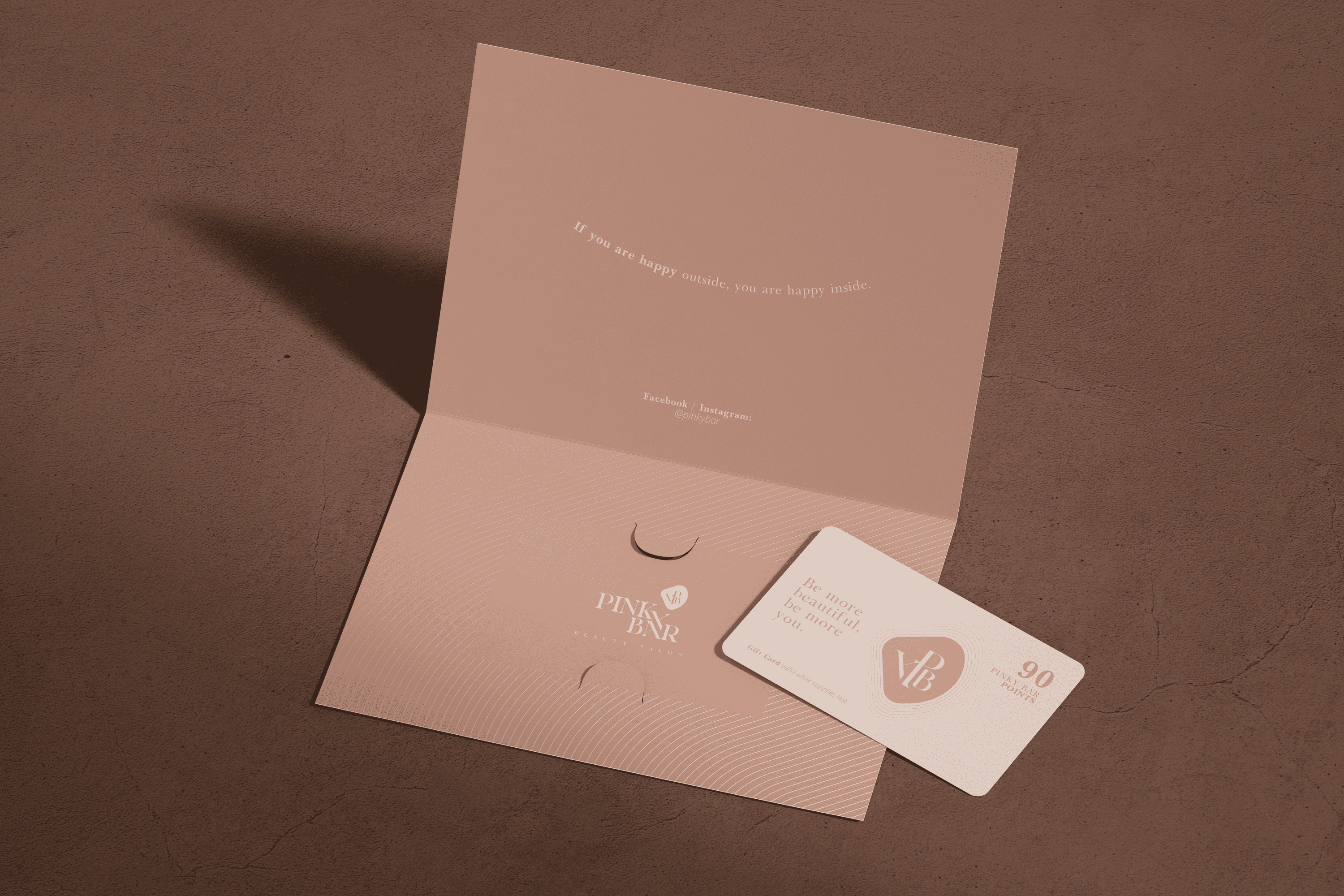
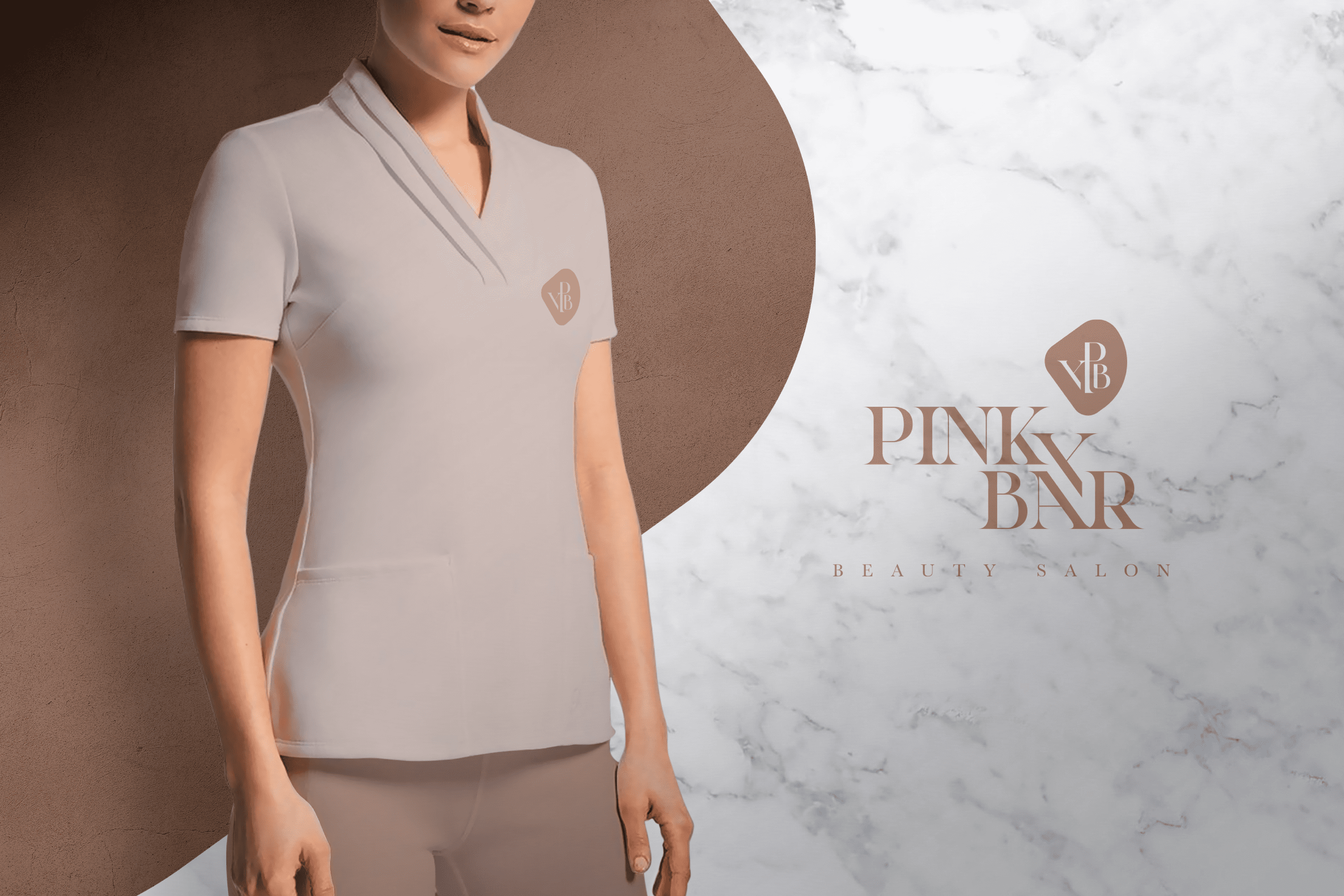
The typography designed for “Pinky Bar” is Serif, its elongated finials give stability and elegance, while the thin flagpoles reinforce the sense of elegance and distinction. The letter “Y” has been developed as an element of integration and its location speaks of the coziness of the beauty salon “Pinky Bar”.

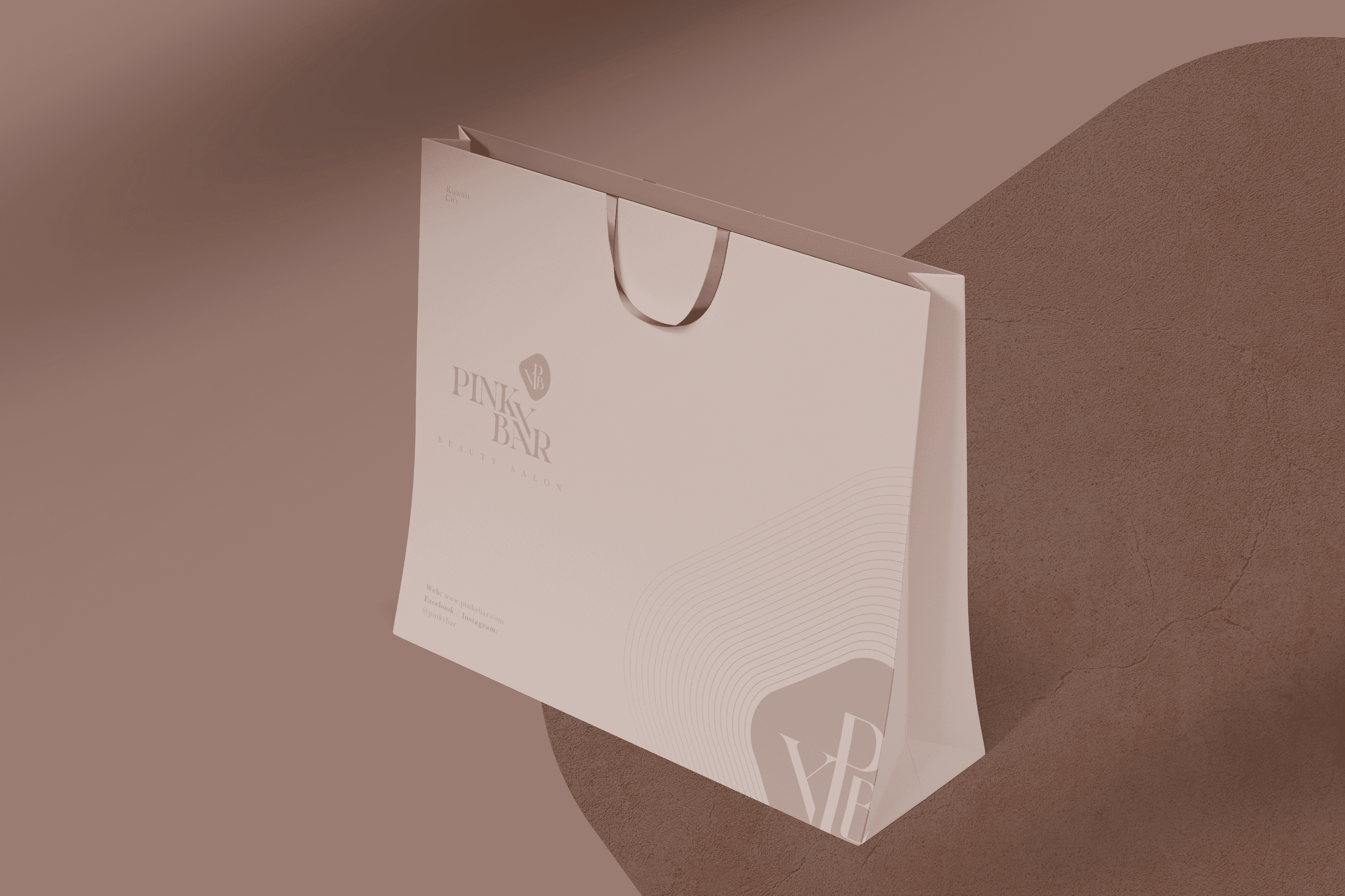
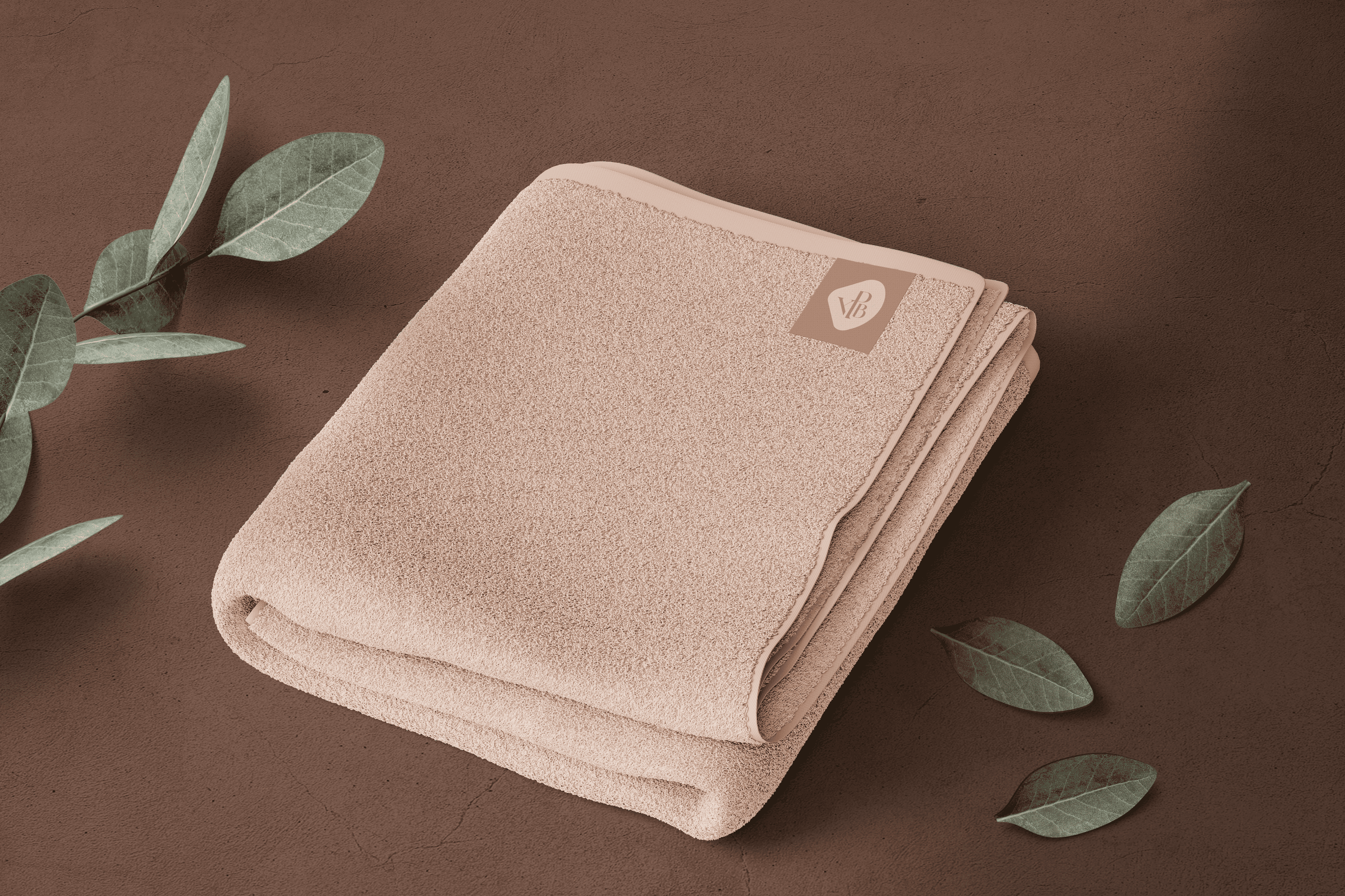
The isotype combines in a gem (beauty element) the most significant letters of the name, to become the emblem of “Pinky Bar”. The lines that complement the isotype were designed to transmit renewal and vitality.
Suggested Projects
Terrenal Resto Bar
Simples Finanzas
Extreme Max
Fundación Iberoamericana de Educación
BRANDING

The Client

The Fundación Iberoamericana de Educación located in the city of Riobamba, Ecuador, has the goal of eradicating the educational gap throughout Ibero-America. They bet on continuous education and professionalization (high school, undergraduate and graduate).


Keywords

Branding / Design / Education / Foundation

The Objective

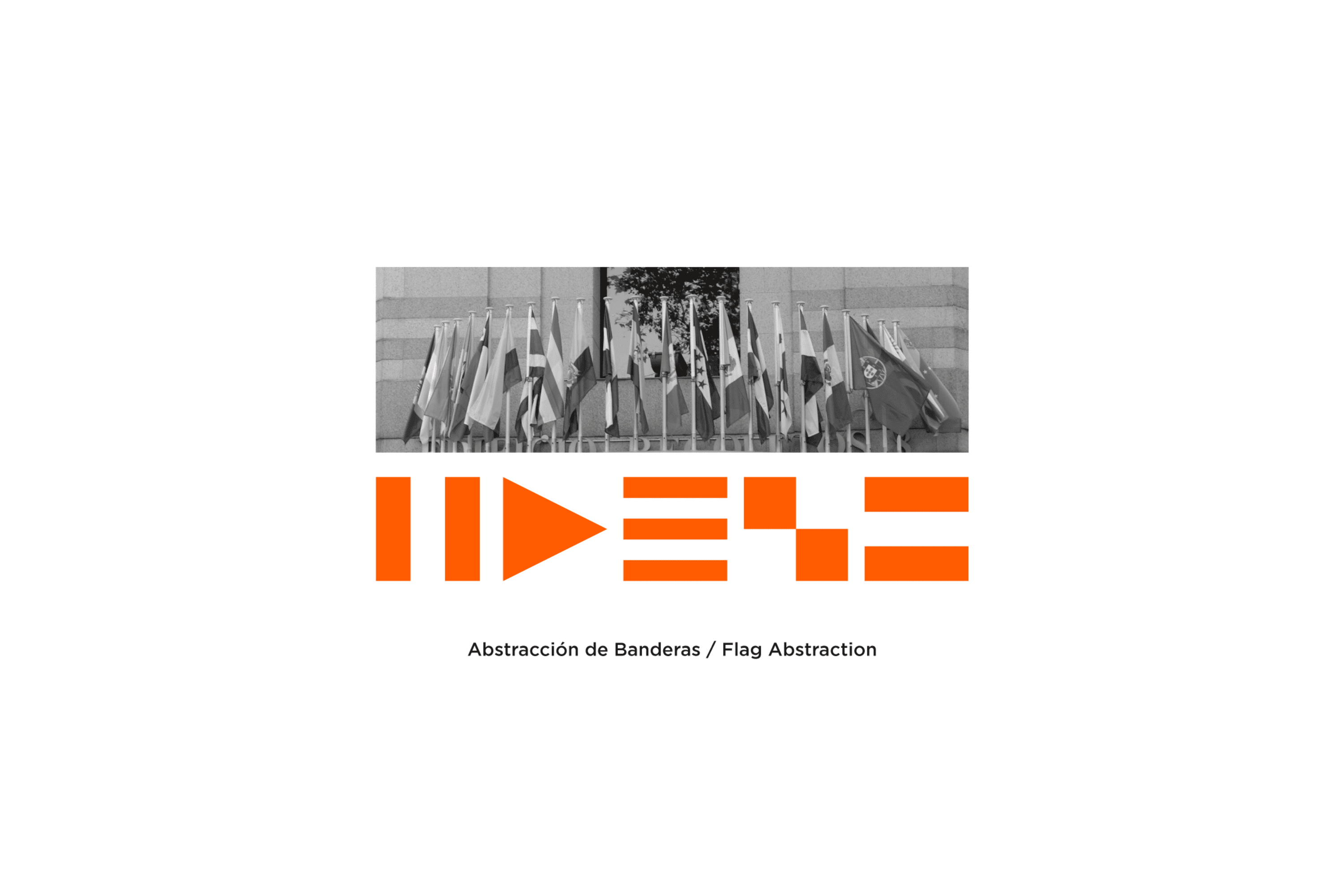
Design an institutional branding system for the Ibero-American Education Foundation that speaks to the importance of education for Ibero-America..


The Solution

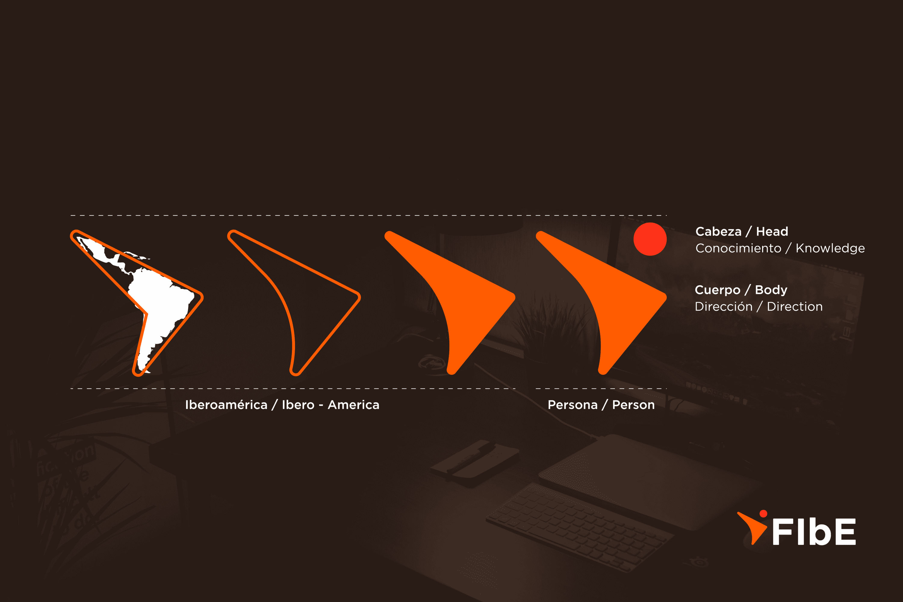
A sans-serif typography, along with the icon designed for the Fundación Iberoamericana de Educación, which is a geometric inscription of the “Ibero-American geographic area,” whose form itself gives this identifier a direction. Another important aspect is that thanks to the upper circle, the “abstraction of a character” is consolidated, and emphasis is placed on the “head as a knowledge manager.” The overall reading would be: Ibero-America advances based on knowledge.

Suggested Projects
Terrenal Resto Bar
Simples Finanzas
Extreme Max
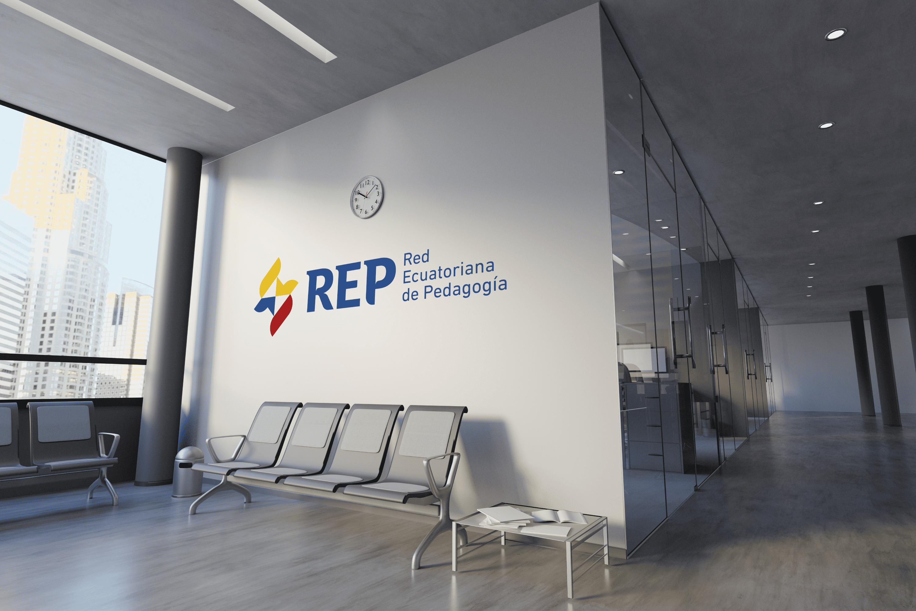
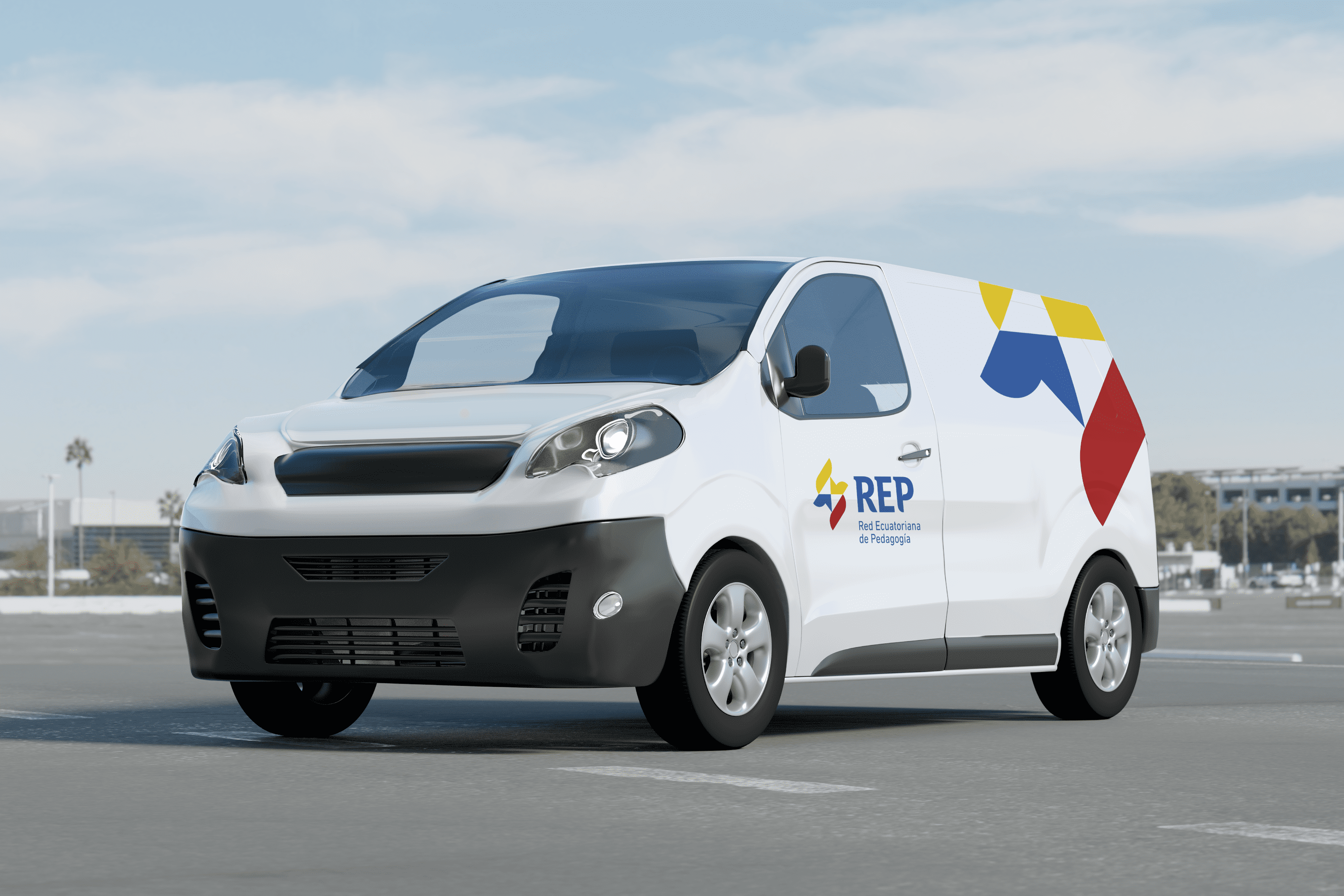
Red Ecuatoriana de Pedagogía
BRANDING

The Client

La Red Ecuatoriana de Pedagogía, is a non-governmental teacher training institution founded in 2017, with more than 40 associated educational institutions in Ecuador and with international presence in countries such as: Argentina, Colombia, Spain, Cuba, United States, located in the city of Riobamba – Ecuador.


Keywords

Branding / Education / Educational Institution / Pedagogy

The Objective

Develop a branding system for the Ecuadorian Pedagogy Network that reflects trust, credibility, direct connection to education, and is perceived as a government institution.


The Solution

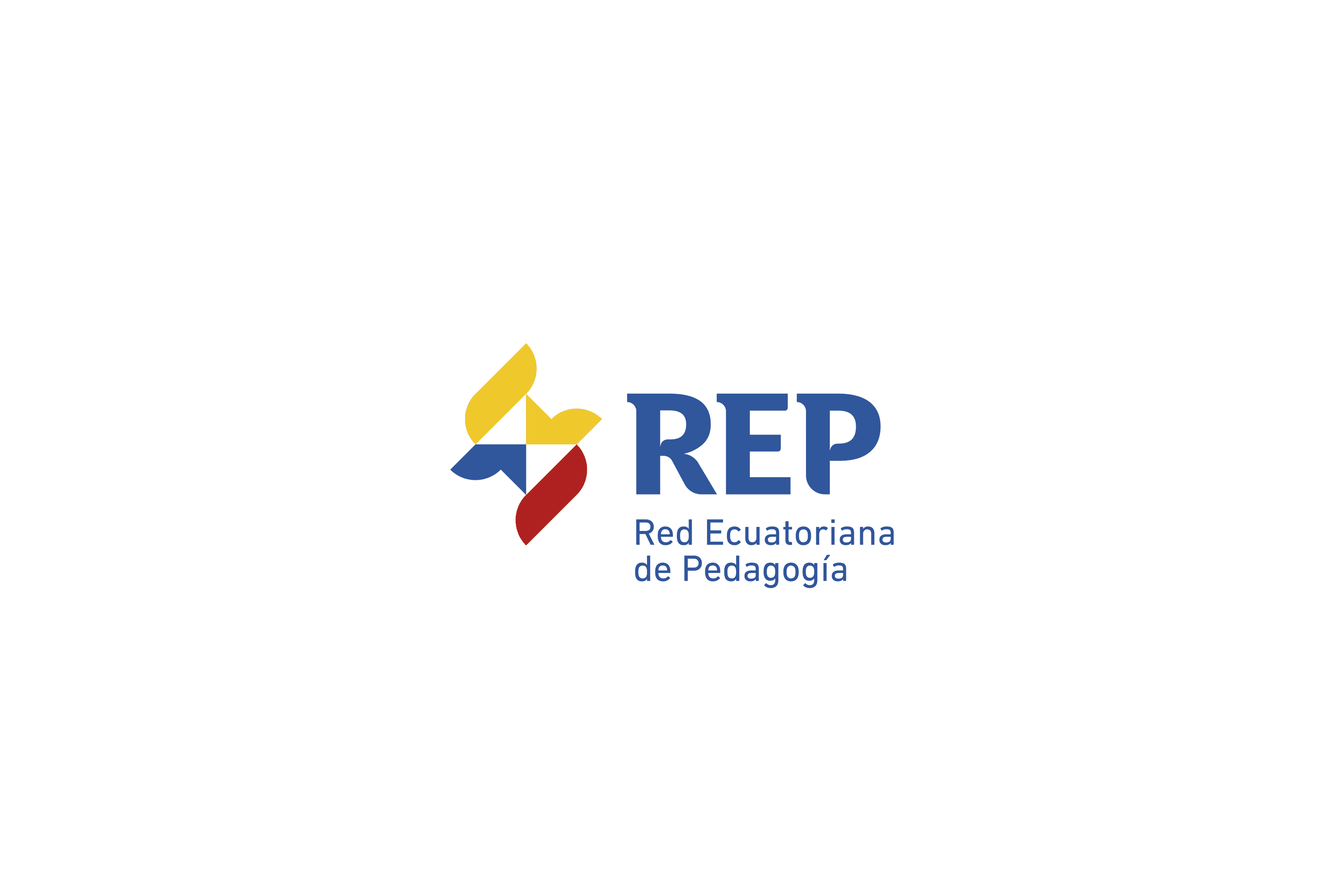
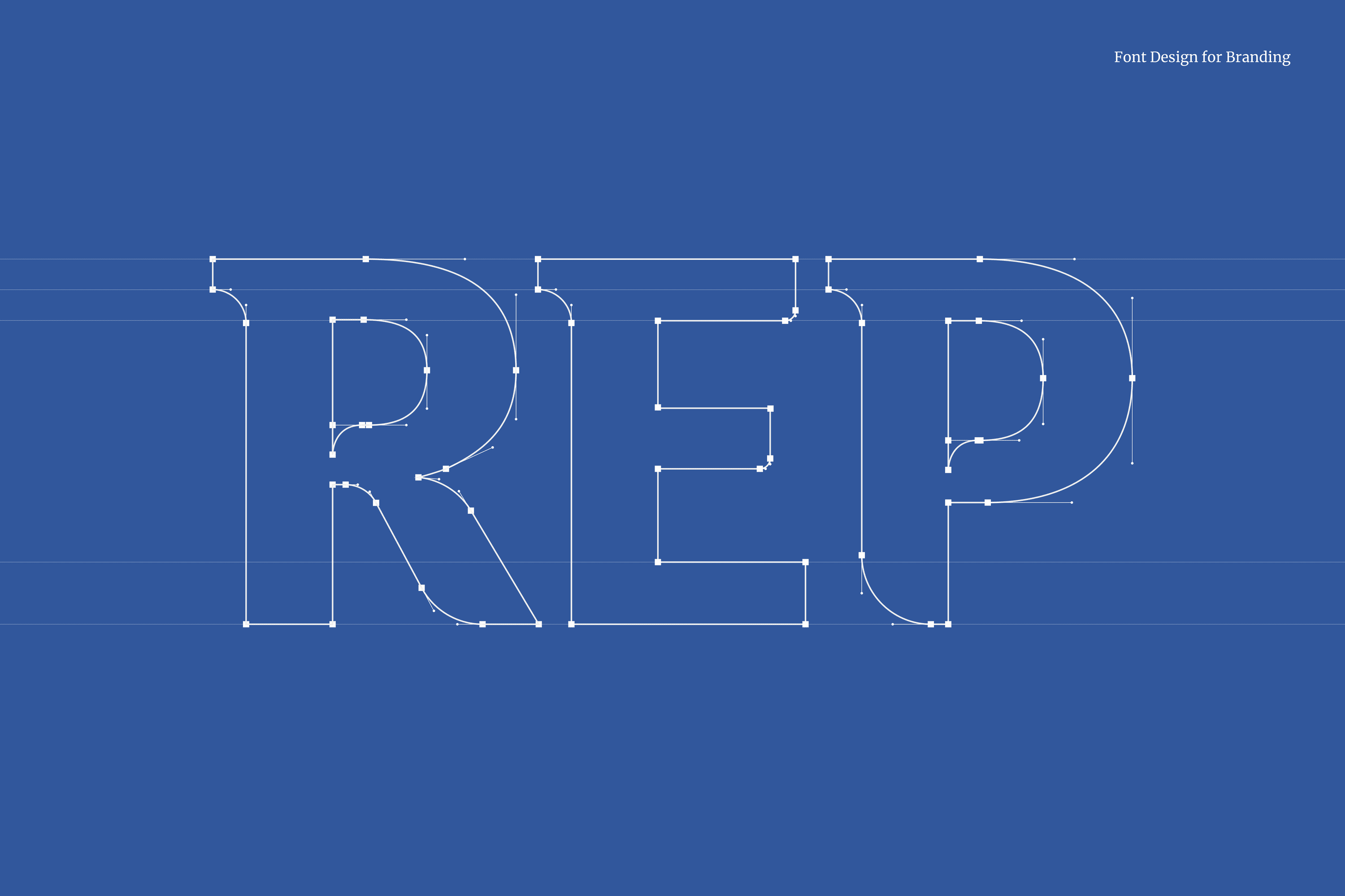
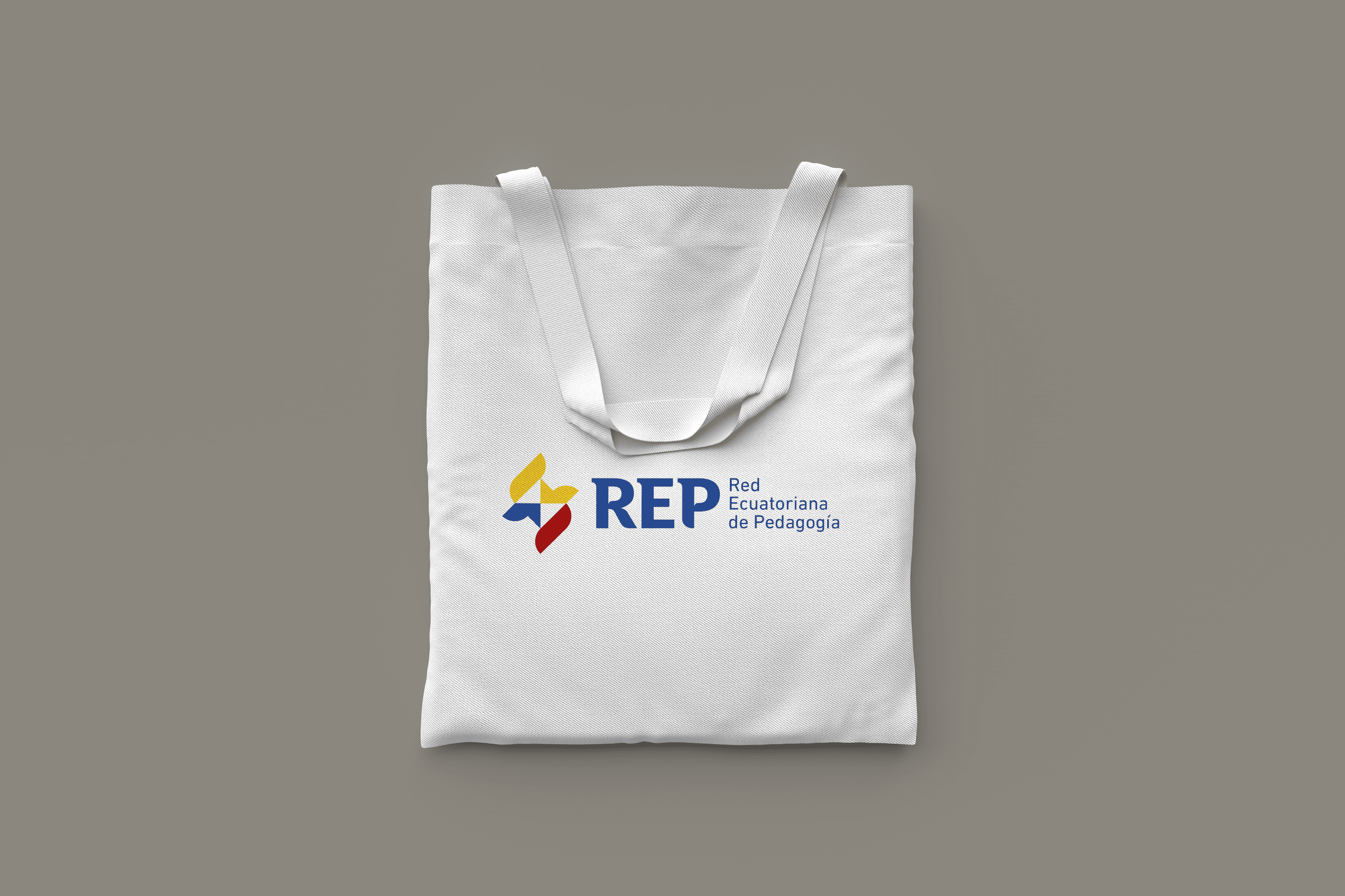
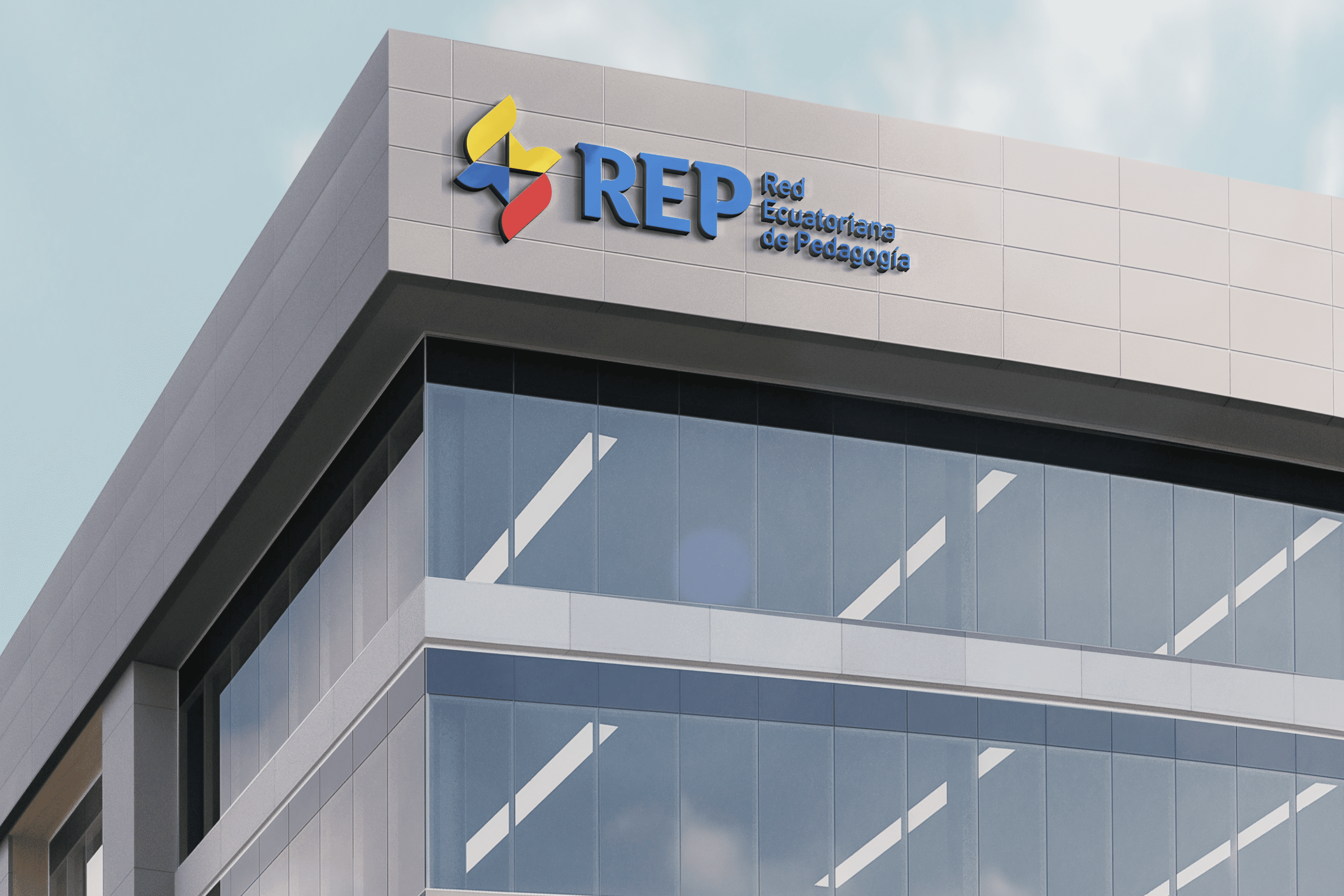
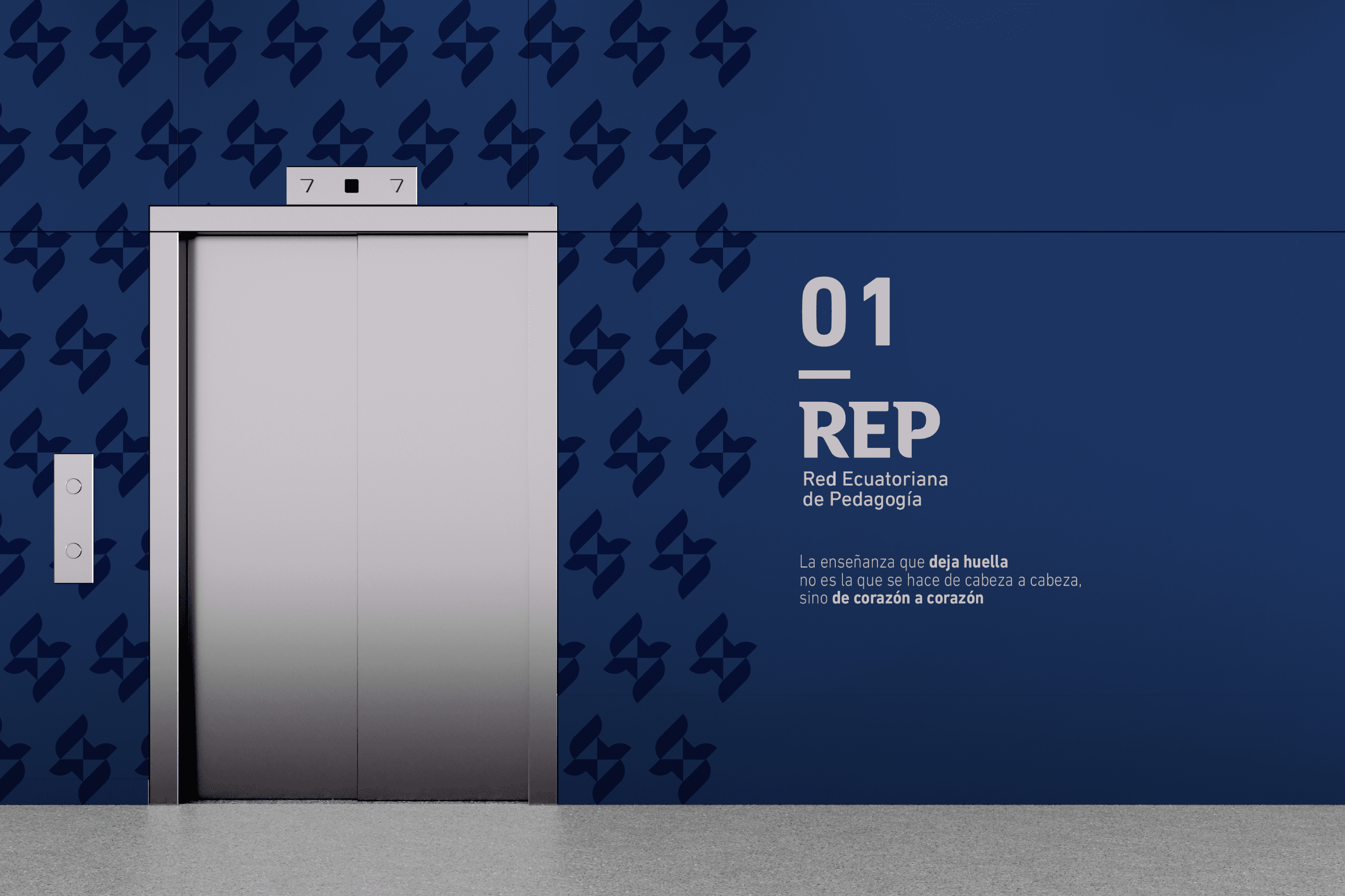
The typeface designed for the REP, retains a San Serif base giving it a modern finish and in turn, in the upper area of its flagpoles has a serif that gives it an academic and institutional aspect. The leg of the “R” and the lower part of the shaft of the “P” were created to evoke kindness; in addition to this, these two letters have in their interior the abstraction of a thought or dialogue box linked to education.

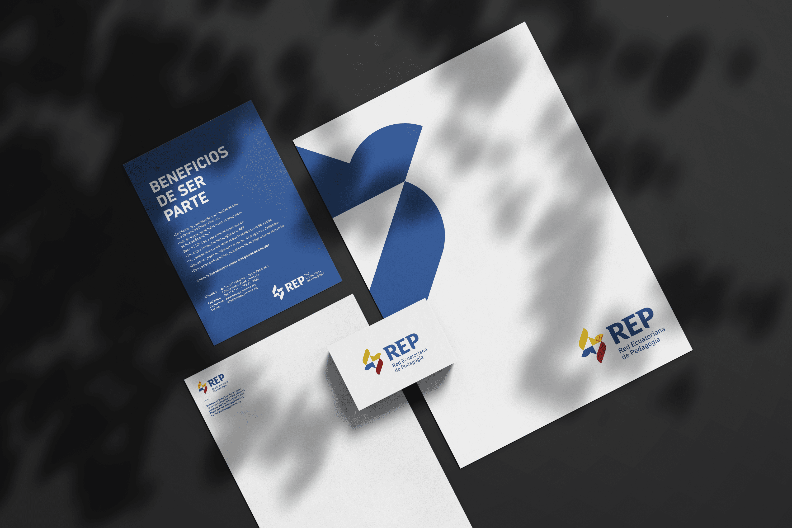
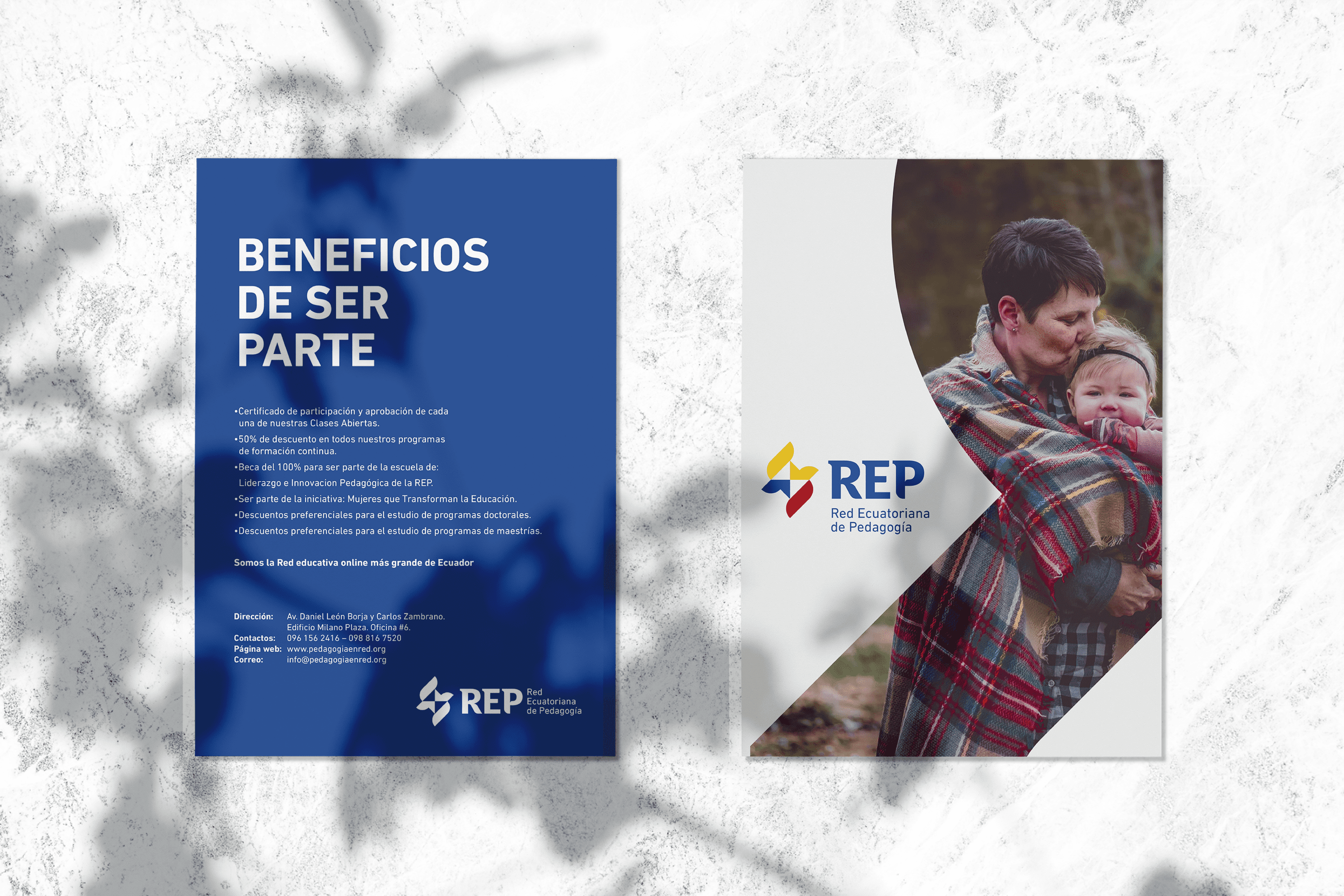
The chromatic palette selected for the Red Ecuatoriana de Pedagogía is yellow, blue and red, which directly links this organization with national and public institutions, the icon has been designed as an objective representation of the flame of knowledge, and a “compass” that determines the direction, as a direct representation of the importance of education to guide the new societies.

Suggested Projects
Terrenal Resto Bar
Simples Finanzas
Extreme Max
Flavio Pizza
BRANDING

The Client

Flavio” is a new Pizzeria specialized in making traditional Neapolitan pizzas, which is located in KuwaitWest Asia.


Keywords

Branding / Packaging / Pizzeria

The Objective

To design a brand that expresses the essence of the city of Naples and its traditional pizza made with love.


The Solution

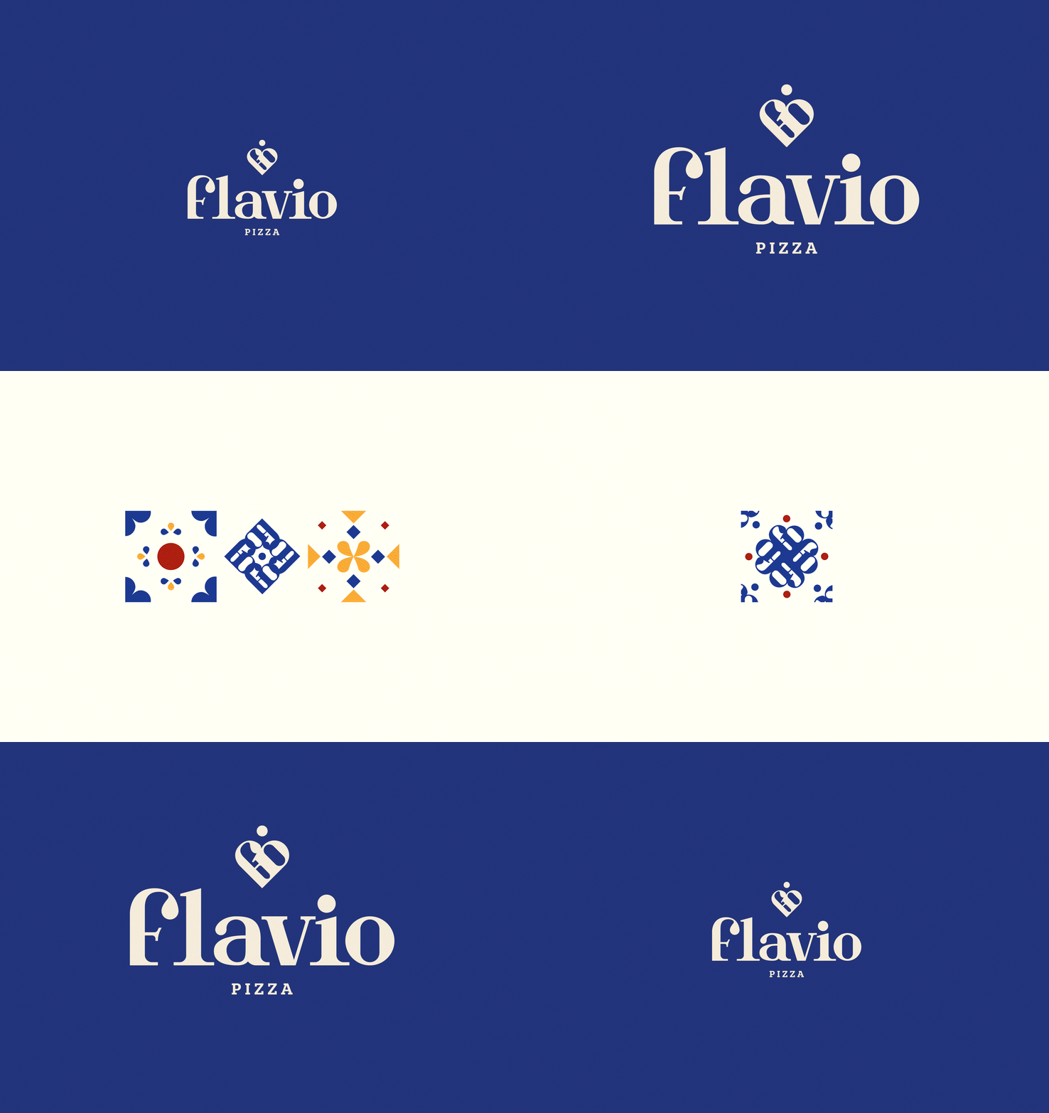
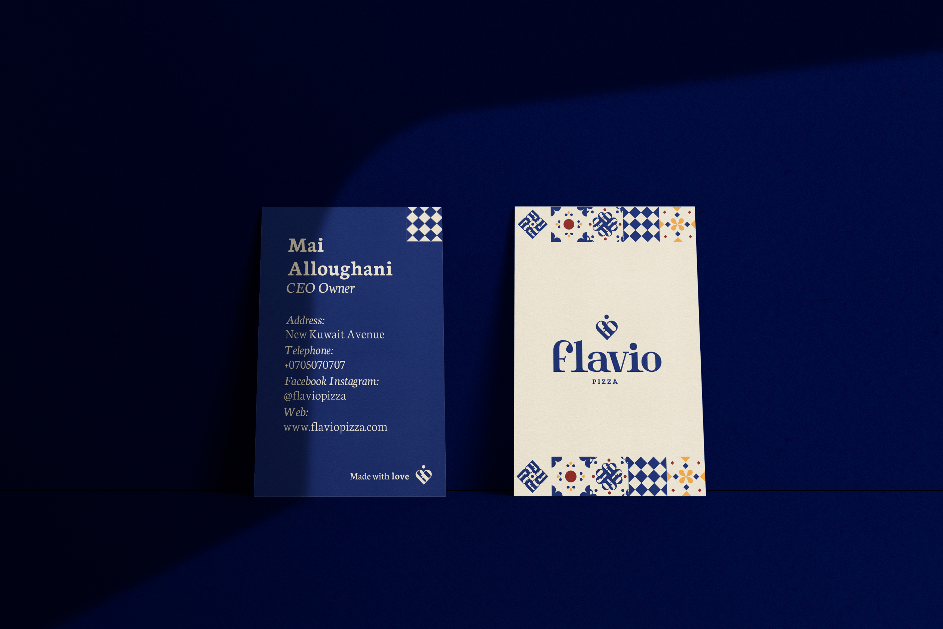
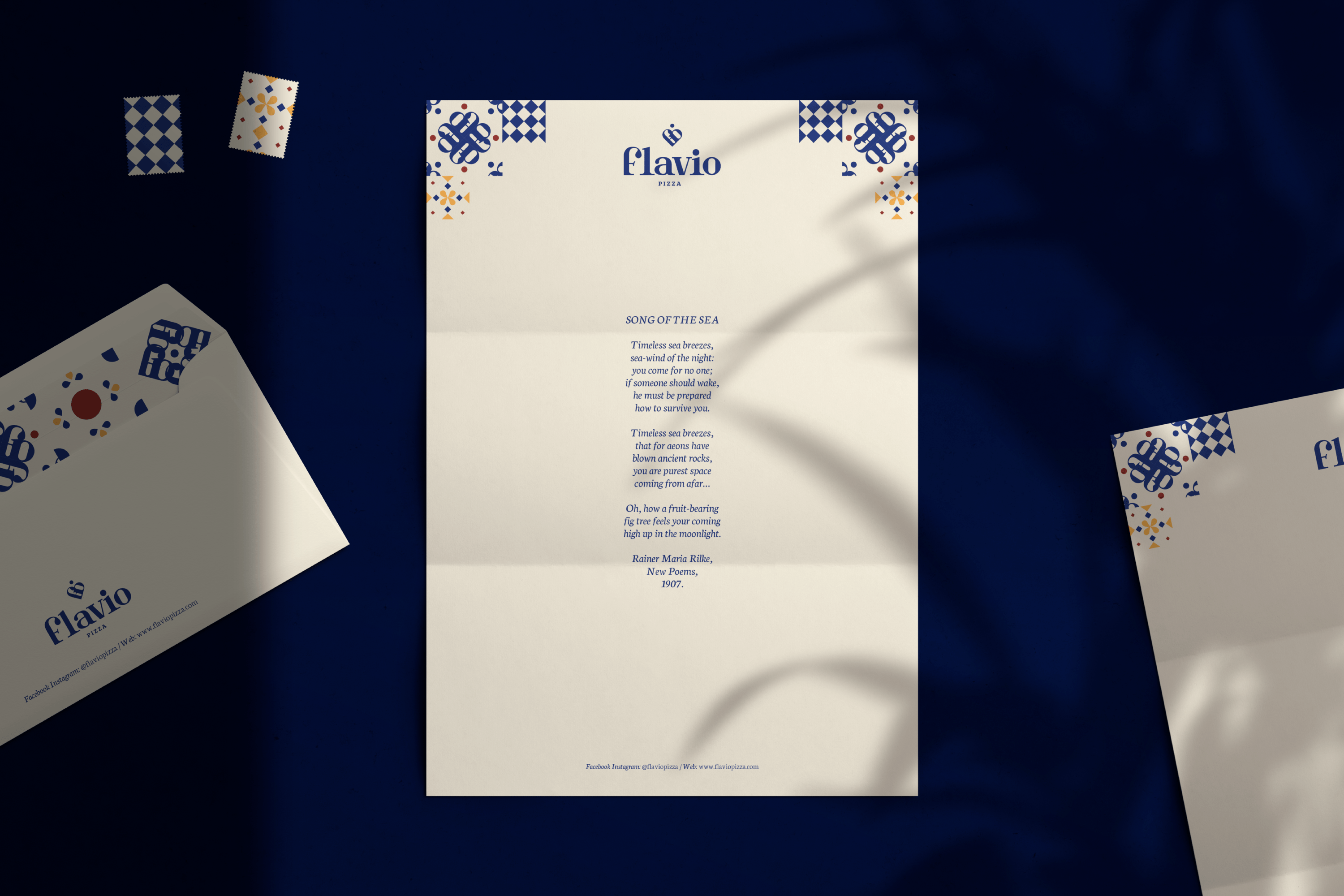
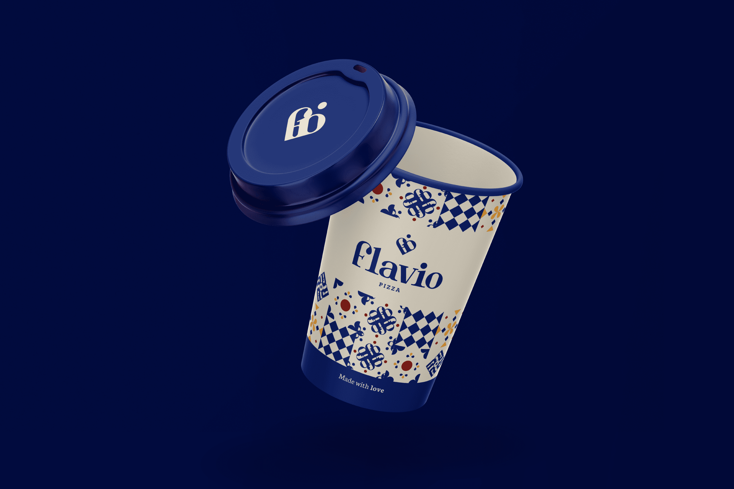
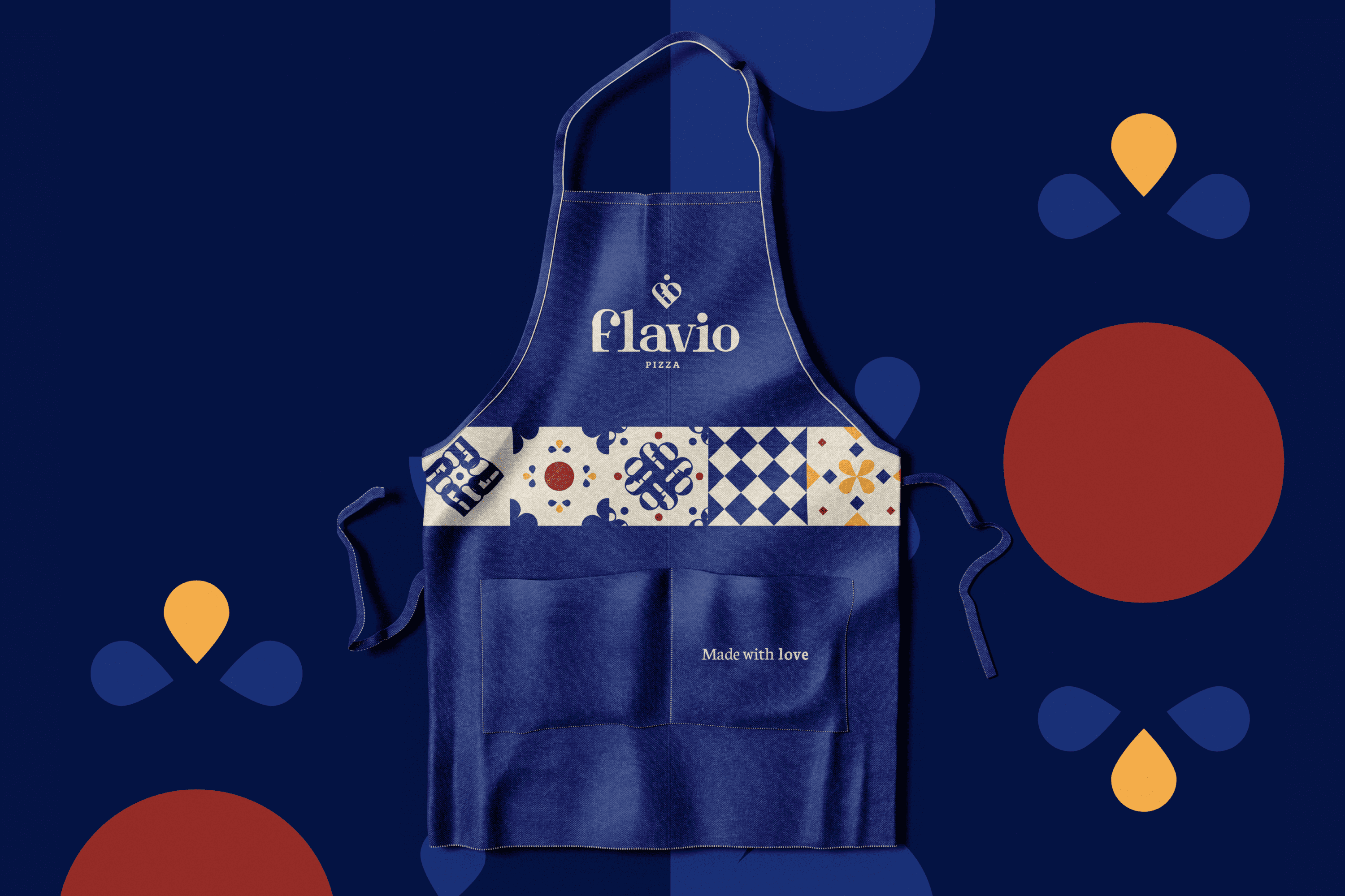
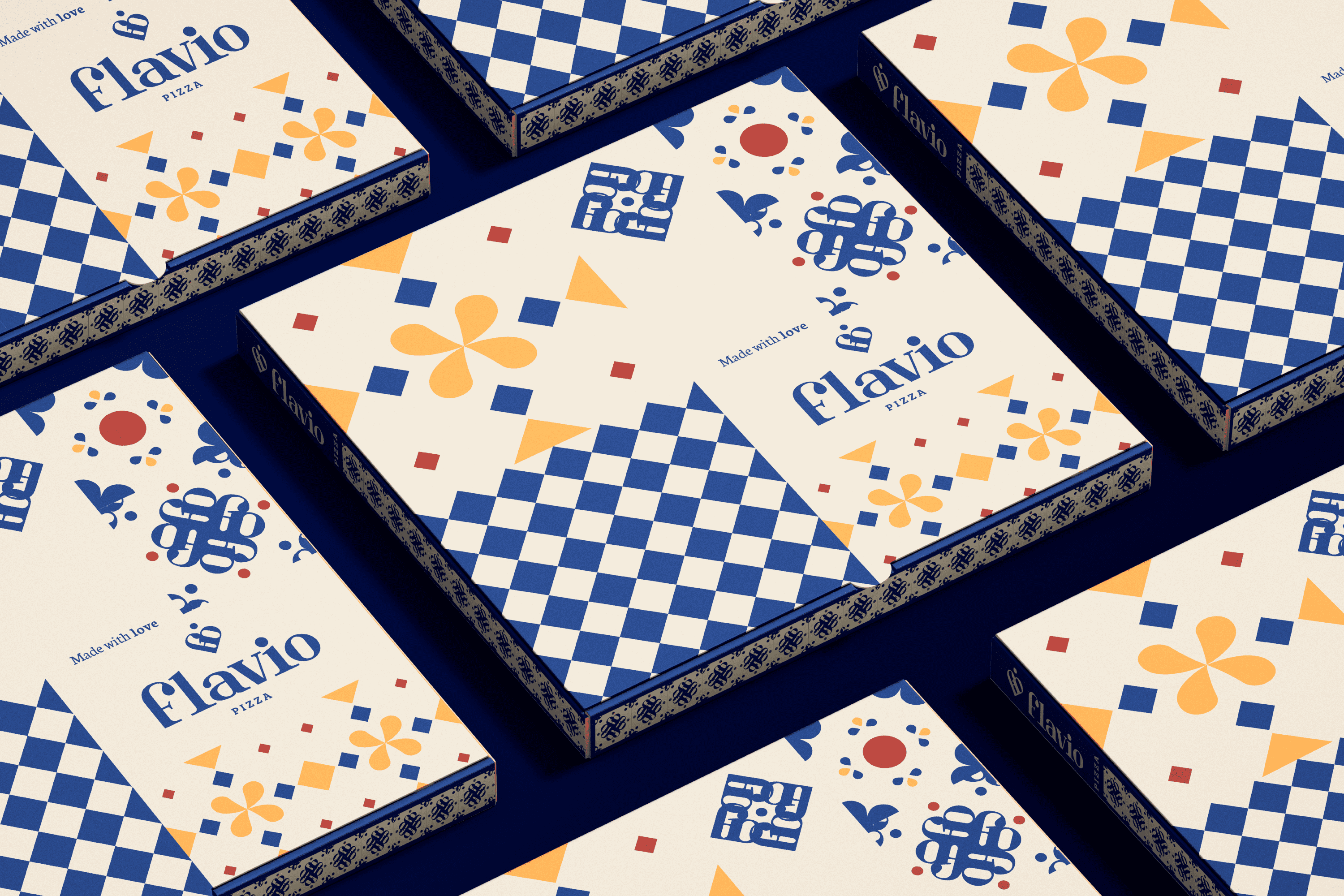
The graphic identity is based on the visual structures found in the architecture of Naples, domes, tiles and columns. The typography developed for “Flavio Pizza” is Serif, the finials are designed based on the Ionic columns present in its historical buildings. When this typography is joined together, it forms a heart and the dot of the is relocated on it as part of the concept, mind and heart make this product, pizzas made with love.

On the other hand, for Flavio Pizza we have developed a tile system that uses the brand icon arranged concentrically that together with other elements obtained from the visual universe of Naples allows us to obtain a mosaic that strengthens the objective of the brand.

Suggested Projects
Terrenal Resto Bar
Simples Finanzas
Extreme Max
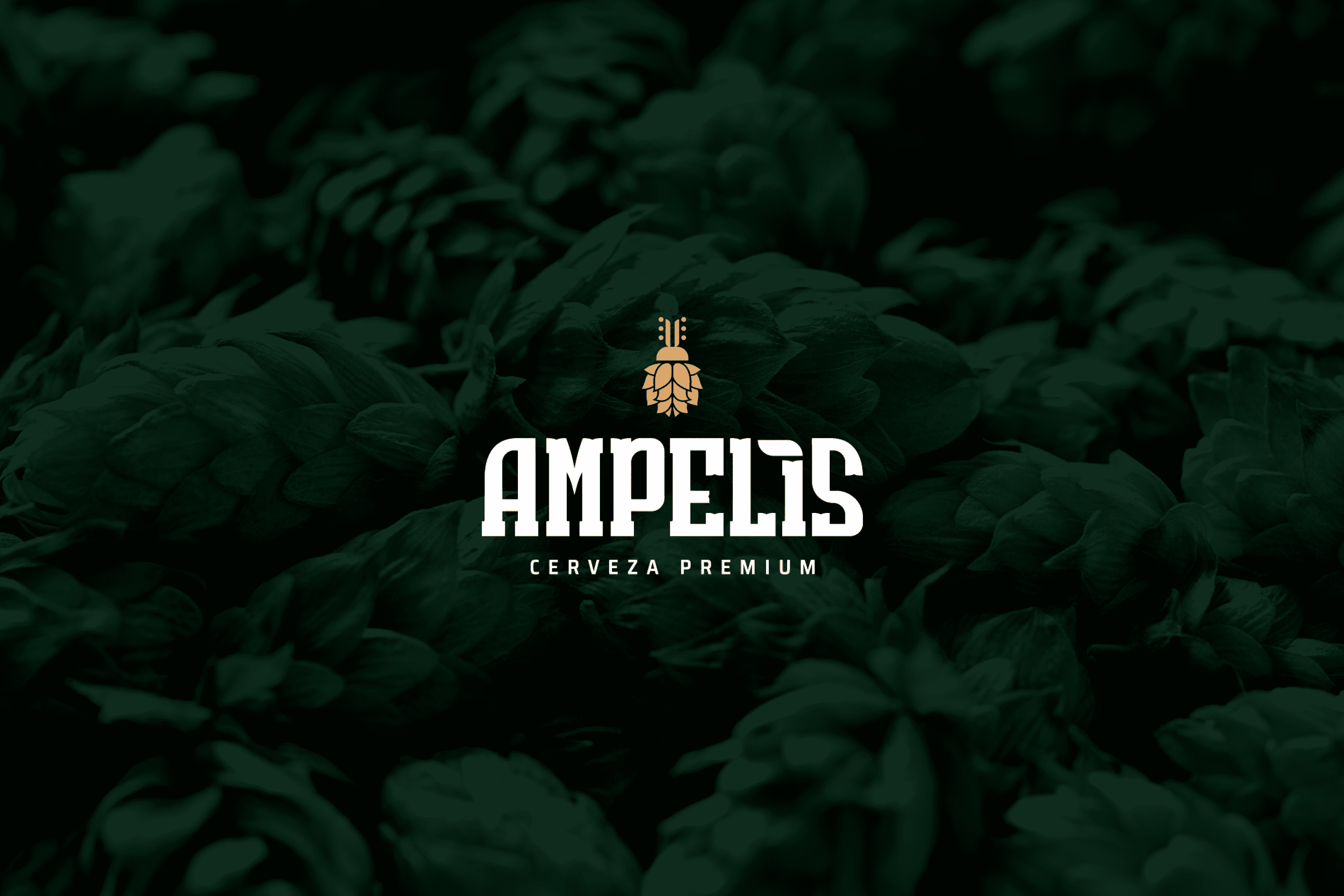
AMPELIS Cerveza Premium
BRANDING

The Client

Cervecería Ampelis” is a new Mexican brewery located in Querétaro, Mexico. The brewery is dedicated to researching new combinations and methods to enhance flavors and improve the beer drinking experience, for national and international sales and distribution.


Keywords

Branding / Packaging / Brewery / Beverages

The Objective

Develop a brand that reflects the history of its owner, quality, trust and the research behind each product.


The Solution

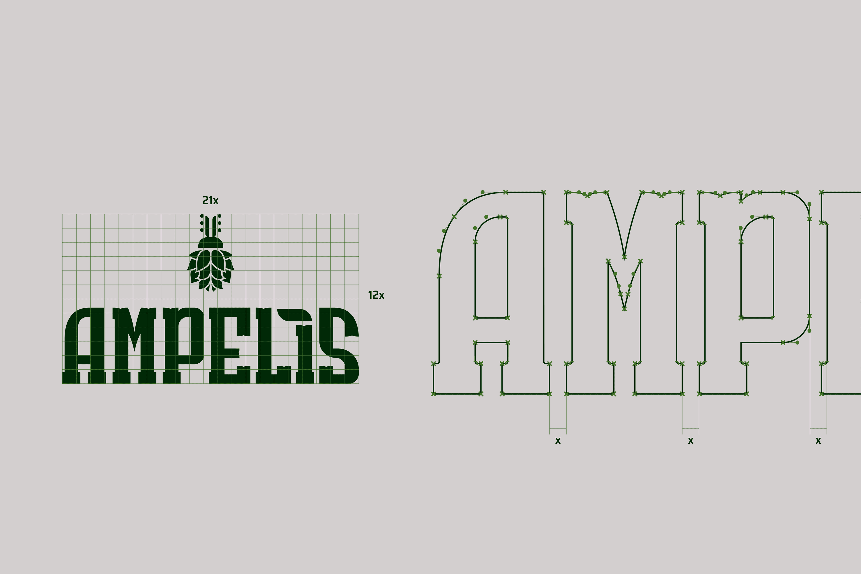
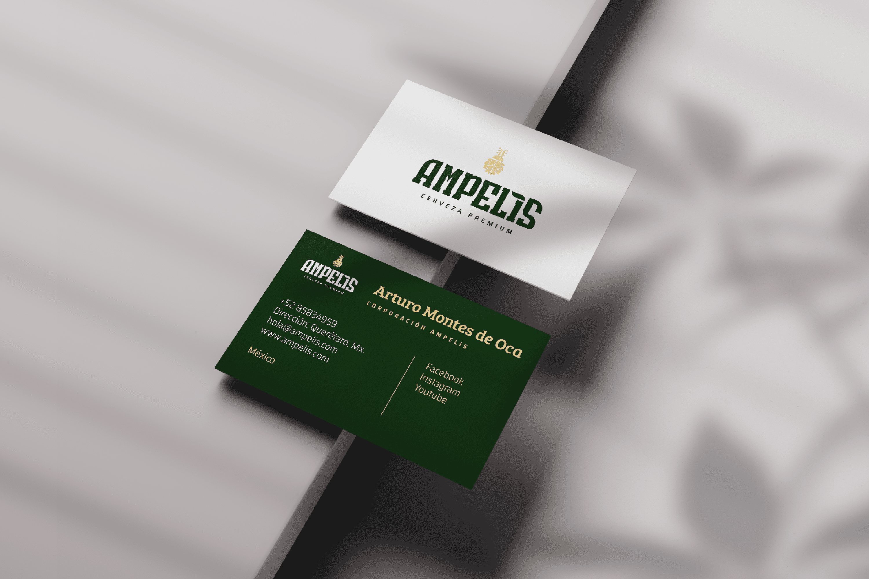
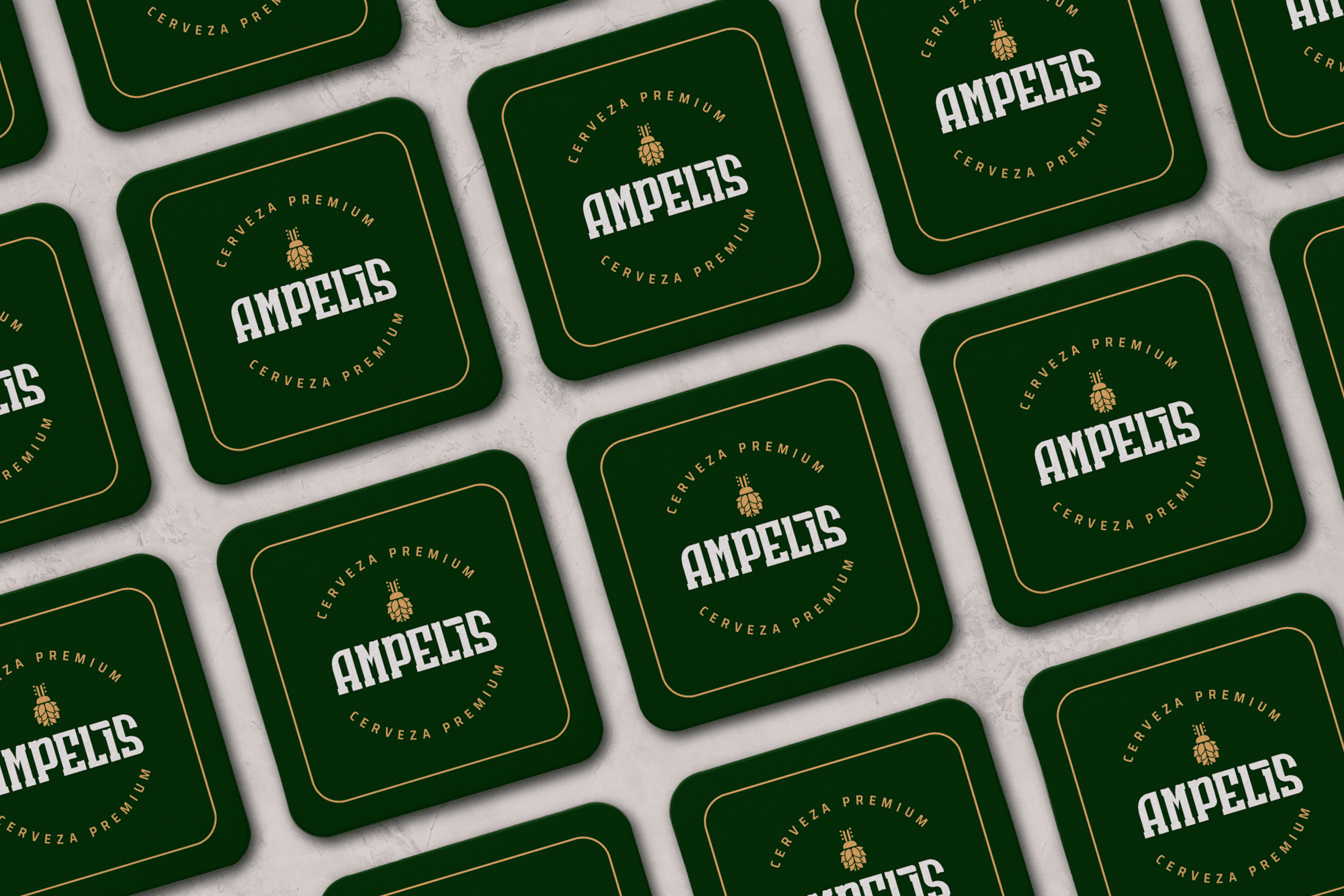
The branding proposal is a visual translation of the modern experience, which is obtained thanks to the existing research behind the brewing process and gives the product confidence and solidity reflected in the typography design. The icon is an abstraction of the heart of this company, Arturo, its owner, who from an early age was known by his friends and family as “Bicho” (Bug), hence the icon is the abstraction of a beetle (bug) fused with hops. And each brand has a story to tell.

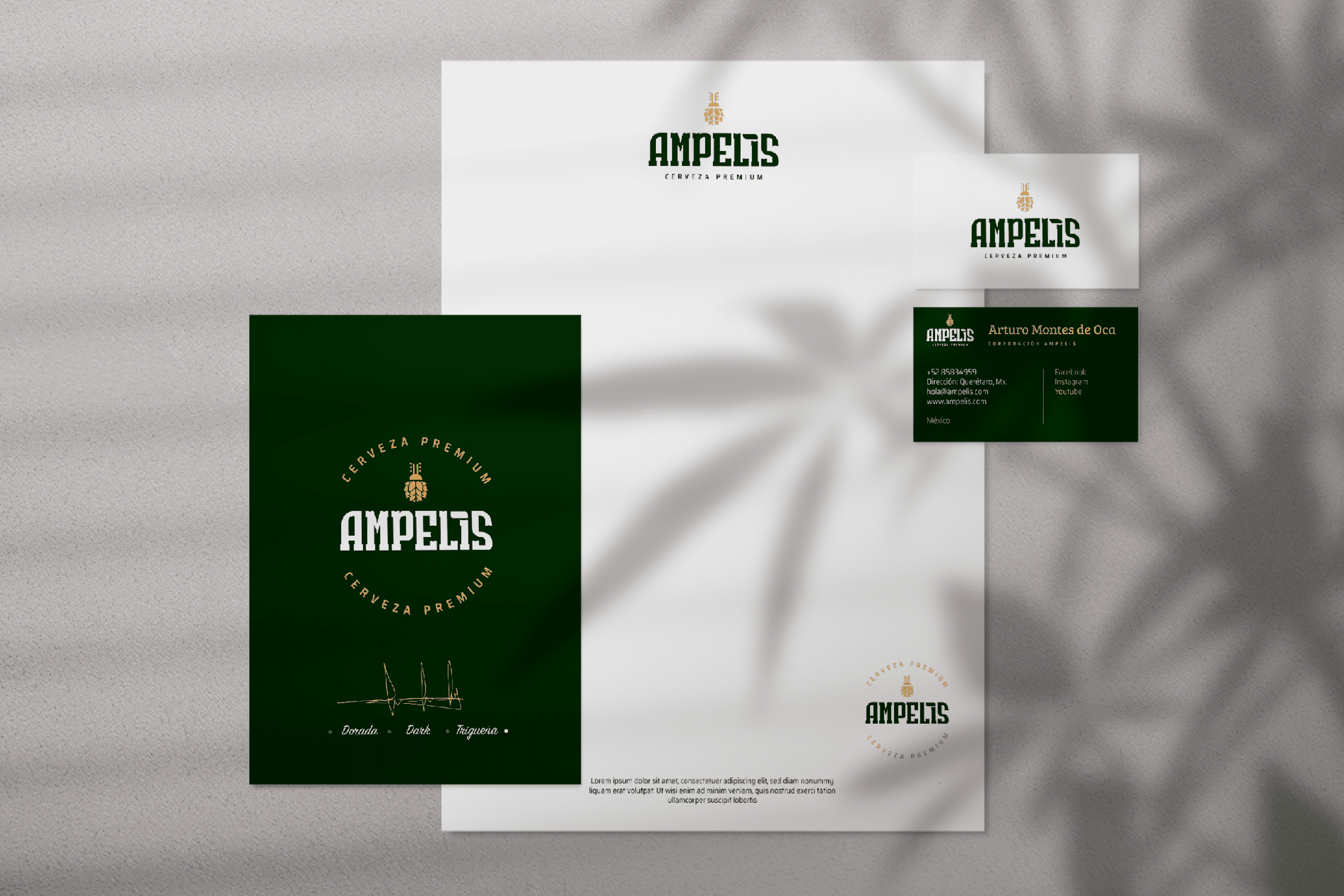
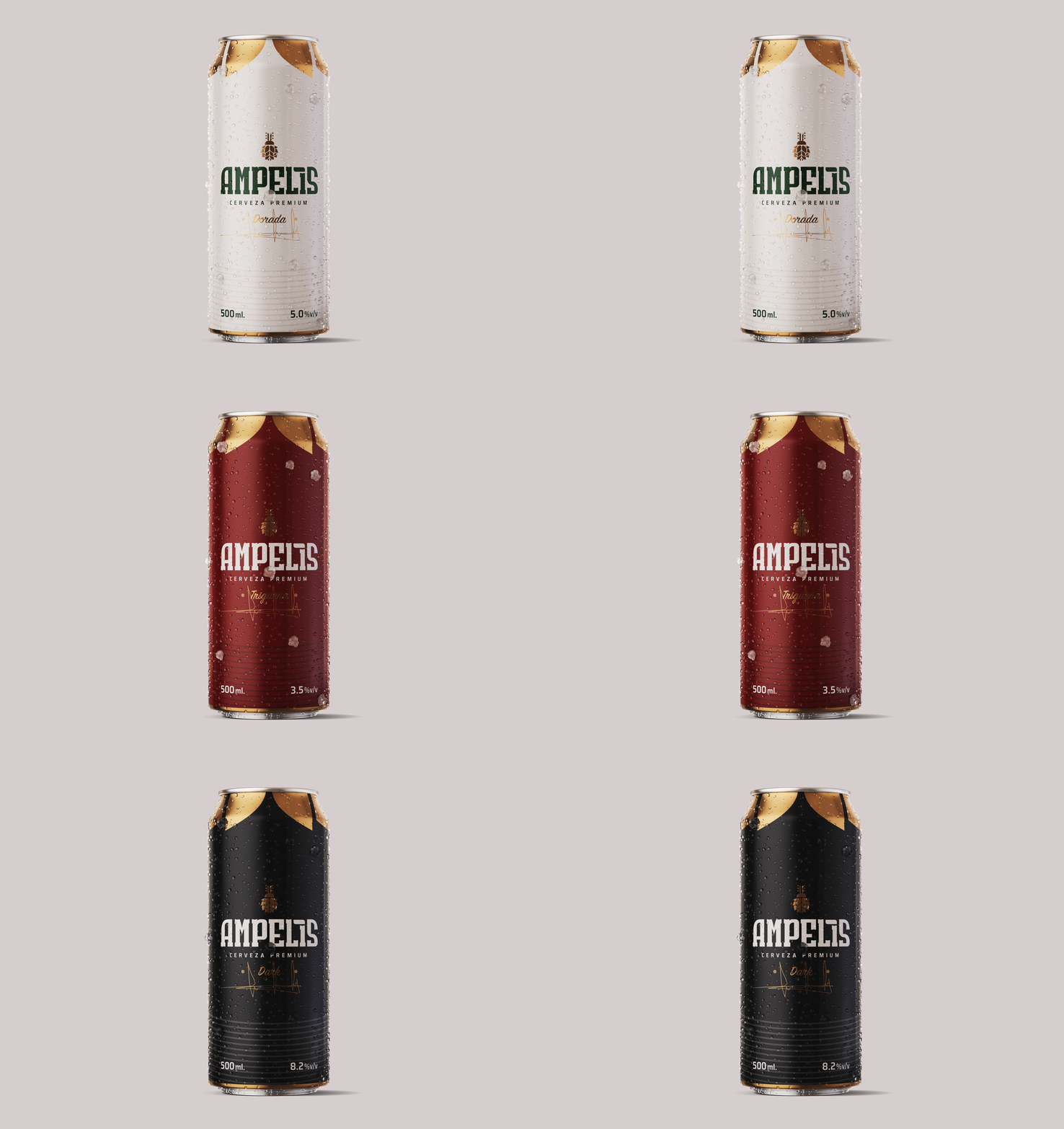
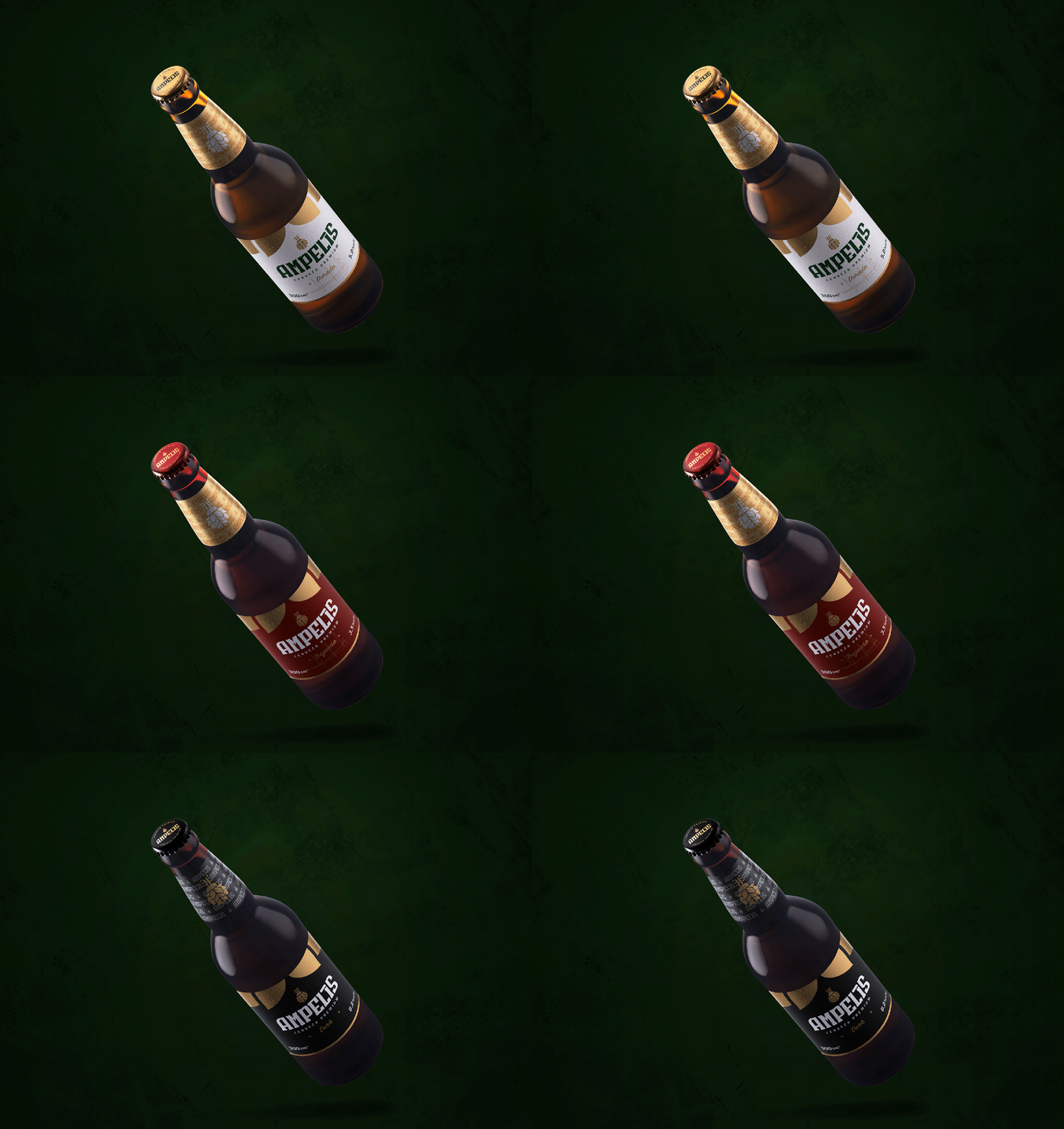
Three premium beers were brewed to mark the beginning of the brand’s legacy. First, the main one: Dorada, the beer of the sun. Second, Triqueña, inspired by Latin women. And finally Dark, the dark beer from Cervecería Ampelis. From light to dark labels and colorful caps and gold finishes, the design of the bottles resembles the hard work and rigorous research process behind each individual beverage.

Suggested Projects
Terrenal Resto Bar
Simples Finanzas
Extreme Max
Anabel Zambrano Dental Clinic
BRANDING

The Client

“Anabel Zambrano” is a Dental Specialty Clinic located in Salcedo Ecuador, which thinks about the welfare of families and pays special attention to their children.


Keywords

Branding / Clinic / Dentist

The Objective

Develop a brand that reflects quality, trust and the research behind each product.


The Solution

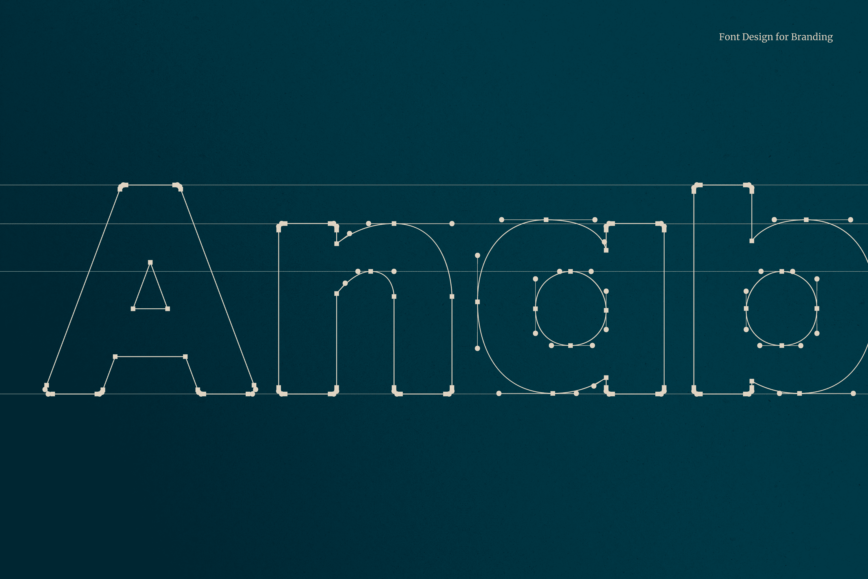
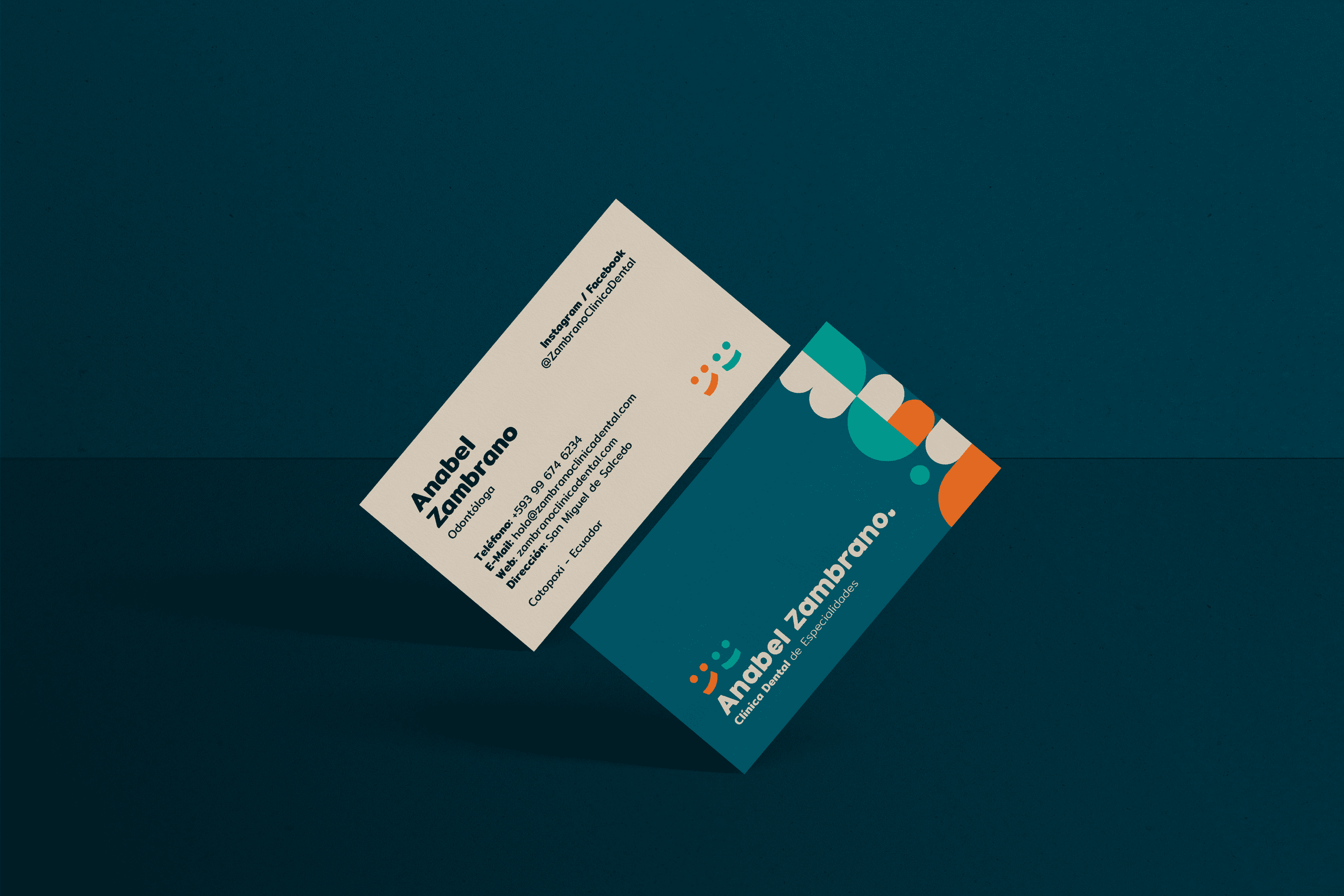
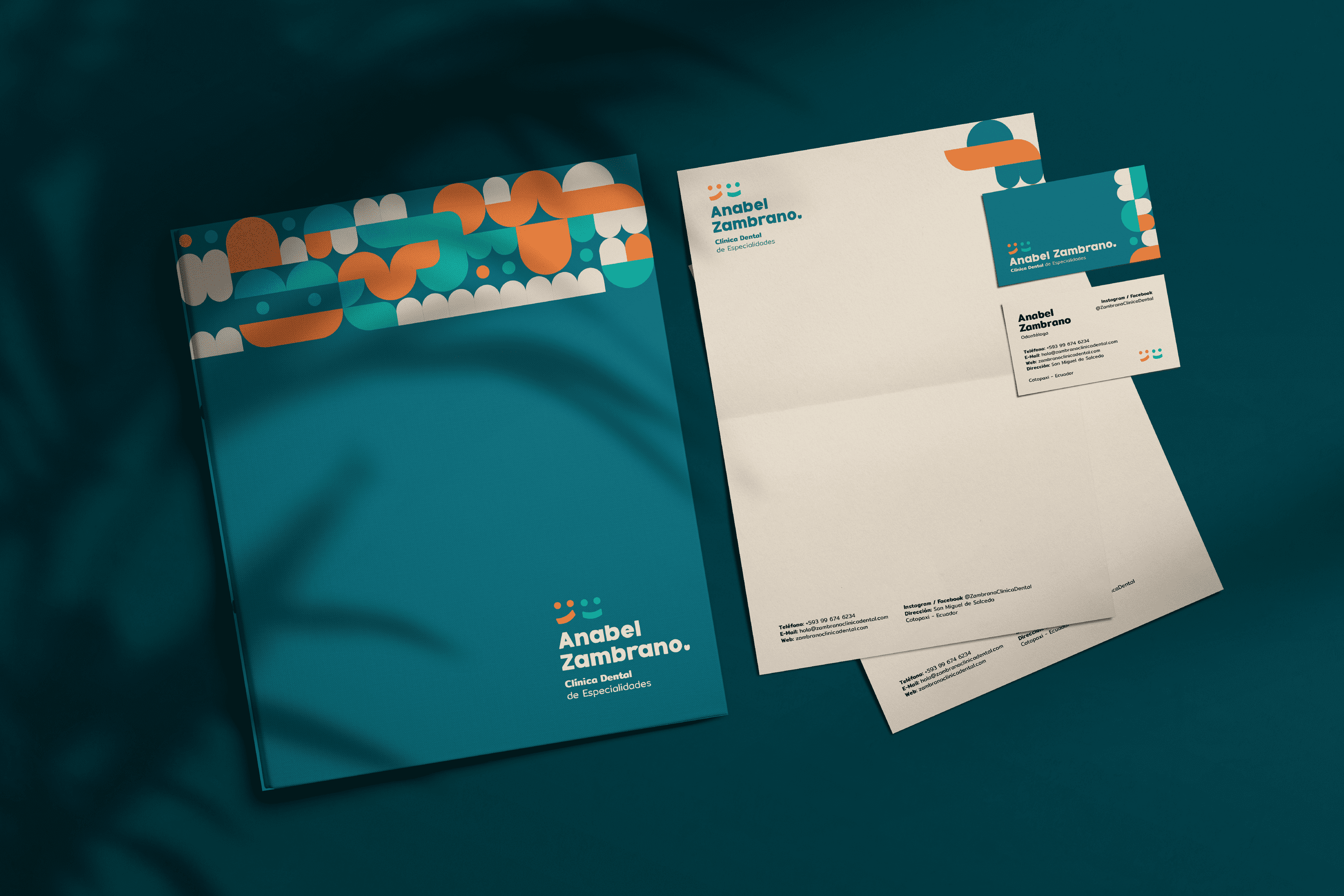
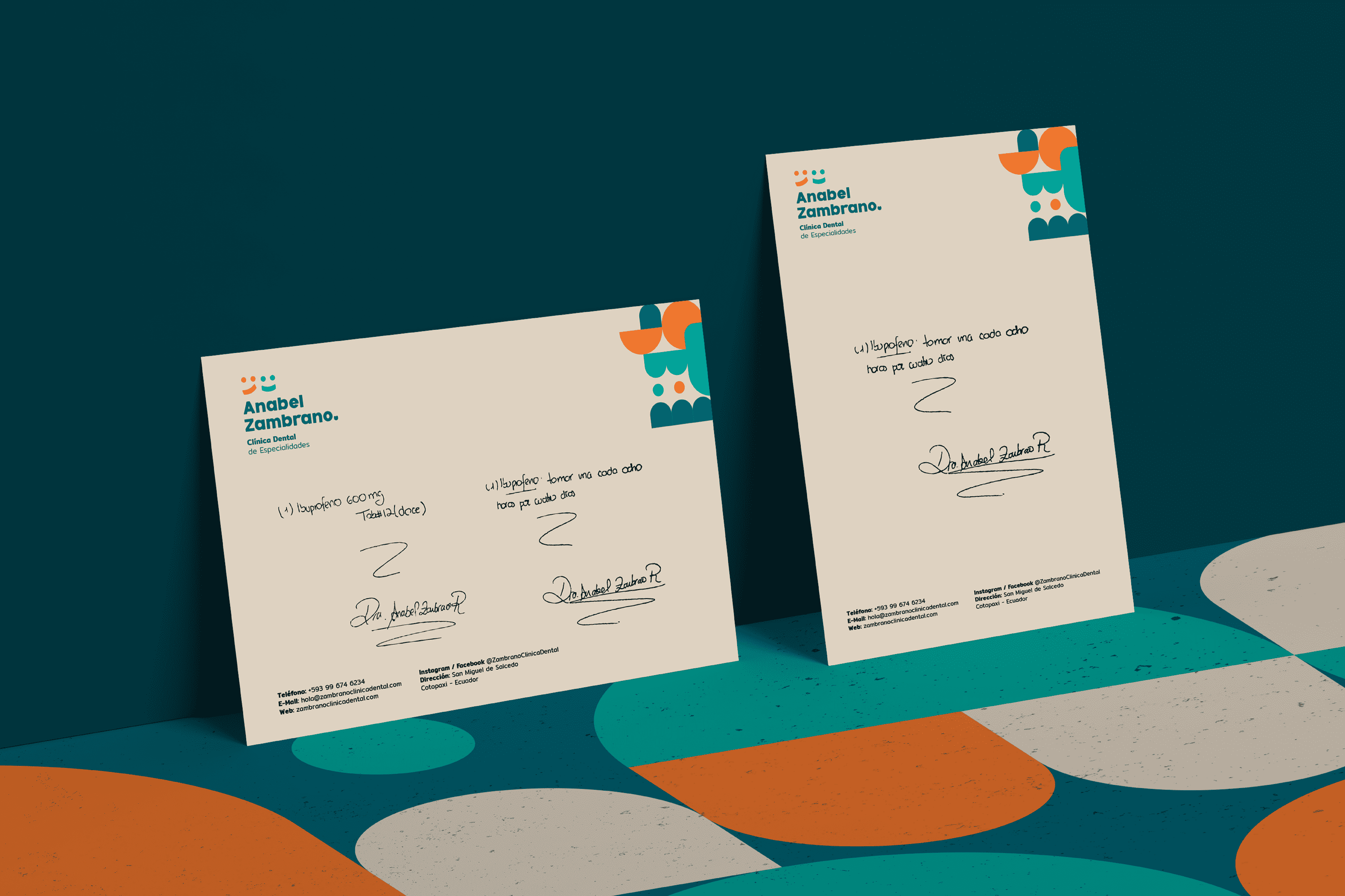
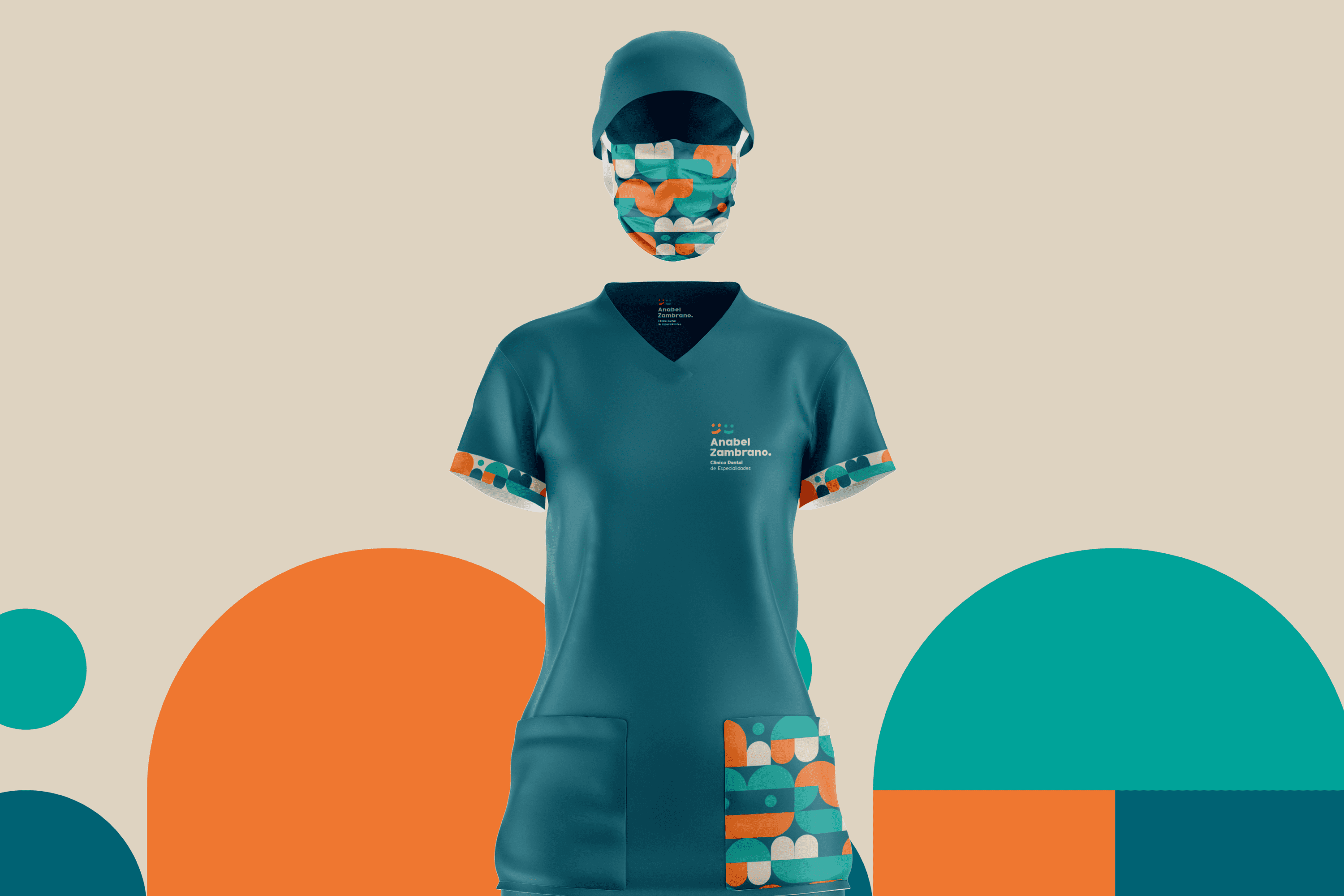
The typography designed for “Anabel Zambrano” is Serif and its wide stroke makes each type stable, which translates as trust, the corners have been slightly rounded to add to the concept of friendliness. The Anabel Zambrano isotype uses basic elements recognizable to any member of the family regardless of age, to represent the before and after of a smile. The colors used generate an atmosphere of joy, friendliness and well-being characteristics that are part of this place.

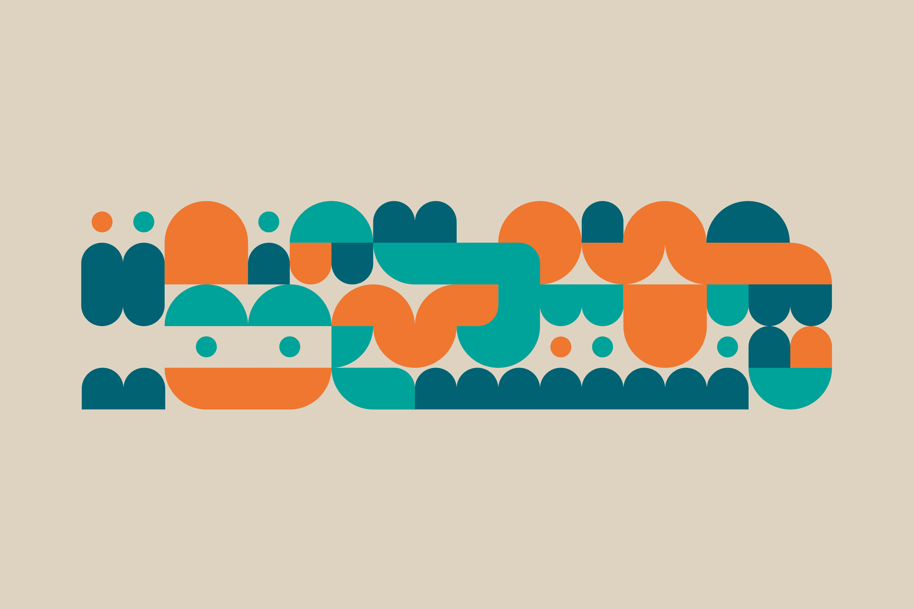
A modular system has been developed, its shape shows abstractions of teeth, molars, people, brushes, smiles, but leaves freedom to the imagination in its possible combinations.

Suggested Projects
Terrenal Resto Bar
Simples Finanzas
Extreme Max