Terrenal Resto Bar
BRANDING | ILLUSTRATION

The Client

Terrenal is a Resto-Bar located in Riobamba, Ecuador that draws inspiration from the Andean Paramo for its concept.


Keywords

Branding / Design / Naming / Restaurant / Bar / Paramo / Andean
The Objective

Design the Naming and Branding for a Resto Bar with the concept of the Andean Paramo.


The Solution

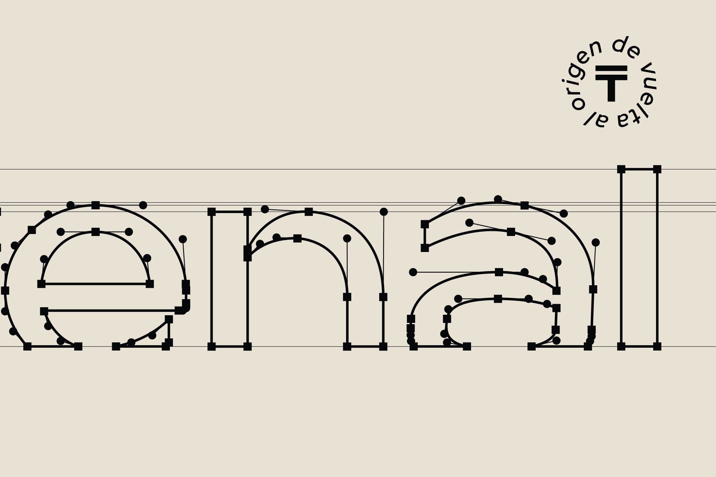
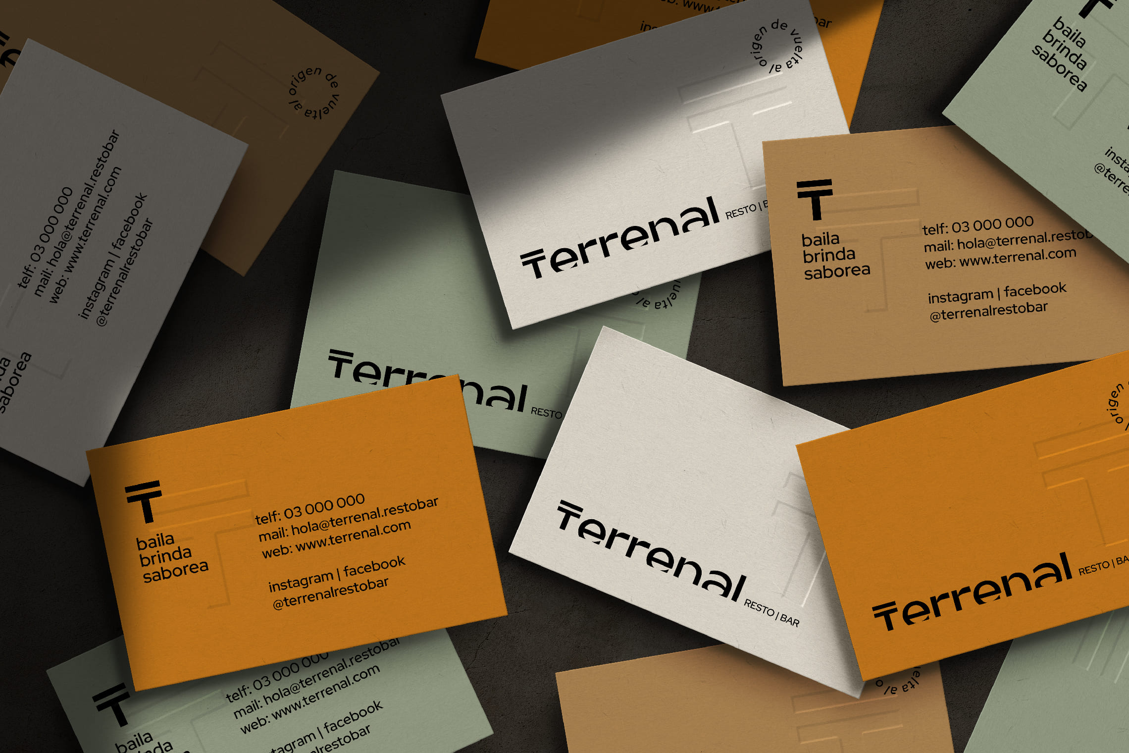
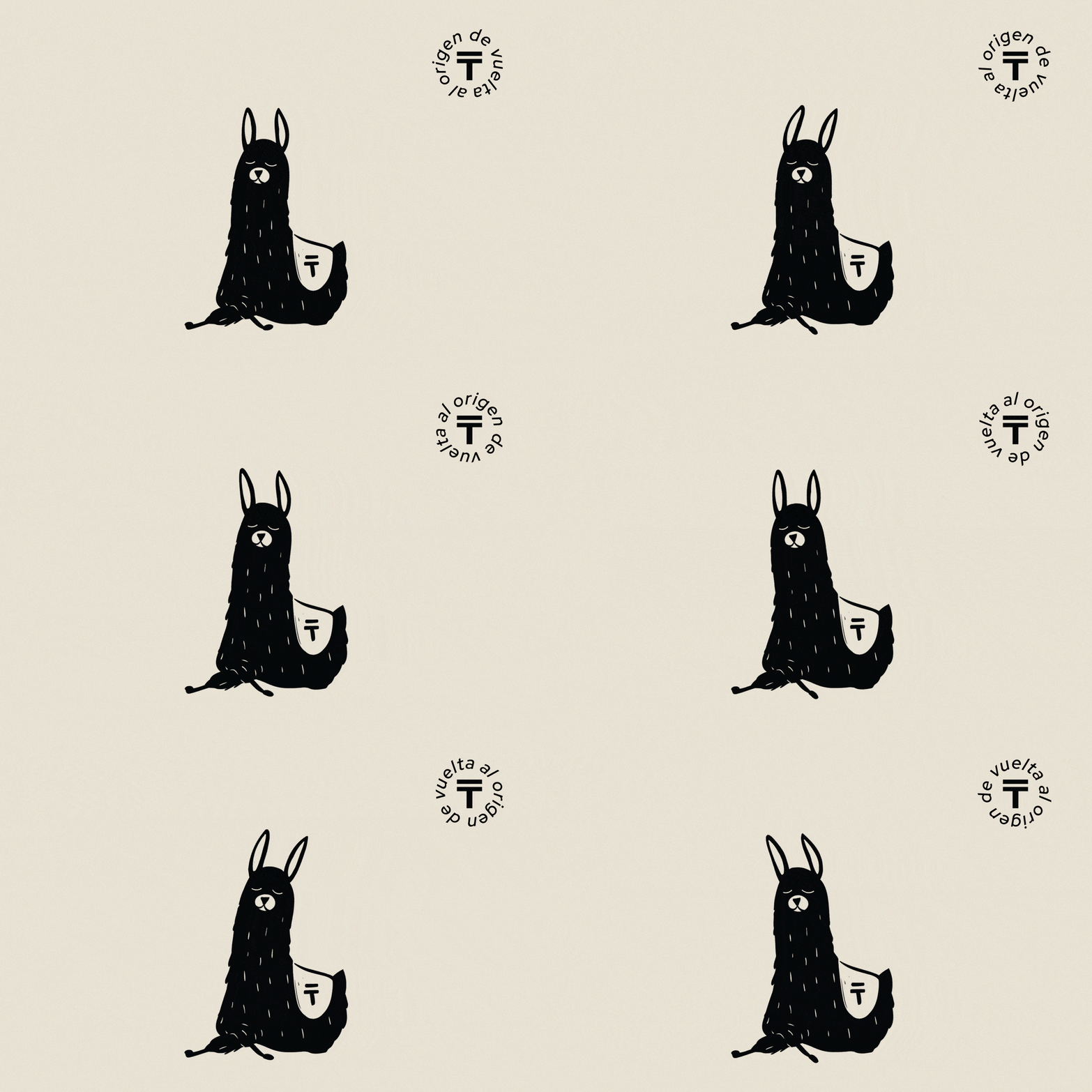
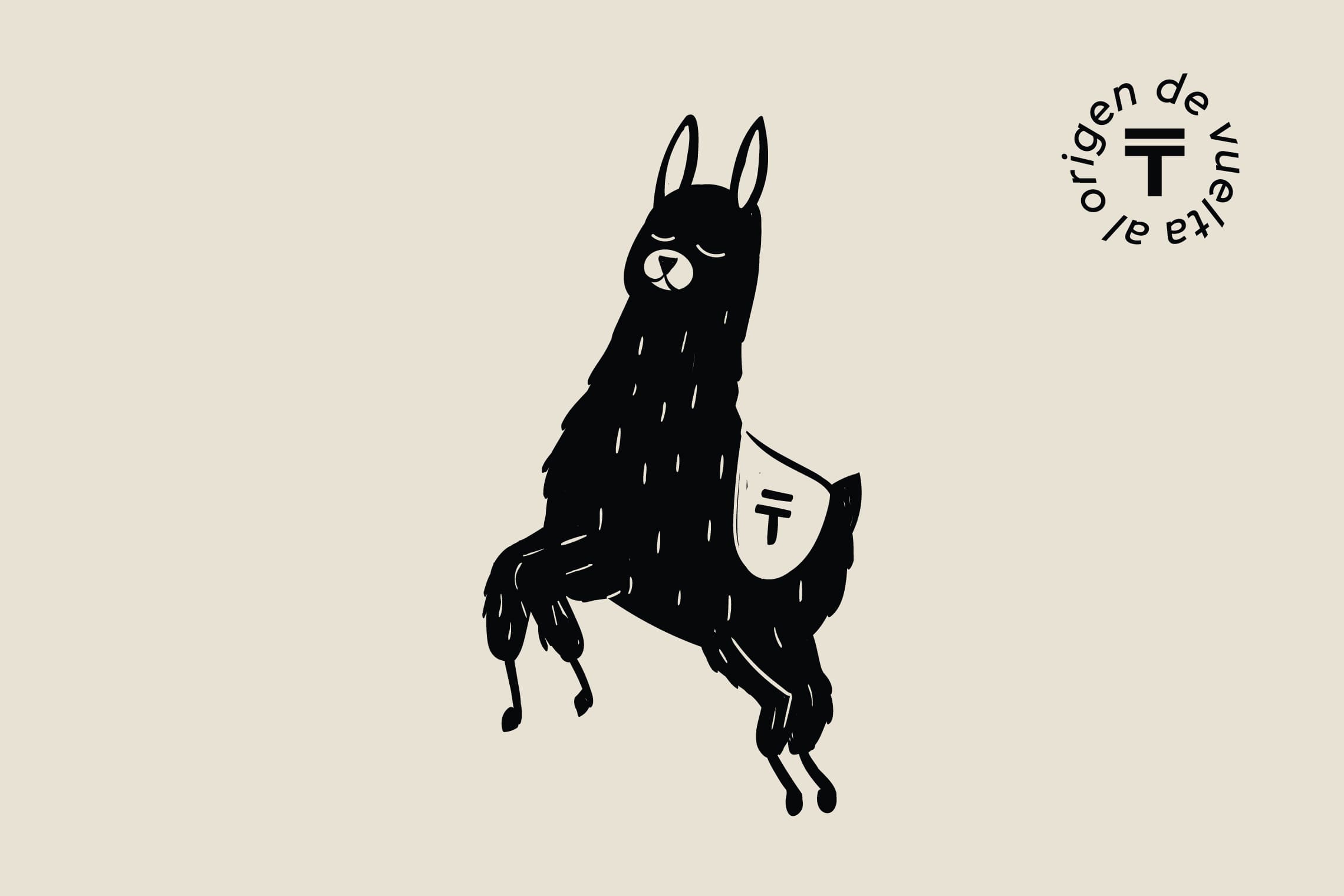
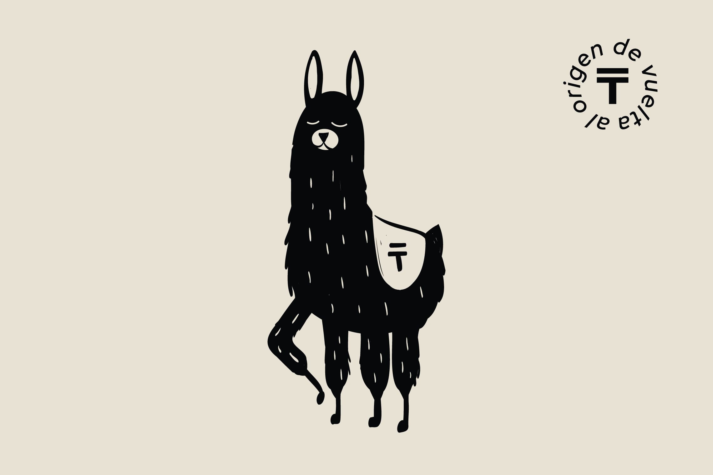
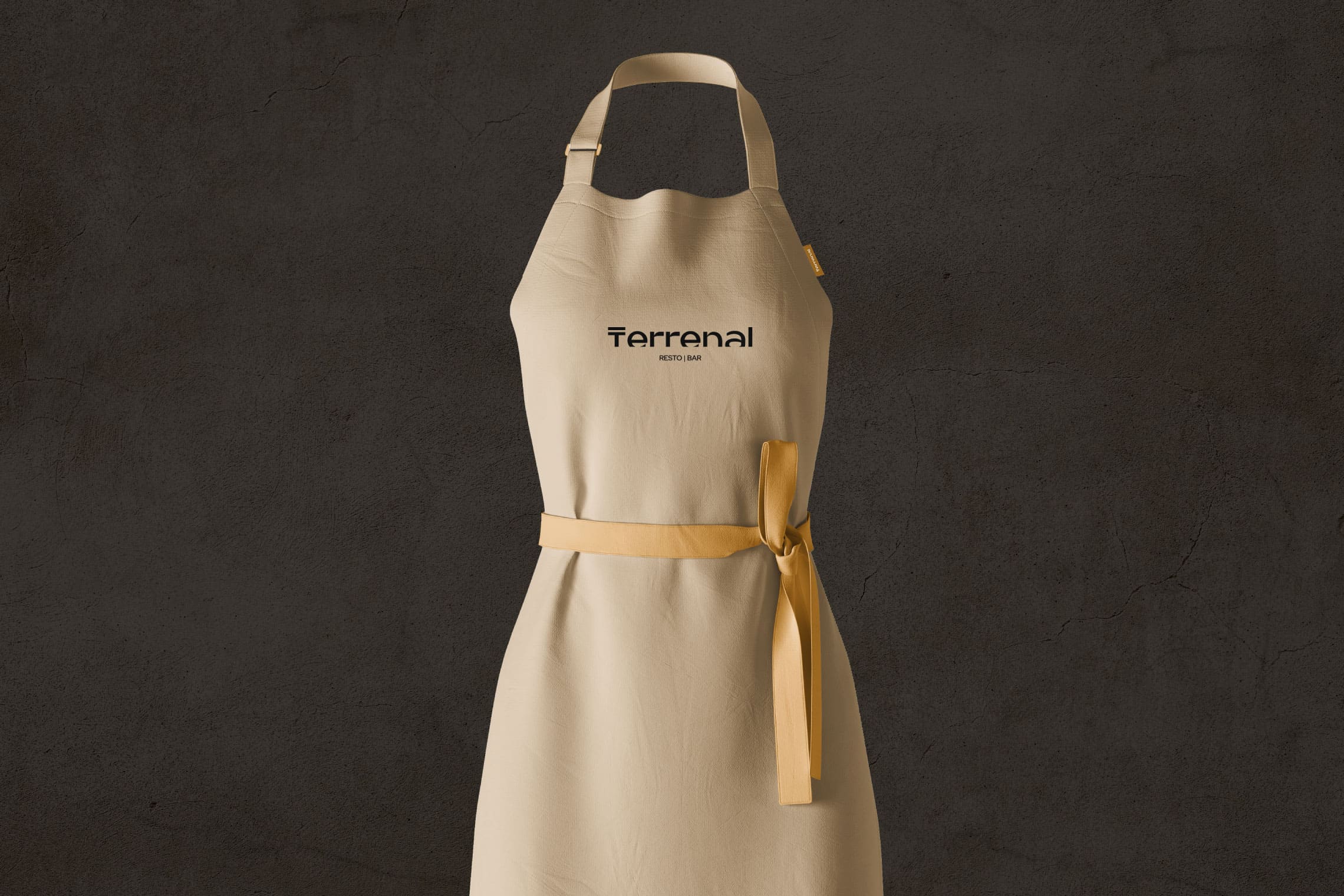
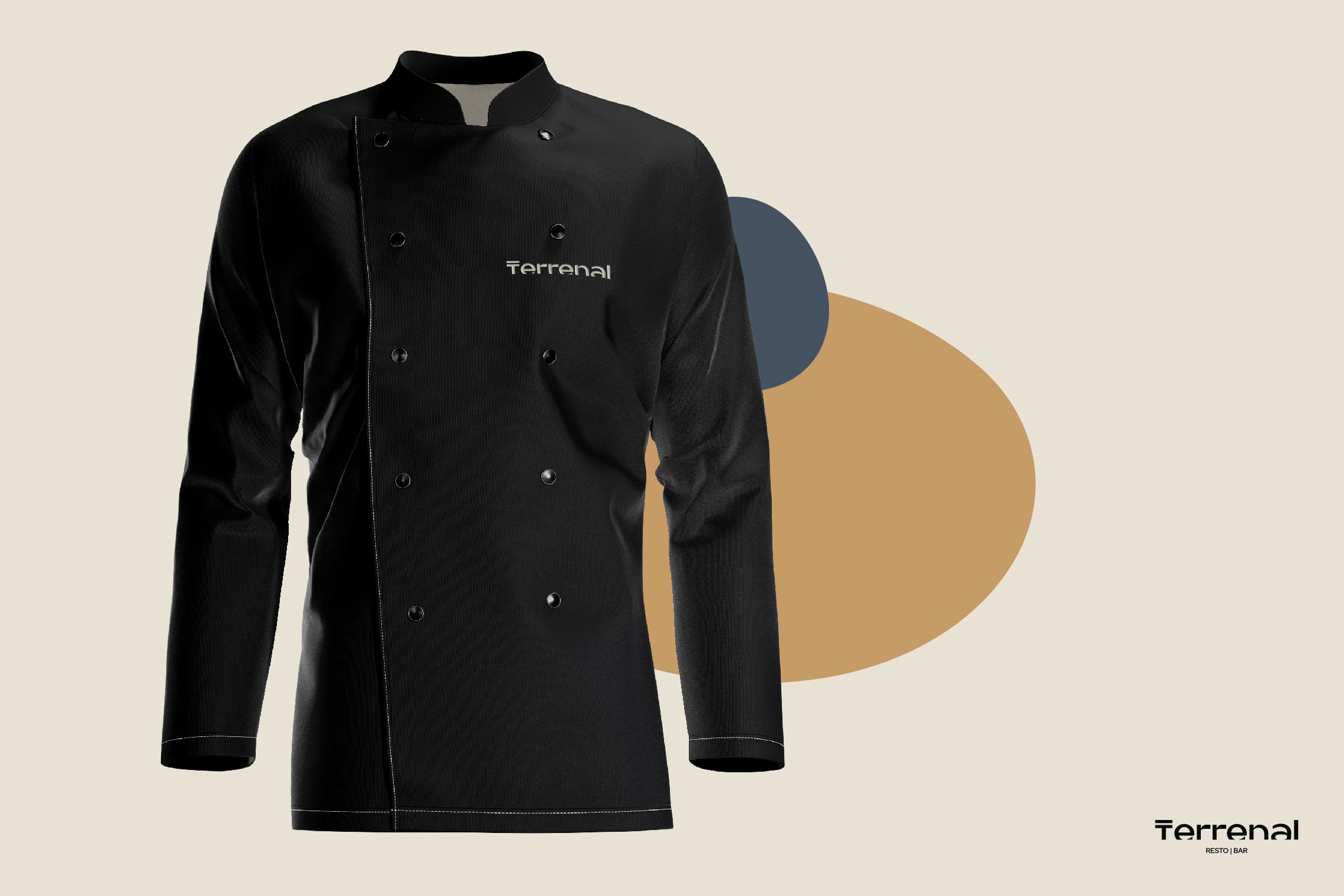
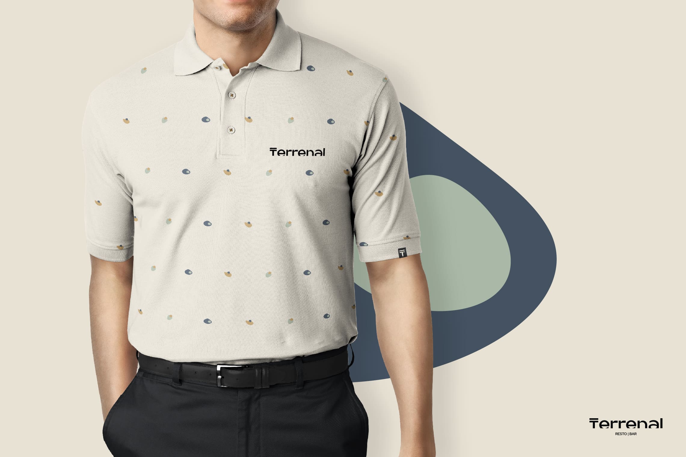
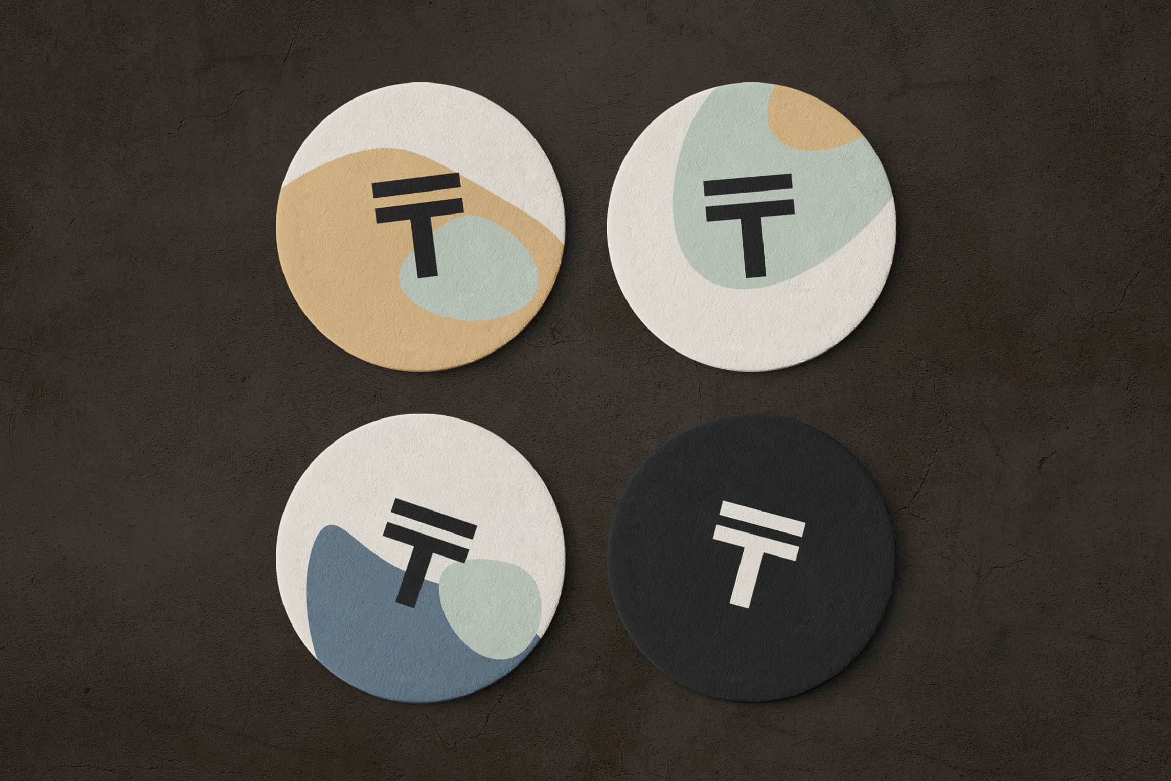
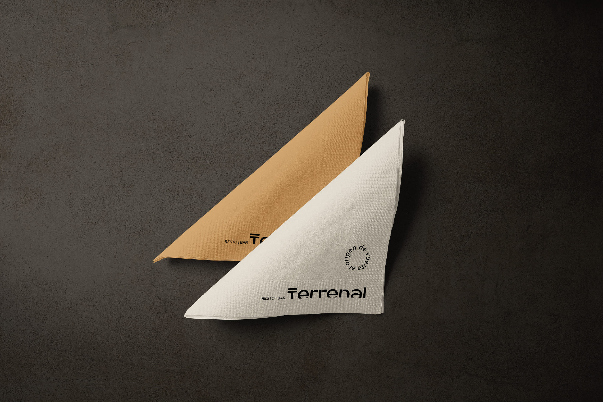
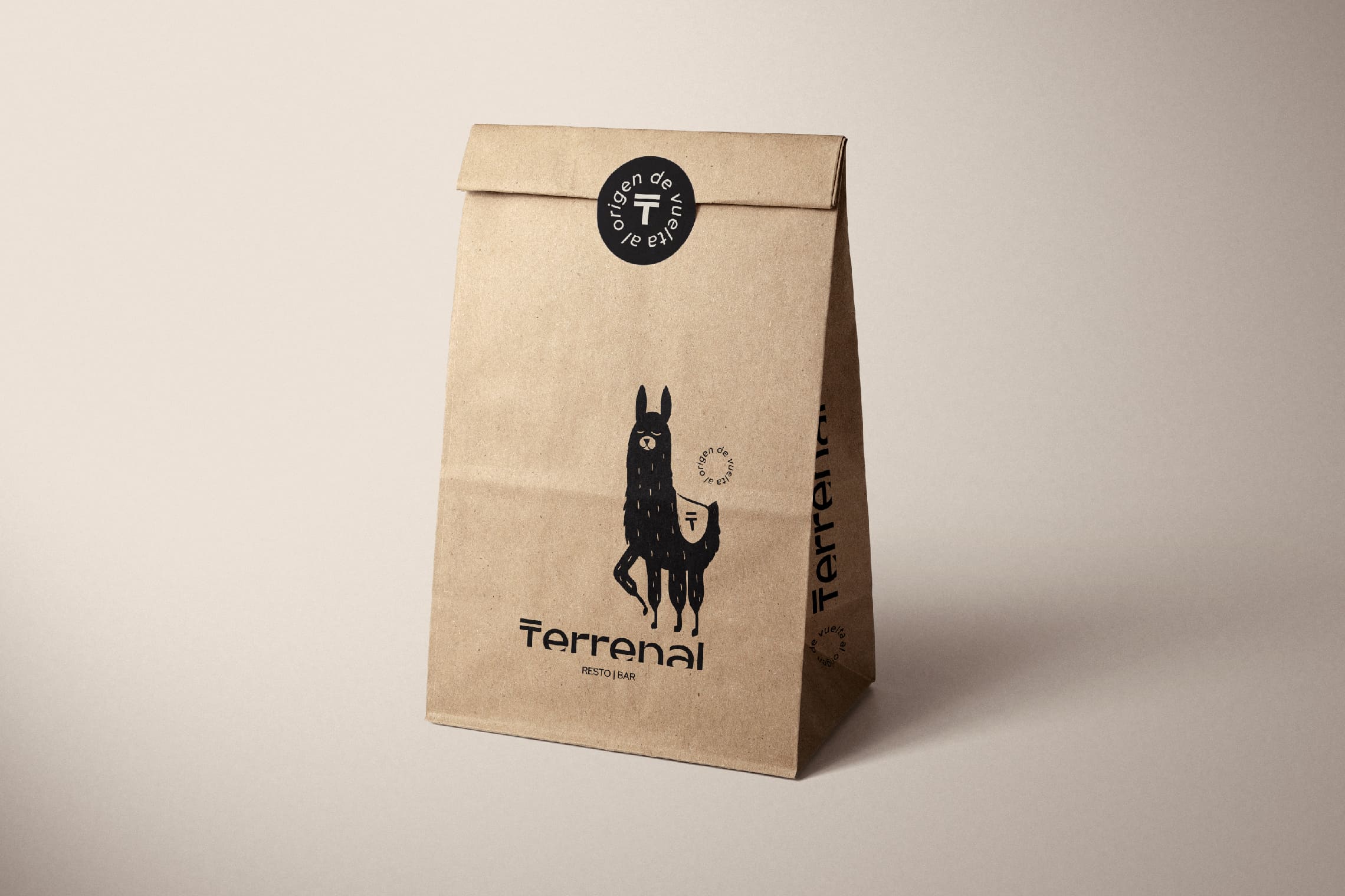
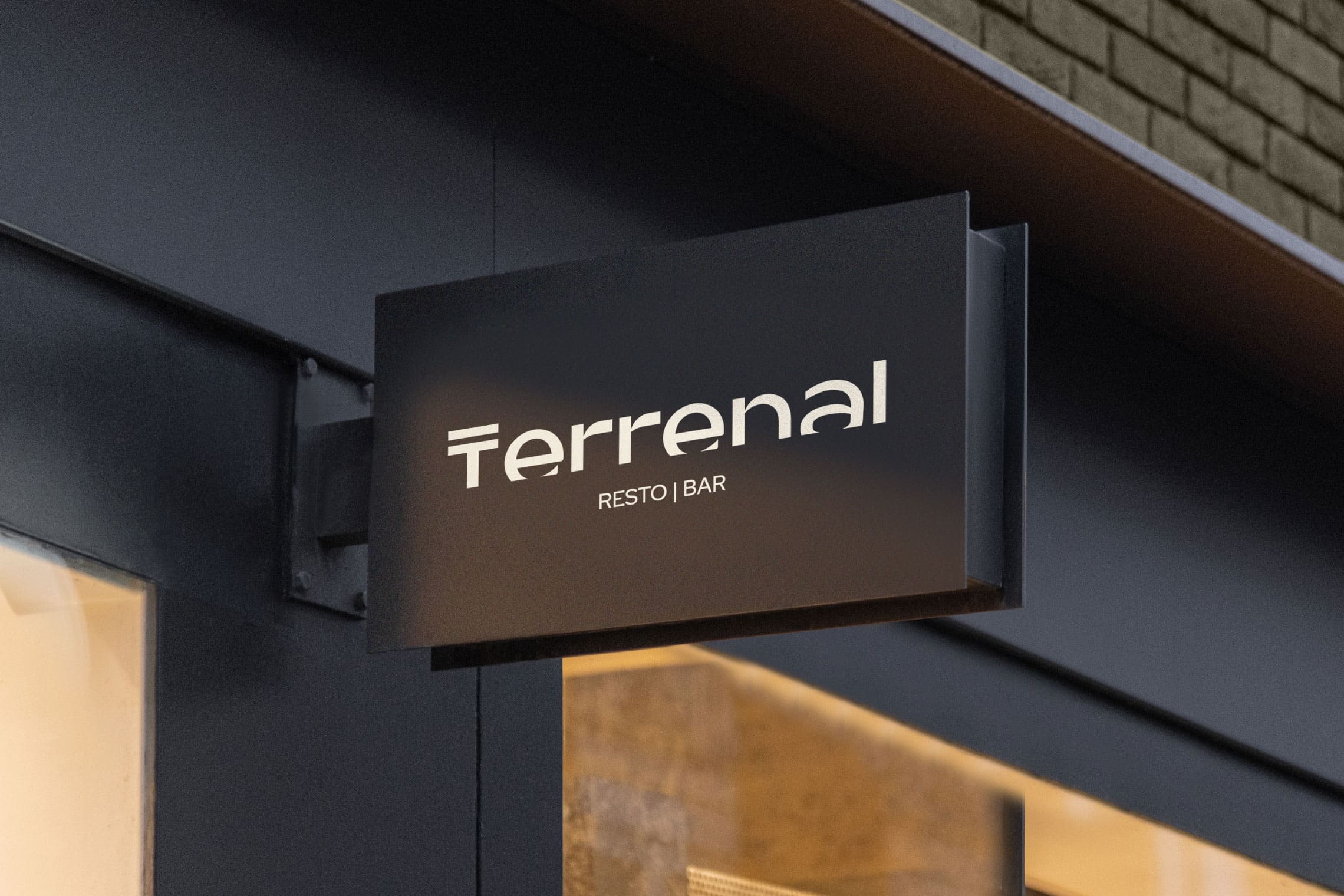
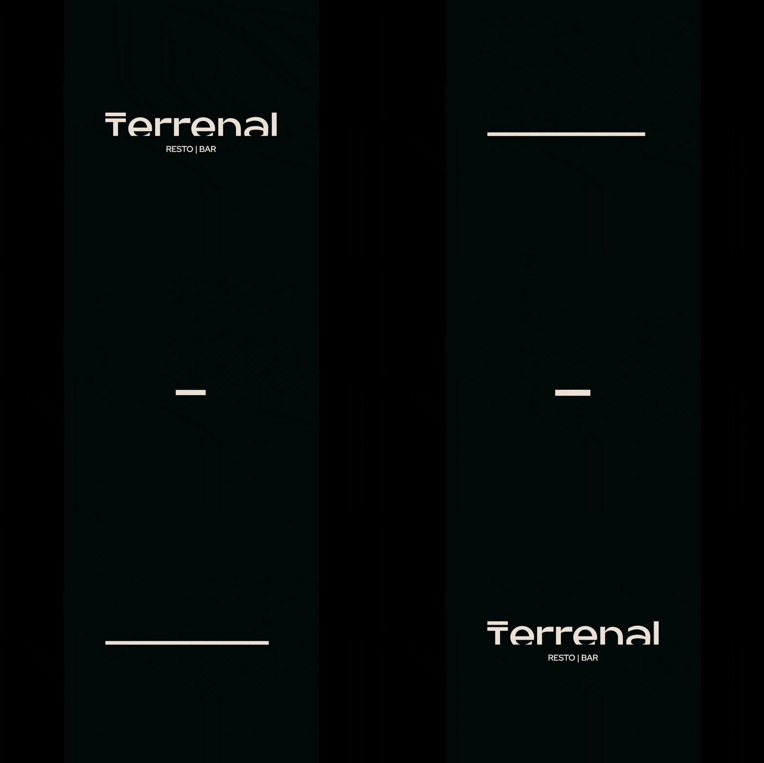
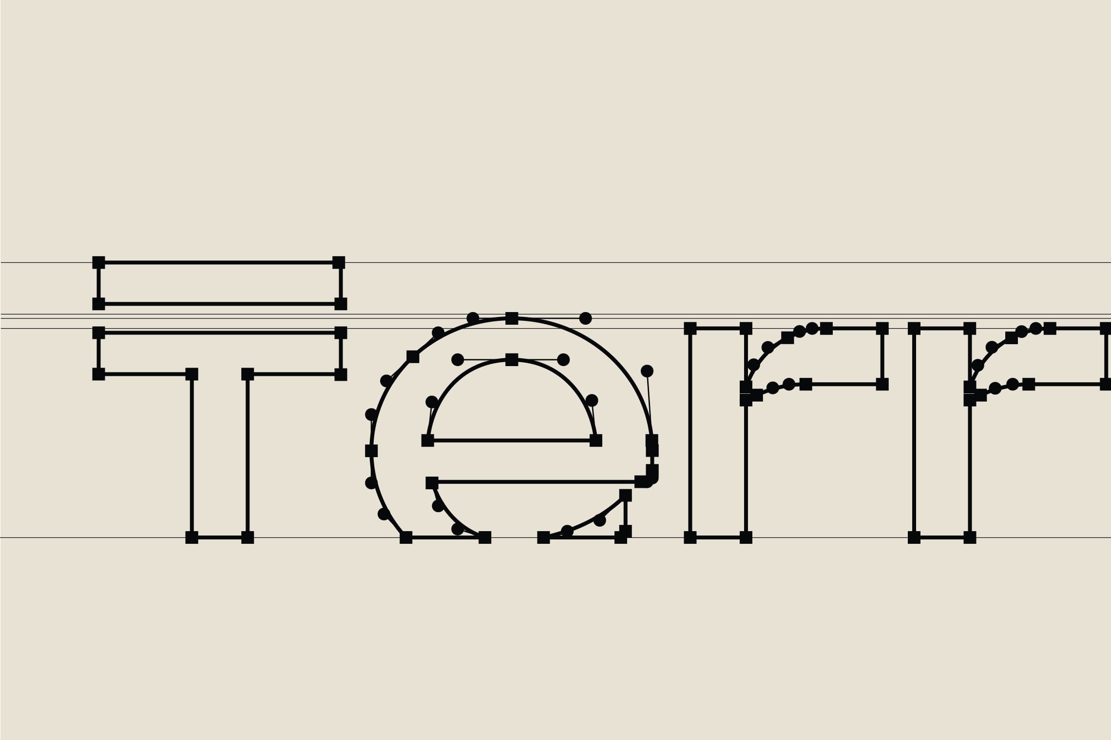
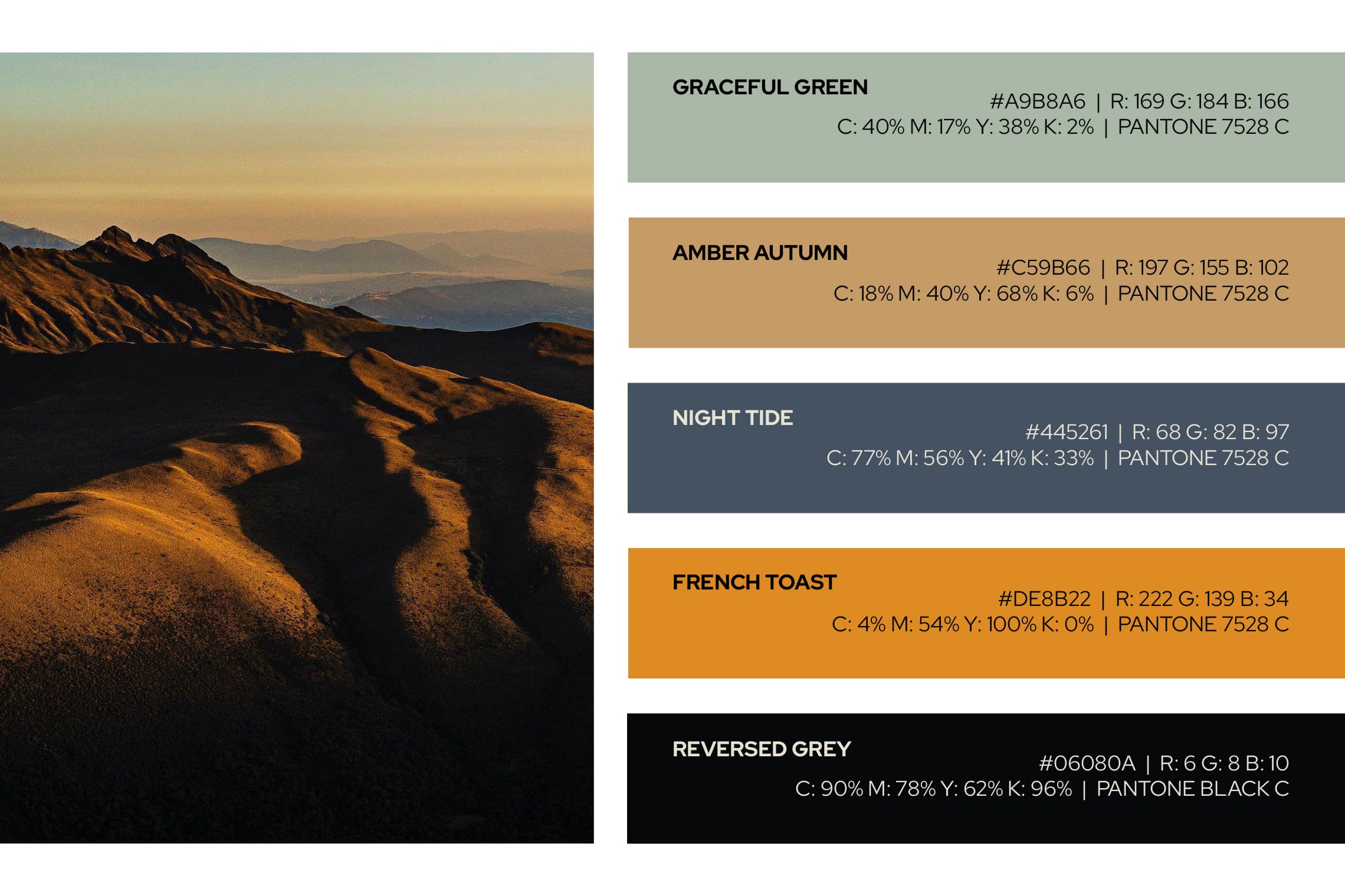
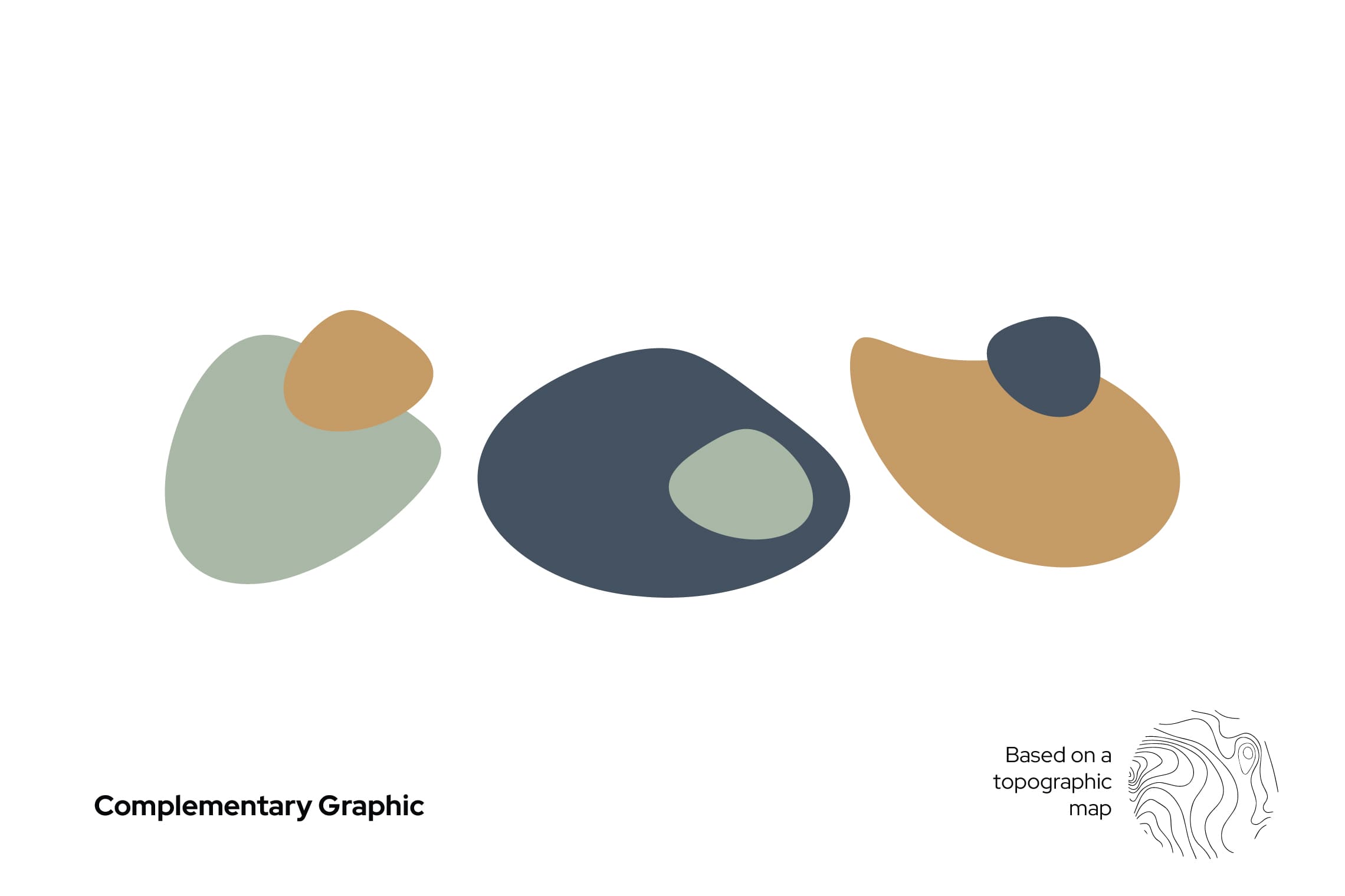
For the name design, we have chosen “Terrenal” for its literal meaning: of earthly and material things, in opposition to the celestial or spiritual, or related to them; this definition favors the experience of traversing the paramo both in its light and in its darkness. The typography designed for this project is a modern sans -serif typeface, with a top line in the letter “T” that leaves everything earthly below it; the concept is strengthened by stopping the letters in time, at a point of sunrise or sunset represented by a cut in the bottom part, evoking the horizon. This project features the colors of the paramo and a unique character native to the paramo to strengthen brand recognition and essence.
Suggested Projects
Simples Finanzas
Extreme Max
Educar com Evidências
Simples Finanzas
BRANDING

The Client

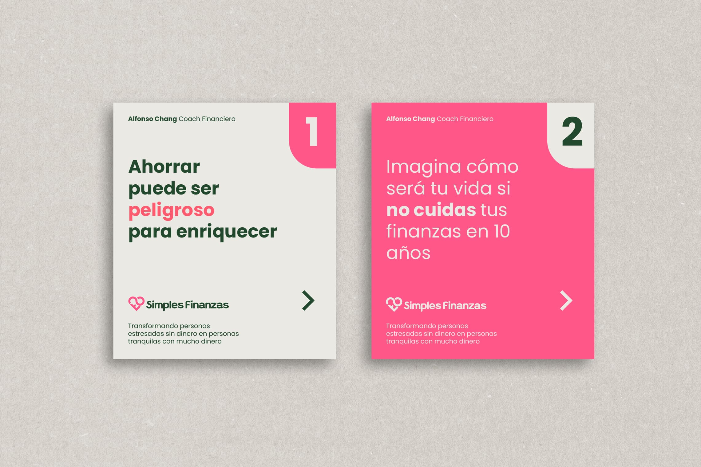
Simple Finances is a financial education program in Mexicali, Mexico, that aims to create wealth, reduce stress, and provide financial control.


Keywords

Branding / Design / Education / Personal Finance

The Objective

Design a brand that represents my ideal of ‘the revolution of love through financial education’ Alfonso Chang Coach


The Solution

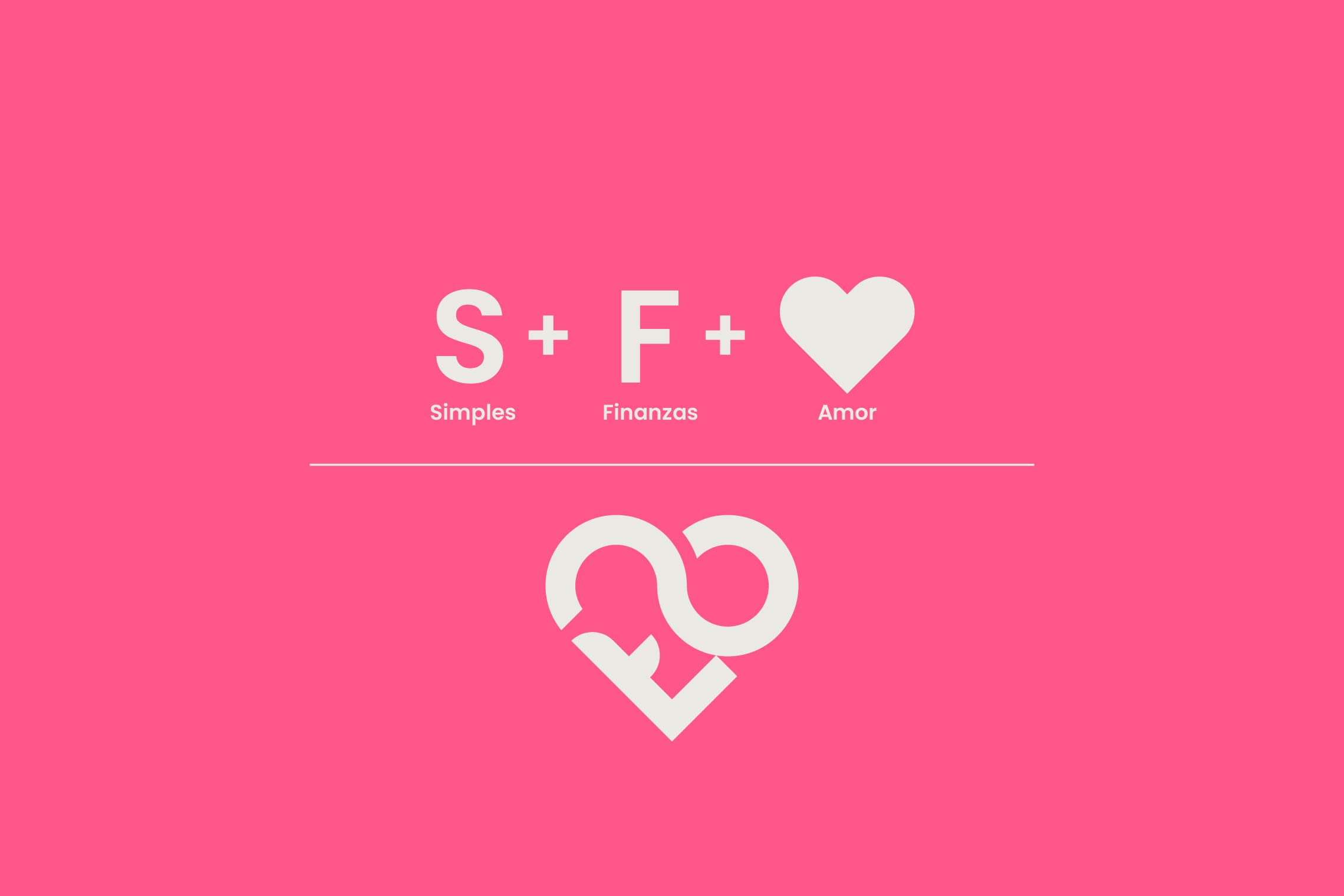
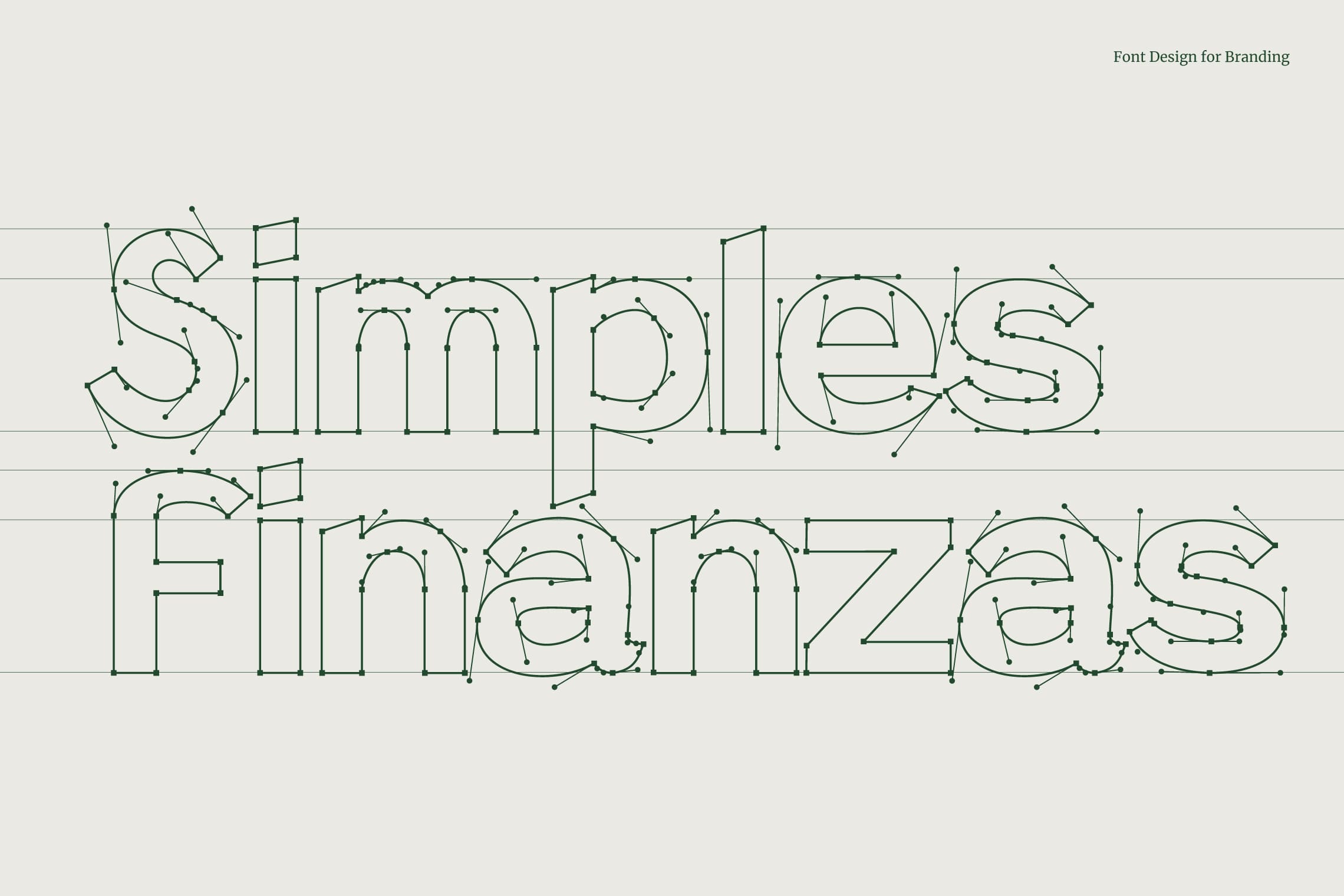
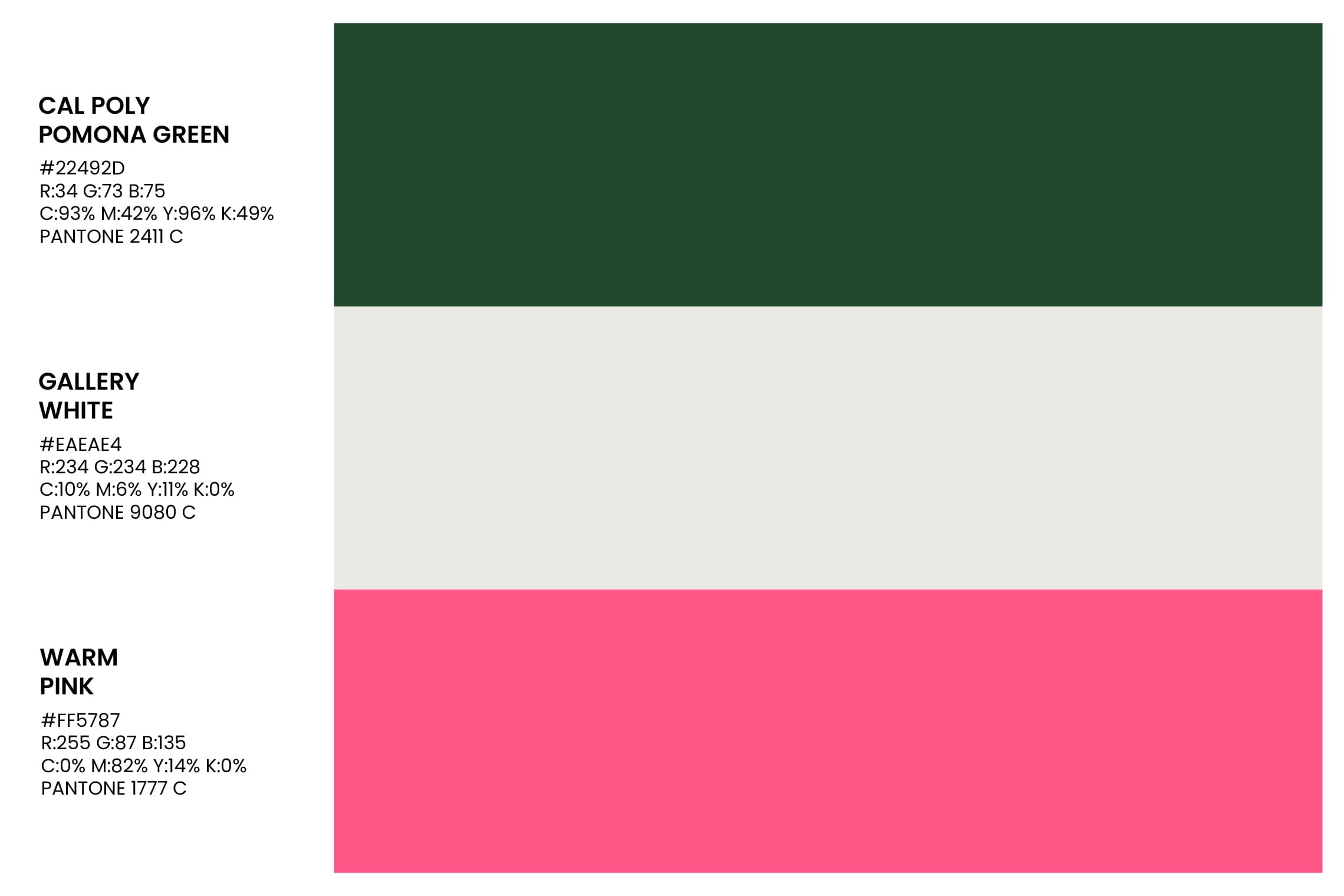
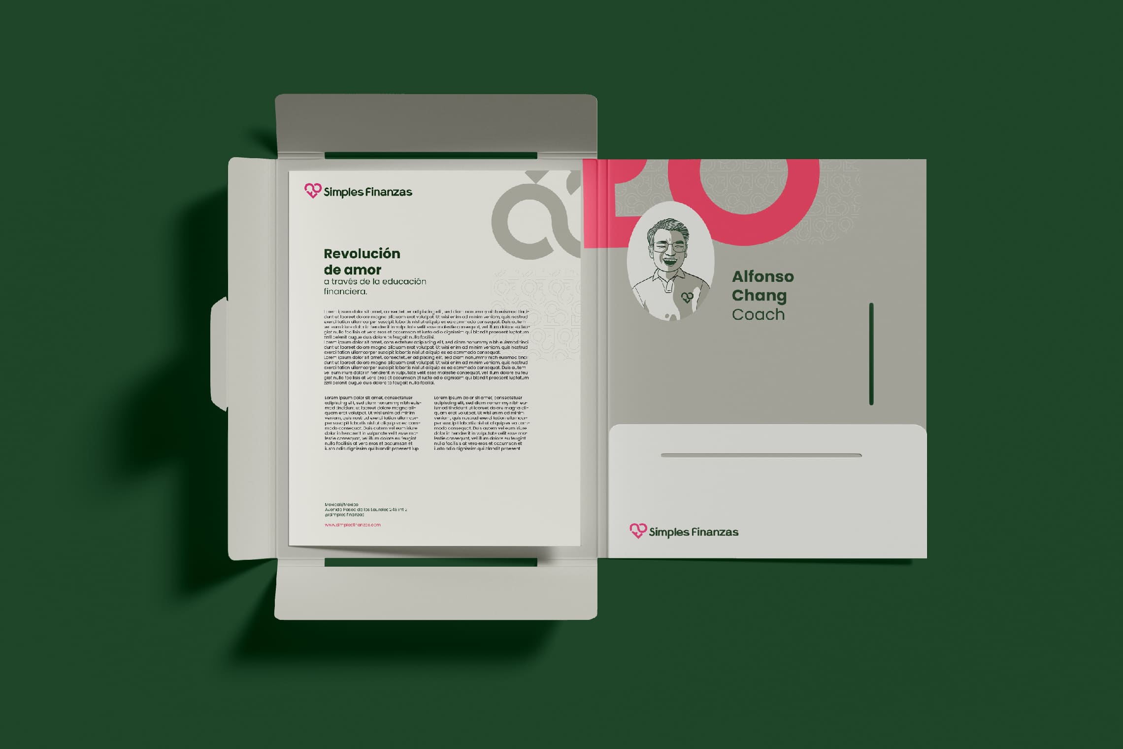
We designed an isologo formed by the S + F that represents a heart, based on the essence of ‘the revolution of love through financial education’. To complement it, we developed a Sans Serif typography with a modern personality and a reliable structure. The chosen colors reinforce the concept of wealth and balance through the use of green, while pink adds positivity and modernity to the whole.
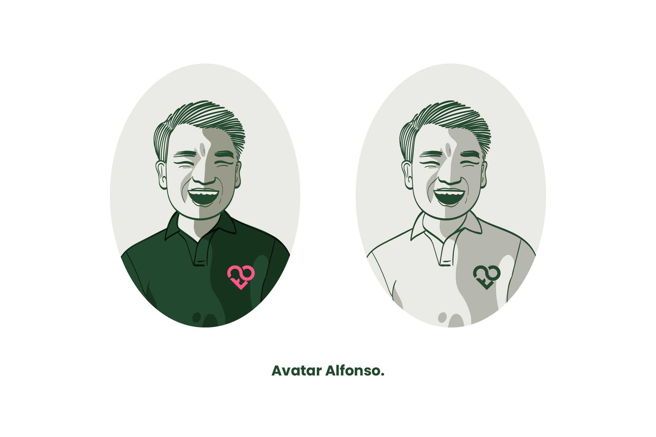
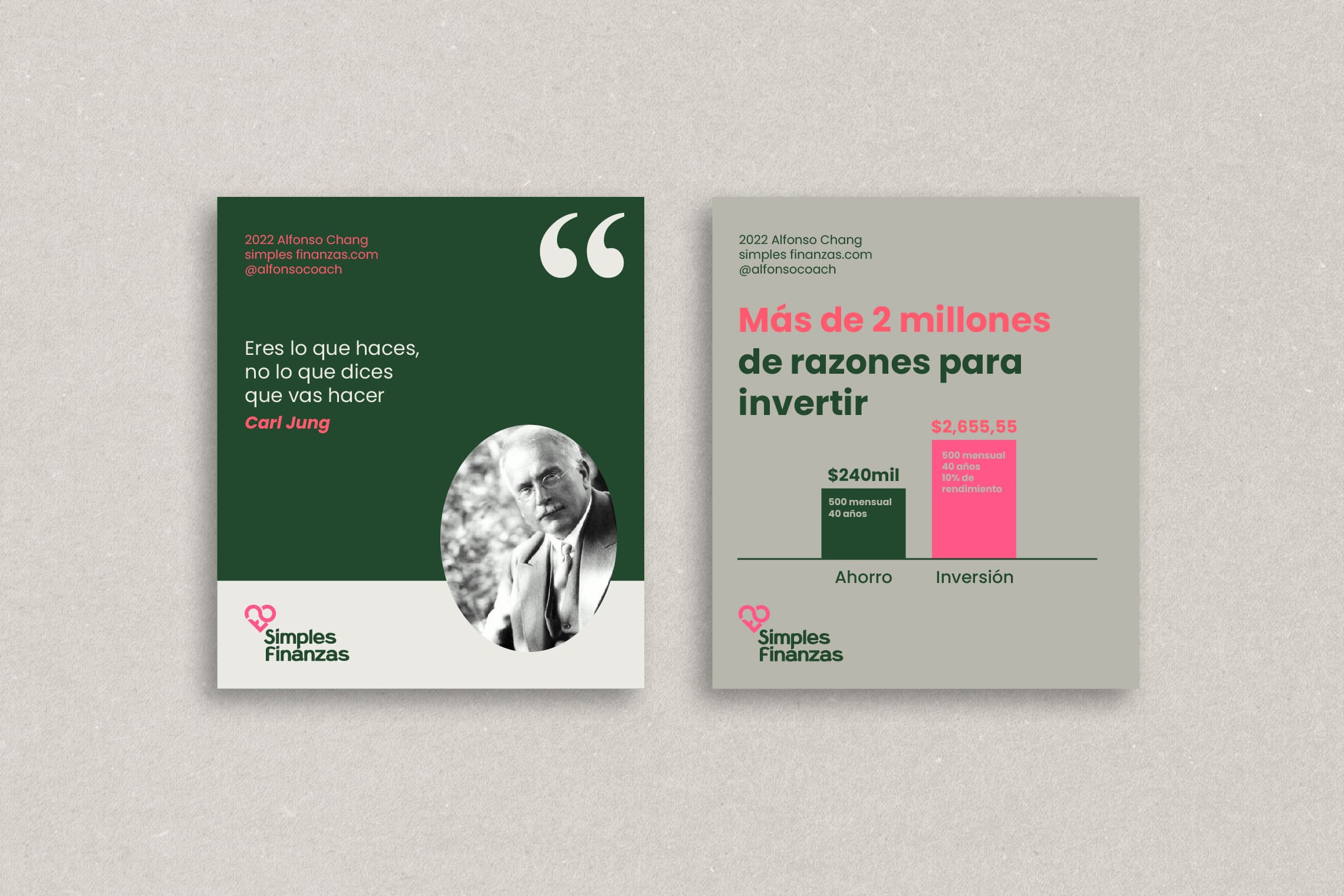
In addition, Alfonso’s avatar has been illustrated to allow for greater closeness with his students, and basic graphic elements and guidelines have also been established for his Instagram account.

Suggested Projects
Extreme Max
Educar com Evidências
SCIO Education Center
BRANDING

The Client

SCIO Education Center, is a training education center that will be located in the city of Latacunga – Ecuador, its goal is to democratize the education for pre-university students, maintaining fair prices and quality education.


Keywords

Branding / Design / Education / Academy

The Objective

To design a brand that conveys experience and confidence, as well as a young and determined attitude, capable of inspiring students to face academic challenges with determination.


The Solution

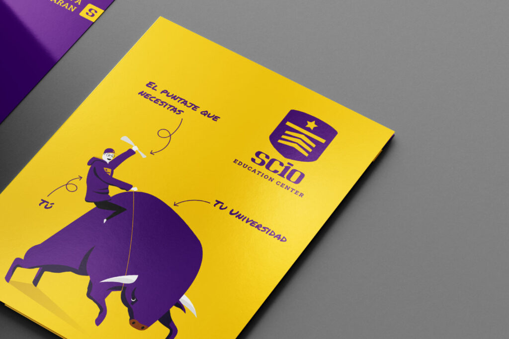
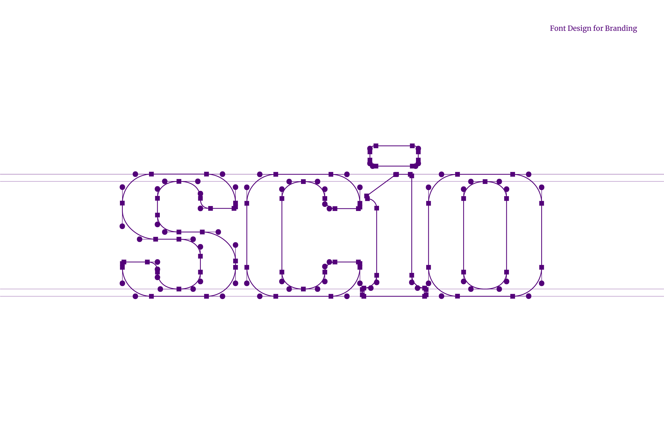
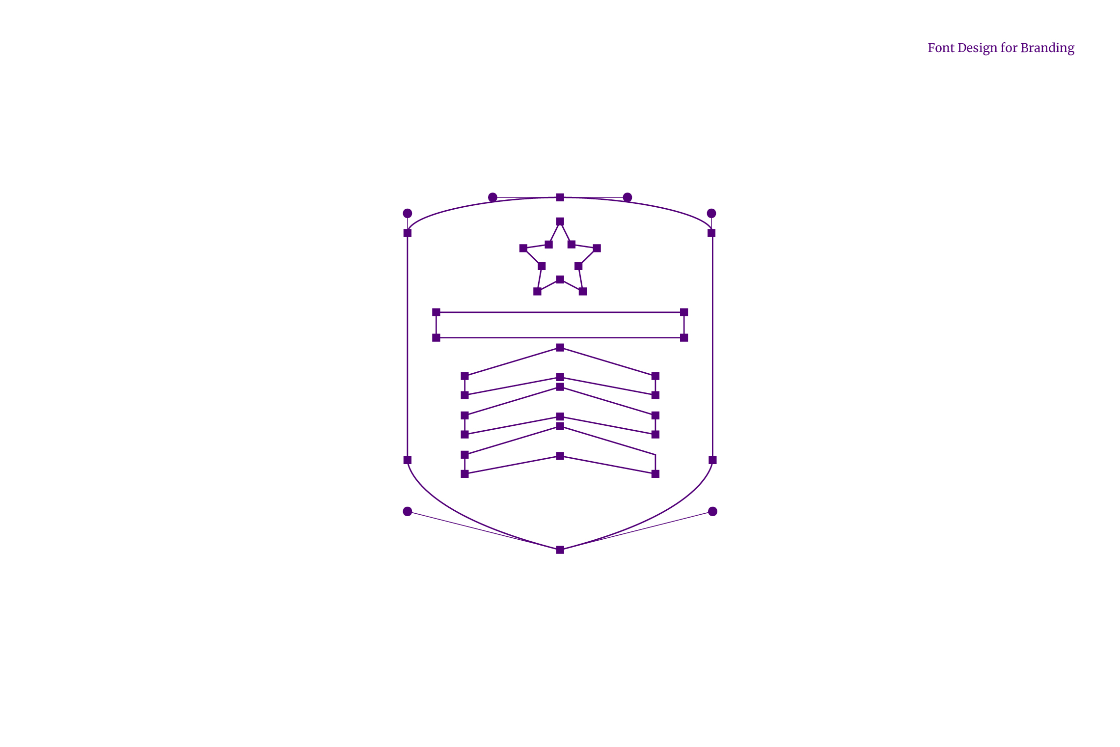
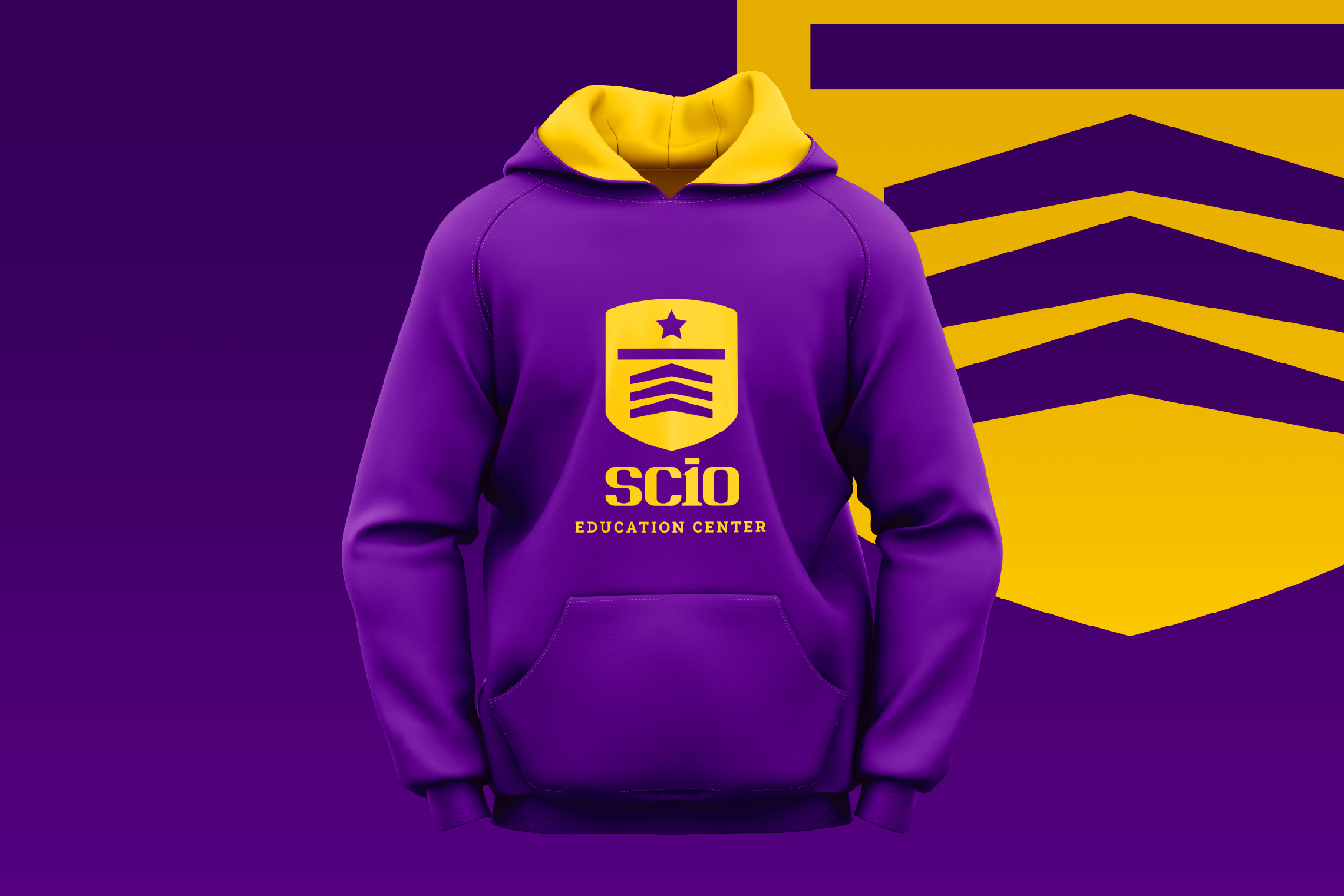
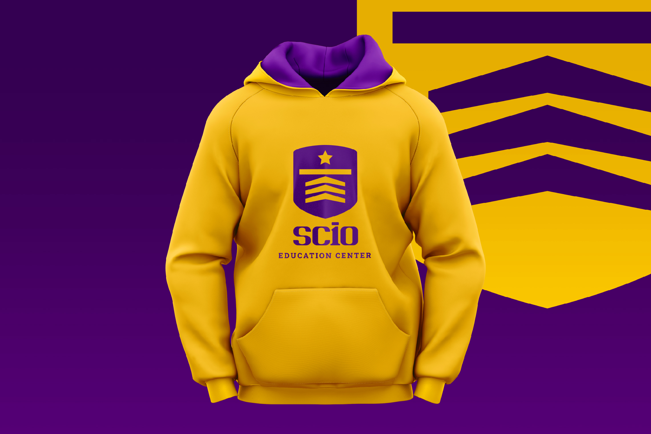
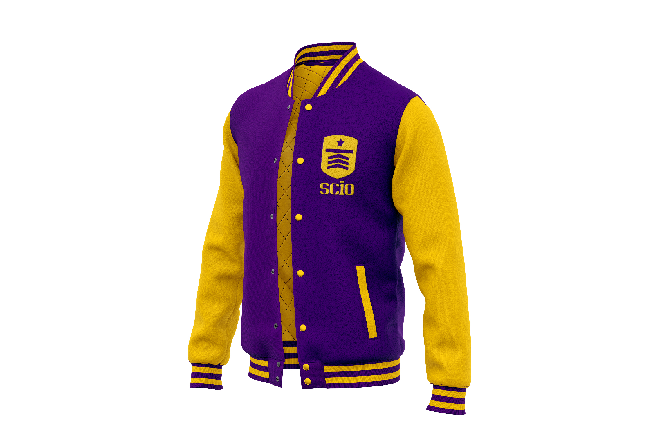
The icon designed for SCIO is a shield that inside shows three arrows, a line and a star, as a representation of the necessary steps to cross and reach the goal, it is also the abstraction of a graduate’s cap. On the other hand, the typography developed for SCIO has a young, strong and academic personality; the number 10 inscribed in the logo represents the highest grade.

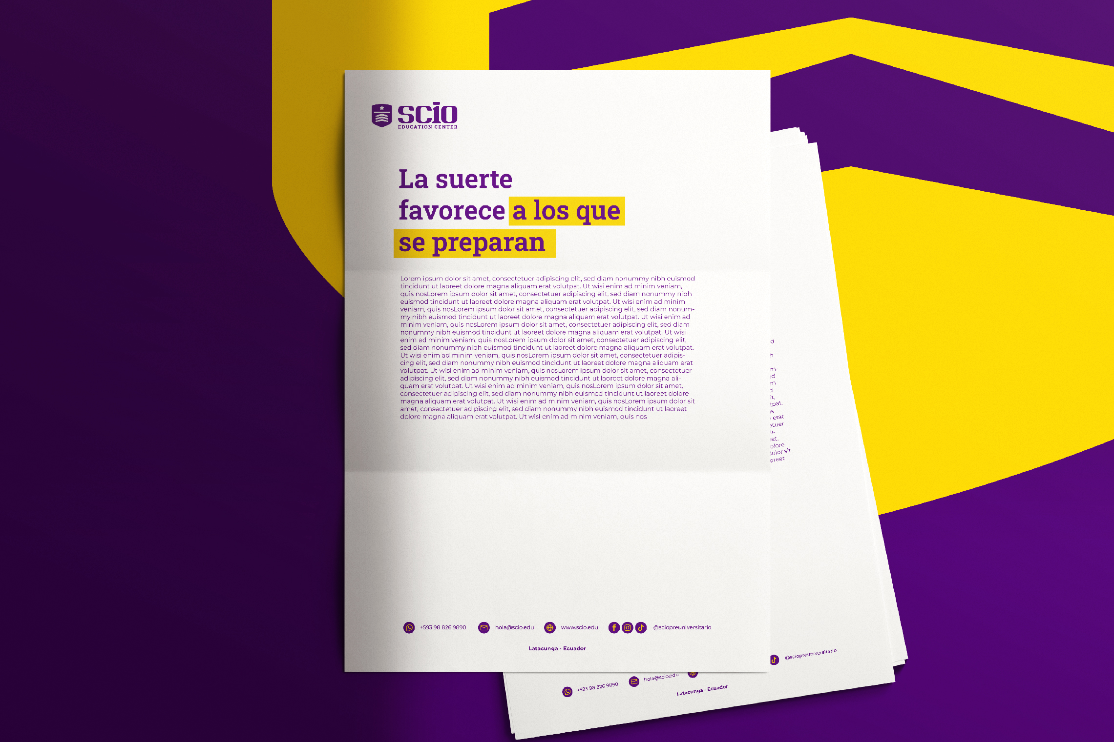
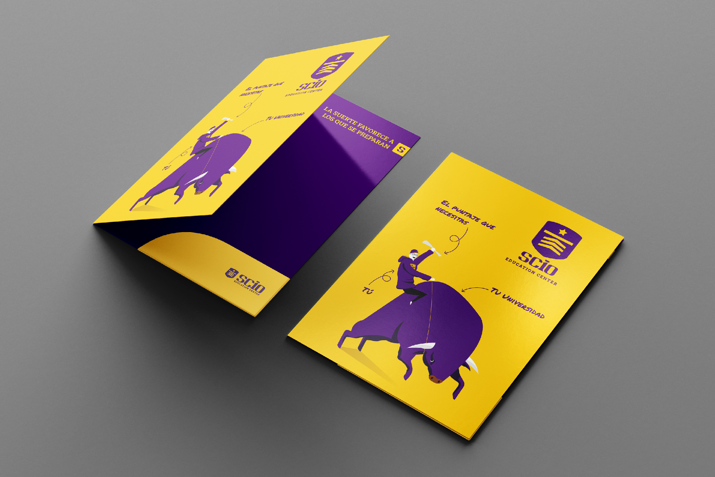
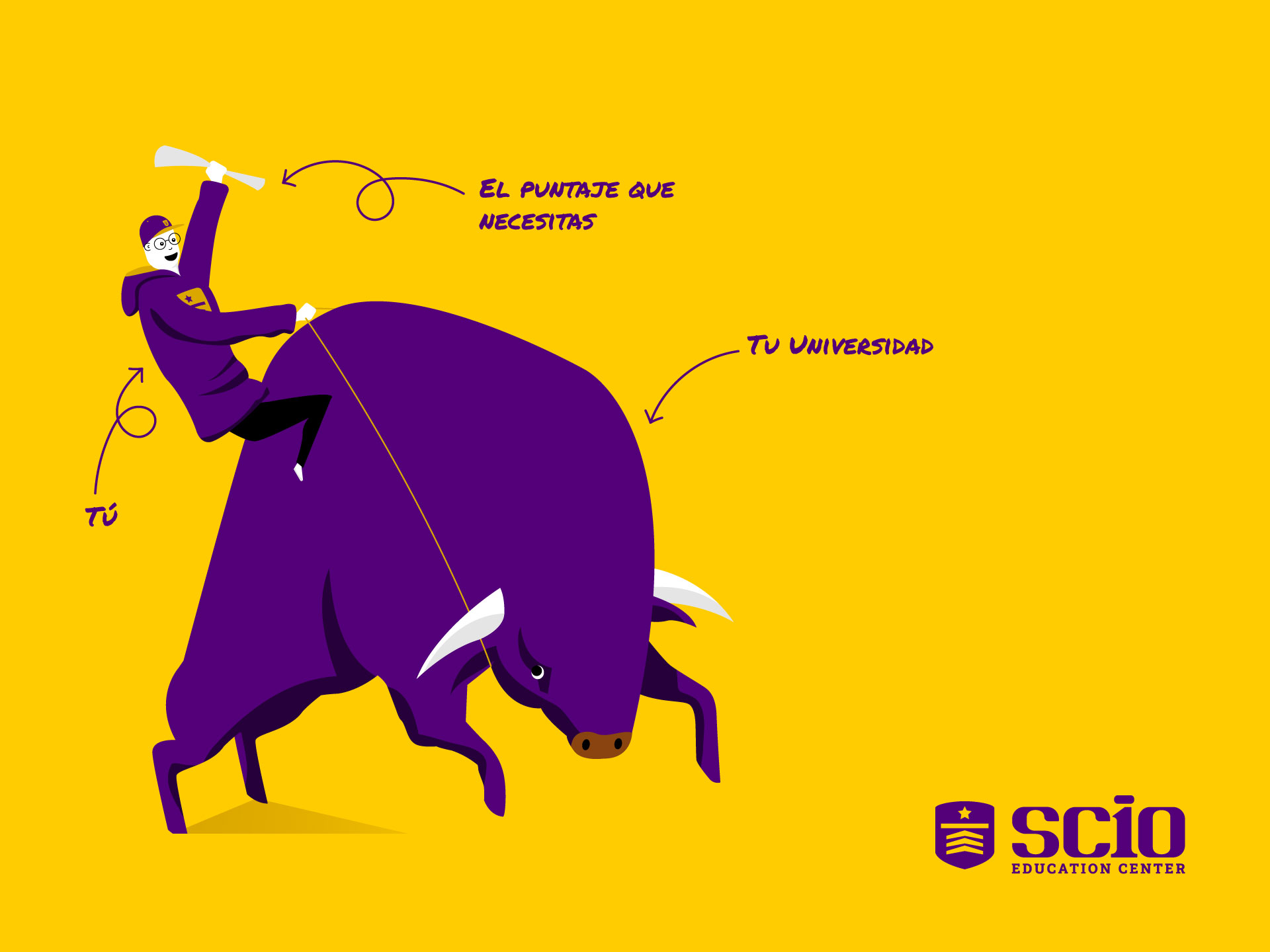
The chosen color scheme for SCIO is violet, linked to wisdom and creativity, accompanied by yellow, which expresses positive energy and warmth. Another graphic element designed for SCIO is the illustration of a bull and a young man with his diploma, it shows that everyone who is trained in this education center will master their goal.

Suggested Projects
Extreme Max
Educar com Evidências
Piamonte Higher Technical Institute
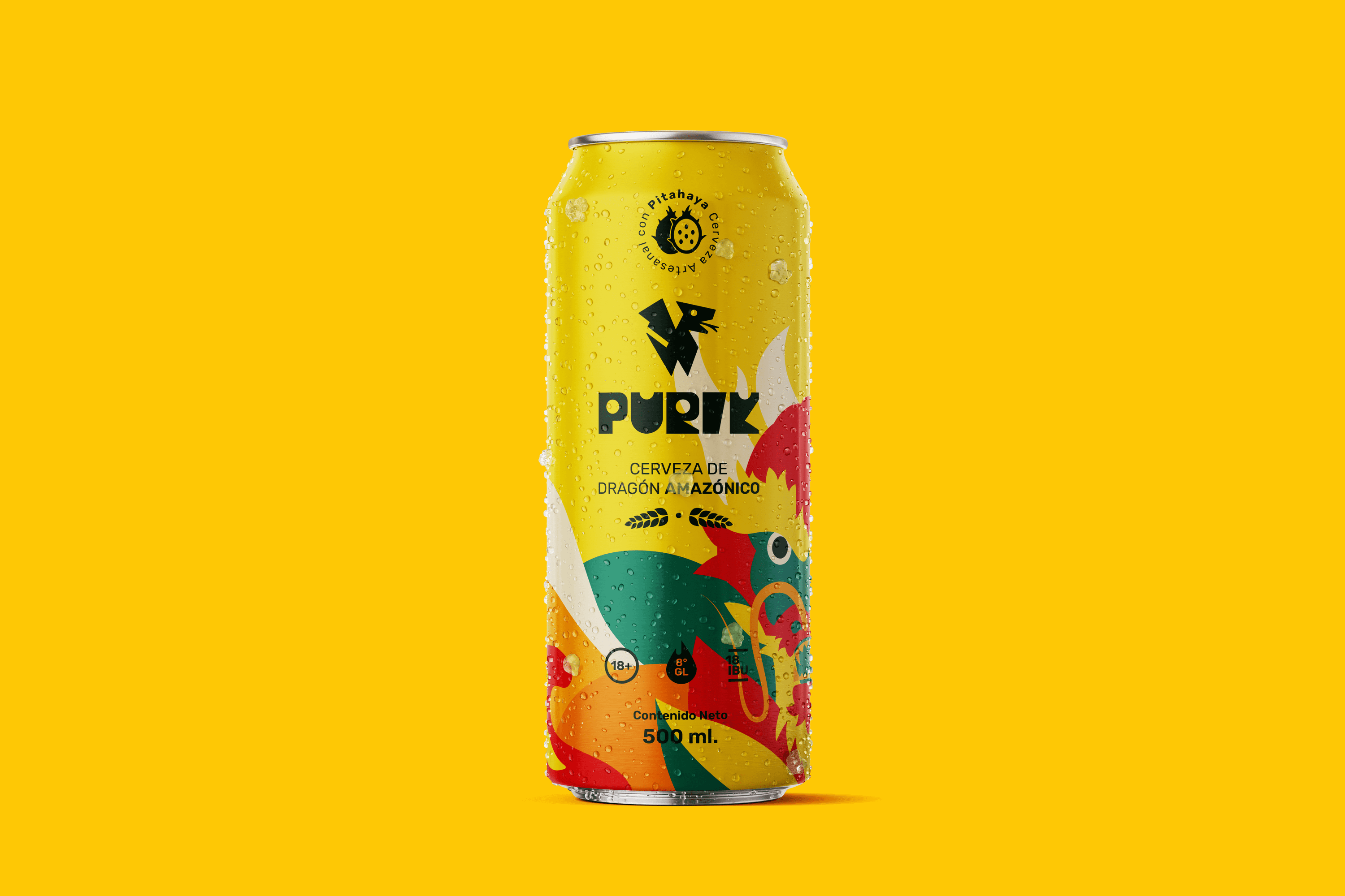
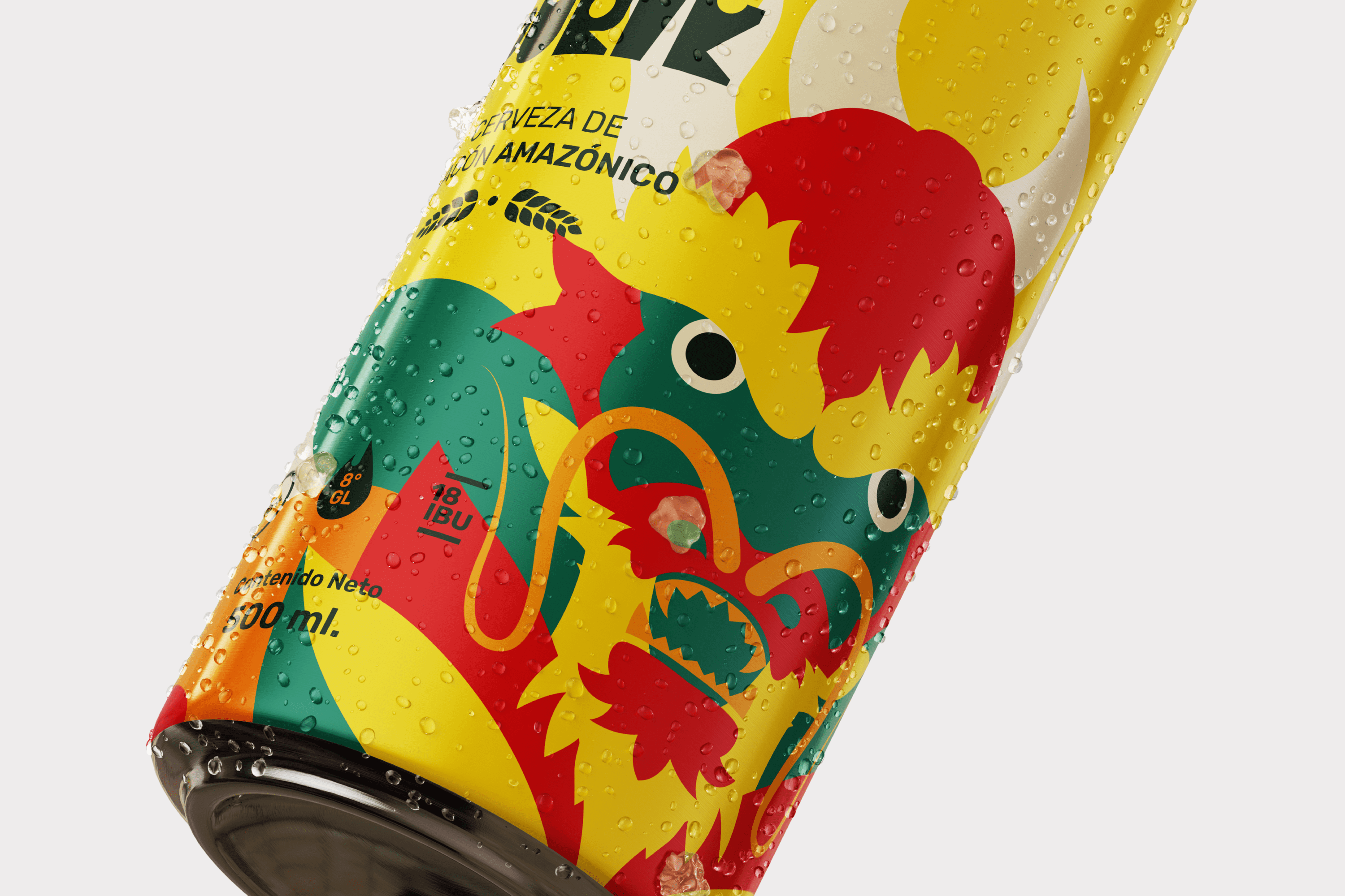
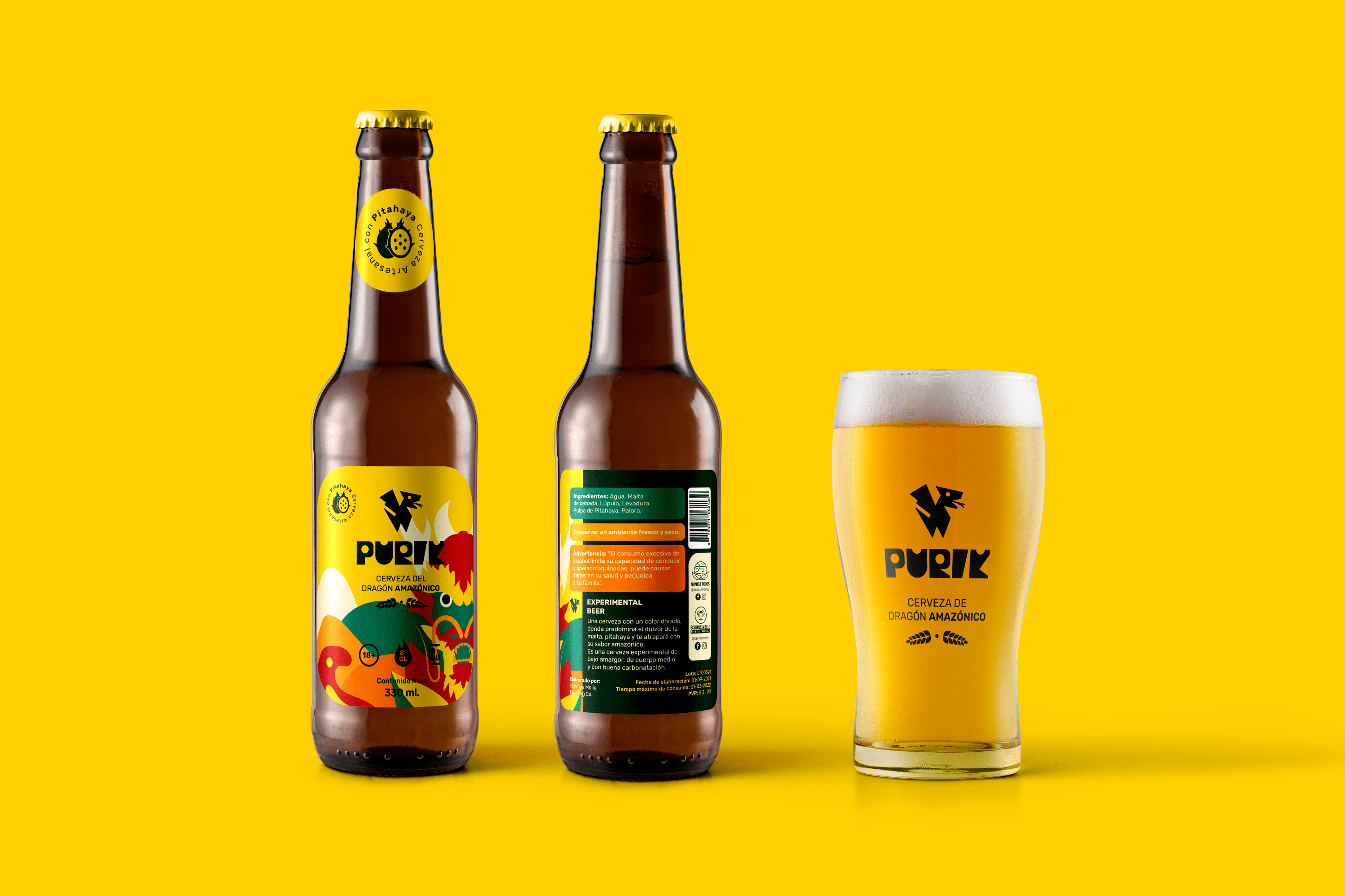
PURIK Amazonian Beer
BRANDING

The Client

We are a pioneering brand in the production of pitahaya (fruit from the Amazon) beer, located in Palora-Ecuador.


Keywords

Branding / Packaging / Beer / Ancestral

The Objective

Design a vibrant beer brand that shows the essence of its Amazonian and ancestral origin.


The Solution

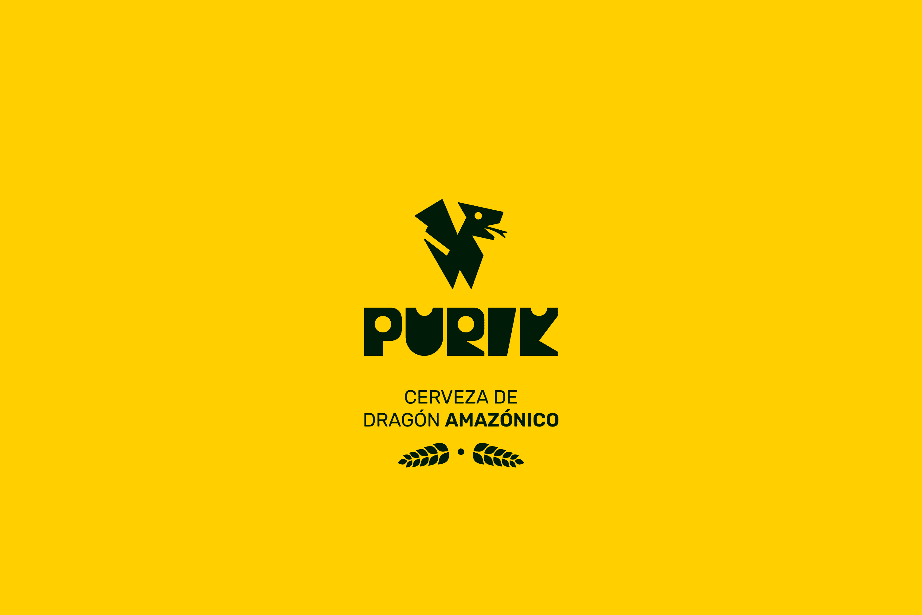
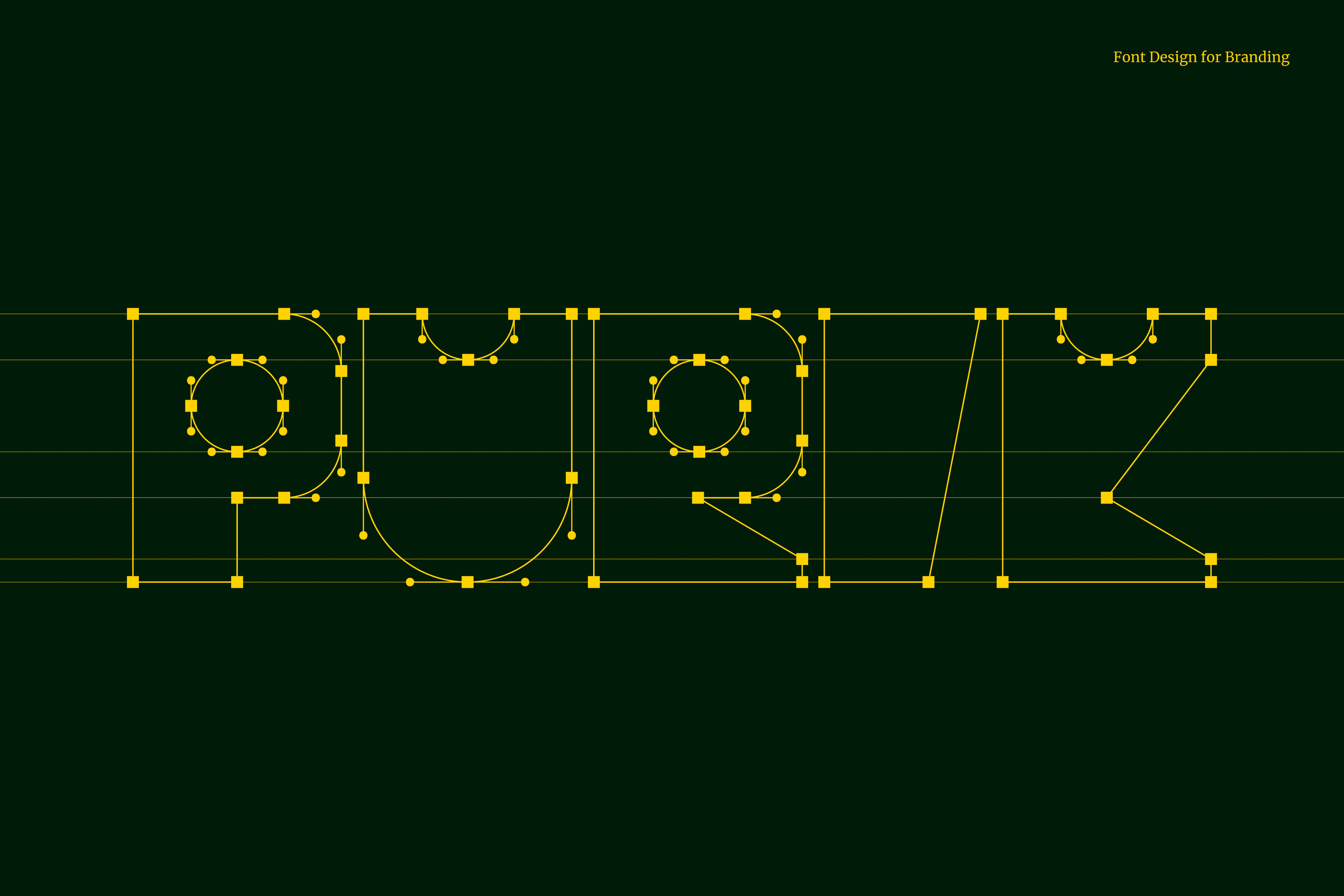
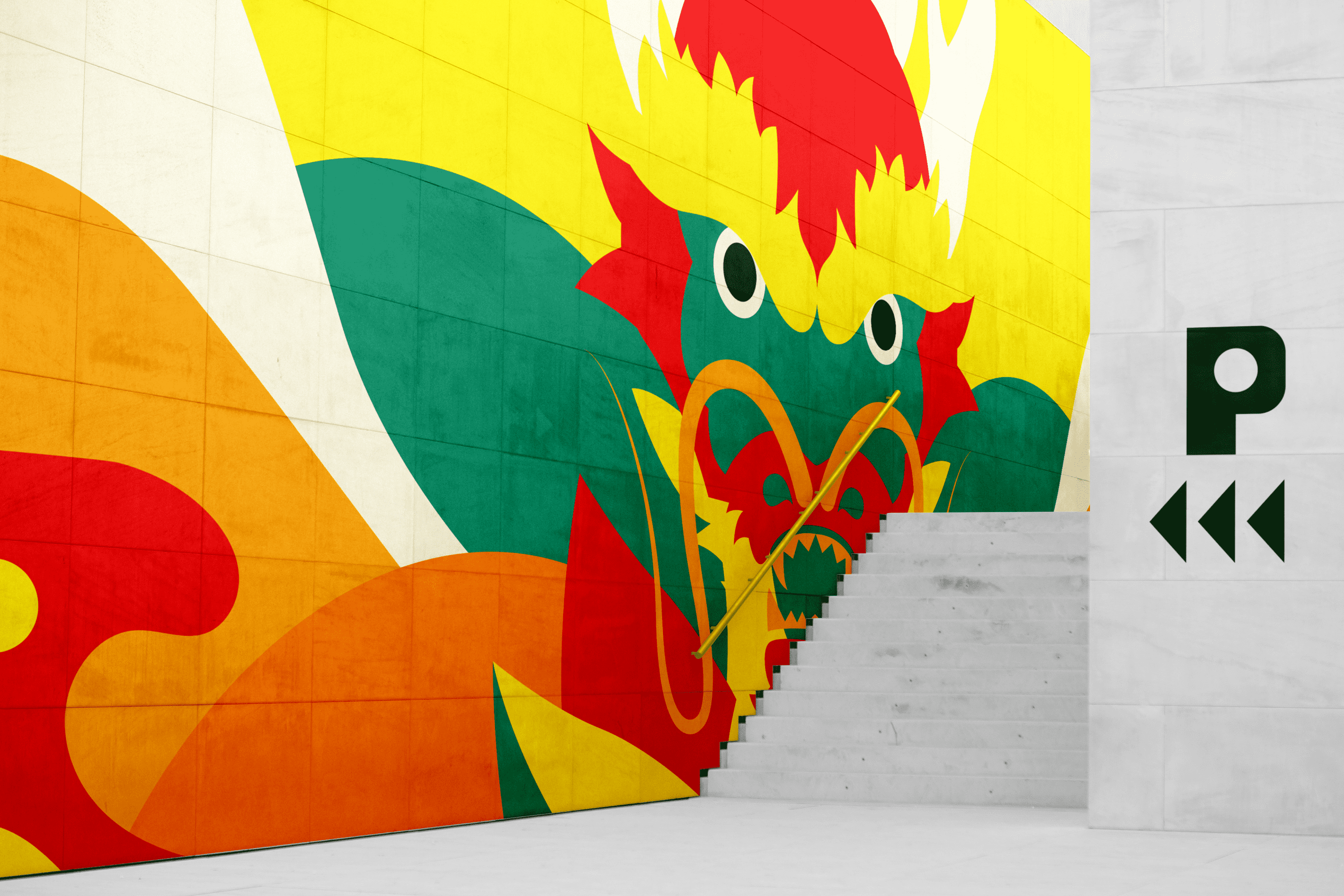
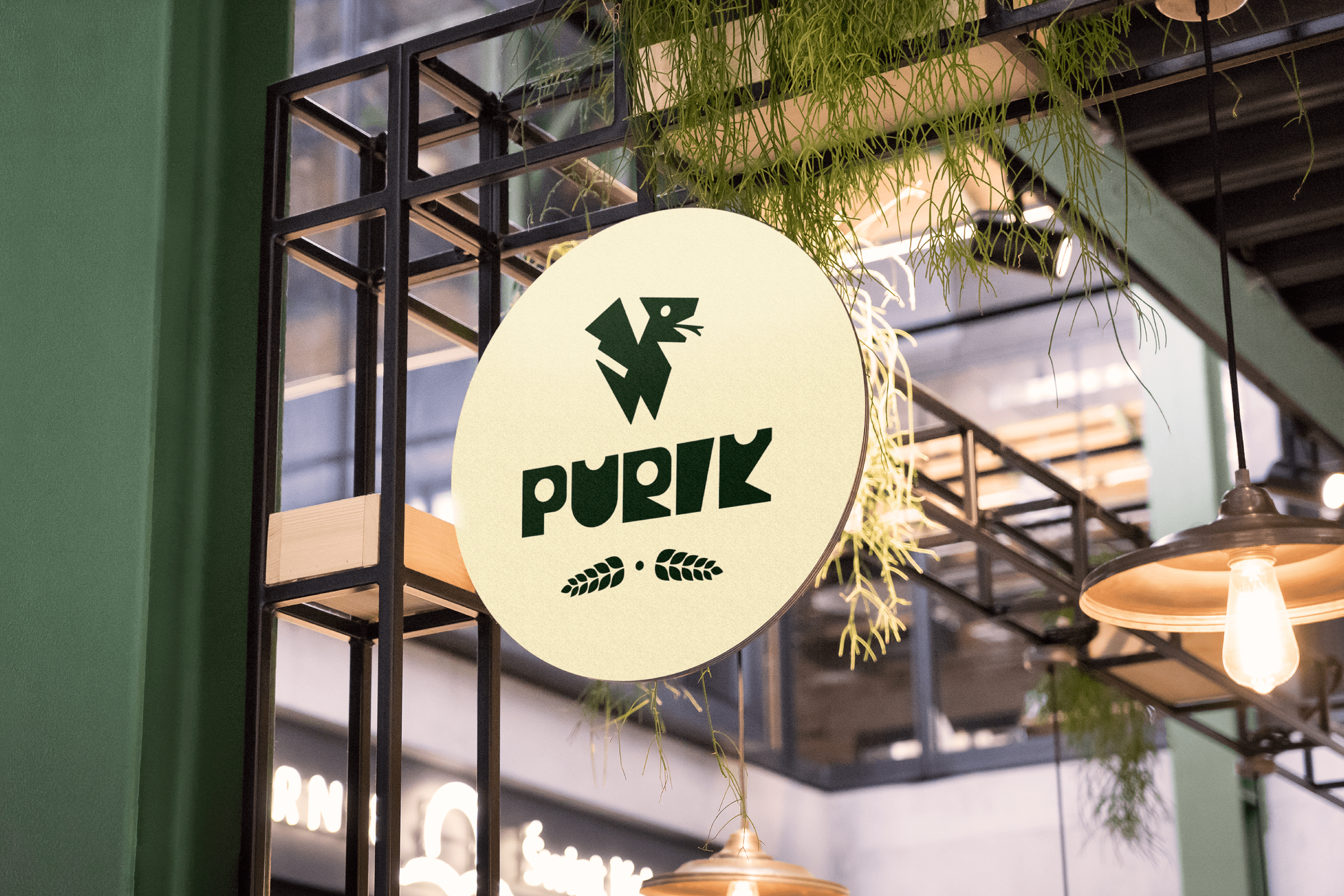
The name we have chosen for this drink is Purik, a word of Kichwa origin that means wanderer. The typography and icon were designed with a hieroglyphic appearance to emphasize the ancestral. Pitajaya is also known as the dragon fruit, for this reason, we have illustrated a dragon wrapped in leaves, shapes and colors full of energy that accentuate its origin. Its strong and vibrant personality reinforces its exotic nature.

Suggested Projects
Extreme Max
Educar com Evidências
Piamonte Higher Technical Institute
NAMU Agency
WEBSITE

The Client

La NAMU Agency, provides guidance to clients to create a memorable brand. Using storytelling techniques, it helps them clarify their message so they can listen and act. It has been collaborating with brands in Los Angeles, Mexico, and Brazil since 2016.


Keywords

Web Design / Web Development / Illustration / Agency / Marketing

The Objective

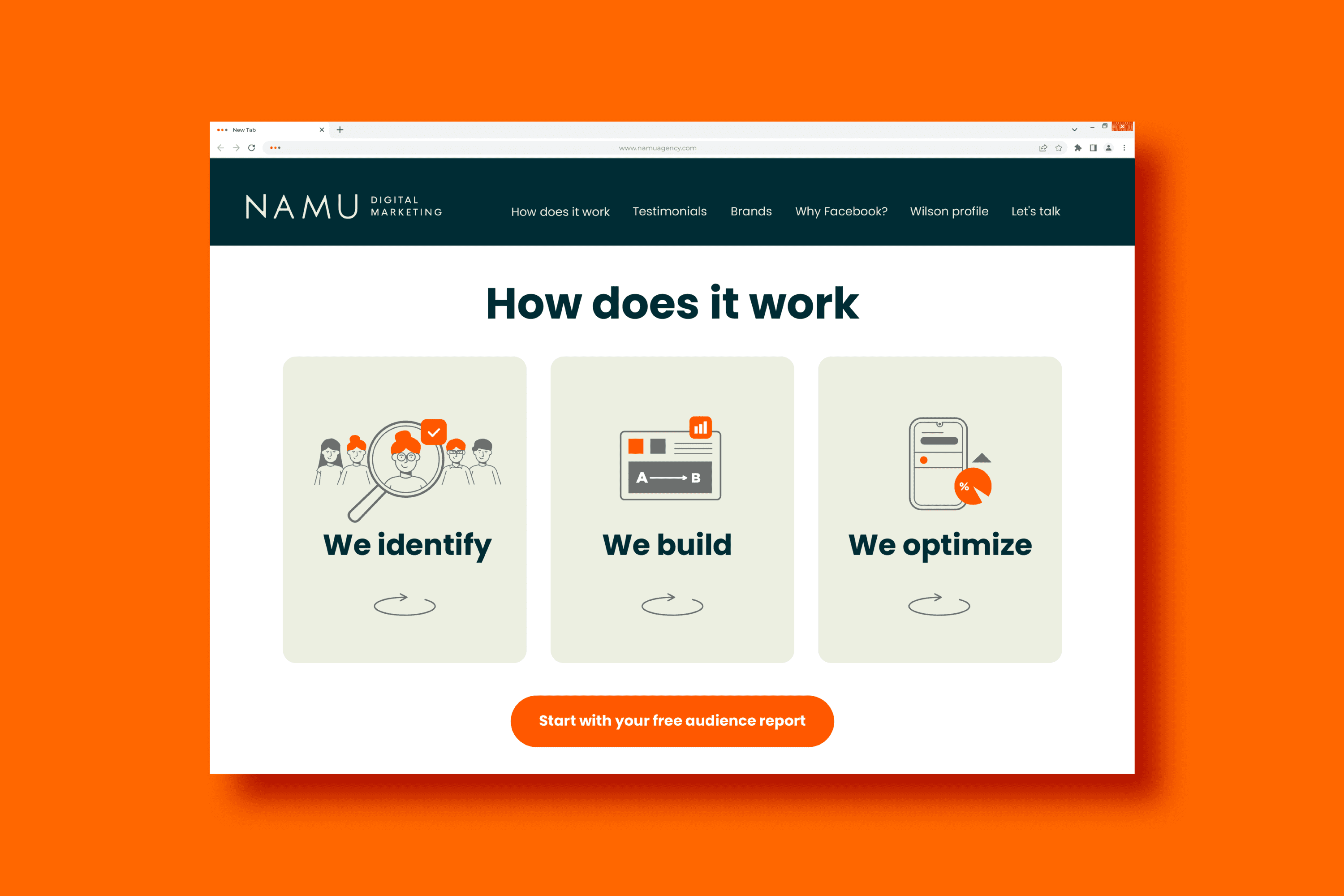
To design and develop a Landing Page that allows our clients to know our services in a clear and friendly way.


The Solution

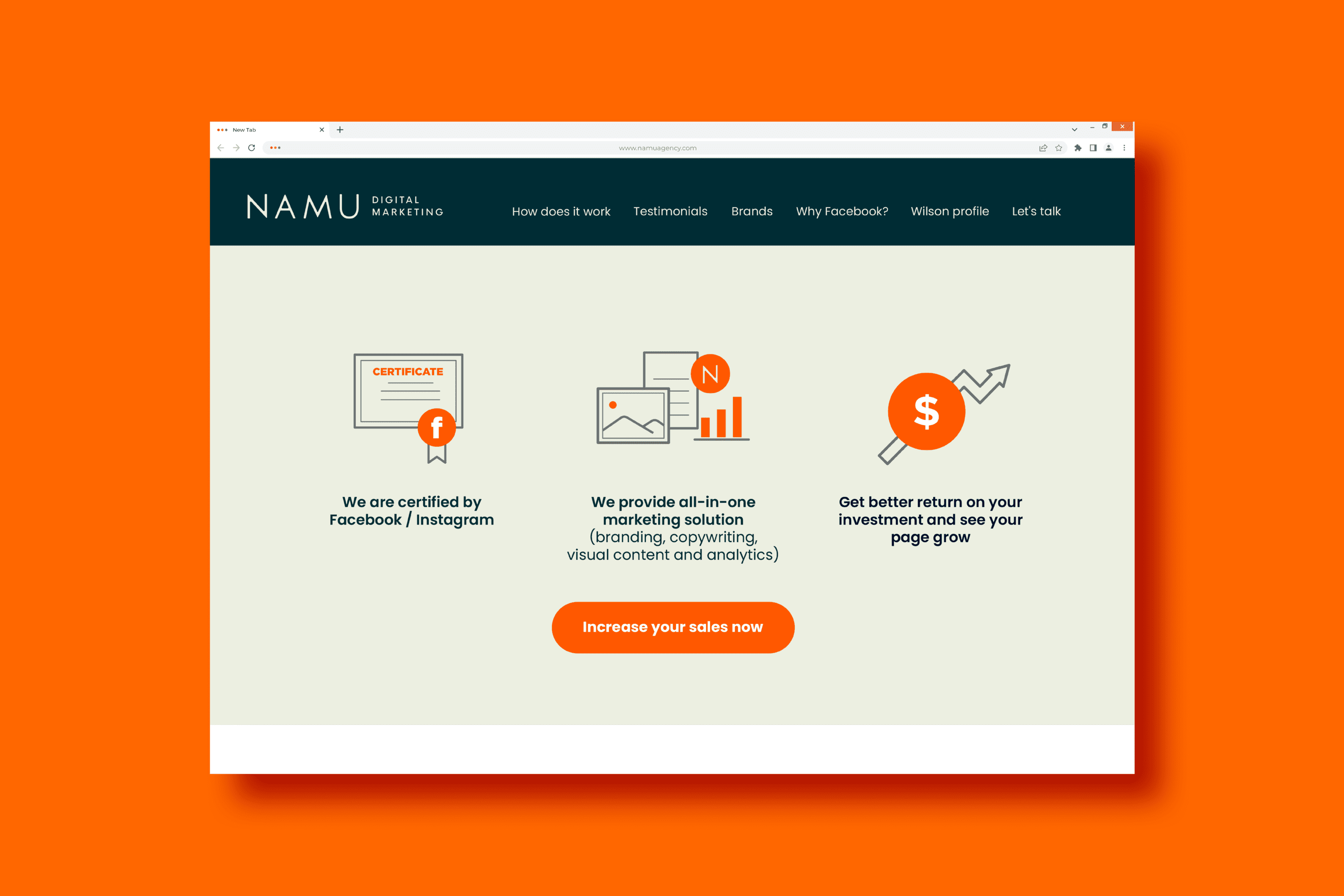
The Landing Page designed for NAMU Agency, uses a minimalist layout that allows for easy scanning of the information. Illustration has been incorporated as a friendly linking element that reinforces the messages shared on the site. We use the orange color which, together with the corporate green, creates a contrast that adds life to the environment and provides a graphical resource that strengthens the call to action on each button.

Suggested Projects
Extreme Max
Educar com Evidências
Piamonte Higher Technical Institute
Fundación Iberoamericana de Educación
WEB SITE

The Client

The Fundación Iberoamericana de Educación located in the city of Riobamba, Ecuador, aims to eradicate the educational gap throughout Ibero-America. They bet on continuous education and professionalization (high school, undergraduate and graduate).


Keywords

Web Design / Web Development / Education / Foundation

The Objective

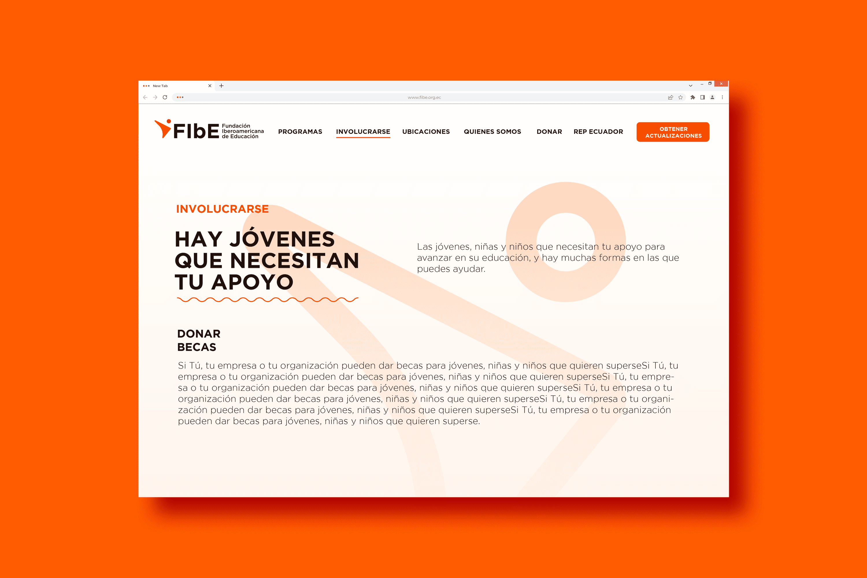
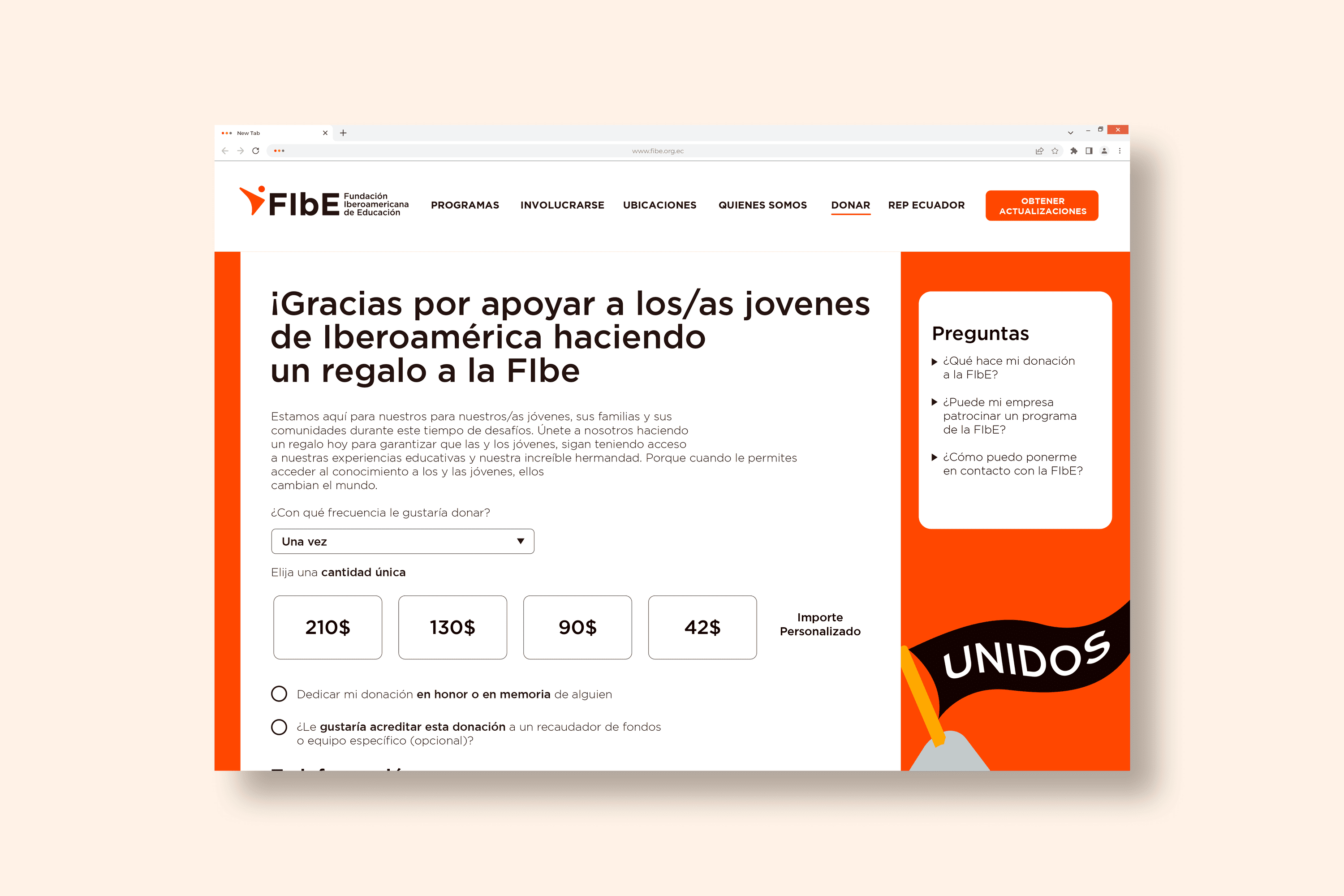
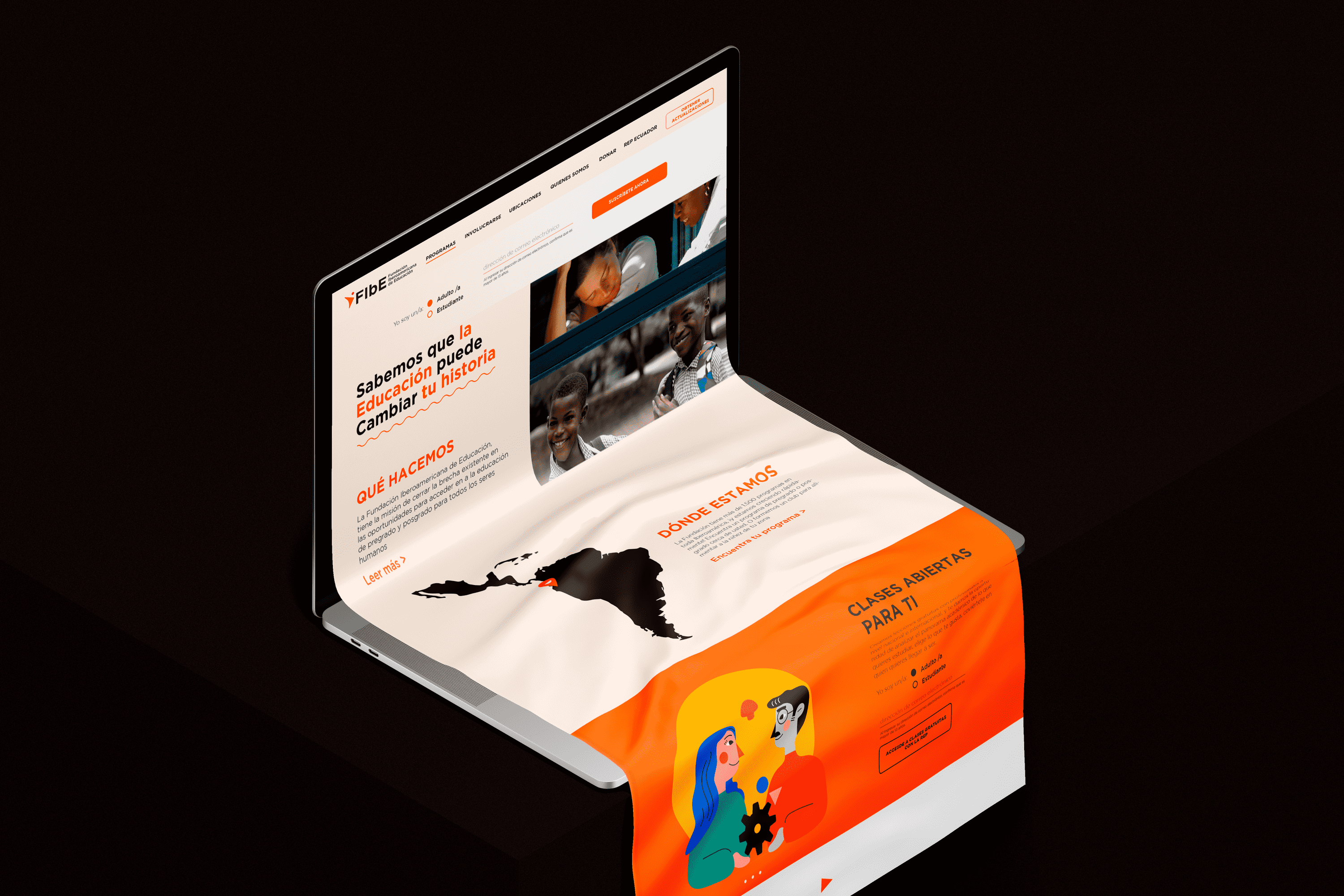
Design an informative website that conveys a lot of happiness and solidarity, that is user-friendly and accepts donations.


The Solution

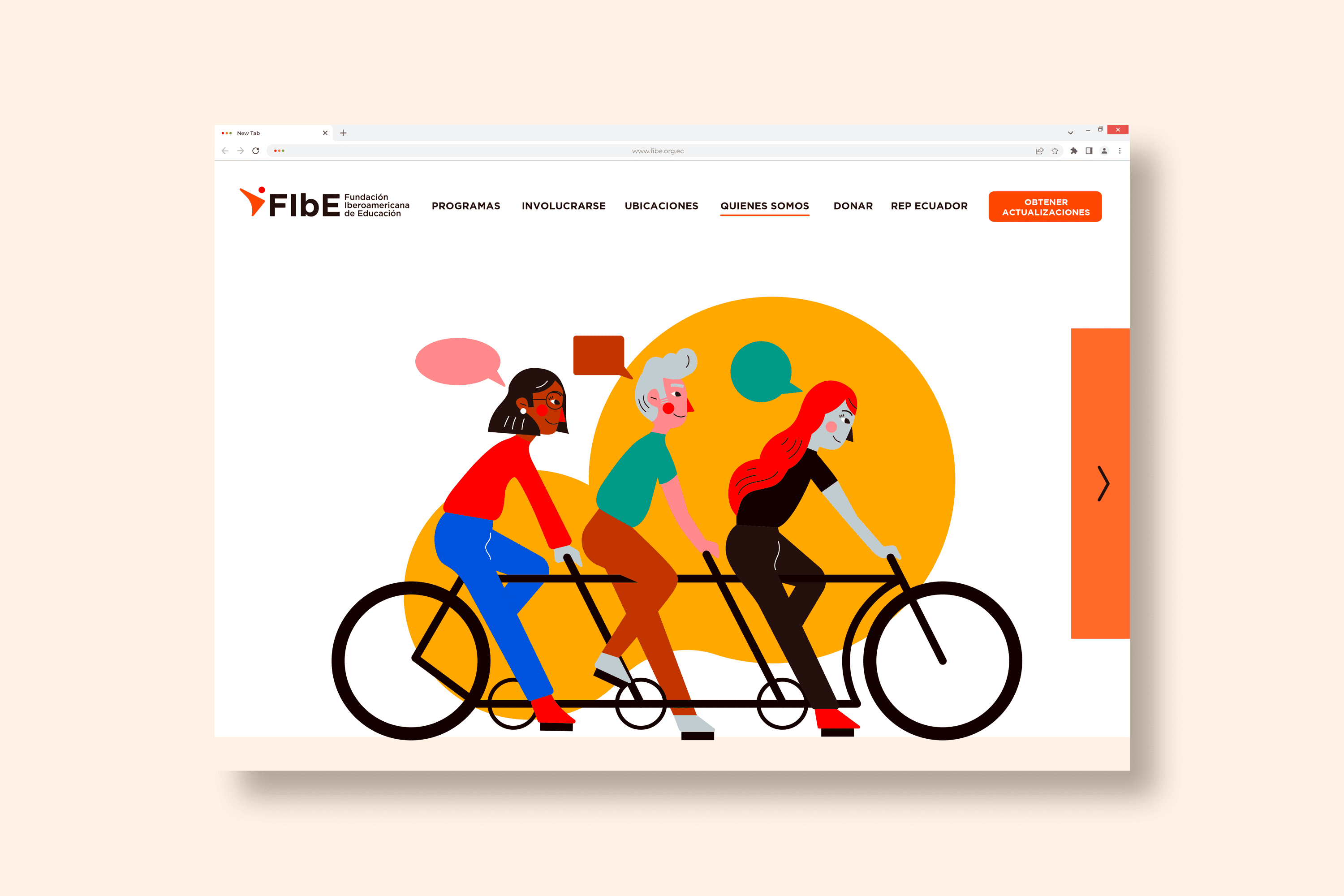
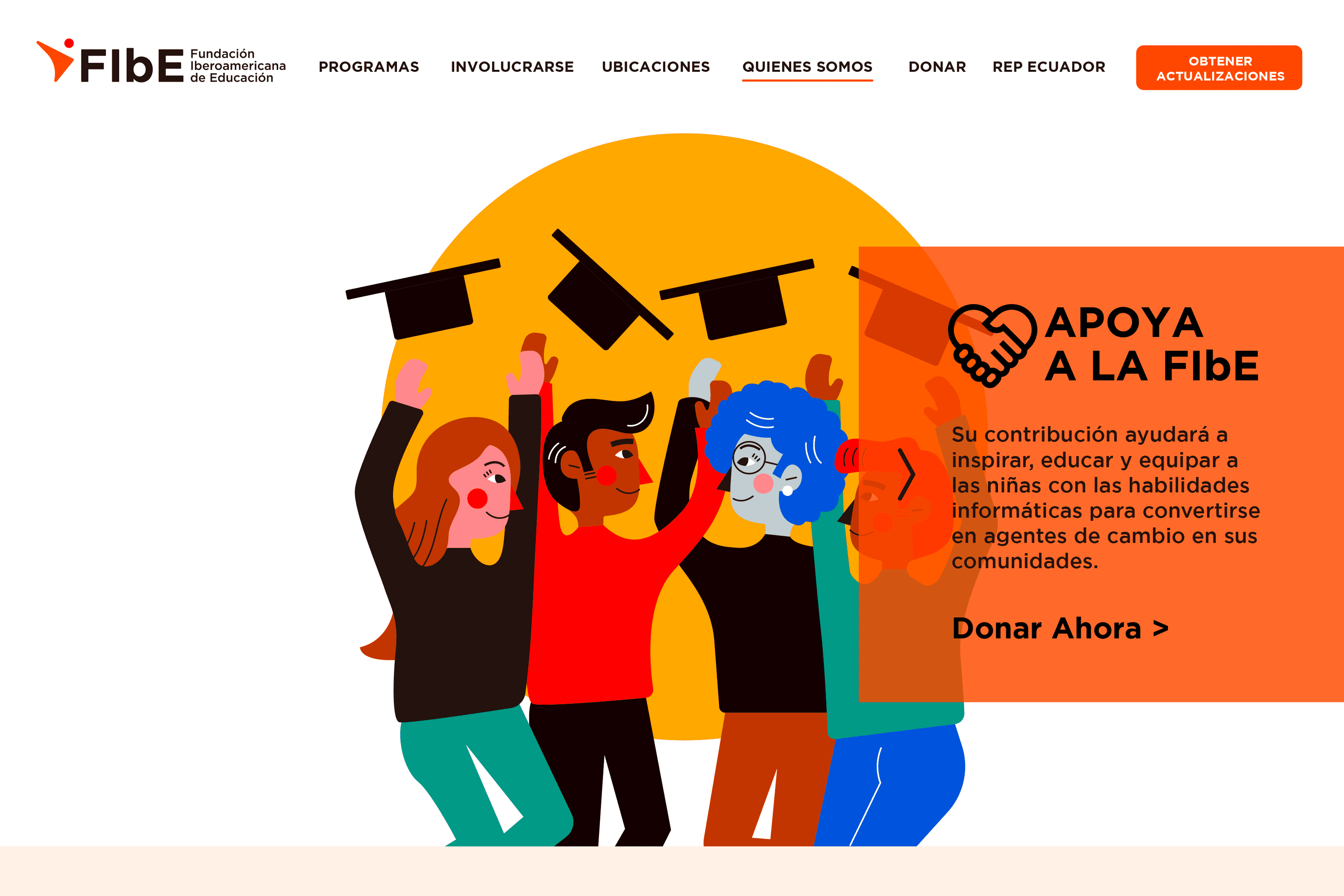
For the website of the Ibero-American Education Foundation, we have created a set of illustrations that convey joy, solidarity, and confidence for its users. This website is responsive, has a donation system, and its security is reinforced to ensure the security of the data.

Suggested Projects
Extreme Max
Educar com Evidências
Piamonte Higher Technical Institute
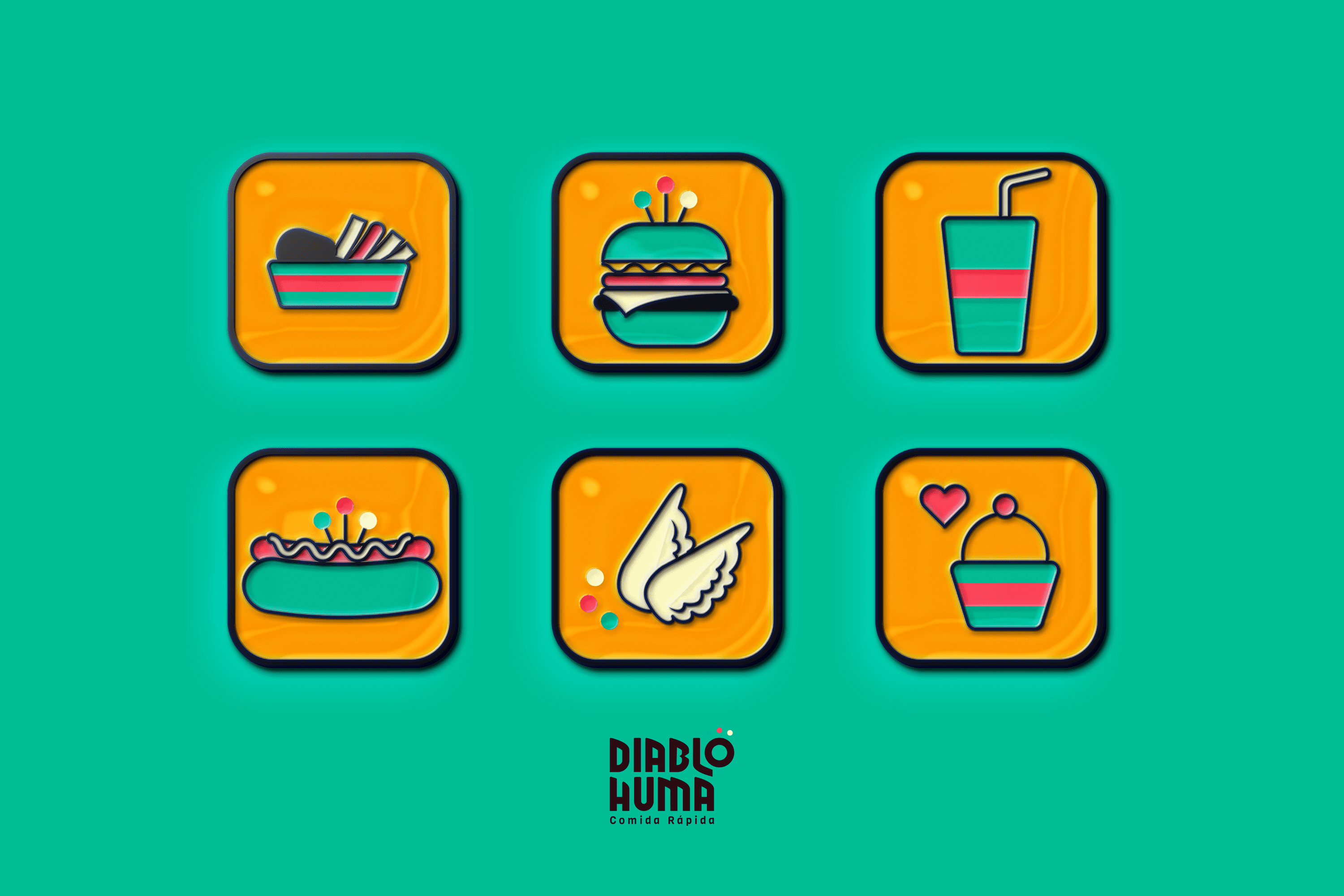
Diablo Huma Food Truck
BRANDING

The Client

“Diablo Huma” is a fast food truck in Ecuador located in Saquisili in the province of Cotopaxi.


Keywords

Branding / Illustration / Fast Food

The Objective

To design the new identity for Diablo Huma Fast Food with the mission of communicating quality, freshness and the culture of the region without losing accessibility.


The Solution

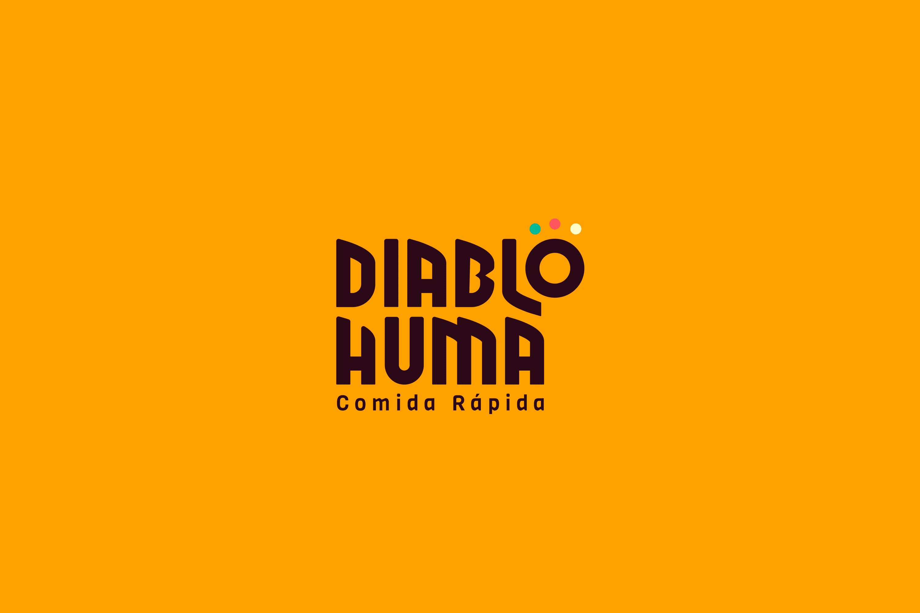
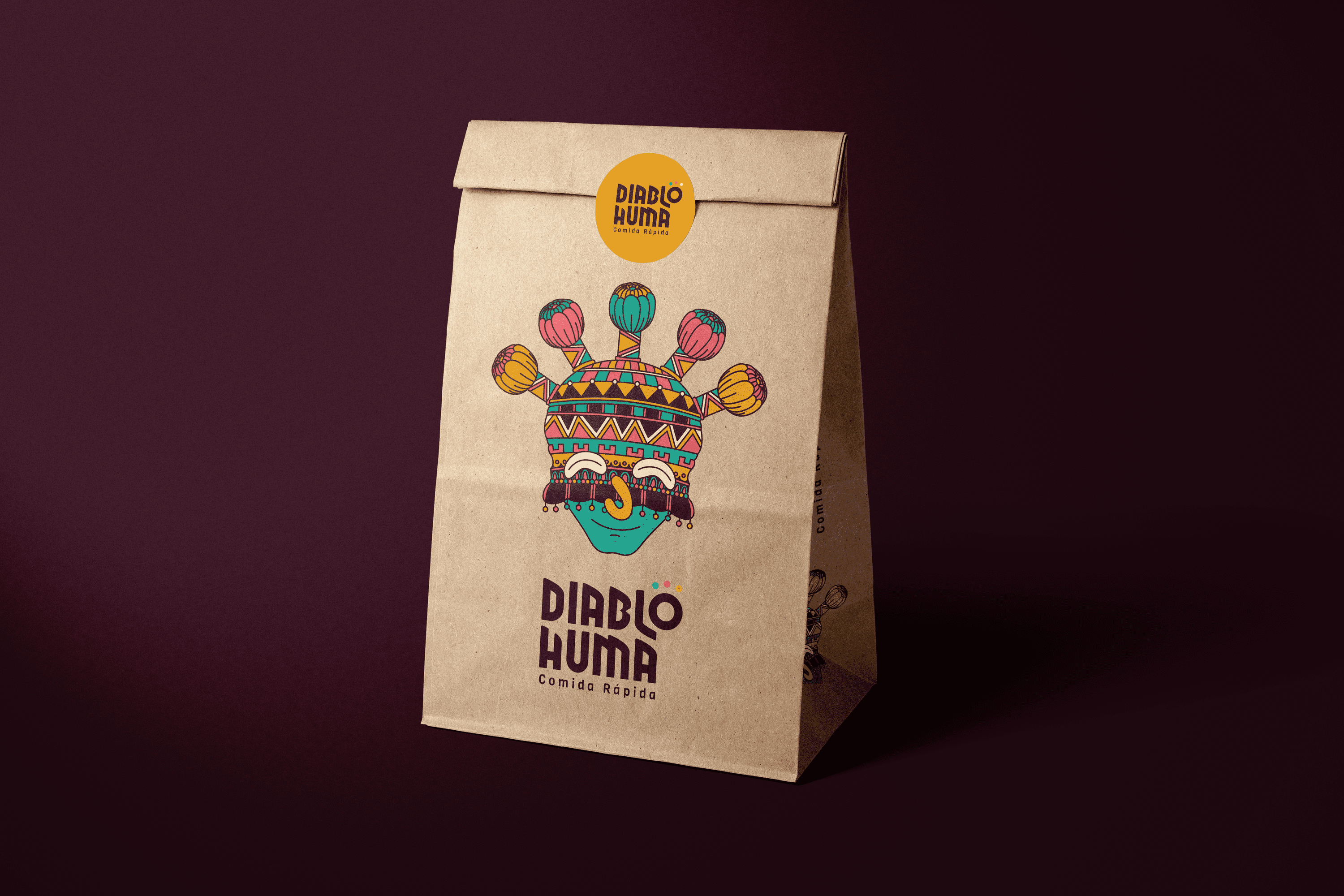
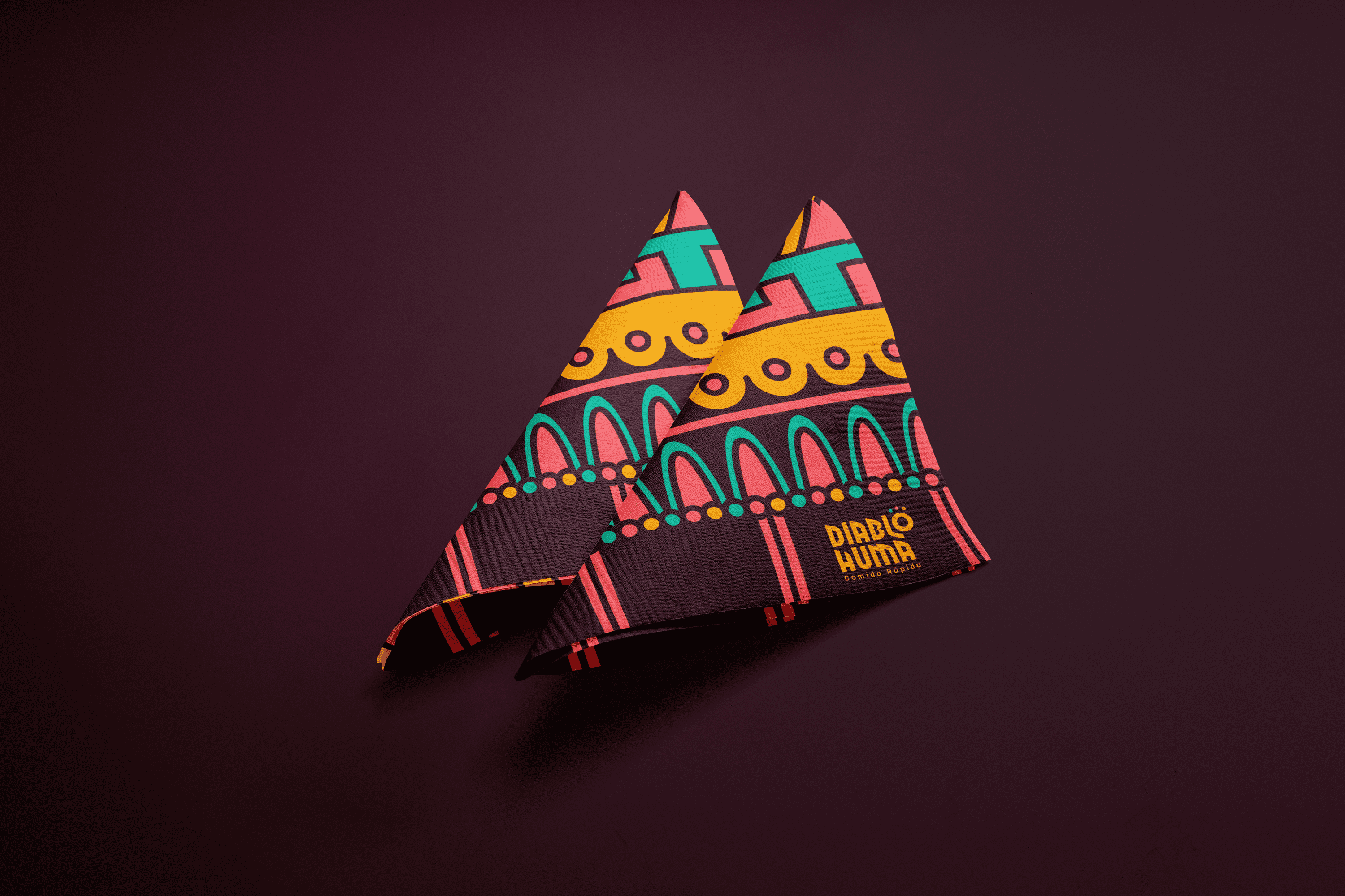
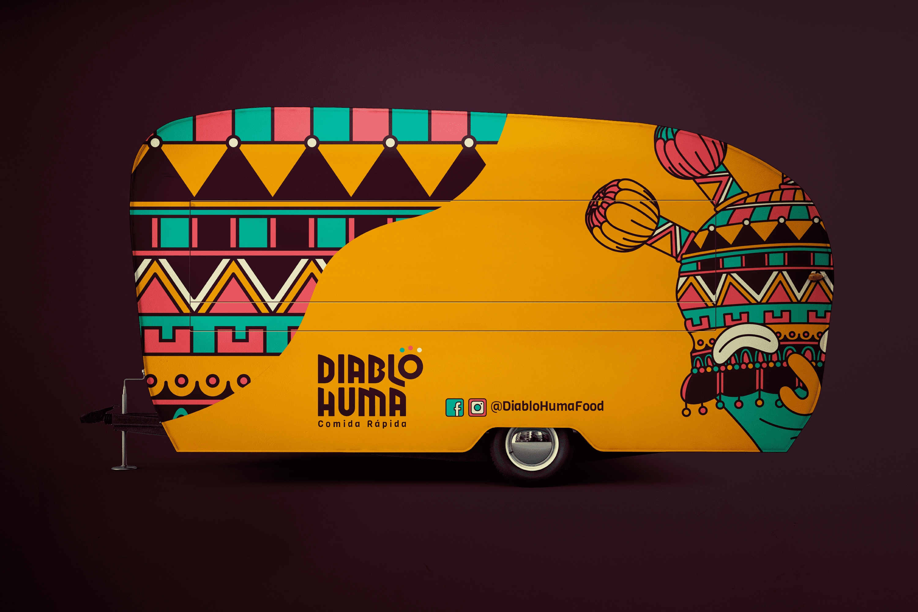
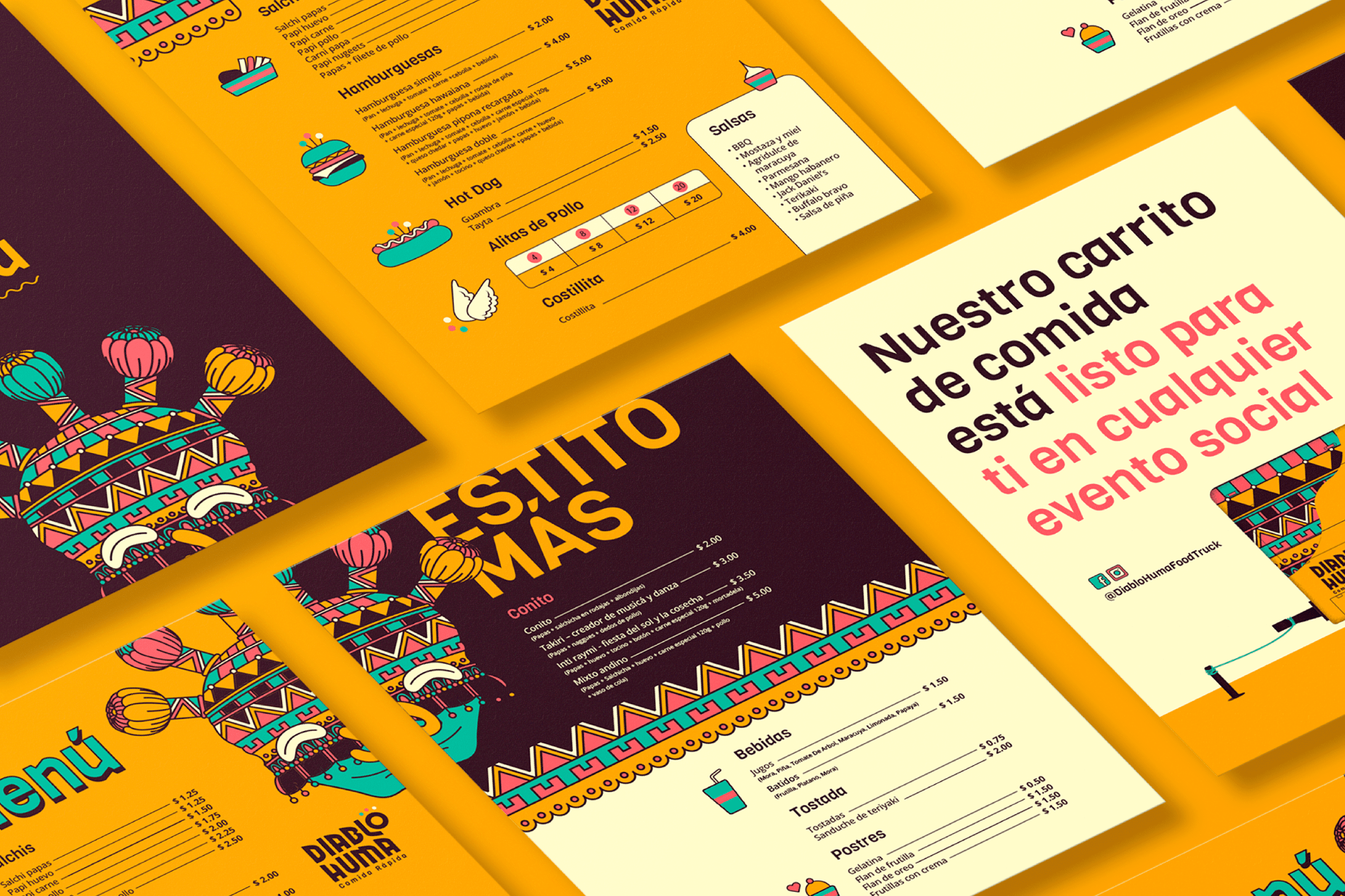
The proposal is based on the character of the Andean region of the Inti Raymi, festival, also known as Aya Uma, it is believed that this character drives away the demons of the crops and dances in three times to connect with the Earth, the Sun and the Moon (these three elements accompany the letter “o” of the logo which in turn is the abstraction of a “Diablo Huma”). The name of the character was used and an illustrated interpretation of it was made, fusing its traditional mask with various patterns present in the fabrics of the Andean Region. This proposal is accompanied by vibrant and friendly colors, close to the young public to which it is addressed..

Suggested Projects
Extreme Max
Educar com Evidências
Piamonte Higher Technical Institute