TAMPER Special Edition
DESIGN

The Client

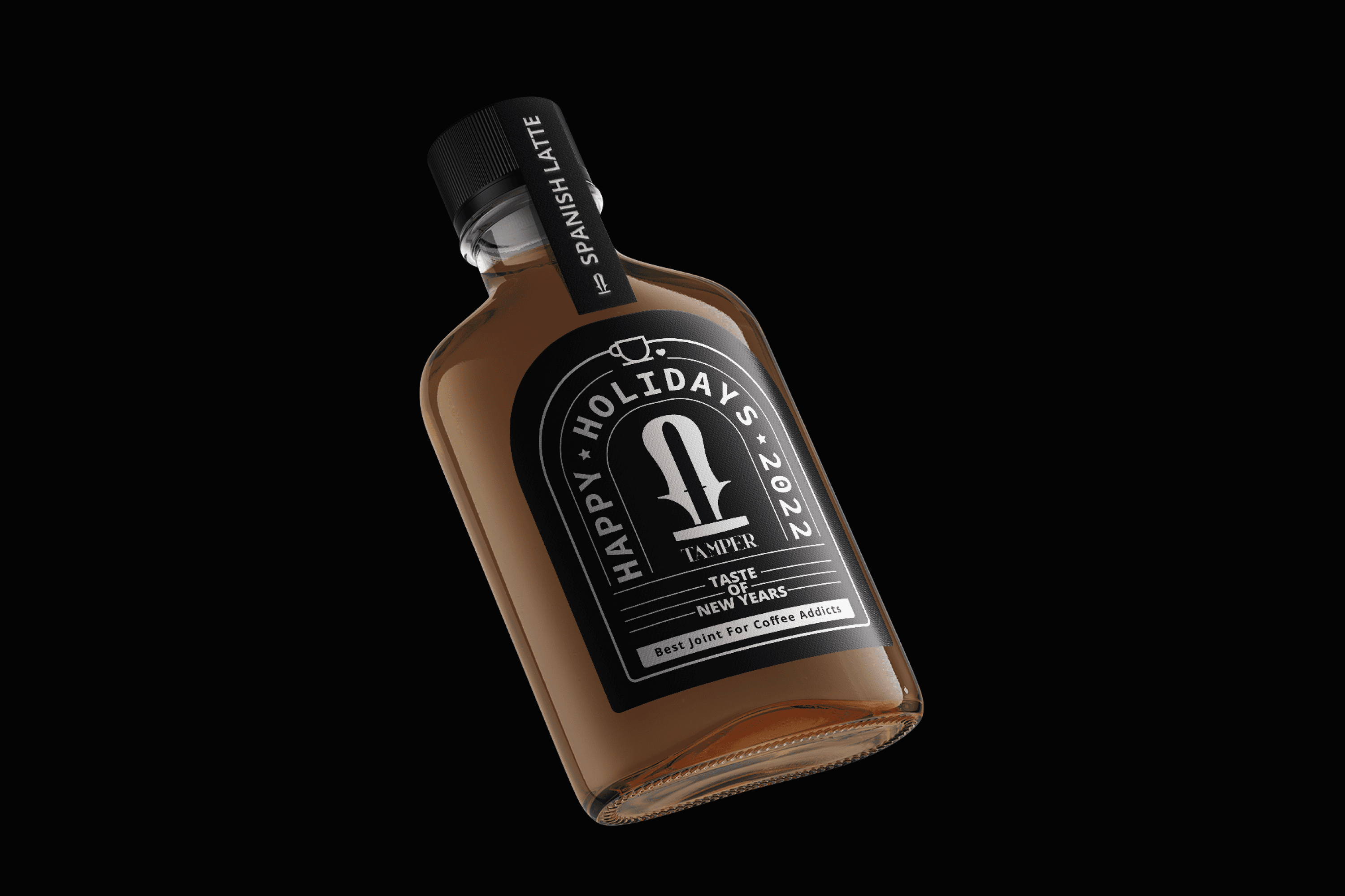
TAMPER is a coffee shop located in Kuwait, West Asia. Its brand promise is “Best Join For Coffee Addicts”.


Keywords

Design / Packaging / Coffee shop
The Objective

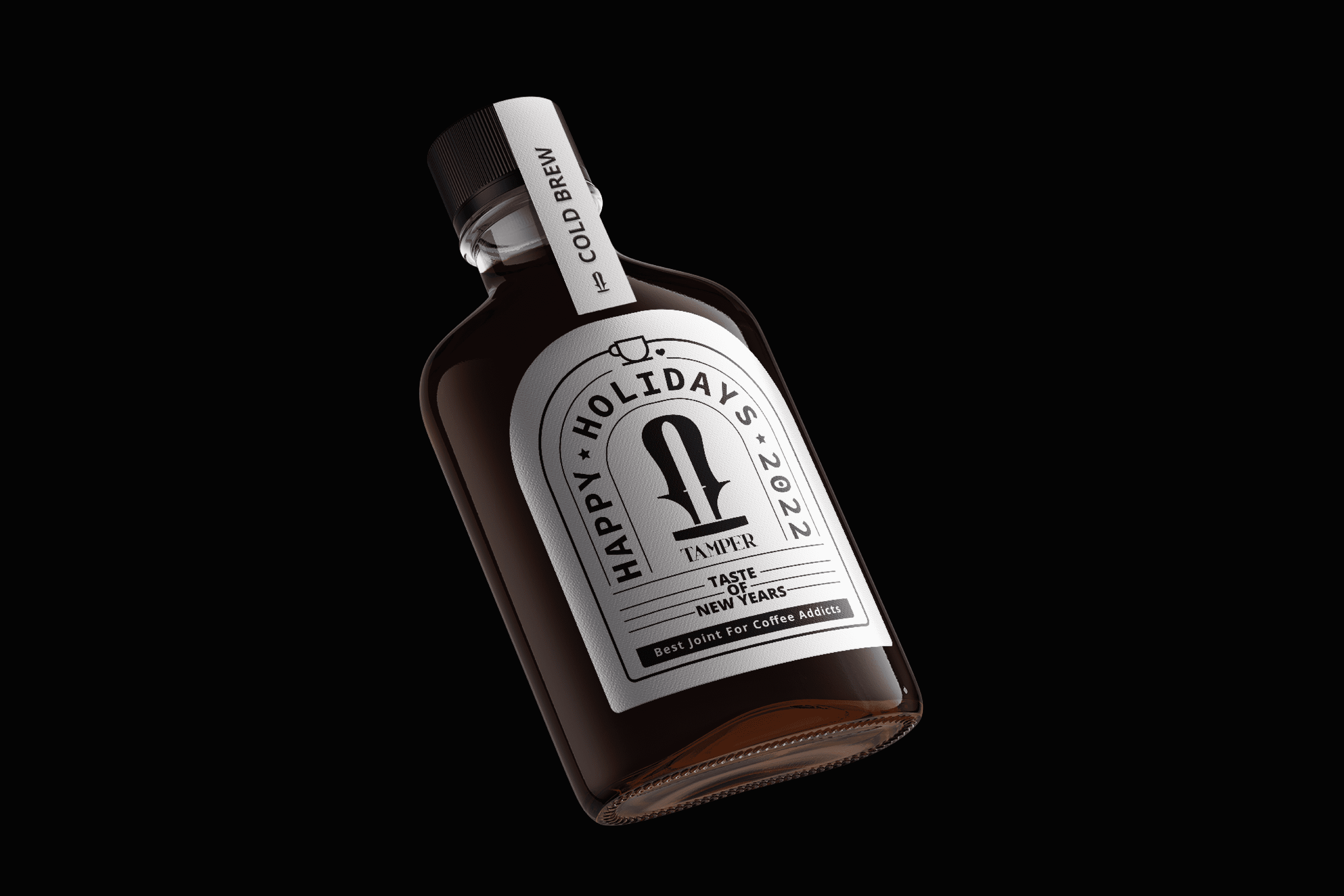
Design a label for our Cold Brew and Spanish Latte coffee in celebration of the New Year, which highlights our brand and preserves our modern and elegant essence.


The Solution

The design of the label created for TAMPER is based on the structure of its packaging to create a window that takes advantage of the space and strengthens the form of the TAMPER logo. The design focuses on the brand and uses lines as a guide to direct the gaze towards specific points and details, such as the small coffee cup on top or “Taste of the New Year.”

Suggested Projects
Terrenal Resto Bar
Simples Finanzas
Extreme Max
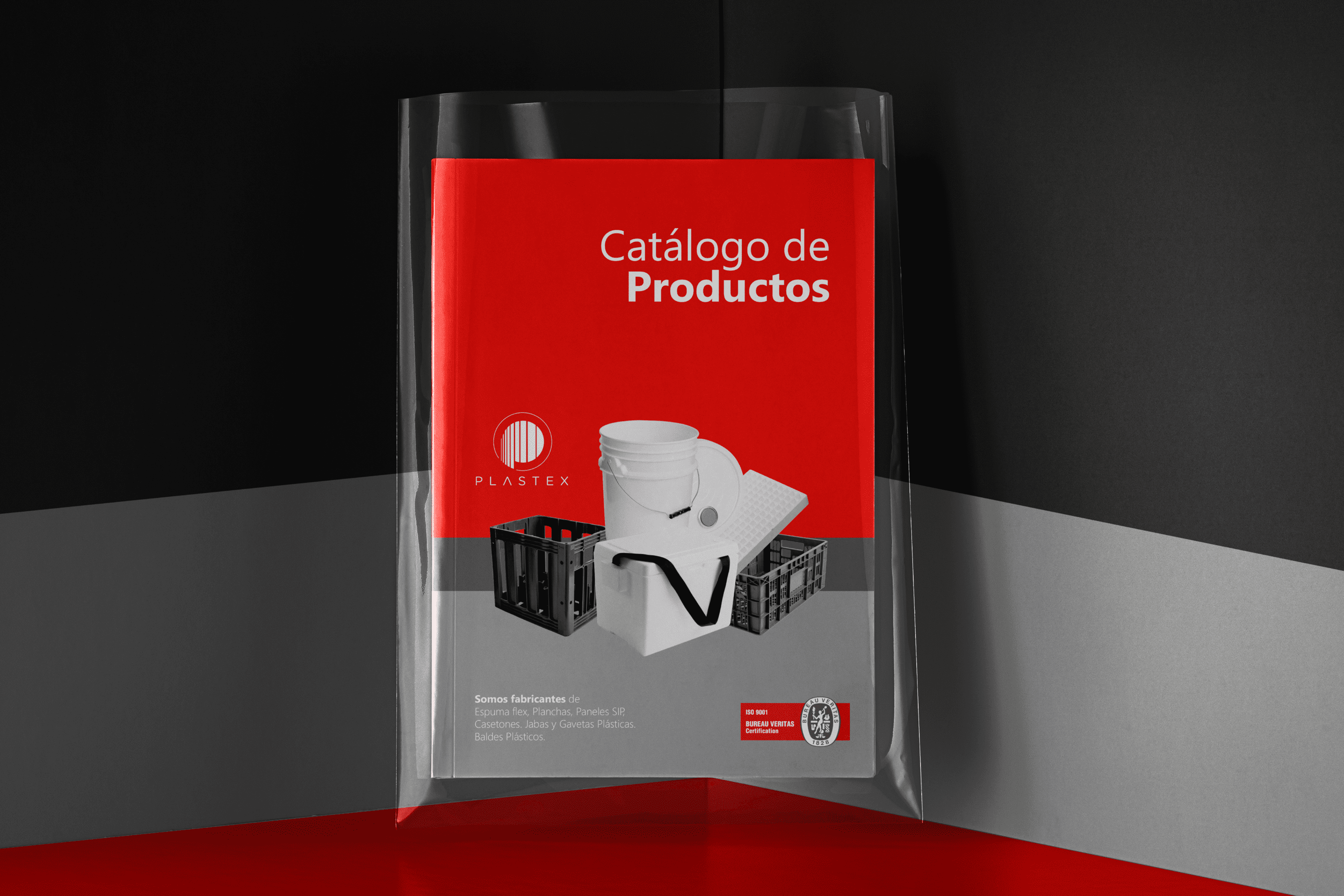
PLASTEX Product Catalog
DESIGN

The Client

Plastex SA – Plastic industry with 65 years of experience in the country, offering the Ecuadorian market products and solutions such as thermal boxes, seed trays, drawers and crates, buckets and mugs, tappers and STYROPLAN®, products, better known as expanded polystyrene (EPS) or foam Flex.


Keywords

Design / Photography / Industrial / Plastics

The Objective

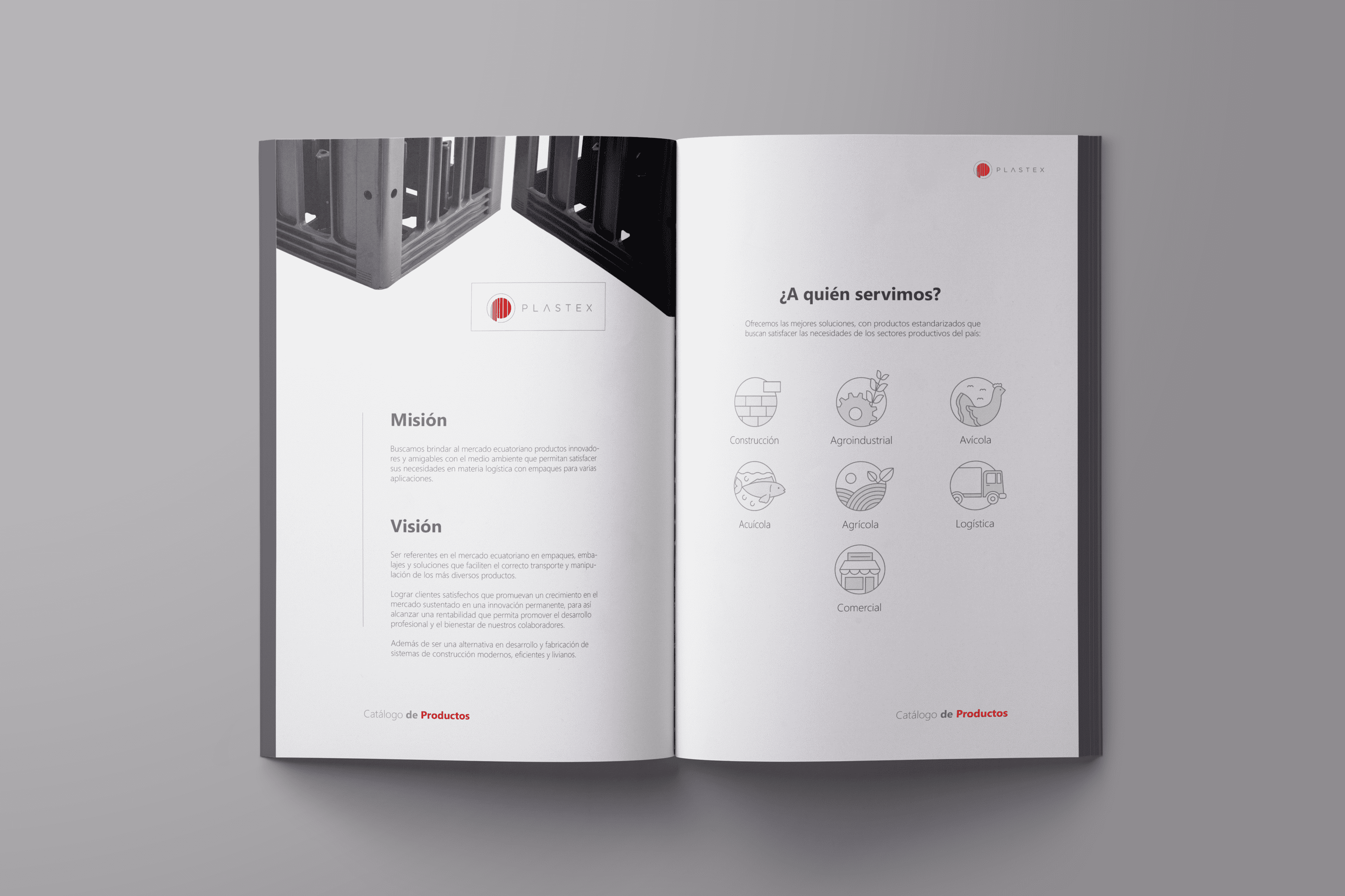
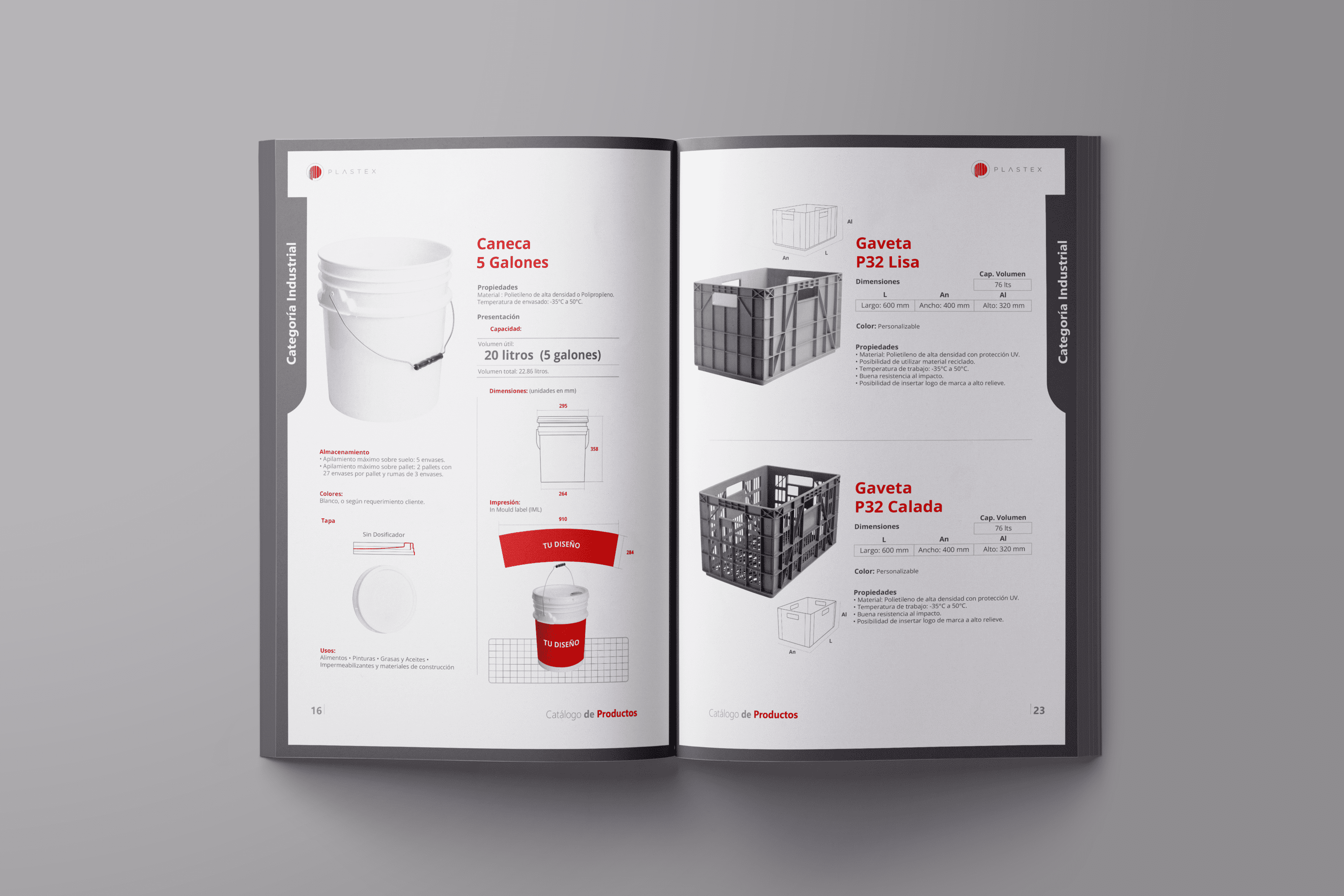
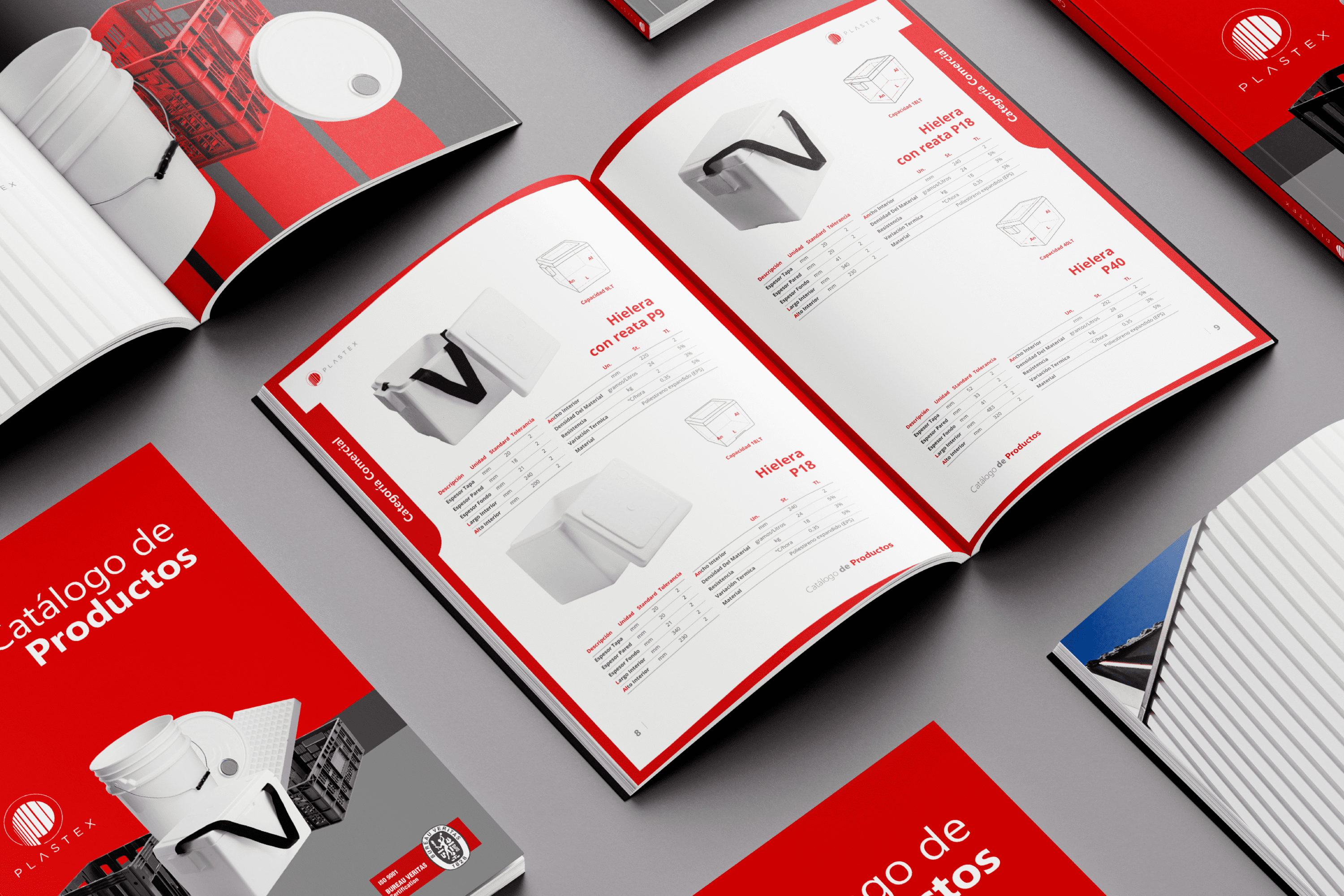
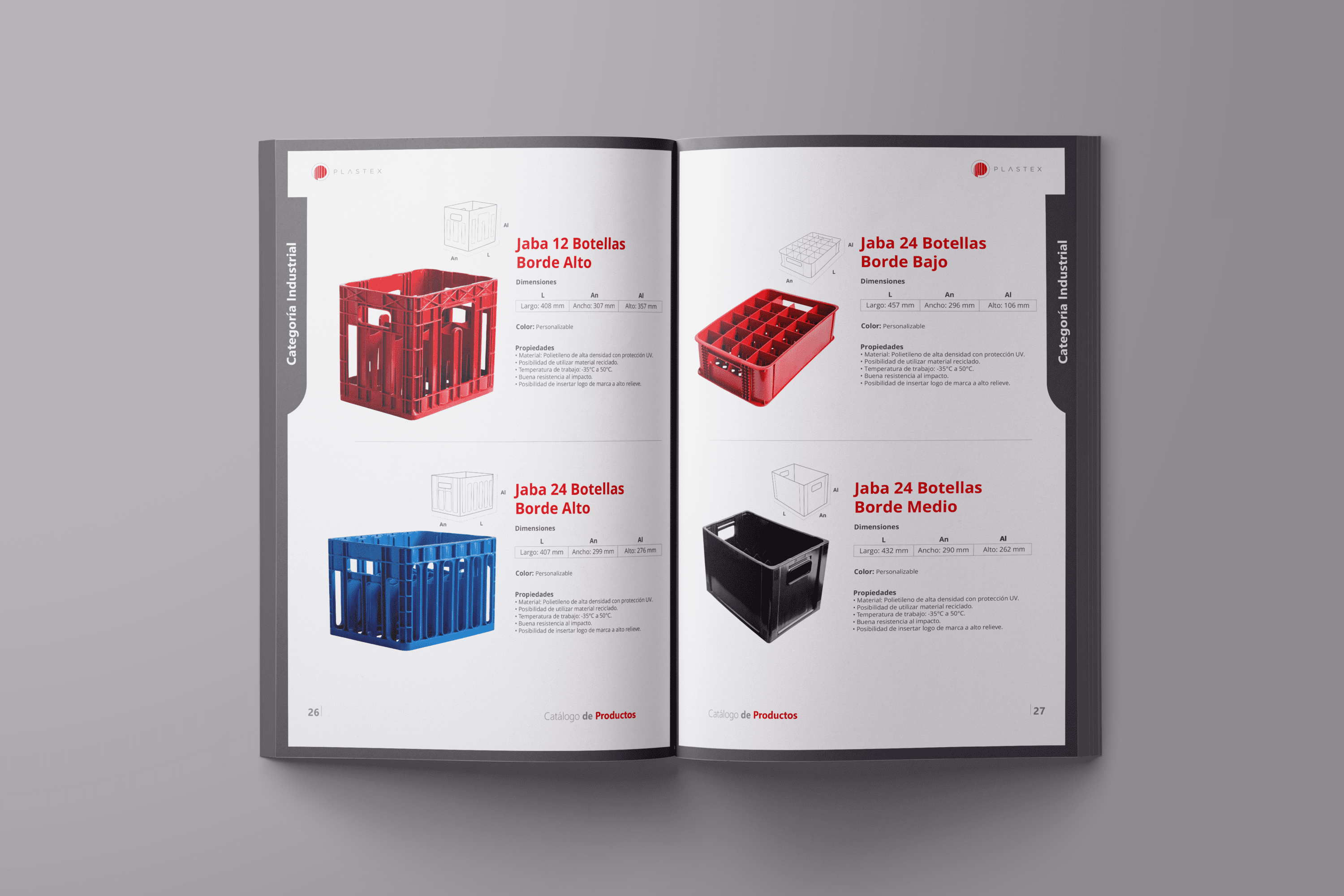
To design a catalog that organizes each category of PLASTEX products and clearly displays the advantages of our products.


The Solution

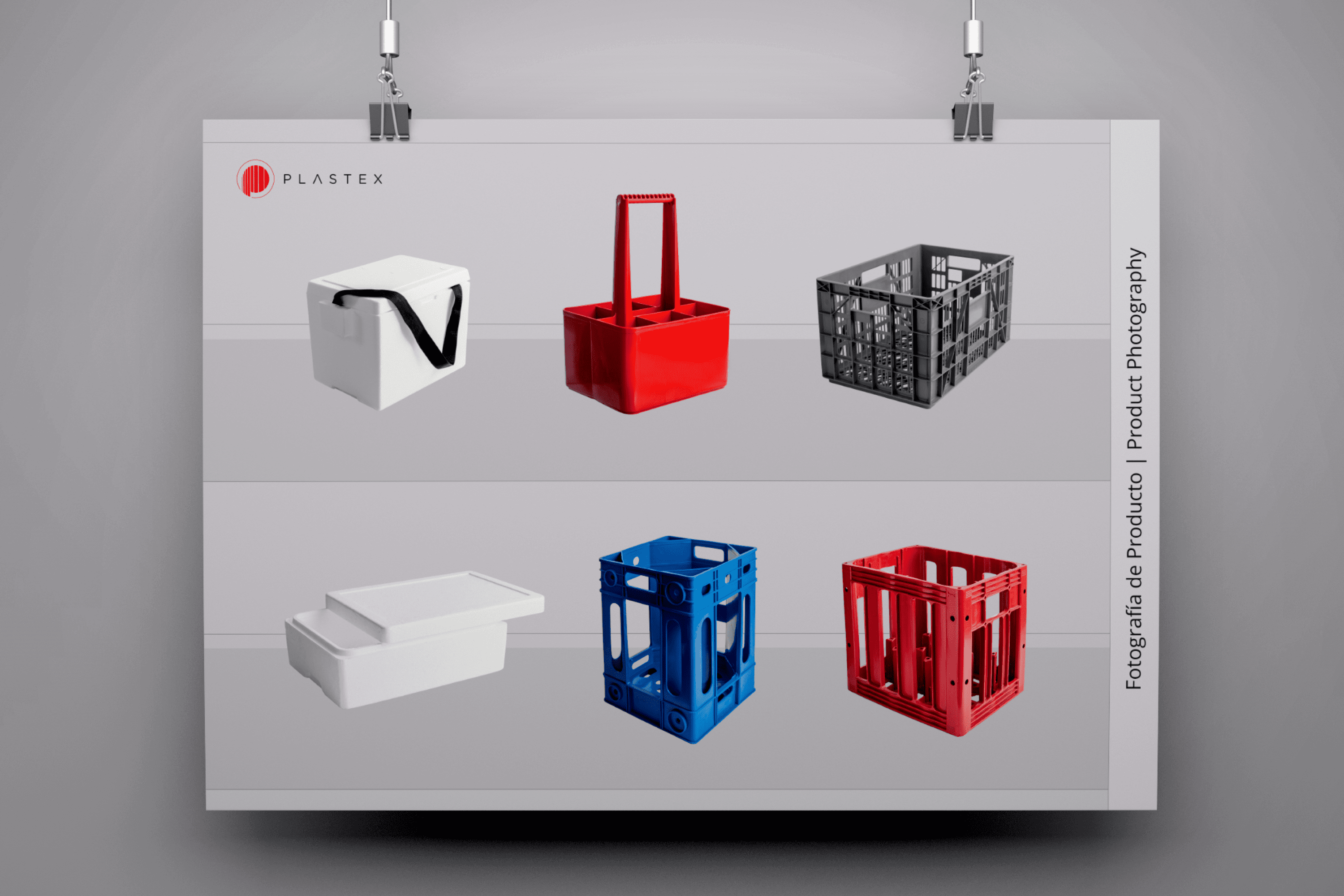
The proposal for PLASTEX separates each category with a unique color, this color distinctive accompanies each page of this category making it easy to recognize. Each product has the technical specifications that customers considered most important when choosing their product, making this document functional for the user. The layout is clean and free of distractions so that the focus remains on the product. The photography allows for correct visualization of the product (colors, shapes and materials).

Suggested Projects
Terrenal Resto Bar
Simples Finanzas
Extreme Max
Poncho Rosa Ice Cream
BRANDING

The Client

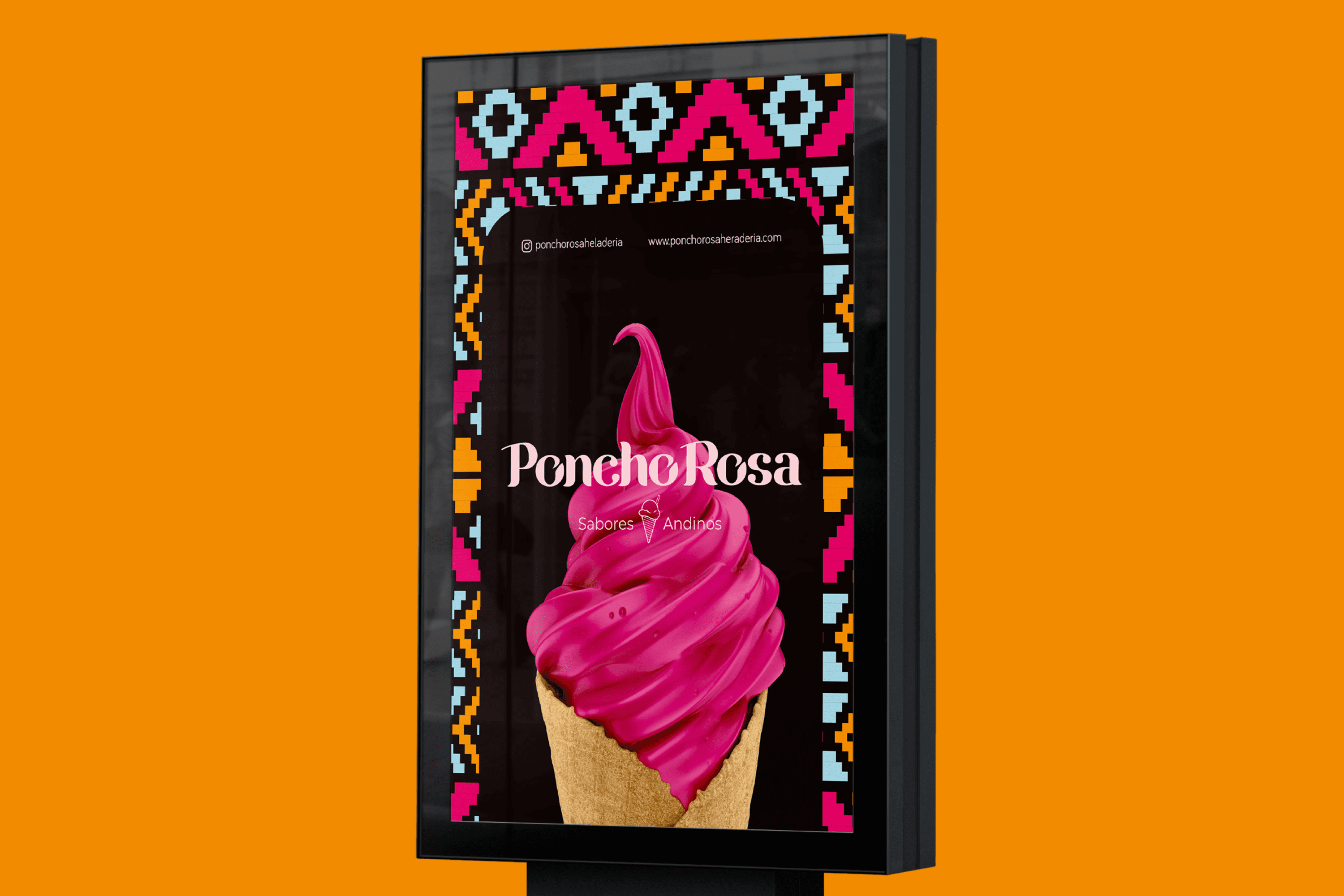
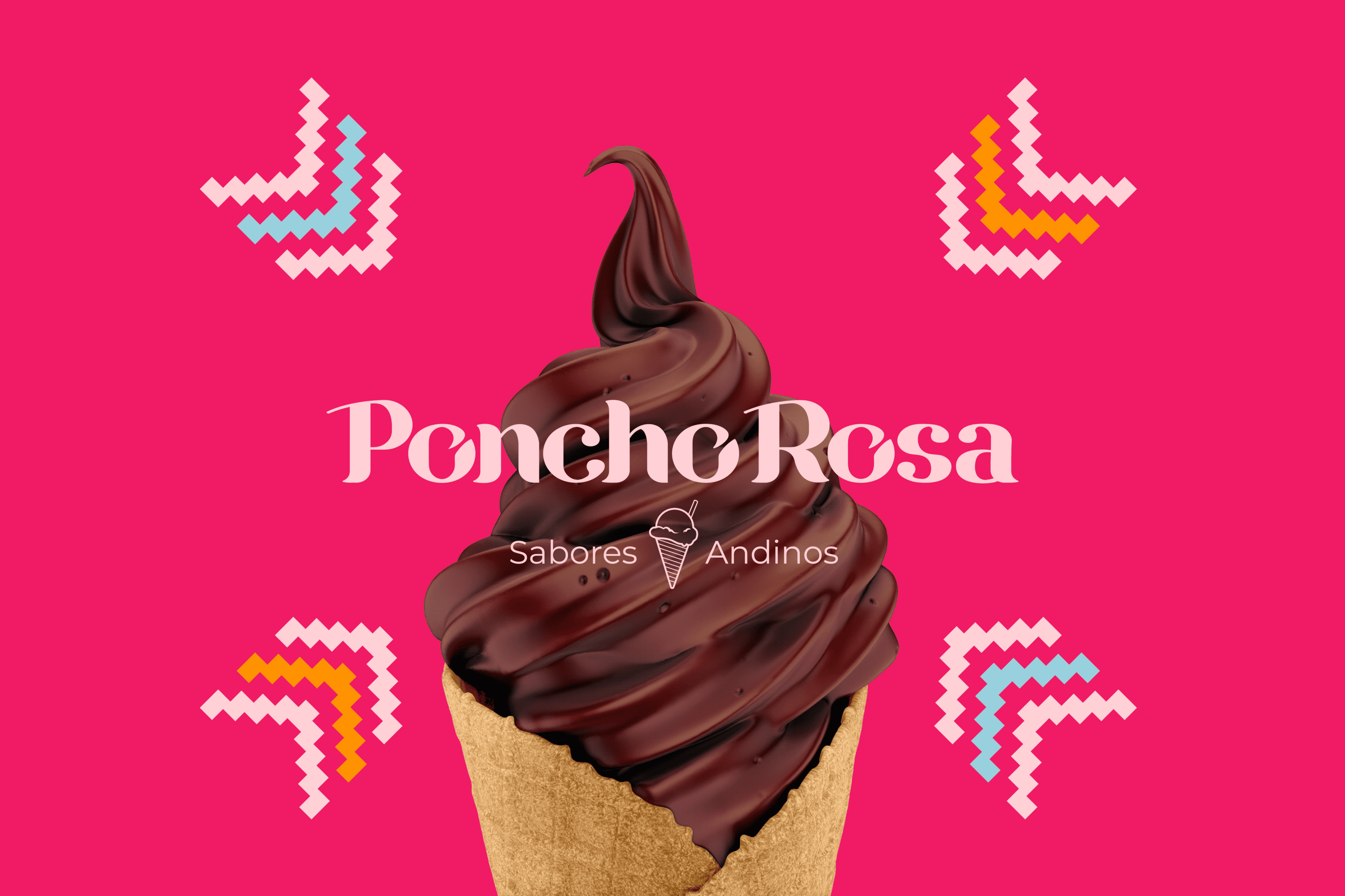
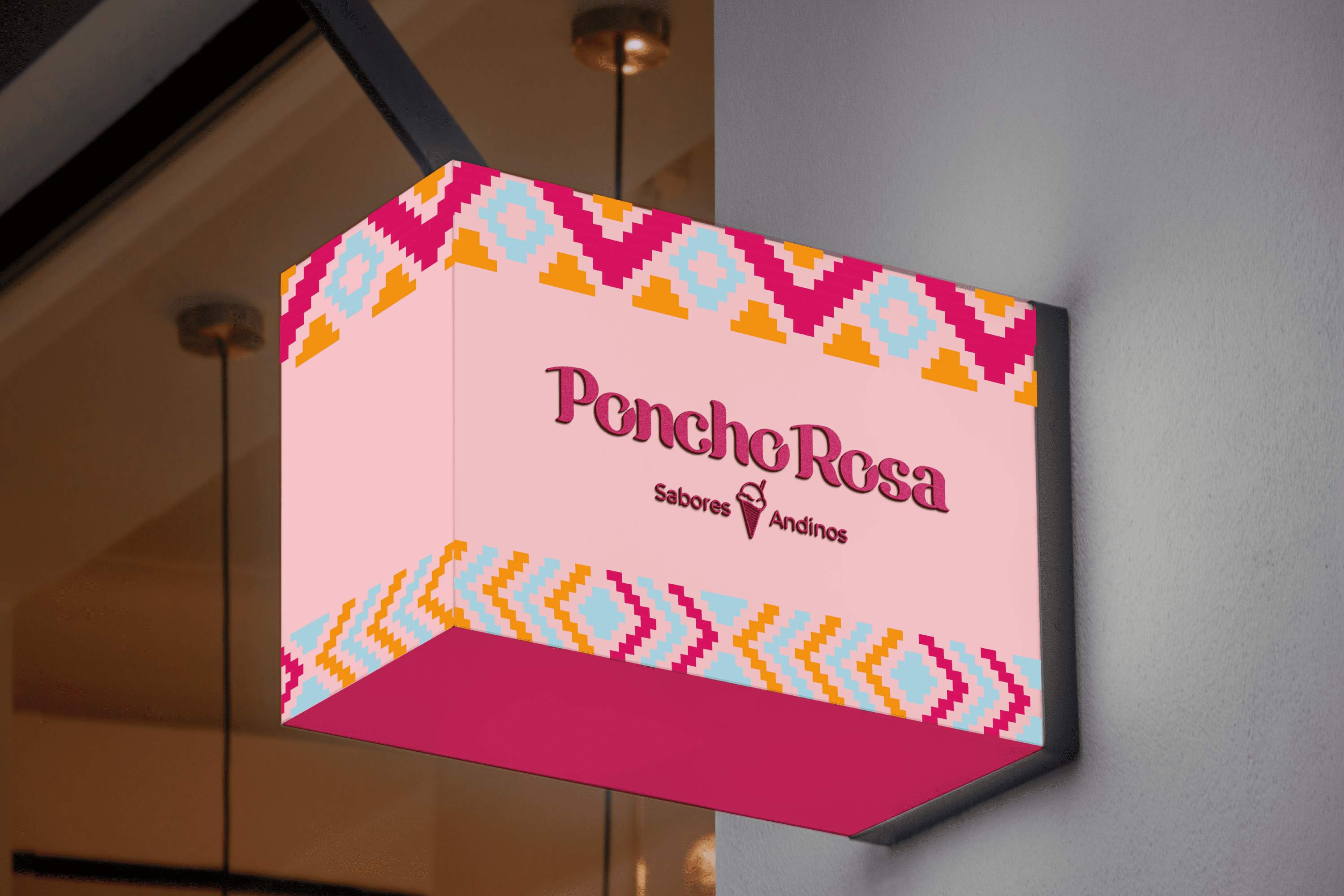
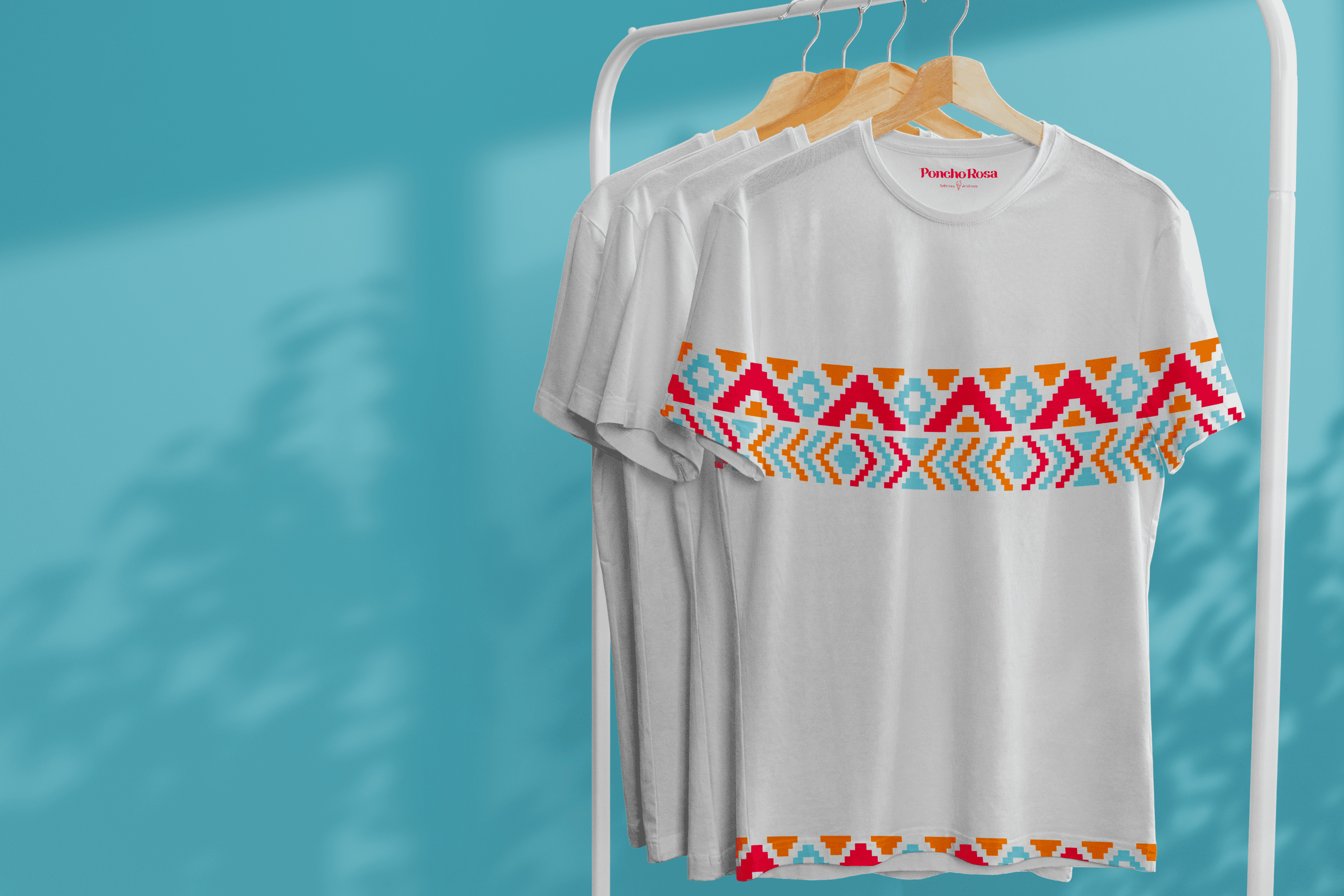
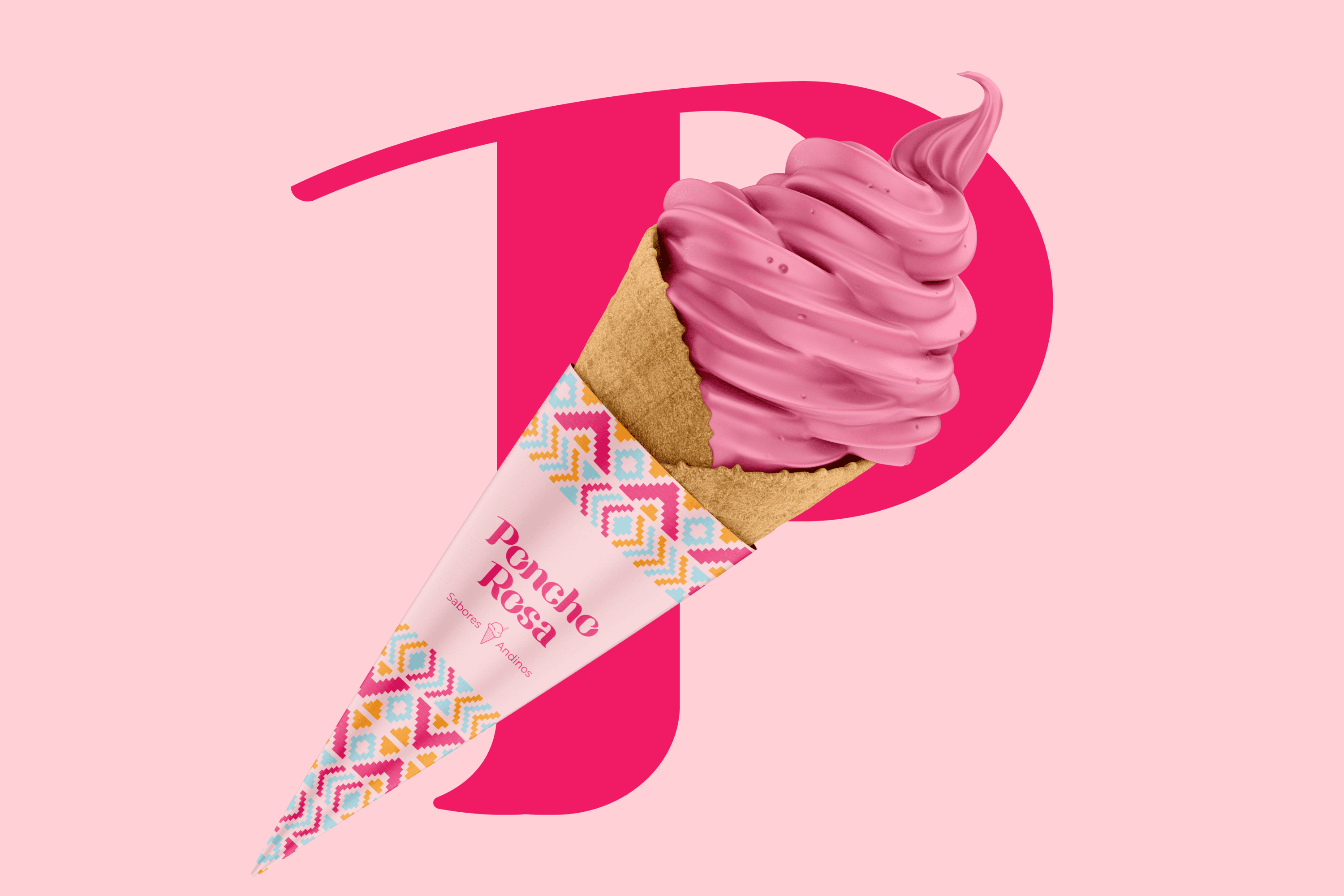
Poncho Rosa is an ice cream shop that blends ice cream with flavors from the Andean region. It is located in Riobamba – Ecuador.


Keywords

Branding / Design / Ice Cream Shop / Cultural / Andean

The Objective

Develop a branding system that expresses the diversity, joy and richness of the Andean region through its forms and colors.


The Solution

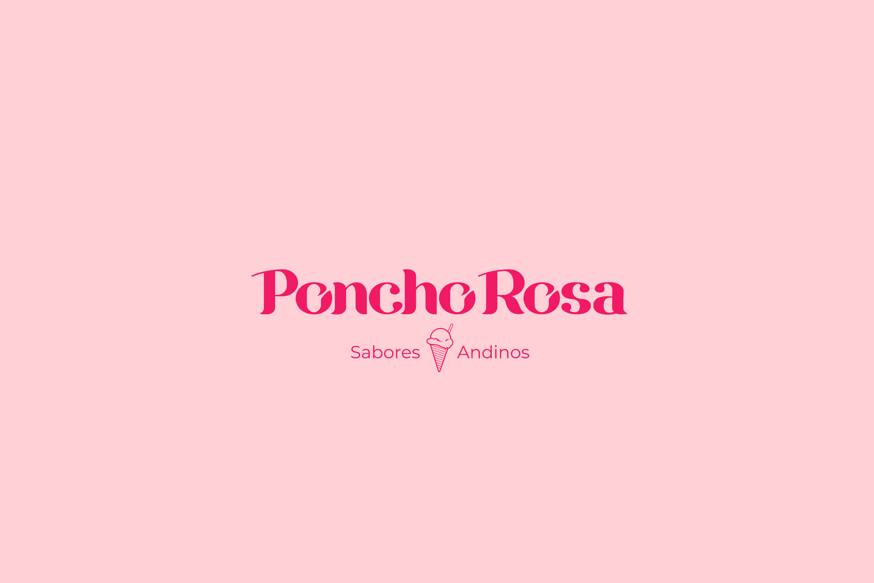
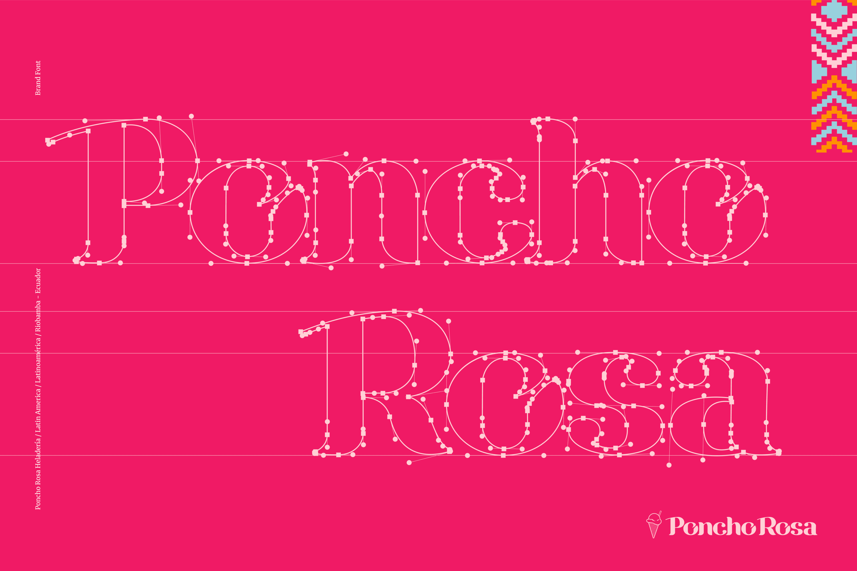
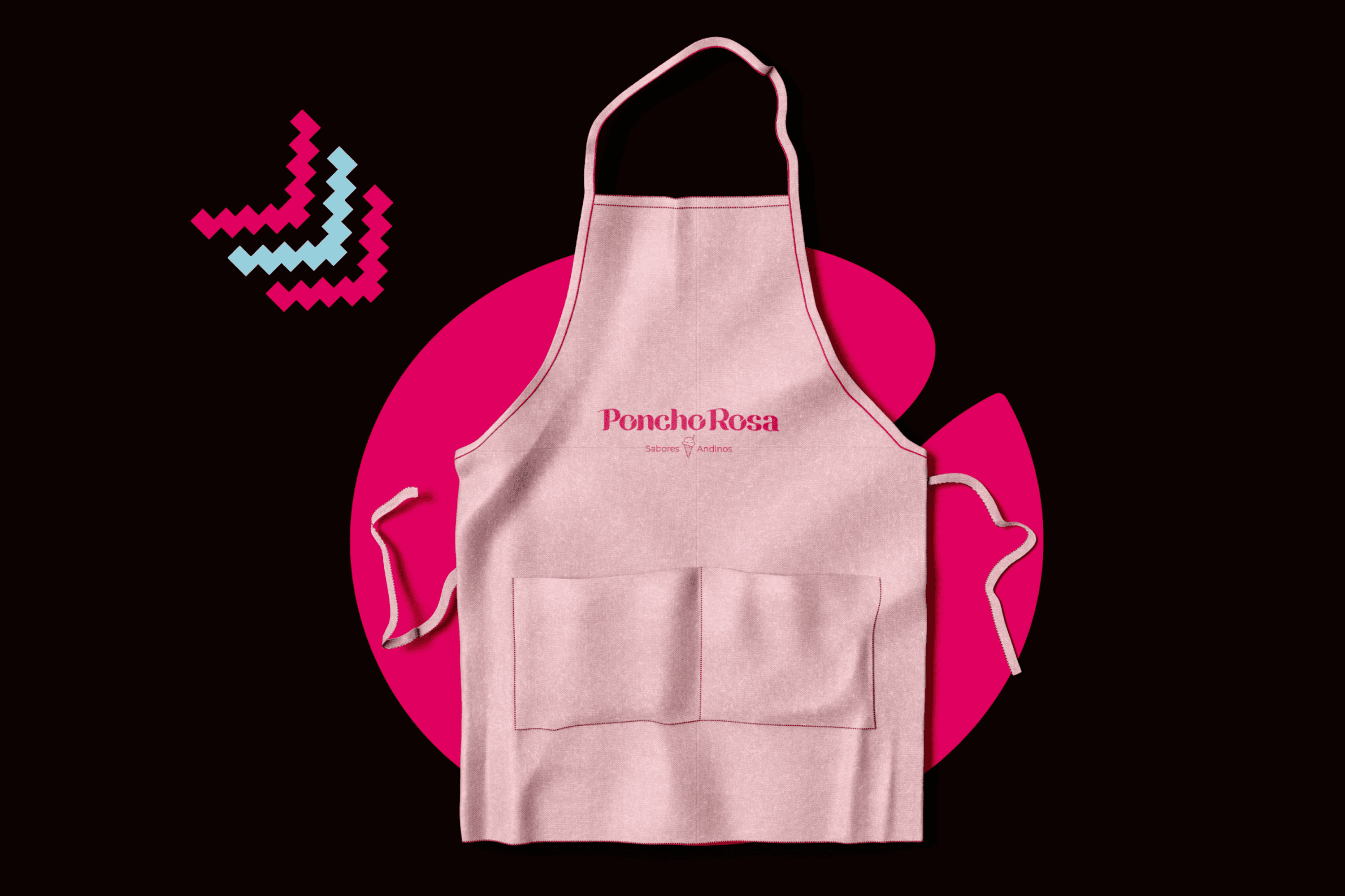
For the creation of Poncho Rosa, we designed a Bold Serif typography that conveys a strong, friendly, and feminine personality, which is characteristic of its origin. The complementary graphic takes Andean visual representations to the world of ice cream and gives it dynamism and color.

Suggested Projects
Terrenal Resto Bar
Simples Finanzas
Extreme Max
NAMU Agency
WEBSITE

The Client

La NAMU Agency, provides guidance to clients to create a memorable brand. Using storytelling techniques, it helps them clarify their message so they can listen and act. It has been collaborating with brands in Los Angeles, Mexico, and Brazil since 2016.


Keywords

Web Design / Web Development / Illustration / Agency / Marketing

The Objective

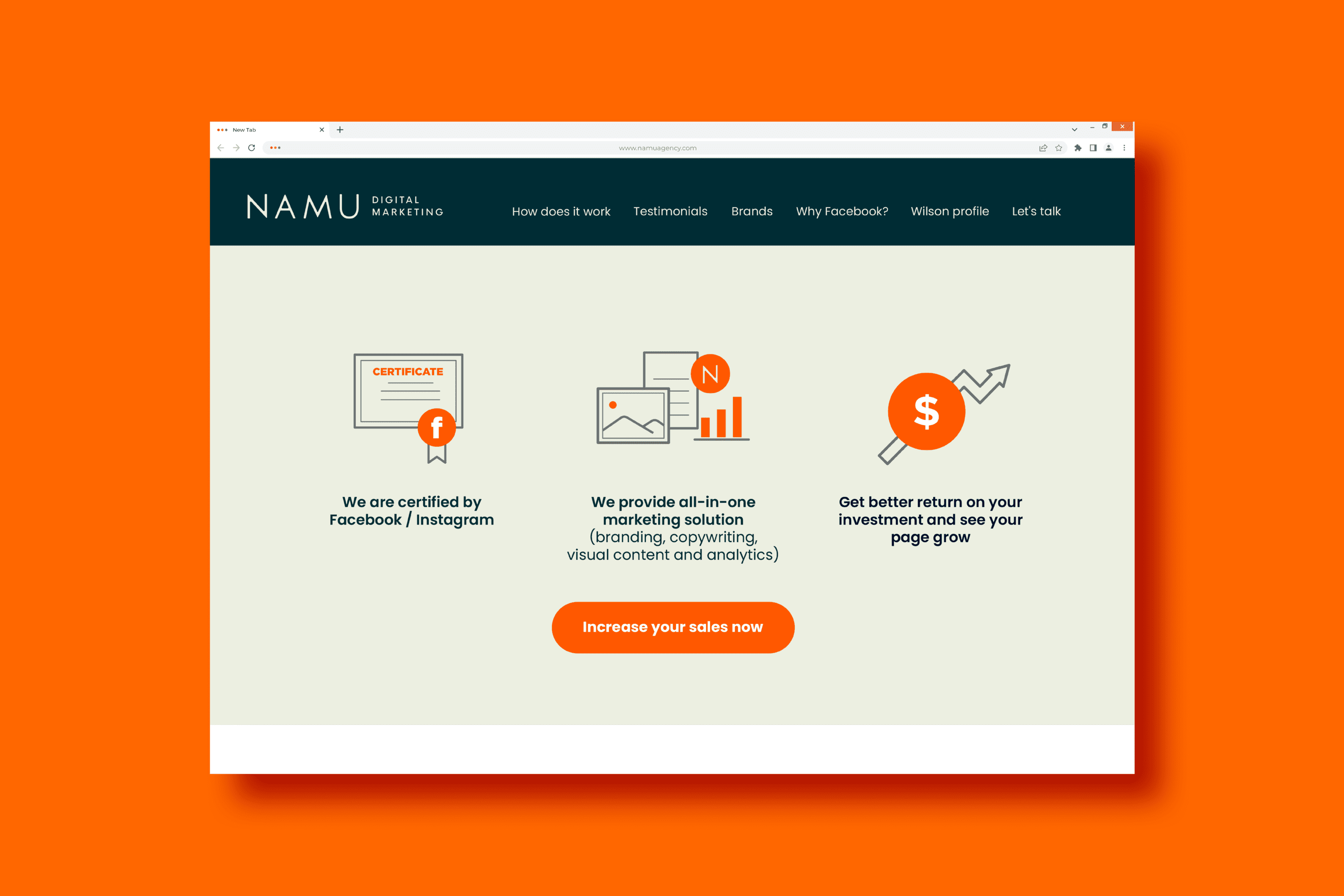
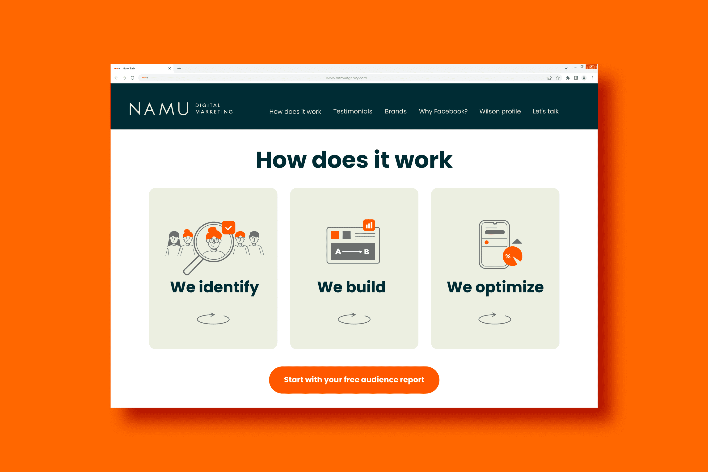
To design and develop a Landing Page that allows our clients to know our services in a clear and friendly way.


The Solution

The Landing Page designed for NAMU Agency, uses a minimalist layout that allows for easy scanning of the information. Illustration has been incorporated as a friendly linking element that reinforces the messages shared on the site. We use the orange color which, together with the corporate green, creates a contrast that adds life to the environment and provides a graphical resource that strengthens the call to action on each button.

Suggested Projects
Terrenal Resto Bar
Simples Finanzas
Extreme Max
NAMU Agency
DESIGN

The Client

La NAMU Agency, provides guidance to clients to create a memorable brand. Using storytelling techniques, it helps them clarify their message so they can listen and act. It has been collaborating with brands in Los Angeles, Mexico, and Brazil since 2016.


Keywords

Design / Social Media / Templates / Agency / Marketing

The Objective

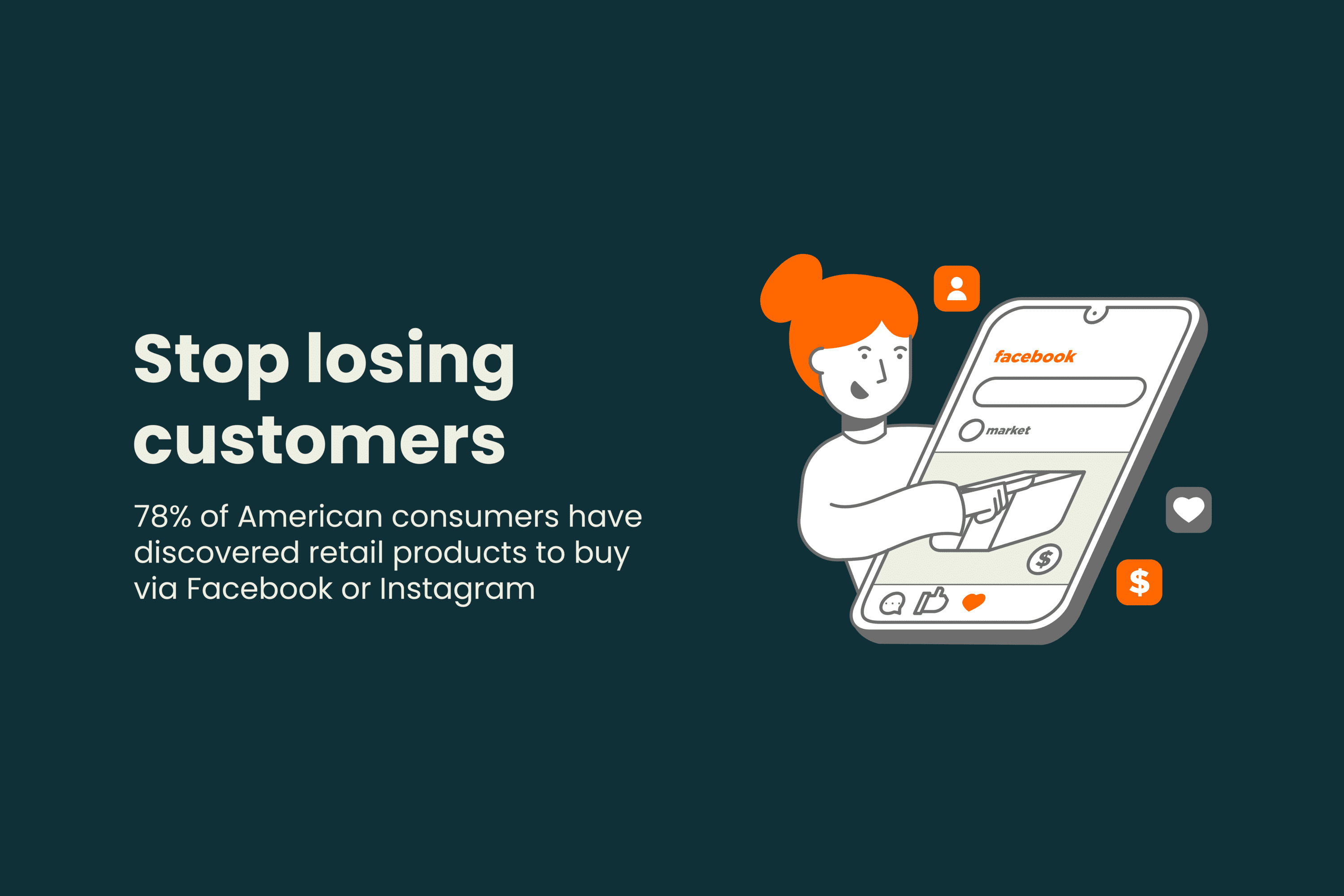
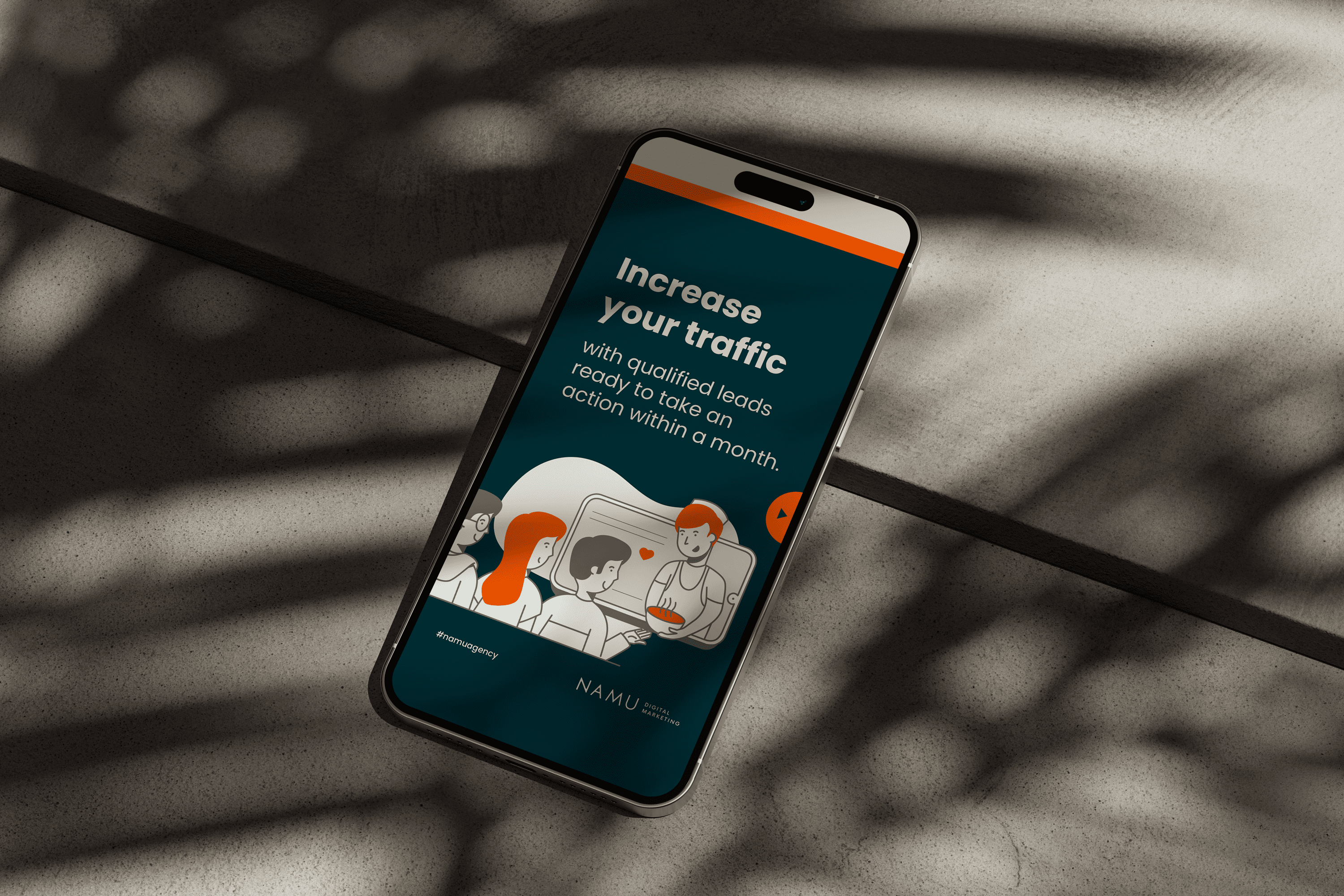
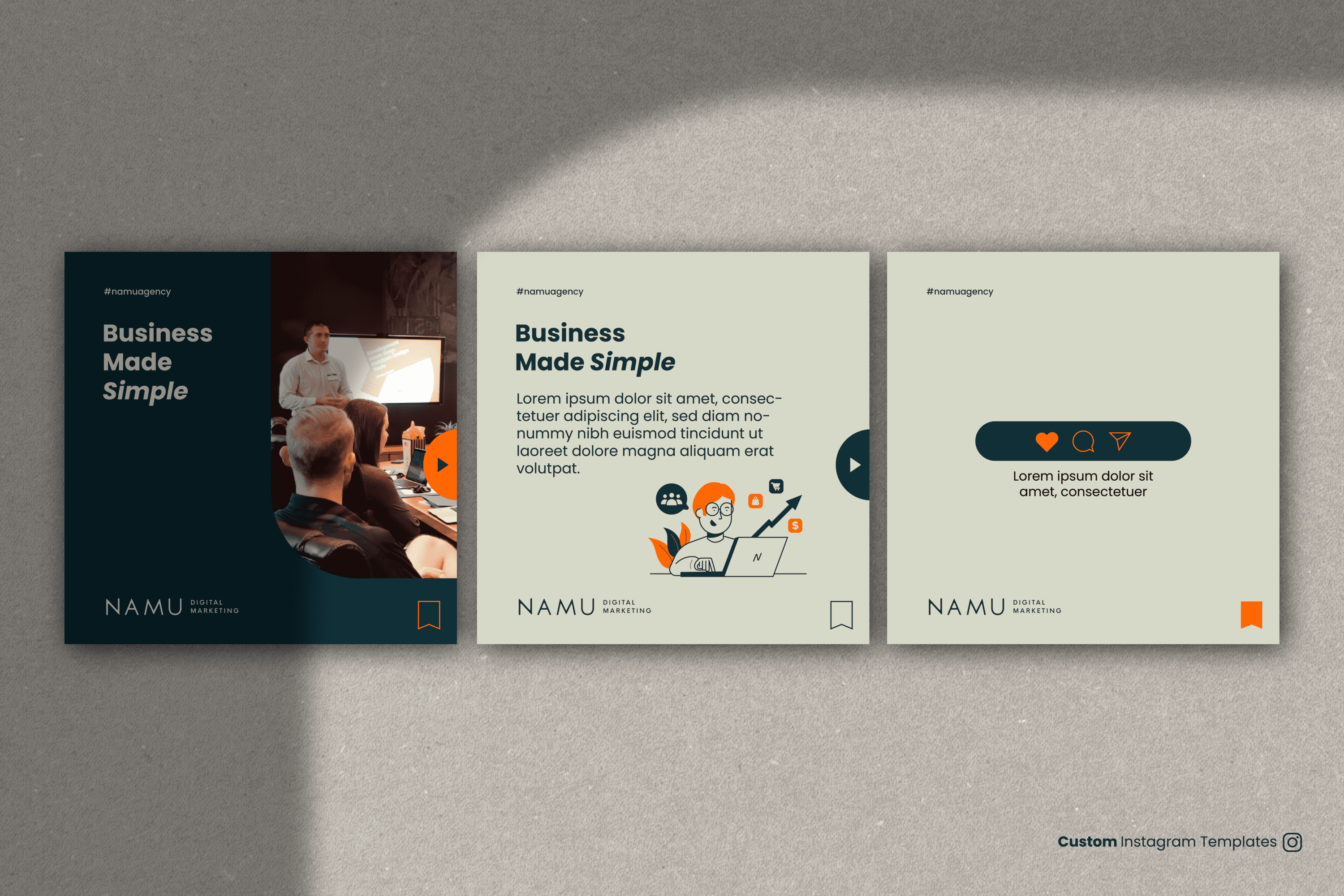
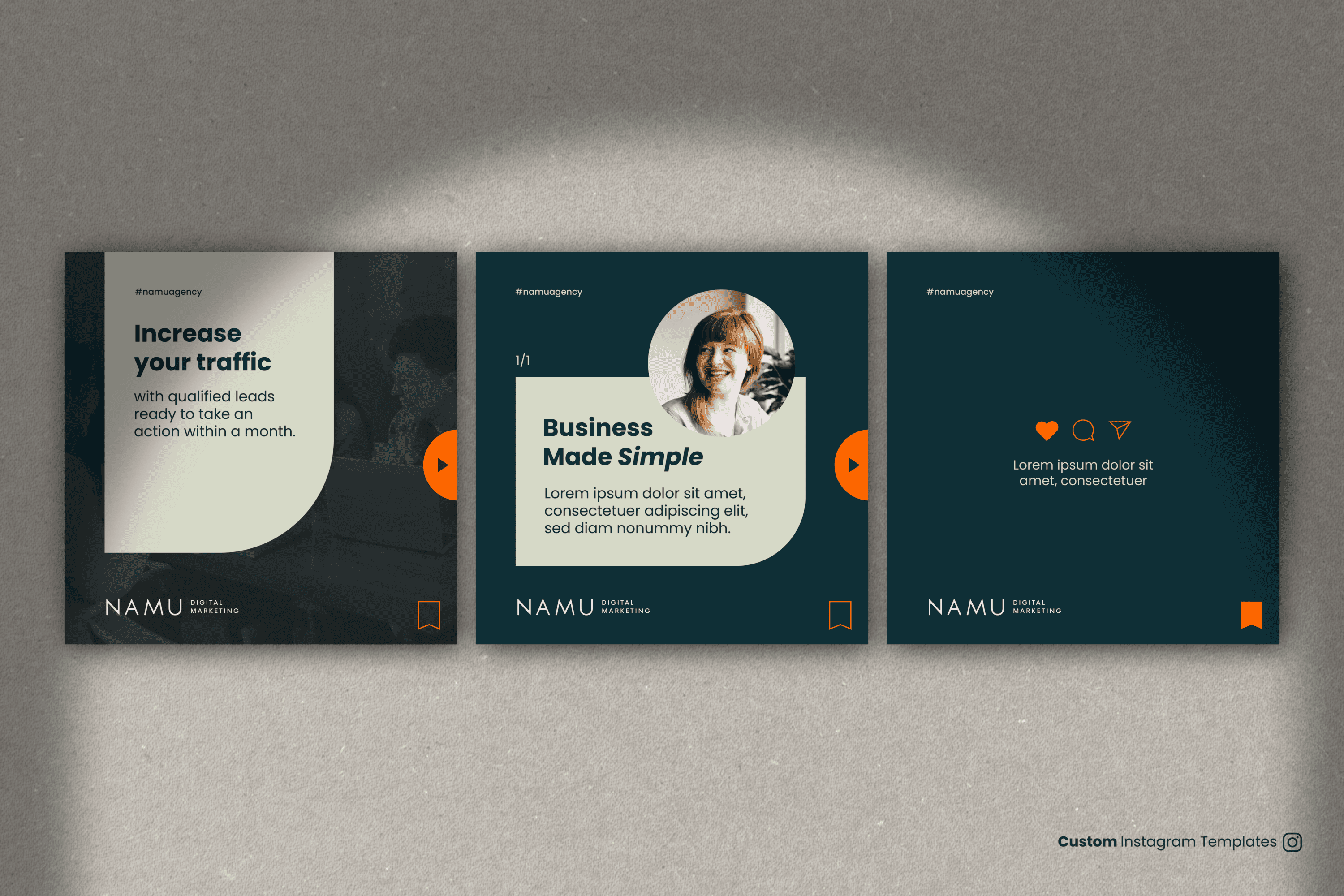
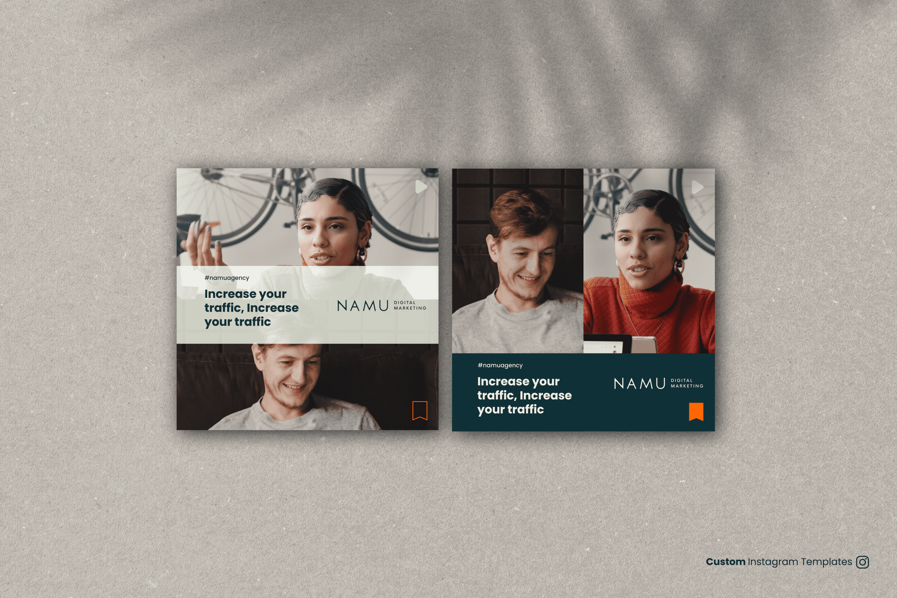
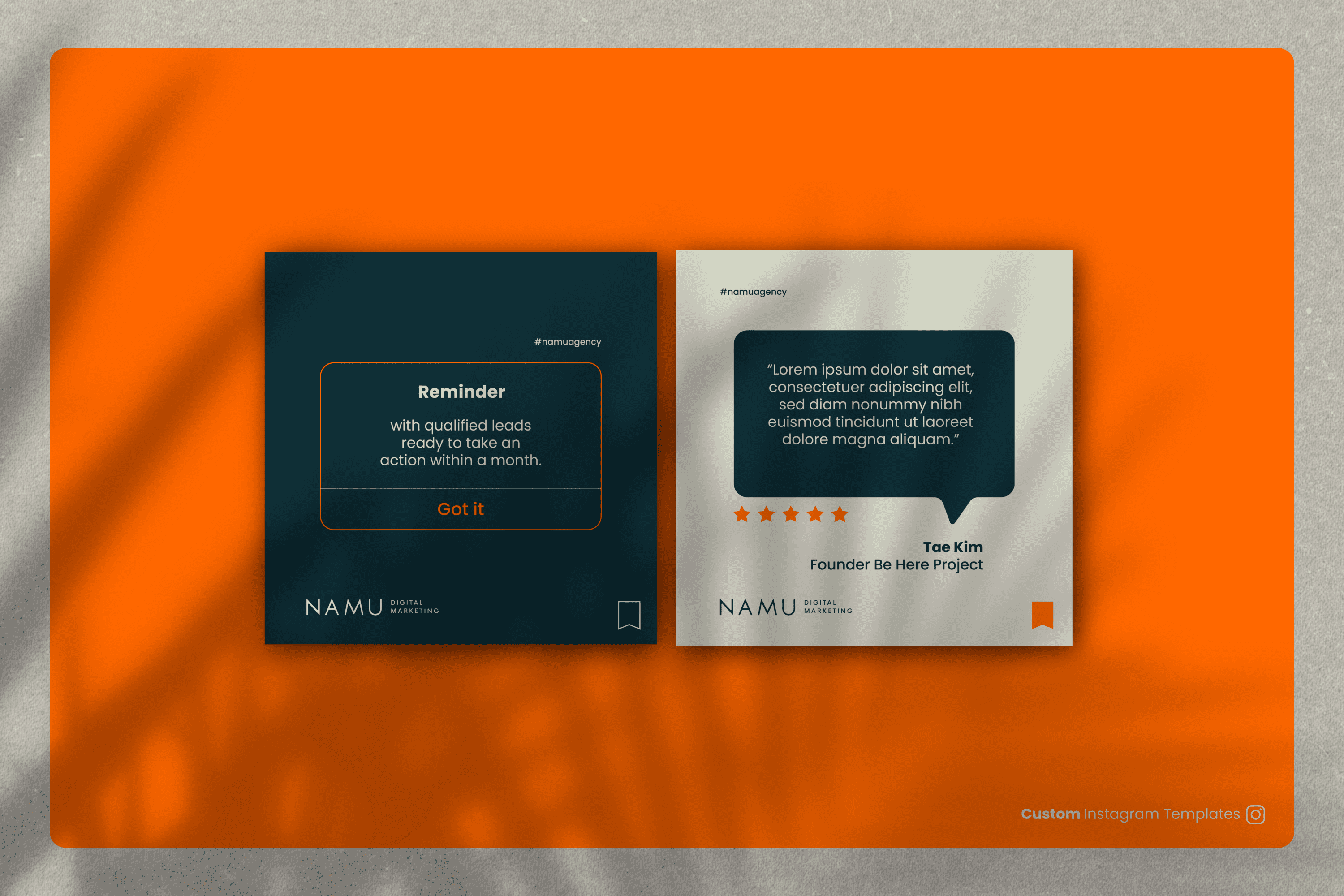
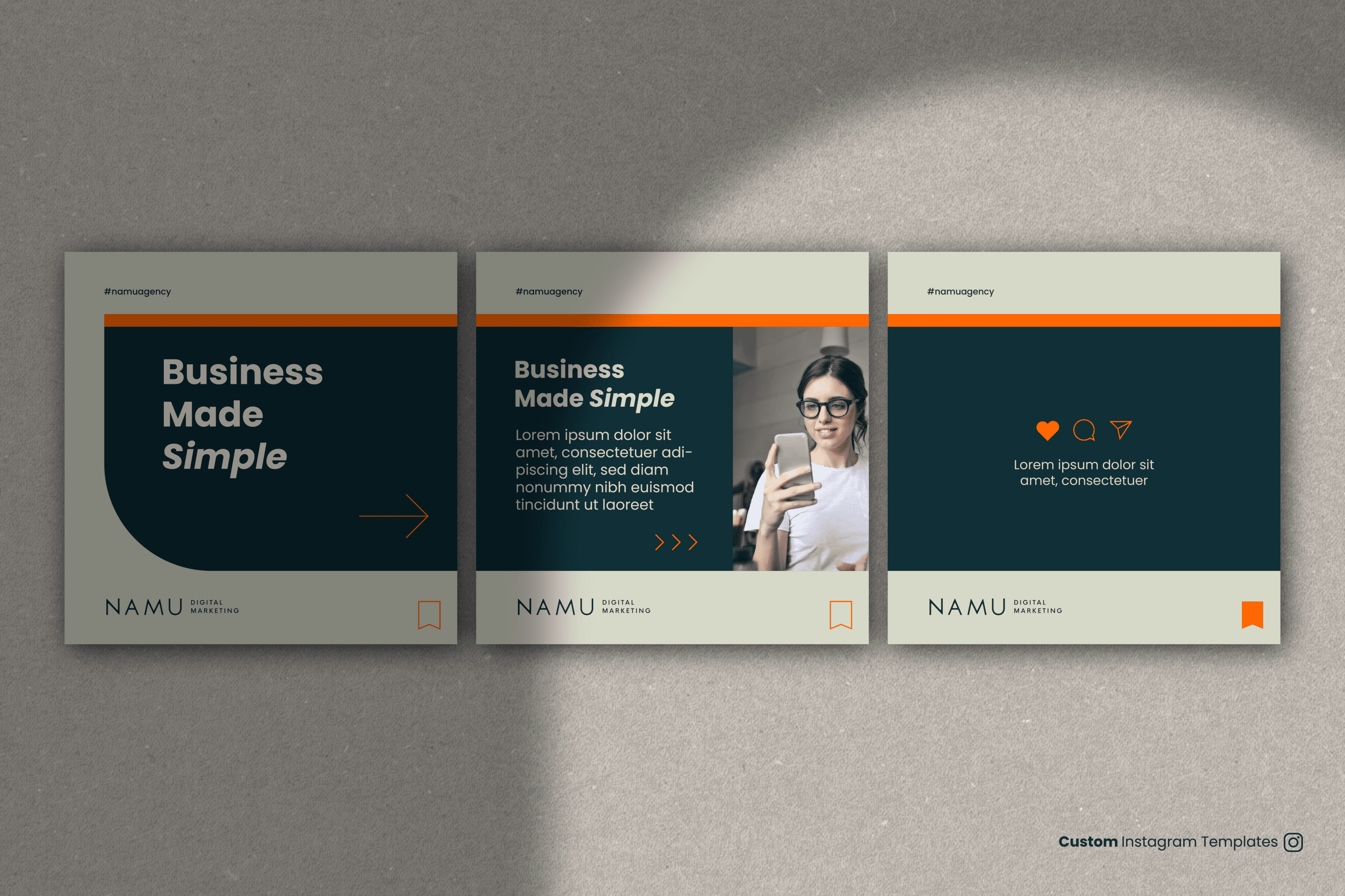
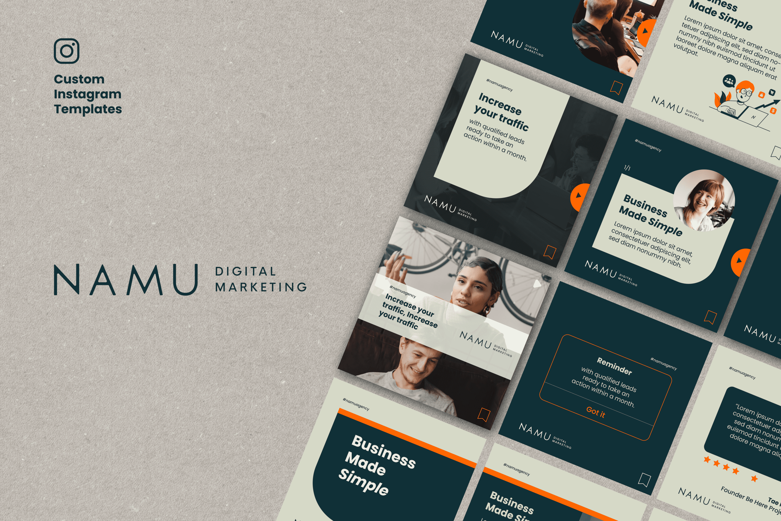
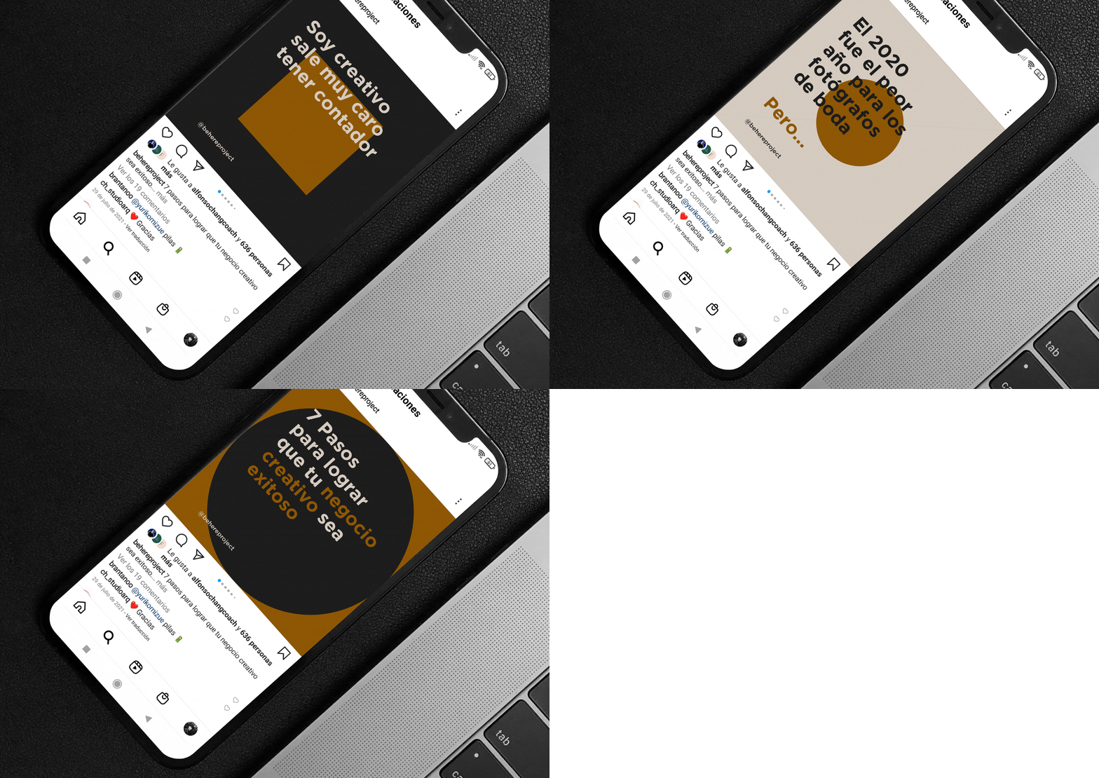
To design a set of Instagram templates that generate a visually coherent structure with our website to share information about NAMU Agency.


The Solution

We have developed a set of 9 user-friendly Instagram templates, allowing for the management of general content or step-by-step processes, aesthetics for videos in the case of interviews, highlighted message posts, and testimonials.

Suggested Projects
Terrenal Resto Bar
Simples Finanzas
Extreme Max
Papita Modelo Fast Food
BRANDING

The Client

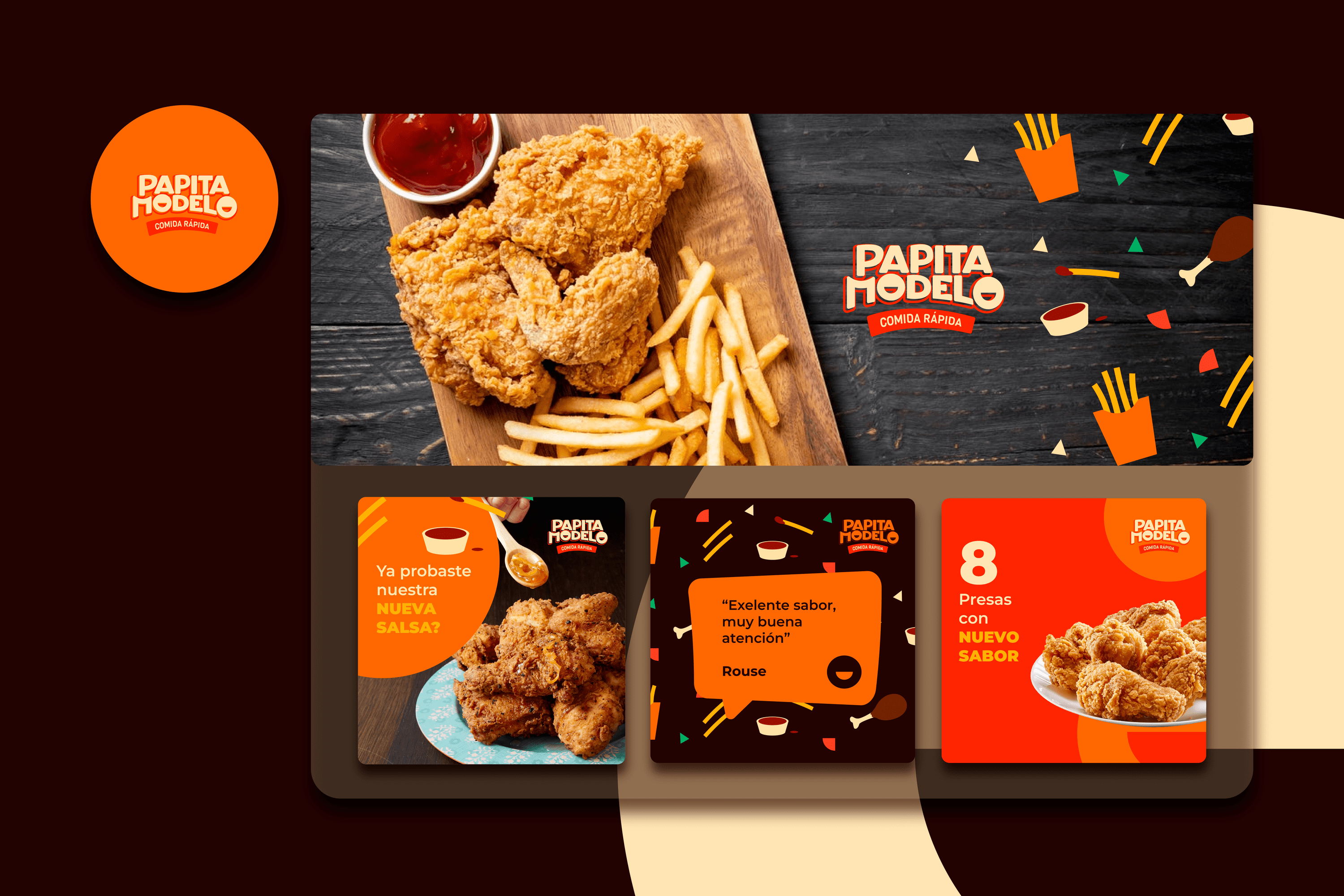
Papita Modelo is a fast food venture in Guayaquil, Ecuador.


Keywords

Branding / Design / Fast Food

The Objective

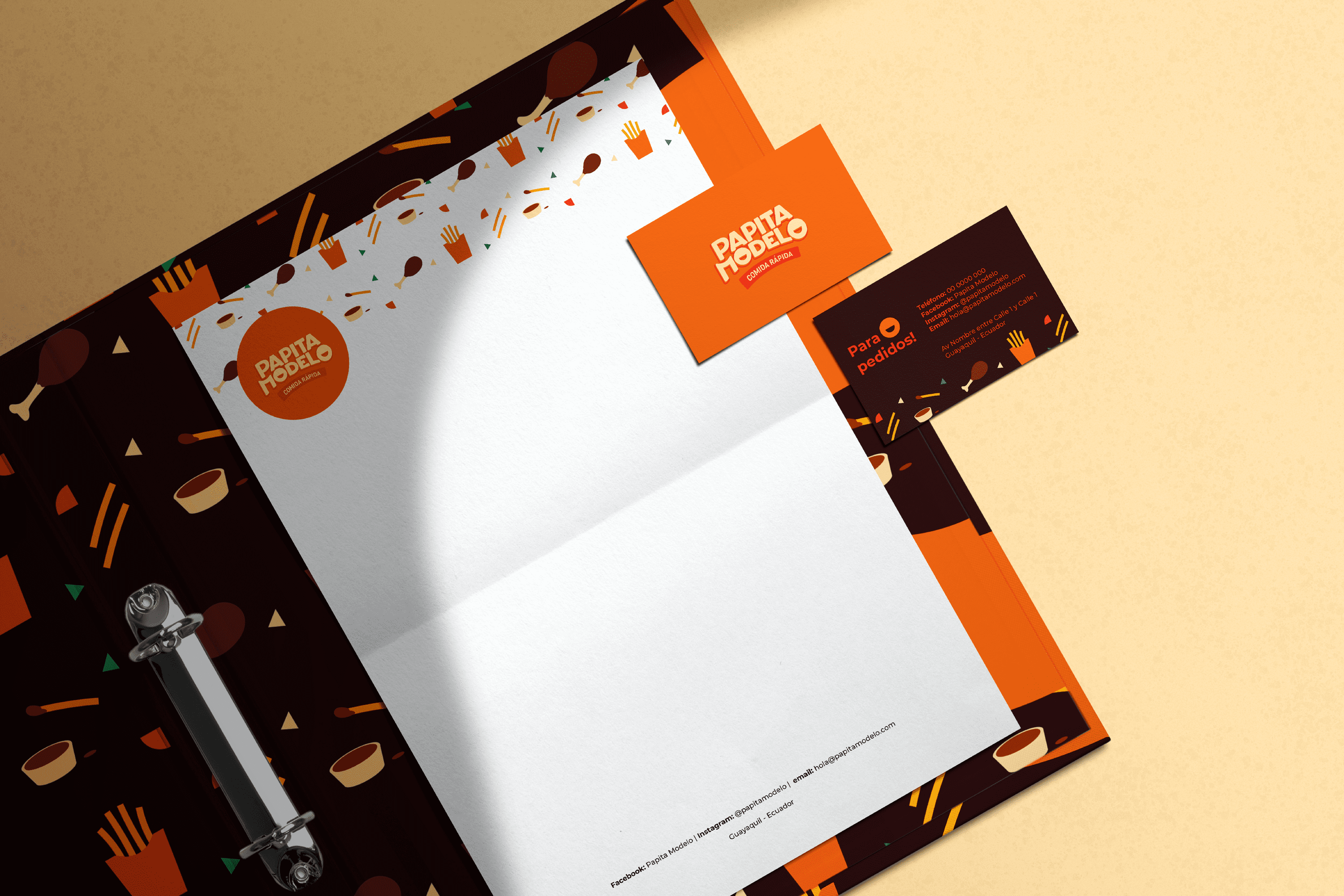
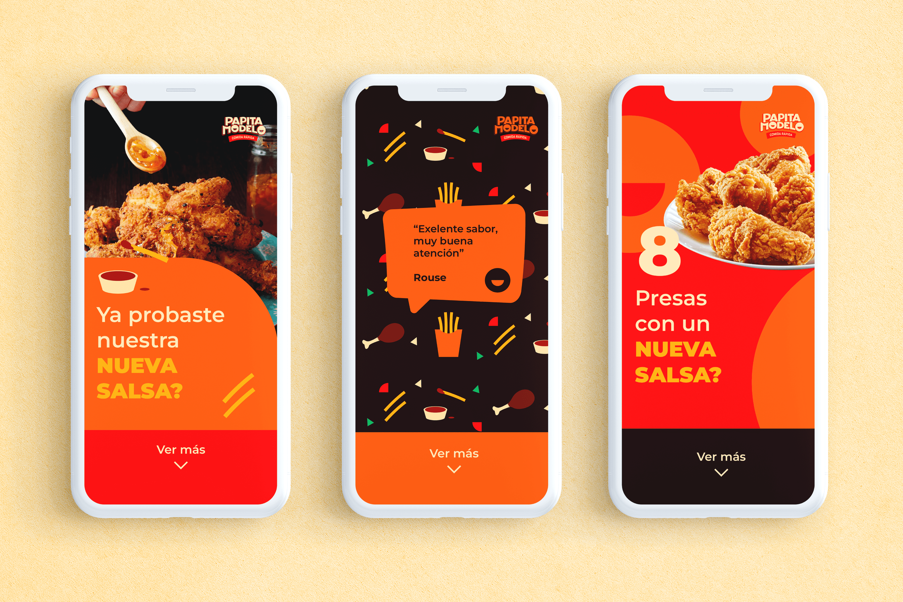
To design a visual identity that is easy recognizable in the sector, with a fun and friendly personality for consumers.


The Solution

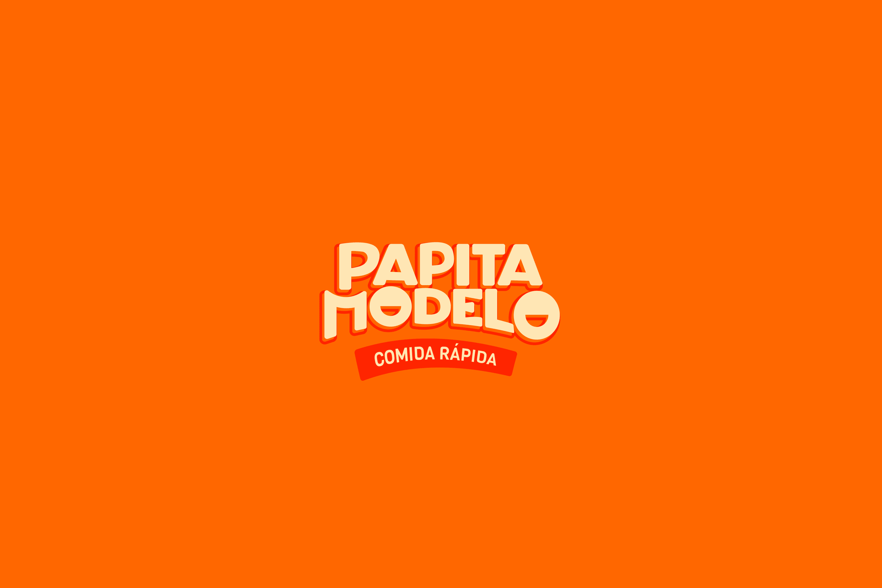
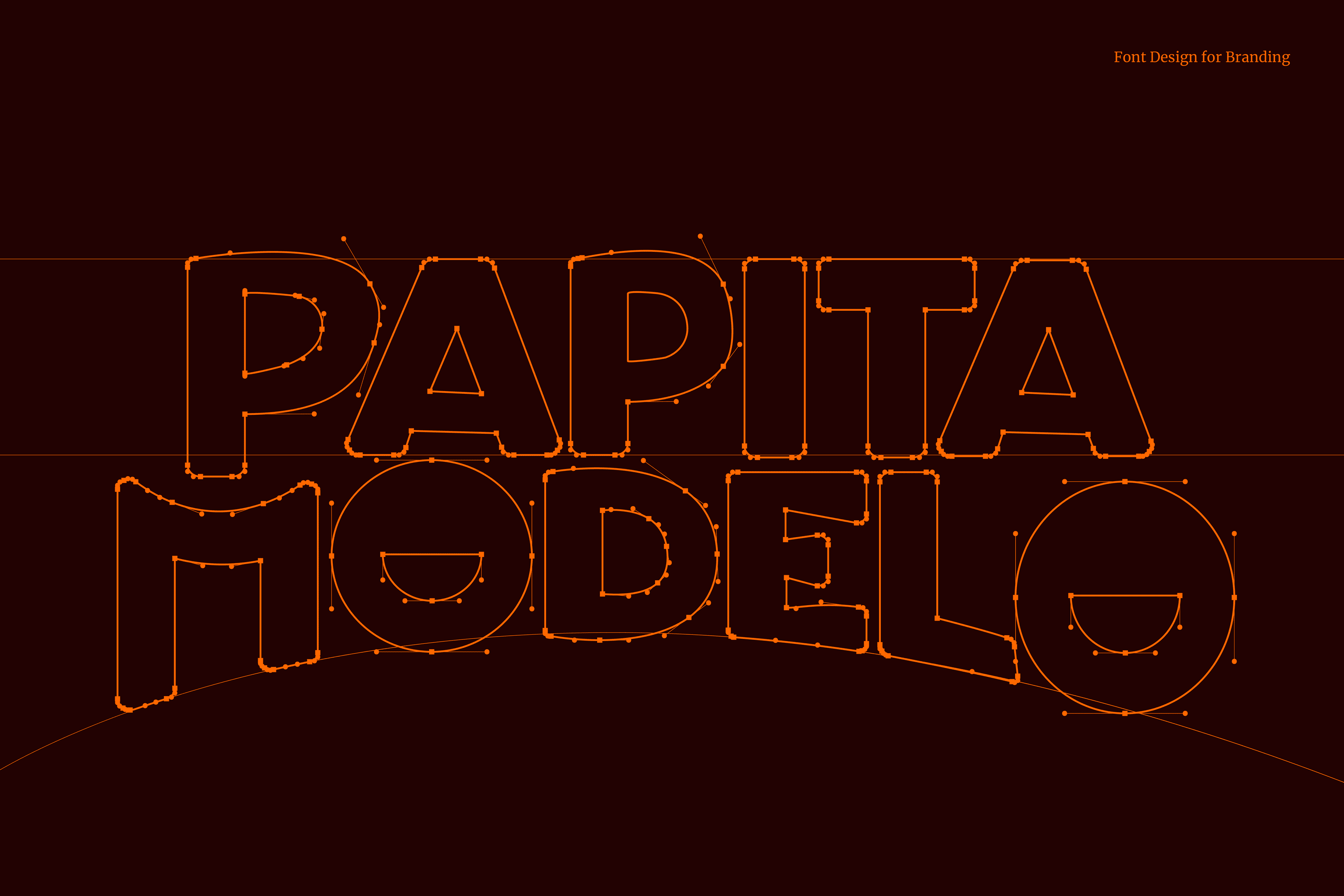
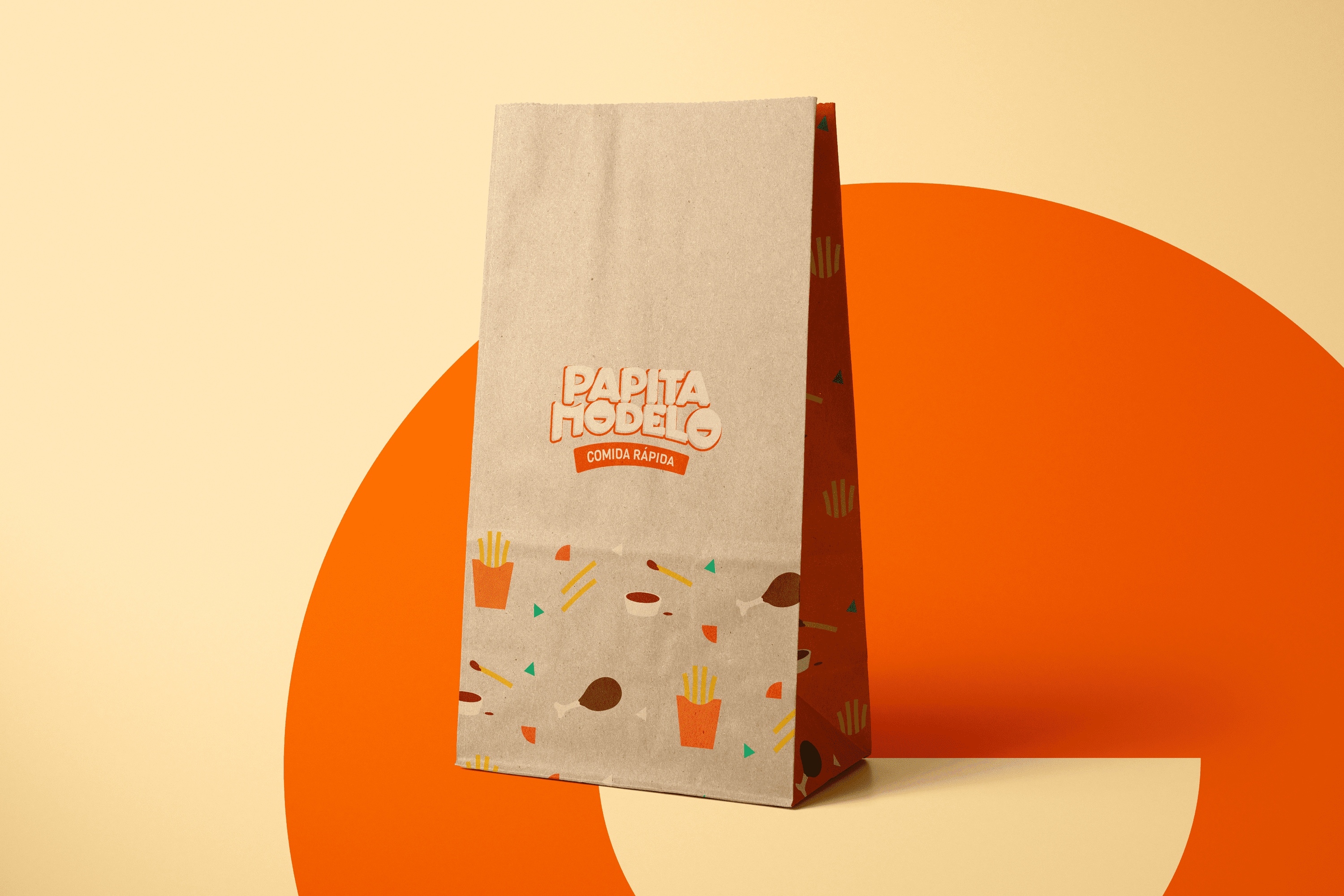
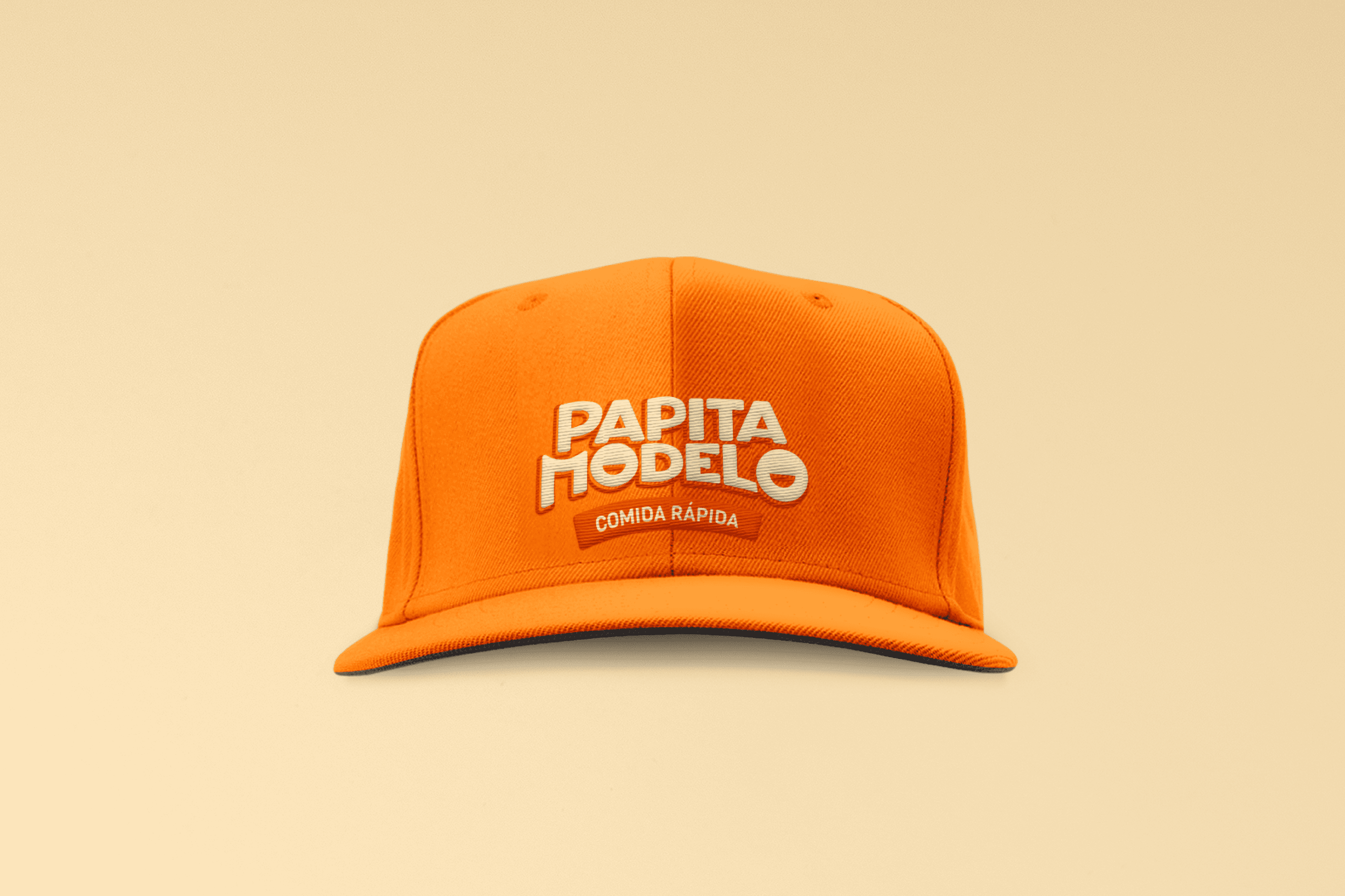
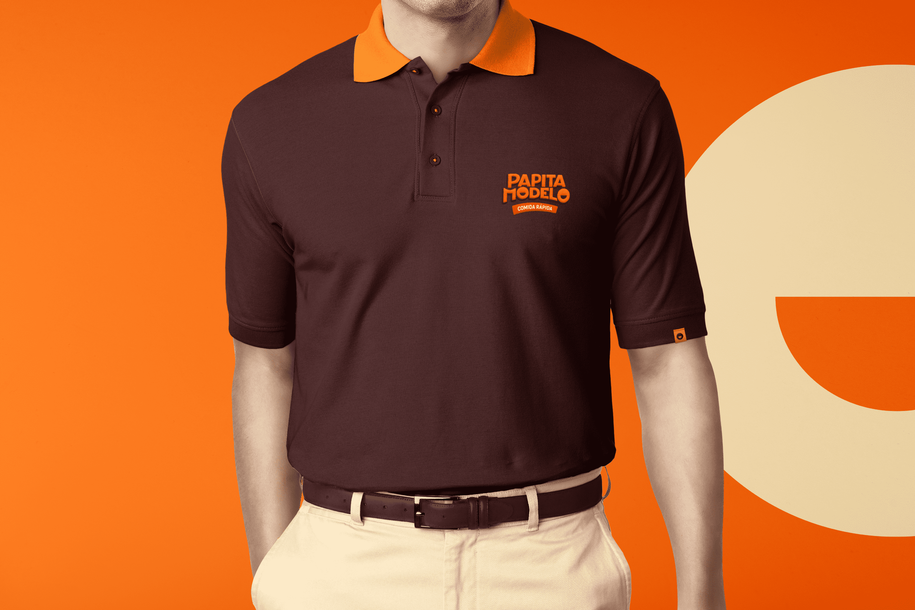
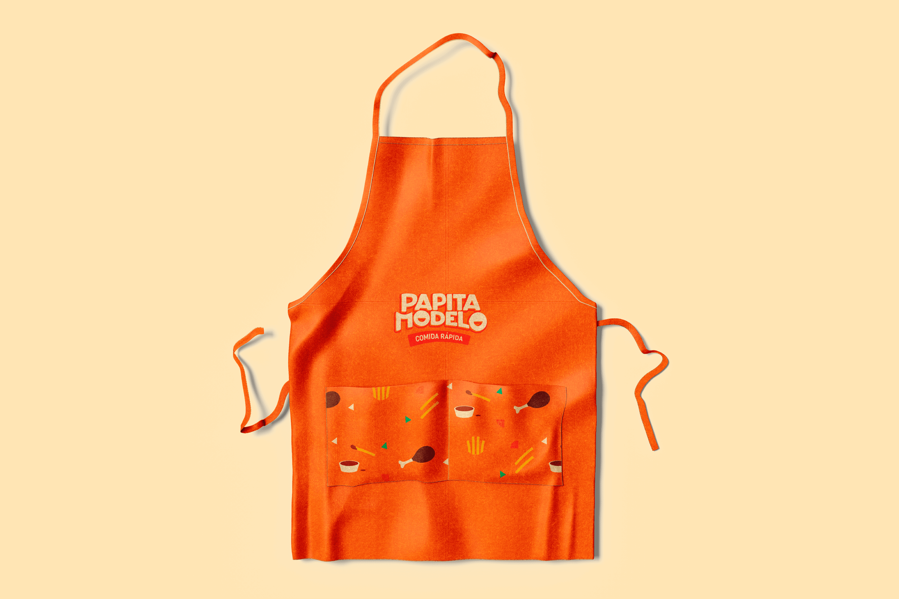
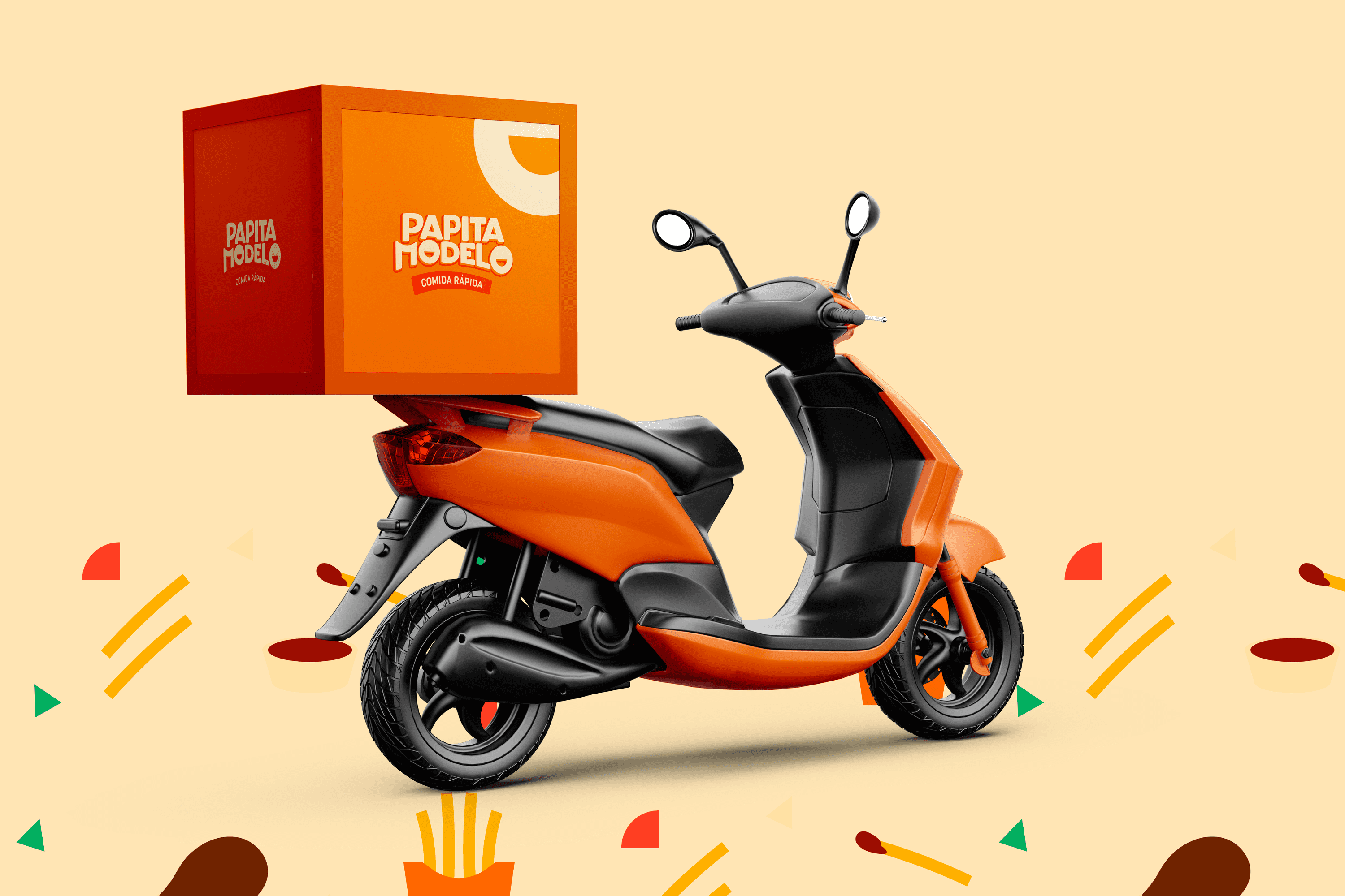
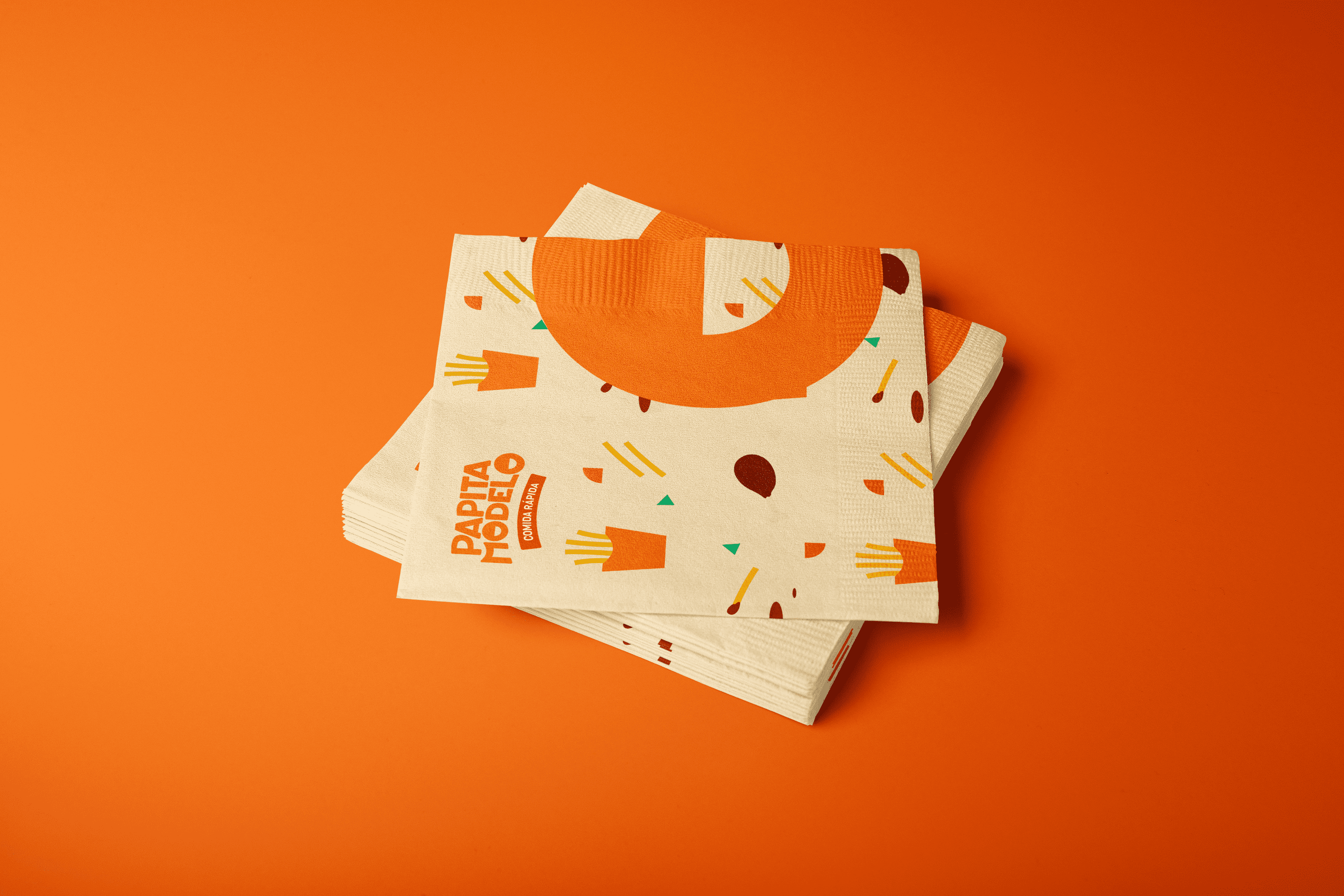
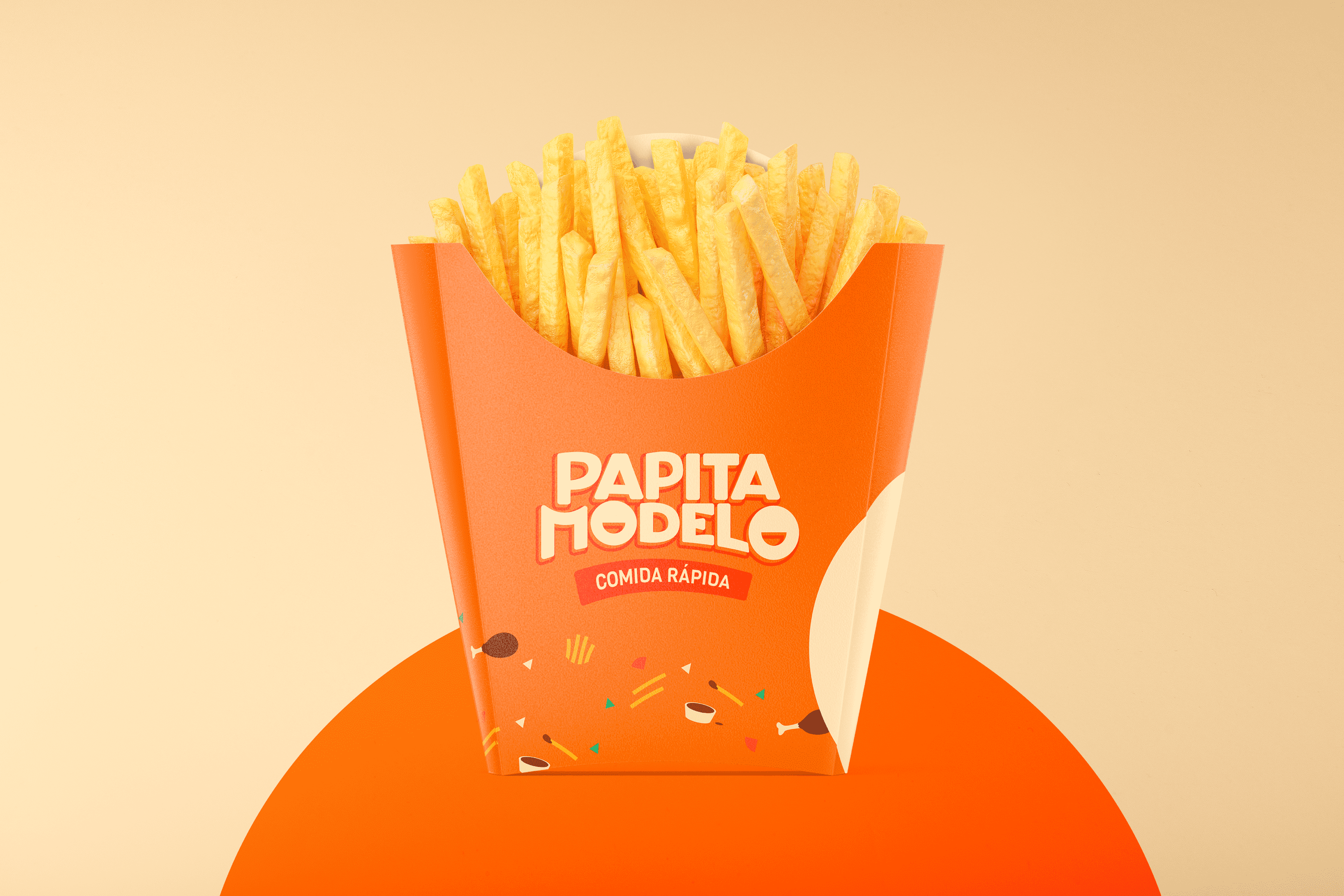
The name chosen for this Establishment is Papita Modelo, which links the neighborhood where it is located with the product, for easy recognition. For the design of Papita Modelo, a youthful and spontaneous typography has been created, a characteristic that is reinforced thanks to the personality of each character, its wide features and the straight line that forms at the top of Papita evoke confidence, at the same time the curved endings both in each character and below Modelo project friendliness; but the most distinctive feature of this logo is the smile drawn in its O this alludes to the joy that is felt after eating and the flavor of Papita Modelo.

The color is directly linked to the fast food sector and the optimistic and fun personality of the brand. As an interesting fact, the thickness of the potatoes was taken as a reference to design this typography.

Suggested Projects
Terrenal Resto Bar
Simples Finanzas
Extreme Max
JM Services and Foods
BRANDING

The Client

JM Services and Foods is a family company that was born 16 years ago, dedicated to the commercialization of vegetables and mushrooms to restaurants, hotels, sub-distributors and end consumers, located in the city of Quito, Ecuador.


Keywords

Branding / Design / Industry / Foods

The Objective

To redesign the JM Services & Foods brand and develop a visual system with a fresh, modern, and easily recognizable personality, allowing us to reach a more selective market.


The Solution

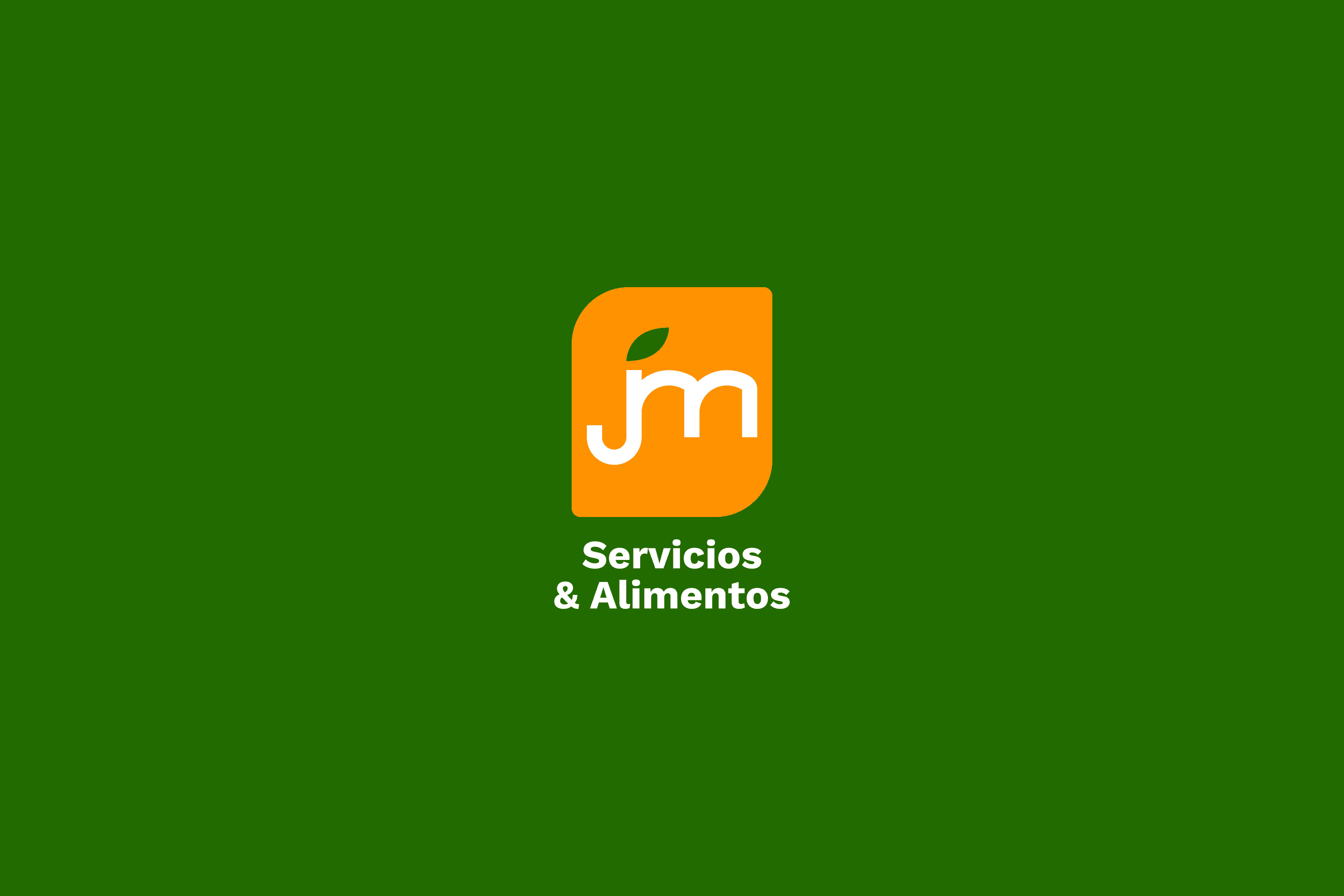
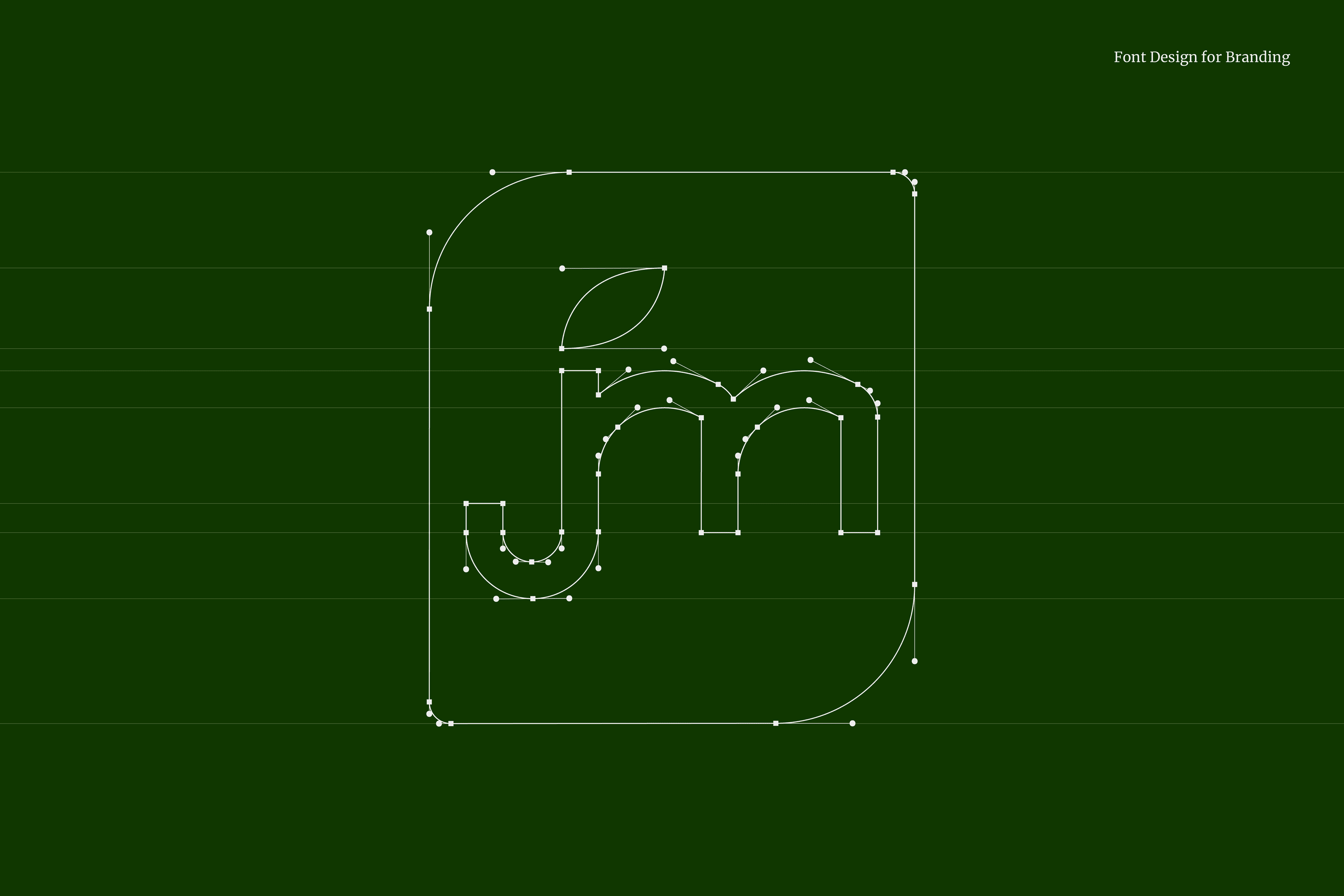
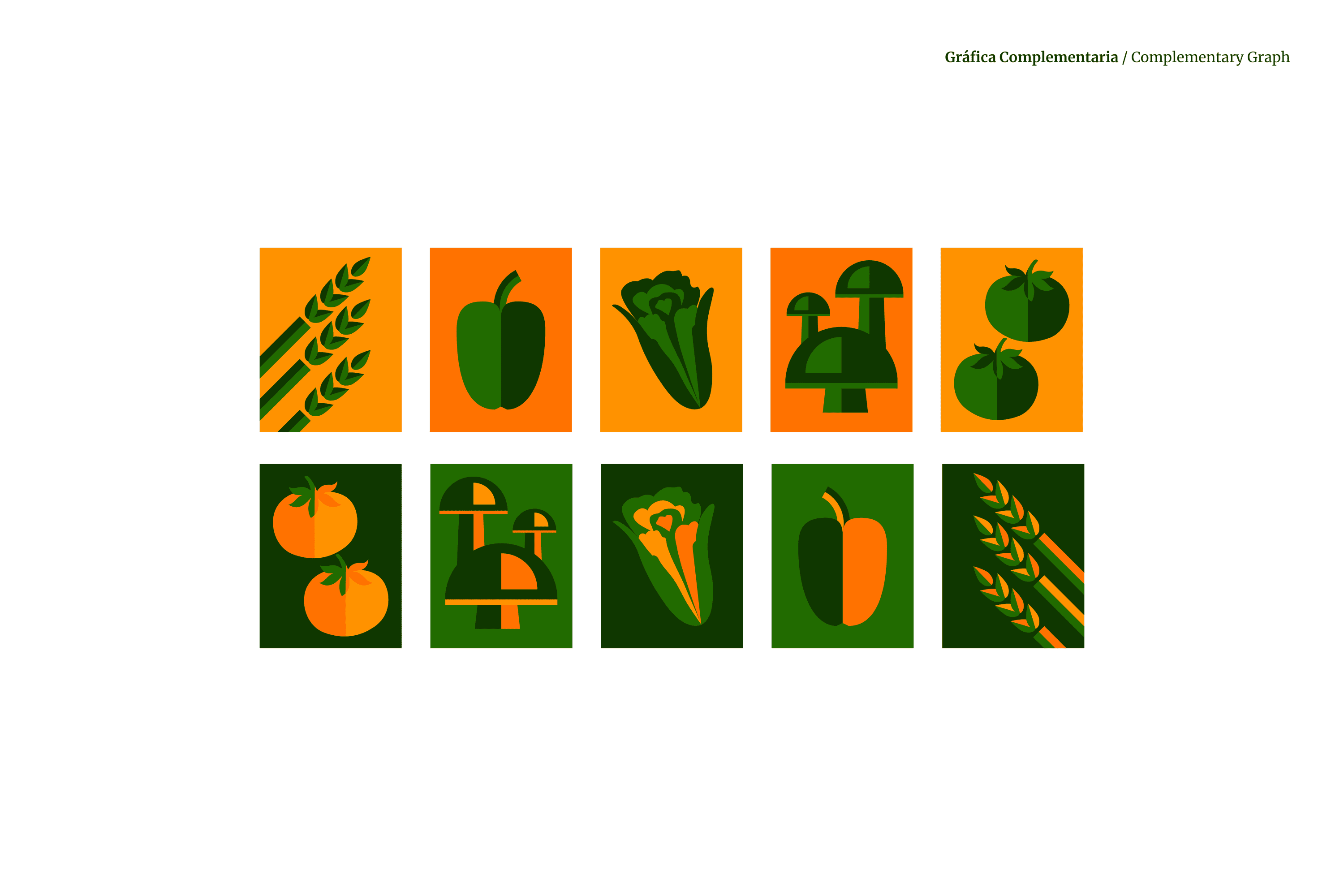
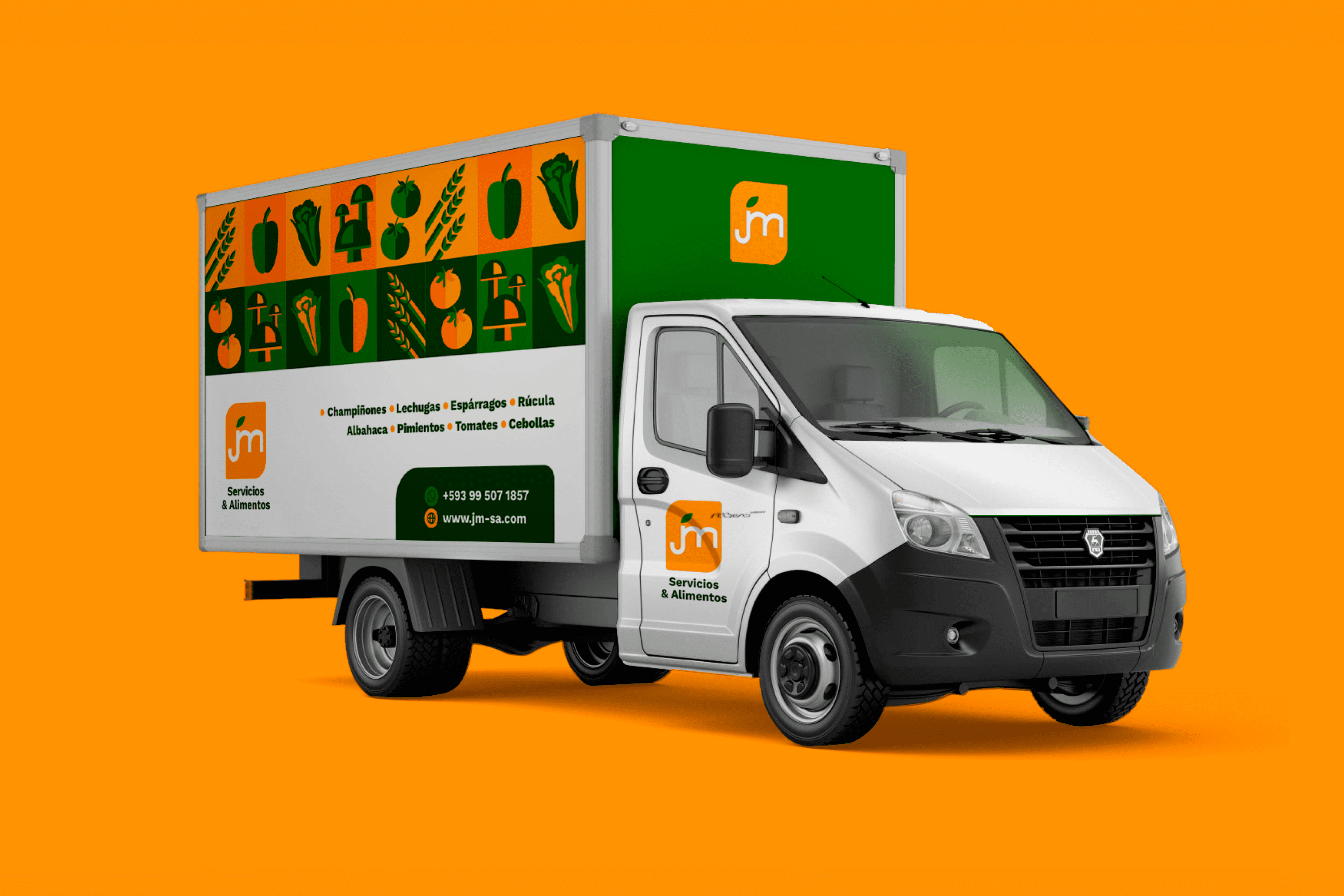
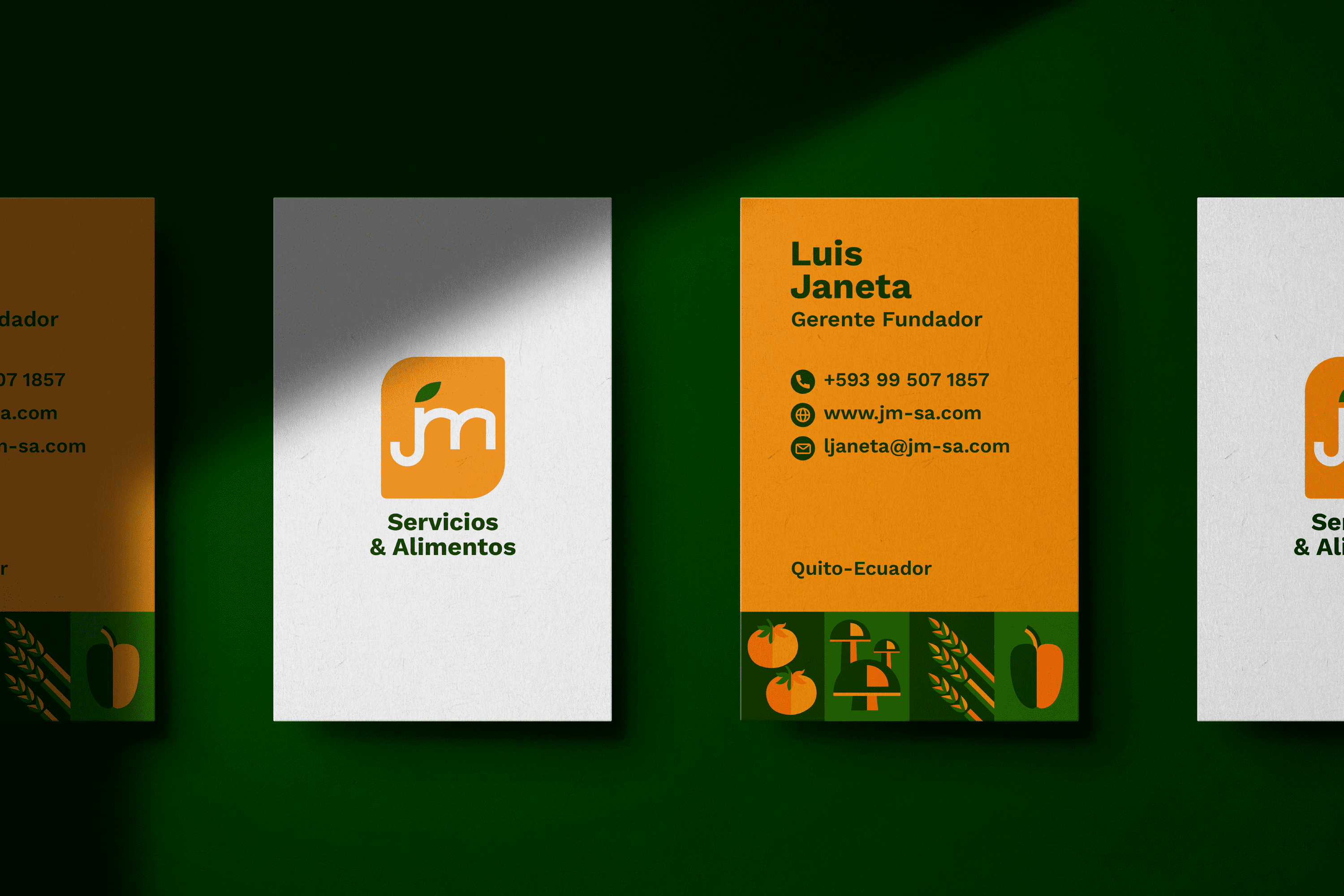
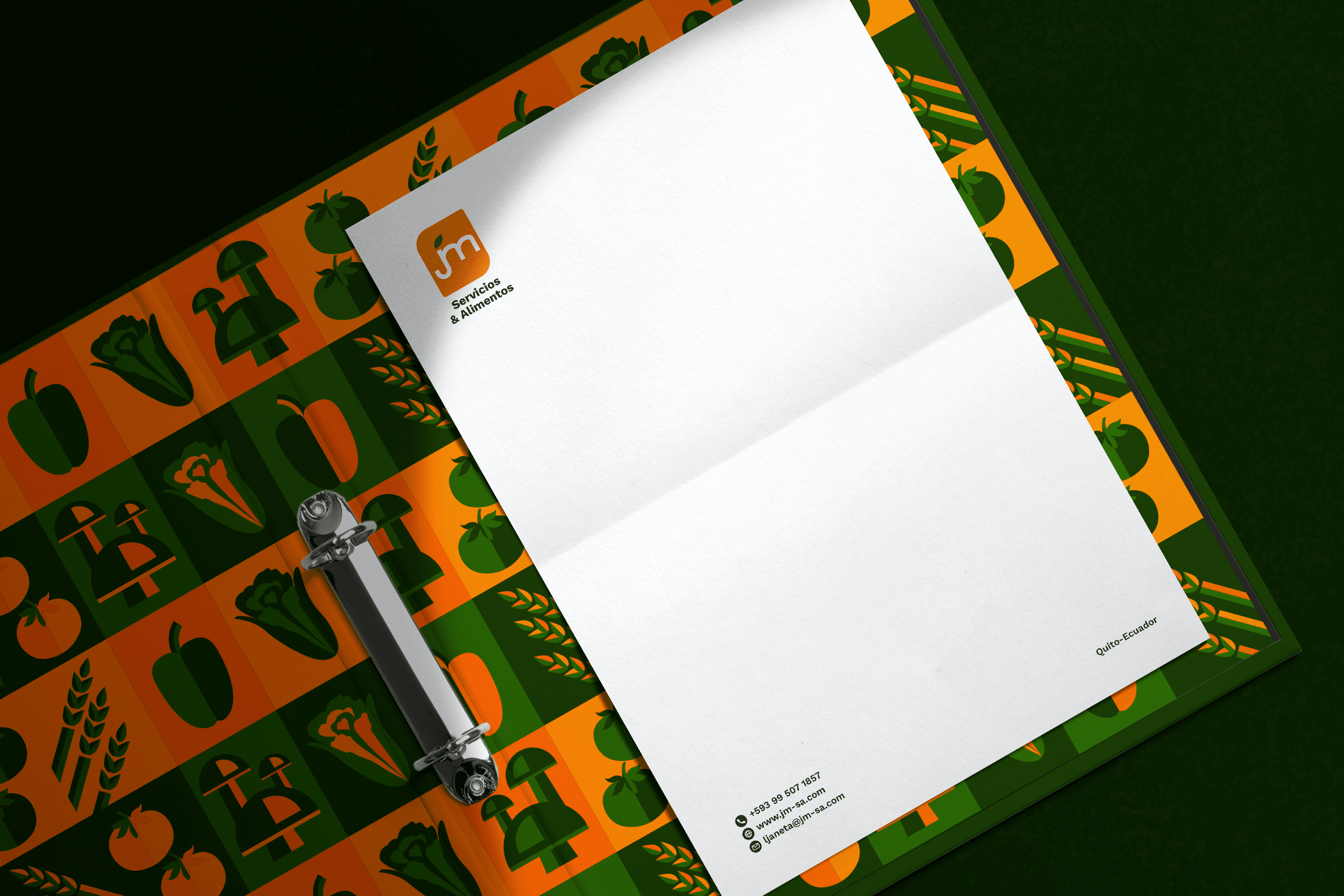
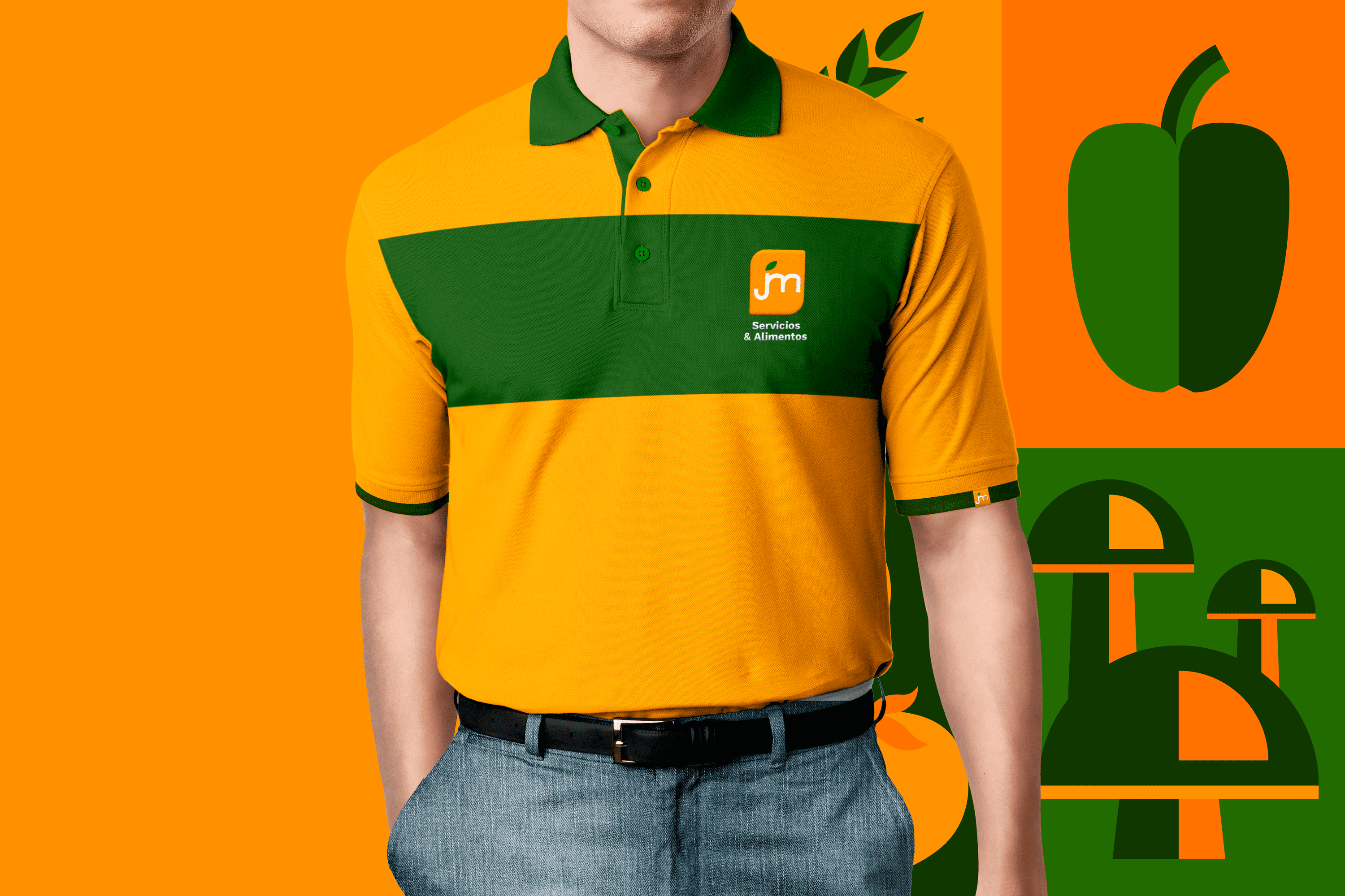
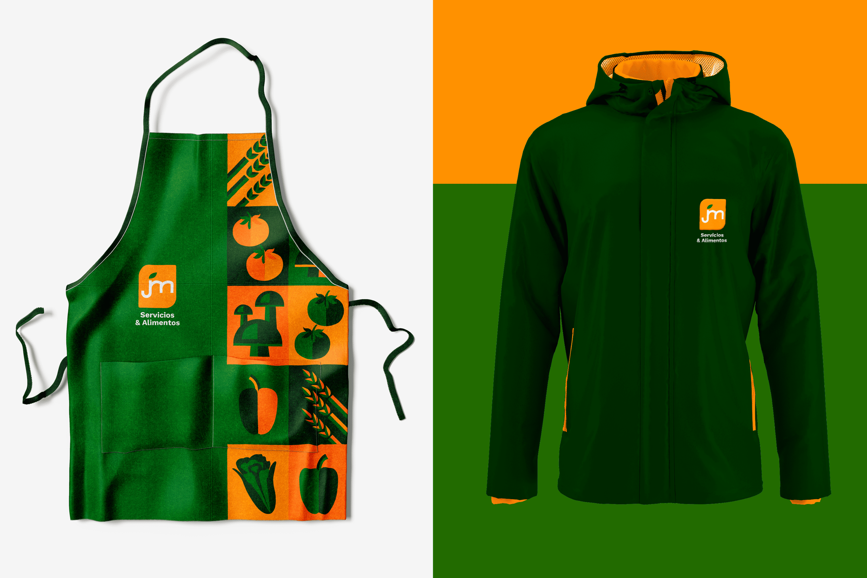
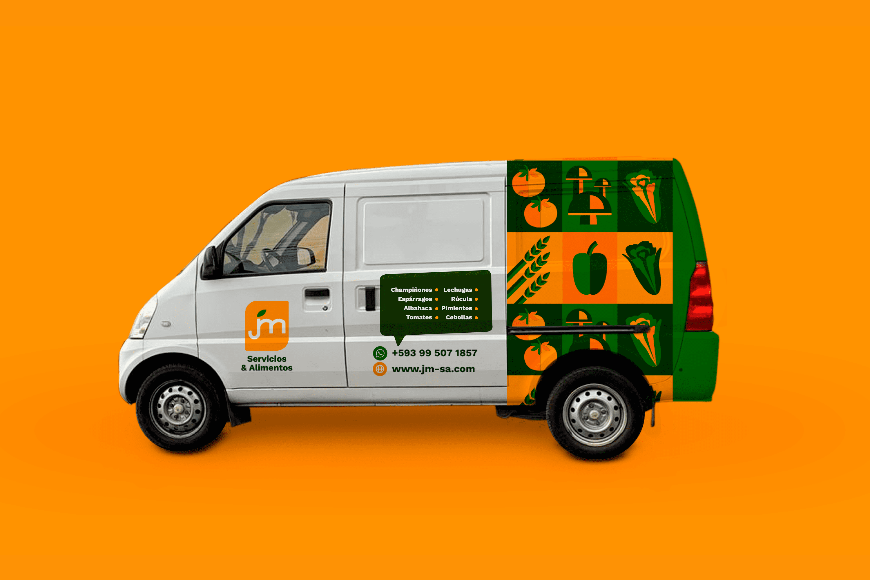
The iconic and typographic parts come together to represent the diversity of food products distributed by JM Services & Foods, inscribed in a rectangular area with rounded corners to communicate protection of JM’s products and trust in both their services and products.

The selected color palette features orange that conveys vitality, friendliness, and closeness. On the other hand, the range of greens represents in color psychology: health, naturalness, freshness, fertility, organic and abundance, qualities that strengthen the identity of JM Services & Foods.

Suggested Projects
Terrenal Resto Bar
Simples Finanzas
Extreme Max
Mansion Santa Isabella
PHOTOGRAPHY

The Client

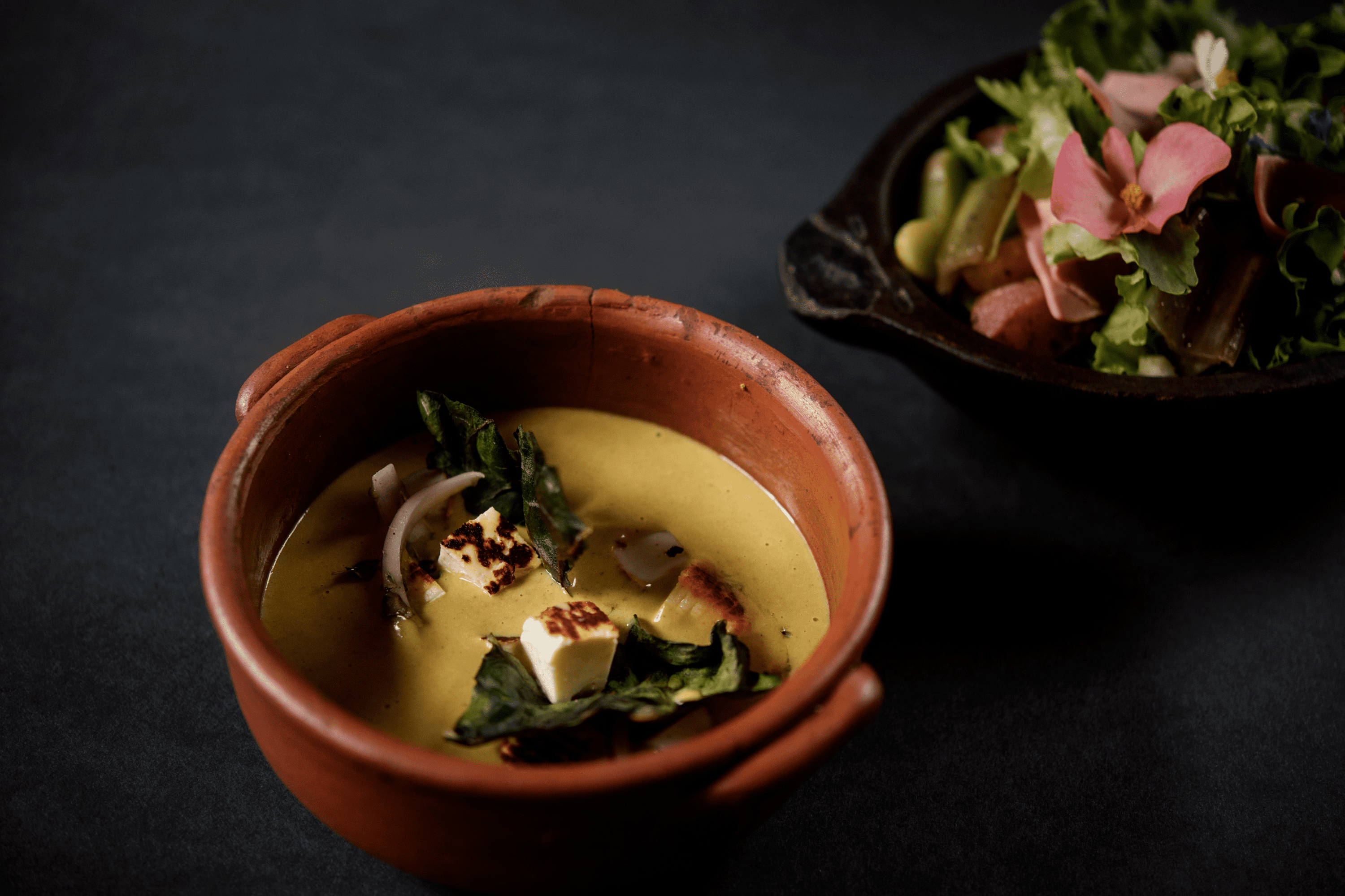
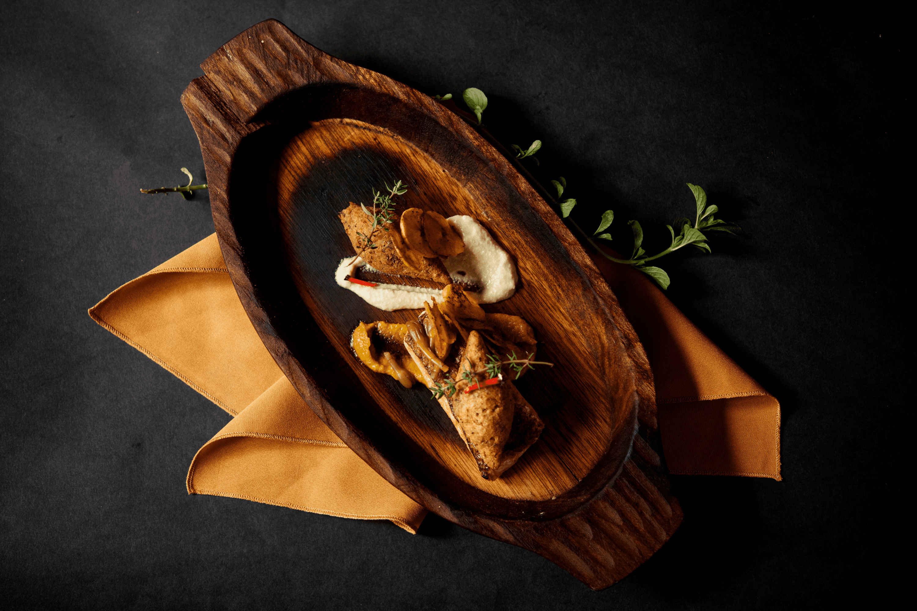
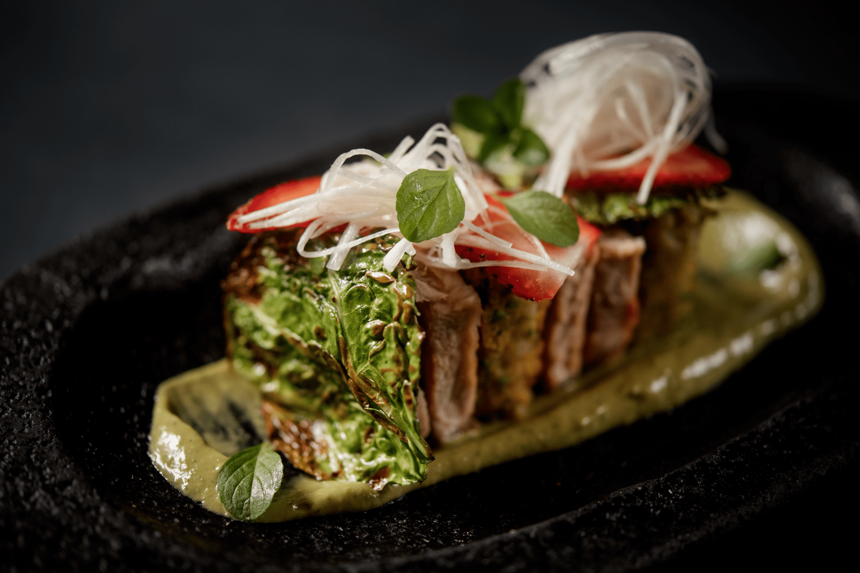
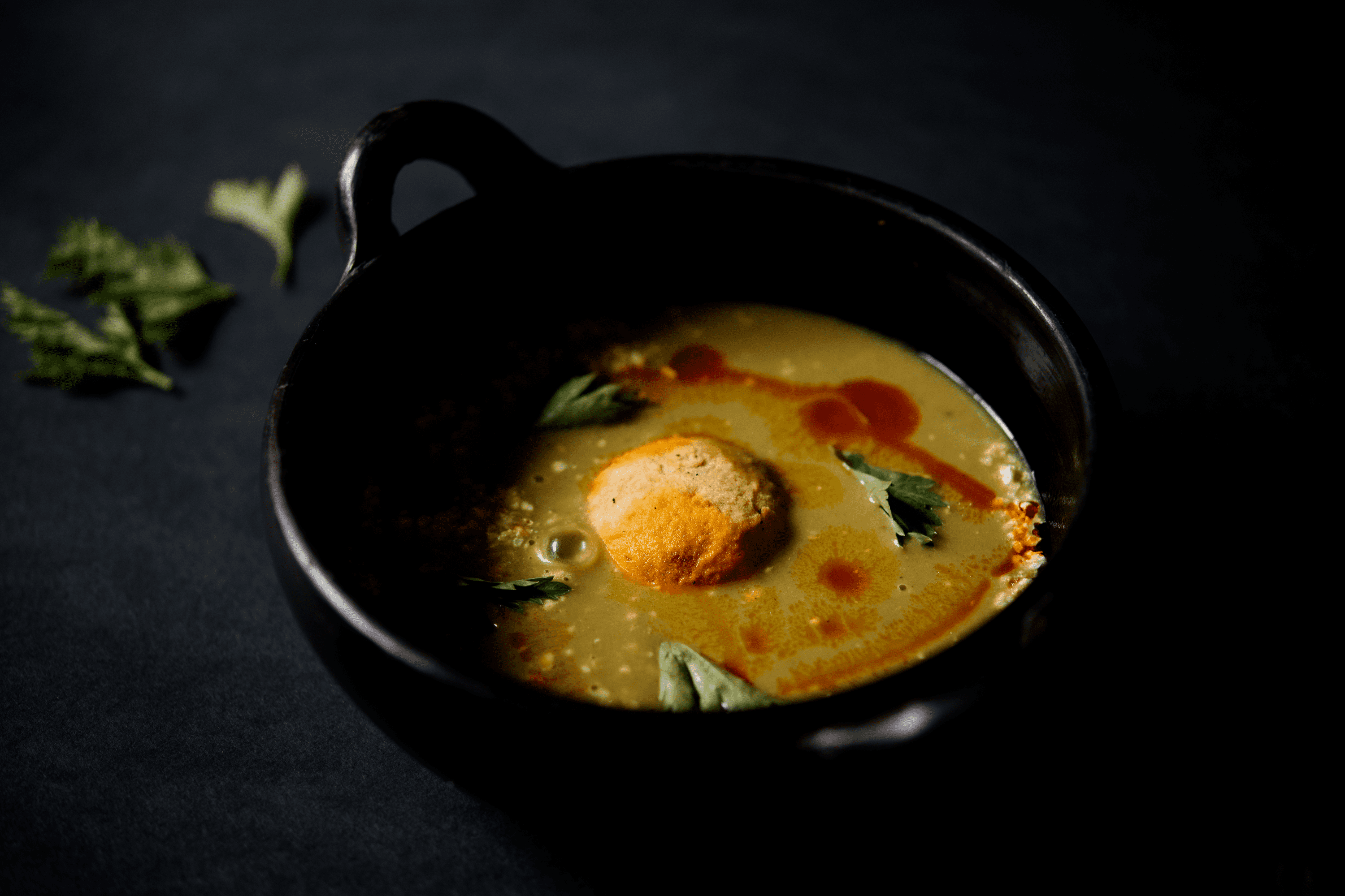
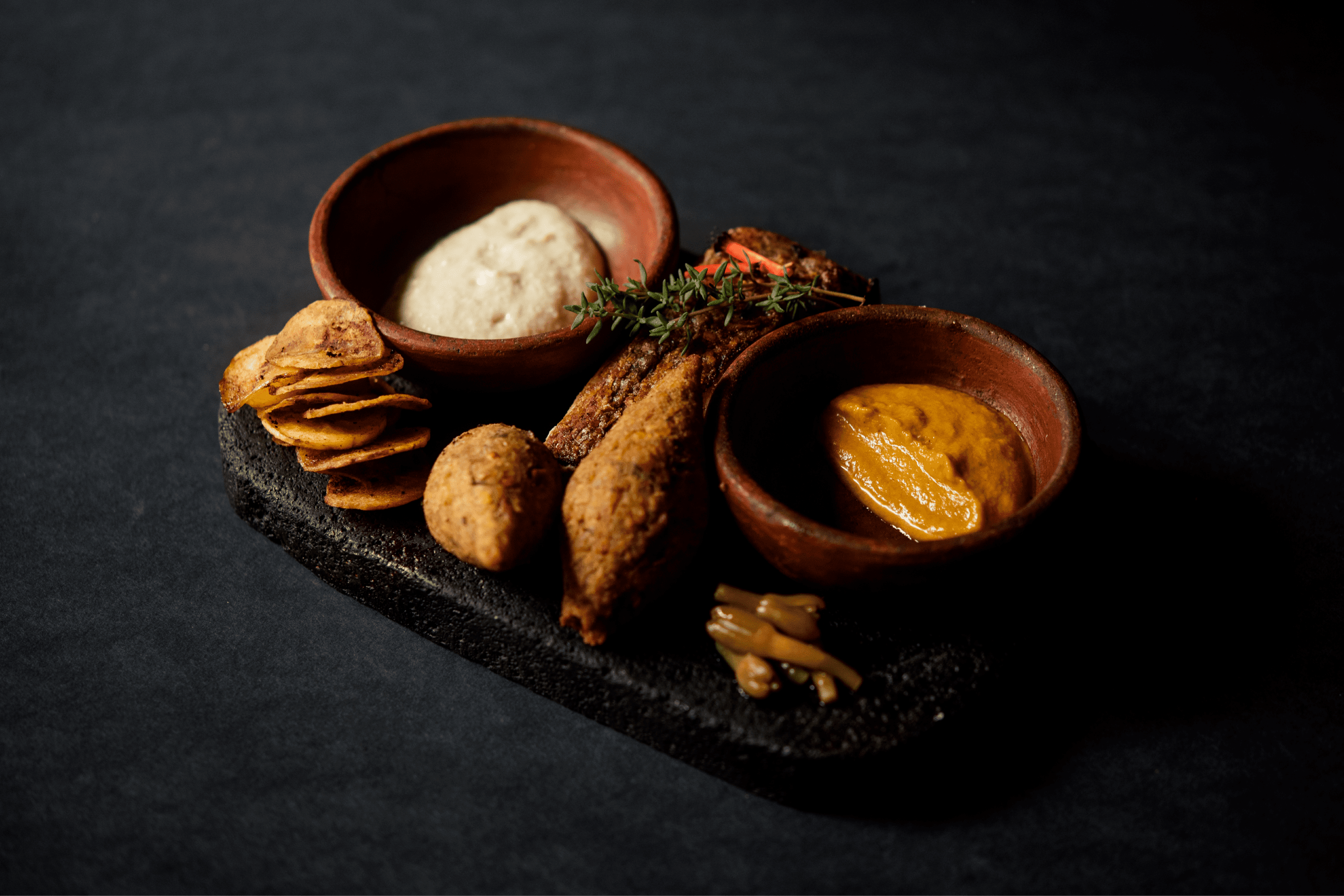
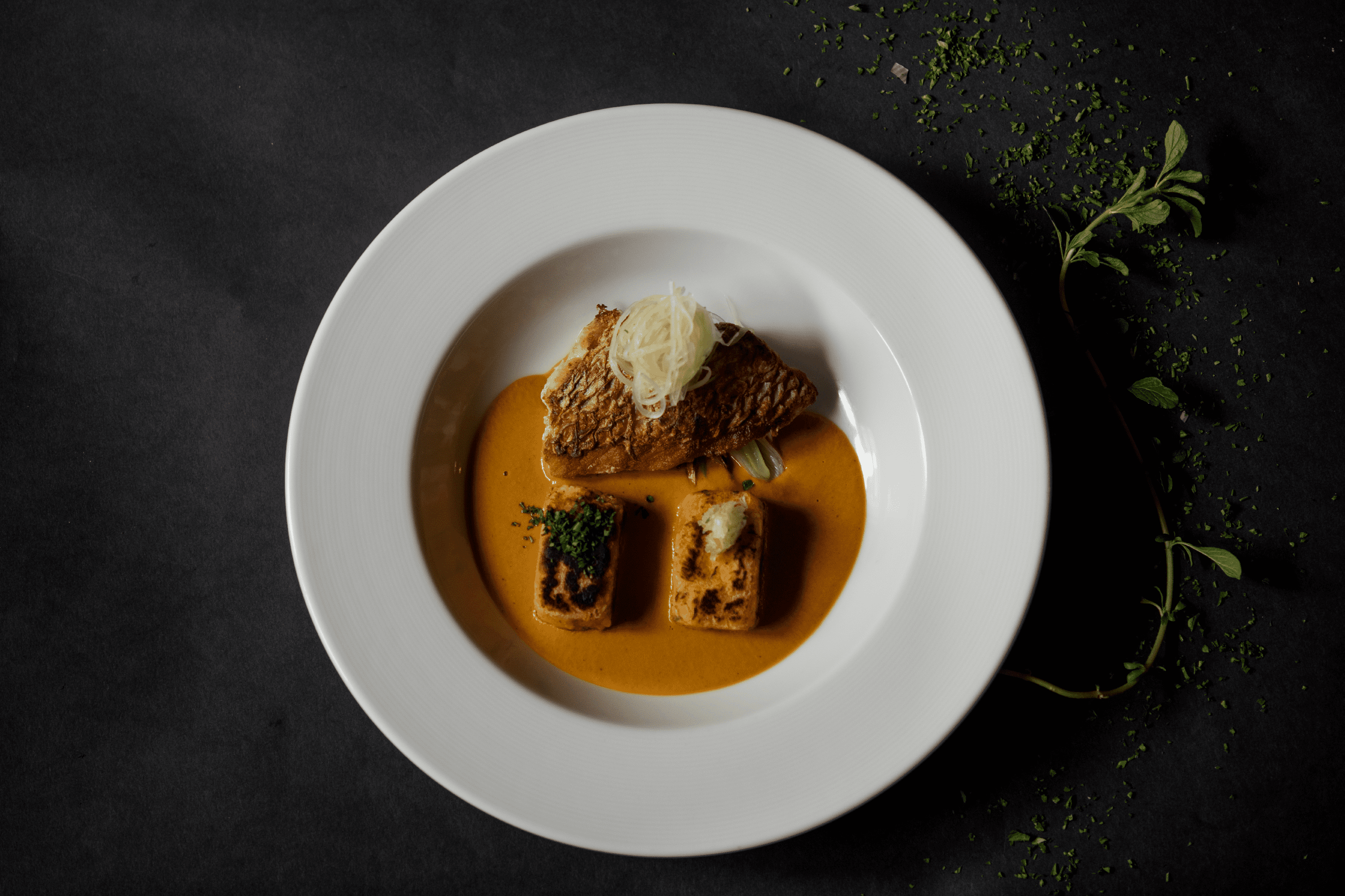
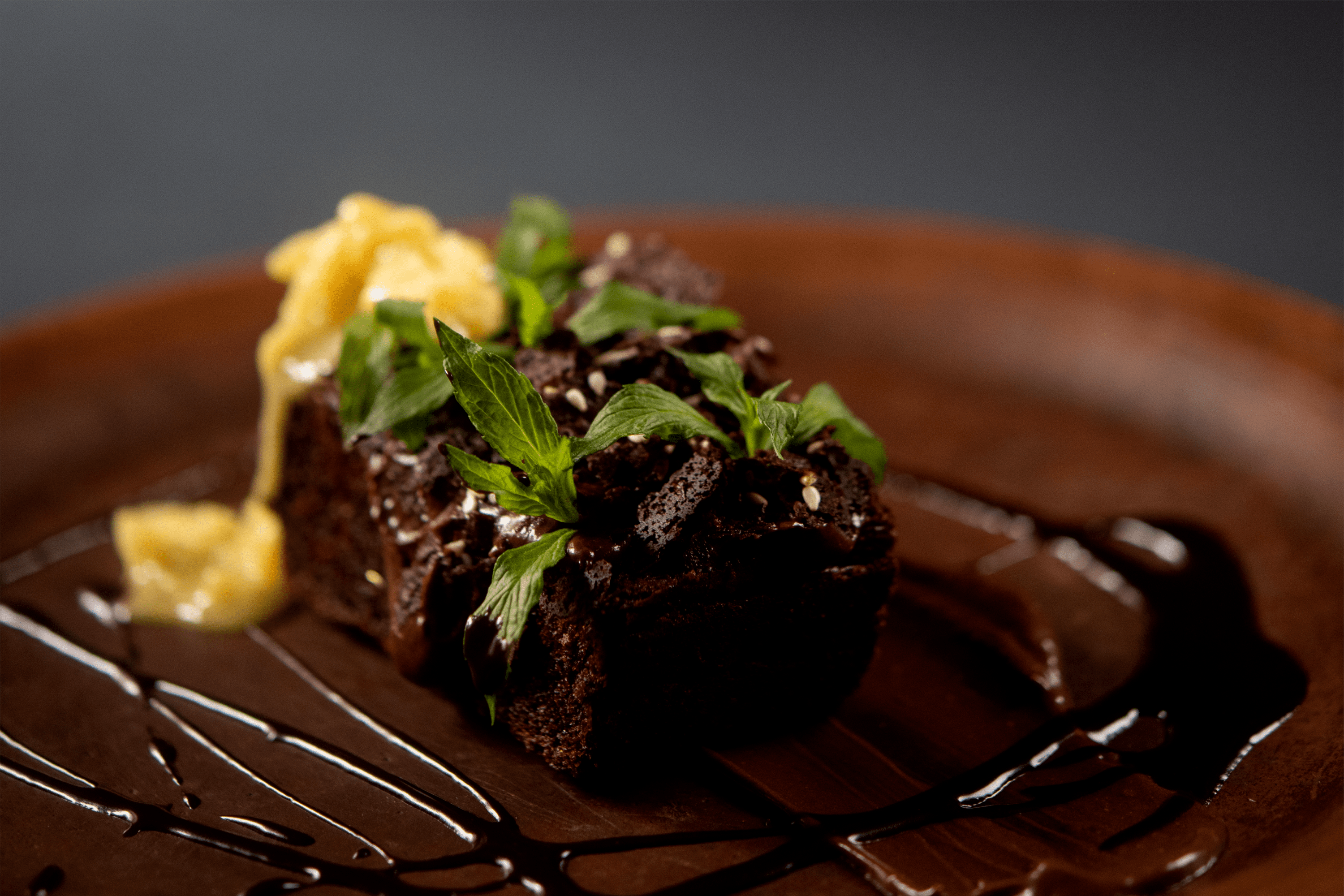
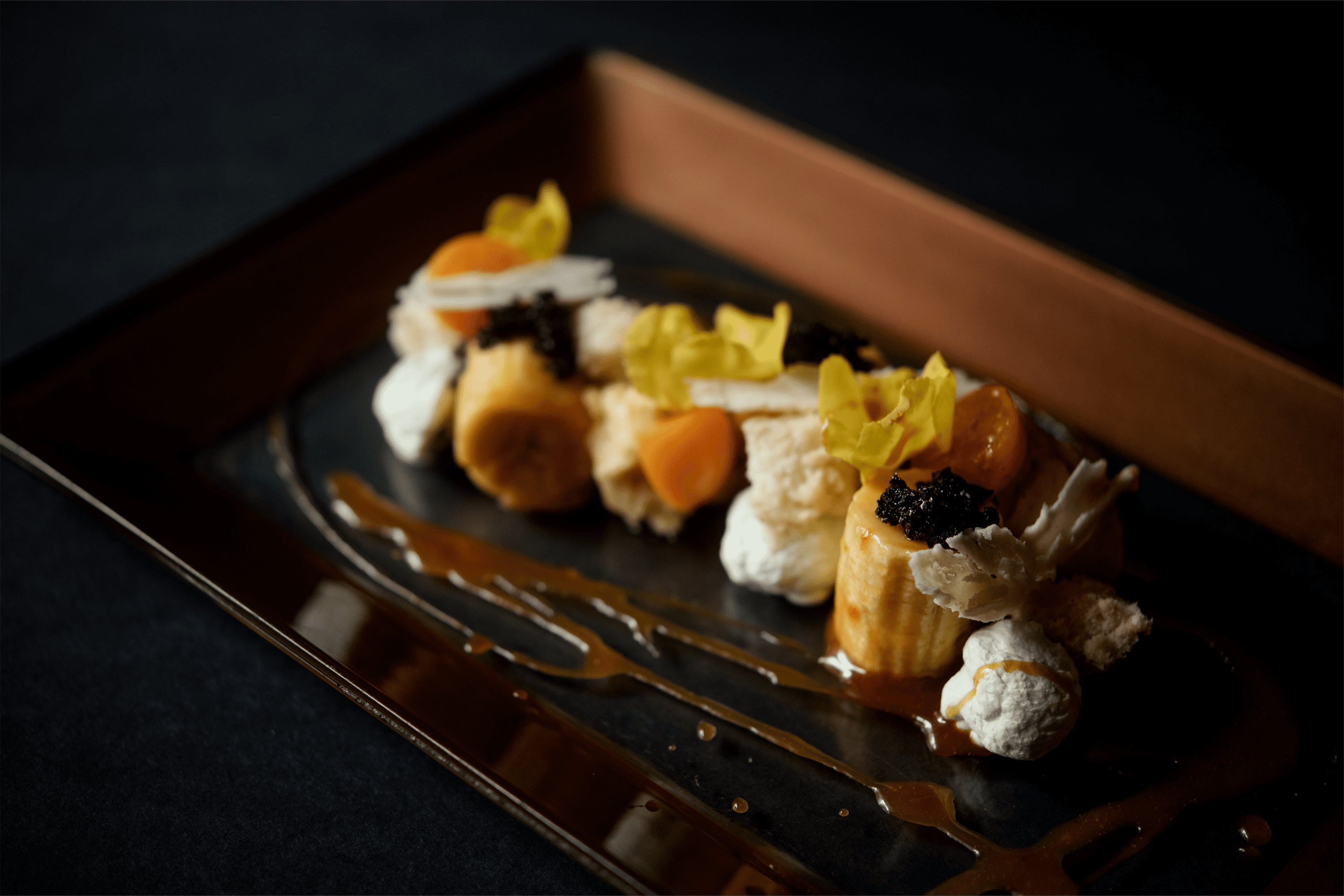
La Masión Santa Isabella is a Boutique Spa Hotel, which mixes modern comforts with historical and ancestral elements. It opened its doors in 2007 in Riobamba, Ecuador with the aim of providing guests with a space for well-being and reconnection. The Mansion has merged with Shamuico an author cuisine restaurant located in Saraguro, Ecuador, whose dishes value local products and care for the environment. Their combinations are traditional and healthy bites for visitors.


Keywords

Photography / Hotel / Restaurant / Gastronomy

The Objective

Capture the gastronomic and artistic essence of the author cuisine of the Shamuico Restaurant.


The Solution

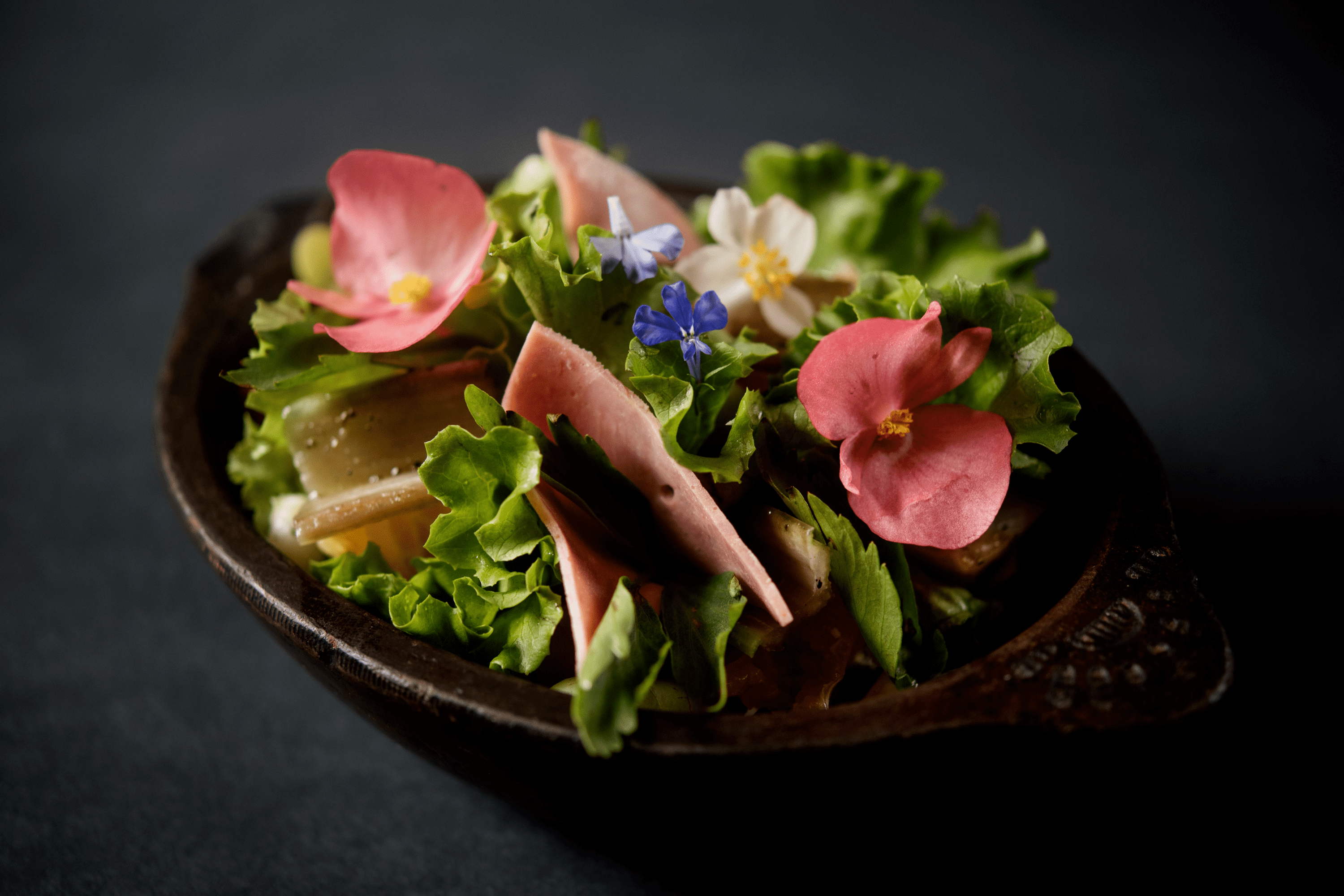
Each dish has its own essence, in these photographs the light and shadow were used to highlight the textures present in each gastronomic composition, the dark backgrounds related to stone speak of an origin and allow the vibrant colors of the ingredients to stand out.

Suggested Projects
Terrenal Resto Bar
Simples Finanzas
Extreme Max
Be Here Project
BRANDING

The Client

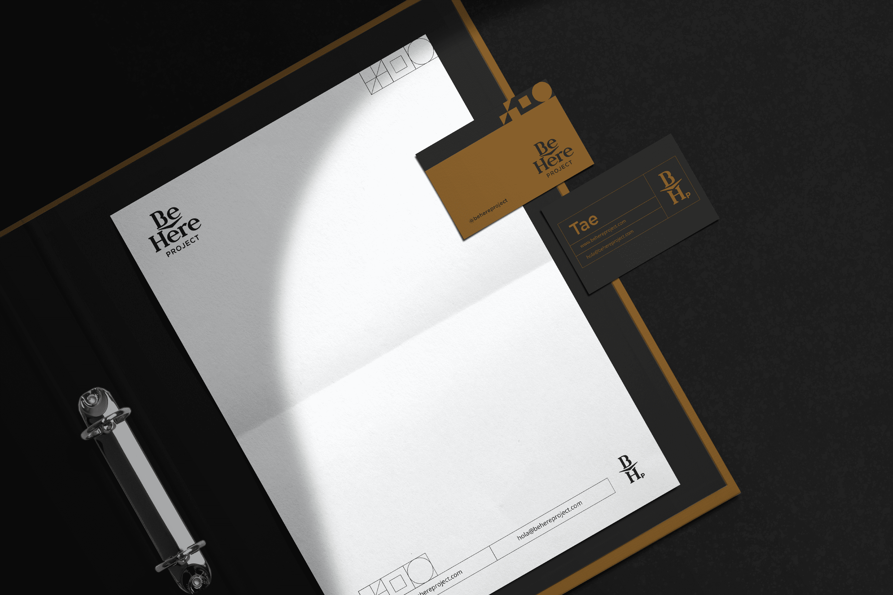
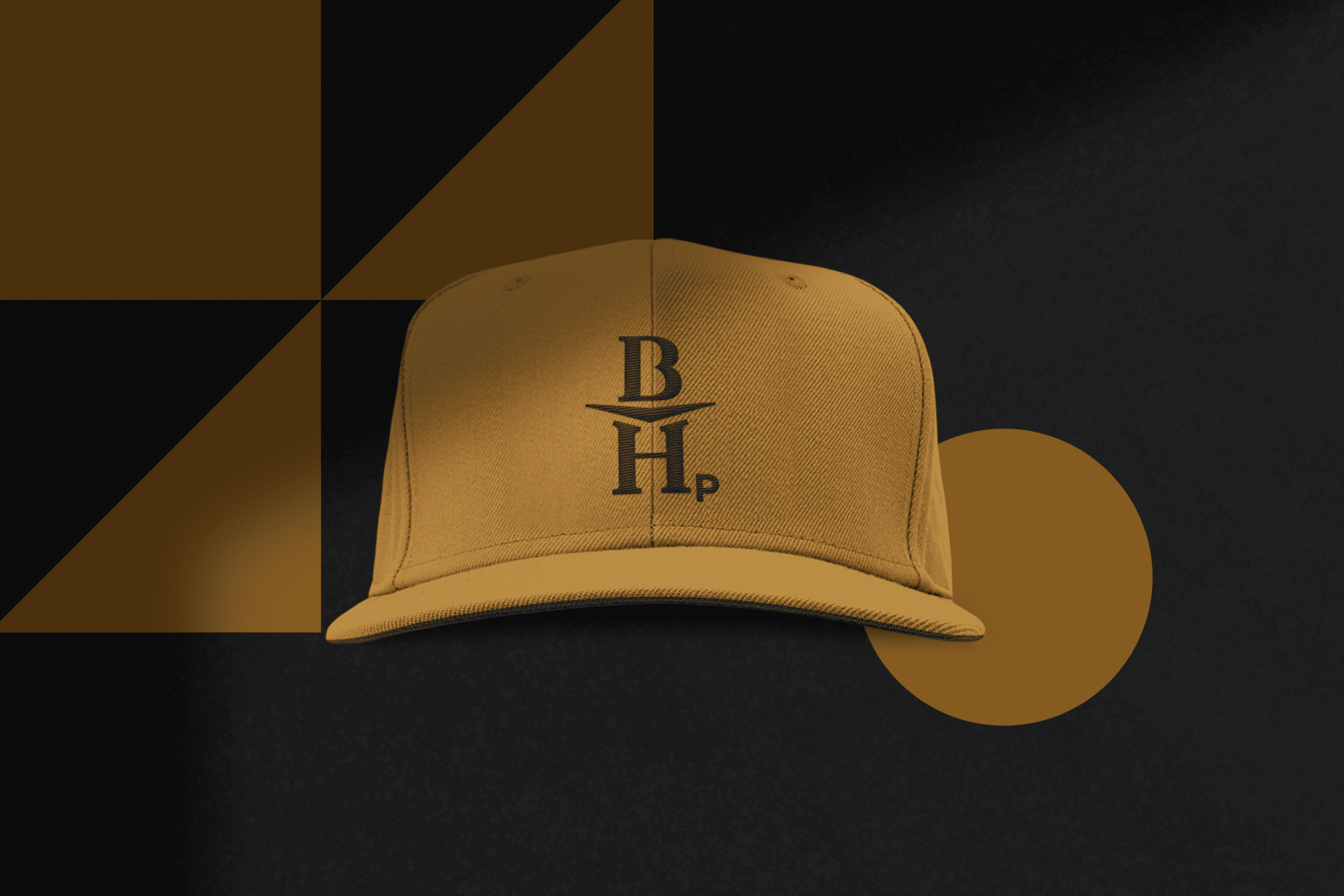
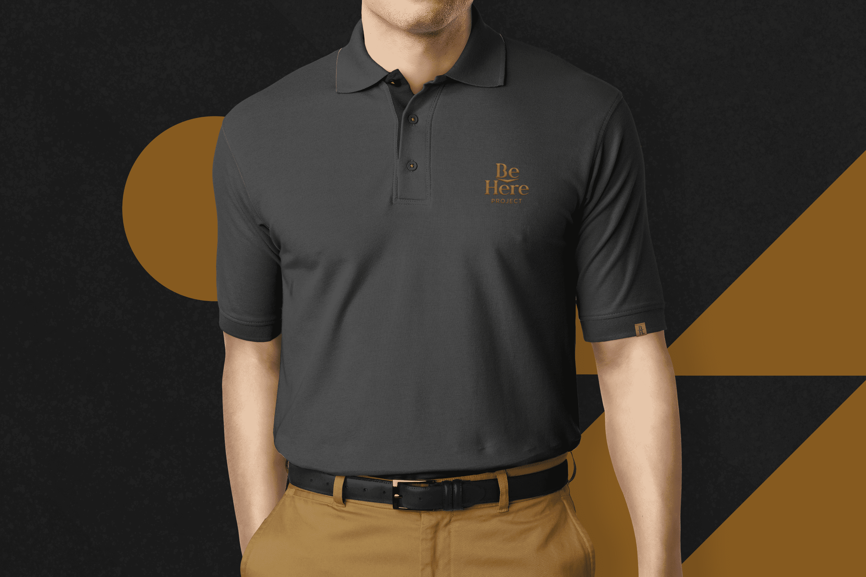
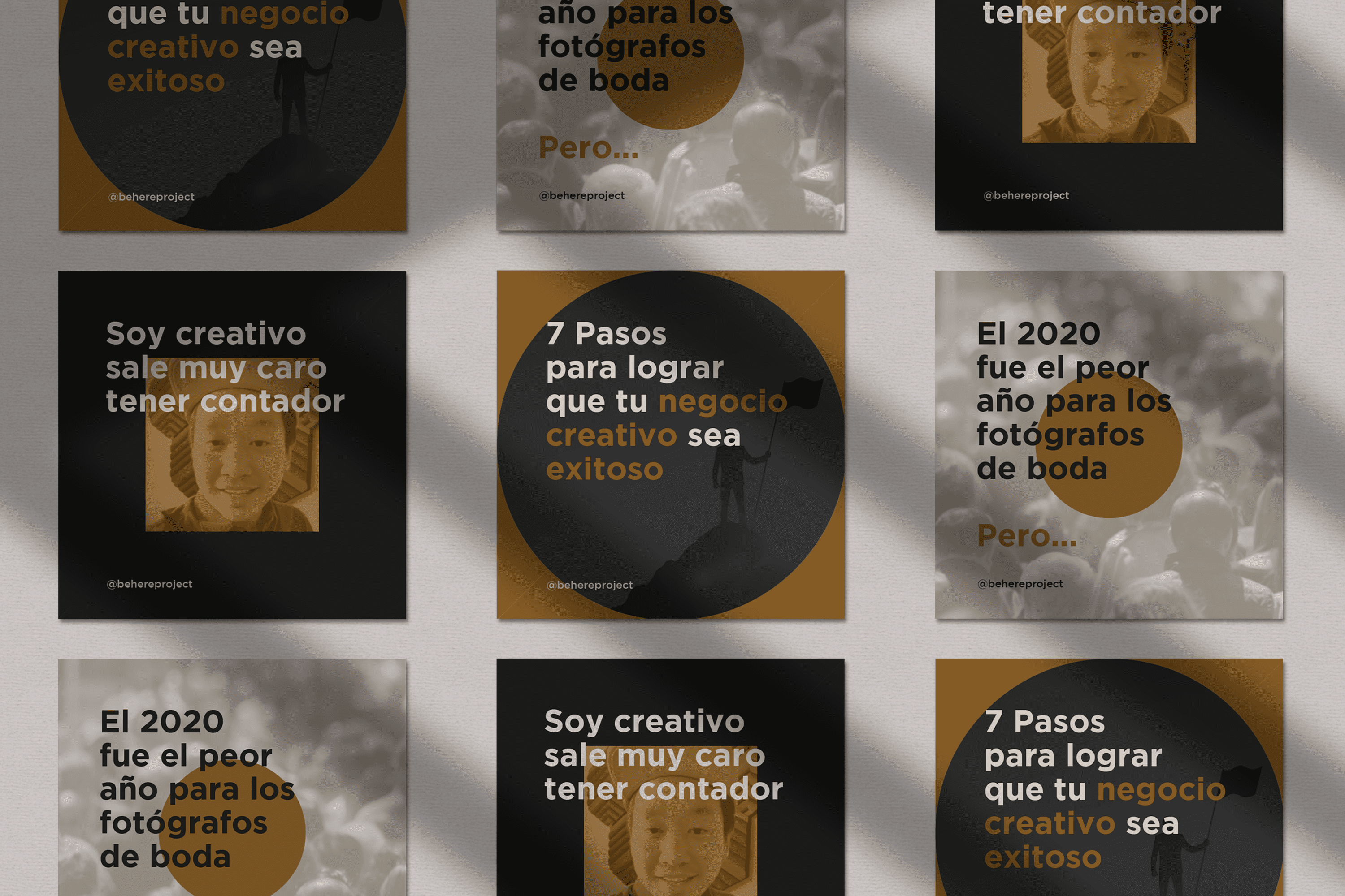
The Be Here Project is an education project for photographers whose mission is to inspire more than 1 million creatives to create a sustainable business while doing what they love, located in Mexicali, Mexico.


Keywords

Branding / Education / Photographers

The Objective

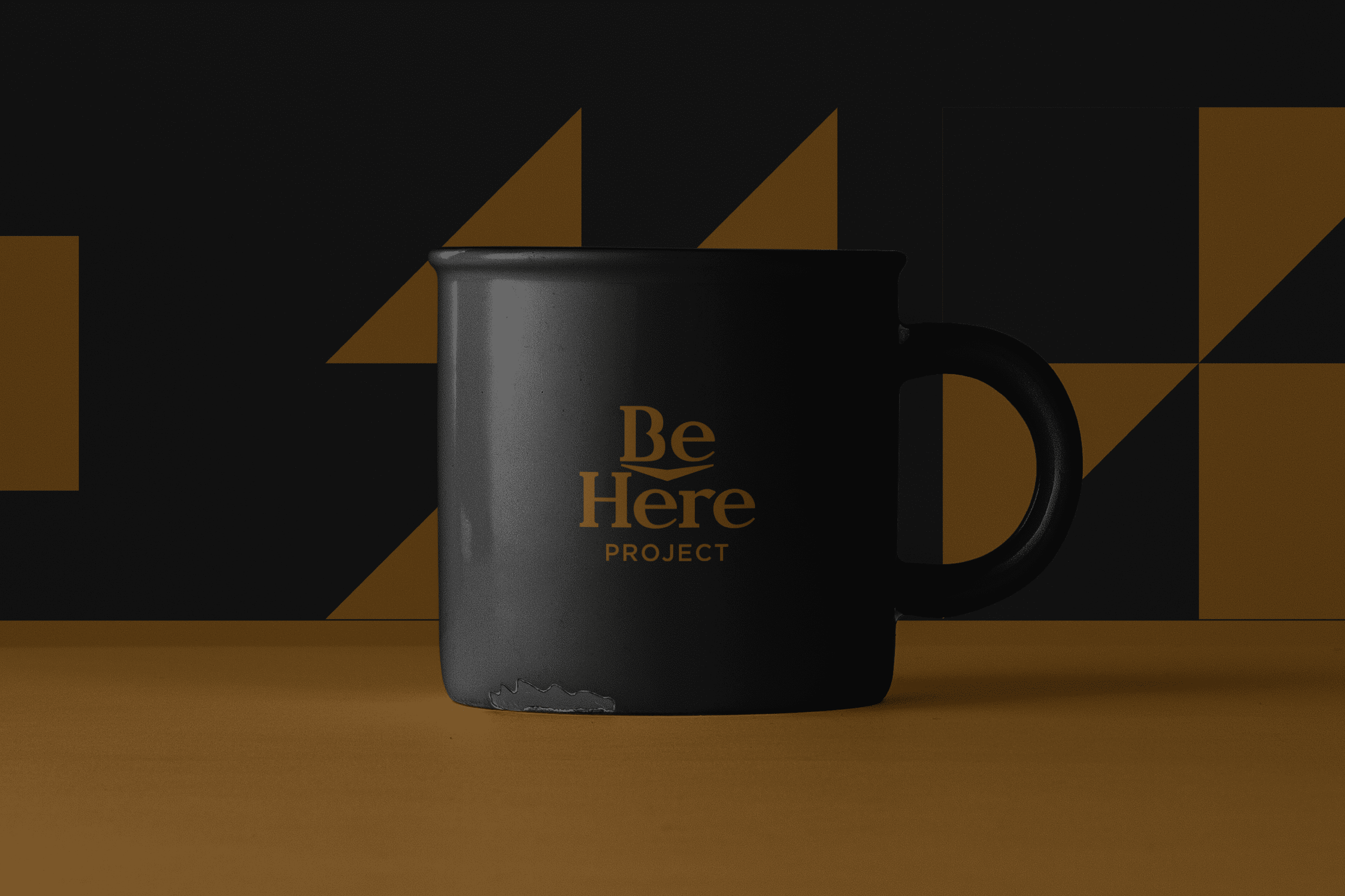
Redesign a brand with an academic personality and a fresh, modern look for Be Here Project.

The Solution

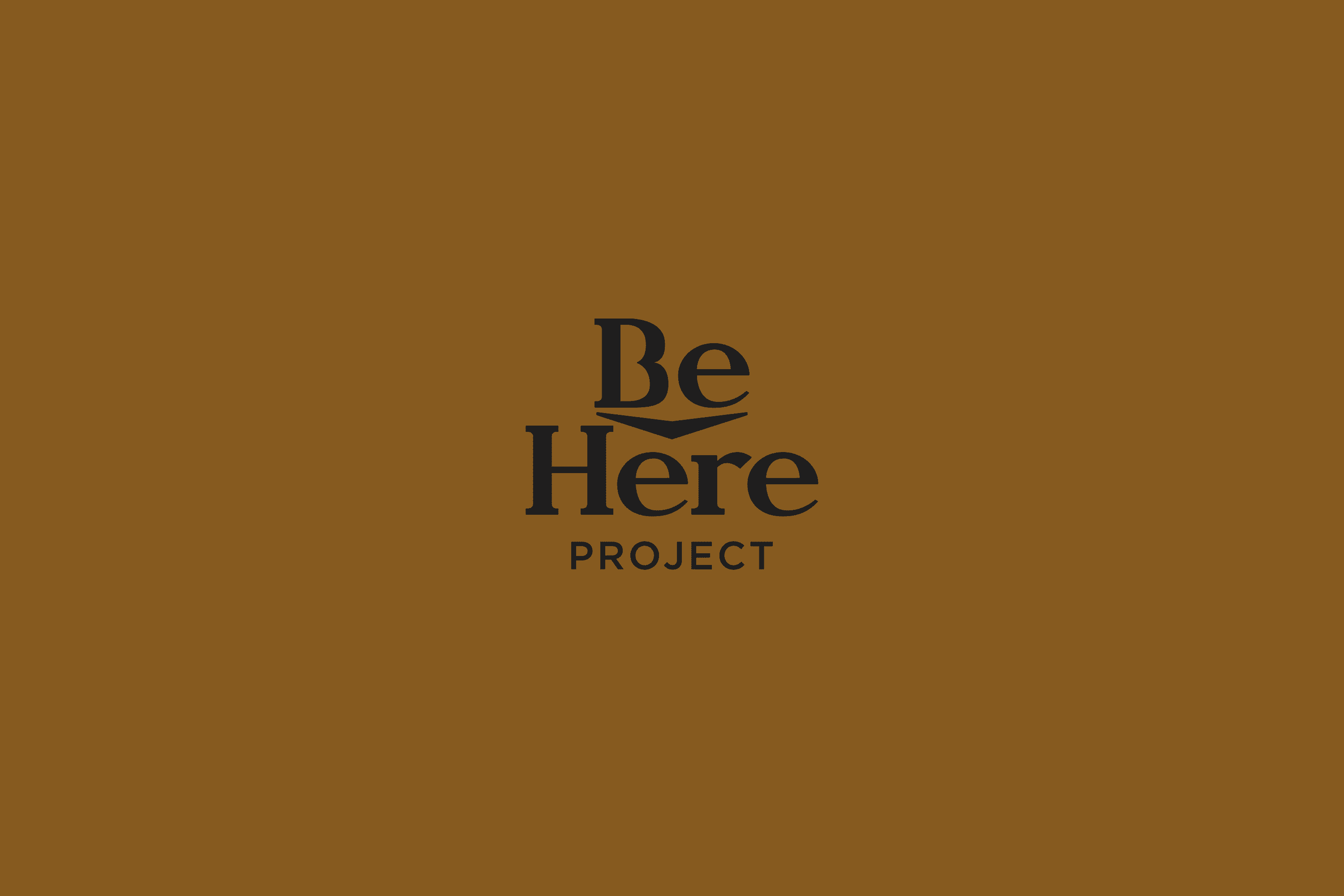
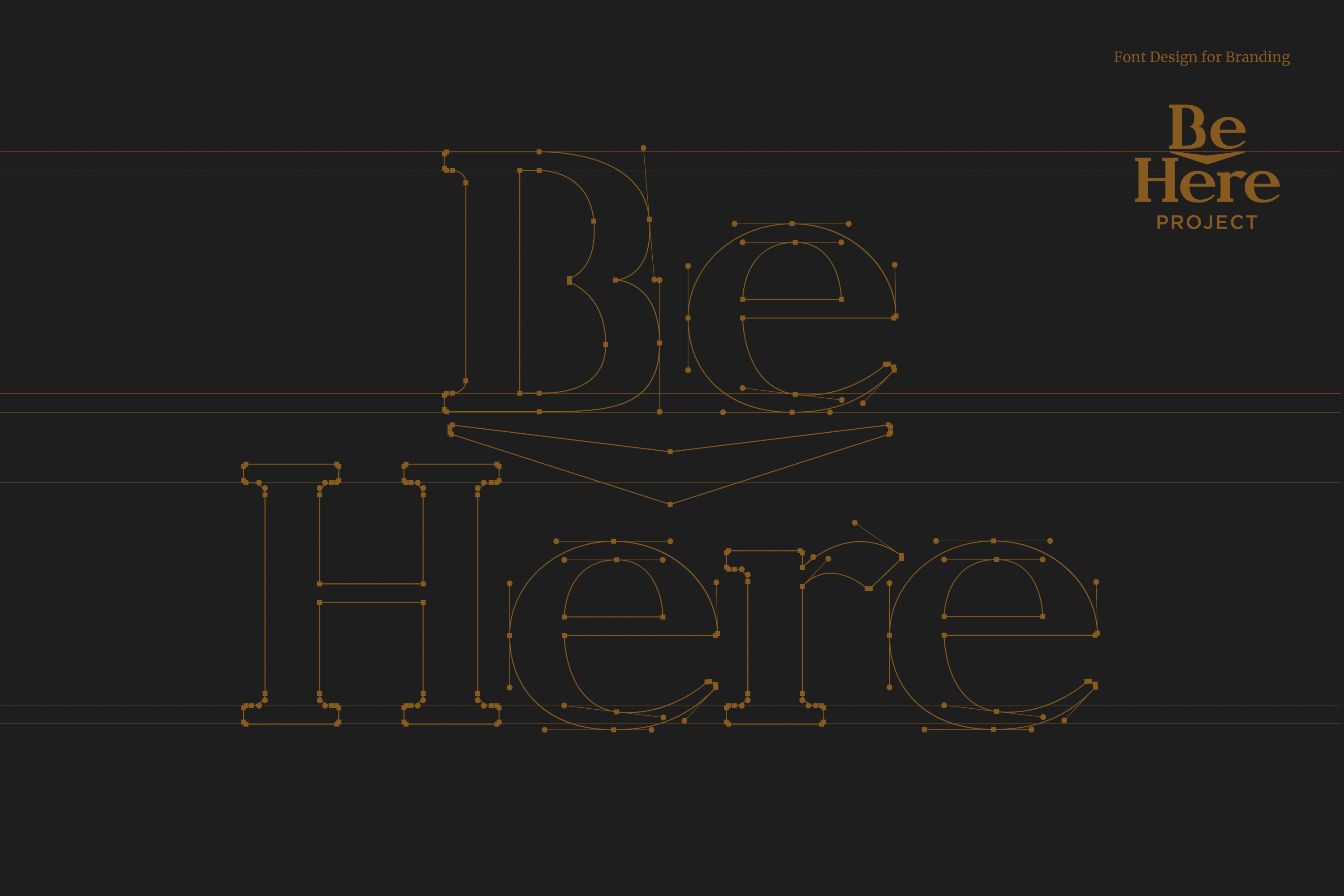
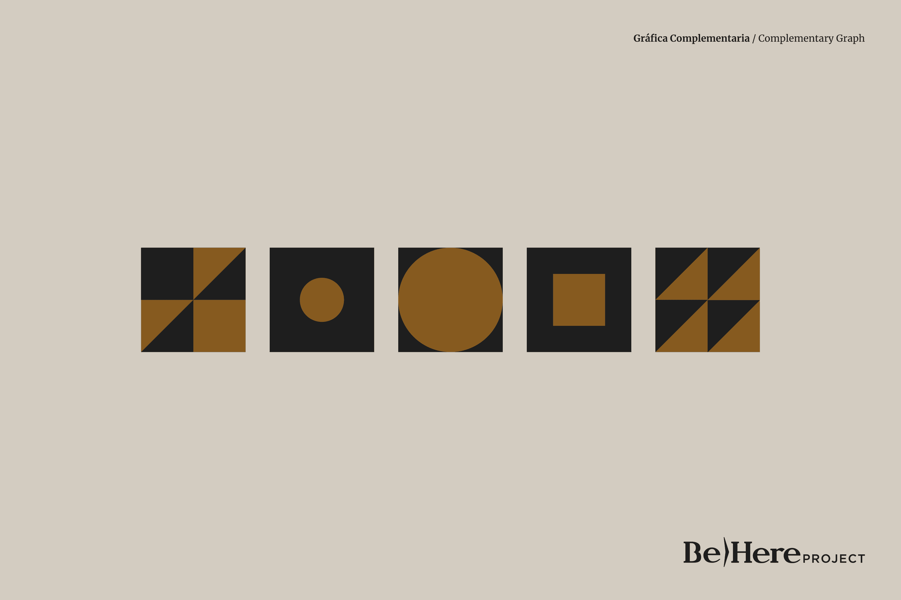
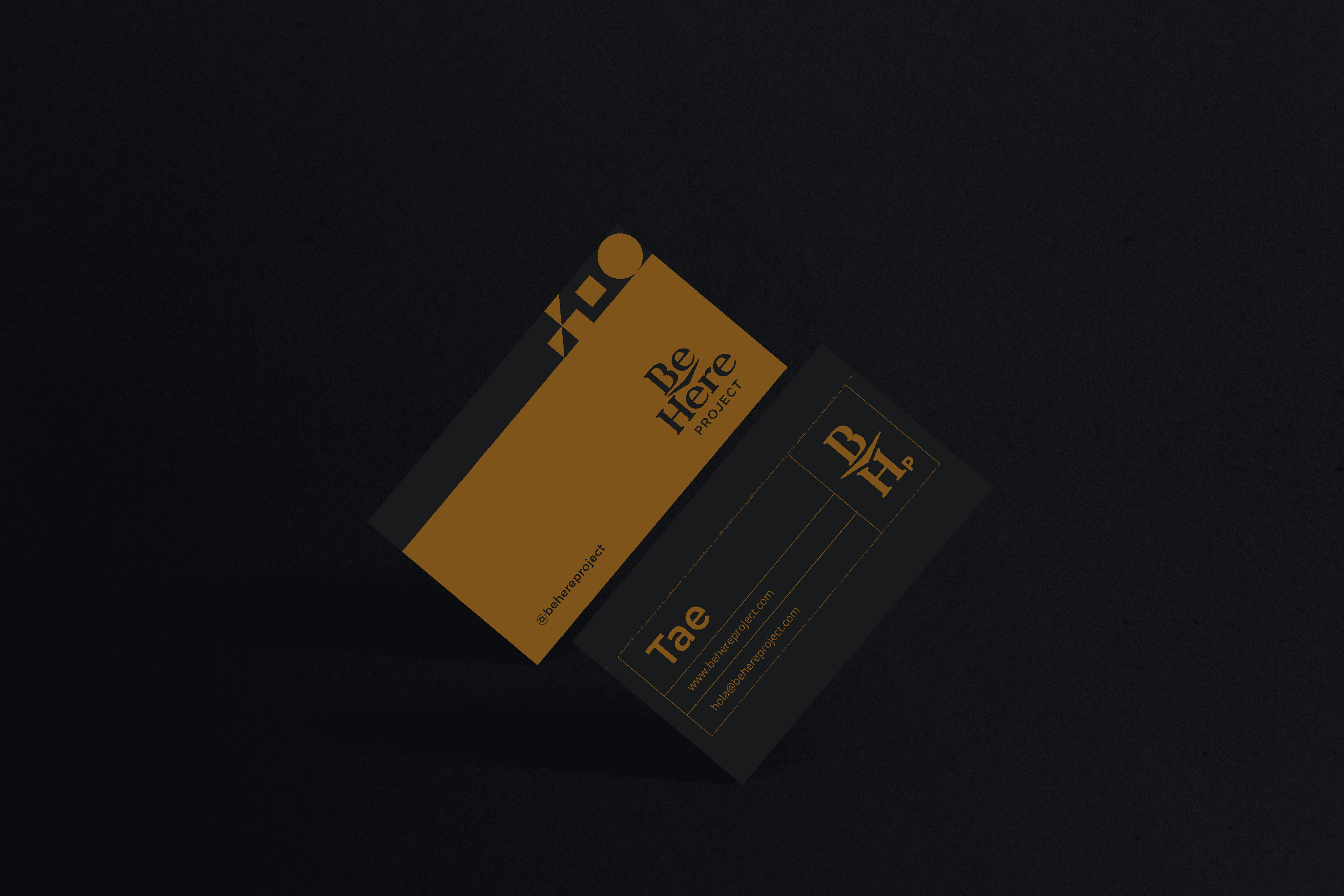
The iconic and typographic part come together to reinforce the concept of “Be Here”. The wide flagpoles and features project confidence, the serif adds to this characteristic, as it gives the typography stability and at the same time the serif alludes to the academic and learning environment. The circular and wide vowels give Be Here Project’s typography a friendly character. On the other hand, the concept of Be Here has been reinforced by integrating a central arrow into the design.

Suggested Projects
Terrenal Resto Bar
Simples Finanzas
Extreme Max
Mafer Merino Photography
BRANDING

The Client

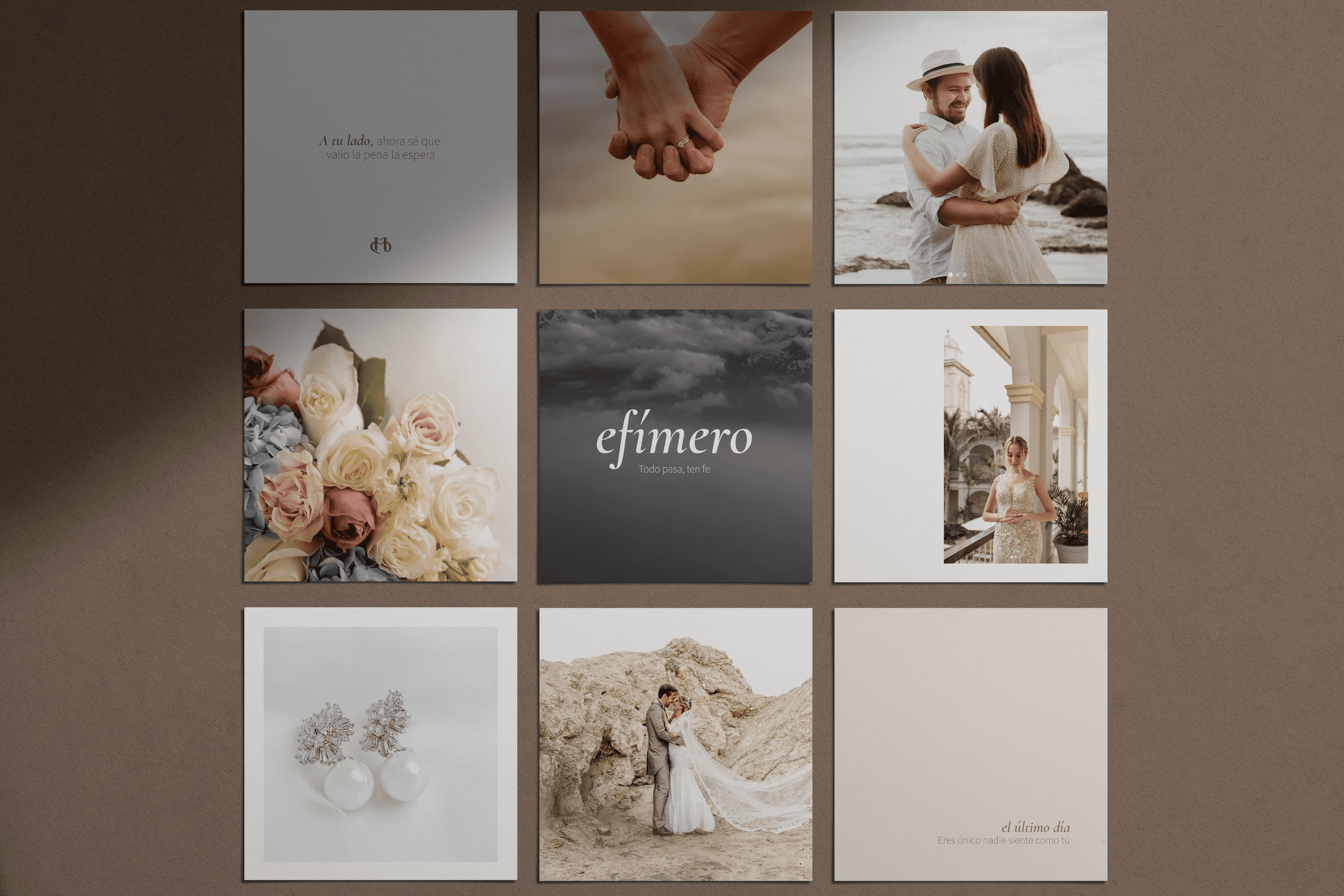
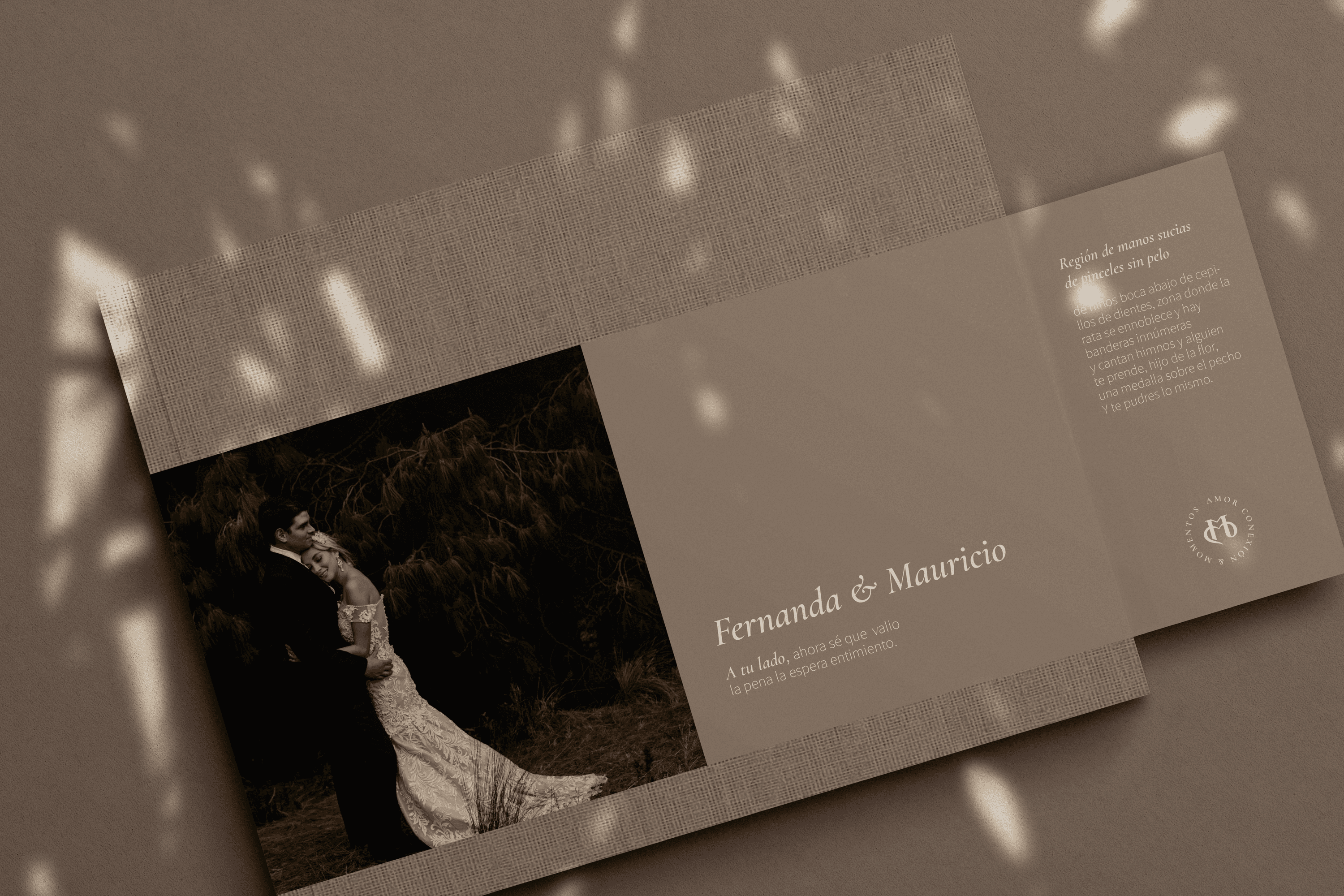
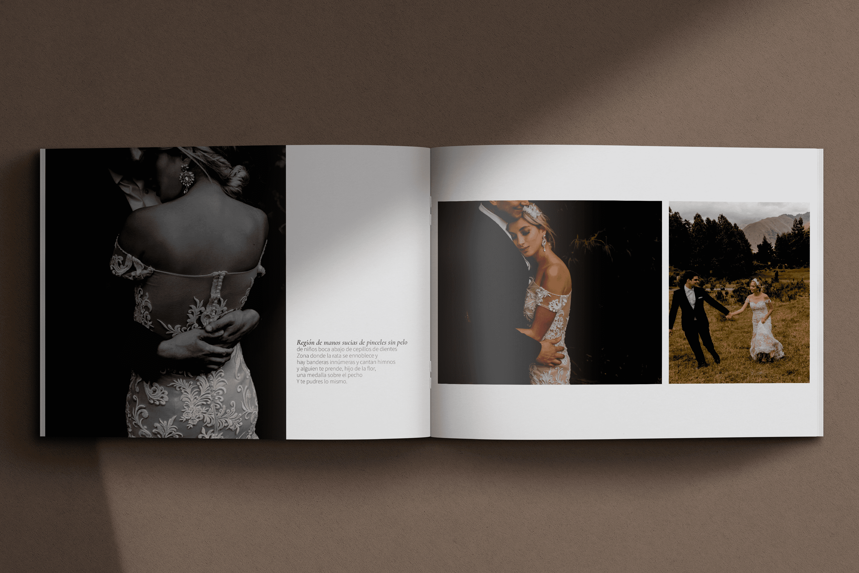
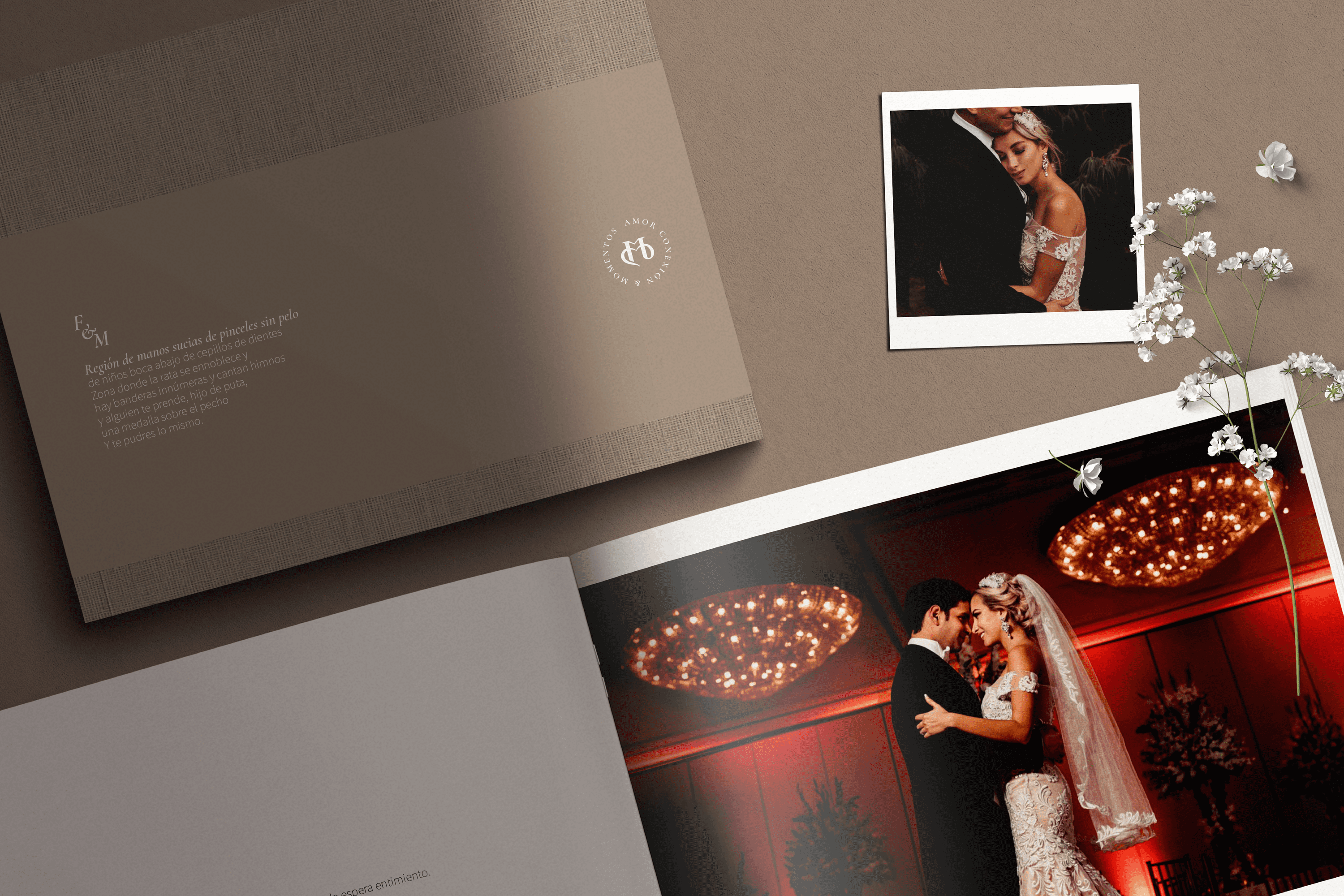
Mafer Merino is a wedding photographer with over 10 years of experience, specializing in capturing the real emotions behind love, located in Samborondón, Ecuador.


Keywords

Branding / Photography / Weddings

The Objective

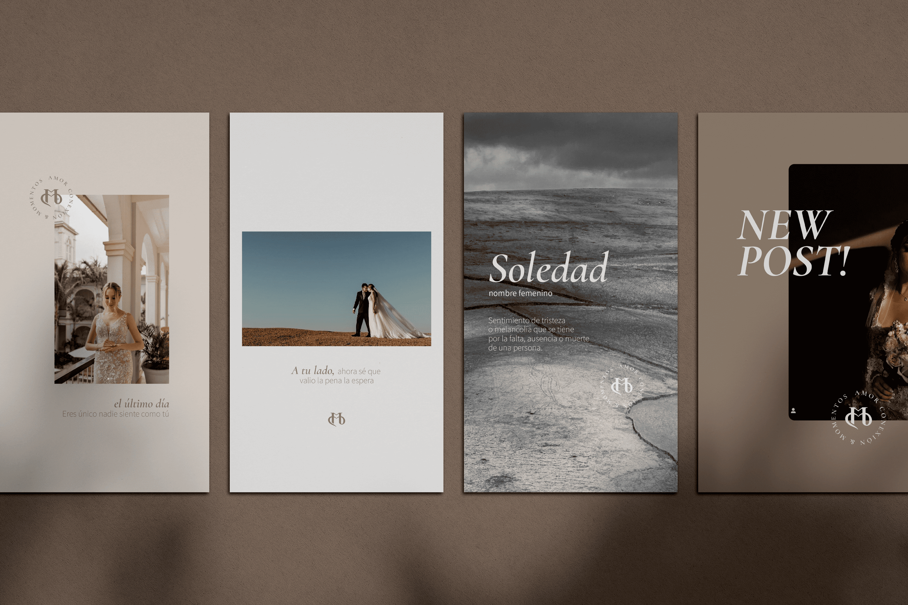
Design a visual identity for a photography lover, which speaks of the experience of love and real connection that my couples experience through my way of living and doing photography.


The Solution

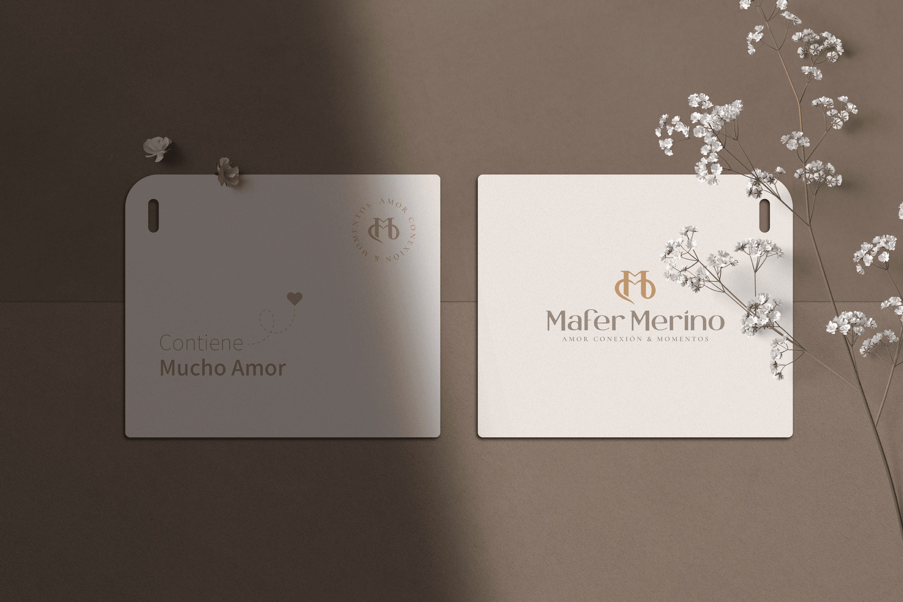
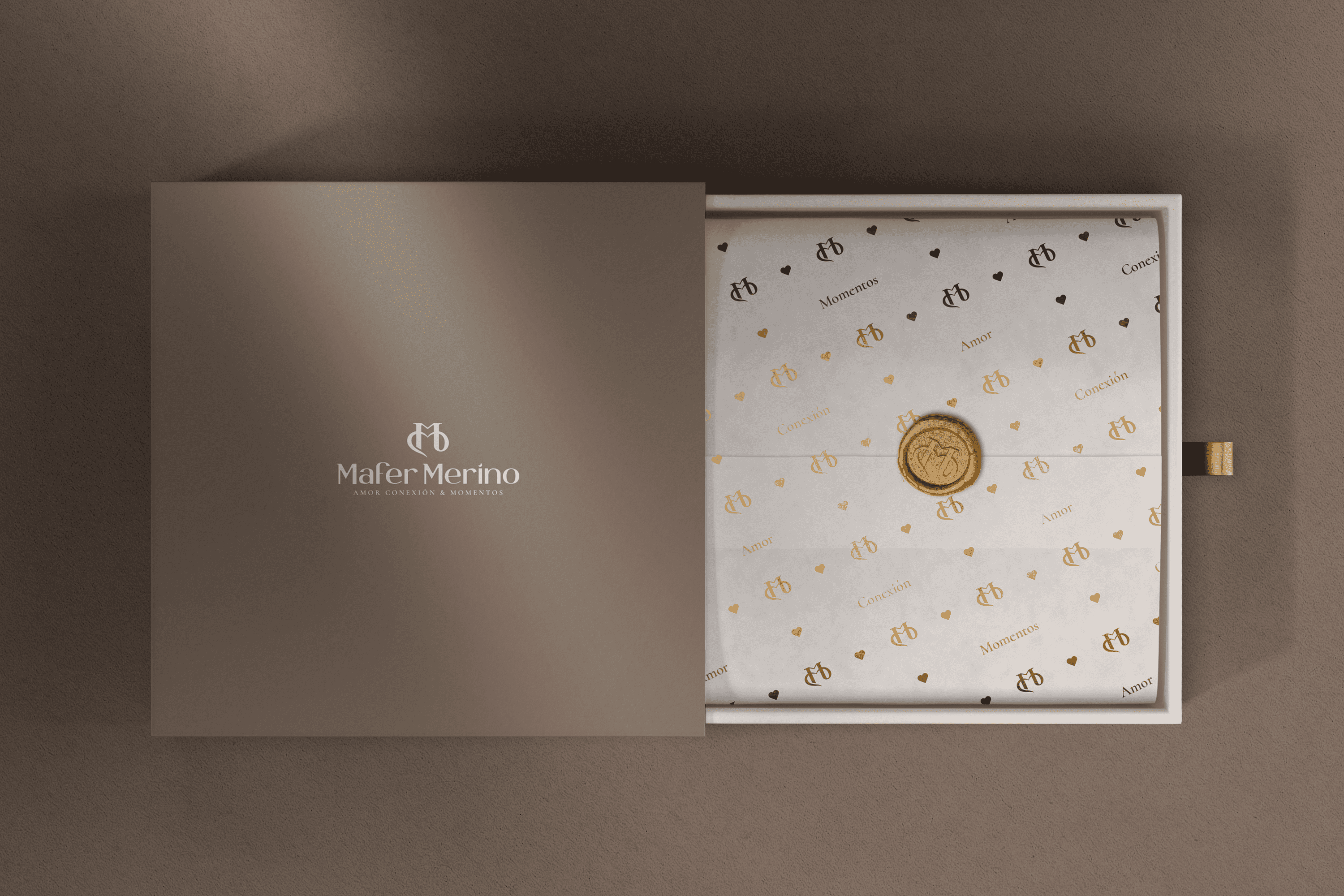
For the redesign of the main Isotope, we were inspired by the love of two people, transforming the initials of Mafer Merino MM, in the first its two pillars allude to two people who are united by the second M that forms a connection link, a bond of love. The finish of this isotope arises from a classic environment.

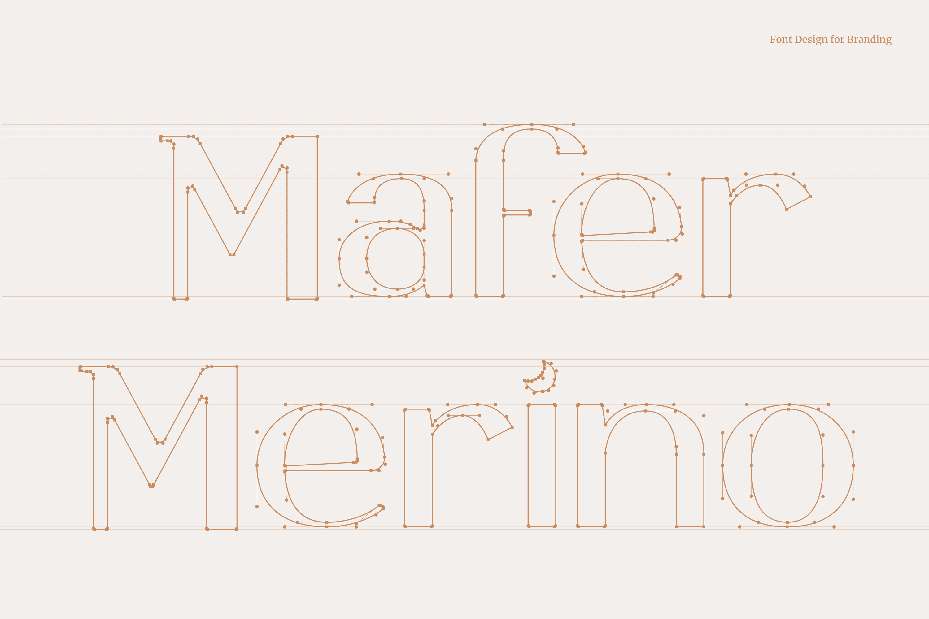
On the other hand, the typography developed for Mafer Merino is San Serif, a contemporary and elegant letter type that together with its isotope speaks of its way of telling stories. Mafer takes care of every detail and is a lover of the moon, for this reason we have hidden a small moon and that is to love is to look towards the sky and dare to dream.
Suggested Projects
Terrenal Resto Bar
Simples Finanzas
Extreme Max