Terrenal Resto Bar
BRANDING | ILLUSTRATION

The Client

Terrenal is a Resto-Bar located in Riobamba, Ecuador that draws inspiration from the Andean Paramo for its concept.


Keywords

Branding / Design / Naming / Restaurant / Bar / Paramo / Andean
The Objective

Design the Naming and Branding for a Resto Bar with the concept of the Andean Paramo.


The Solution

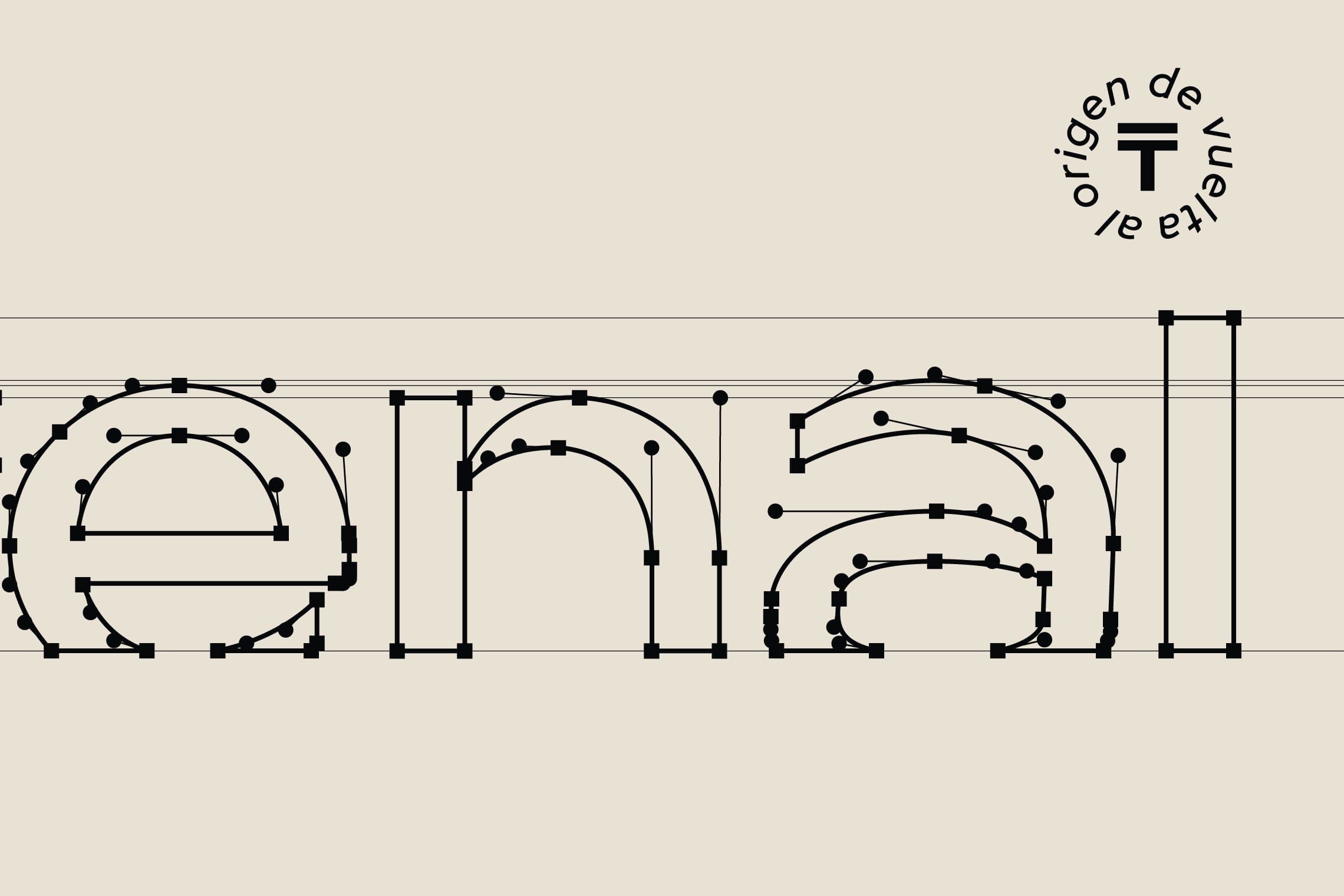
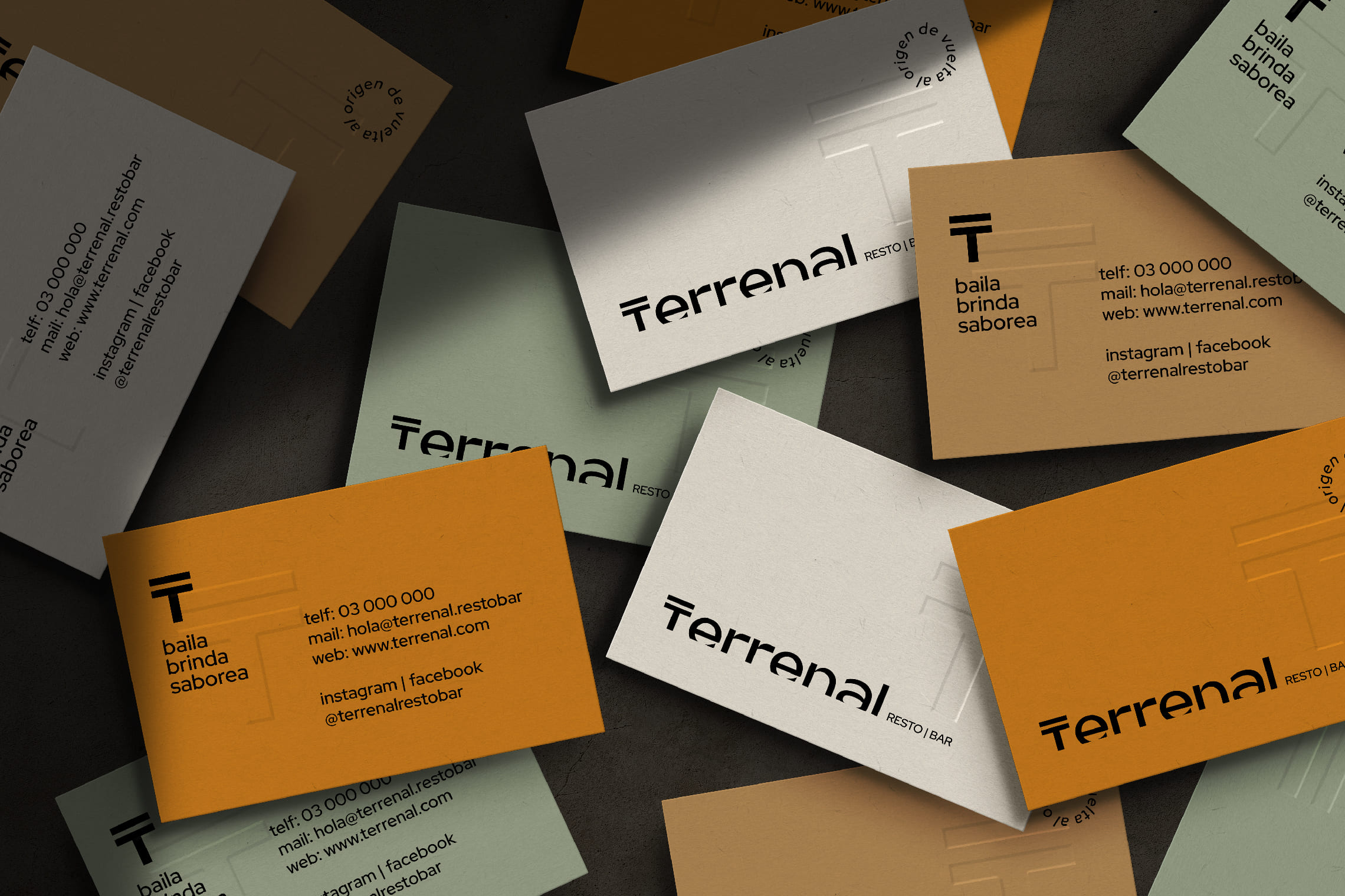
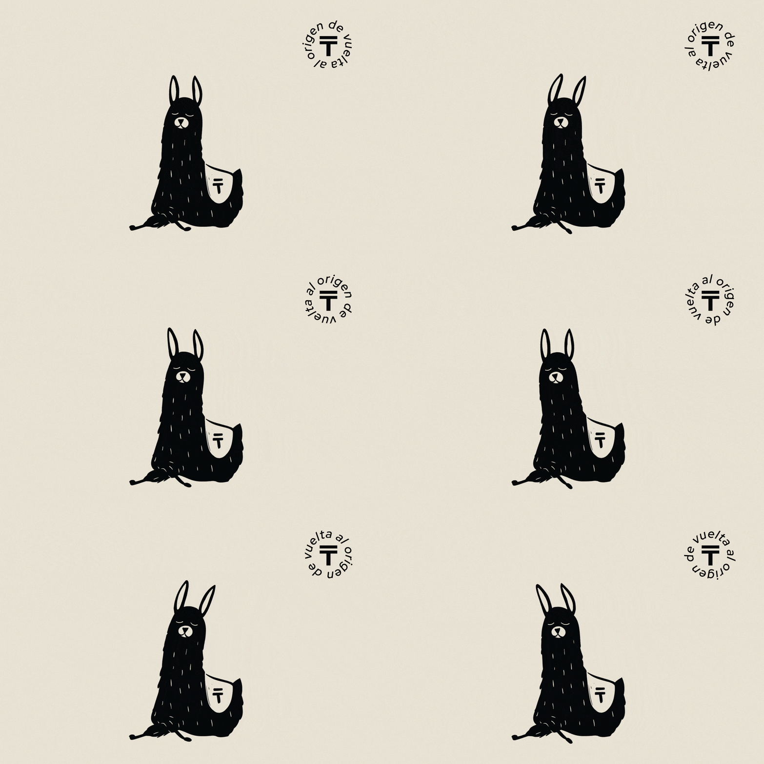
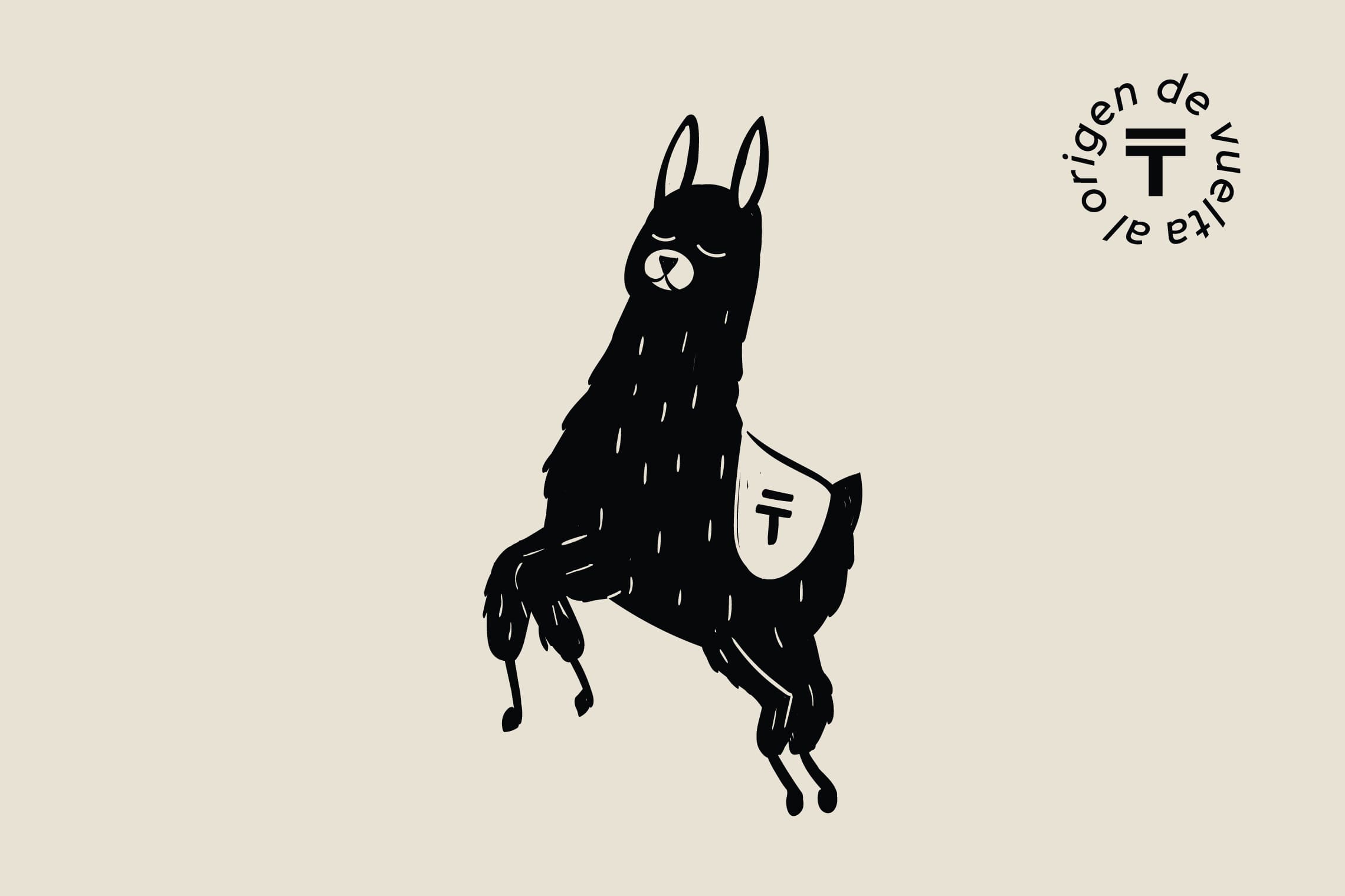
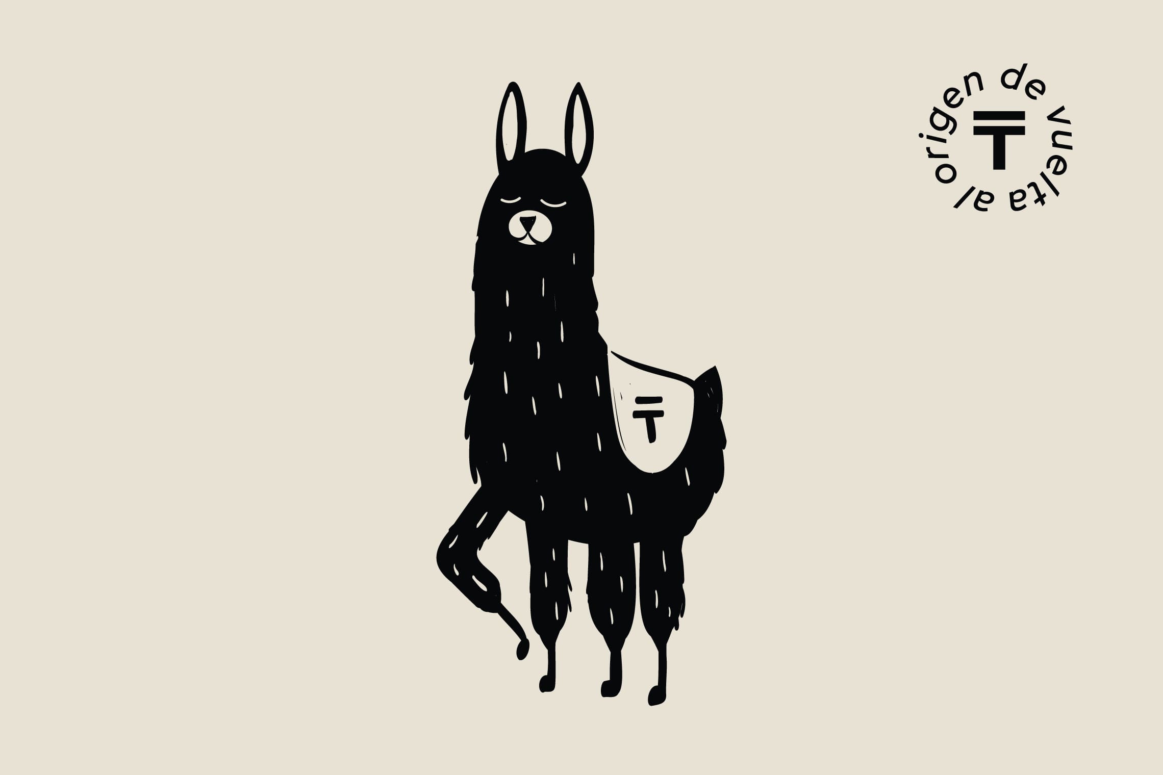
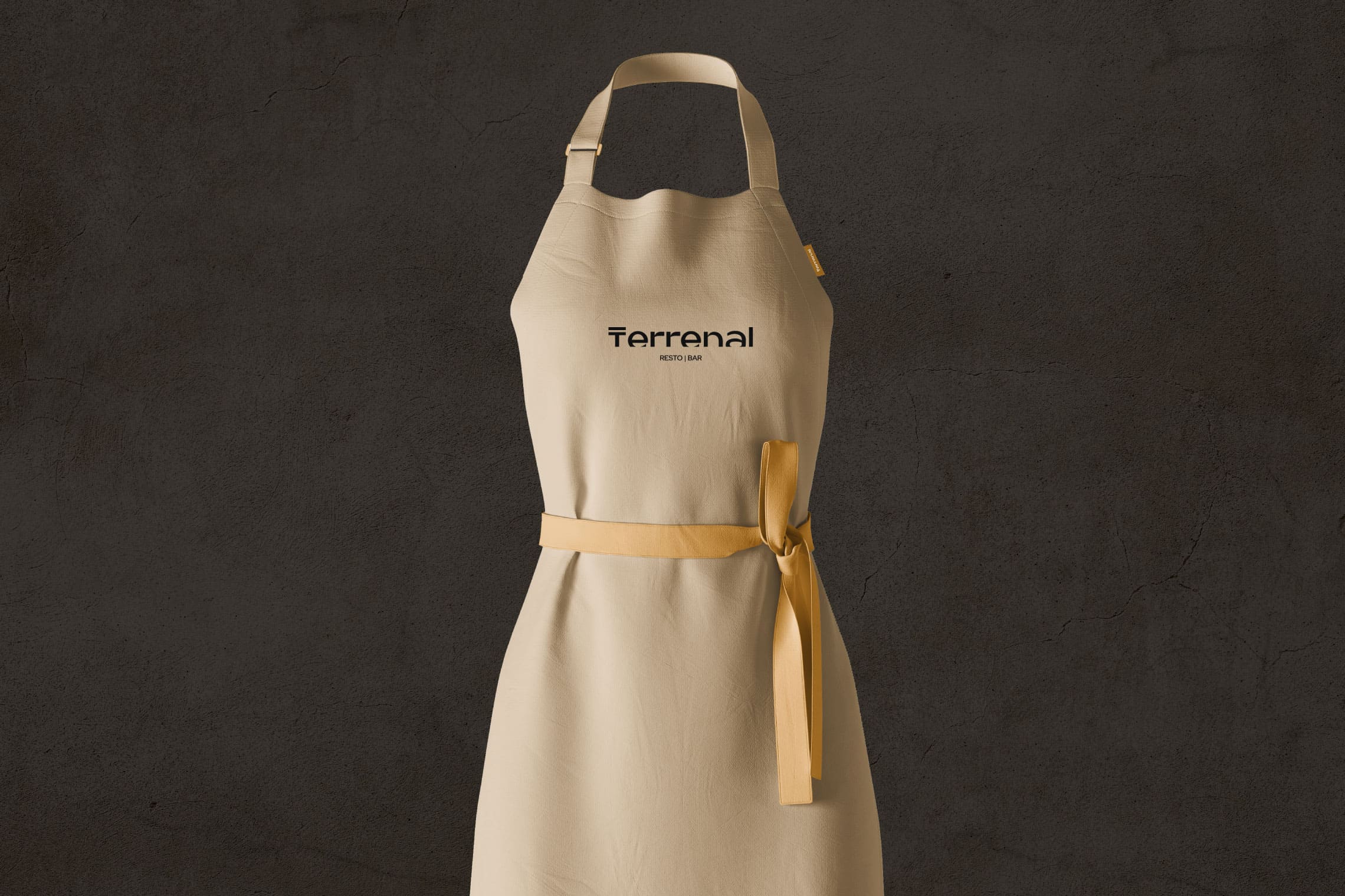
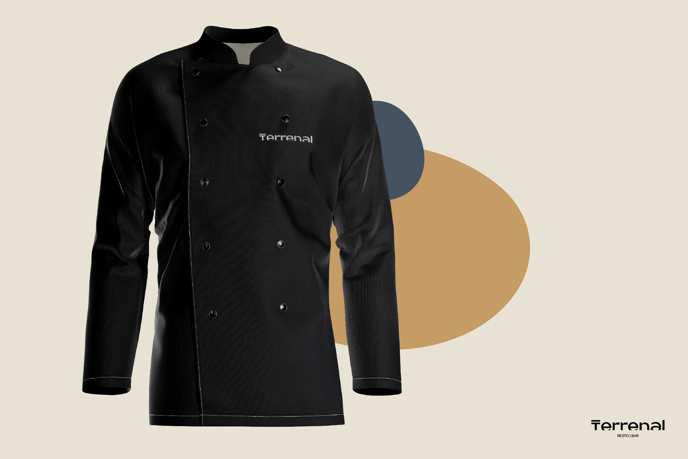
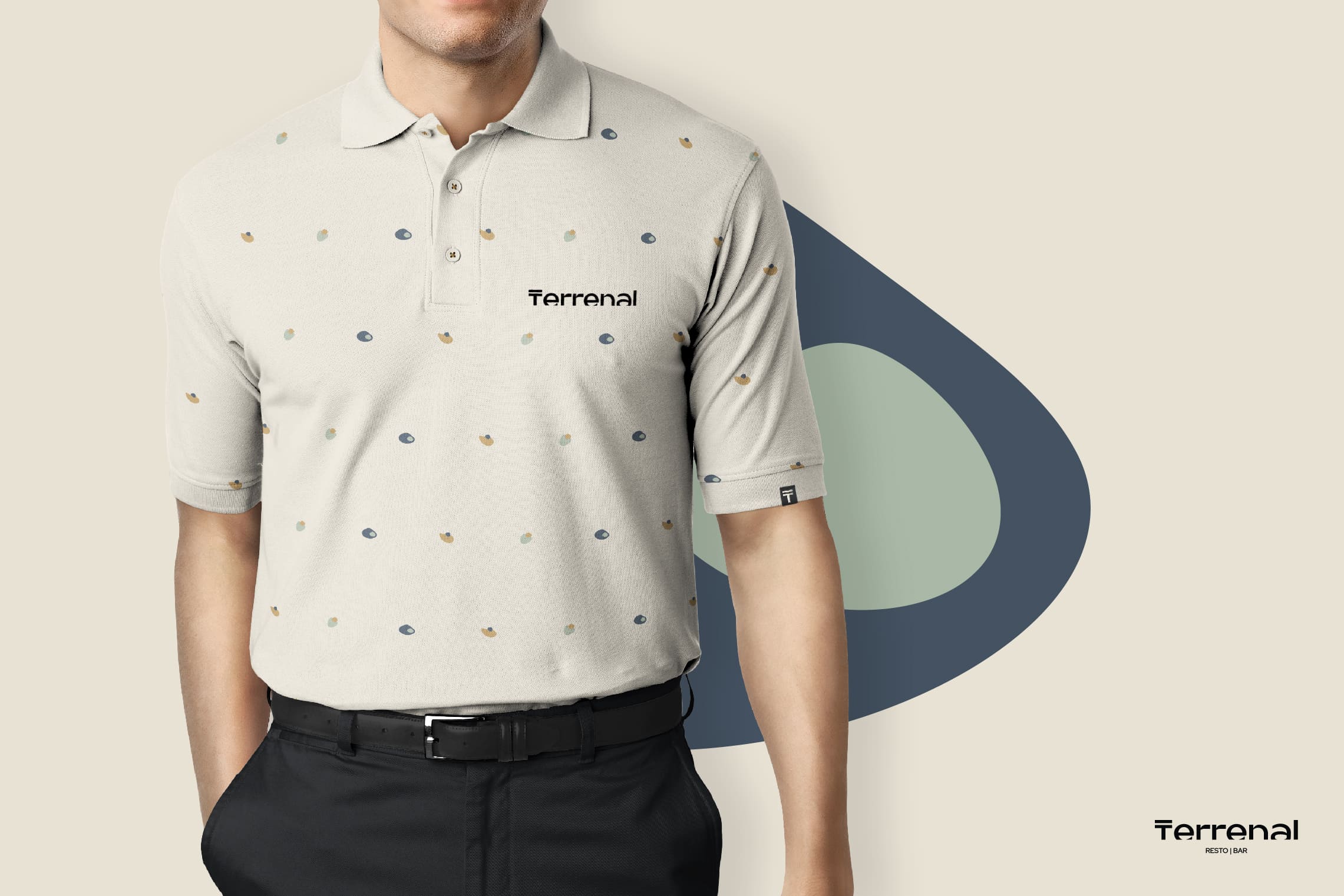
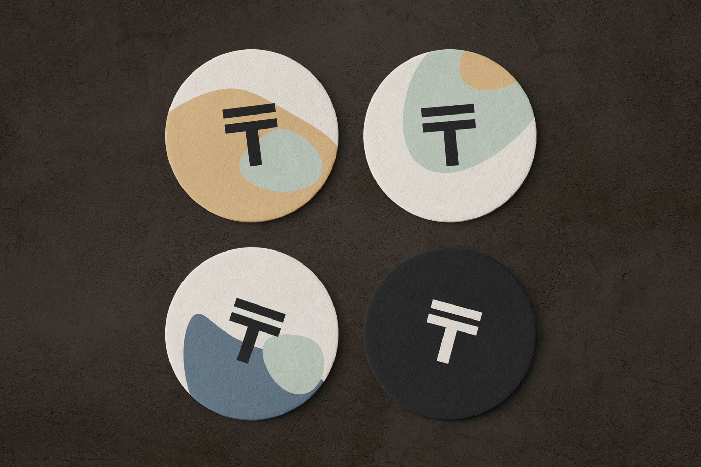
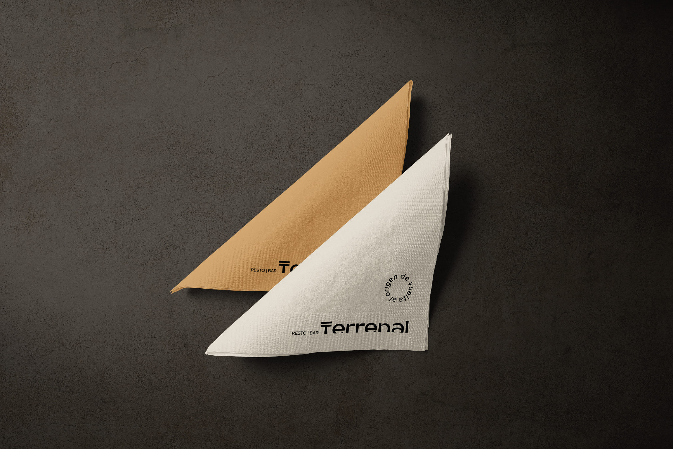
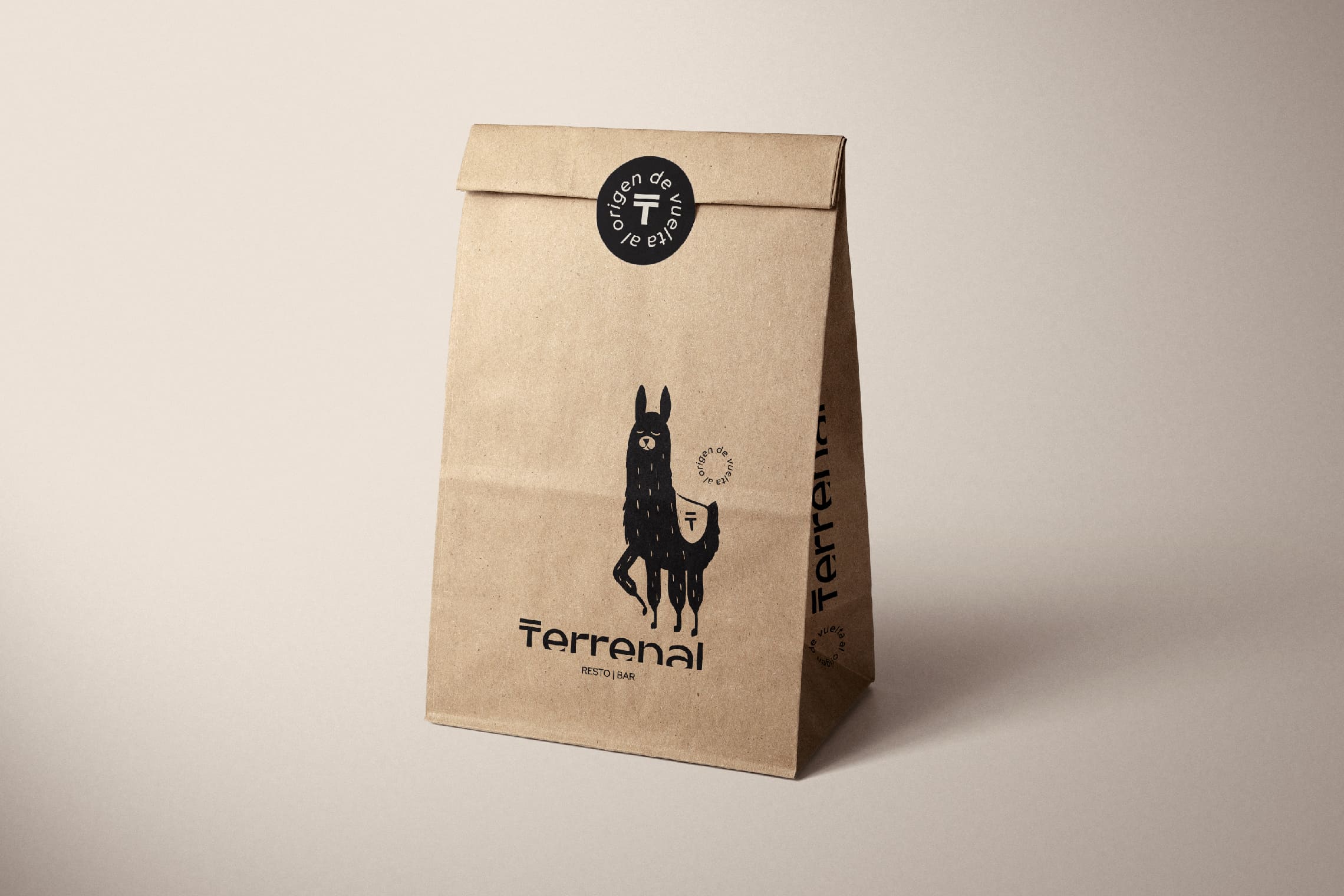
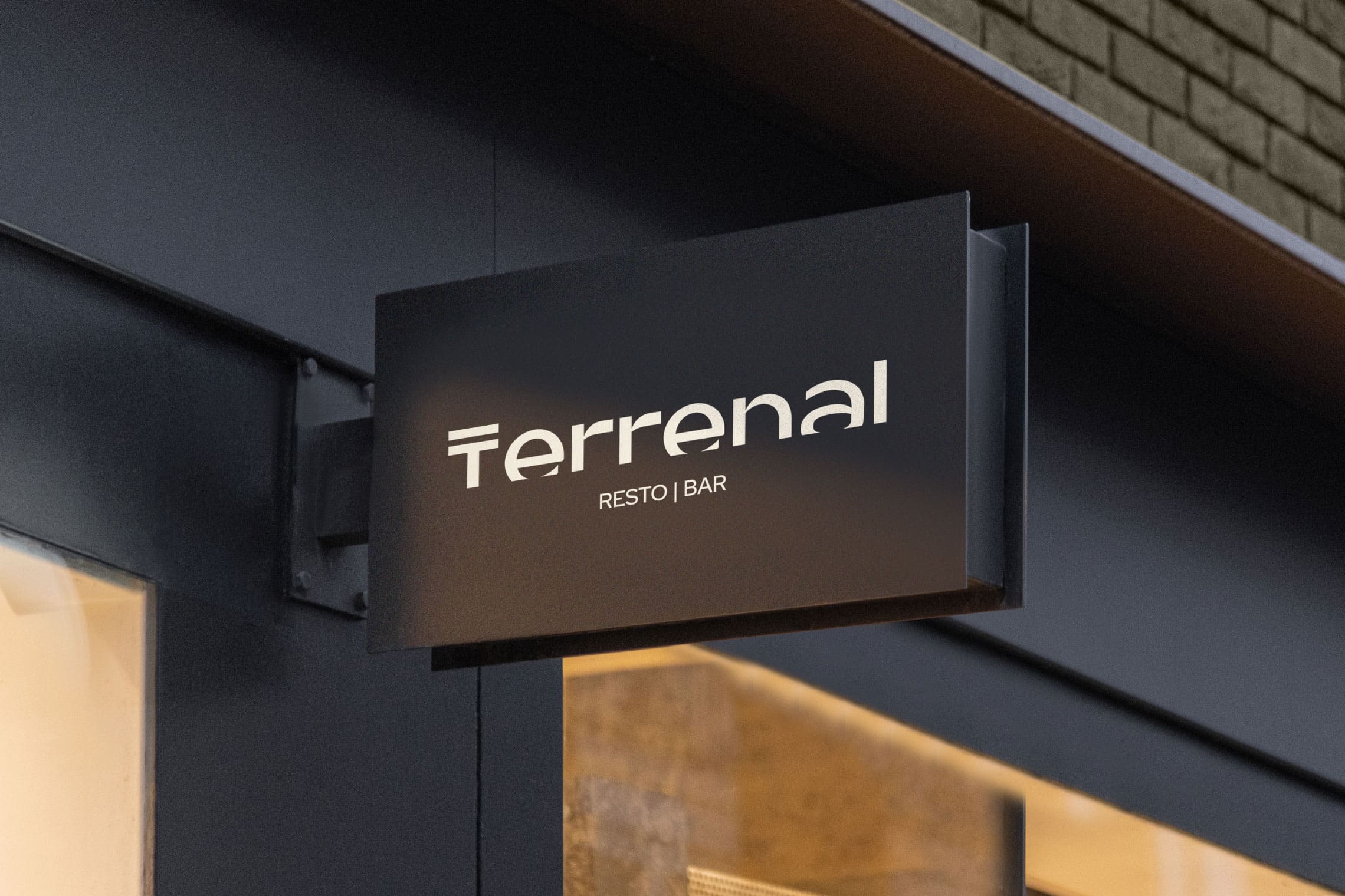
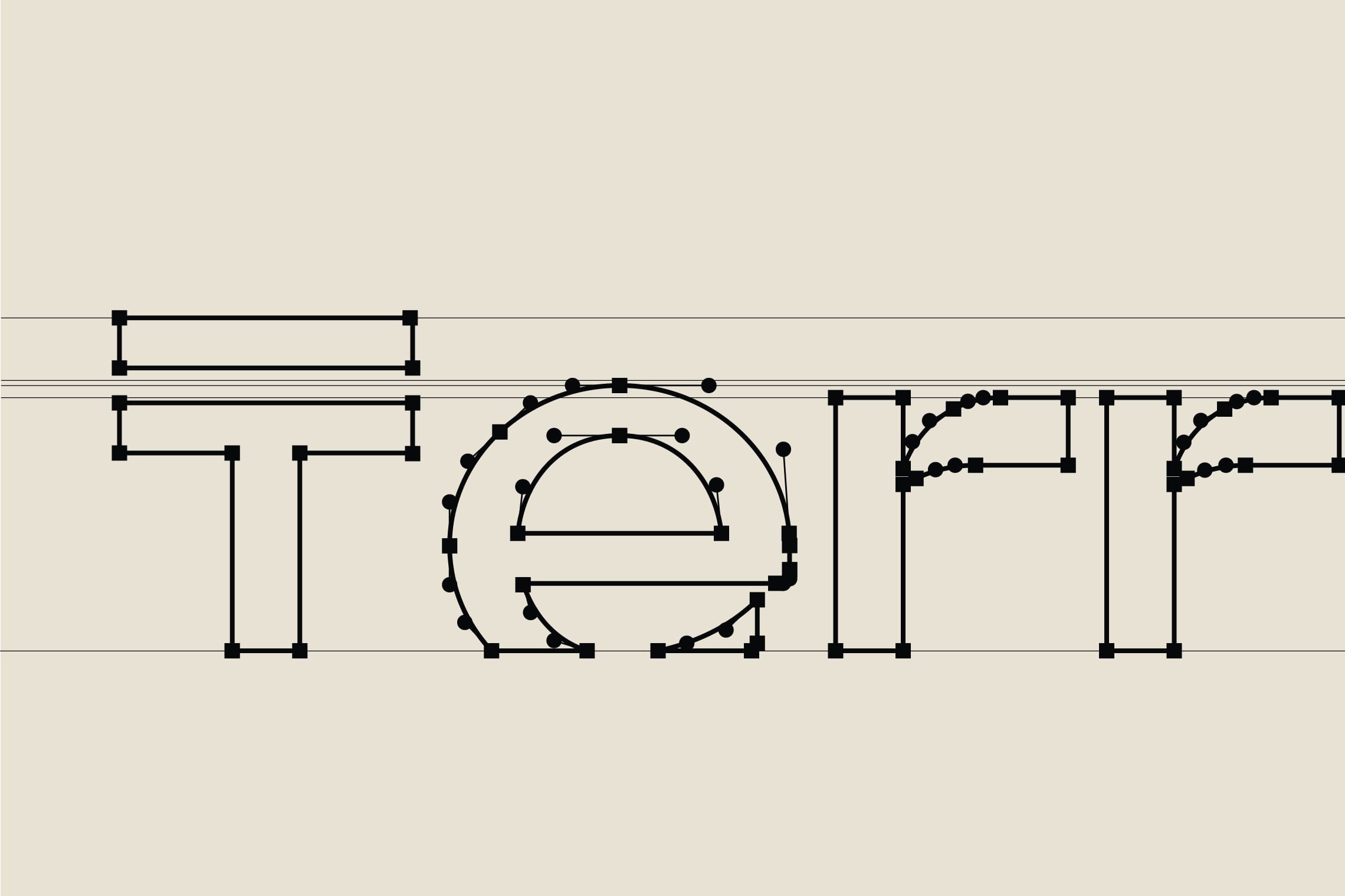
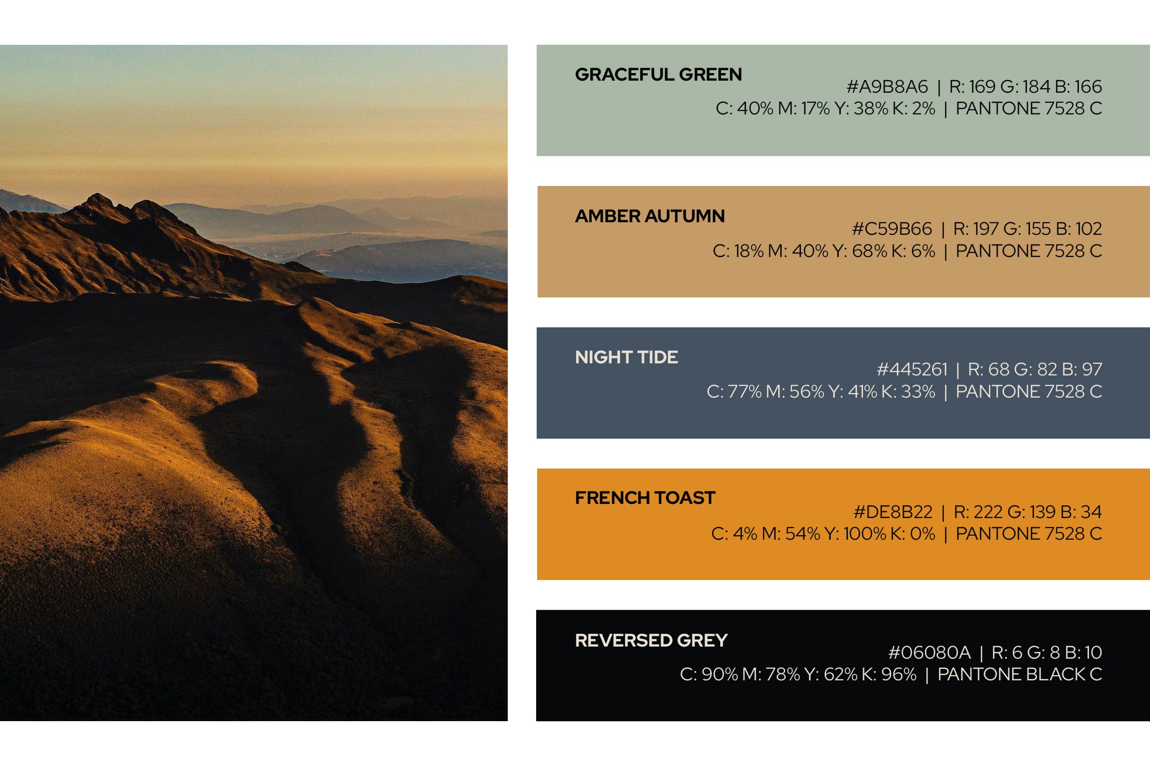
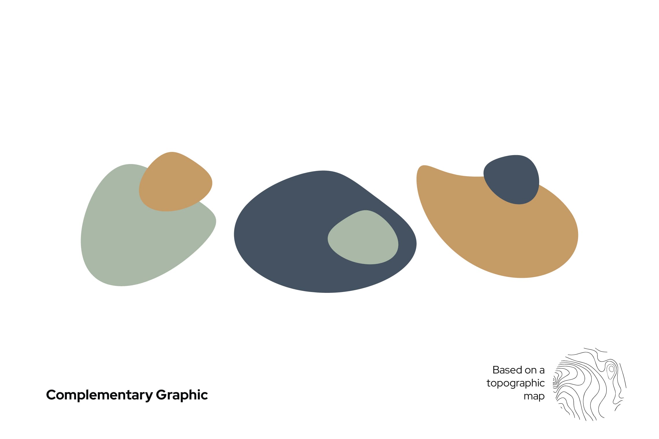
For the name design, we have chosen “Terrenal” for its literal meaning: of earthly and material things, in opposition to the celestial or spiritual, or related to them; this definition favors the experience of traversing the paramo both in its light and in its darkness. The typography designed for this project is a modern sans -serif typeface, with a top line in the letter “T” that leaves everything earthly below it; the concept is strengthened by stopping the letters in time, at a point of sunrise or sunset represented by a cut in the bottom part, evoking the horizon. This project features the colors of the paramo and a unique character native to the paramo to strengthen brand recognition and essence.
Suggested Projects
Simples Finanzas
Extreme Max
Educar com Evidências
Be Here Project
BRANDING

The Client

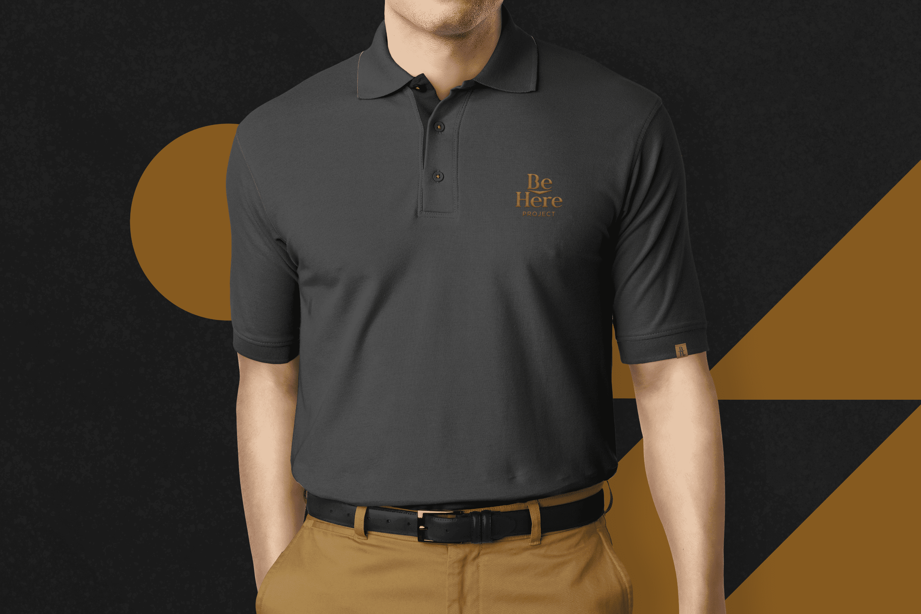
The Be Here Project is an education project for photographers whose mission is to inspire more than 1 million creatives to create a sustainable business while doing what they love, located in Mexicali, Mexico.


Keywords

Branding / Education / Photographers

The Objective

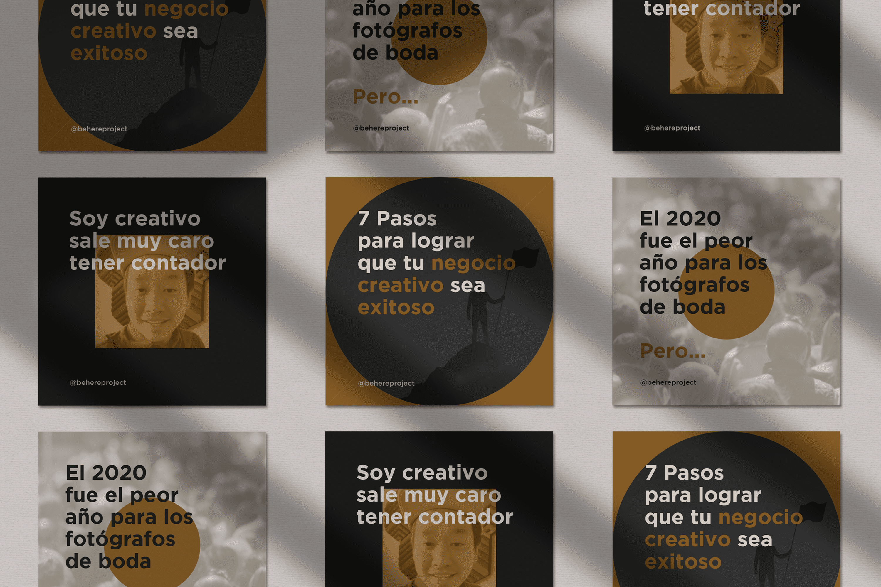
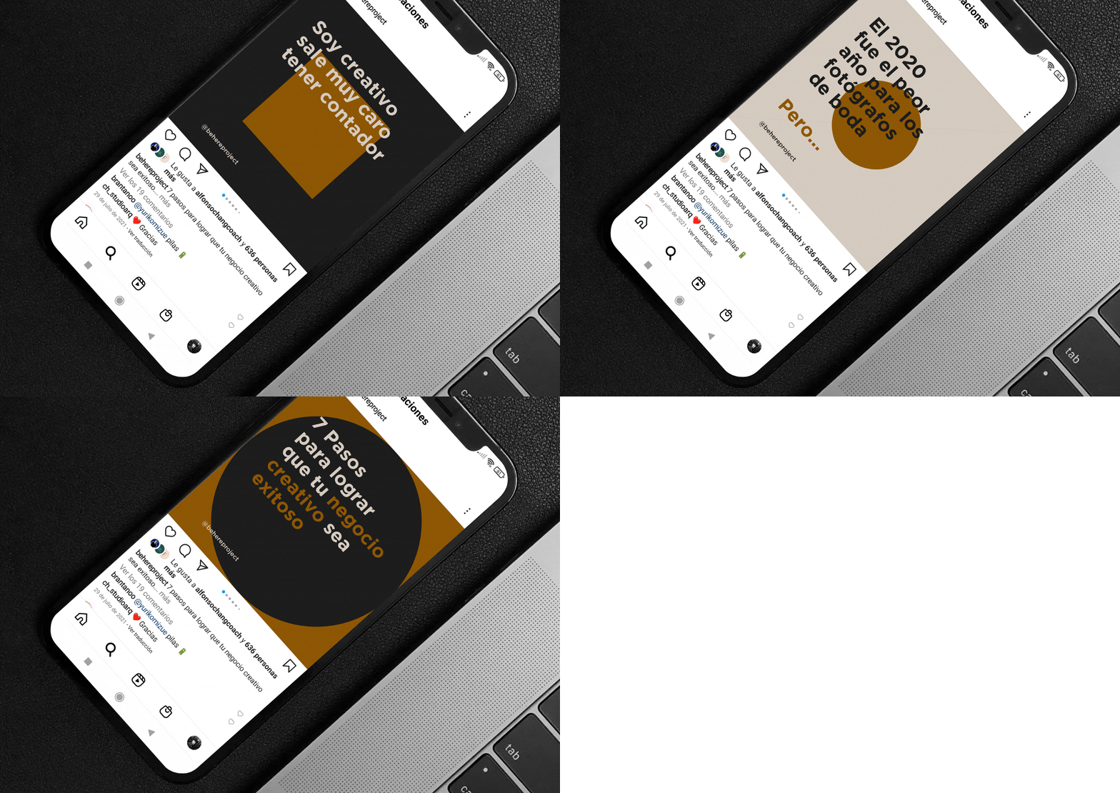
Redesign a brand with an academic personality and a fresh, modern look for Be Here Project.


The Solution

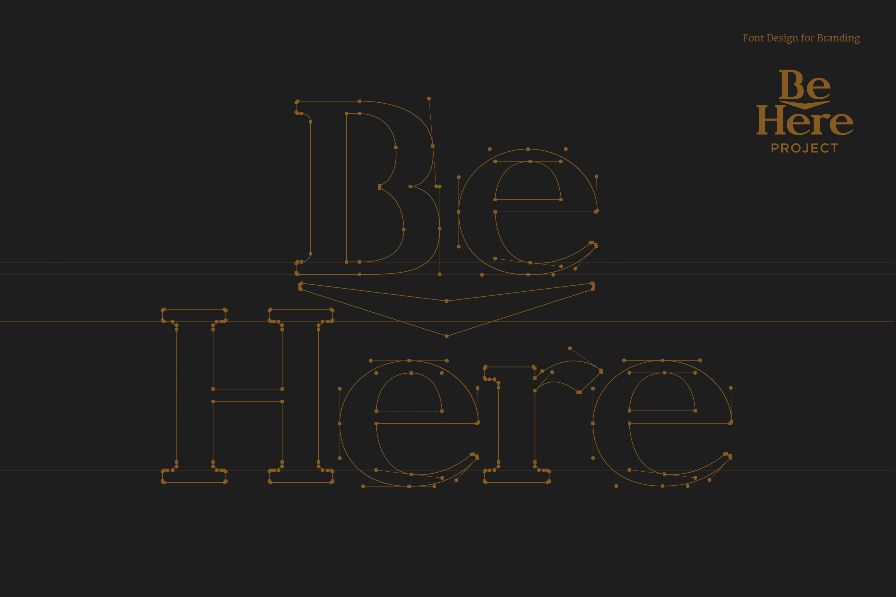
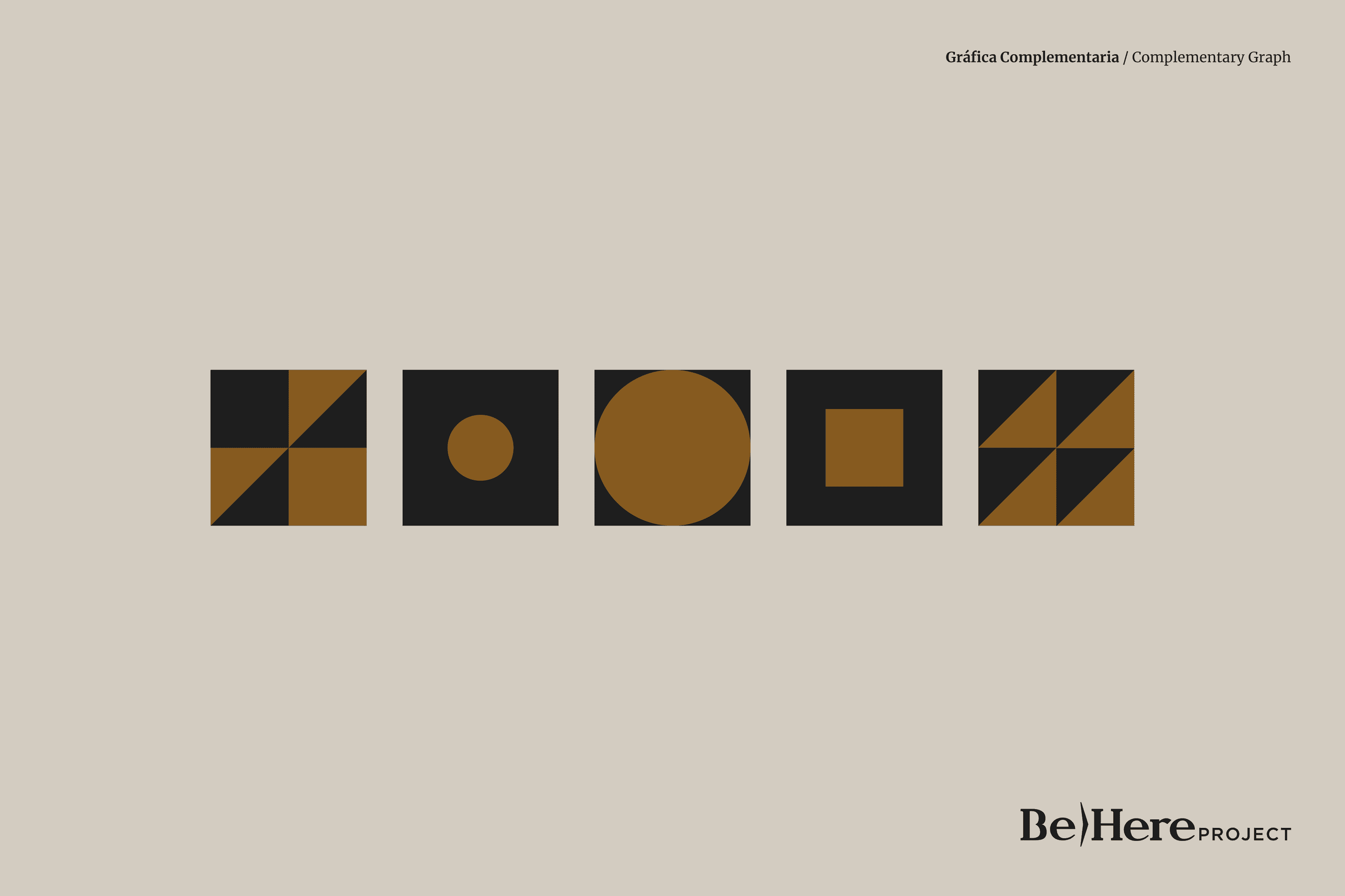
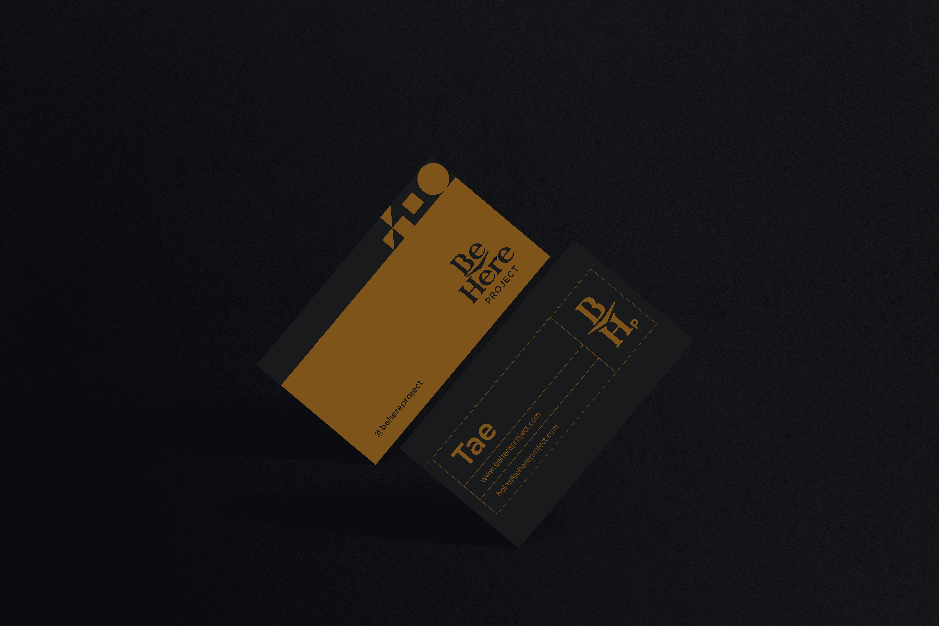
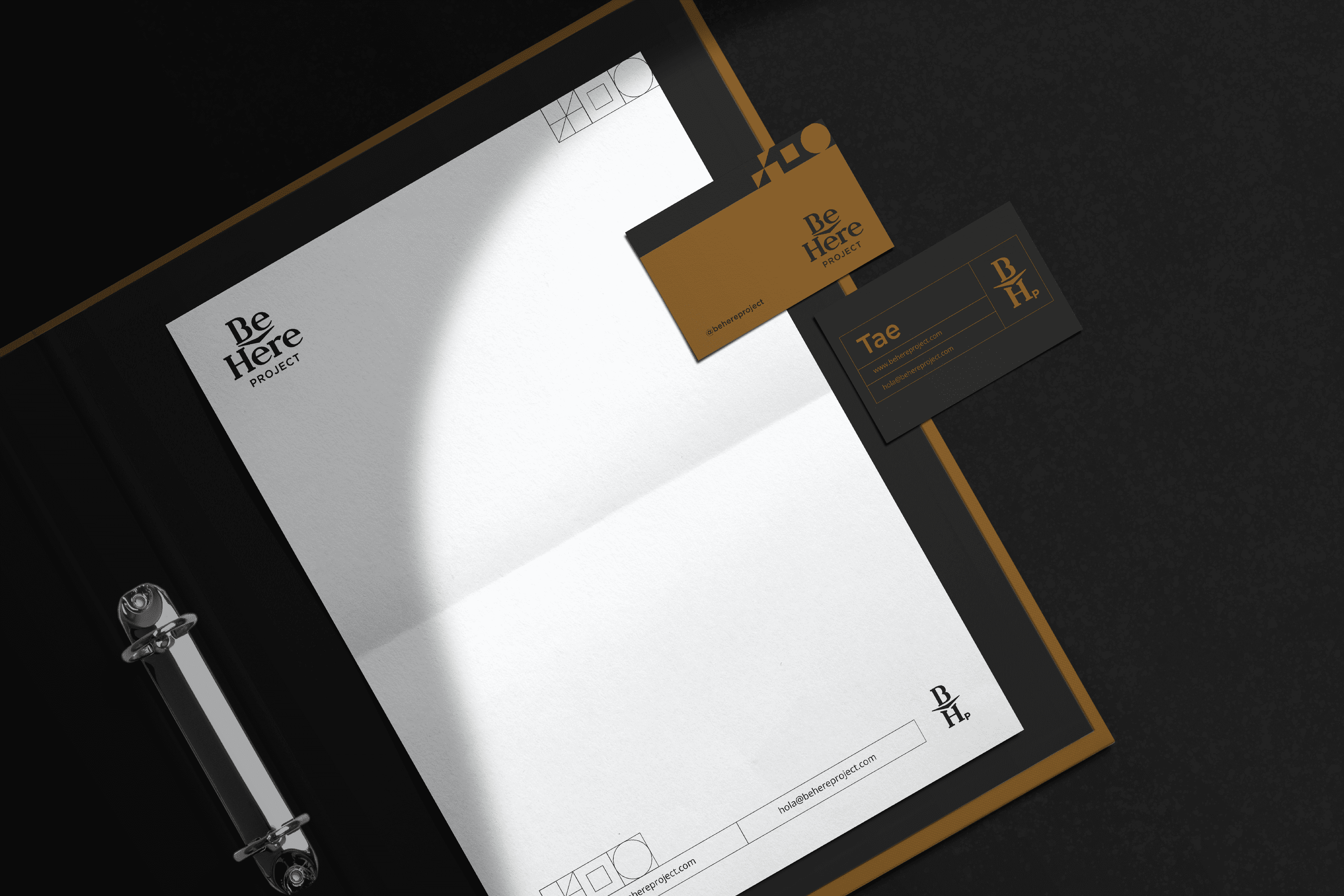
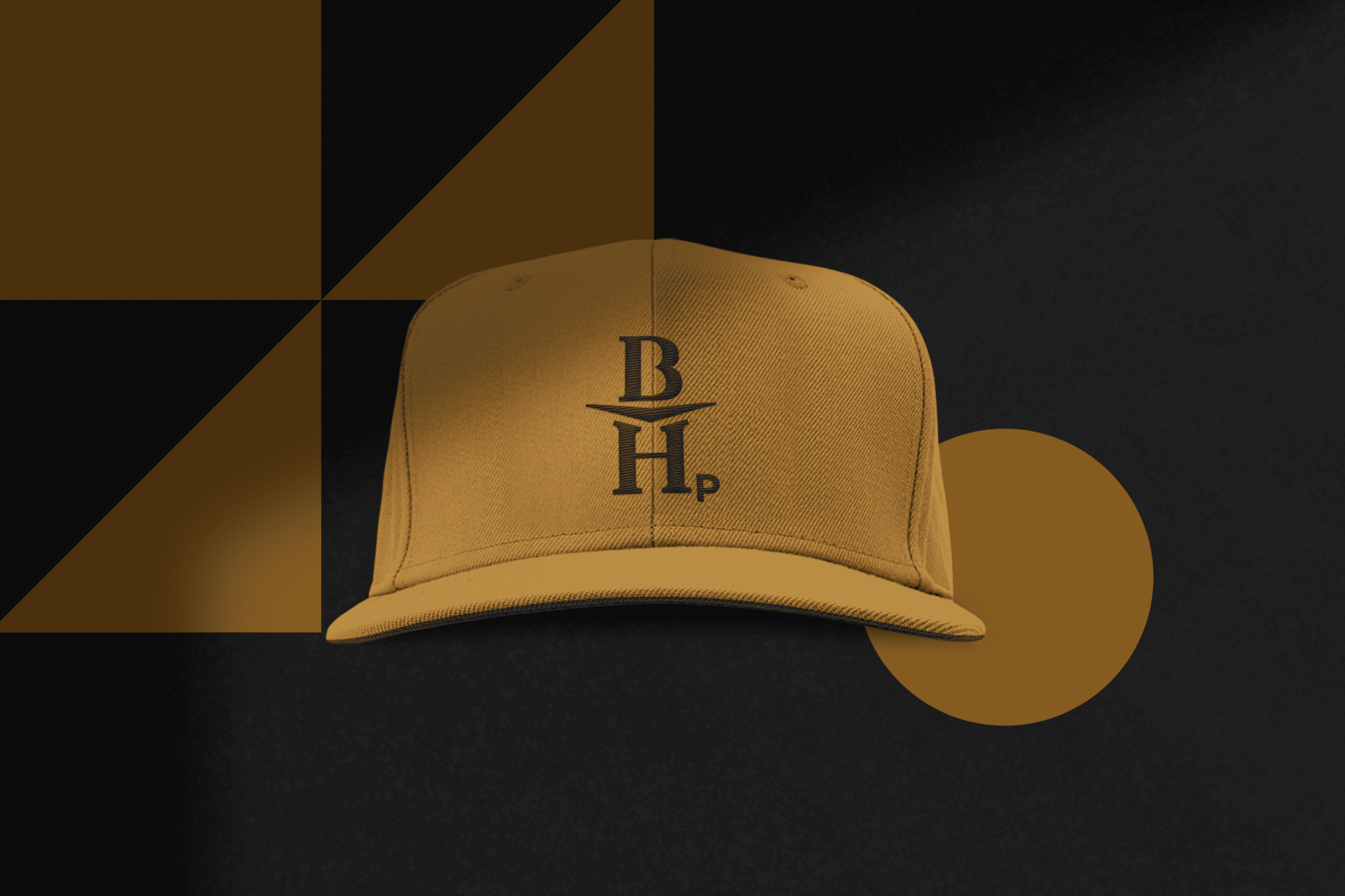
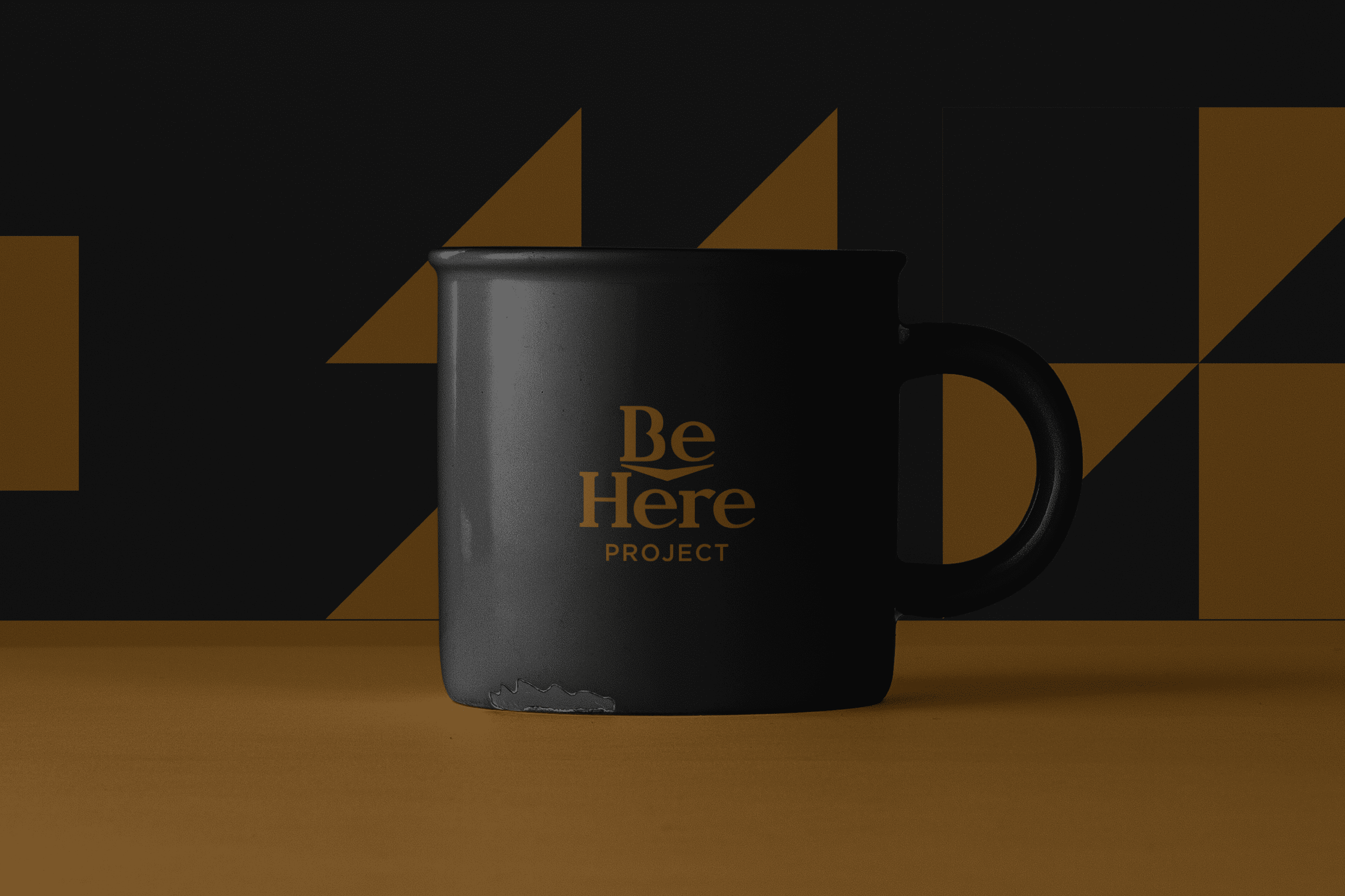
The iconic and typographic part come together to reinforce the concept of “Be Here”. The wide flagpoles and features project confidence, the serif adds to this characteristic, as it gives the typography stability and at the same time the serif alludes to the academic and learning environment. The circular and wide vowels give Be Here Project’s typography a friendly character. On the other hand, the concept of Be Here has been reinforced by integrating a central arrow into the design.

Suggested Projects
Simples Finanzas
Extreme Max
Educar com Evidências
Mafer Merino Photography
BRANDING

The Client

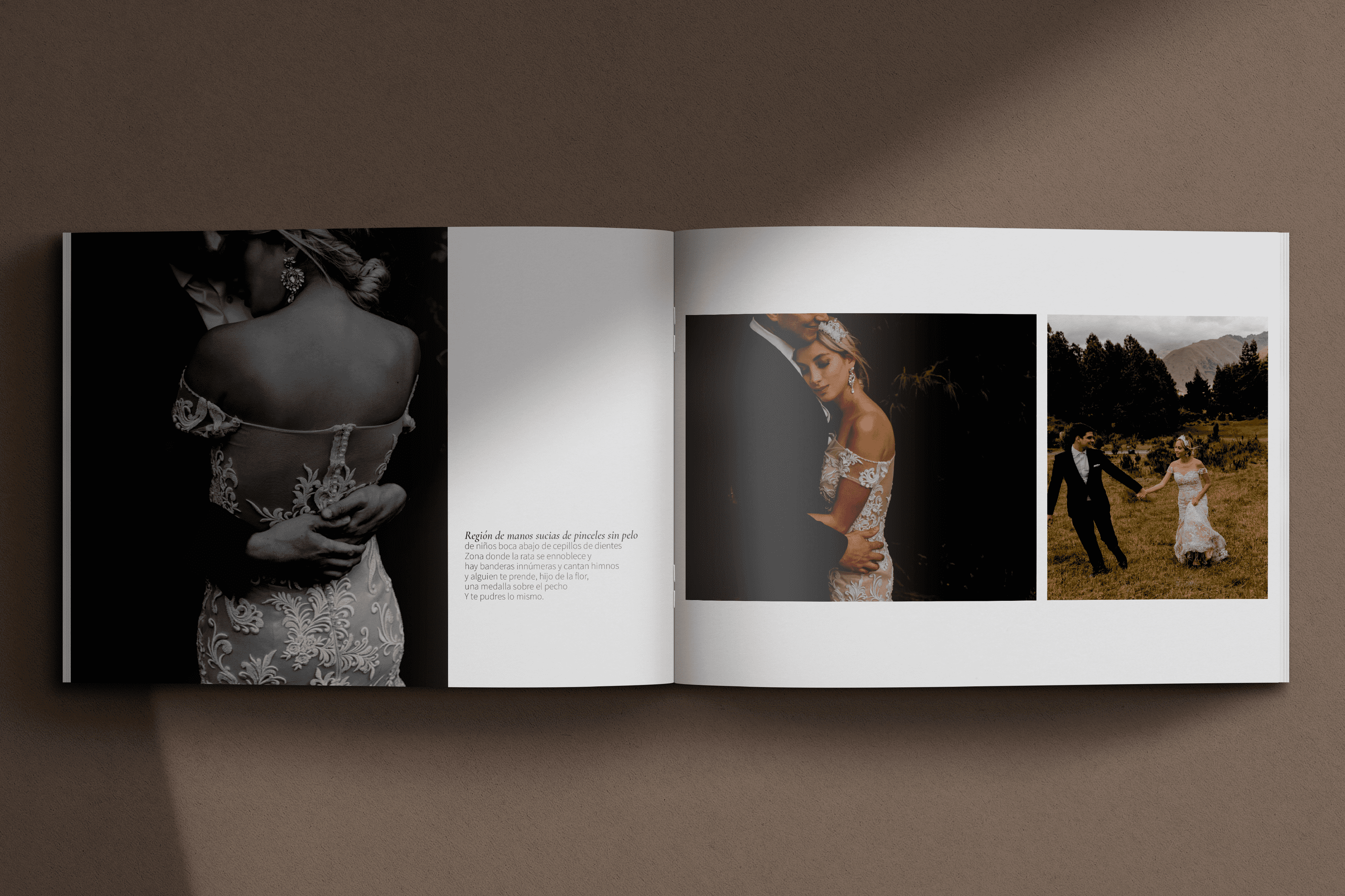
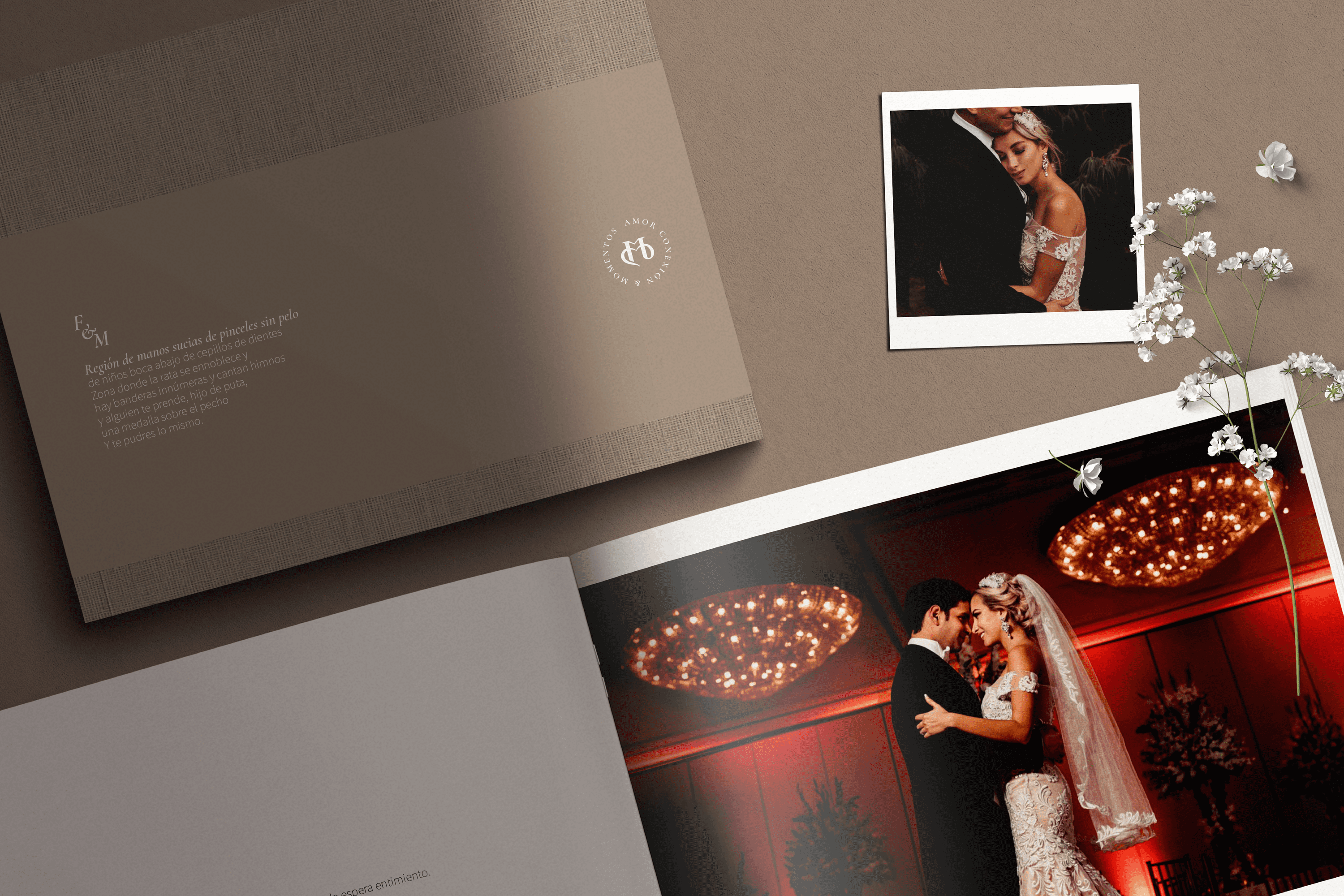
Mafer Merino is a wedding photographer with over 10 years of experience, specializing in capturing the real emotions behind love, located in Samborondón, Ecuador.


Keywords

Branding / Photography / Weddings

The Objective

Design a visual identity for a photography lover, which speaks of the experience of love and real connection that my couples experience through my way of living and doing photography.


The Solution

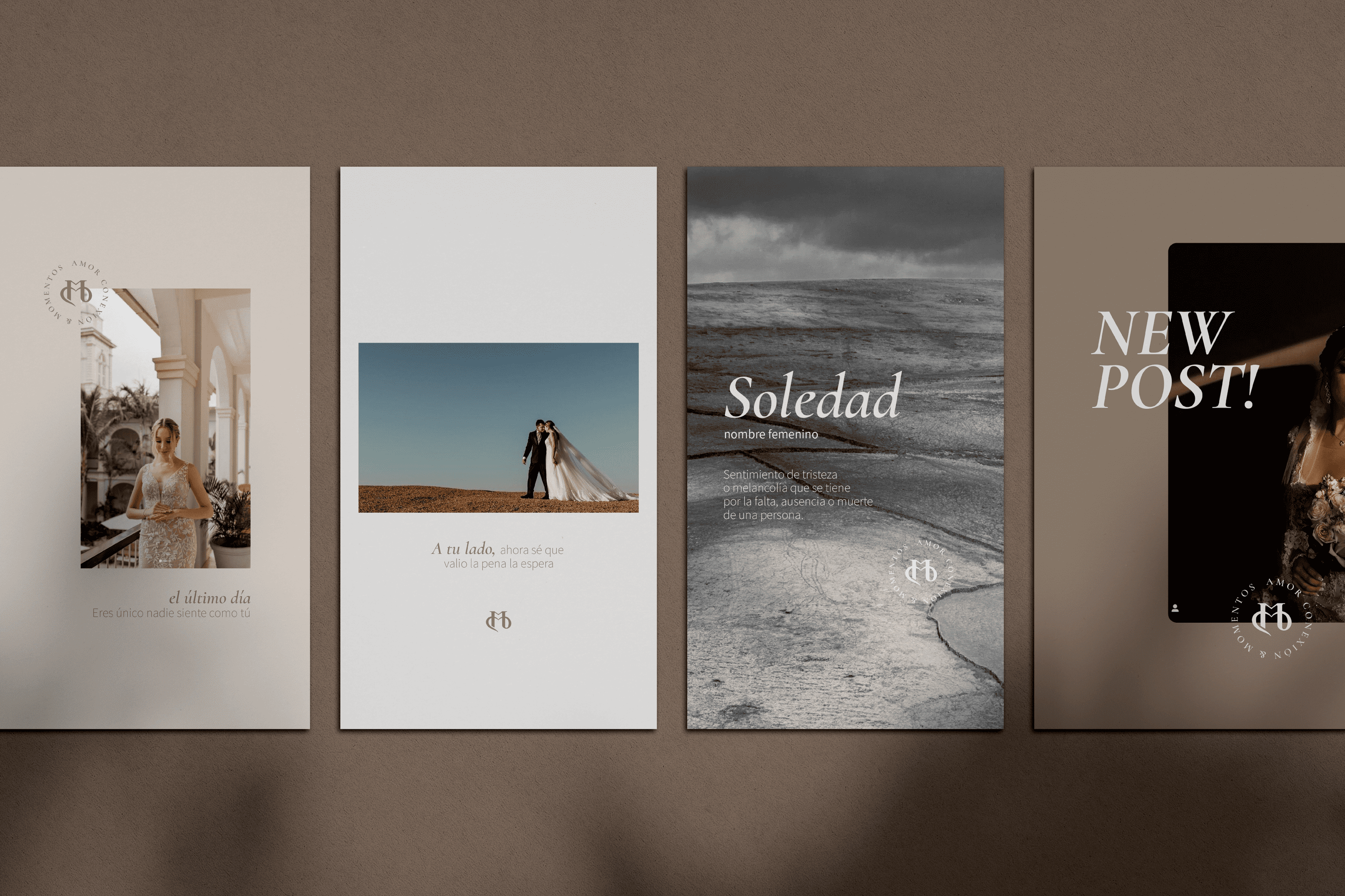
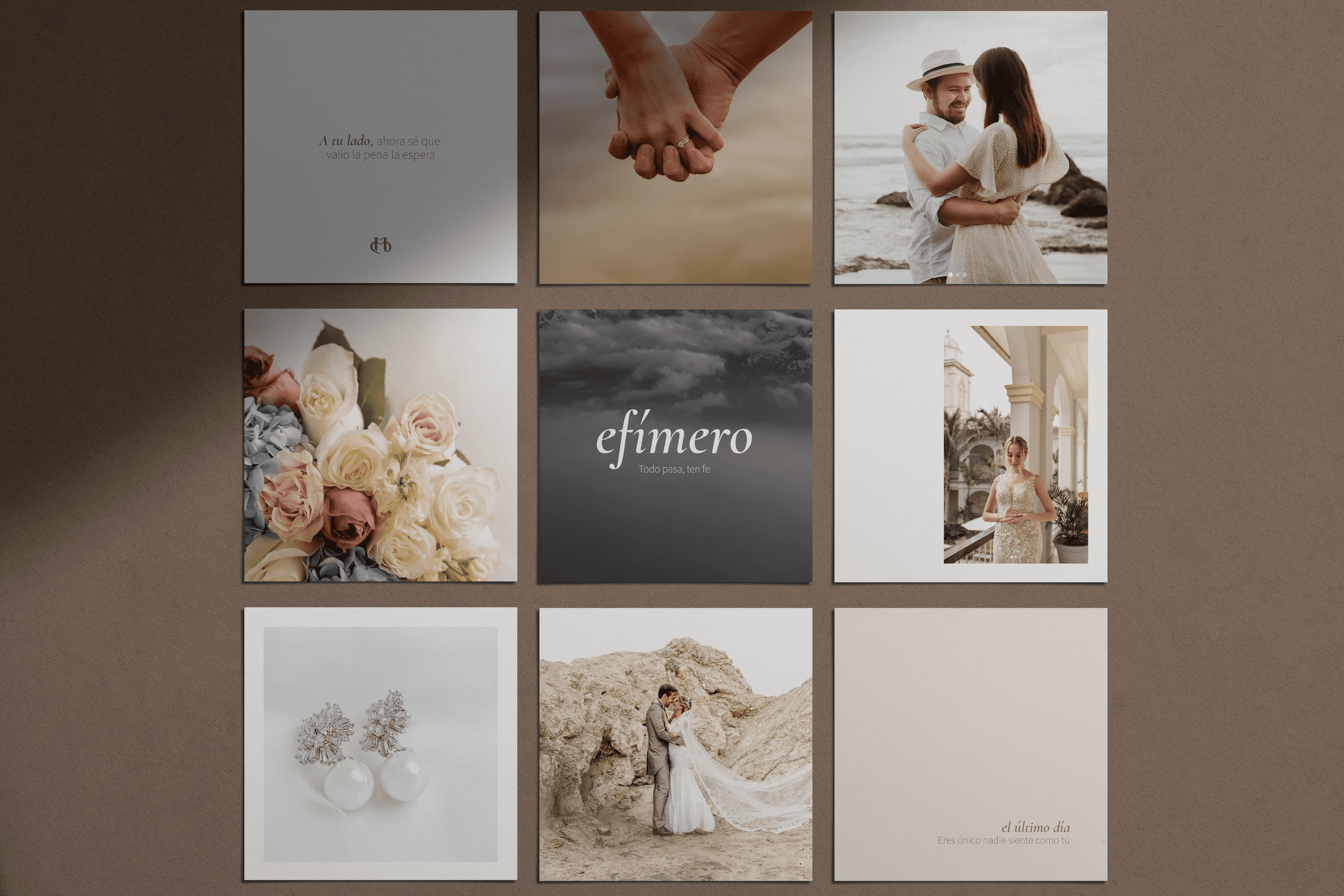
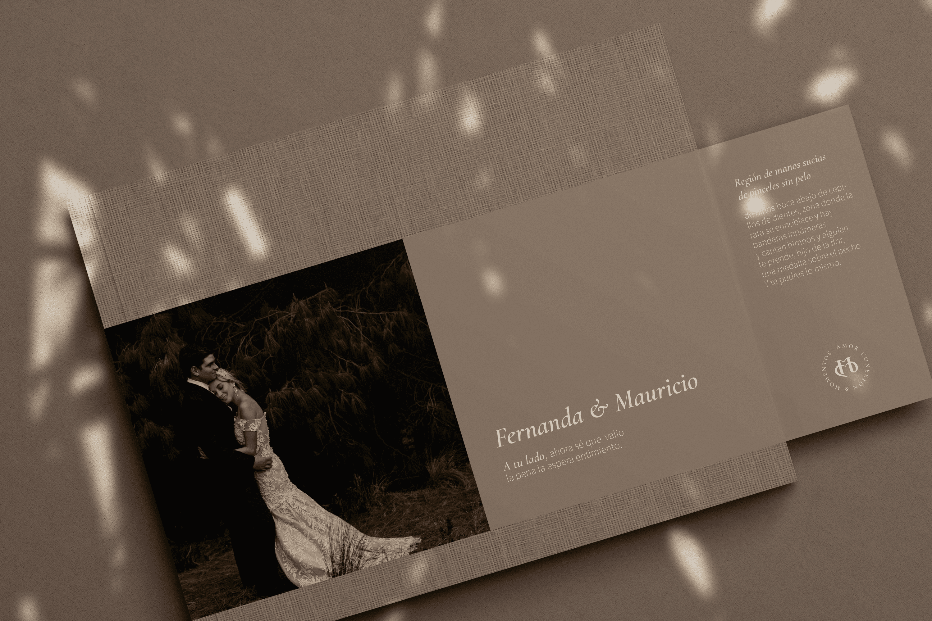
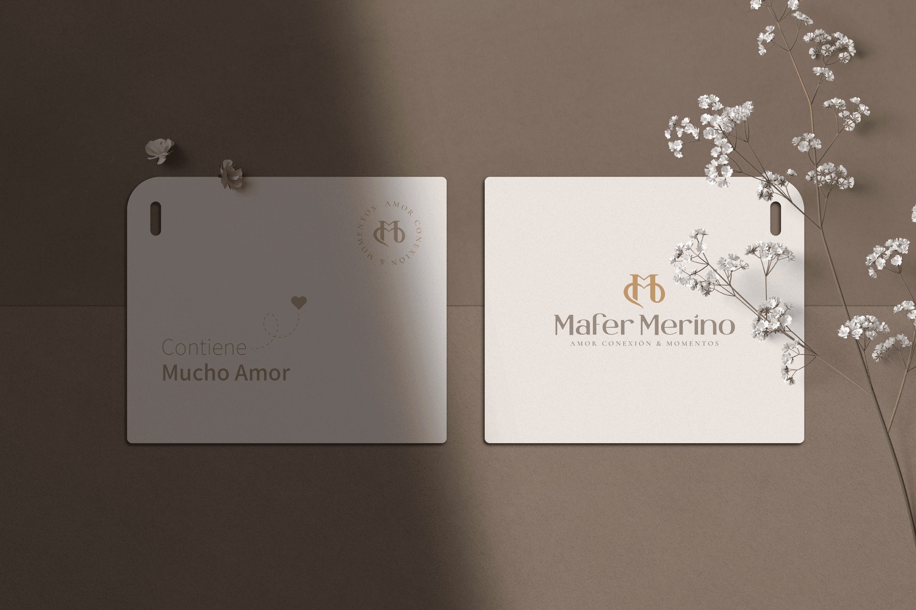
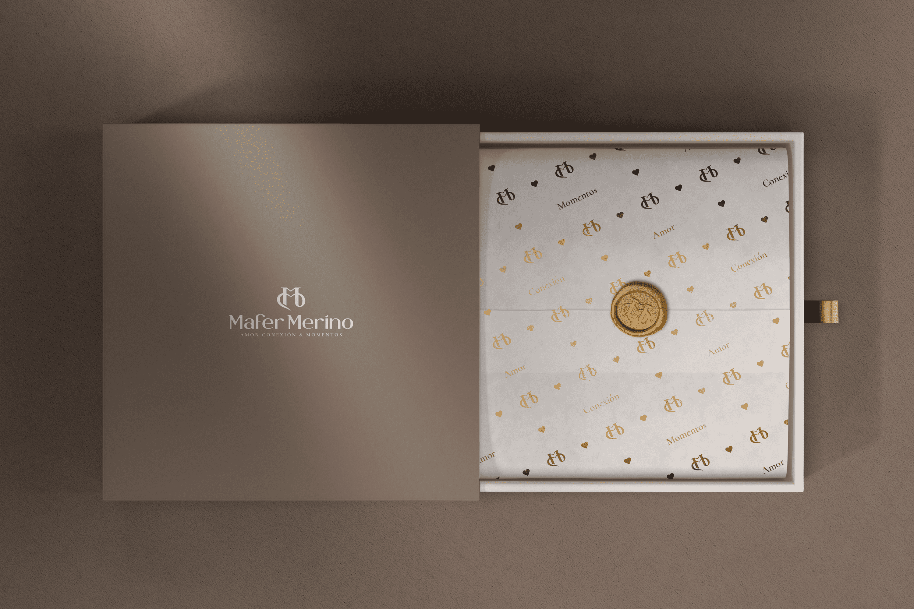
For the redesign of the main Isotope, we were inspired by the love of two people, transforming the initials of Mafer Merino MM, in the first its two pillars allude to two people who are united by the second M that forms a connection link, a bond of love. The finish of this isotope arises from a classic environment.

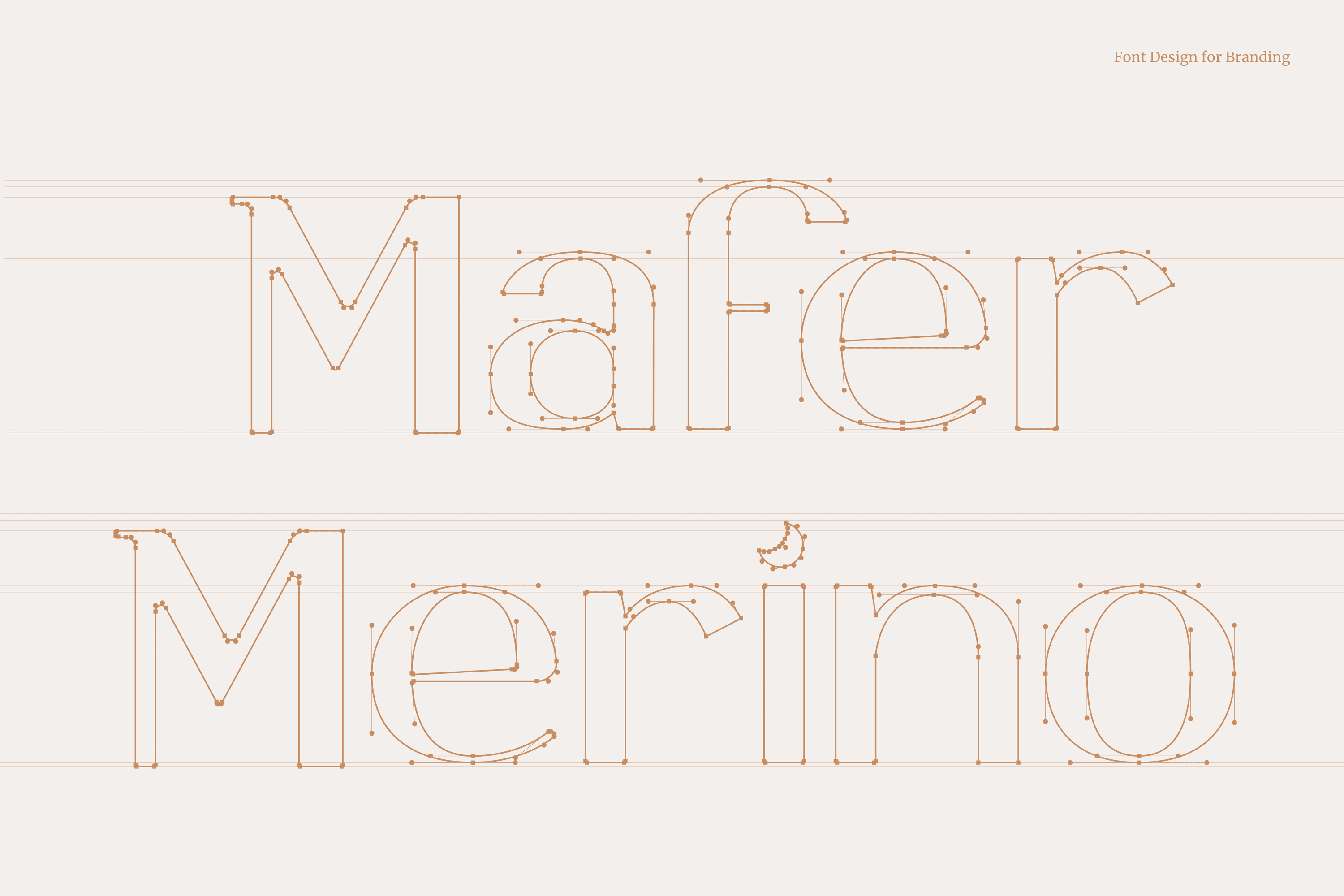
On the other hand, the typography developed for Mafer Merino is San Serif, a contemporary and elegant letter type that together with its isotope speaks of its way of telling stories. Mafer takes care of every detail and is a lover of the moon, for this reason we have hidden a small moon and that is to love is to look towards the sky and dare to dream.

Suggested Projects
Simples Finanzas
Extreme Max
Educar com Evidências
Diablo Huma Food Truck
BRANDING

The Client

“Diablo Huma” is a fast food truck in Ecuador located in Saquisili in the province of Cotopaxi.


Keywords

Branding / Illustration / Fast Food

The Objective

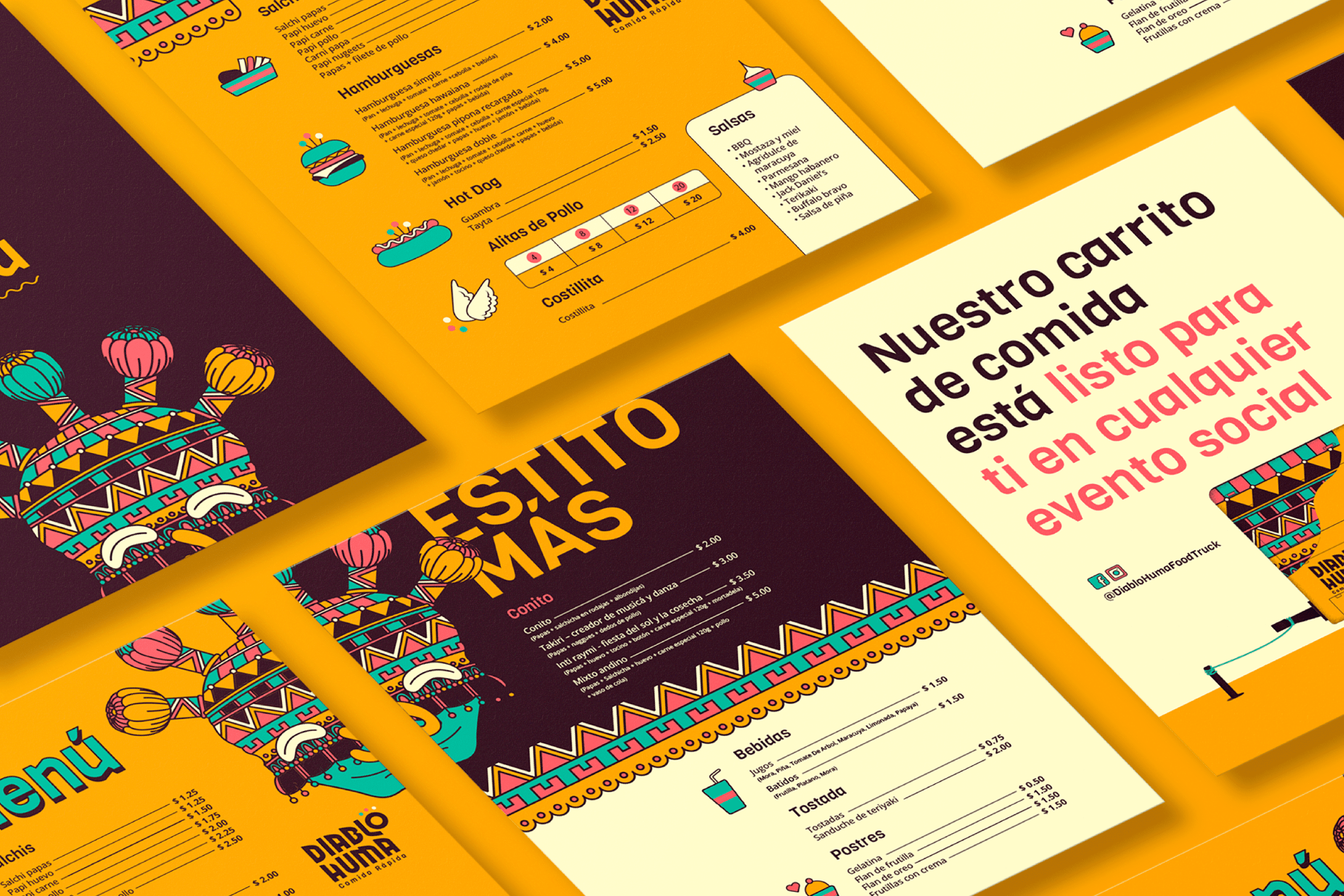
To design the new identity for Diablo Huma Fast Food with the mission of communicating quality, freshness and the culture of the region without losing accessibility.


The Solution

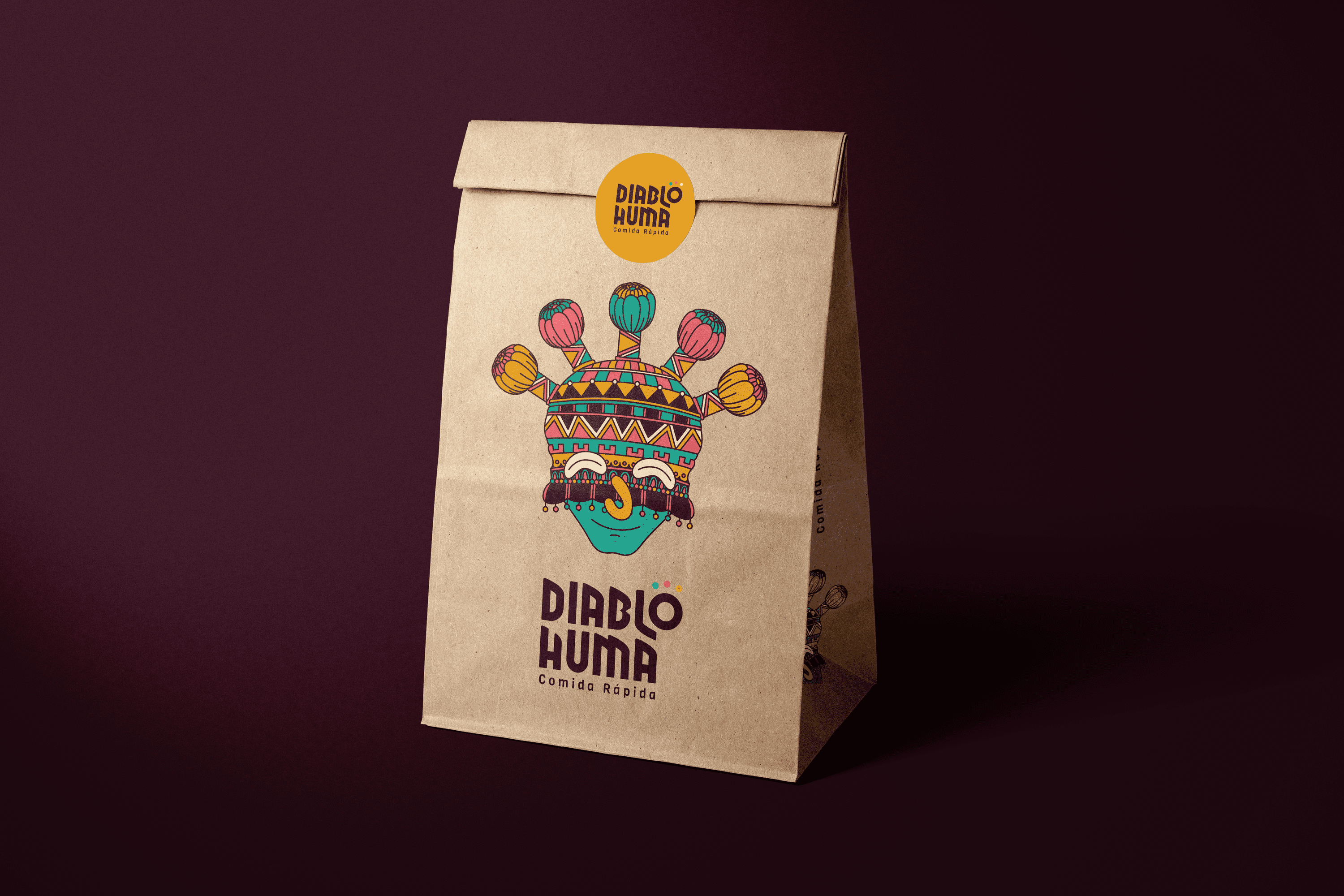
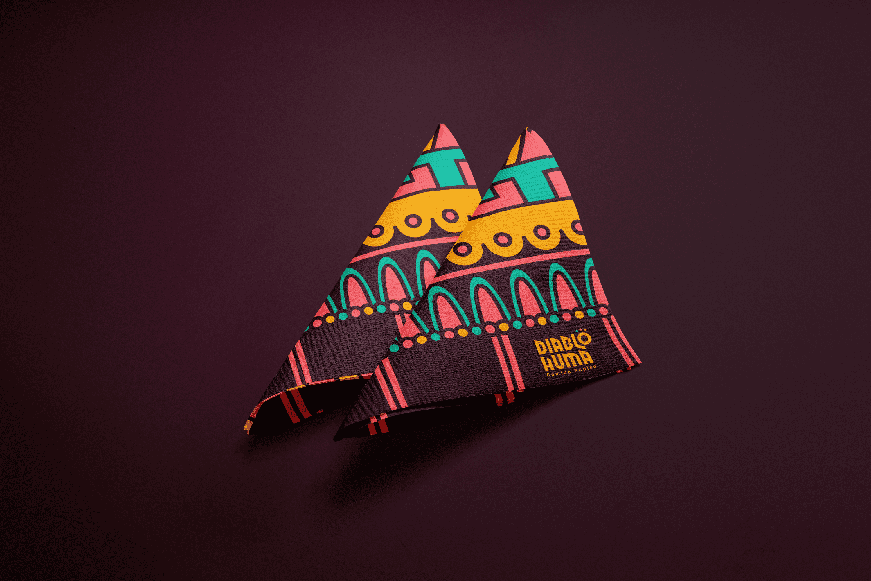
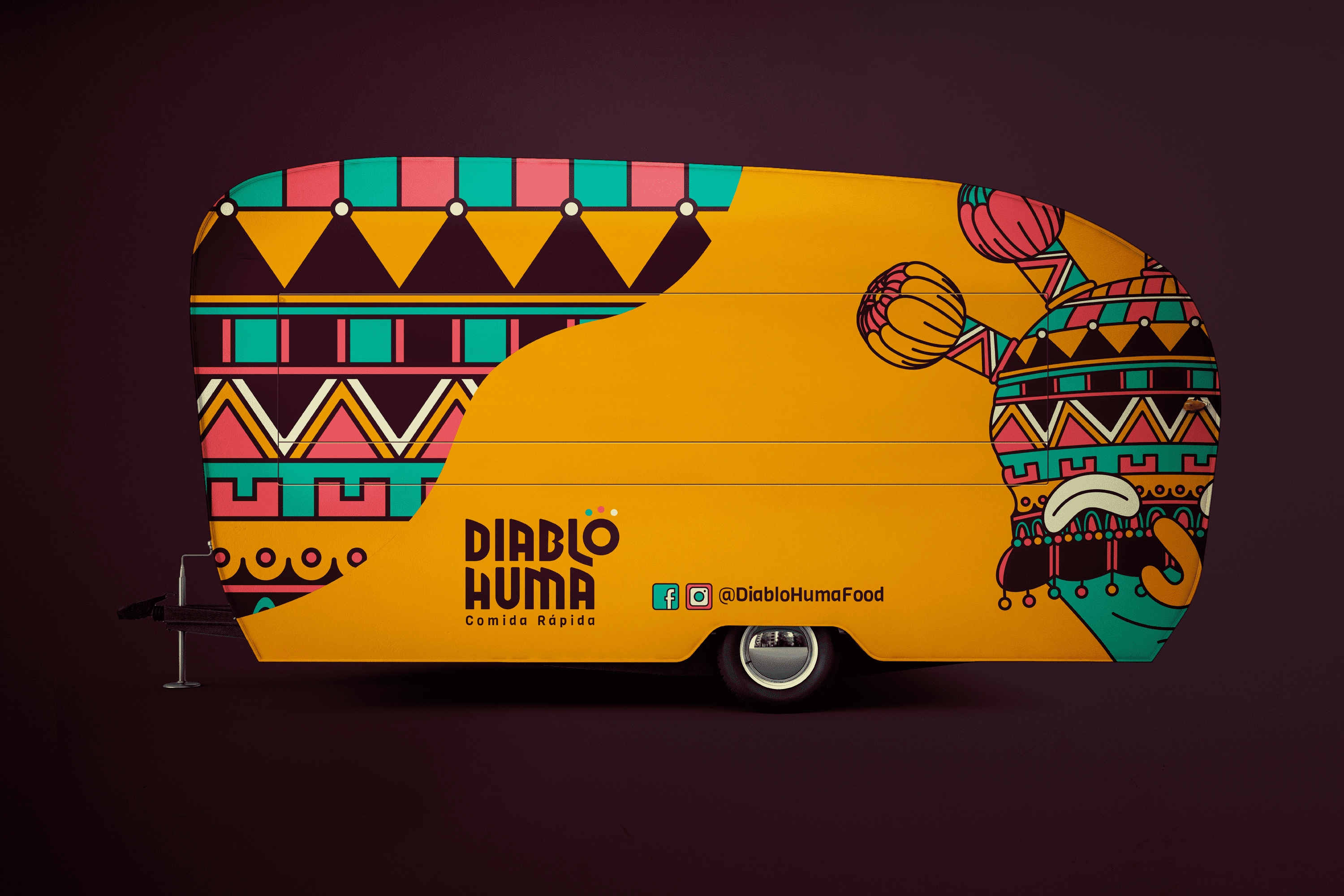
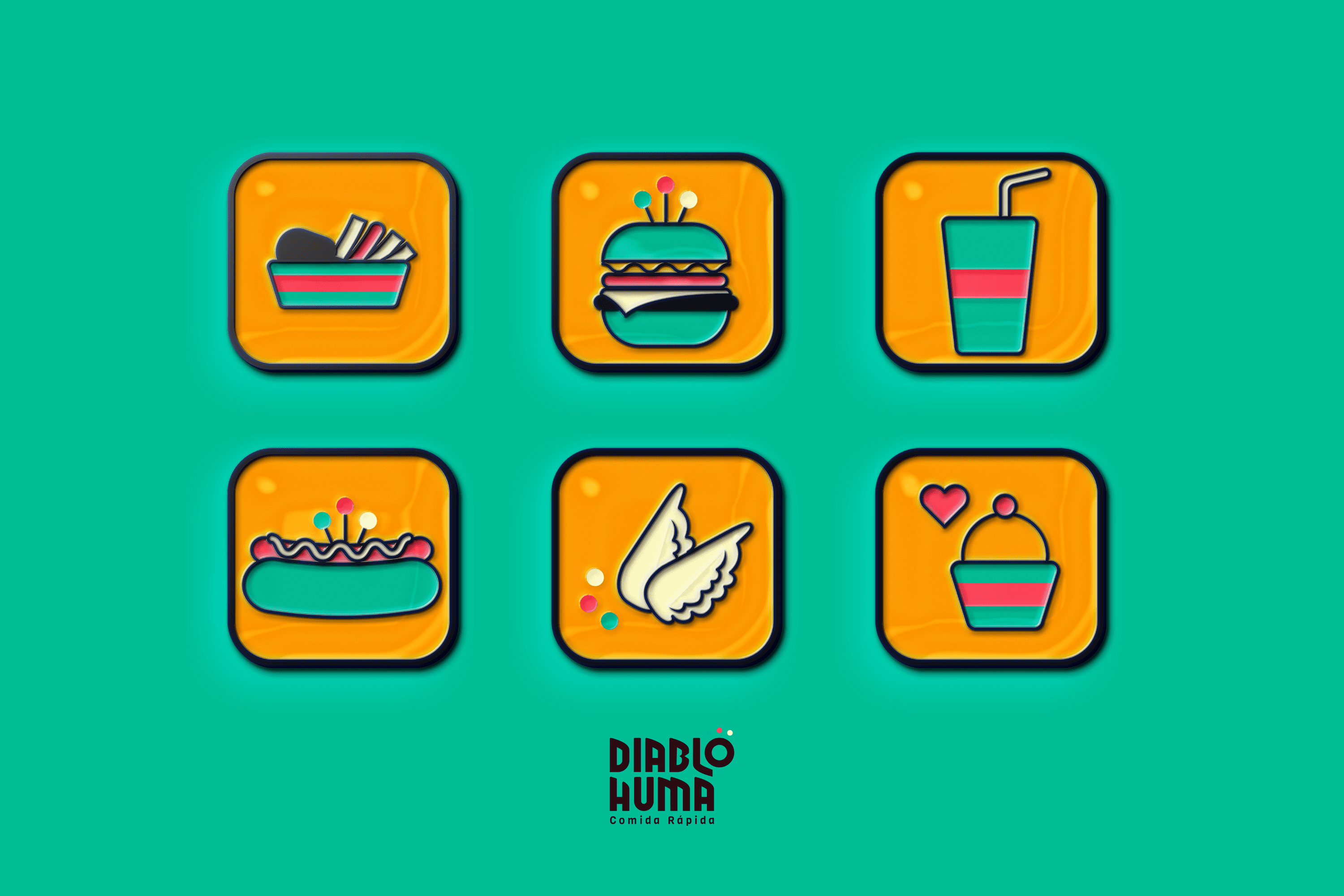
The proposal is based on the character of the Andean region of the Inti Raymi, festival, also known as Aya Uma, it is believed that this character drives away the demons of the crops and dances in three times to connect with the Earth, the Sun and the Moon (these three elements accompany the letter “o” of the logo which in turn is the abstraction of a “Diablo Huma”). The name of the character was used and an illustrated interpretation of it was made, fusing its traditional mask with various patterns present in the fabrics of the Andean Region. This proposal is accompanied by vibrant and friendly colors, close to the young public to which it is addressed..

Suggested Projects
Simples Finanzas
Extreme Max
Educar com Evidências