Pinky Bar
BRANDING
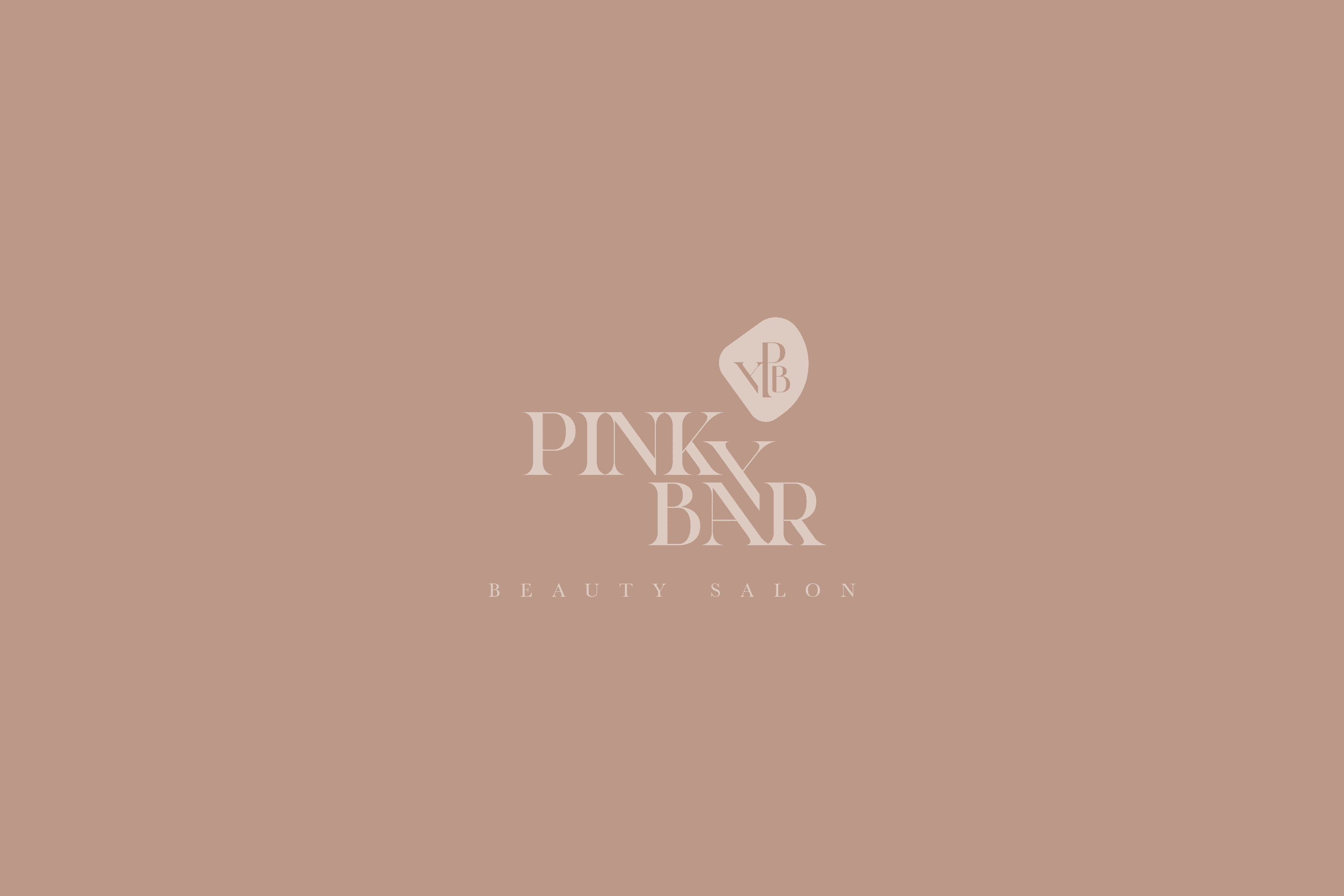
The Client
“Pinky Bar” is a beauty salon with more than 10 years, which goes hand in hand with the trends and offers the service of hairdressing, coloring among other beauty services. It is located in Kuwait, Western Asia.
Keywords
Branding / Beauty Salon
The Objective
Develop an elegant brand, linked to beauty care, that transmits confidence and status.
The Solution
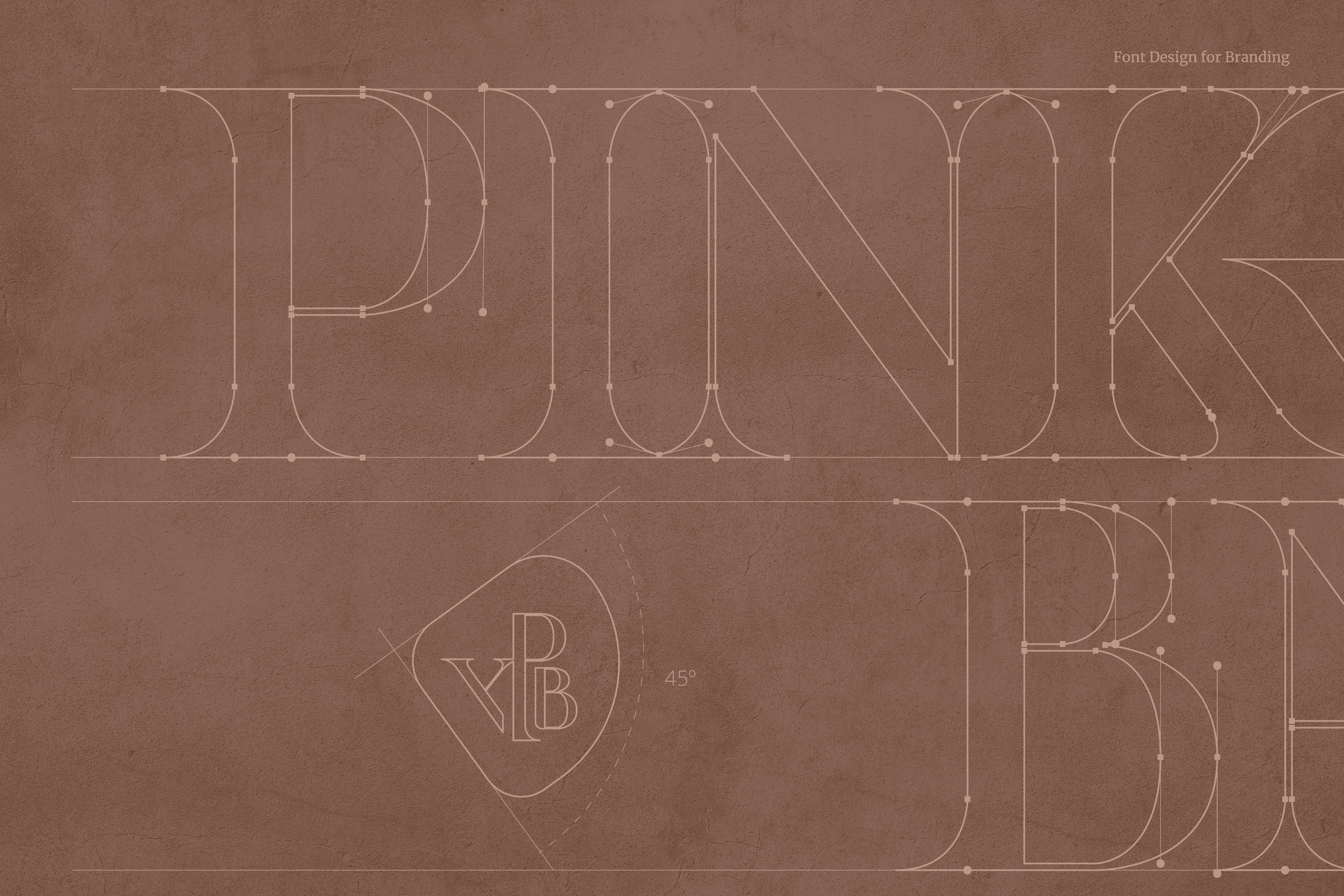
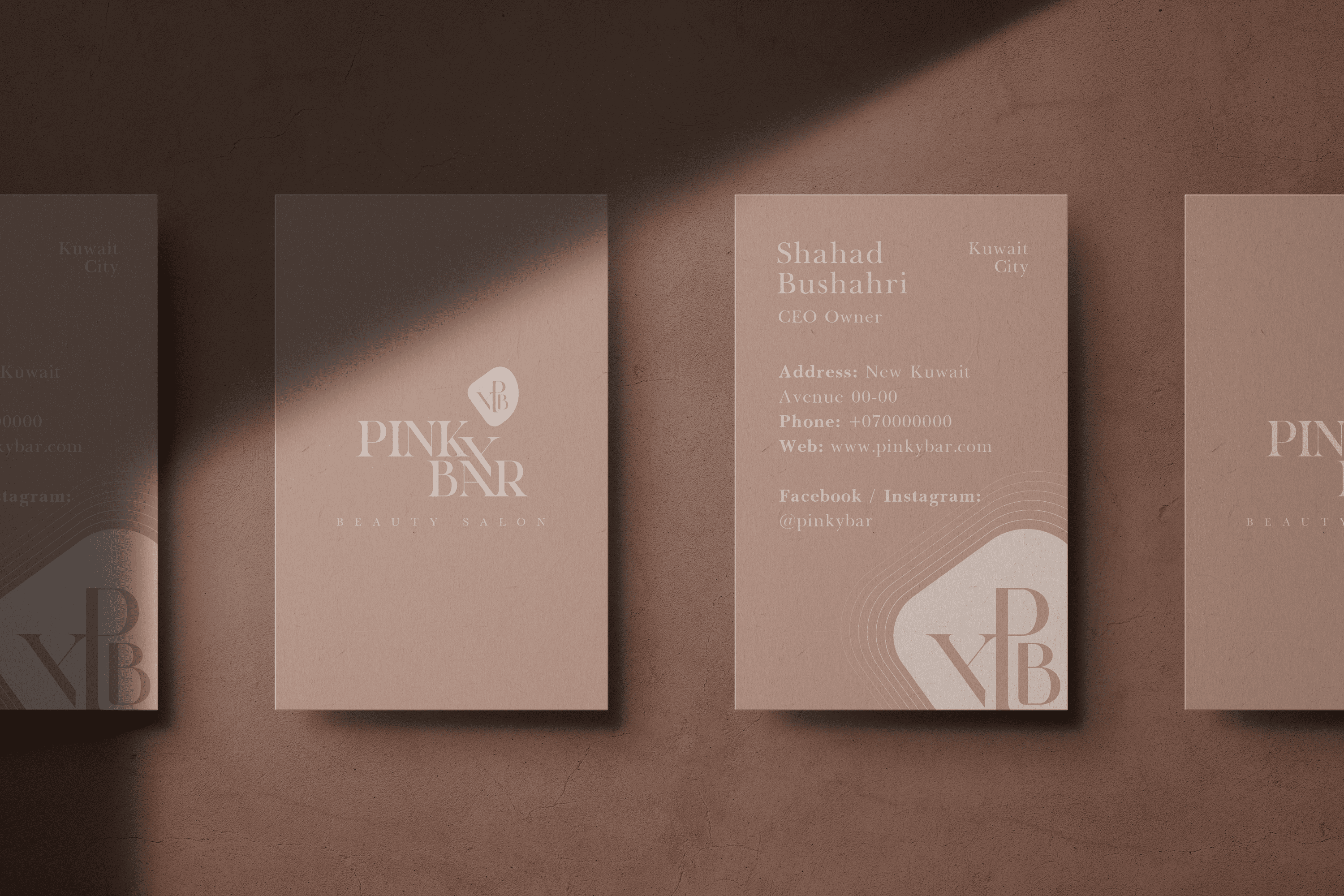
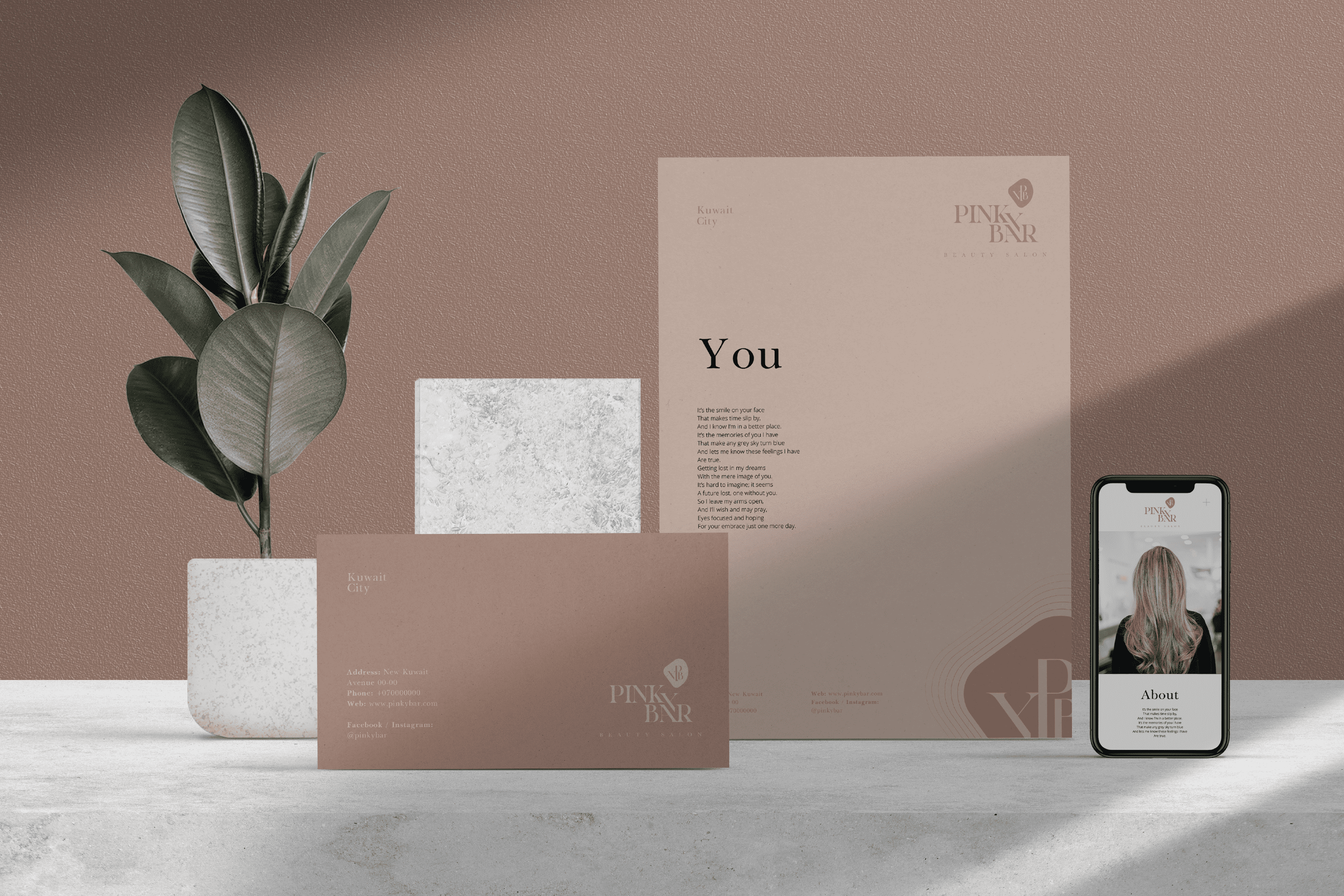
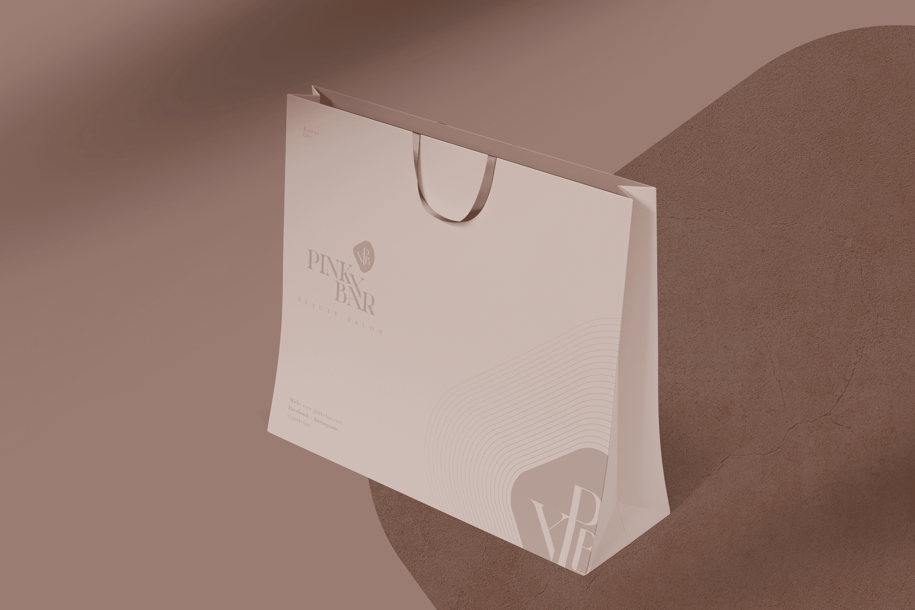
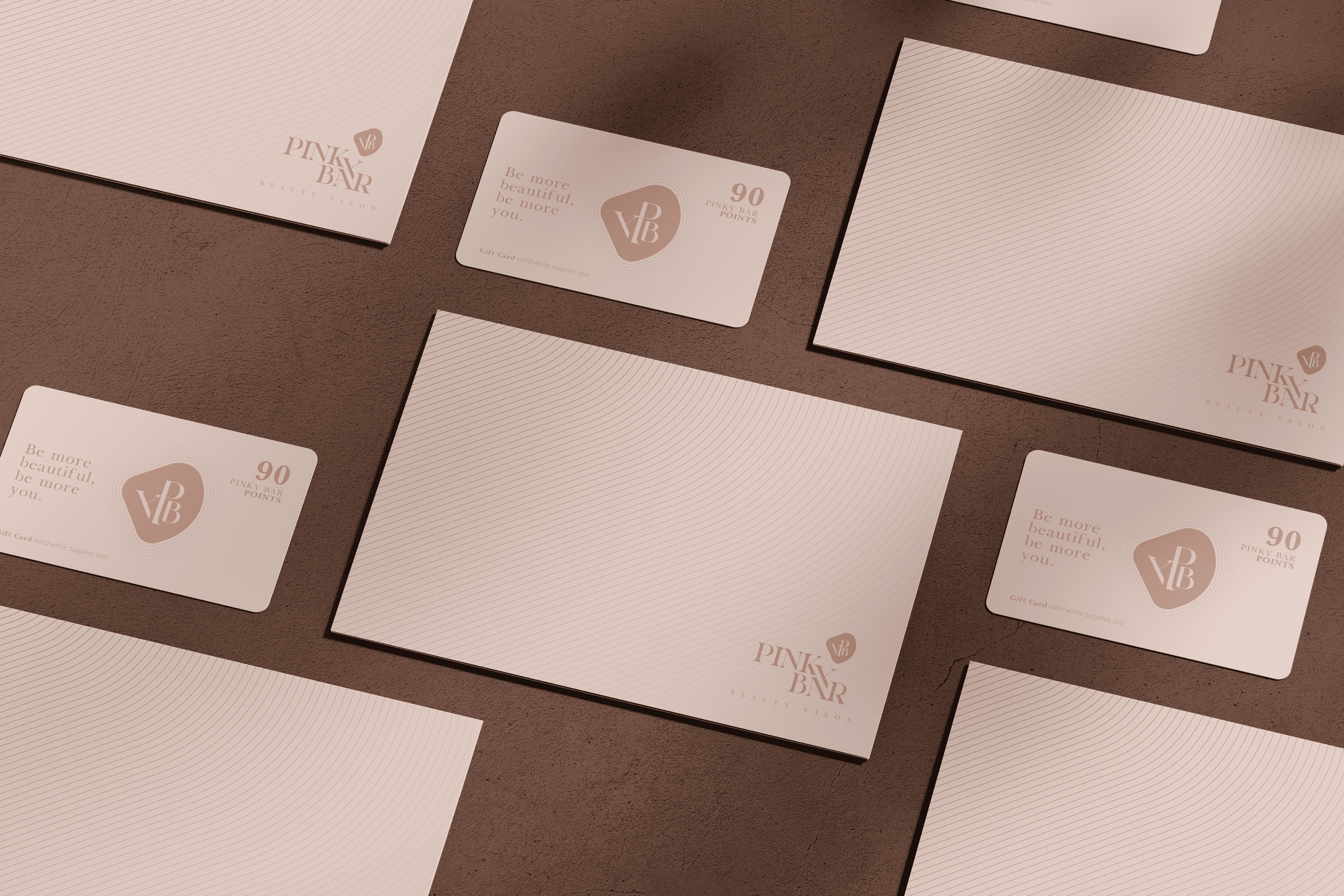
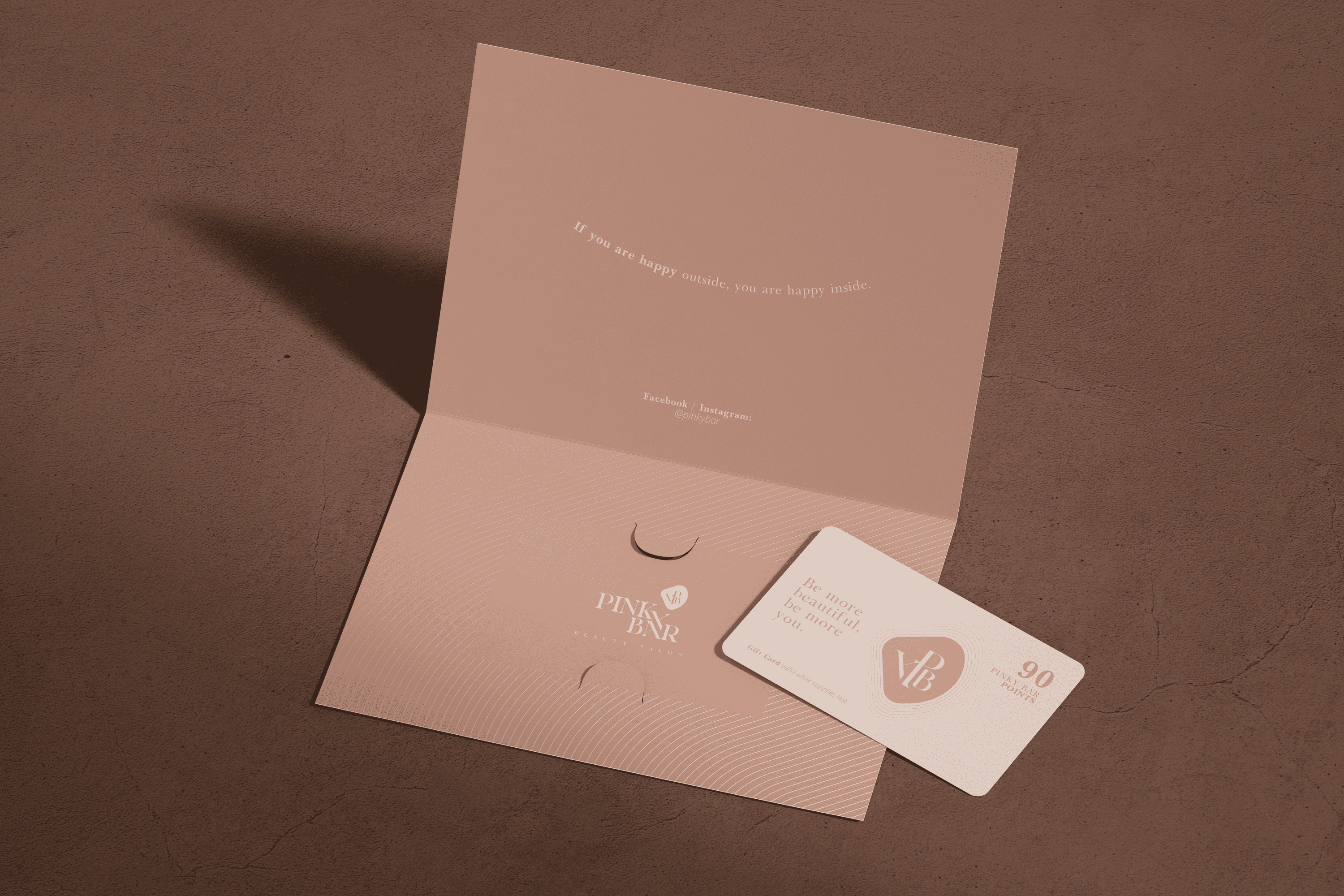
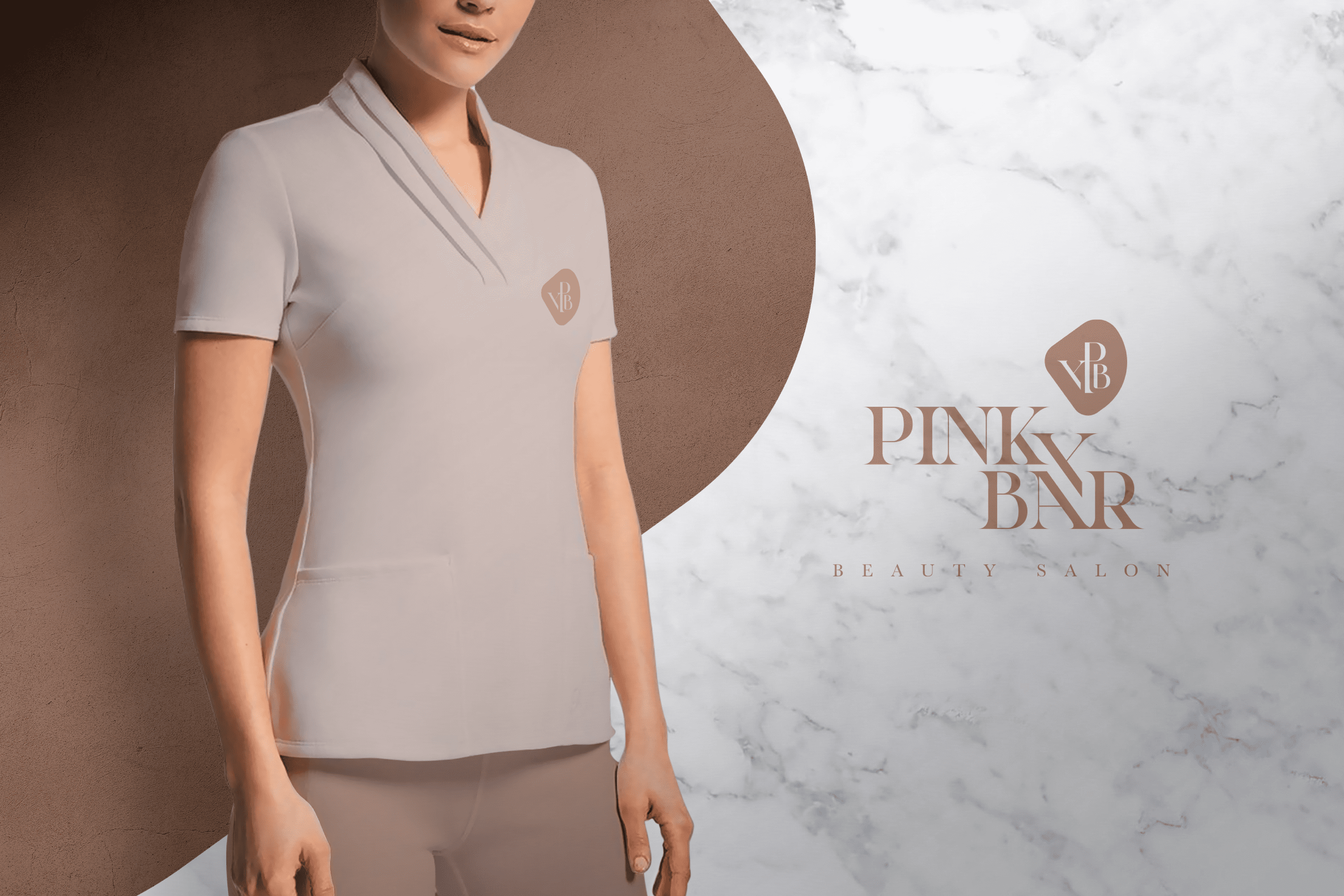
The typography designed for “Pinky Bar” is Serif, its elongated finials give stability and elegance, while the thin flagpoles reinforce the sense of elegance and distinction. The letter “Y” has been developed as an element of integration and its location speaks of the coziness of the beauty salon “Pinky Bar”.
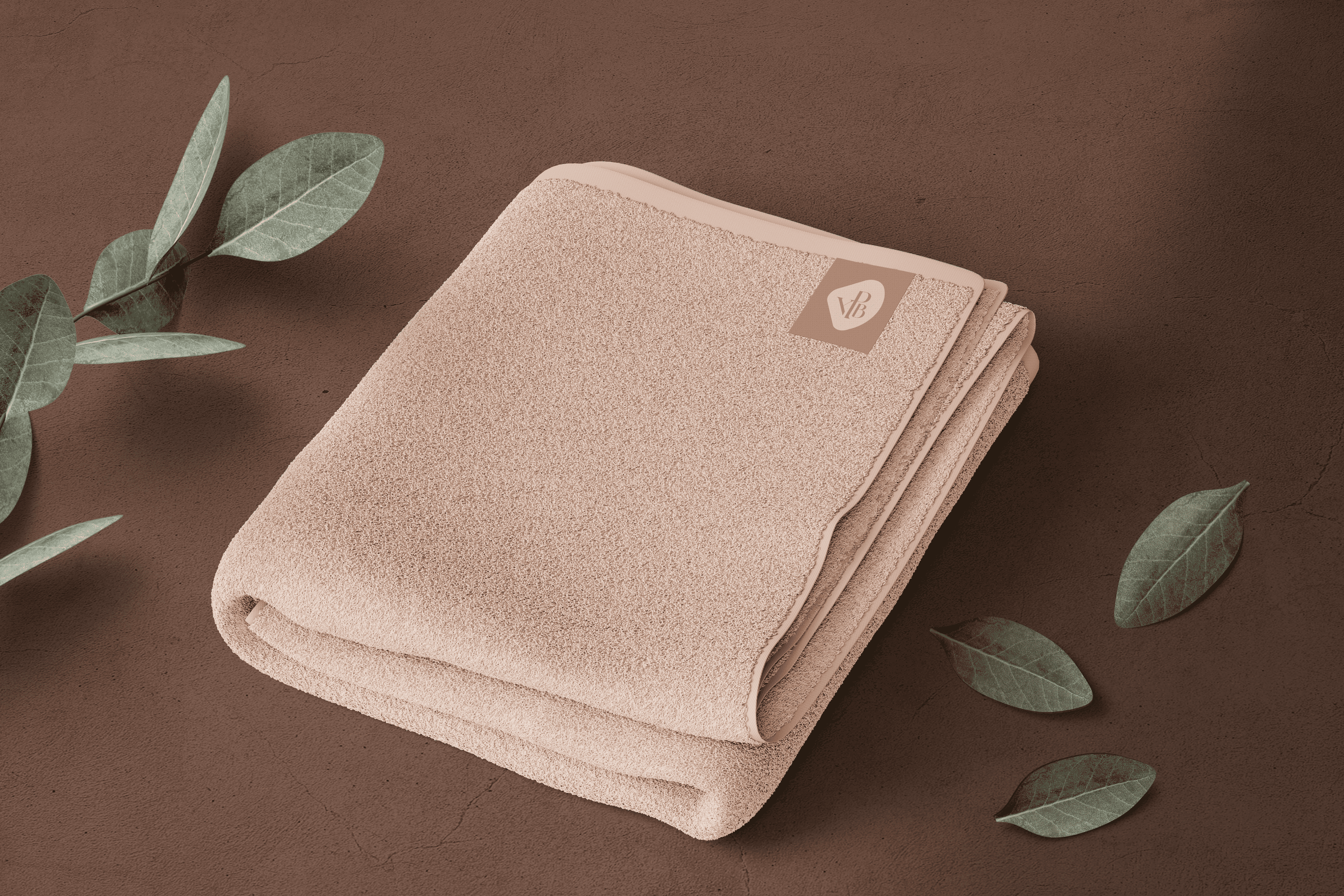
The isotype combines in a gem (beauty element) the most significant letters of the name, to become the emblem of “Pinky Bar”. The lines that complement the isotype were designed to transmit renewal and vitality.
 Facebook