The Client
“Handverso” is a new brand of handcrafted gifts located in Quito Ecuador. Each and every gift (wines, nuts, chocolates, etc.) is prepared in the most impeccable way possible, taking care of the final consumer experience.
Keywords
Branding / Naming / Packaging / Handmade / Gifts
The Objective
To develop a women’s brand, friendly, egalitarian, elegant and strong, of handmade details for men and women.
The Solution
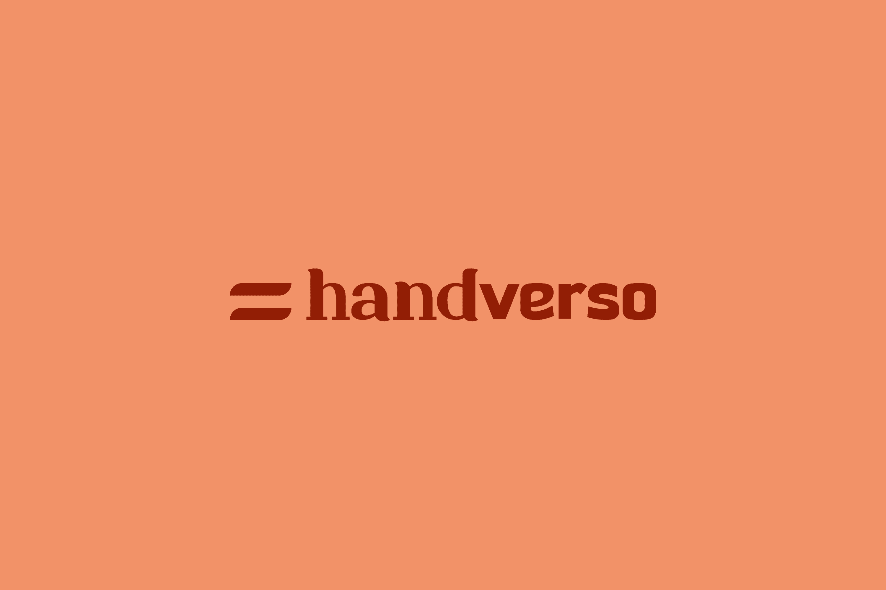
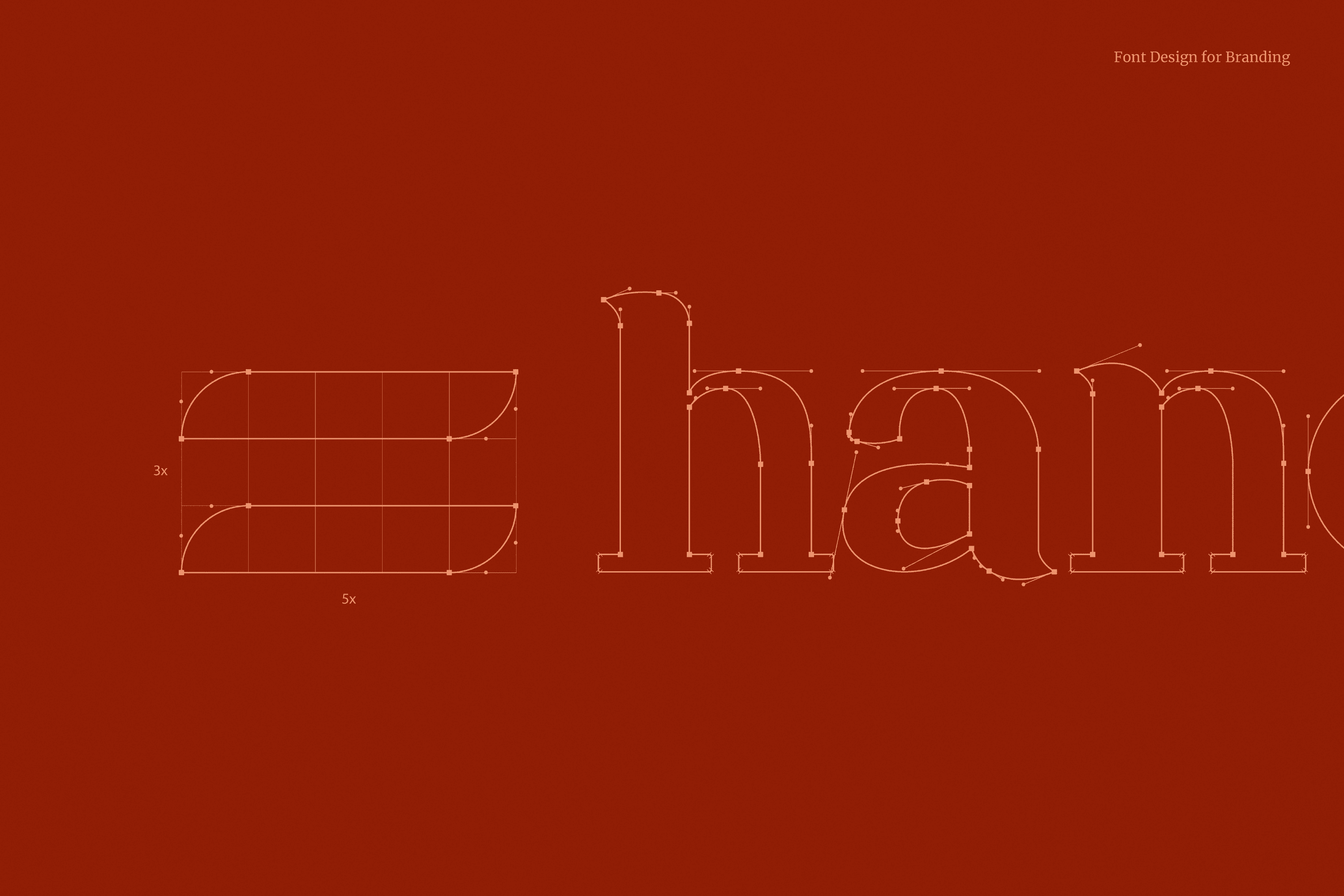
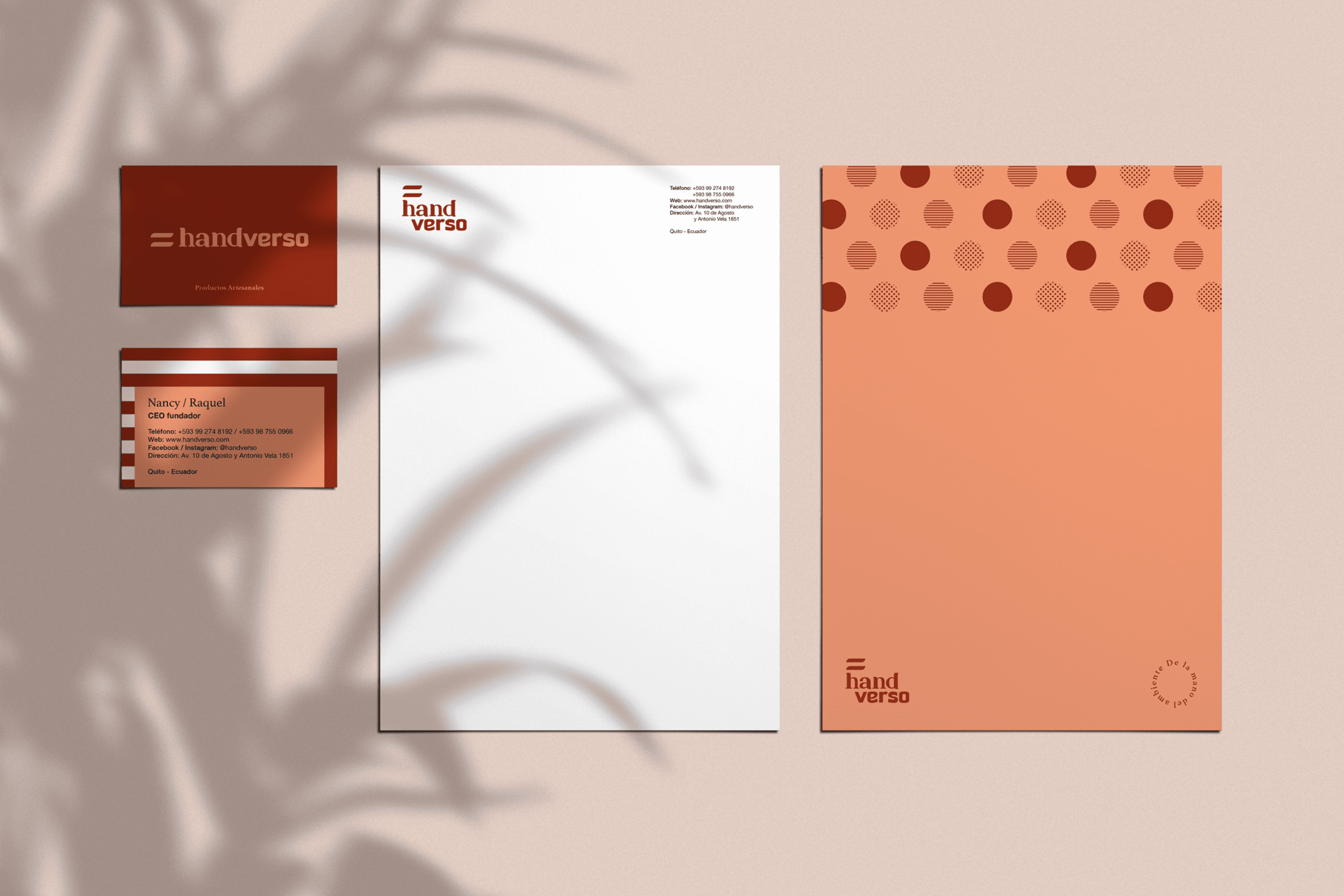
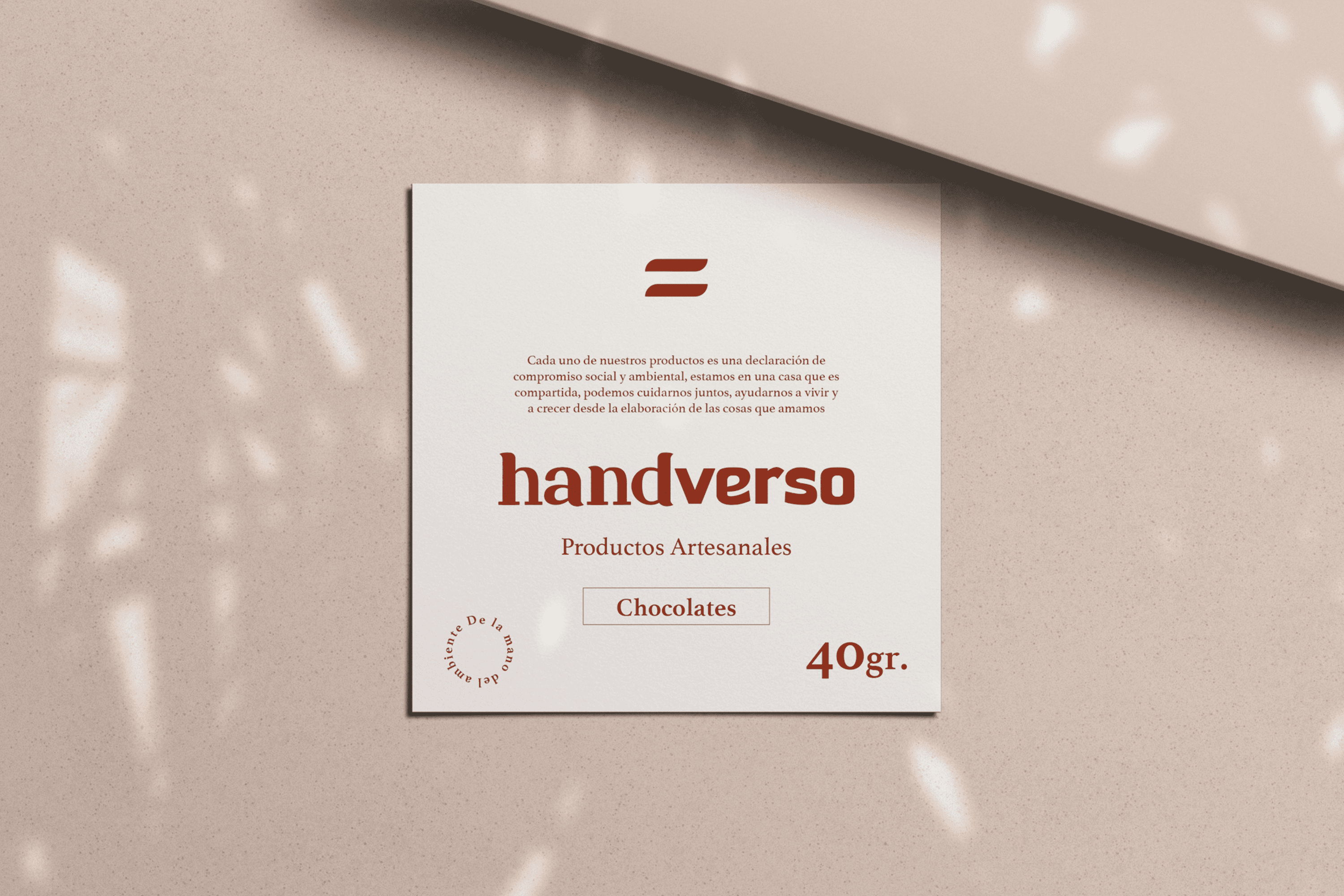
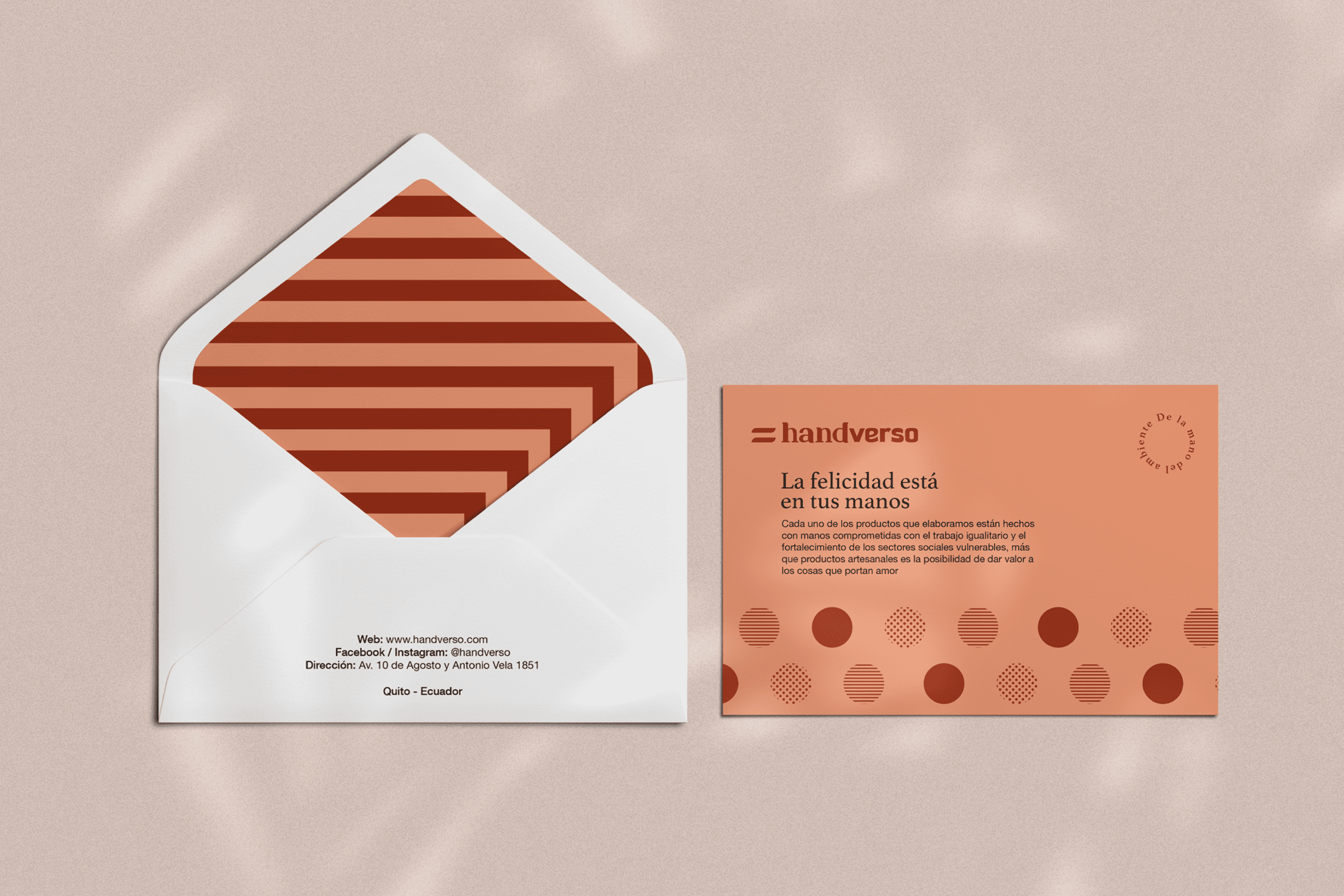
An identity has been developed whose name comes from the combination of “hand”and “verso” which in Spanish means verse as that union of words that forms a unit in a poem, thus referring to the delicacy with which the details of Handverso are elaborated. The typography has been designed based on one of the most important values present in this company, which is to highlight the delicacy, elegance and strength of the handverso woman, this has been achieved by merging two typefaces where “hand” is written with a delicate and elegant Serif typeface, and “verso” on the contrary expresses strength through a San Serif typeface. The icon is the flag of handverso, speaking of equality, both in gender, opportunities, treatment and use of resources used, seeking full respect for their environment. Two warm colors have been chosen to reflect its feminine nature, but allow handverso to be well received by both men and women.
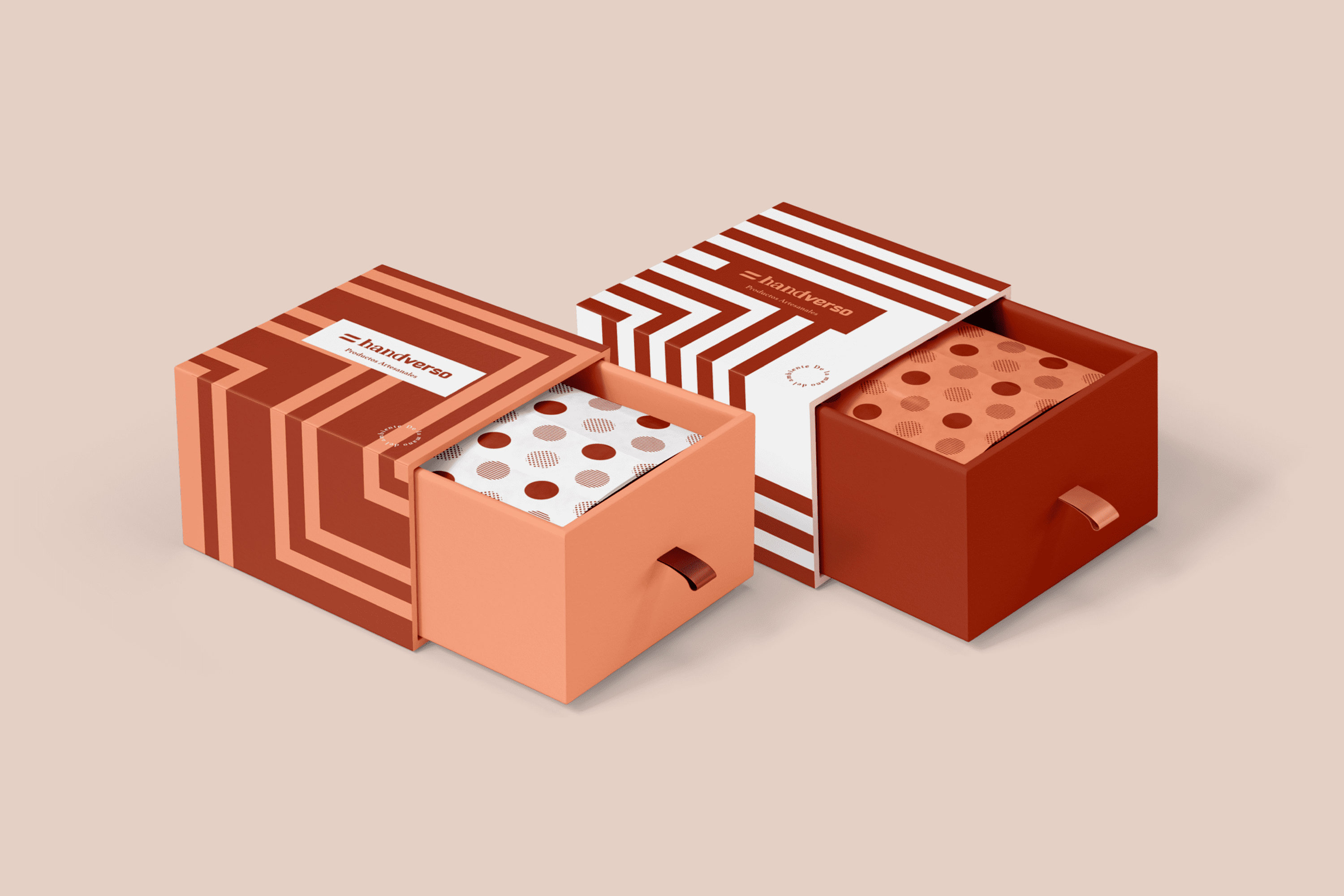
The linear design of the exterior of the packaging is a representation of the multiple possible ways to reach the same goal, and also tells us that it is the road traveled that makes this detail important. On the other hand, the inside is covered with several equal but different circumferences in its composition, thus valuing human diversity and making it part of this great gift.
 Facebook