PURIK Amazonian Beer
BRANDING

The Client

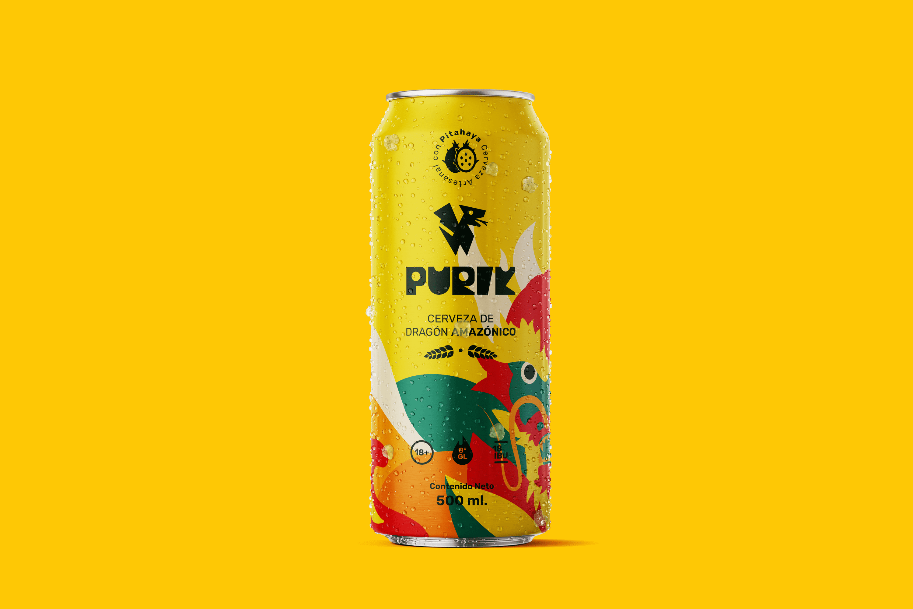
We are a pioneering brand in the production of pitahaya (fruit from the Amazon) beer, located in Palora-Ecuador.


Keywords

Branding / Packaging / Beer / Ancestral
The Objective

Design a vibrant beer brand that shows the essence of its Amazonian and ancestral origin.


The Solution

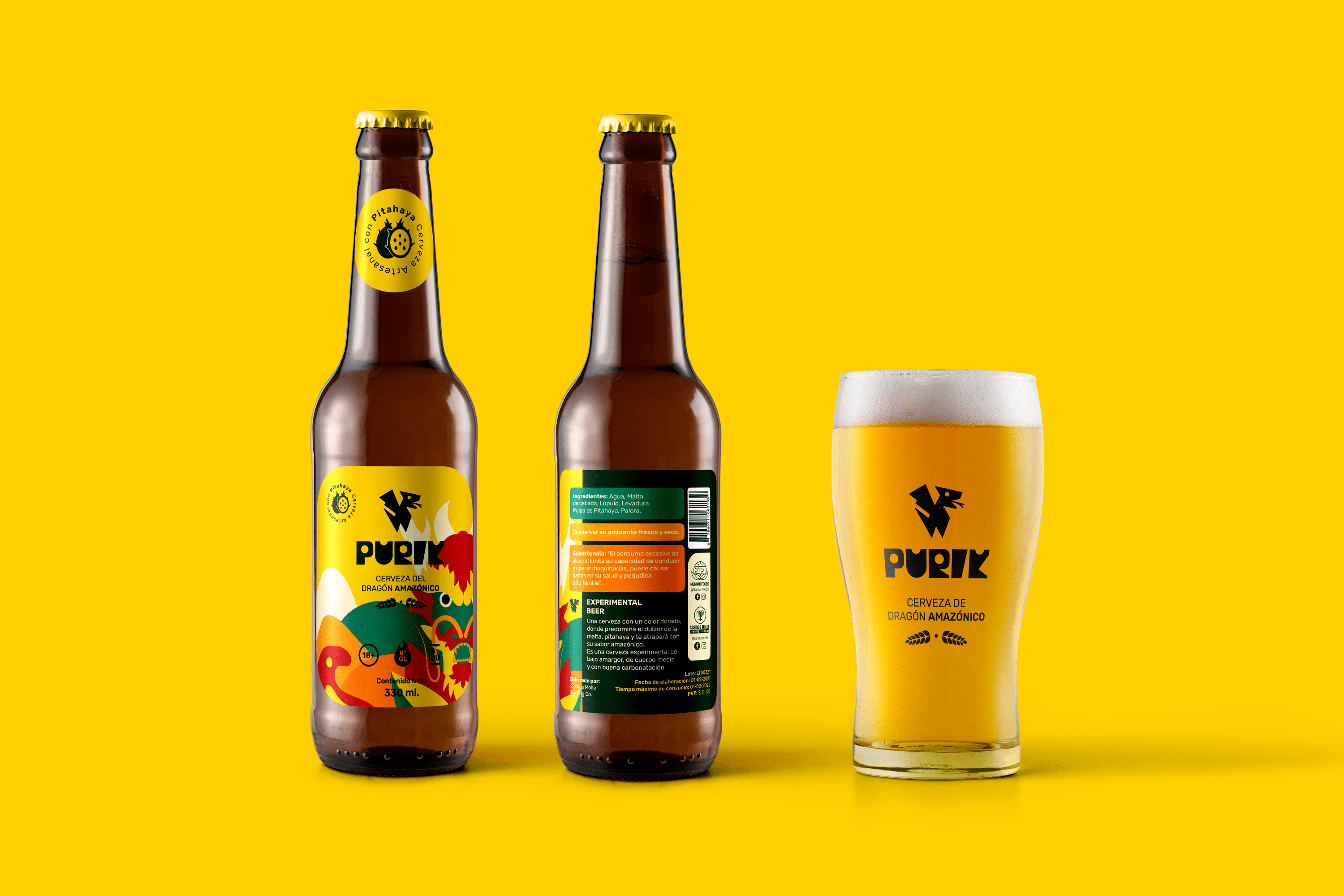
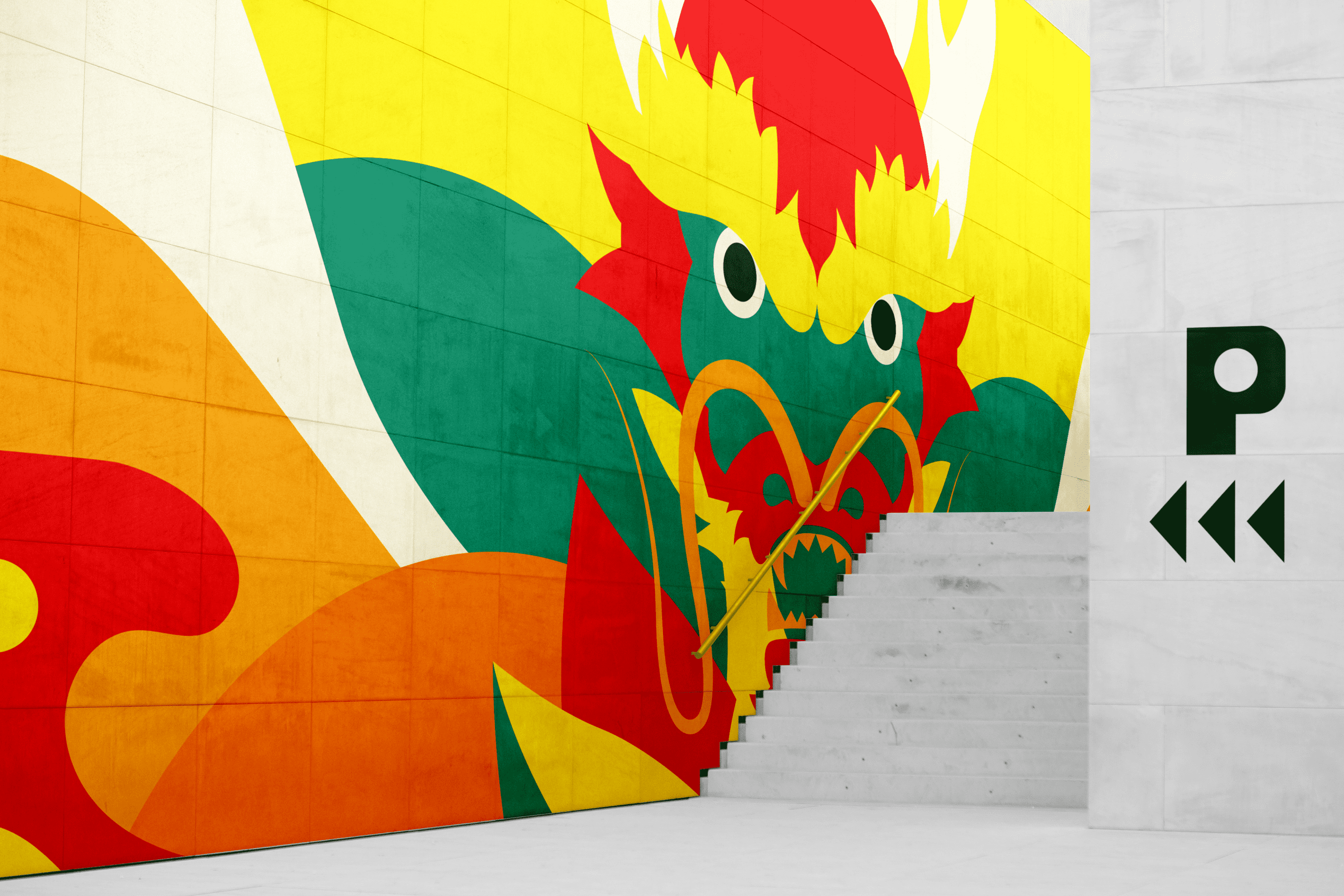
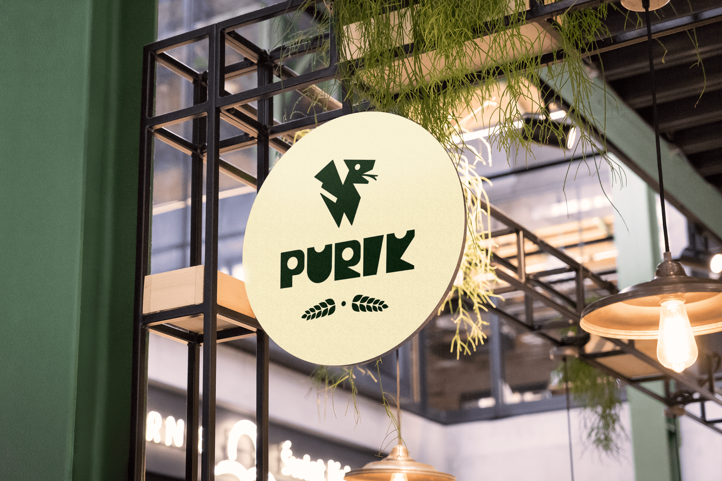
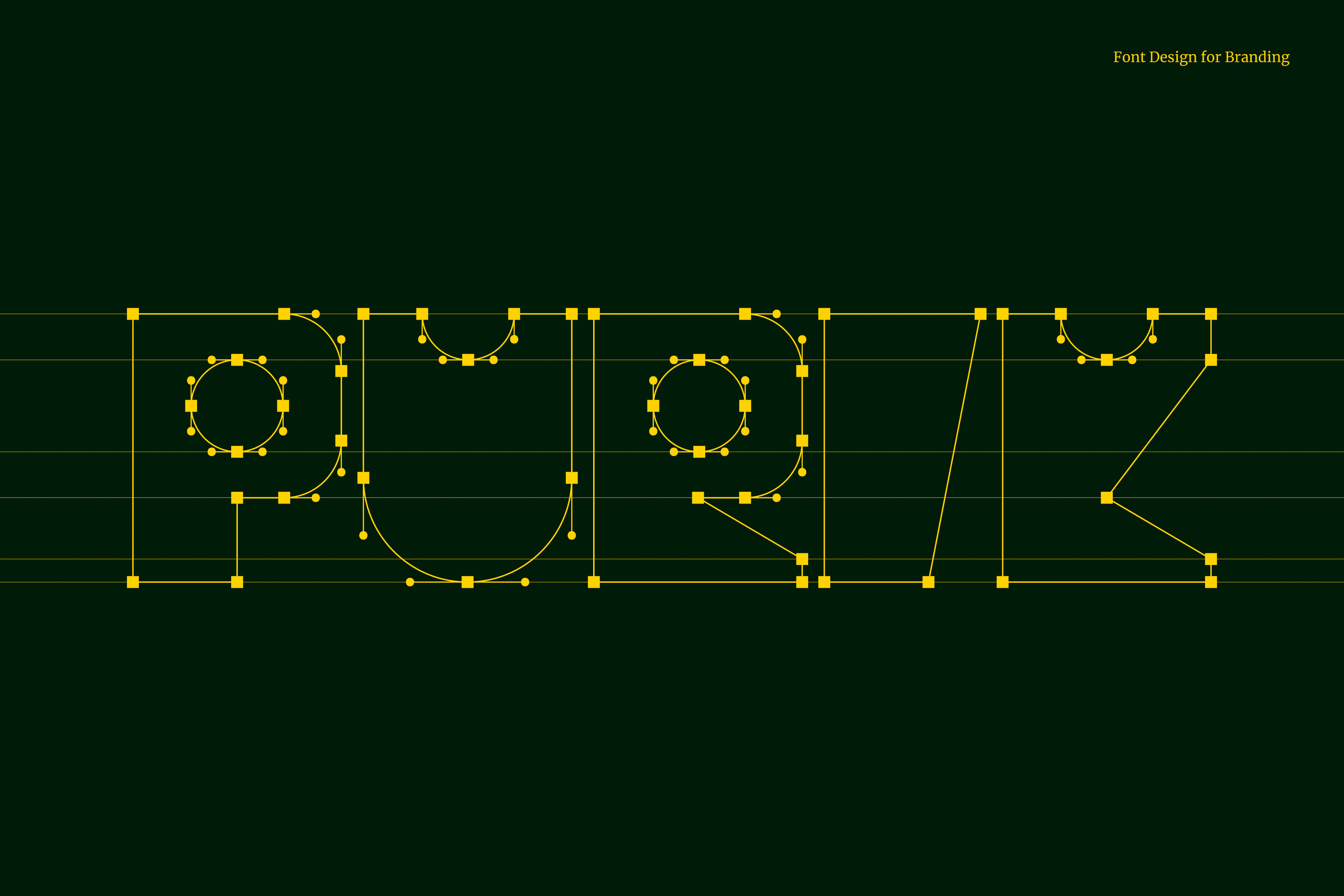
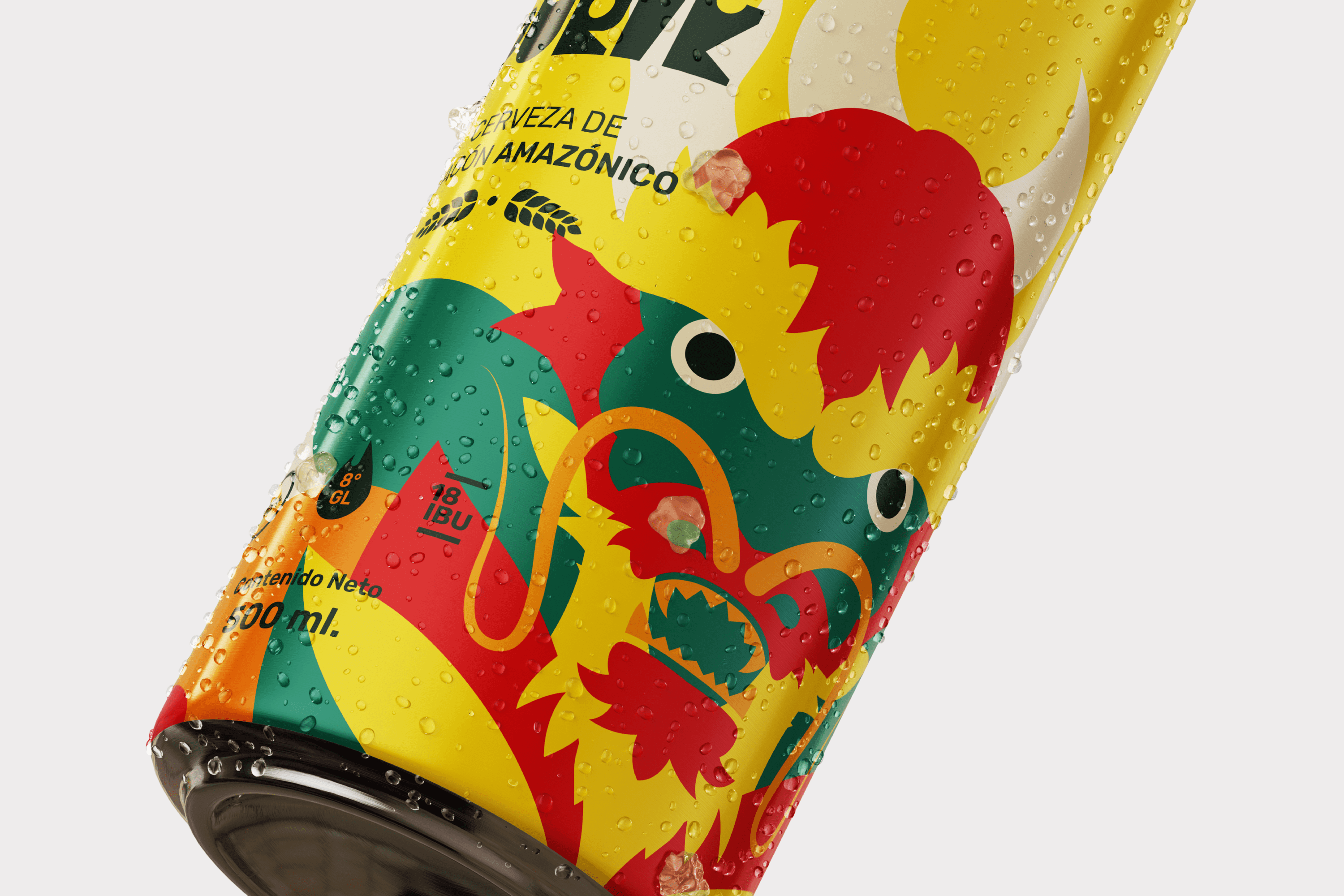
The name we have chosen for this drink is Purik, a word of Kichwa origin that means wanderer. The typography and icon were designed with a hieroglyphic appearance to emphasize the ancestral. Pitajaya is also known as the dragon fruit, for this reason, we have illustrated a dragon wrapped in leaves, shapes and colors full of energy that accentuate its origin. Its strong and vibrant personality reinforces its exotic nature.
Suggested Projects
Terrenal Resto Bar
Simples Finanzas
Extreme Max
TAMPER Special Edition
DESIGN

The Client

TAMPER is a coffee shop located in Kuwait, West Asia. Its brand promise is “Best Join For Coffee Addicts”.


Keywords

Design / Packaging / Coffee shop

The Objective

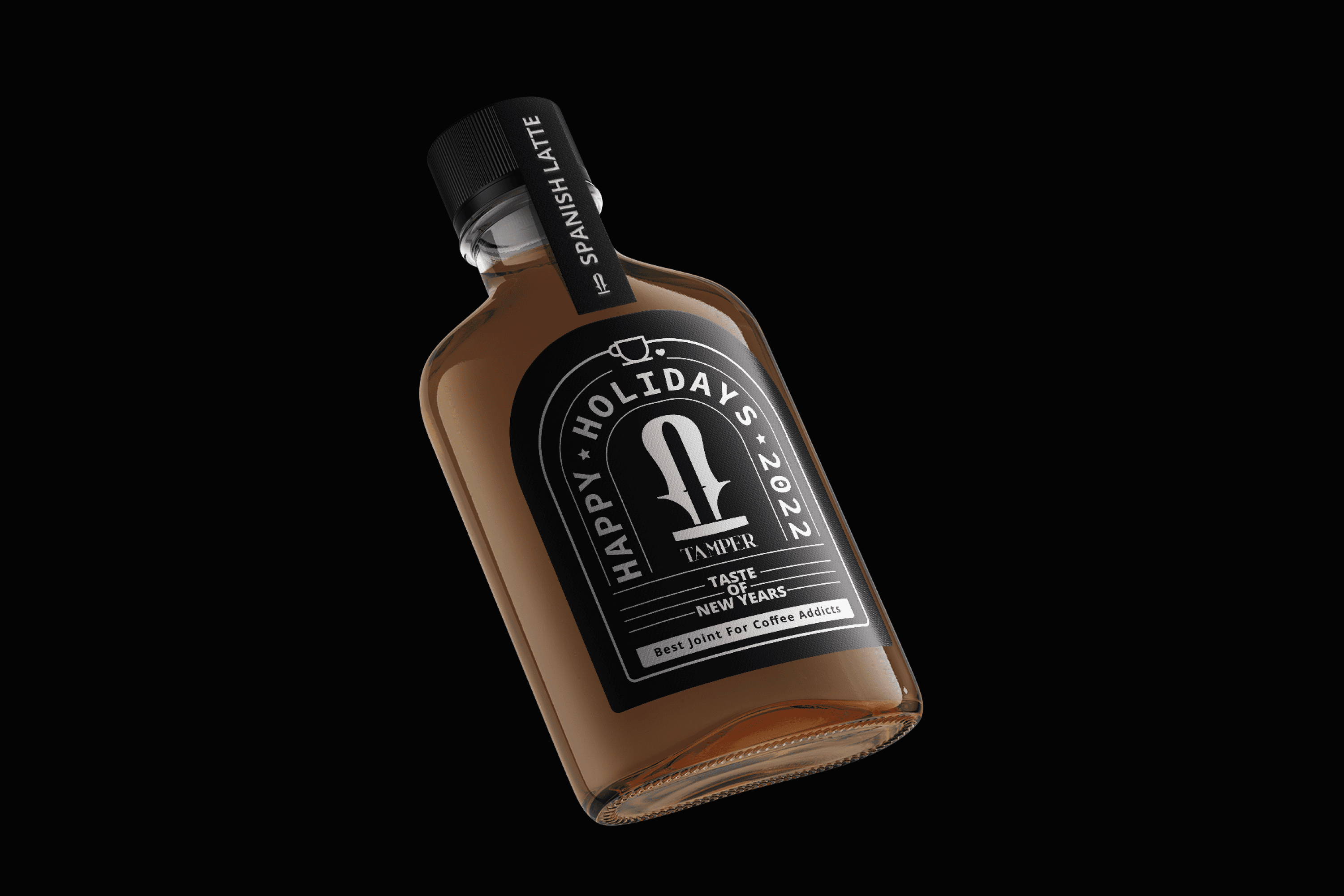
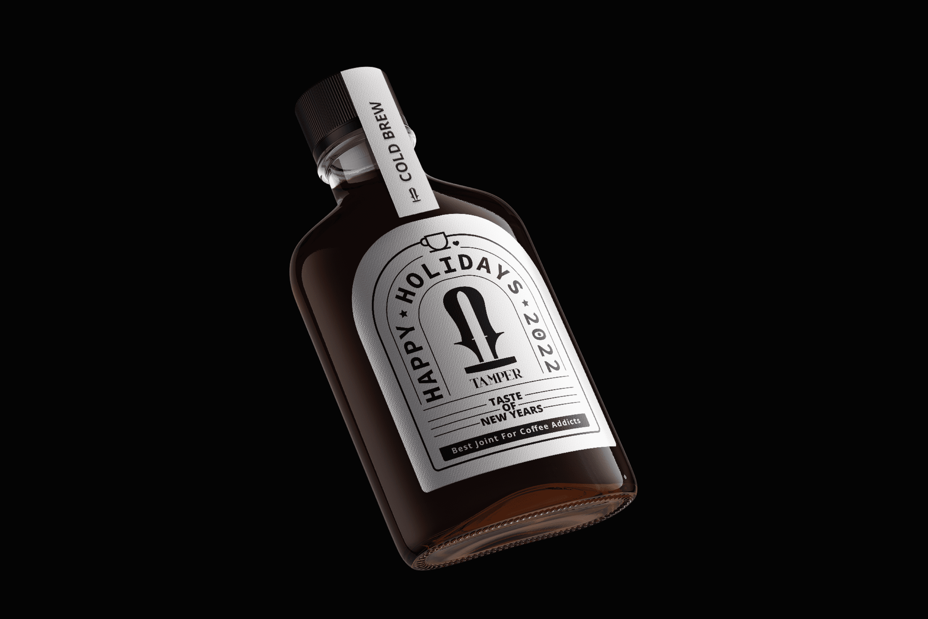
Design a label for our Cold Brew and Spanish Latte coffee in celebration of the New Year, which highlights our brand and preserves our modern and elegant essence.


The Solution

The design of the label created for TAMPER is based on the structure of its packaging to create a window that takes advantage of the space and strengthens the form of the TAMPER logo. The design focuses on the brand and uses lines as a guide to direct the gaze towards specific points and details, such as the small coffee cup on top or “Taste of the New Year.”

Suggested Projects
Terrenal Resto Bar
Simples Finanzas
Extreme Max
Flavio Pizza
BRANDING

The Client

Flavio” is a new Pizzeria specialized in making traditional Neapolitan pizzas, which is located in KuwaitWest Asia.


Keywords

Branding / Packaging / Pizzeria

The Objective

To design a brand that expresses the essence of the city of Naples and its traditional pizza made with love.


The Solution

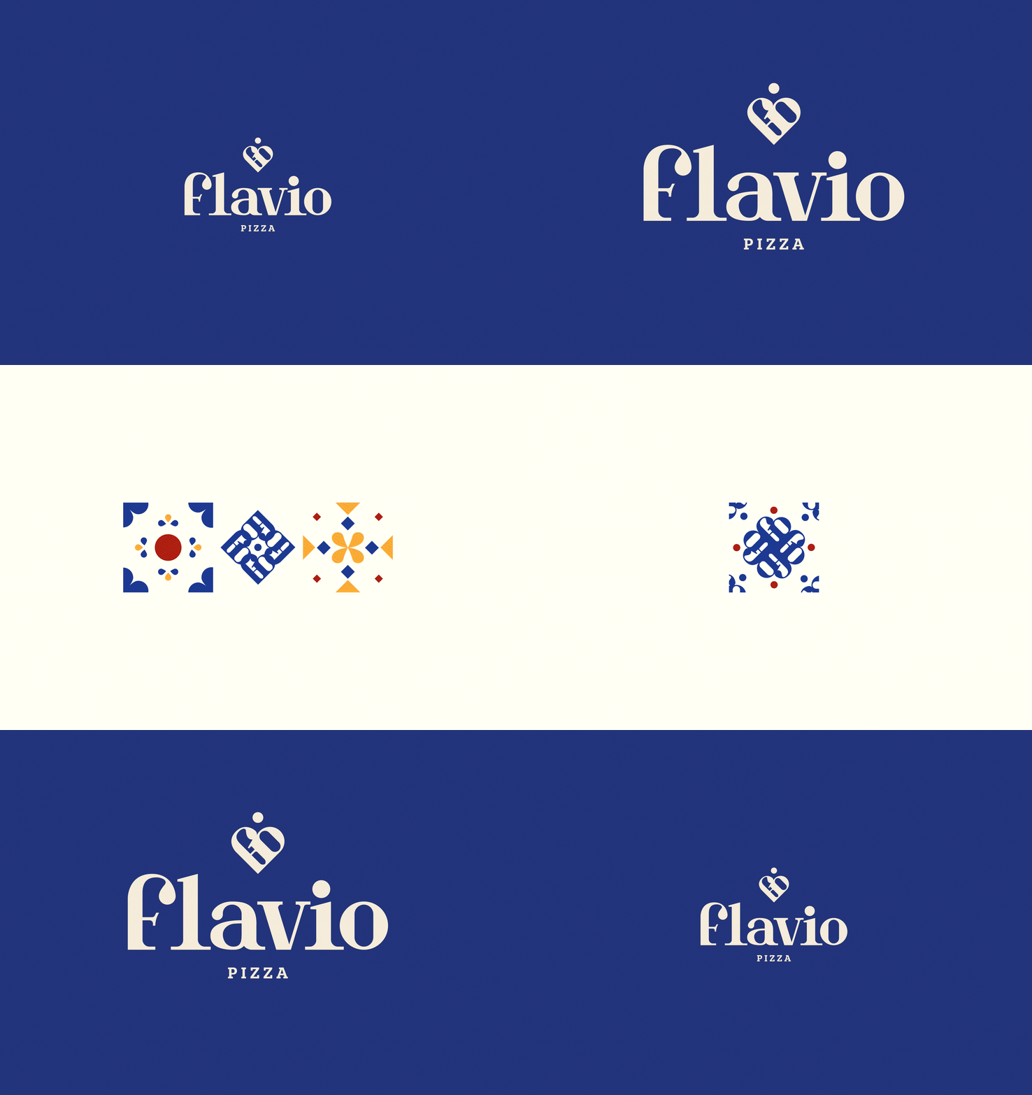
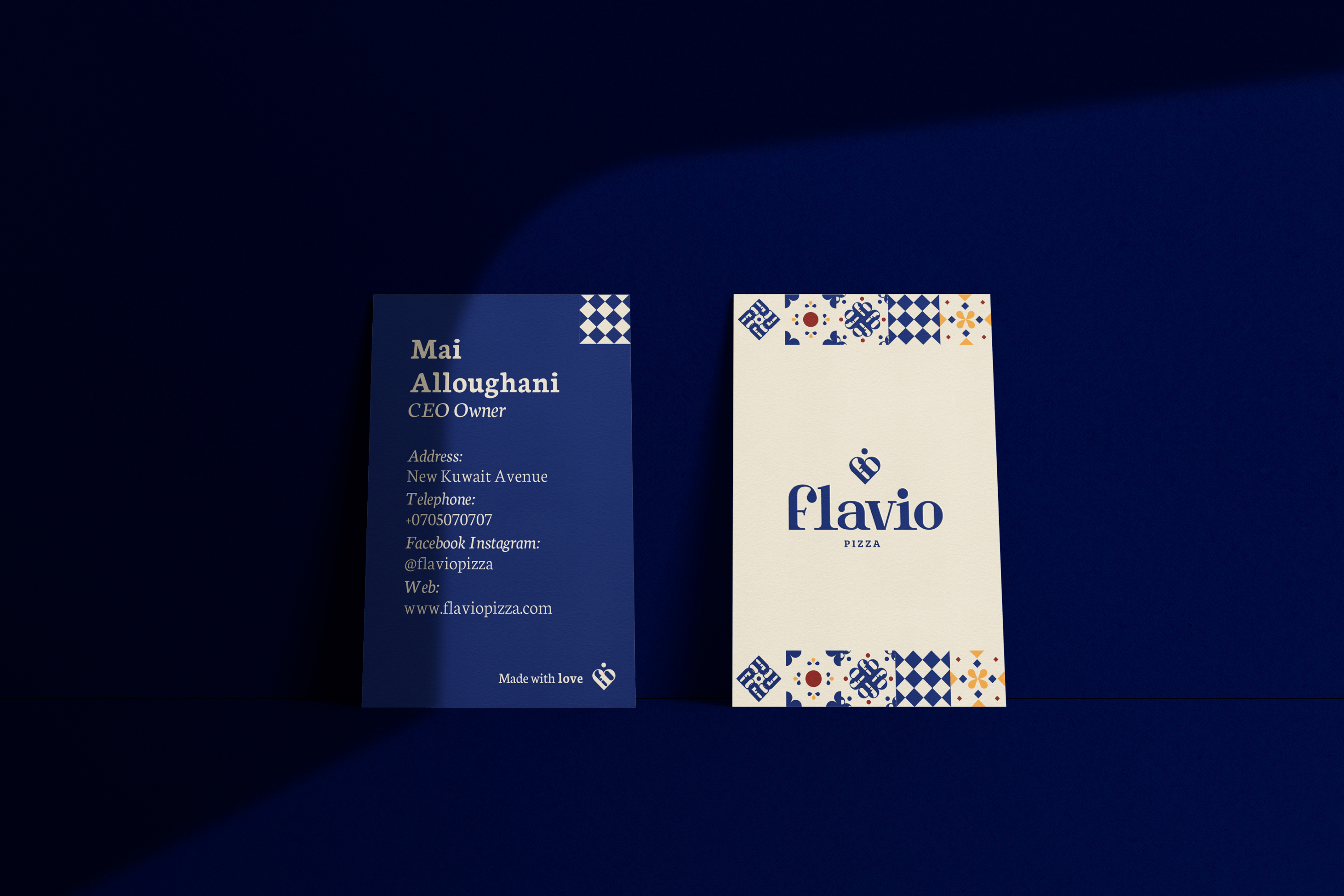
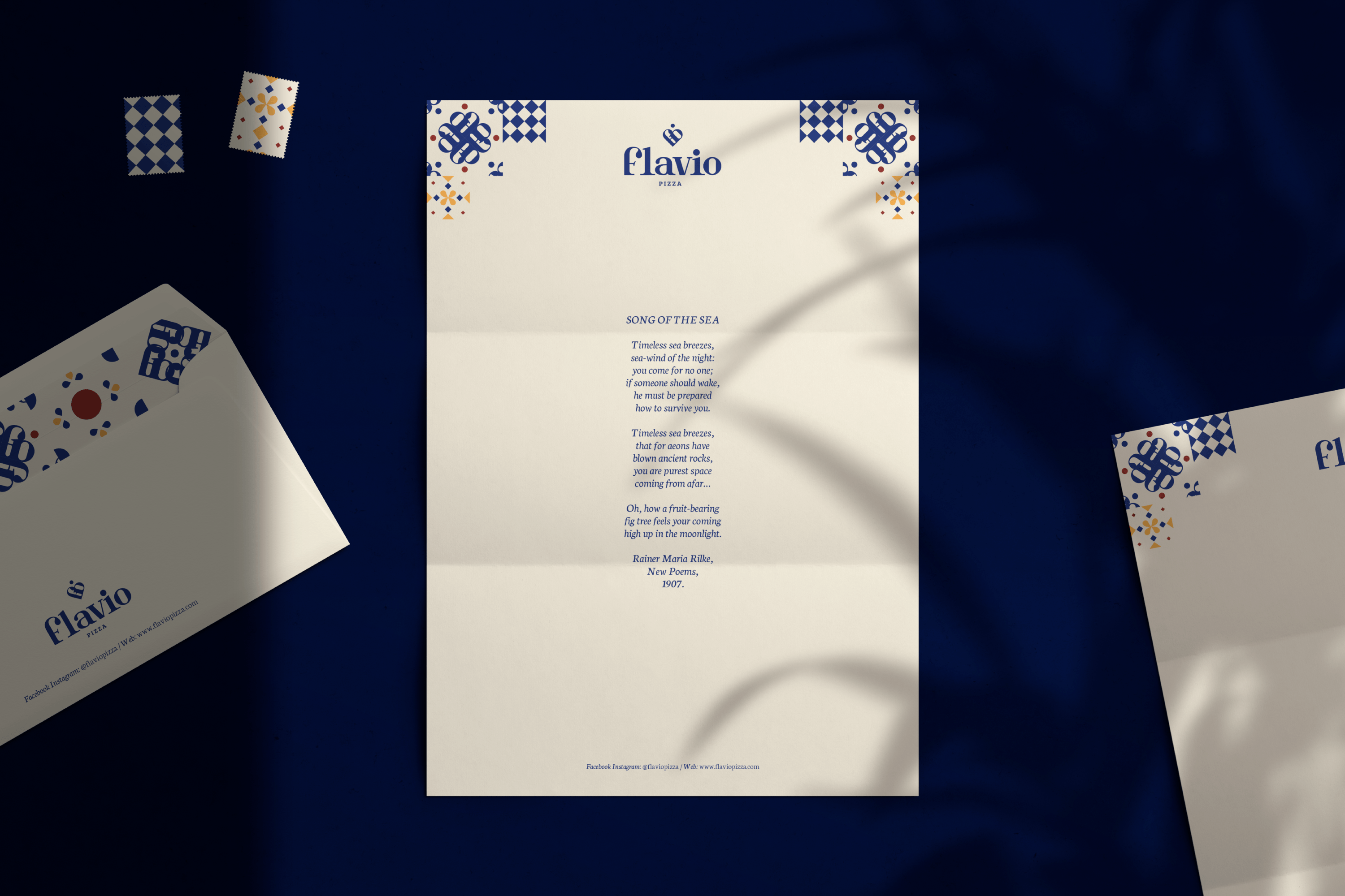
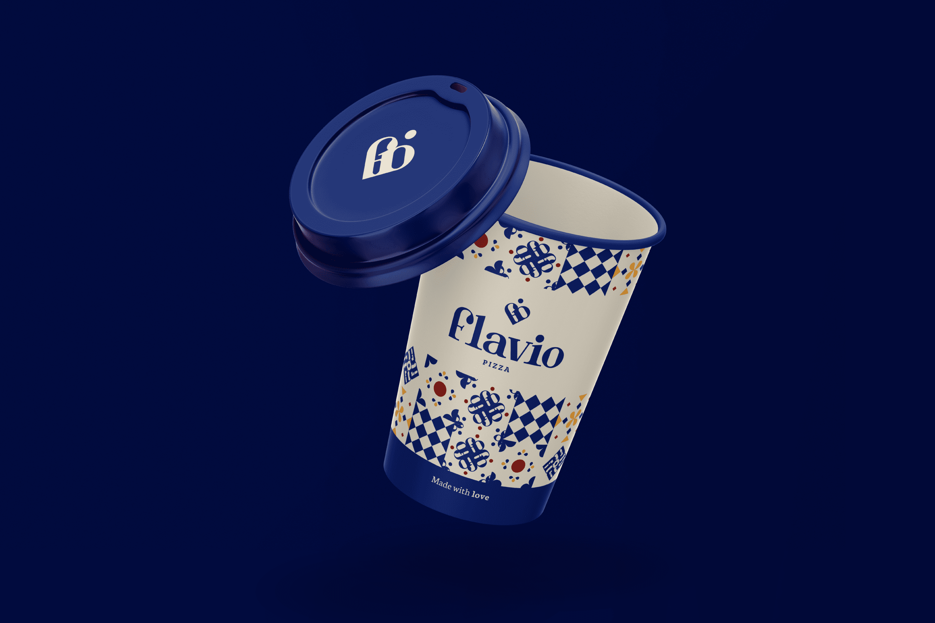
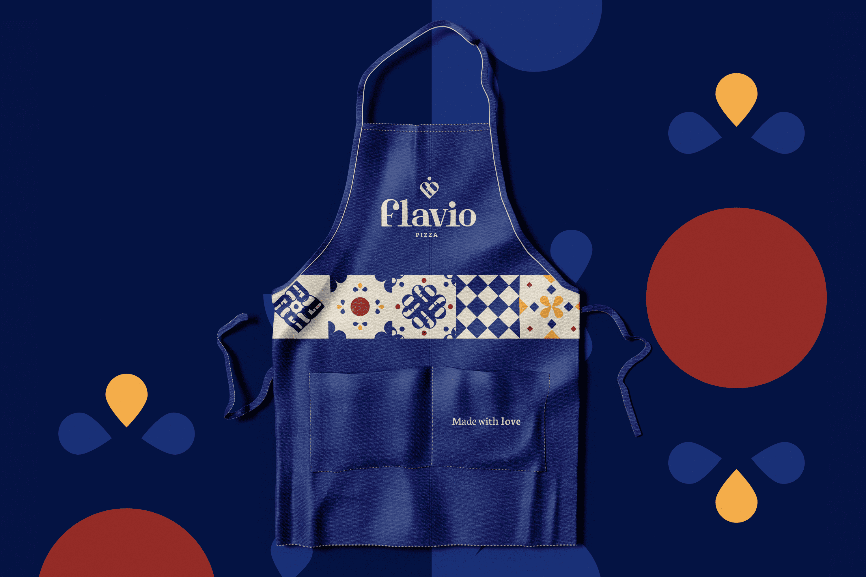
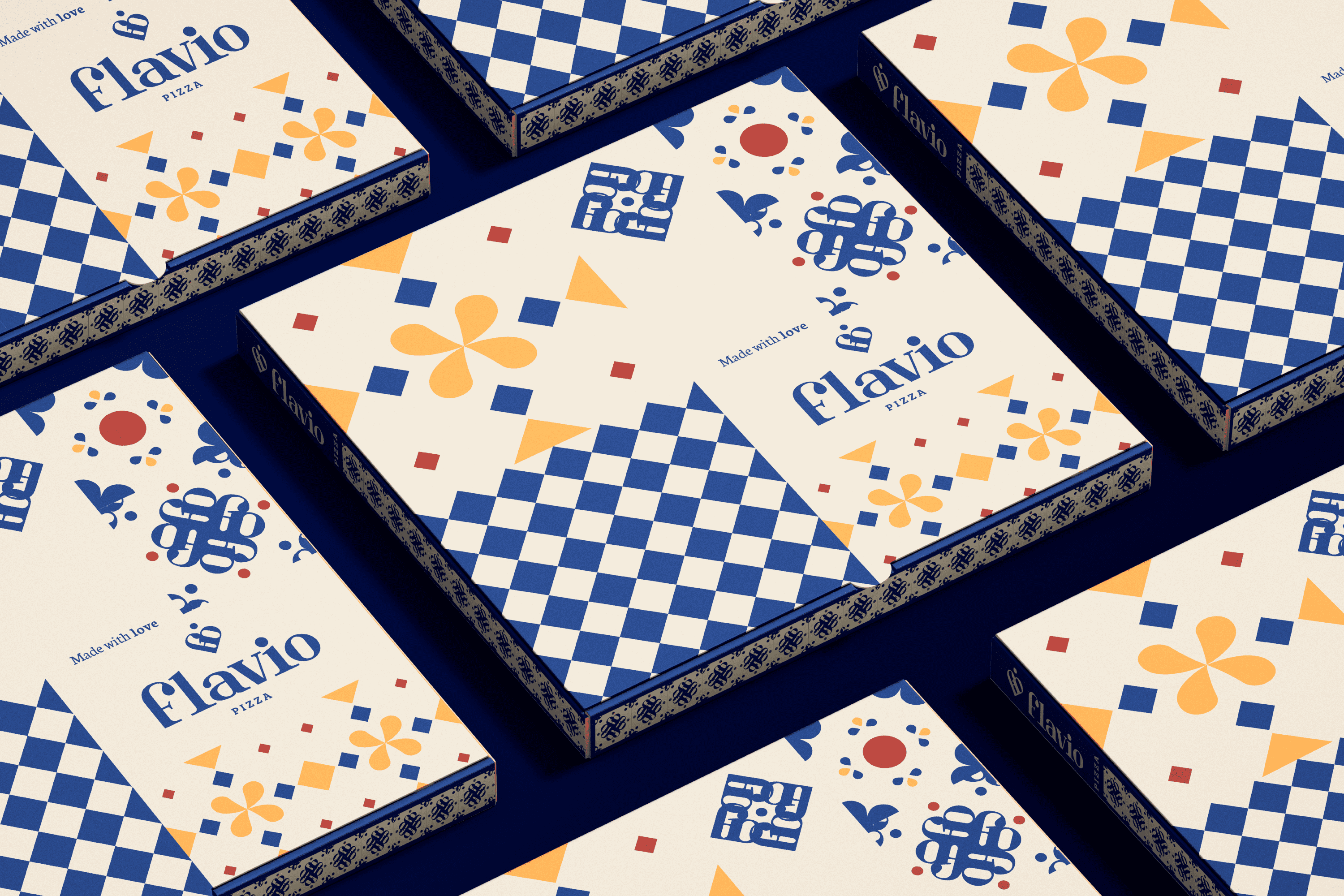
The graphic identity is based on the visual structures found in the architecture of Naples, domes, tiles and columns. The typography developed for “Flavio Pizza” is Serif, the finials are designed based on the Ionic columns present in its historical buildings. When this typography is joined together, it forms a heart and the dot of the is relocated on it as part of the concept, mind and heart make this product, pizzas made with love.

On the other hand, for Flavio Pizza we have developed a tile system that uses the brand icon arranged concentrically that together with other elements obtained from the visual universe of Naples allows us to obtain a mosaic that strengthens the objective of the brand.

Suggested Projects
Terrenal Resto Bar
Simples Finanzas
Extreme Max
AMPELIS Cerveza Premium
BRANDING

The Client

Cervecería Ampelis” is a new Mexican brewery located in Querétaro, Mexico. The brewery is dedicated to researching new combinations and methods to enhance flavors and improve the beer drinking experience, for national and international sales and distribution.


Keywords

Branding / Packaging / Brewery / Beverages

The Objective

Develop a brand that reflects the history of its owner, quality, trust and the research behind each product.


The Solution

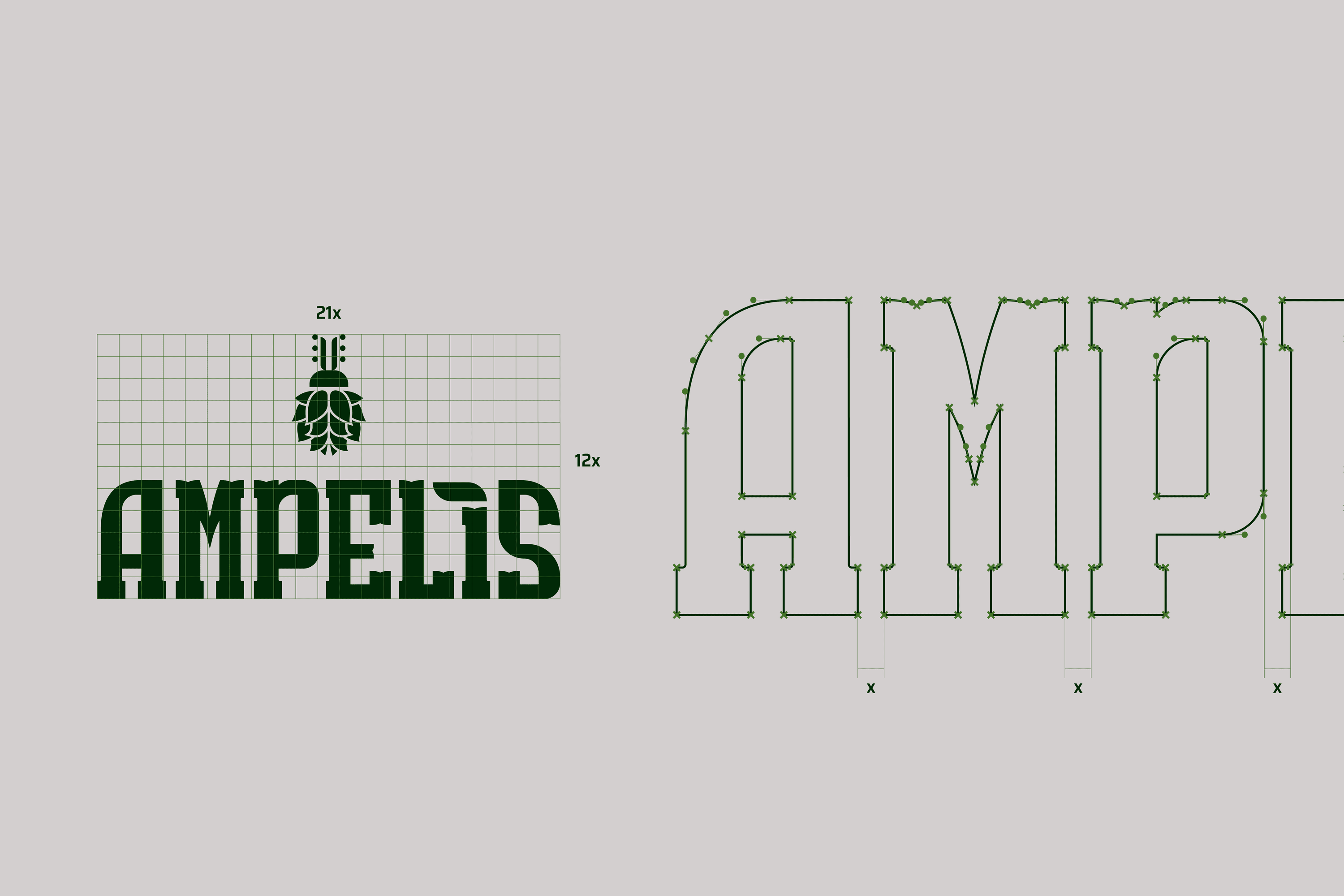
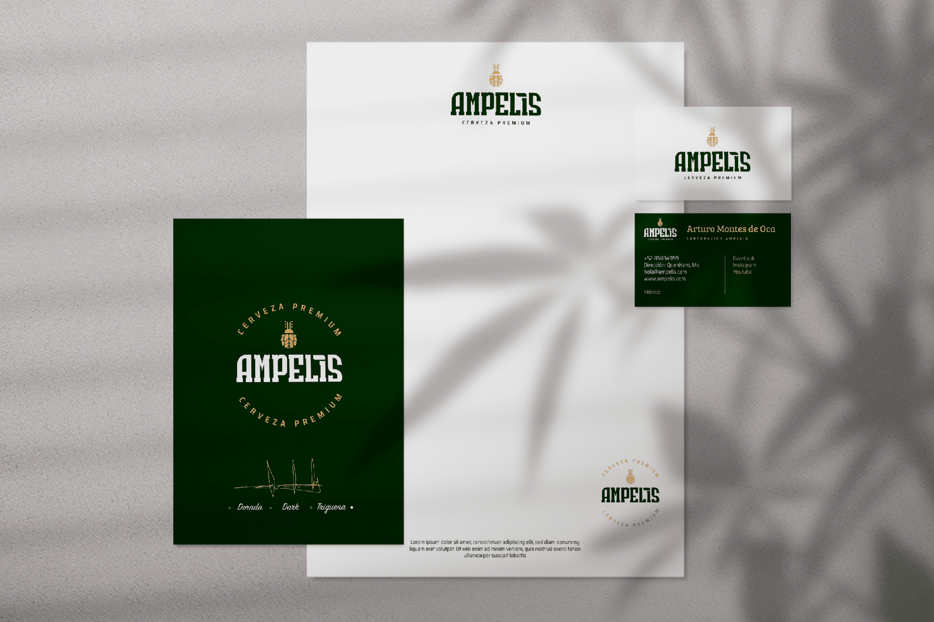
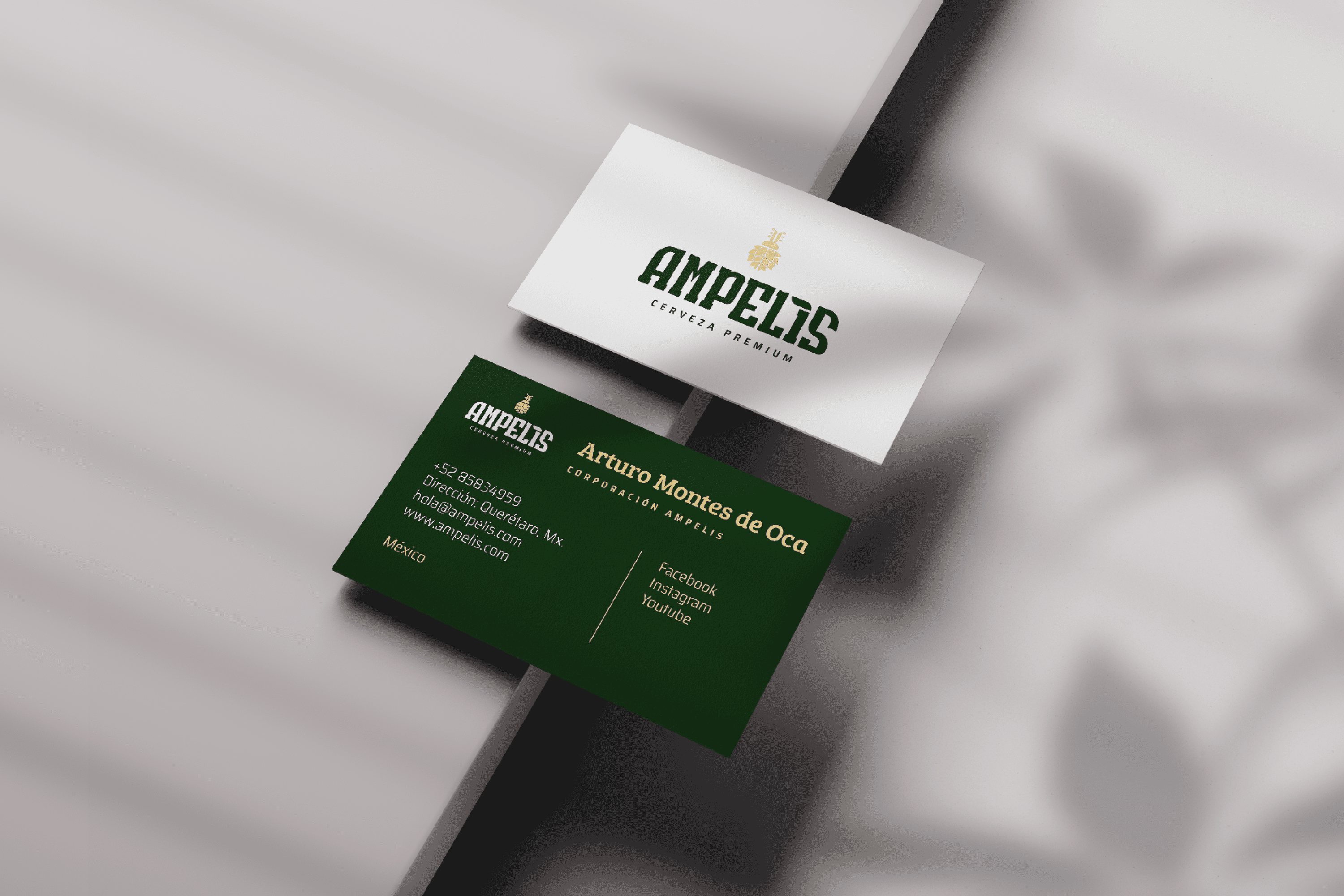
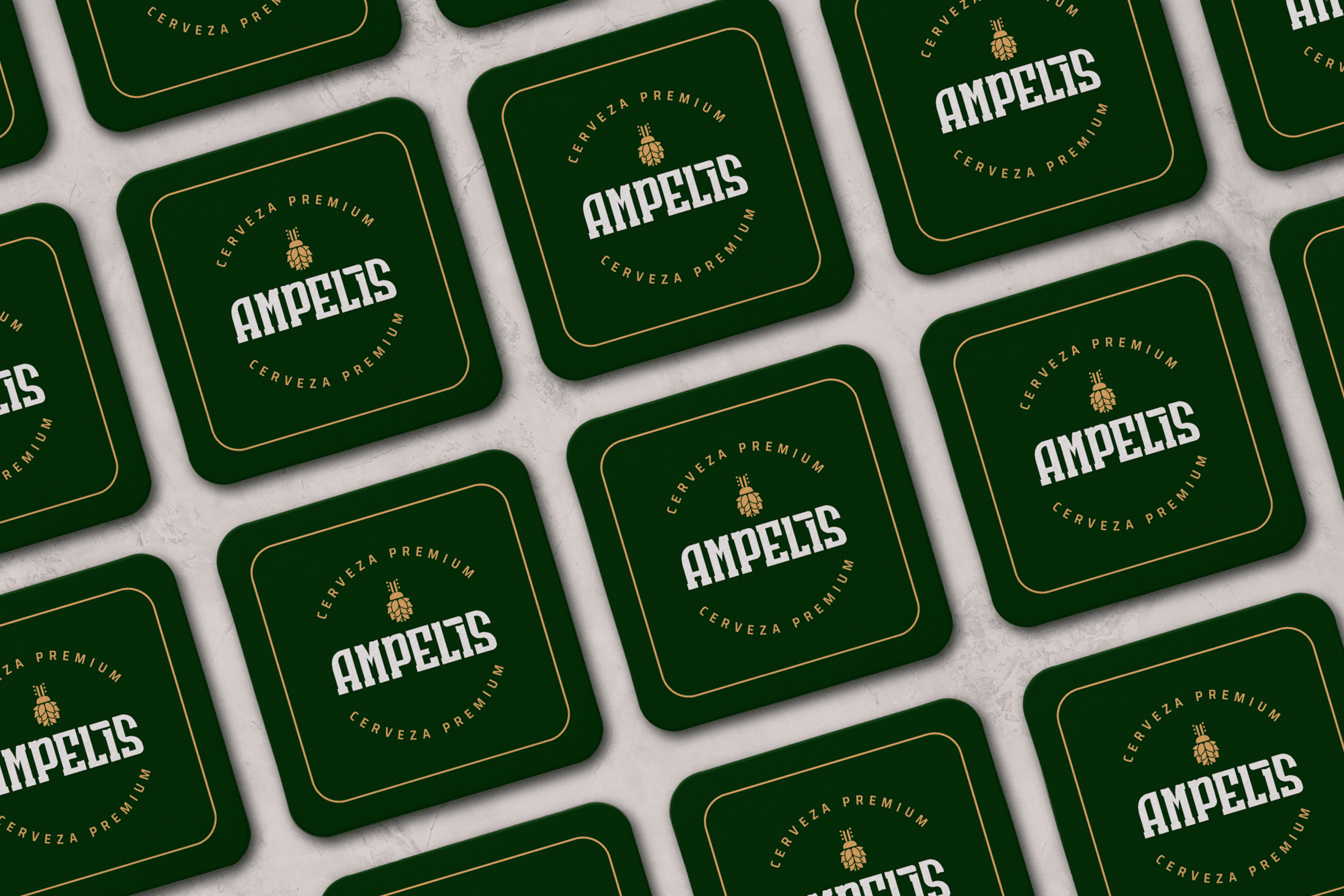
The branding proposal is a visual translation of the modern experience, which is obtained thanks to the existing research behind the brewing process and gives the product confidence and solidity reflected in the typography design. The icon is an abstraction of the heart of this company, Arturo, its owner, who from an early age was known by his friends and family as “Bicho” (Bug), hence the icon is the abstraction of a beetle (bug) fused with hops. And each brand has a story to tell.

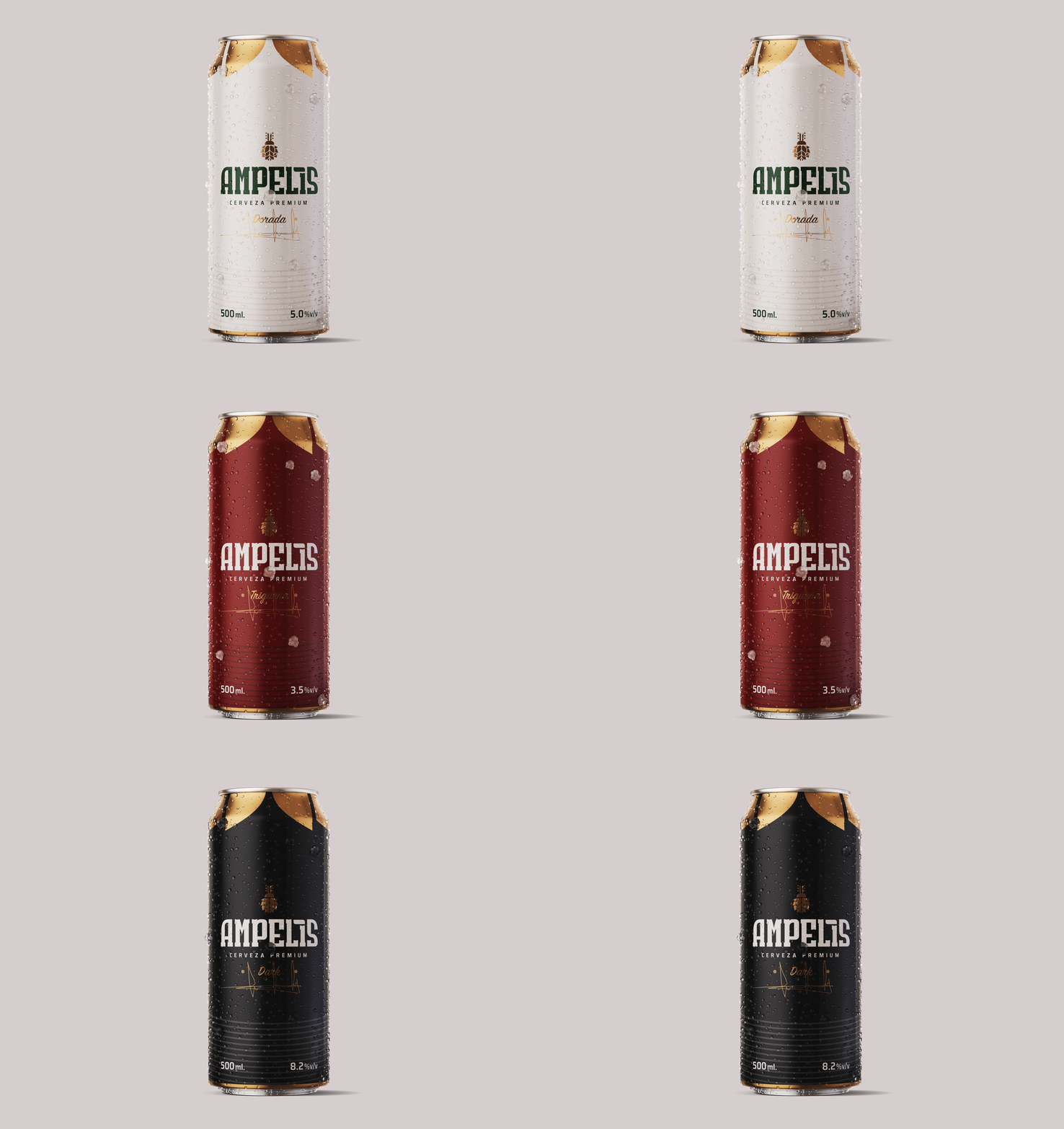
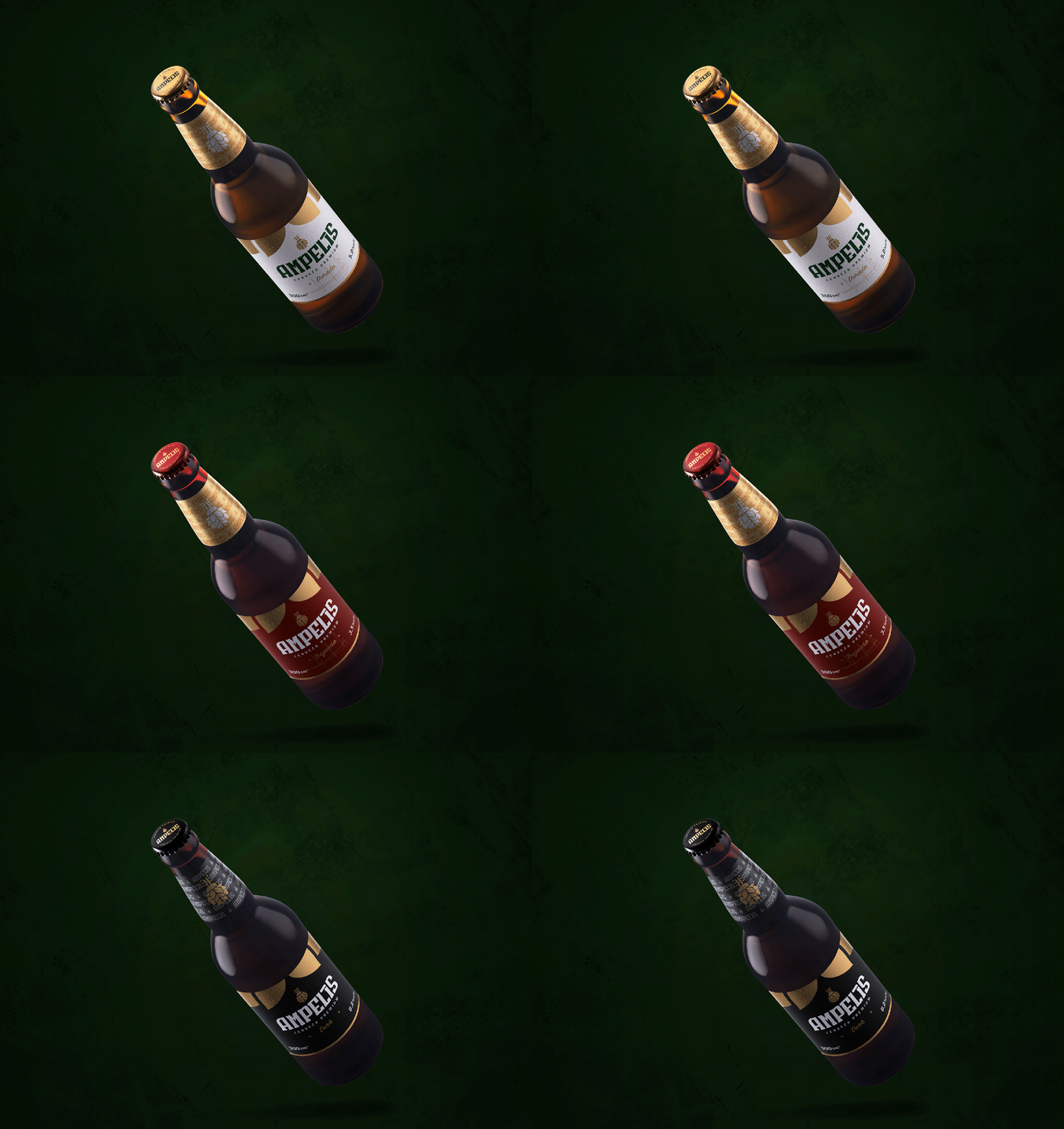
Three premium beers were brewed to mark the beginning of the brand’s legacy. First, the main one: Dorada, the beer of the sun. Second, Triqueña, inspired by Latin women. And finally Dark, the dark beer from Cervecería Ampelis. From light to dark labels and colorful caps and gold finishes, the design of the bottles resembles the hard work and rigorous research process behind each individual beverage.

Suggested Projects
Terrenal Resto Bar
Simples Finanzas
Extreme Max
Handverso
BRANDING

The Client

“Handverso” is a new brand of handcrafted gifts located in Quito Ecuador. Each and every gift (wines, nuts, chocolates, etc.) is prepared in the most impeccable way possible, taking care of the final consumer experience.


Keywords

Branding / Naming / Packaging / Handmade / Gifts

The Objective

To develop a women’s brand, friendly, egalitarian, elegant and strong, of handmade details for men and women.


The Solution

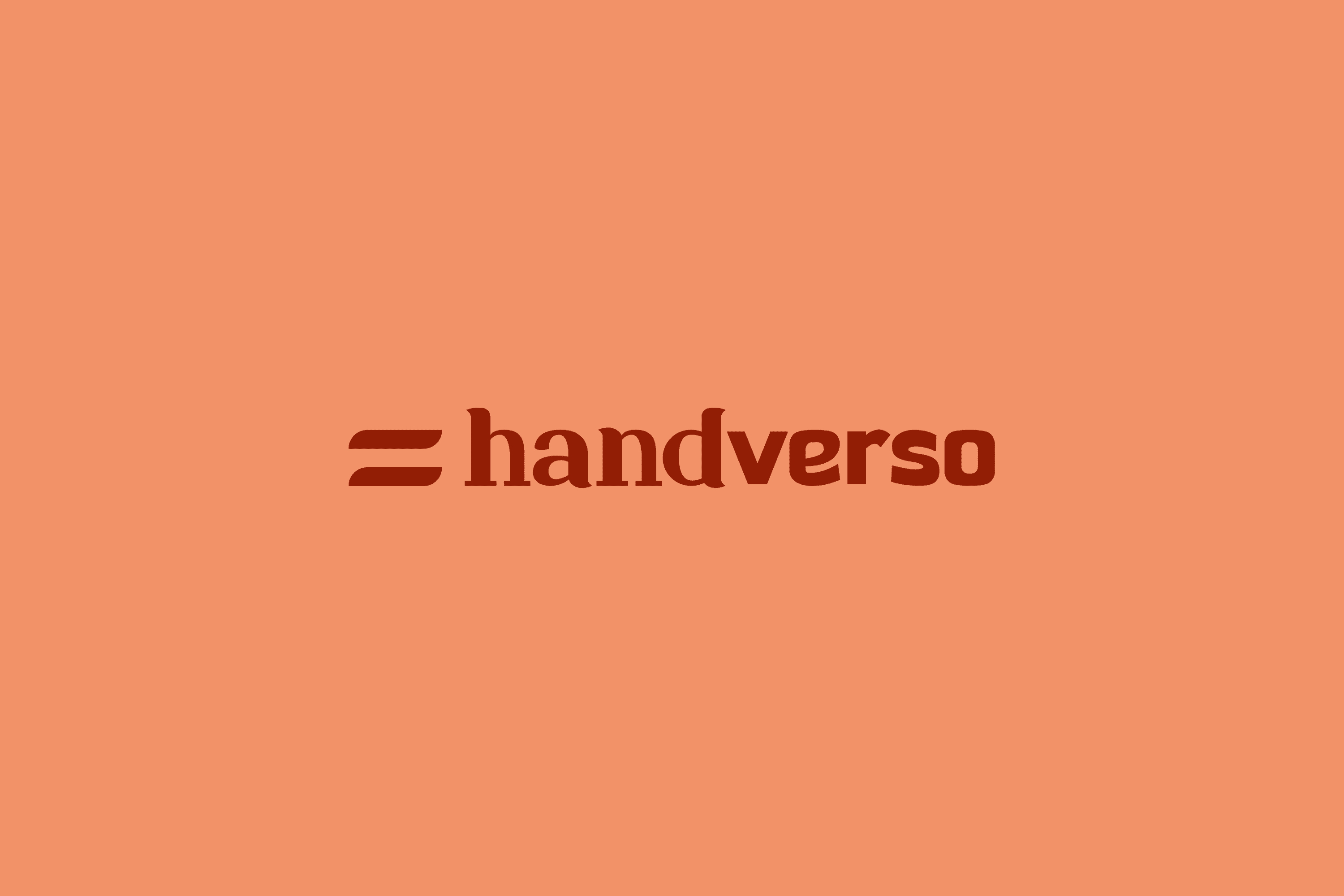
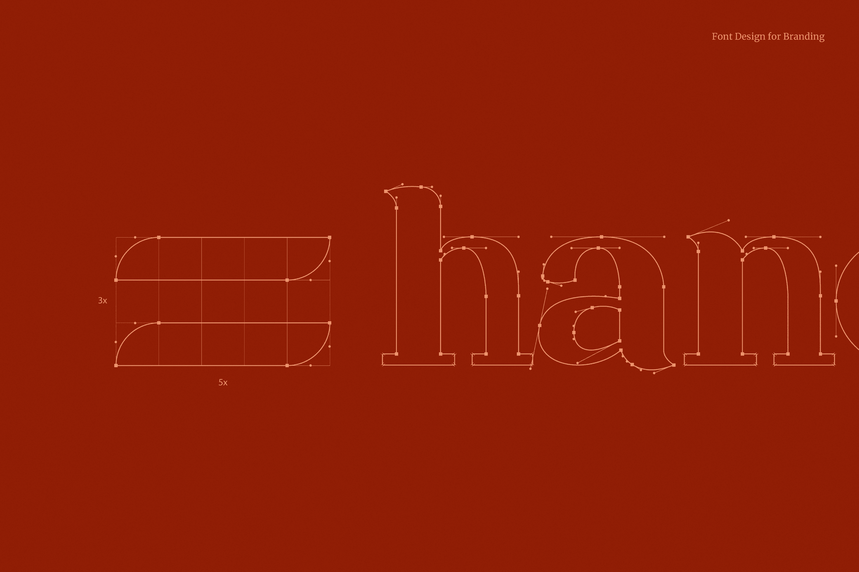
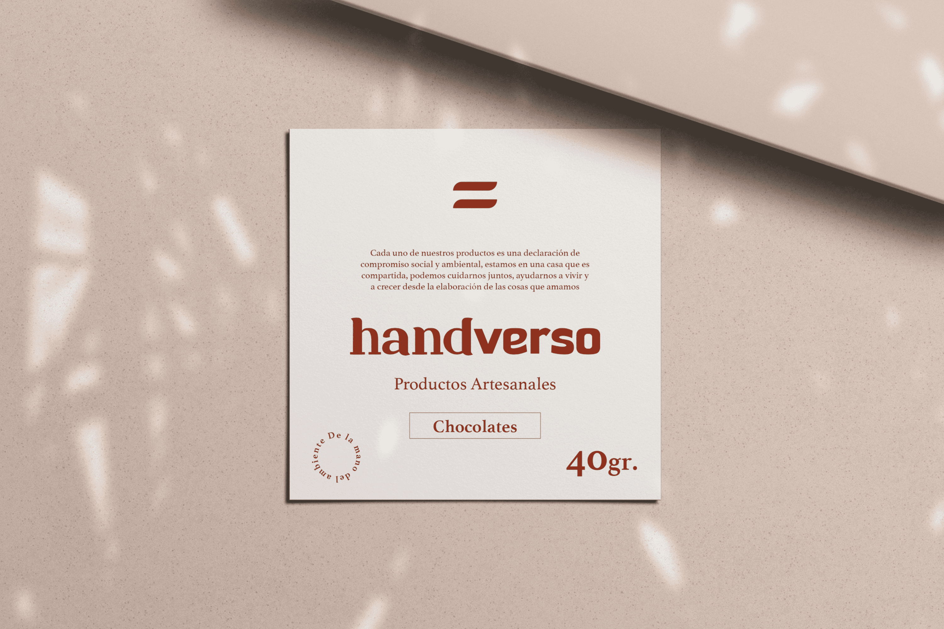
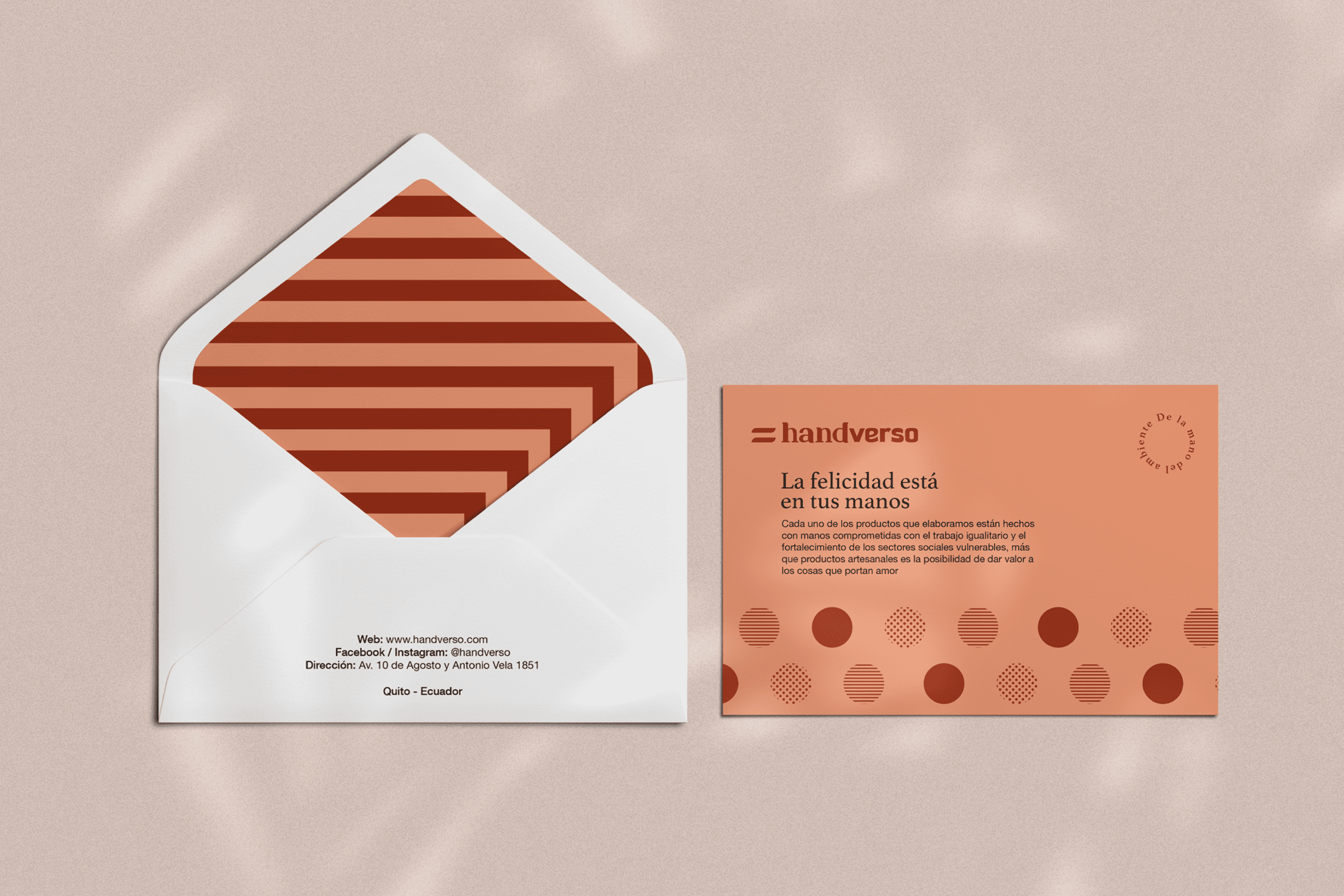
An identity has been developed whose name comes from the combination of “hand”and “verso” which in Spanish means verse as that union of words that forms a unit in a poem, thus referring to the delicacy with which the details of Handverso are elaborated. The typography has been designed based on one of the most important values present in this company, which is to highlight the delicacy, elegance and strength of the handverso woman, this has been achieved by merging two typefaces where “hand” is written with a delicate and elegant Serif typeface, and “verso” on the contrary expresses strength through a San Serif typeface. The icon is the flag of handverso, speaking of equality, both in gender, opportunities, treatment and use of resources used, seeking full respect for their environment. Two warm colors have been chosen to reflect its feminine nature, but allow handverso to be well received by both men and women.

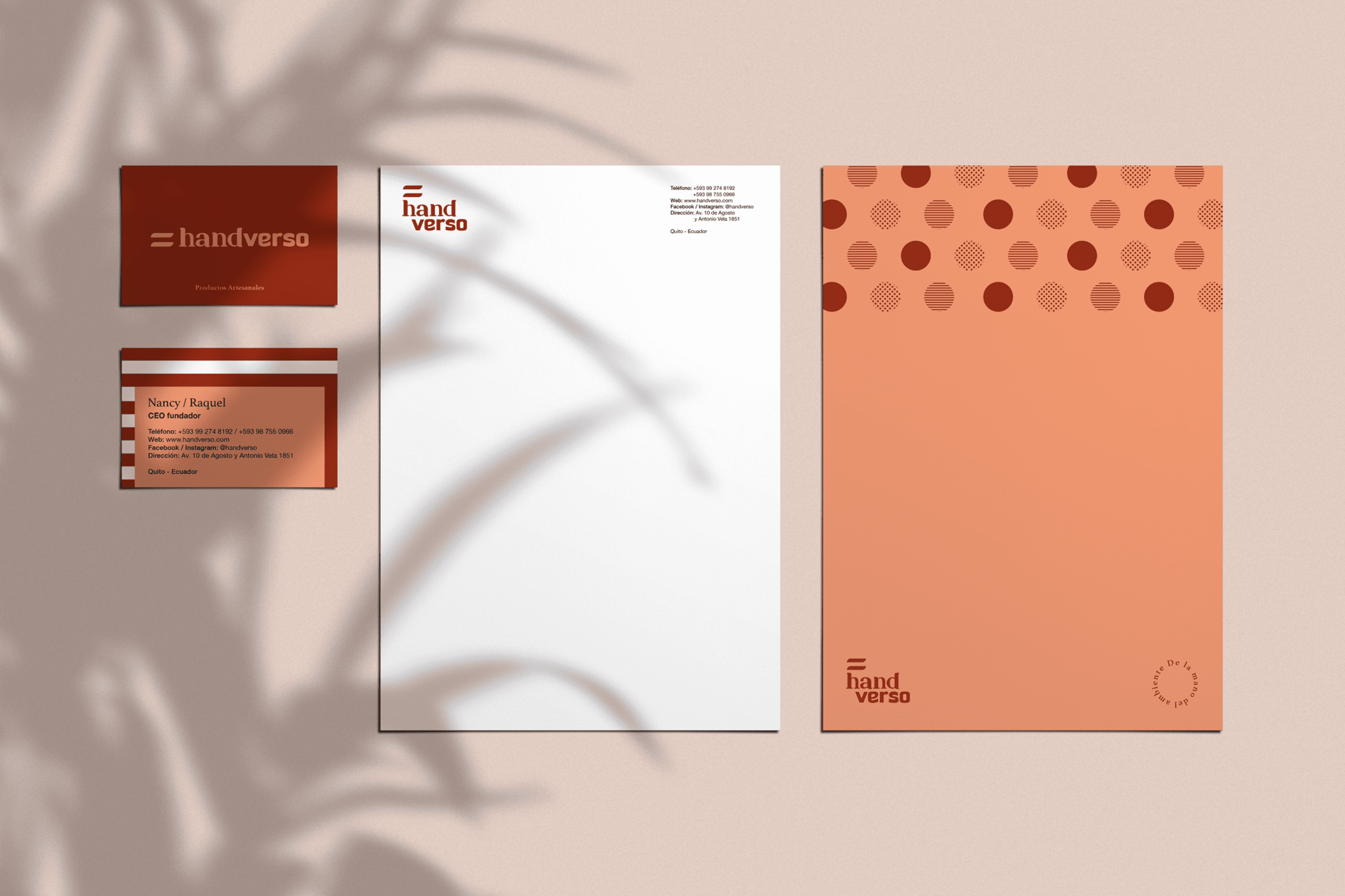
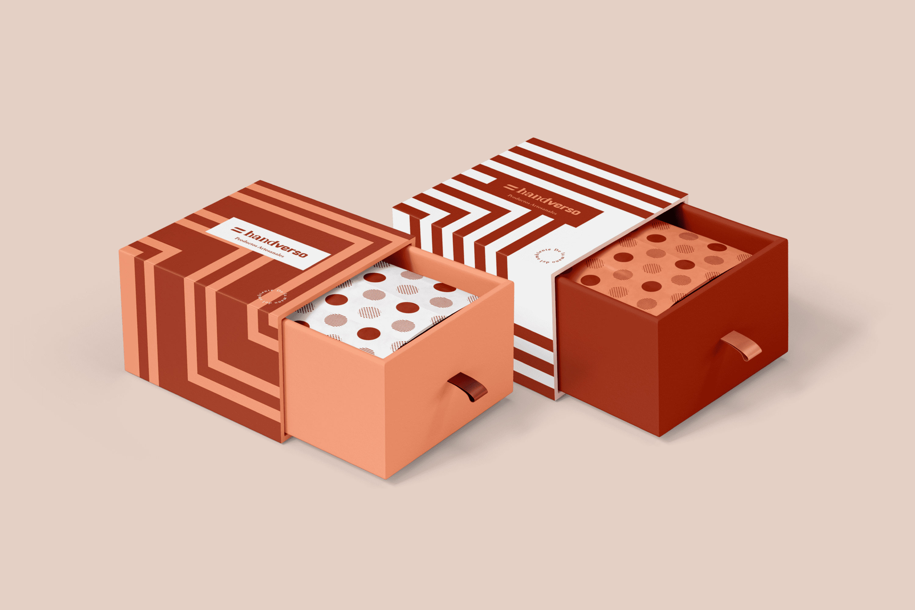
The linear design of the exterior of the packaging is a representation of the multiple possible ways to reach the same goal, and also tells us that it is the road traveled that makes this detail important. On the other hand, the inside is covered with several equal but different circumferences in its composition, thus valuing human diversity and making it part of this great gift.

Suggested Projects
Terrenal Resto Bar
Simples Finanzas
Extreme Max