Anabel Zambrano Dental Clinic
BRANDING

The Client

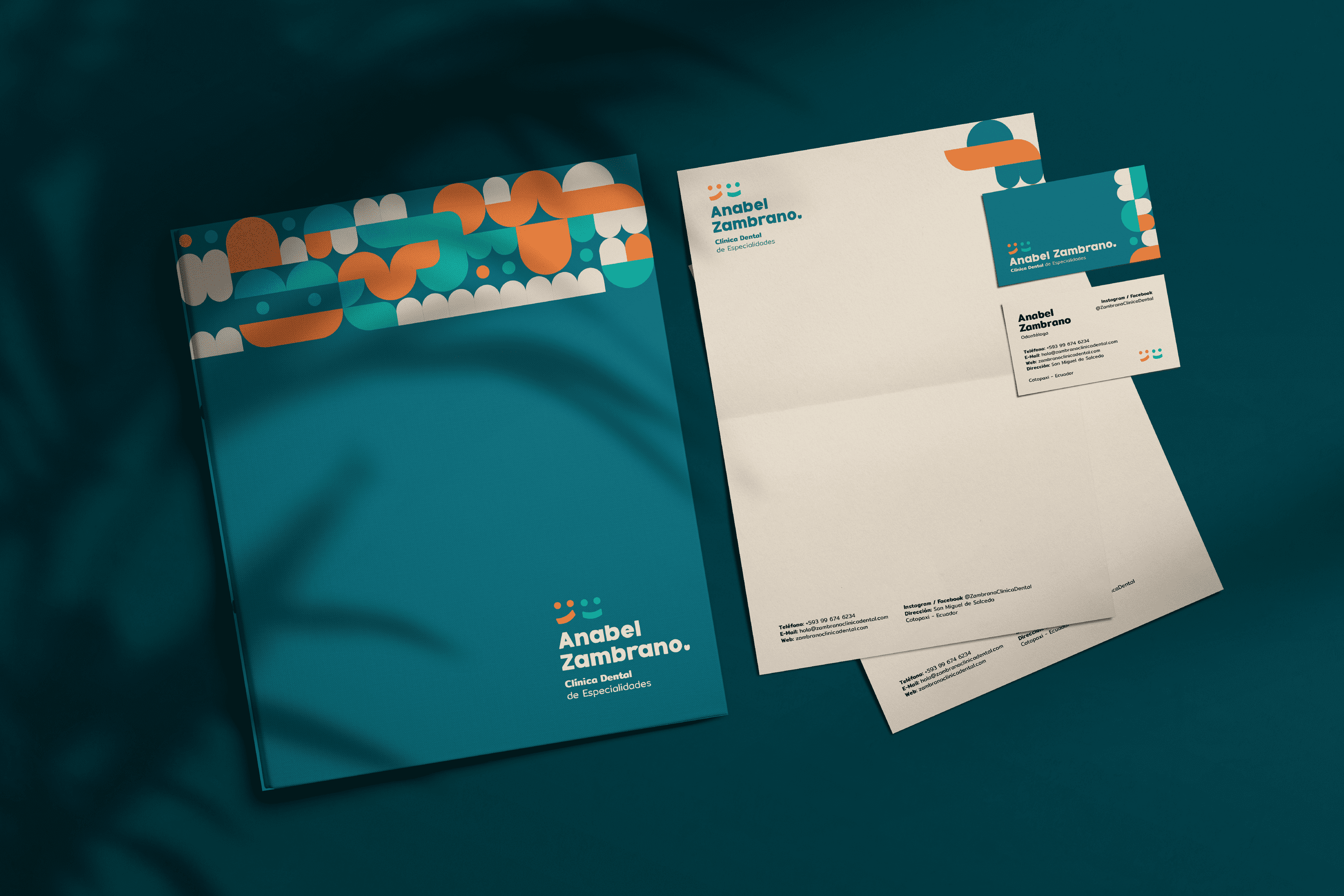
“Anabel Zambrano” is a Dental Specialty Clinic located in Salcedo Ecuador, which thinks about the welfare of families and pays special attention to their children.


Keywords

Branding / Clinic / Dentist
The Objective

Develop a brand that reflects quality, trust and the research behind each product.


The Solution

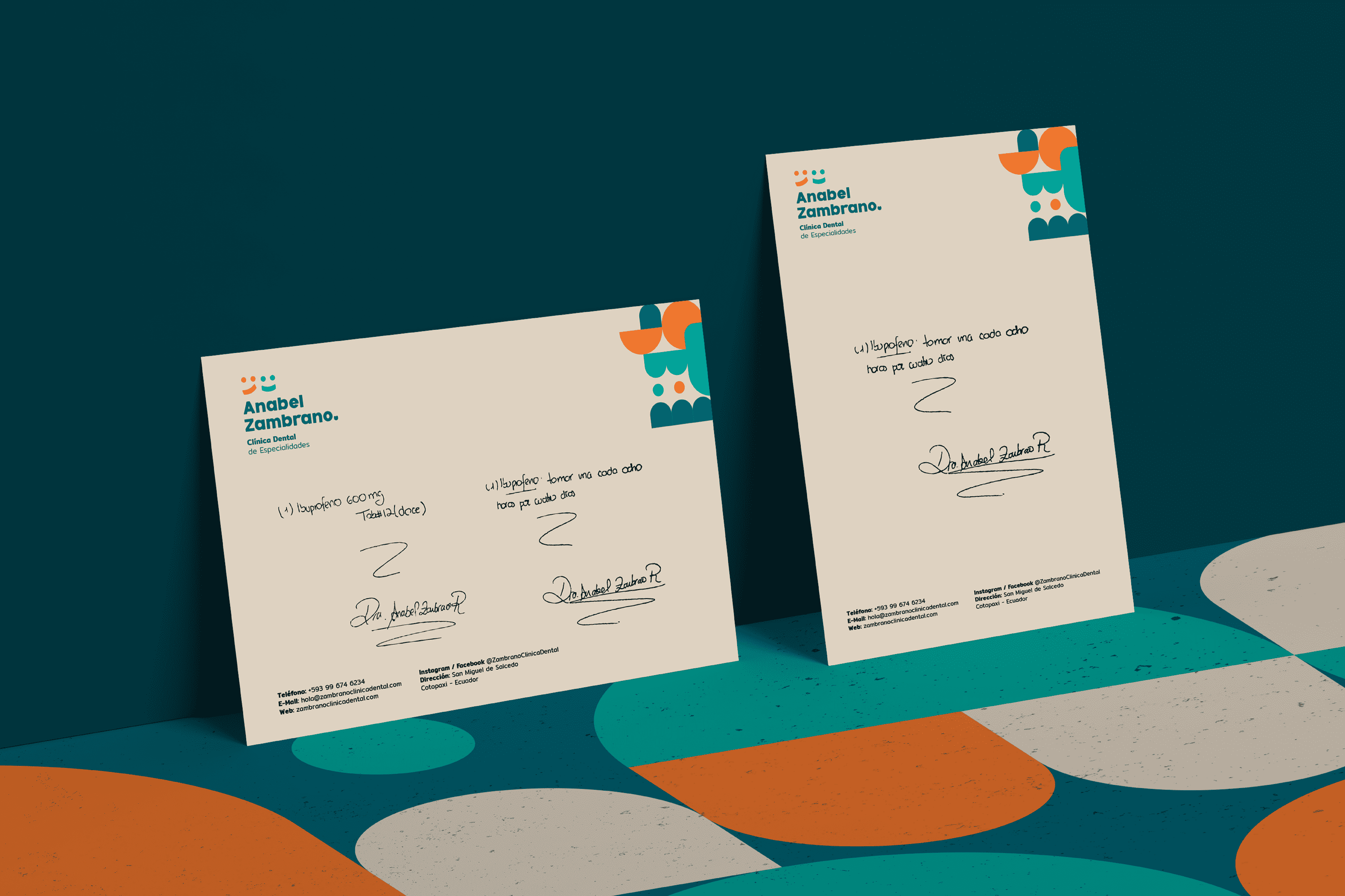
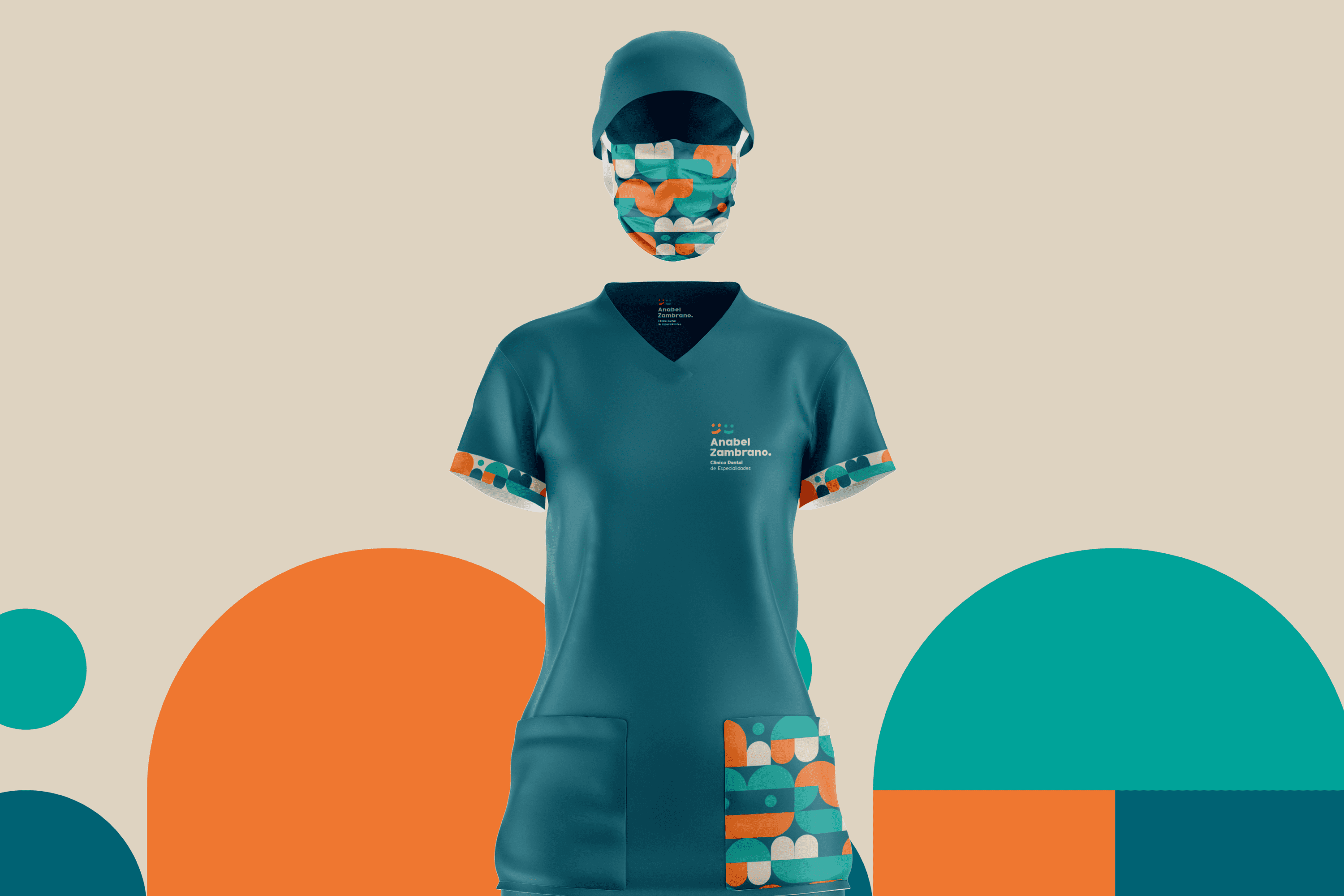
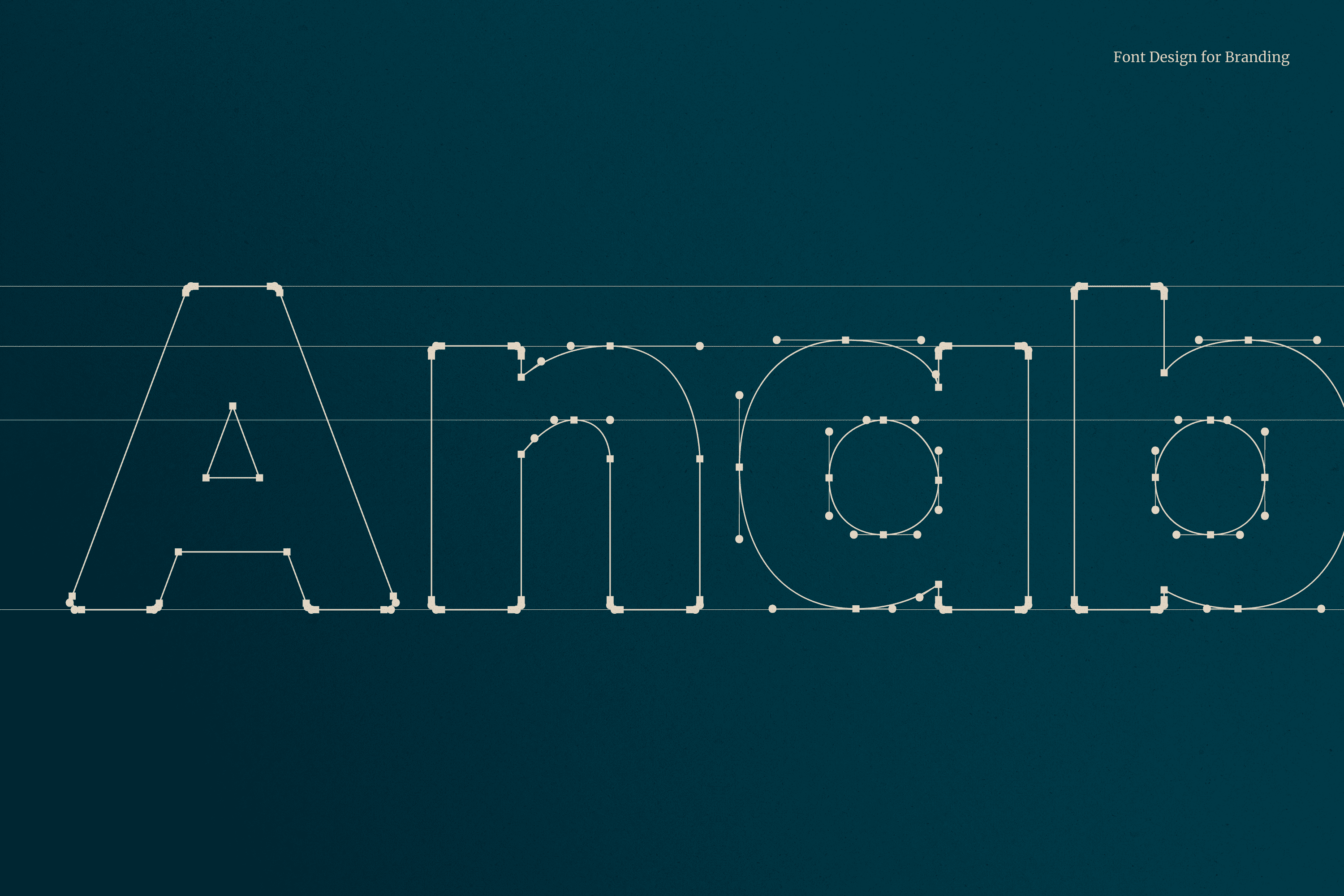
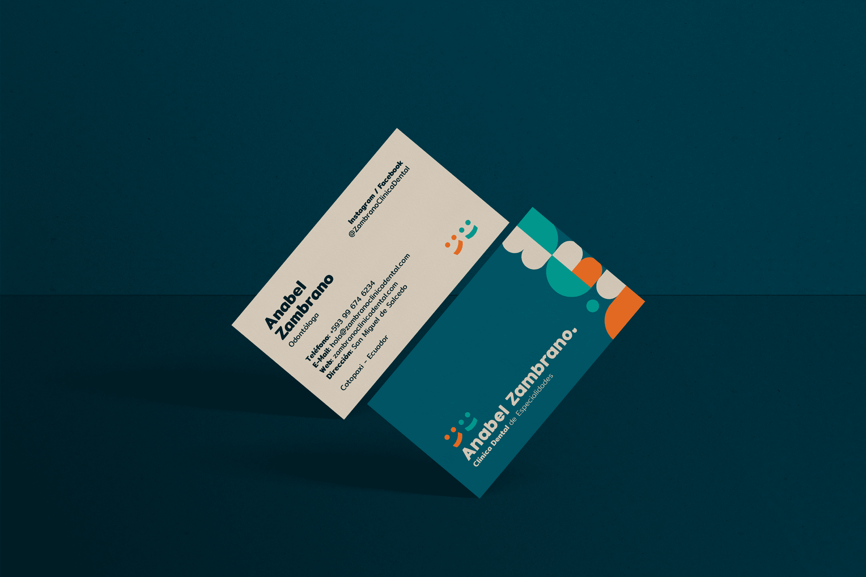
The typography designed for “Anabel Zambrano” is Serif and its wide stroke makes each type stable, which translates as trust, the corners have been slightly rounded to add to the concept of friendliness. The Anabel Zambrano isotype uses basic elements recognizable to any member of the family regardless of age, to represent the before and after of a smile. The colors used generate an atmosphere of joy, friendliness and well-being characteristics that are part of this place.

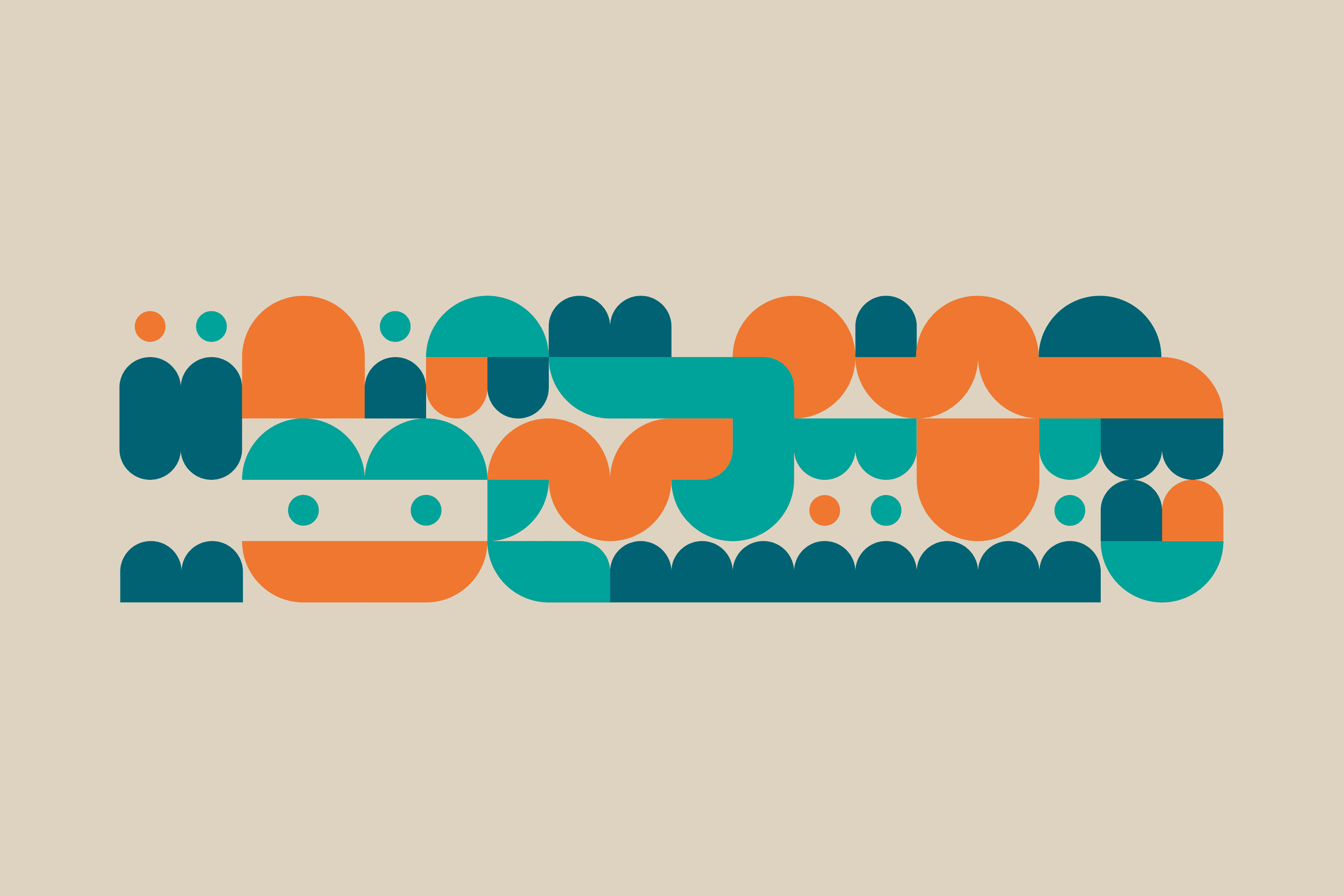
A modular system has been developed, its shape shows abstractions of teeth, molars, people, brushes, smiles, but leaves freedom to the imagination in its possible combinations.
Suggested Projects
Terrenal Resto Bar
Simples Finanzas
Extreme Max
Handverso
BRANDING

The Client

“Handverso” is a new brand of handcrafted gifts located in Quito Ecuador. Each and every gift (wines, nuts, chocolates, etc.) is prepared in the most impeccable way possible, taking care of the final consumer experience.


Keywords

Branding / Naming / Packaging / Handmade / Gifts

The Objective

To develop a women’s brand, friendly, egalitarian, elegant and strong, of handmade details for men and women.


The Solution

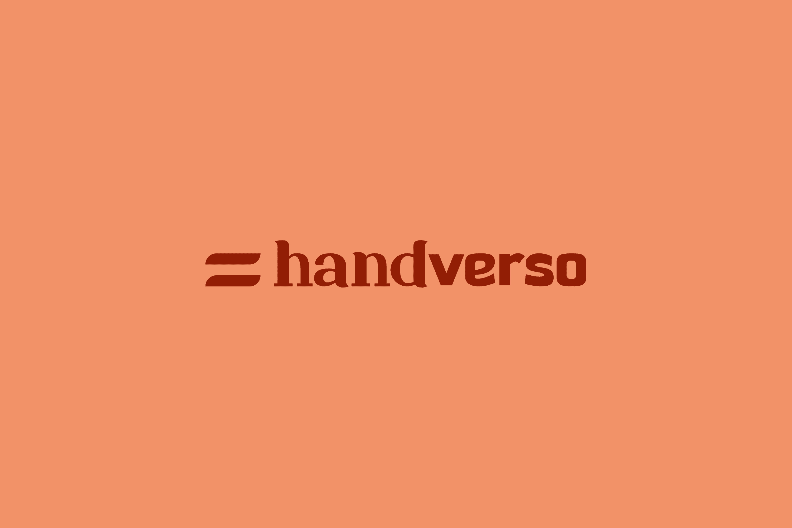
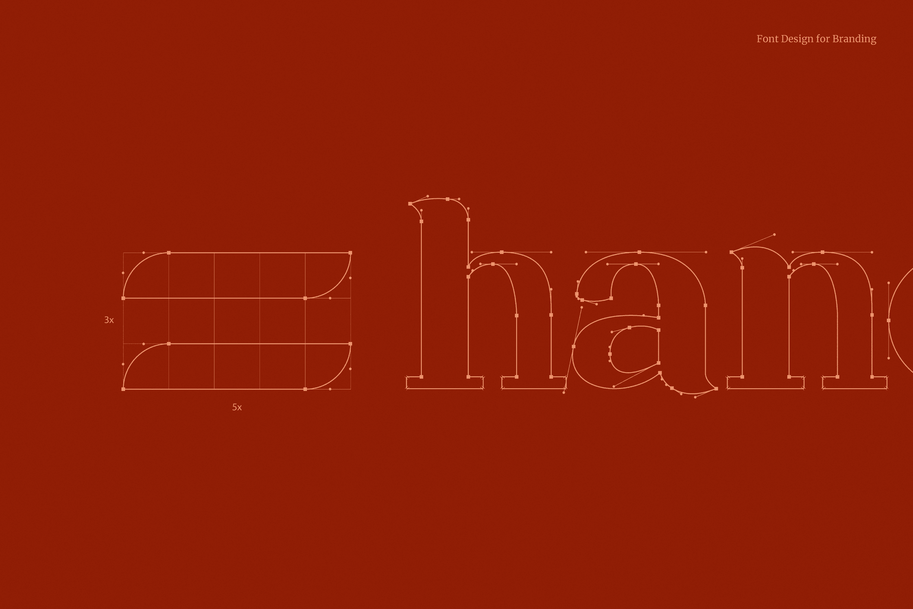
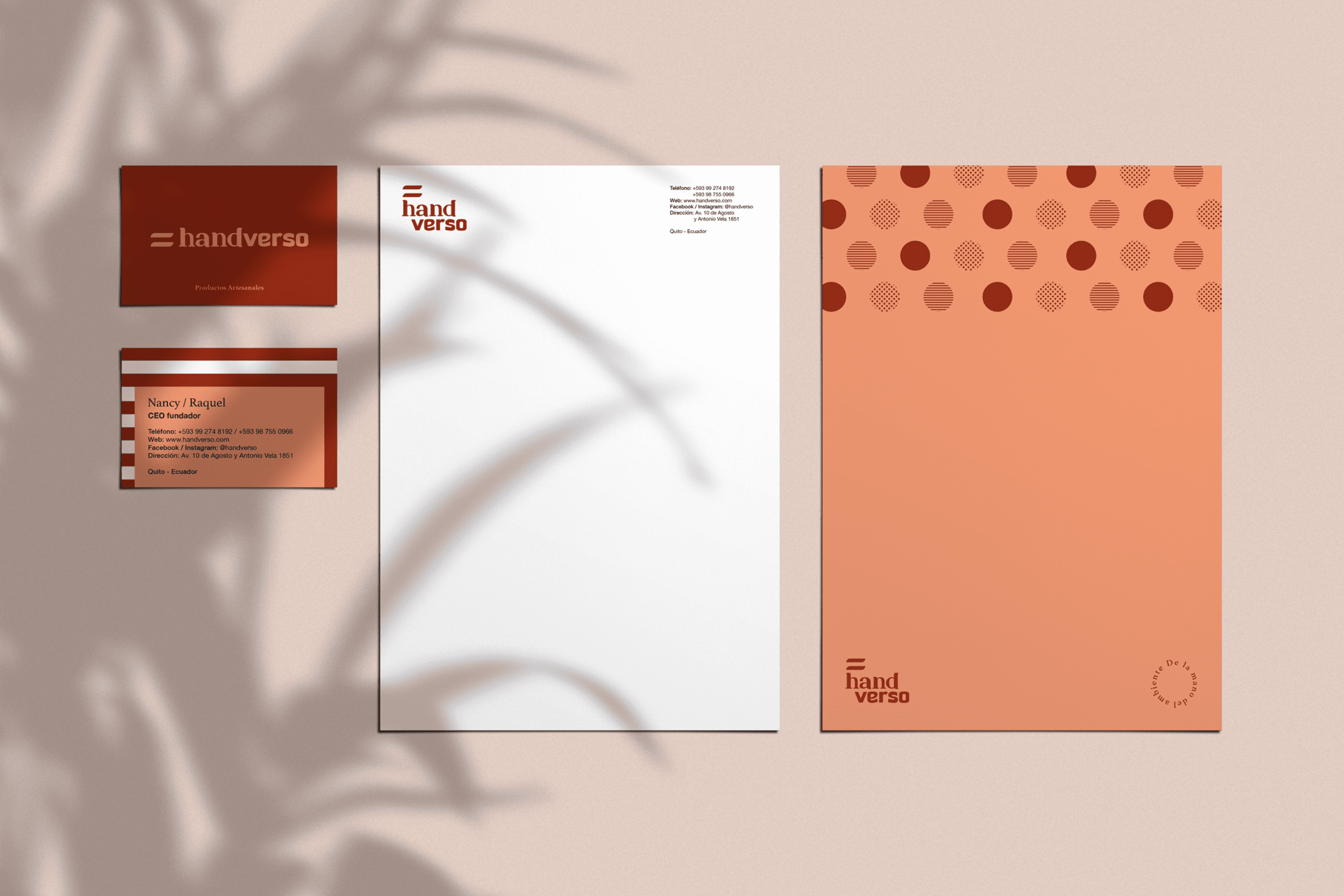
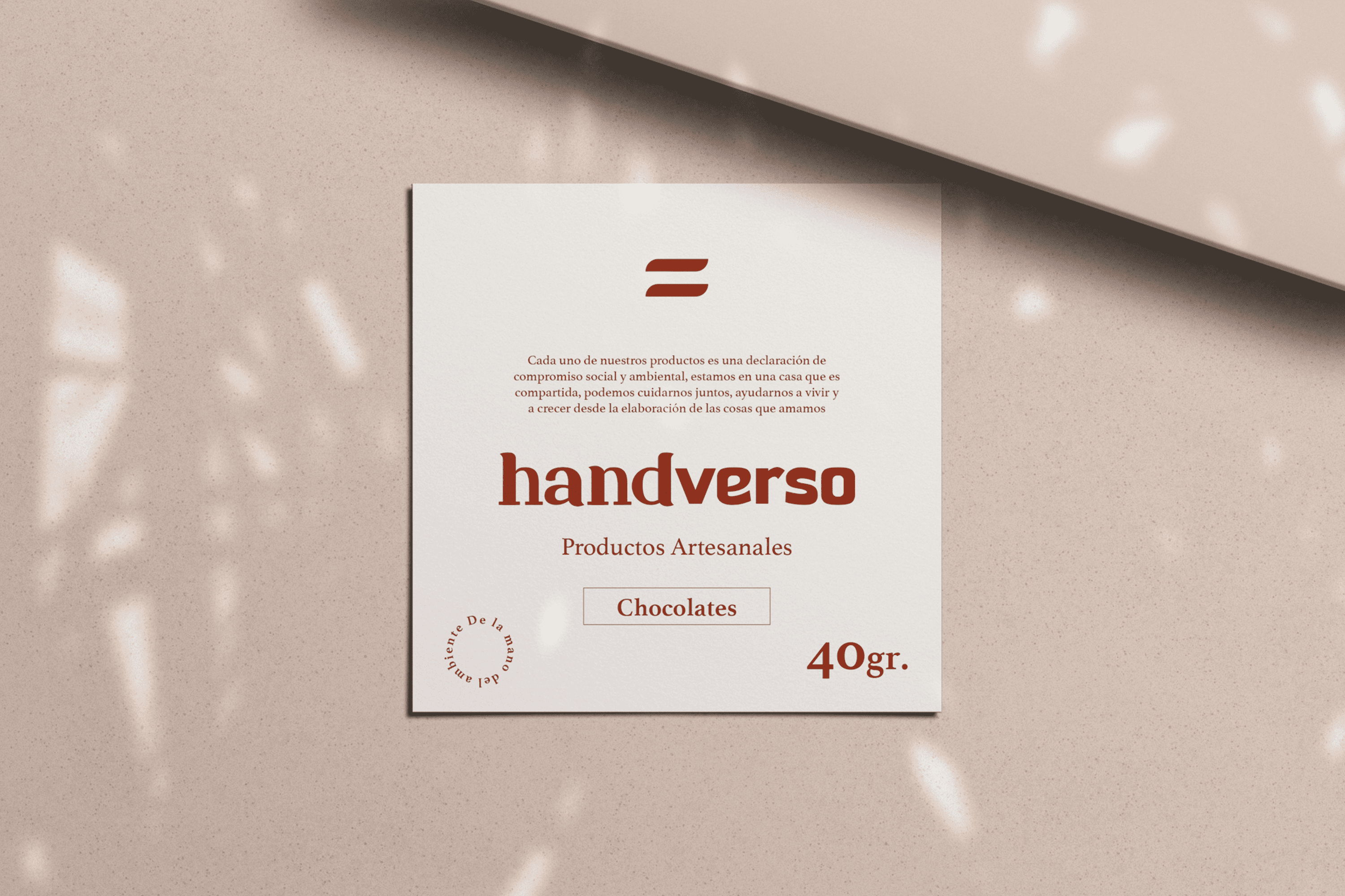
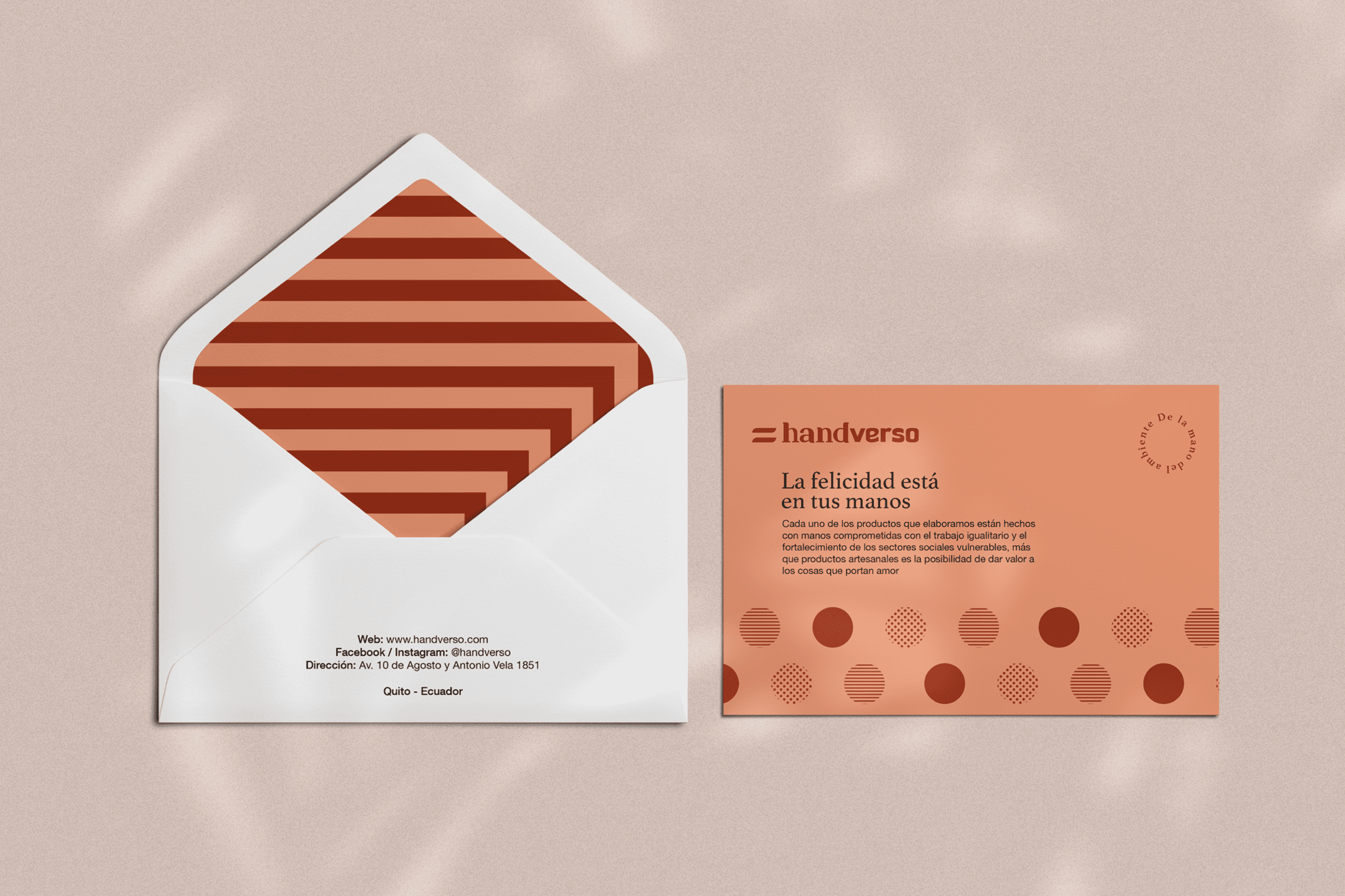
An identity has been developed whose name comes from the combination of “hand”and “verso” which in Spanish means verse as that union of words that forms a unit in a poem, thus referring to the delicacy with which the details of Handverso are elaborated. The typography has been designed based on one of the most important values present in this company, which is to highlight the delicacy, elegance and strength of the handverso woman, this has been achieved by merging two typefaces where “hand” is written with a delicate and elegant Serif typeface, and “verso” on the contrary expresses strength through a San Serif typeface. The icon is the flag of handverso, speaking of equality, both in gender, opportunities, treatment and use of resources used, seeking full respect for their environment. Two warm colors have been chosen to reflect its feminine nature, but allow handverso to be well received by both men and women.

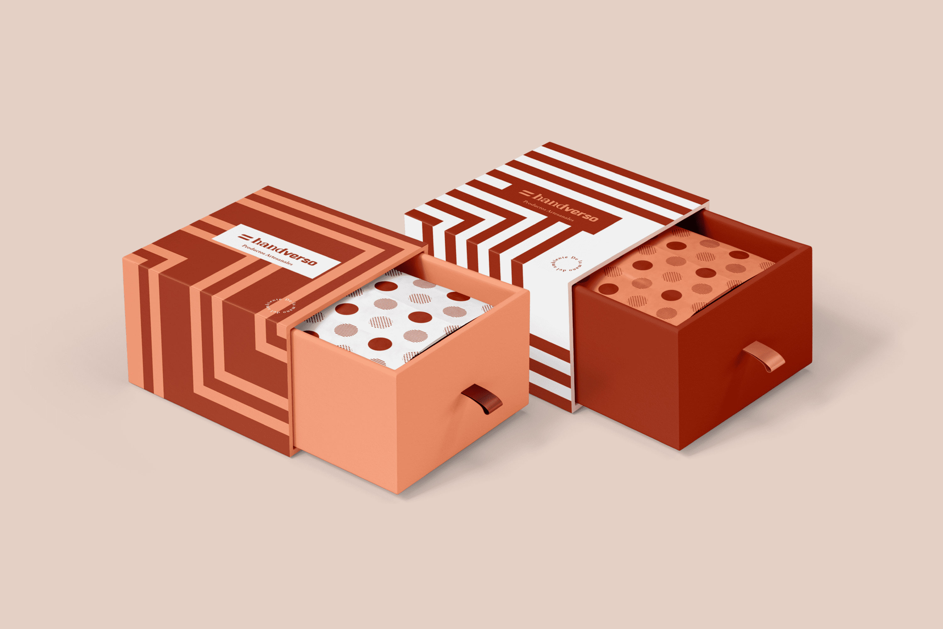
The linear design of the exterior of the packaging is a representation of the multiple possible ways to reach the same goal, and also tells us that it is the road traveled that makes this detail important. On the other hand, the inside is covered with several equal but different circumferences in its composition, thus valuing human diversity and making it part of this great gift.

Suggested Projects
Terrenal Resto Bar
Simples Finanzas
Extreme Max
Diablo Huma Food Truck
BRANDING

The Client

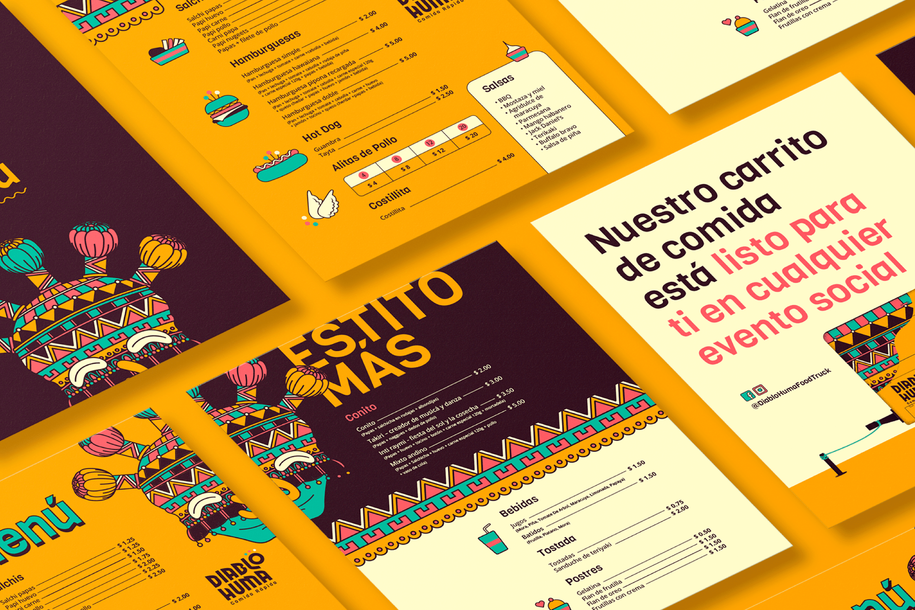
“Diablo Huma” is a fast food truck in Ecuador located in Saquisili in the province of Cotopaxi.


Keywords

Branding / Illustration / Fast Food

The Objective

To design the new identity for Diablo Huma Fast Food with the mission of communicating quality, freshness and the culture of the region without losing accessibility.


The Solution

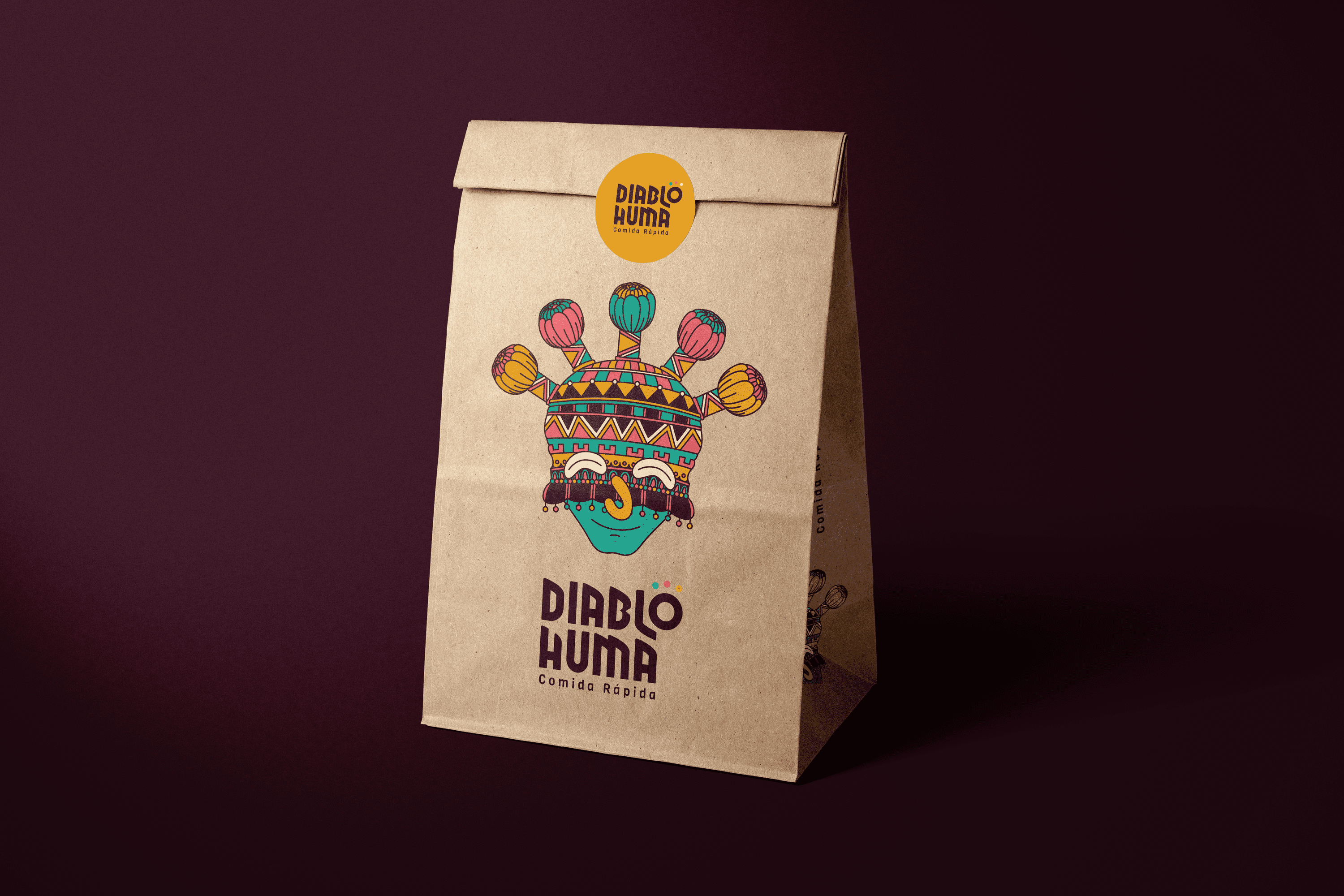
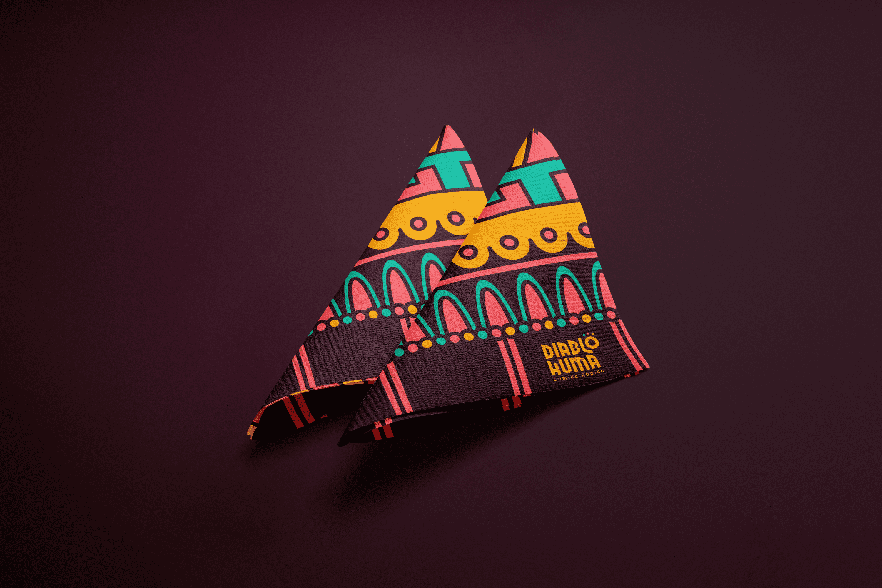
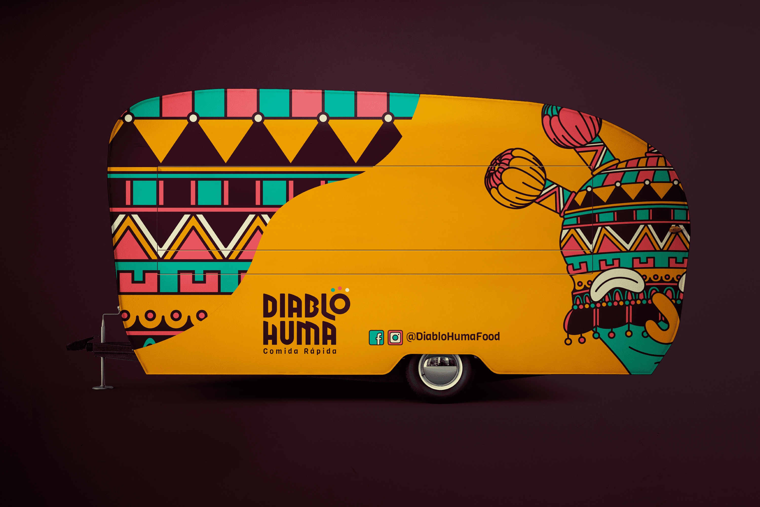
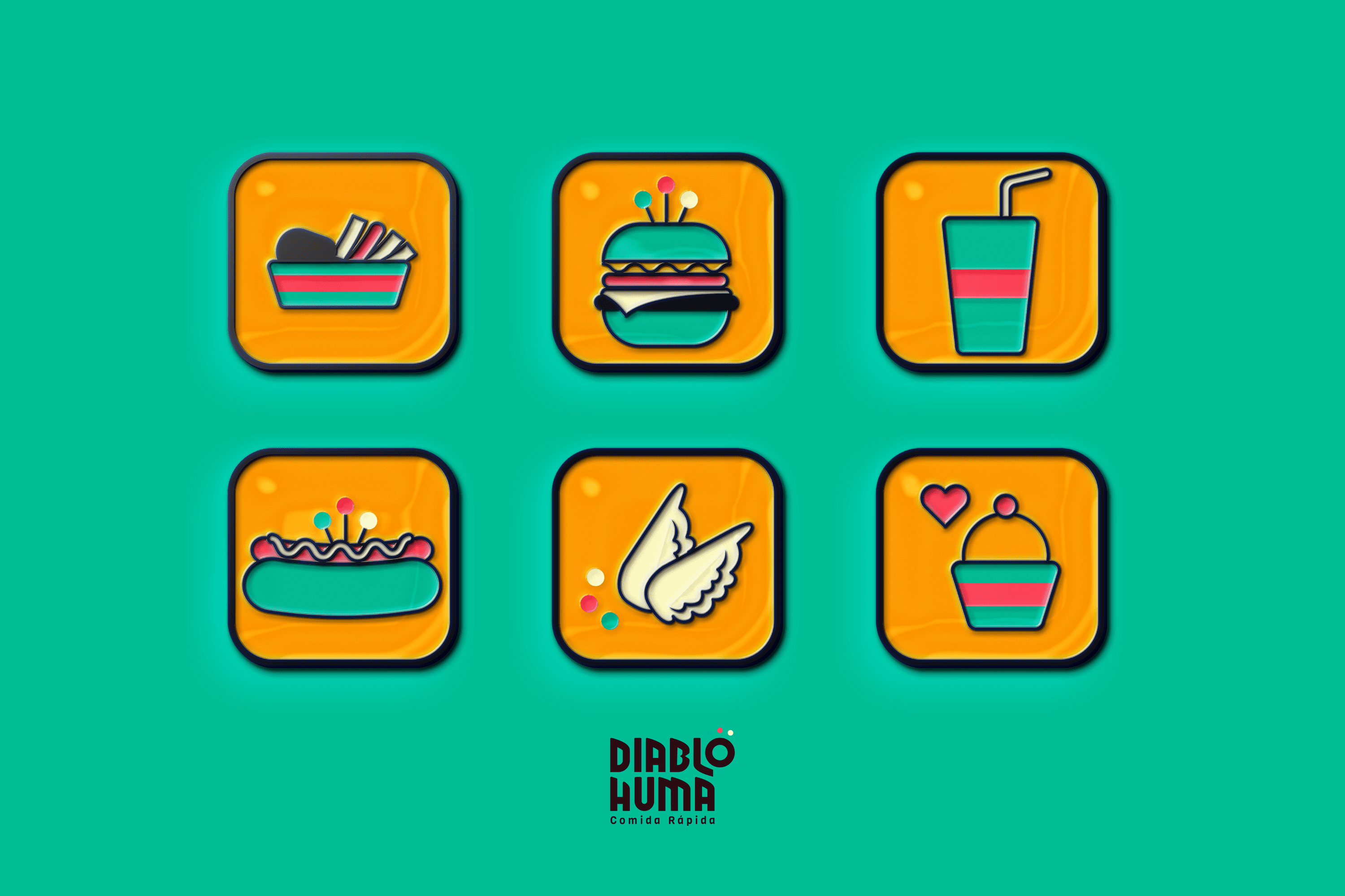
The proposal is based on the character of the Andean region of the Inti Raymi, festival, also known as Aya Uma, it is believed that this character drives away the demons of the crops and dances in three times to connect with the Earth, the Sun and the Moon (these three elements accompany the letter “o” of the logo which in turn is the abstraction of a “Diablo Huma”). The name of the character was used and an illustrated interpretation of it was made, fusing its traditional mask with various patterns present in the fabrics of the Andean Region. This proposal is accompanied by vibrant and friendly colors, close to the young public to which it is addressed..

Suggested Projects
Terrenal Resto Bar
Simples Finanzas
Extreme Max
Casa Nova
BRANDING

The Client

Casa Nova is a furniture and decoration store that provides customized advice to its customers, located in the city of Riobamba, Ecuador.


Keywords

Branding / Graphic Design / Furniture / Decoration / Home

The Objective

Develop a modern brand that shows constant development and has a visually familiar personality.


The Solution

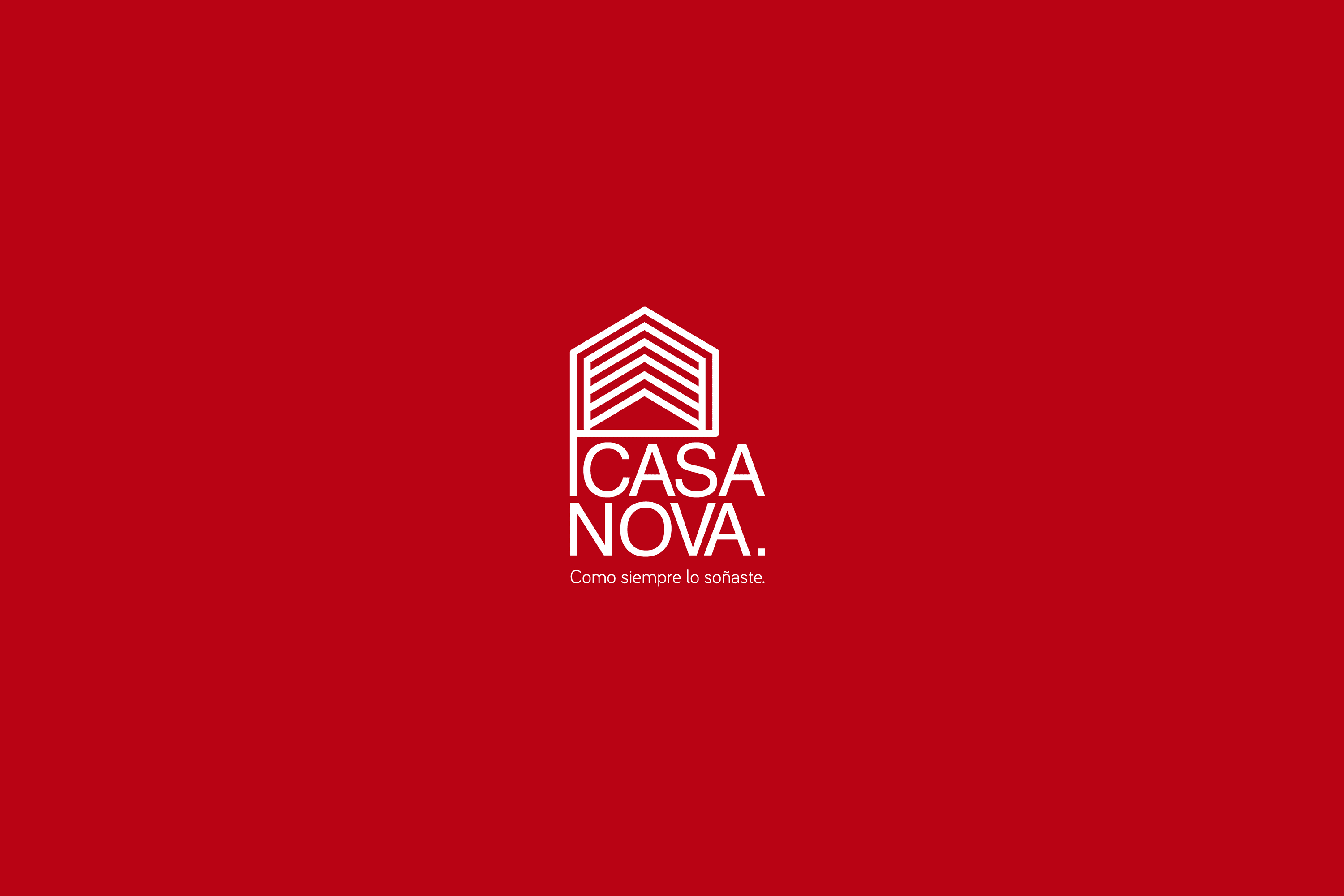
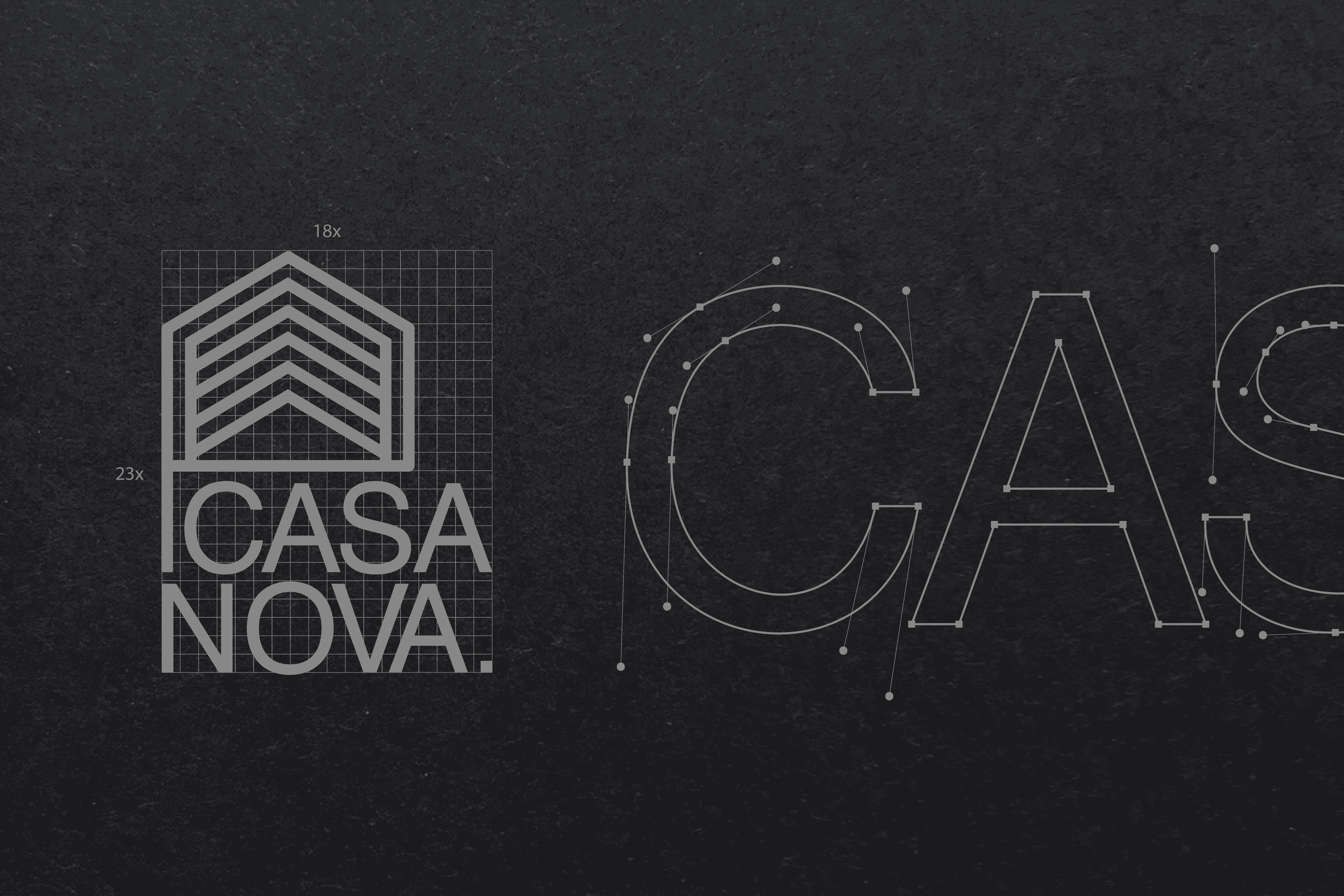
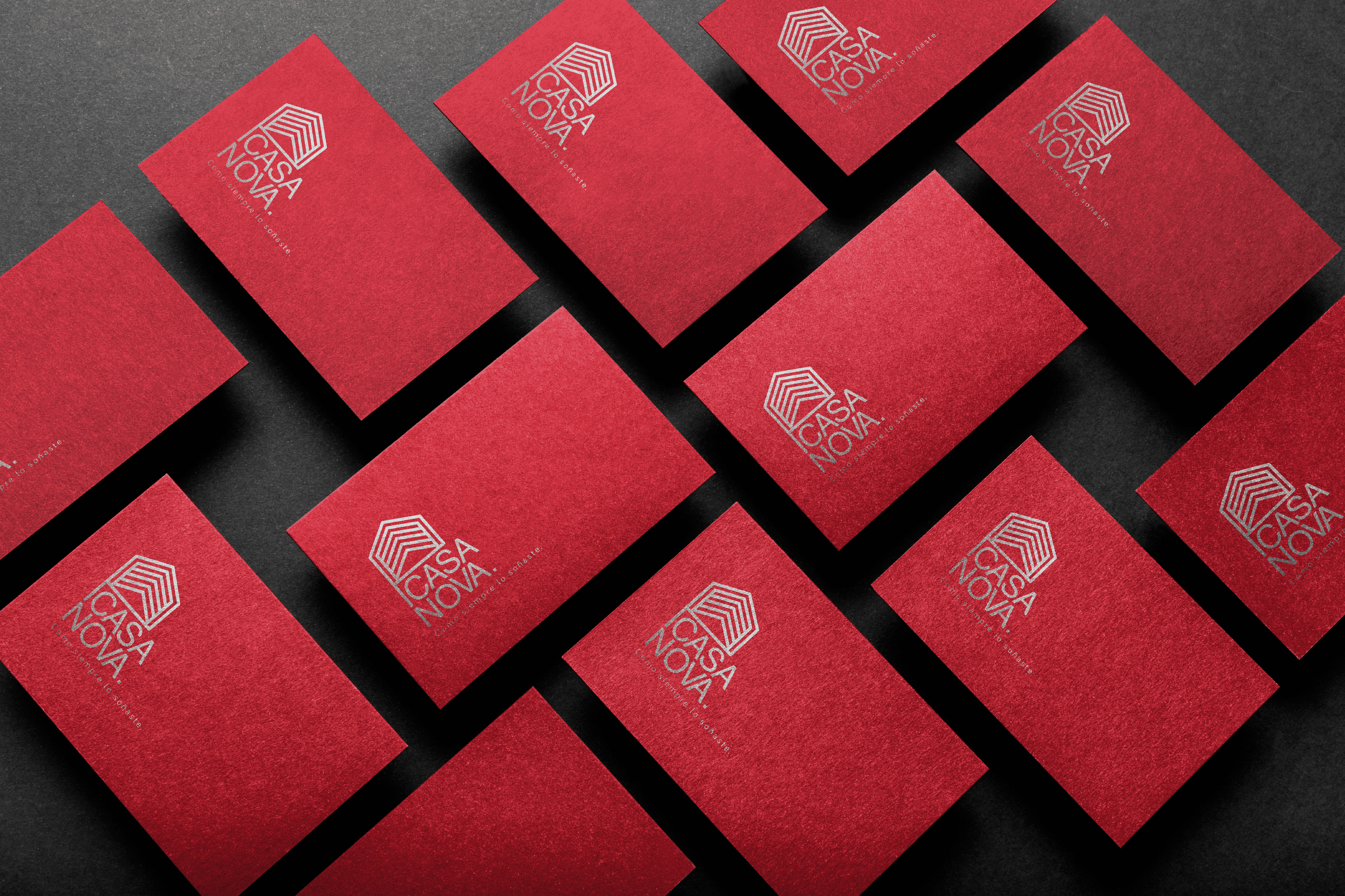
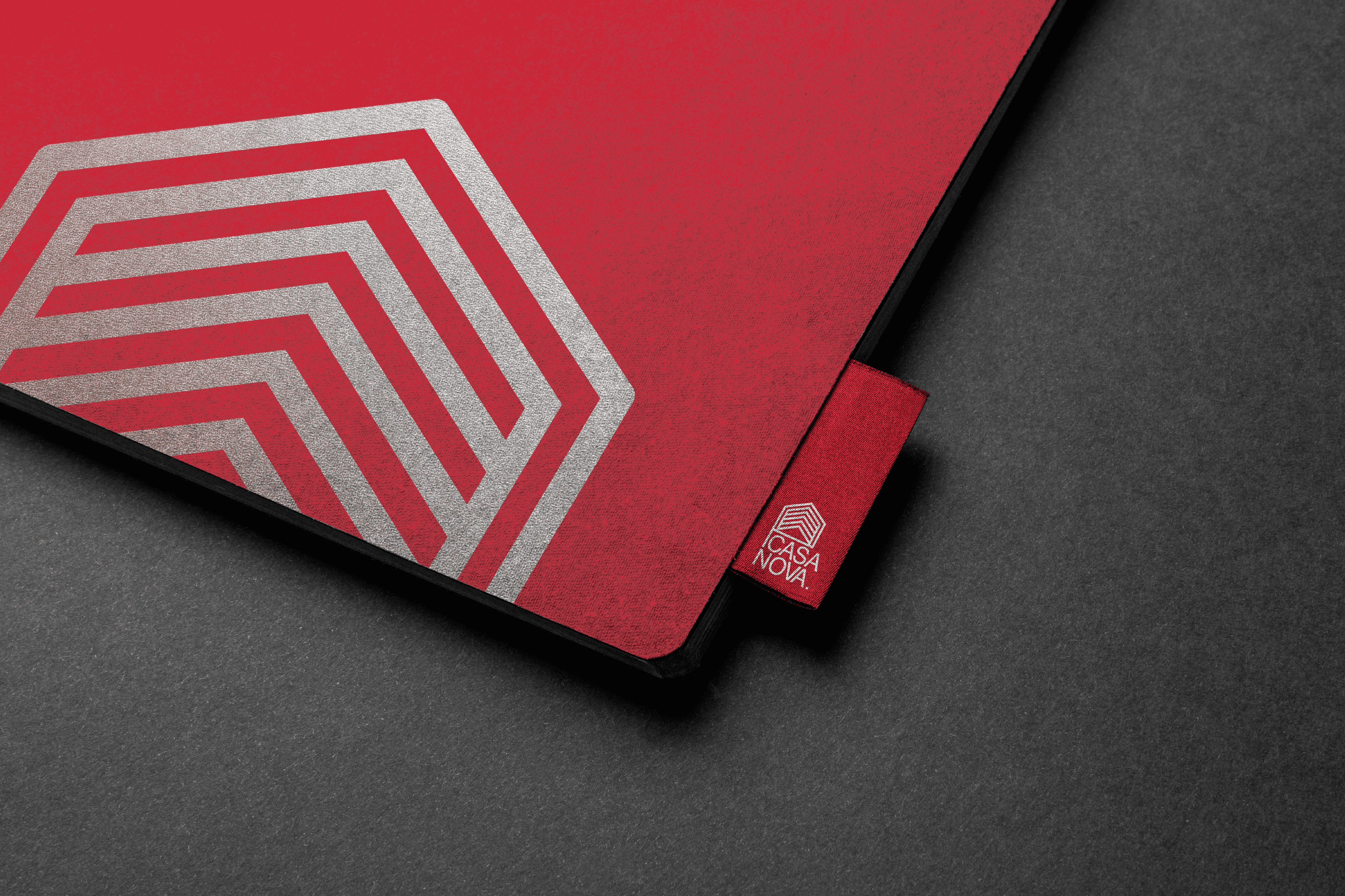
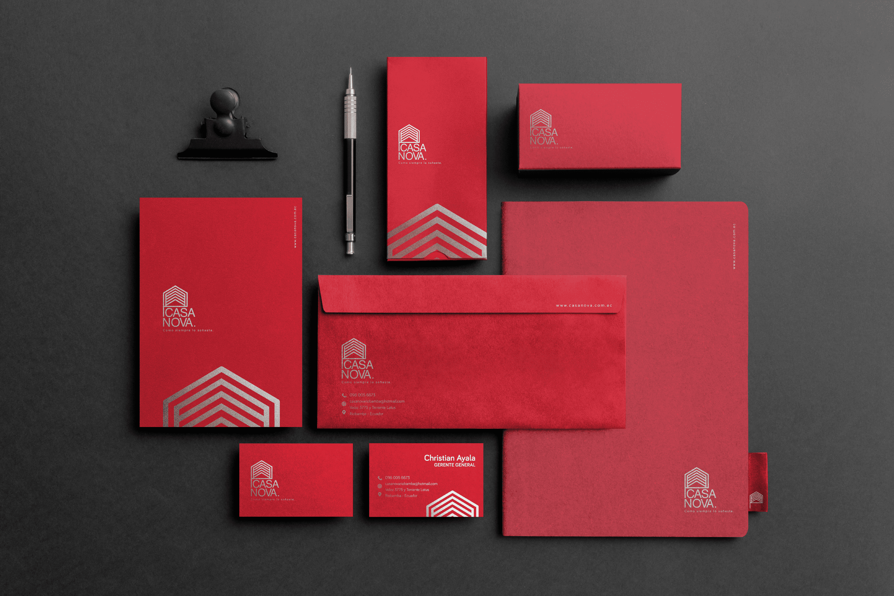
The proposal for the logo is complex, with a chromatic palette intended to portray the passion for decoration. The abstraction of a house with several lines in its interior, express the diversity of products that exist in this store, and its projection upwards the sense of constant innovation. The line that protrudes from the house to join the structure of the text, is the representation of “thinking outside the box”, an attitude that is present when it comes to innovation

Suggested Projects
Terrenal Resto Bar
Simples Finanzas
Extreme Max
Ecuador in Solidarity
CARTELISM

History

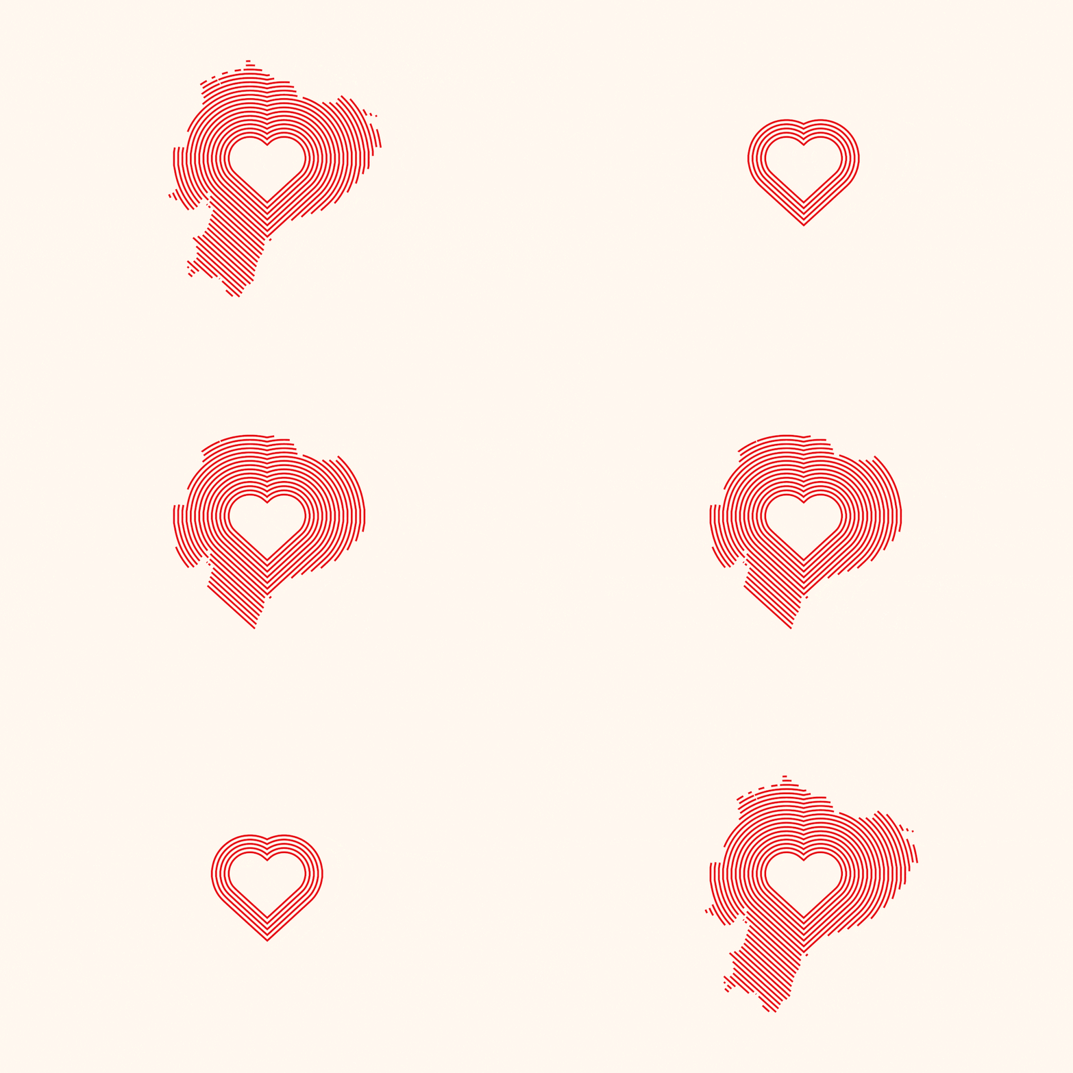
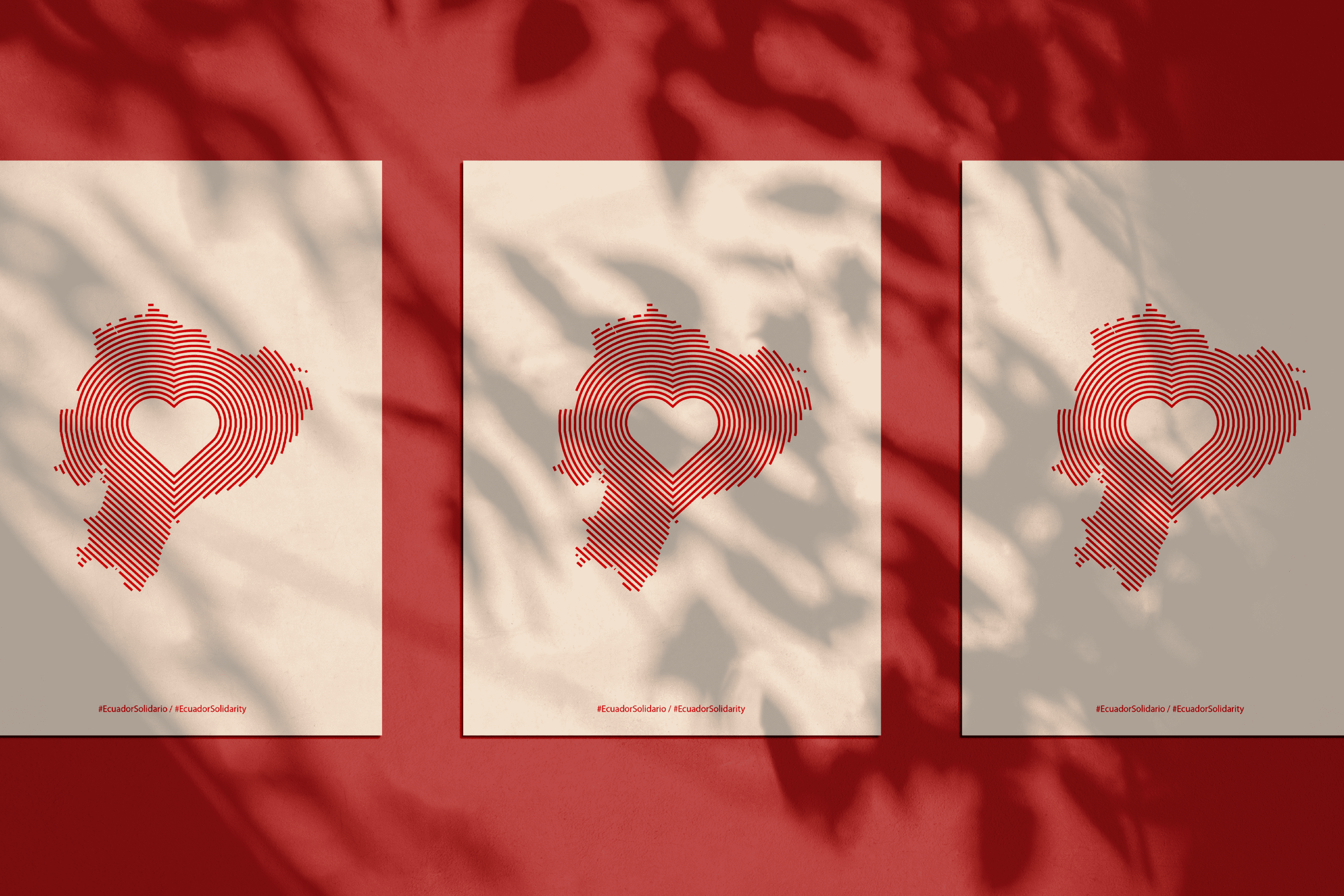
Ecuador Solidario o Ecuador in Solidarity is a graphic cry for social aid that was born as support for the victims of the earthquake of April 16, 2016, with a magnitude of 7.8 on the Richter scale in Manabí, Ecuador, “The sound of several hearts helping, is the only one capable of restoring peoples” David Feria.


Keywords

Design / Poster / Humanitarian Aid

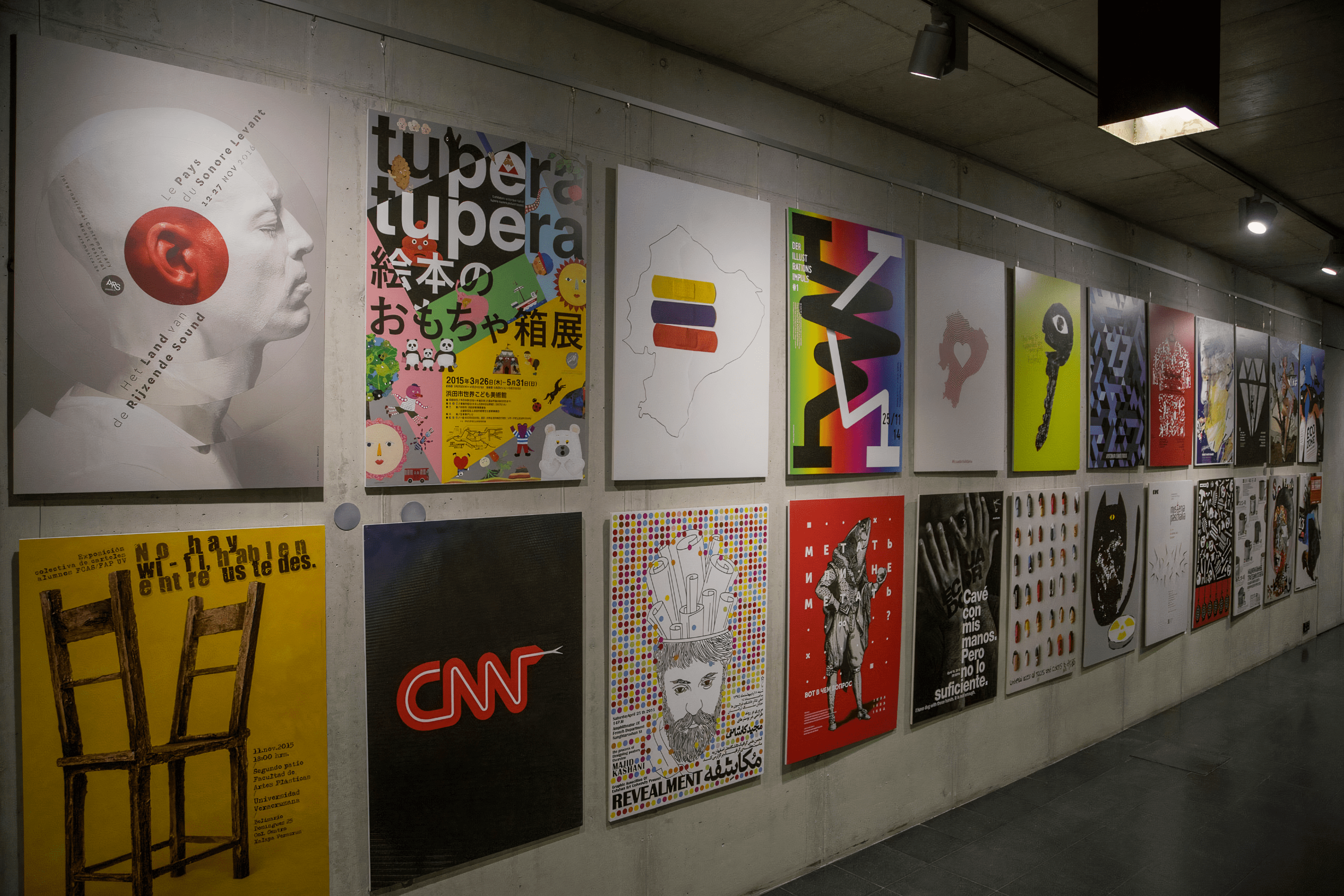
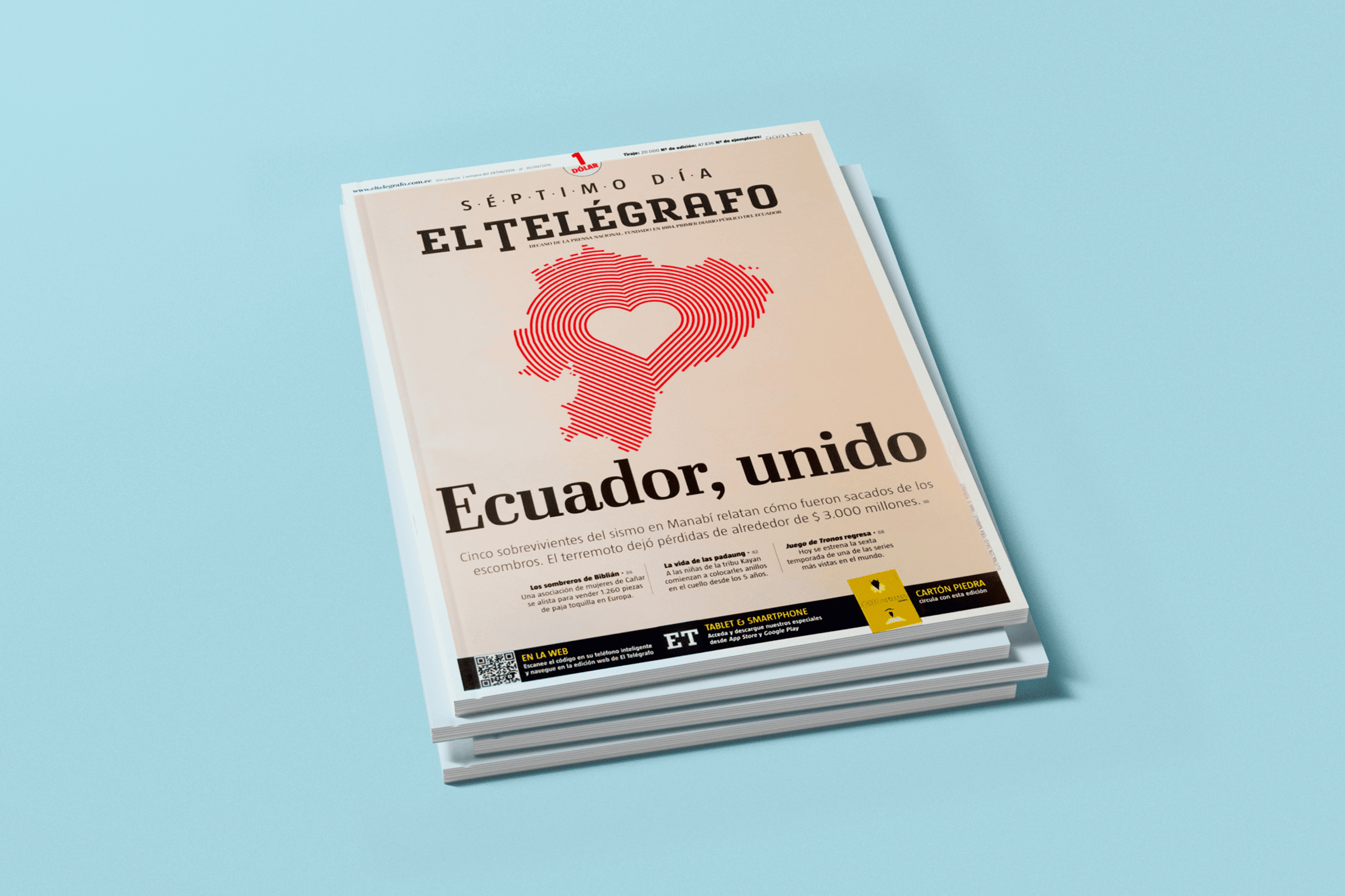
The repercussion that this visual message had led him to the cover of the Séptimo Día Magazine of the newspaper El Telégrafo of Guayaquil, recognized by the World Summit of Design in the Press. Some time later, is part of the selection of the Ecuador Poster Biennial in Quito 2016 and travels with it to Centrum Spotkania Kultur in Lublin.

A year later at the Bienal del Cartel Bolivia BICeBé 2017,he won first place in CATEGORY E. Animated Gif Poster. But beyond the recognitions, this project is one of my favorite because of all the people he was able to help in the earthquake of April 16, 2016. “We are not the graphics we make, we are the people whose message we give helps” David Feria.

Suggested Projects
Terrenal Resto Bar
Simples Finanzas
Extreme Max