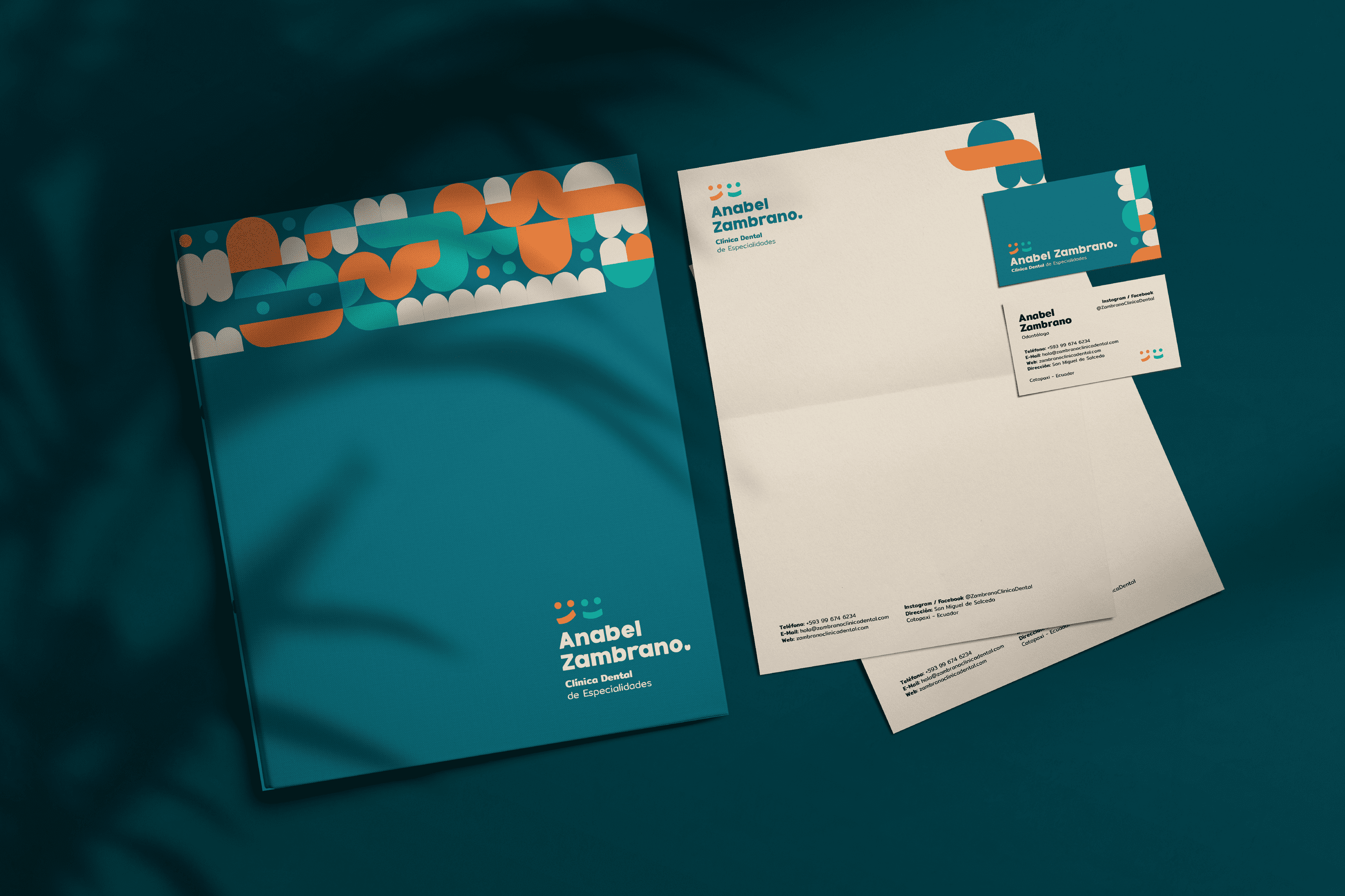
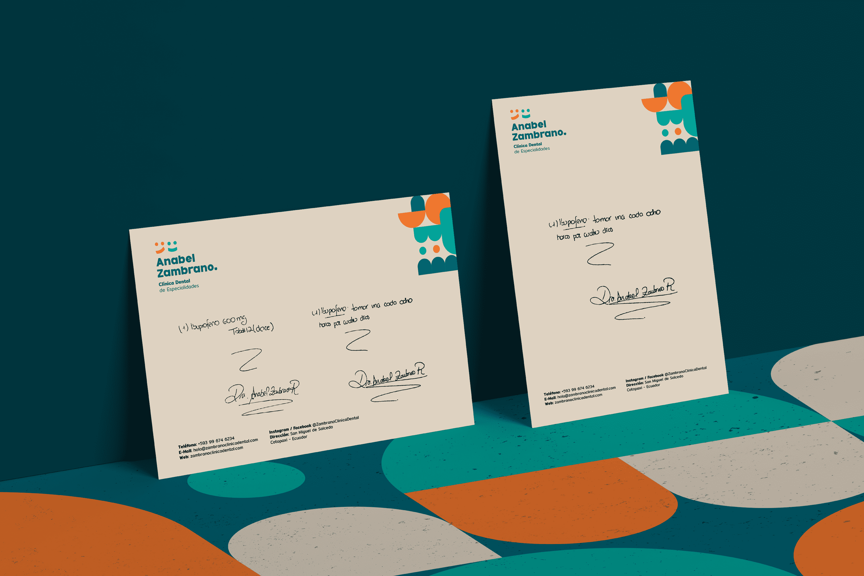
The Client
“Anabel Zambrano” is a Dental Specialty Clinic located in Salcedo Ecuador, which thinks about the welfare of families and pays special attention to their children.
Keywords
Branding / Clinic / Dentist
The Objective
Develop a brand that reflects quality, trust and the research behind each product.
The Solution
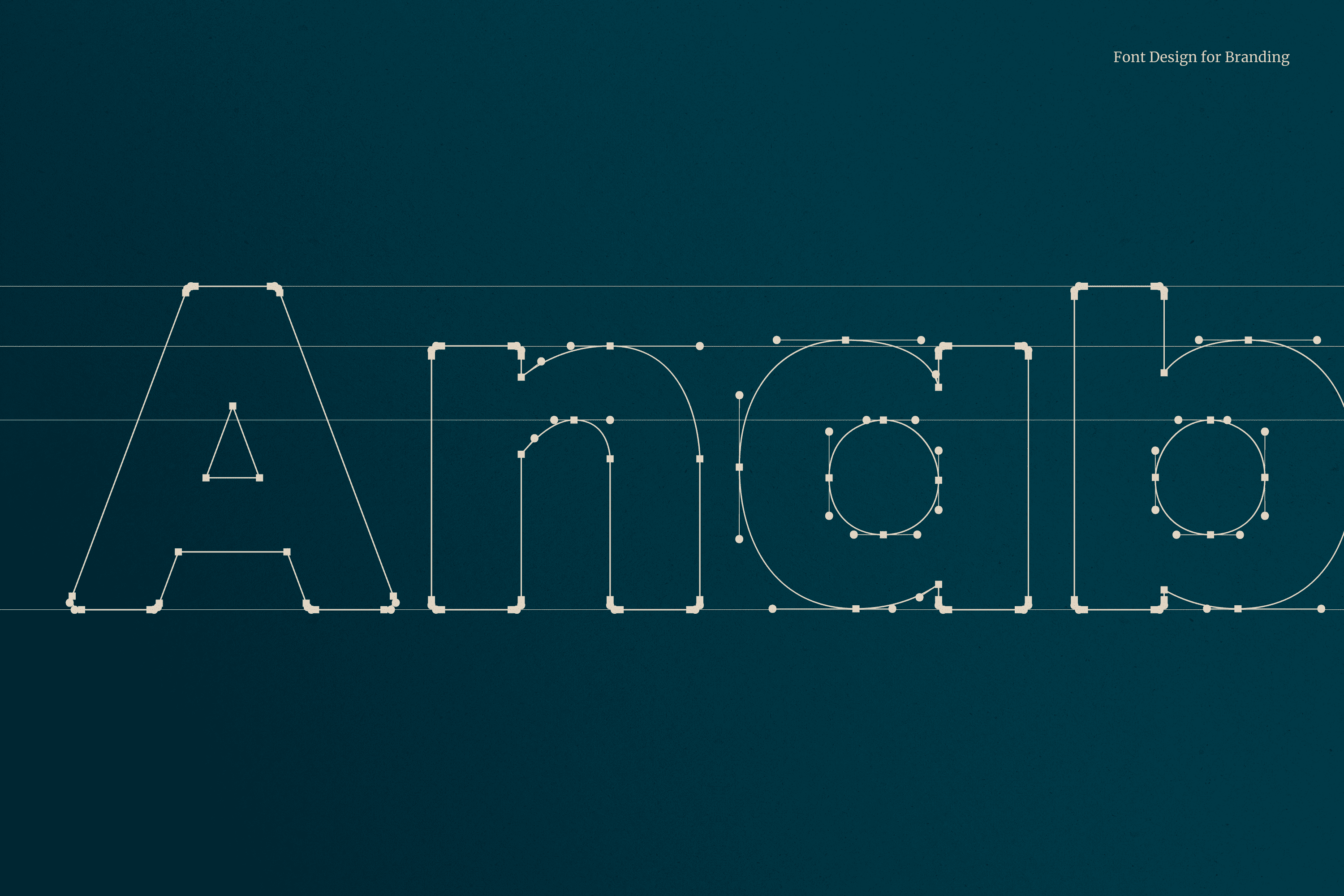
The typography designed for “Anabel Zambrano” is Serif and its wide stroke makes each type stable, which translates as trust, the corners have been slightly rounded to add to the concept of friendliness. The Anabel Zambrano isotype uses basic elements recognizable to any member of the family regardless of age, to represent the before and after of a smile. The colors used generate an atmosphere of joy, friendliness and well-being characteristics that are part of this place.
A modular system has been developed, its shape shows abstractions of teeth, molars, people, brushes, smiles, but leaves freedom to the imagination in its possible combinations.


 Facebook