Customize Consent Preferences

We use cookies to help you navigate efficiently and perform certain functions. You will find detailed information about all cookies under each consent category below.

The cookies that are categorized as "Necessary" are stored on your browser as they are essential for enabling the basic functionalities of the site. ... 

Always Active

Necessary cookies are required to enable the basic features of this site, such as providing secure log-in or adjusting your consent preferences. These cookies do not store any personally identifiable data.

No cookies to display.

Functional cookies help perform certain functionalities like sharing the content of the website on social media platforms, collecting feedback, and other third-party features.

No cookies to display.

Analytical cookies are used to understand how visitors interact with the website. These cookies help provide information on metrics such as the number of visitors, bounce rate, traffic source, etc.

No cookies to display.

Performance cookies are used to understand and analyze the key performance indexes of the website which helps in delivering a better user experience for the visitors.

No cookies to display.

Advertisement cookies are used to provide visitors with customized advertisements based on the pages you visited previously and to analyze the effectiveness of the ad campaigns.

No cookies to display.

Terrenal Resto Bar
BRANDING | ILLUSTRATION

The Client

Terrenal is a Resto-Bar located in Riobamba, Ecuador that draws inspiration from the Andean Paramo for its concept.


Keywords

Branding / Design / Naming / Restaurant / Bar / Paramo / Andean

The Objective

Design the Naming and Branding for a Resto Bar with the concept of the Andean Paramo.


The Solution

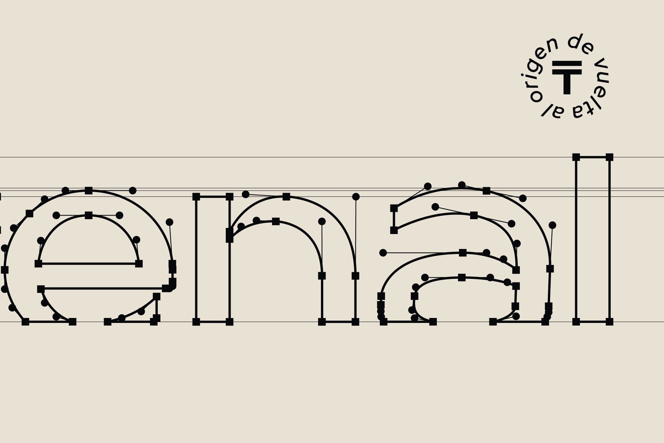
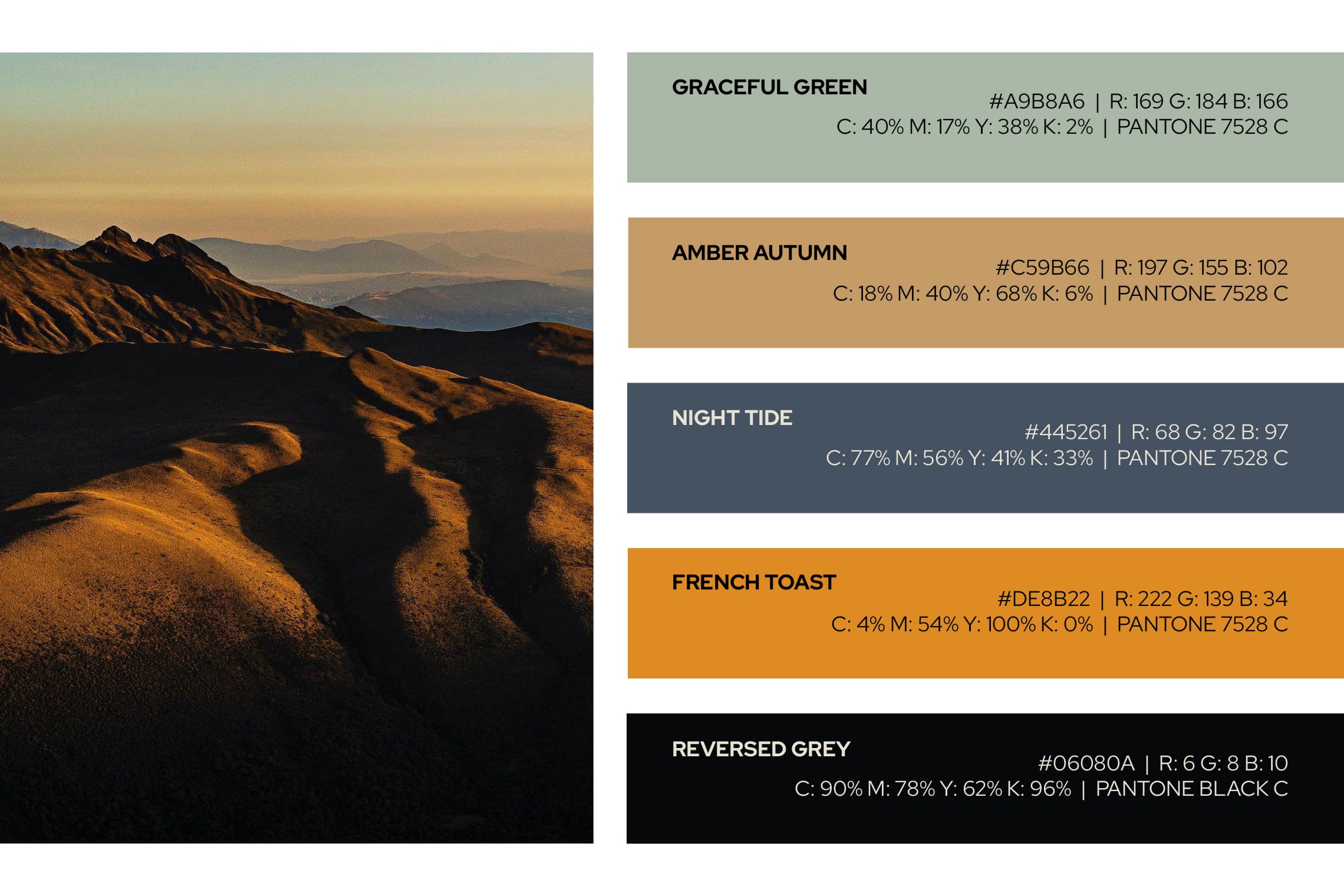
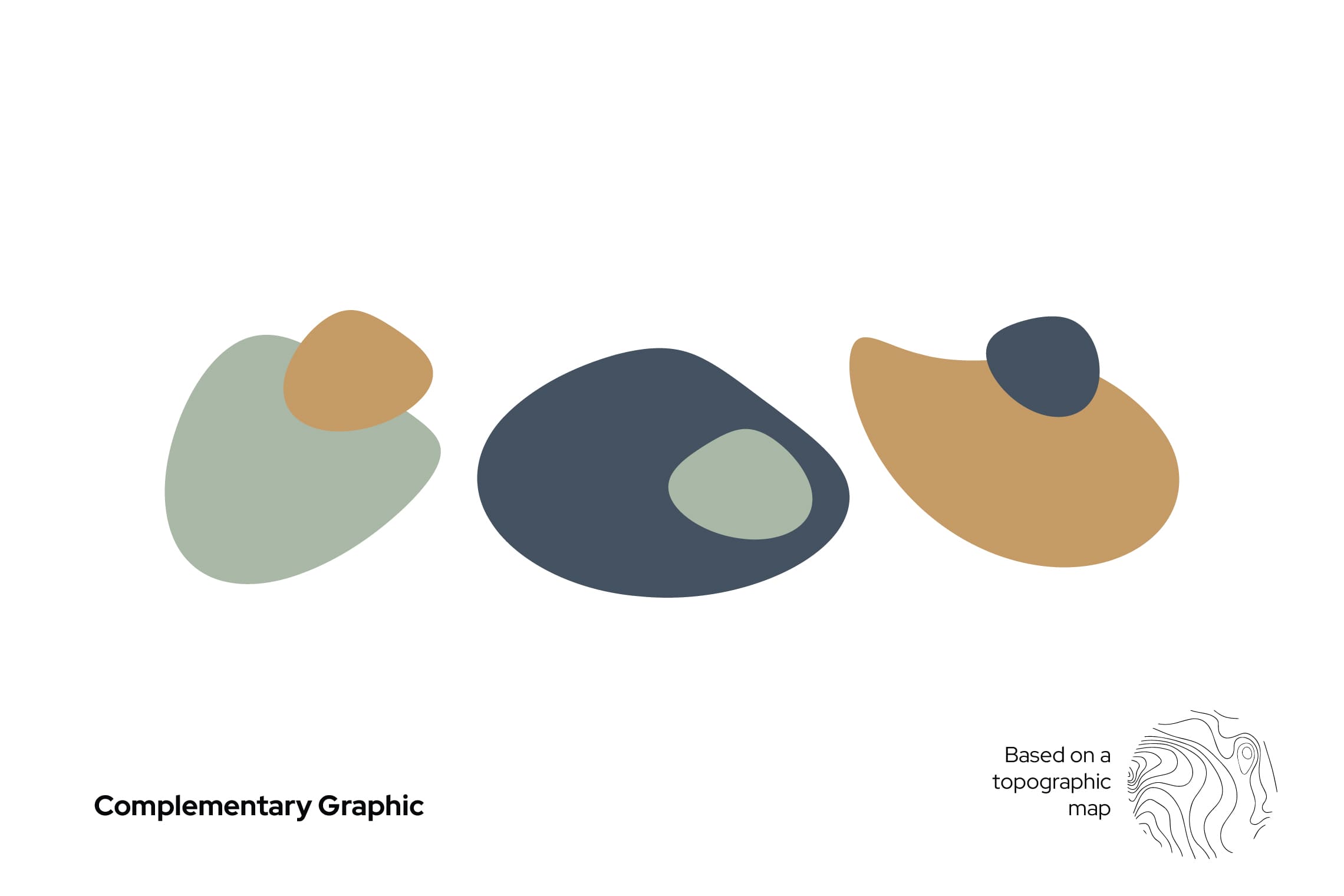
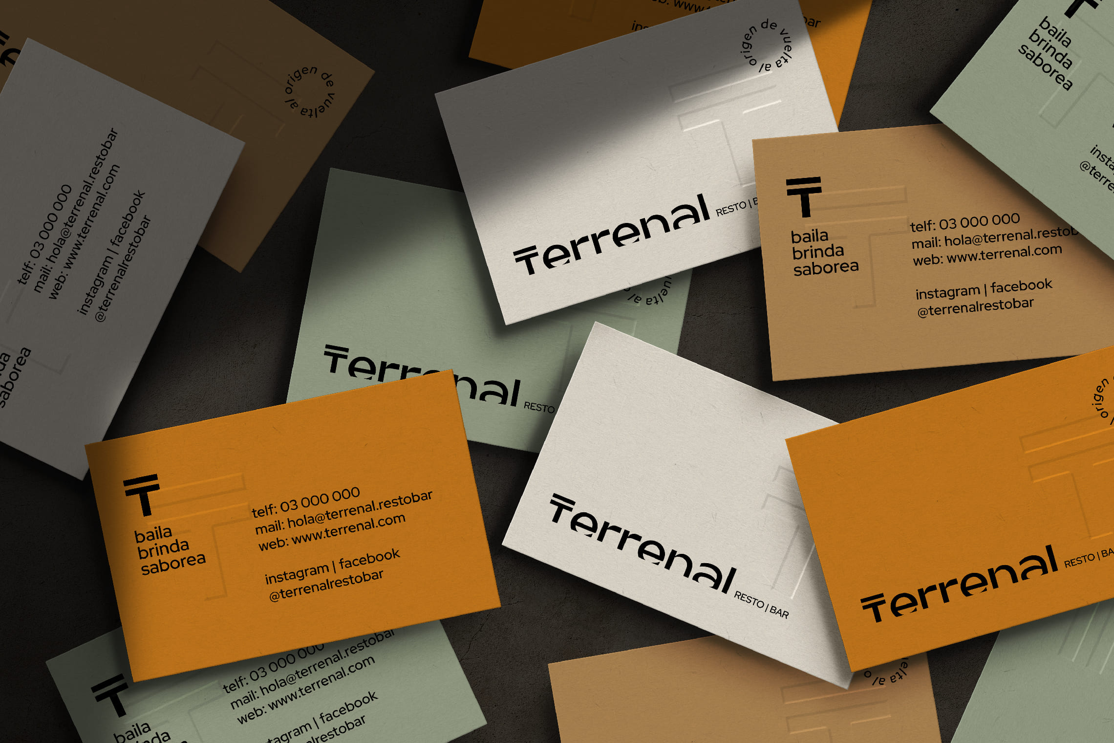
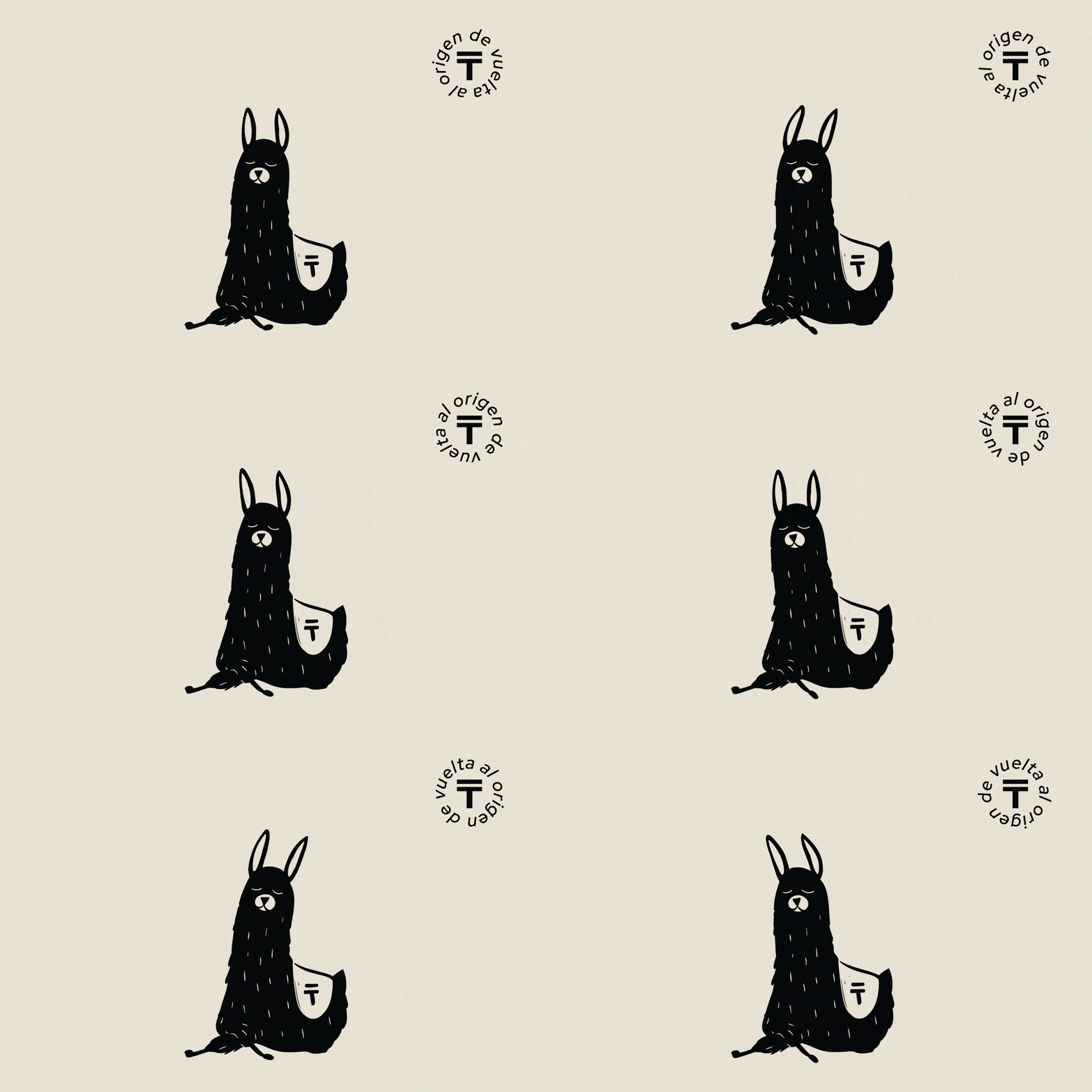
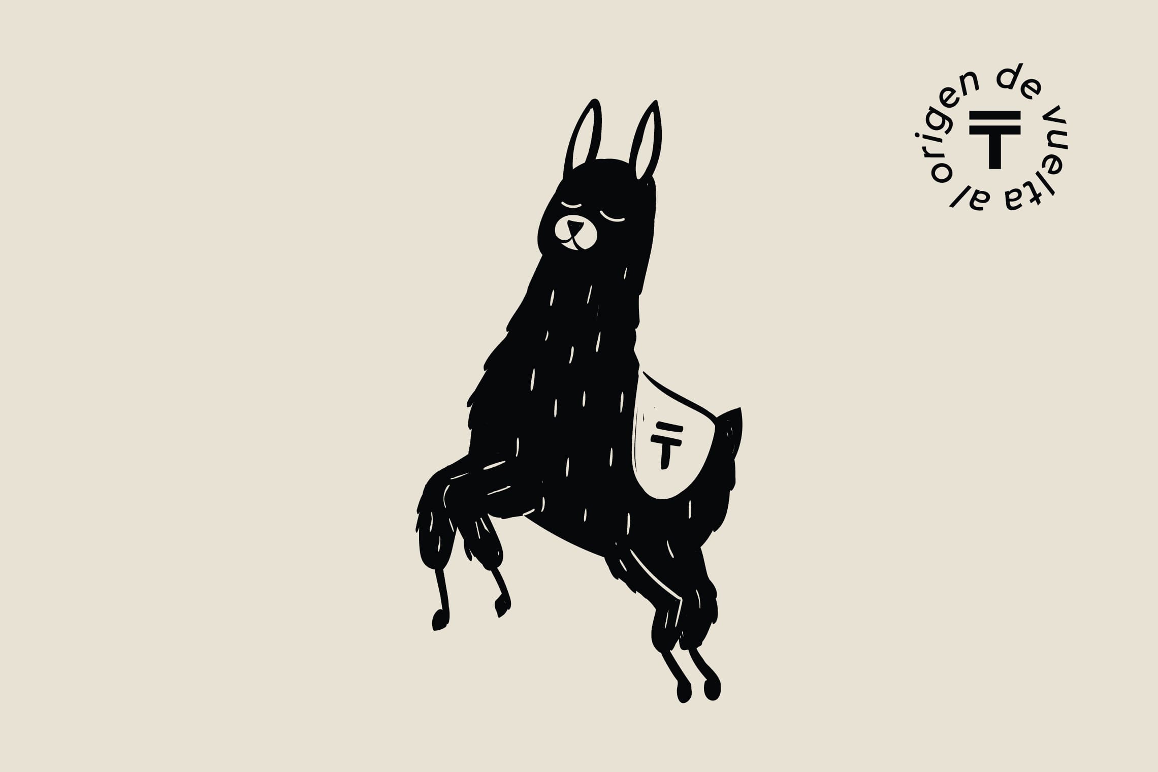
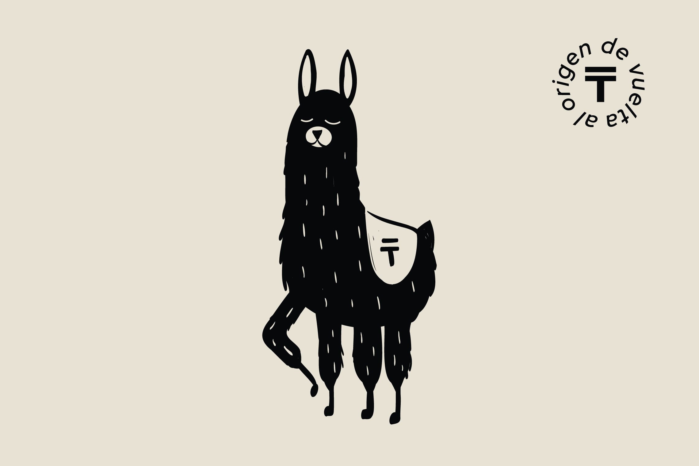
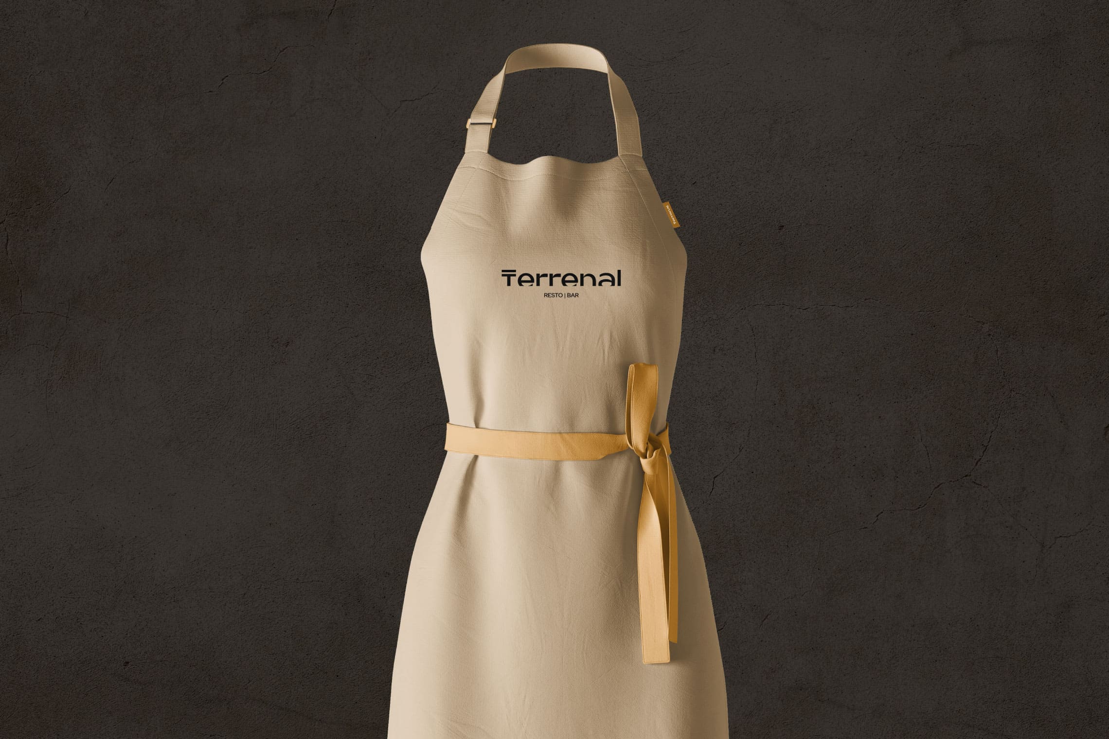
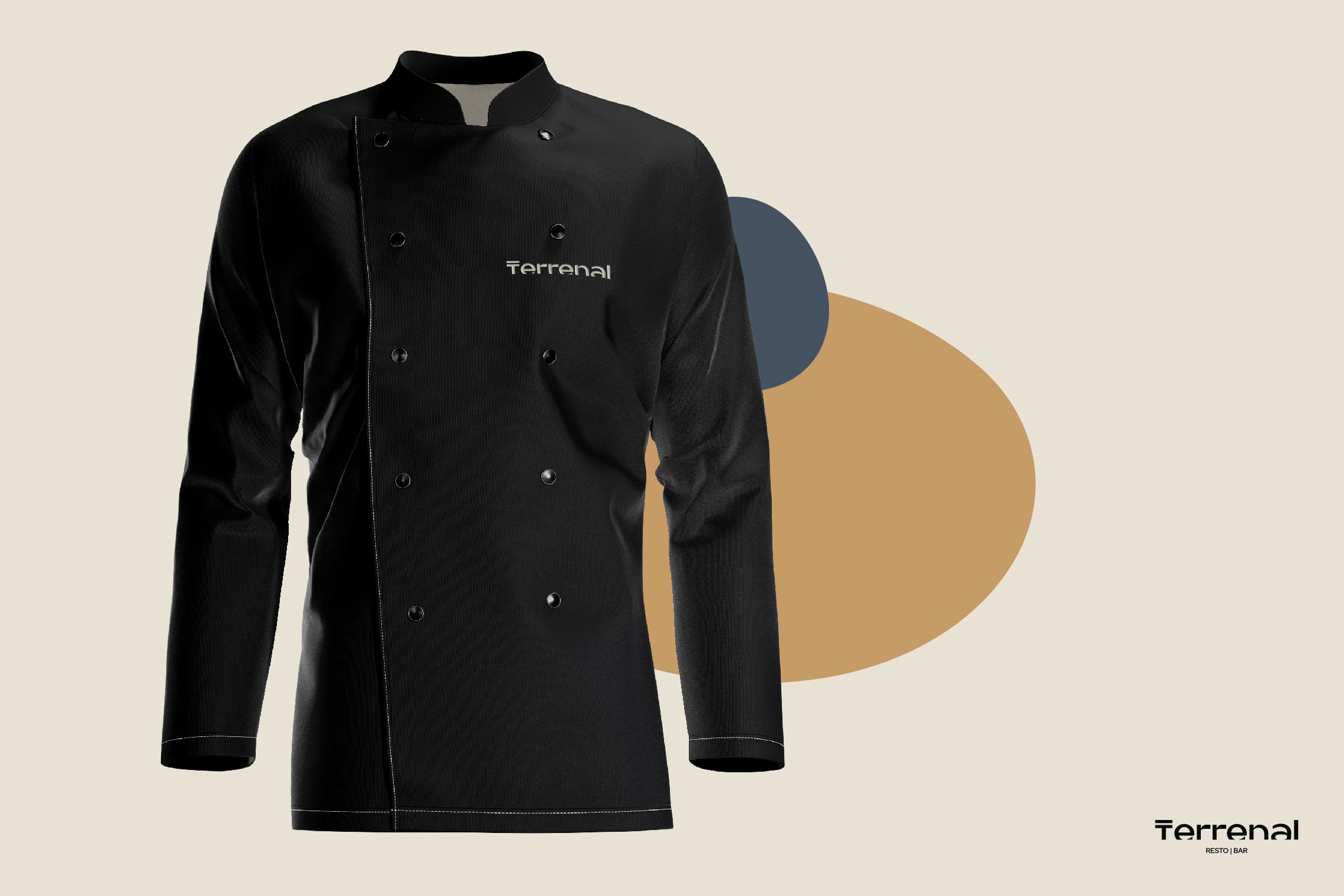
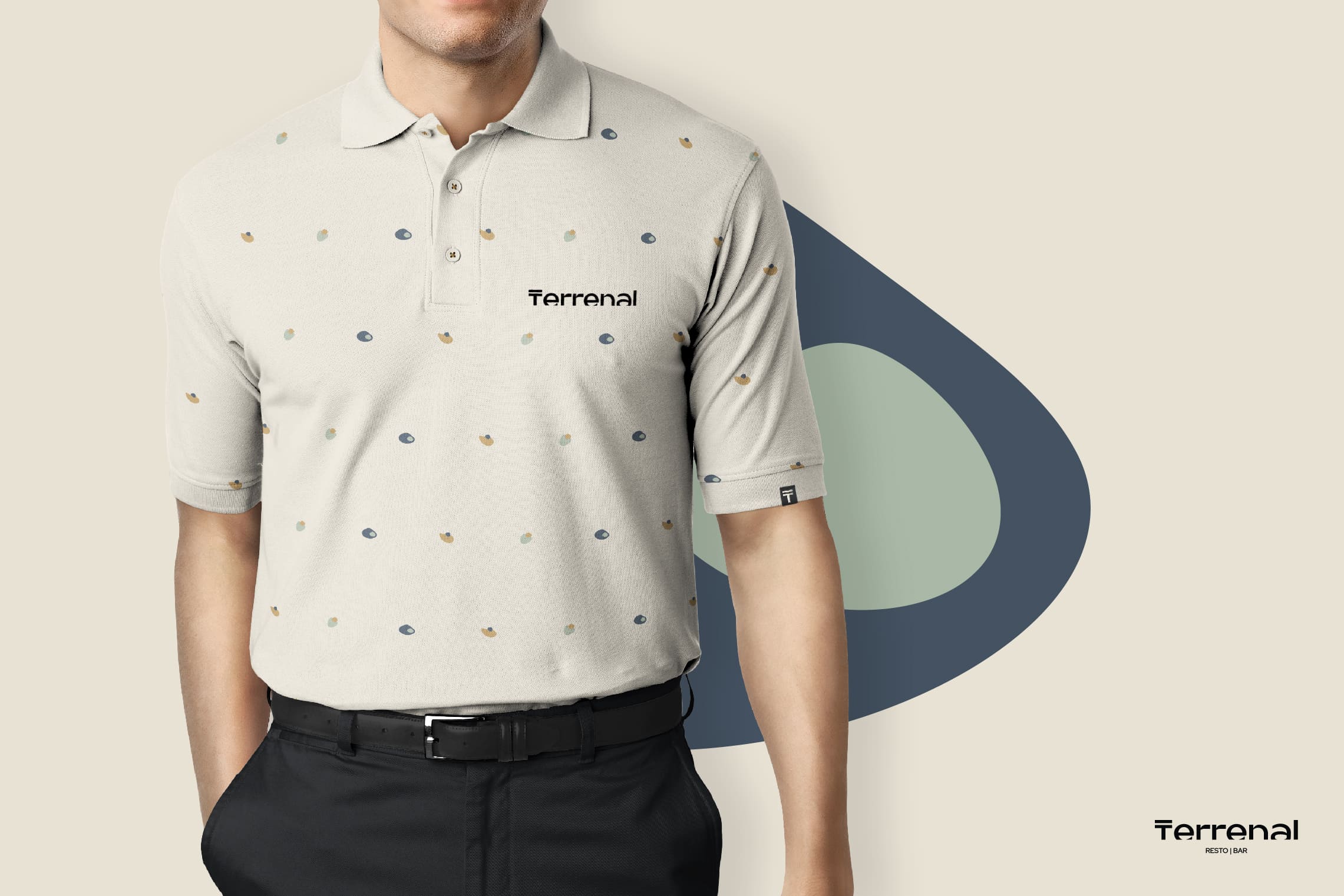
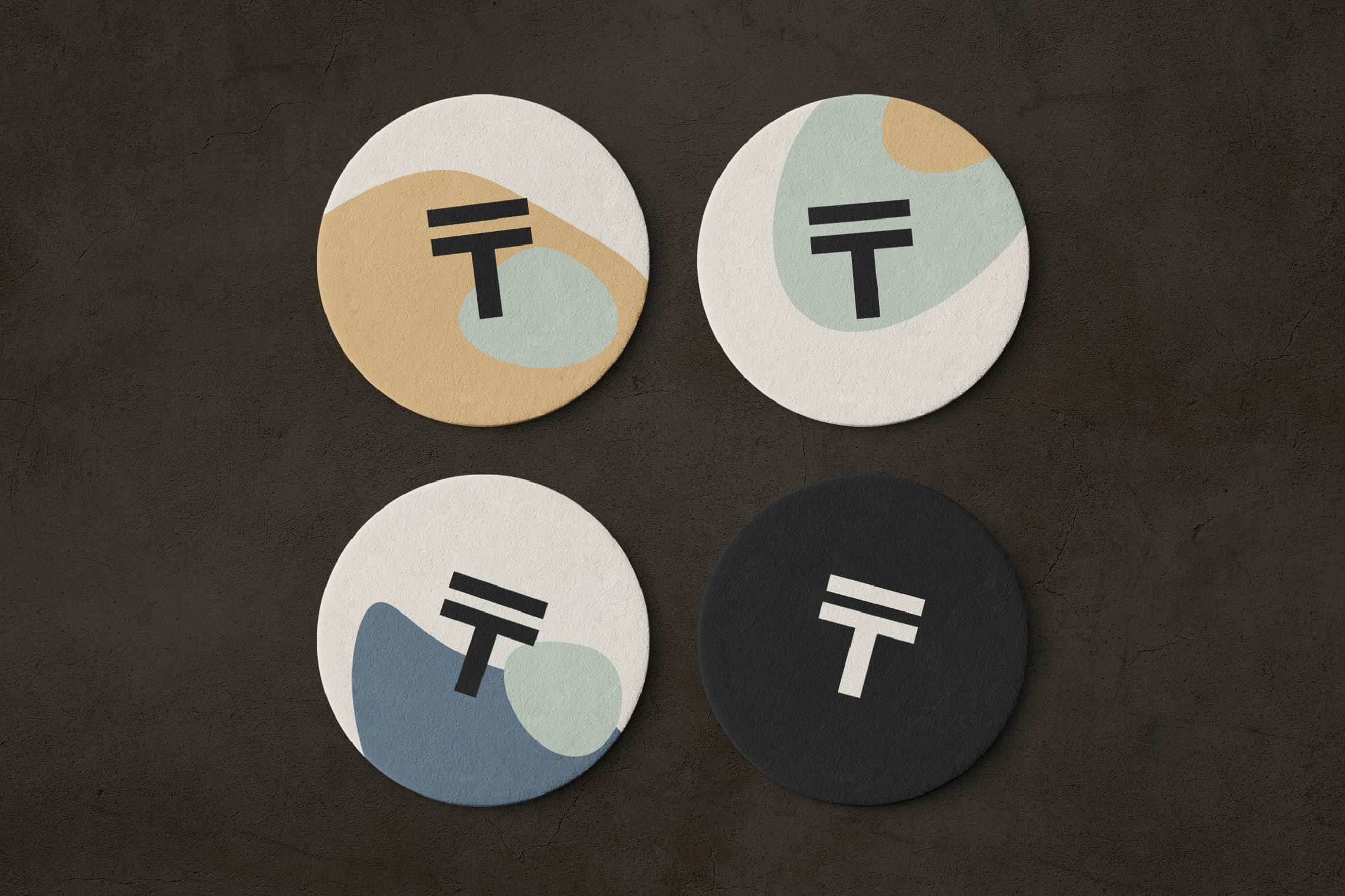
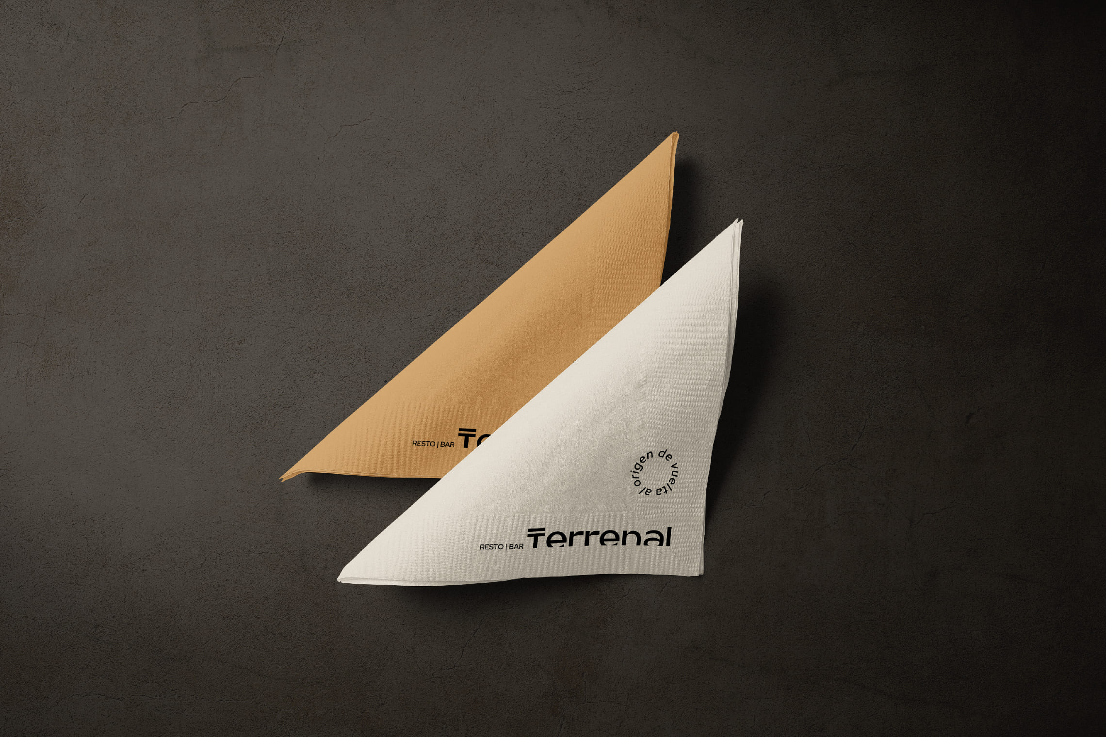
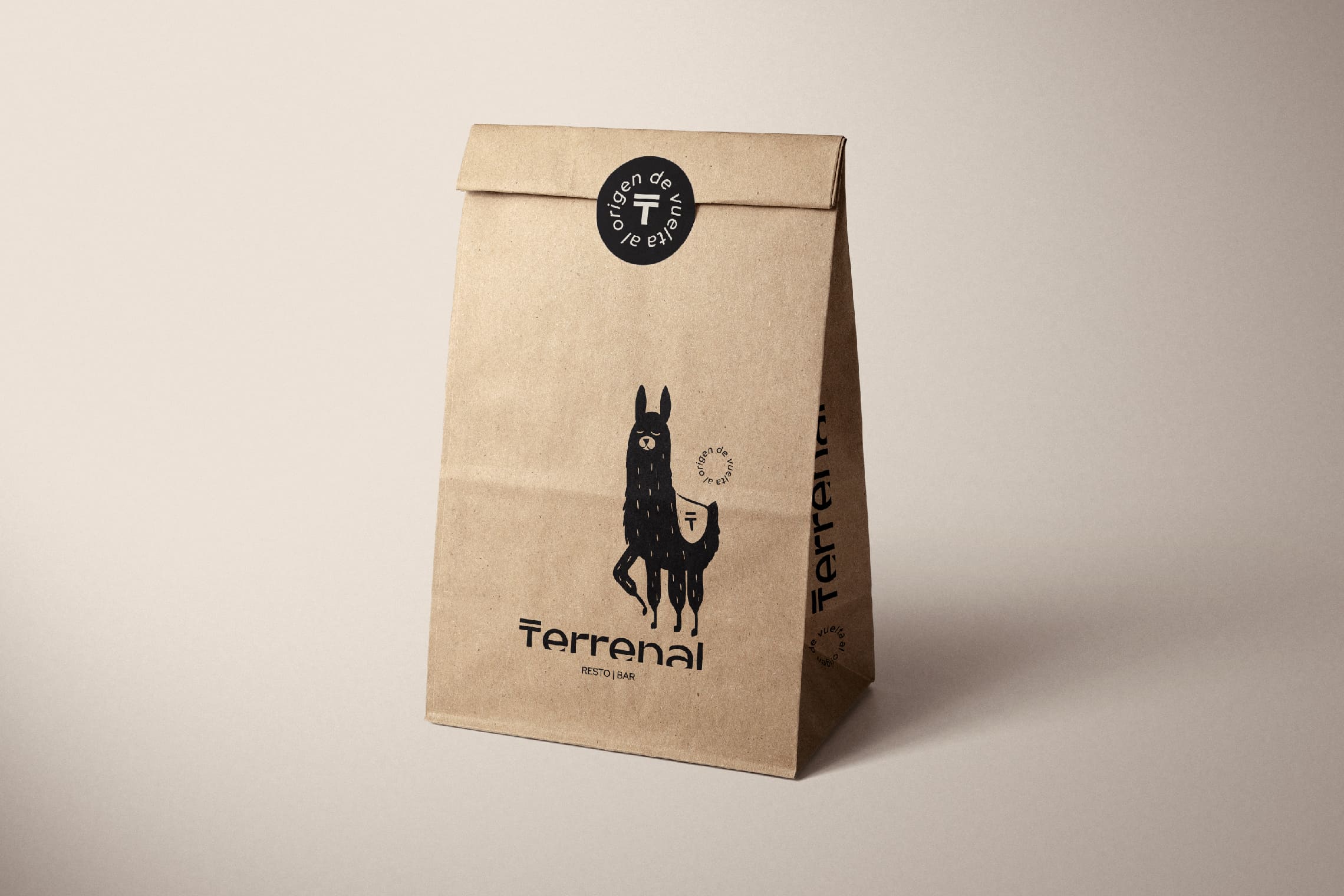
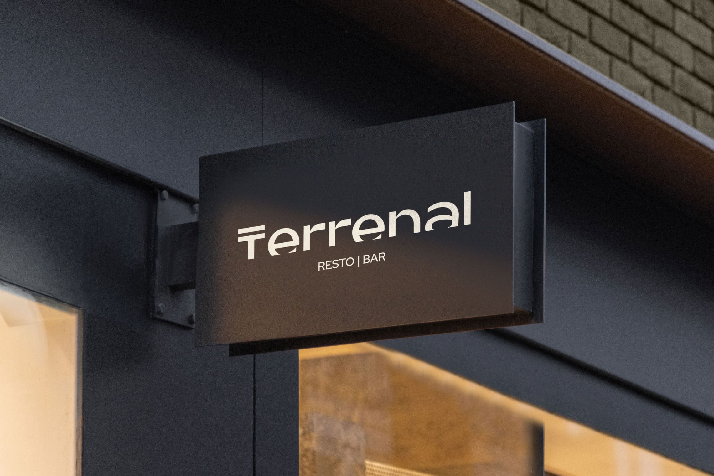
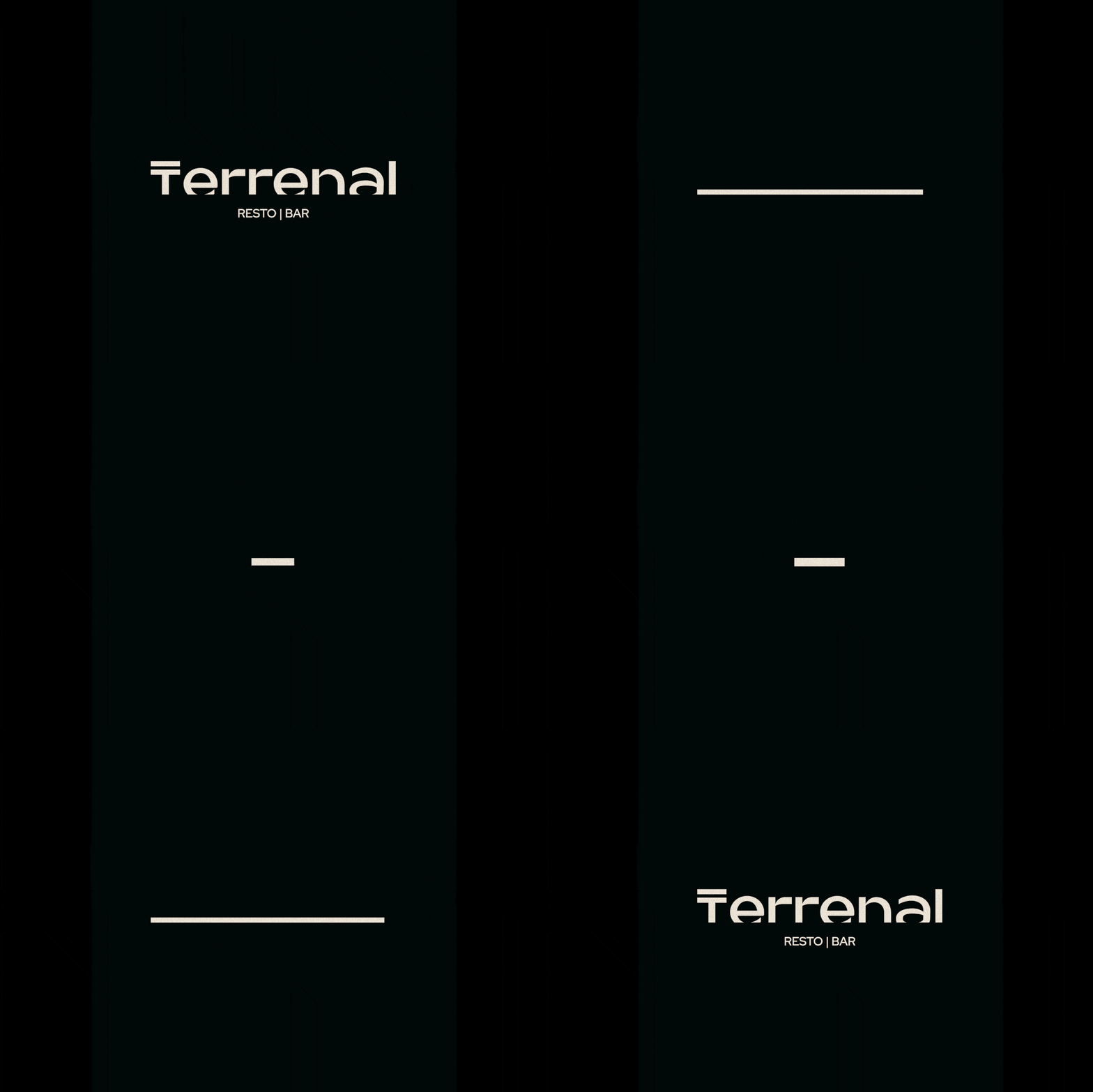
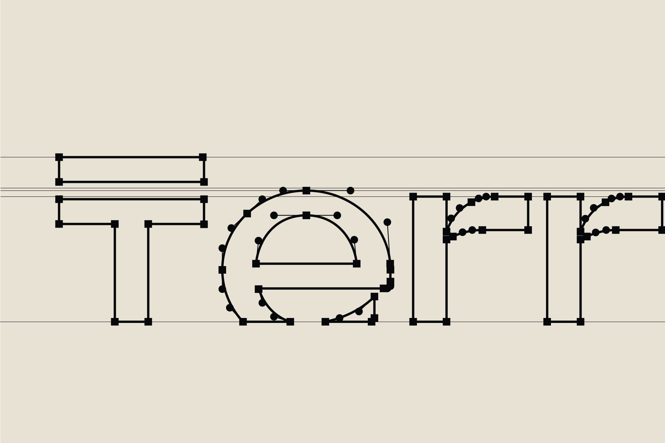
For the name design, we have chosen “Terrenal” for its literal meaning: of earthly and material things, in opposition to the celestial or spiritual, or related to them; this definition favors the experience of traversing the paramo both in its light and in its darkness. The typography designed for this project is a modern sans -serif typeface, with a top line in the letter “T” that leaves everything earthly below it; the concept is strengthened by stopping the letters in time, at a point of sunrise or sunset represented by a cut in the bottom part, evoking the horizon. This project features the colors of the paramo and a unique character native to the paramo to strengthen brand recognition and essence.
Suggested Projects
Simples Finanzas
Extreme Max
Educar com Evidências